10 / 14
2018
Almost every designer once has complained there being no client who can give him/her the complete freedom to give full play to creativity. Therefore, many of us attempt to experiment on our own offices with our whole imagination of aesthetics.
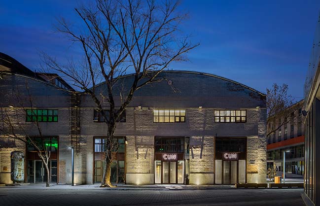
Interior Design: CUN Design
Location: Beijing, China
Year: 2018
Area: 700 m2
Designer: Cui Shu, Wang Jizhou
Installation & Display: Cui Shu, Miao Debao, Kong Weiqing
Construction Company: Beijing Pingyizuo Deisgn consultation Co., Ltd.
Photography: Su Tang, Wang Ting, Wang Jin
Project's description: Nevertheless, it is often the case that designers tend to distract from the main road and be divorced from reality due to excessive intensity. Eventually, the space is likely to be deviated from the original purpose and turned into a showroom out of brainstorming.
That is why we, as designers, need to stay sober and focus on the primitive practical use of the space when it comes to designing a work space for ourselves. In other words, we are supposed to put ourselves in clients’ feet and keep self-disciplined.
In 2017, we found a creative industry park that was transformed from a decades-old factory. After rounds of discussions with all the teammates, we made up our minds to set up the new studio there.
The original space and the site boast the following features:
1. Excellent storey height. After roof restoration, more daylights are able to be in.
2. The structure and partial exterior wall of old buildings. The reservation of old textures brings back the fading memory of those old days.
An integrated business complex. The 24-hour creative industry park includes not only commercial operations, but also office area.
Based on these conditions, we set about carrying out the design. But the project was not officially launched before we “shaking off” the identity of designers and saw ourselves as clients.
Step One - Identifying the objectives and functional requirements for the project
1. Work comes first - Since it’s a working place, the most basic demand is to guarantee a pleasant environment where the staff can grasp a comfortable working distance and, at the same time, high communication efficiency under appropriate illumination conditions and temperature control. As our company is stepping into a new development phase, the space is expected to have various sectors respectively for different departments, as well as to meet the needs of potential expansion in the near 5 years.
2. Efficient cooperation - Like many other designing companies, our daily work involves not only single-person tasks, but more frequently the teamwork, ranging from material selecting and sorting with suppliers, phased communications with partners, to the internal interactions among all levels of associates.
3. Clients reception - Considering the developmental stage of the company, it is of great importance to assign a certain area for client reception. We tried jumping out of the box of a typical design office’s outlook, making it relaxing but not void of business formality.
4. Be time-saving - For a person like me who is occupied with designing work and administration affairs, every minute matters so much. Therefore, I need this space to serve social function as well, so that I can have friends’ gatherings and business activities without spending time in traveling. In a fast-paced like Beijing, saving time is no different from creating value.
5. A personal request - I desire for a workbench which, on one hand, is big enough to integrate all of ordinary tasks, and on the other hand, is succinct enough to do my work with the shortest streamline. Only in this case am I able to make the most of time and improve work efficiency.
Step Two - Spatial planning based on functional requirements for the project
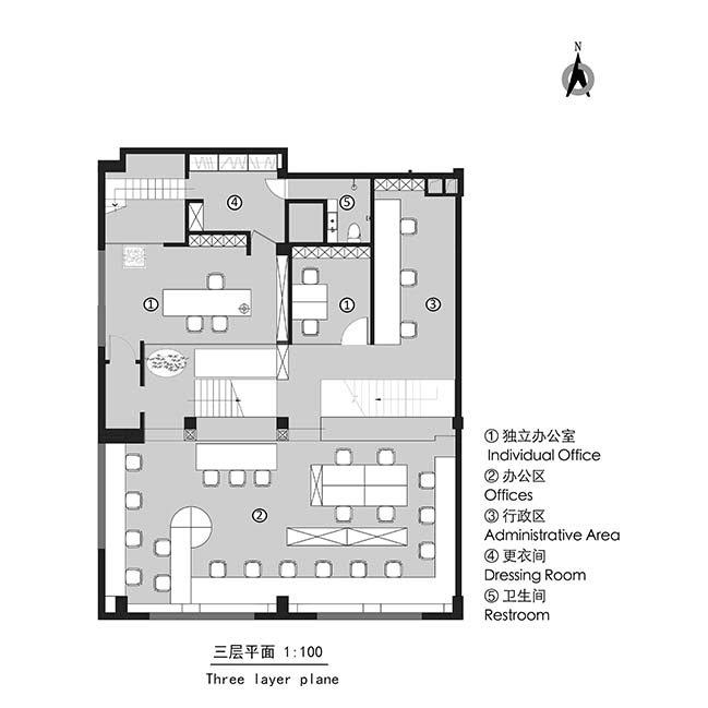
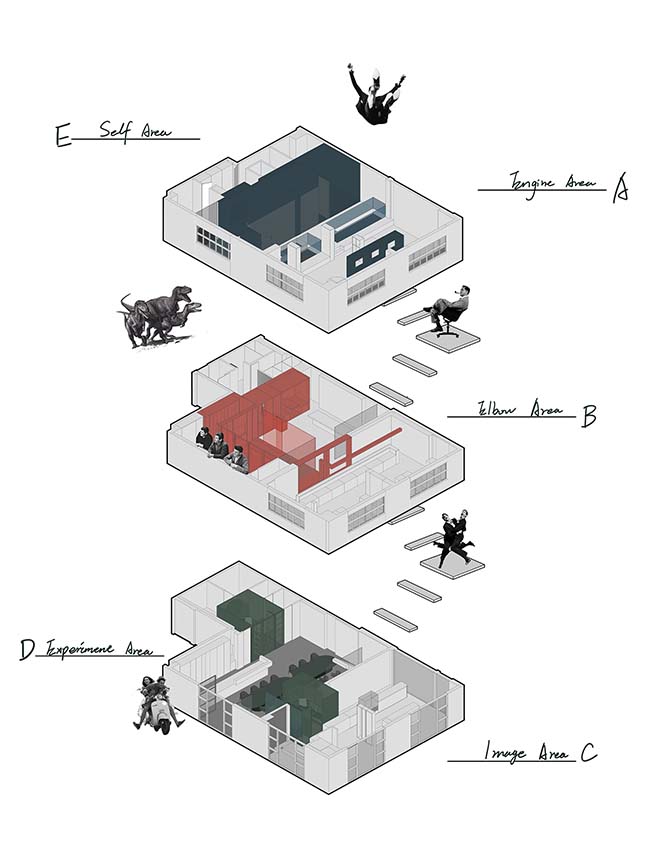
1. Zone A - “Engine Area” - Working section is most frequently utilized, so we arranged the best area in southern/northern part of this space to be the working area and schematized it with smooth circulations.
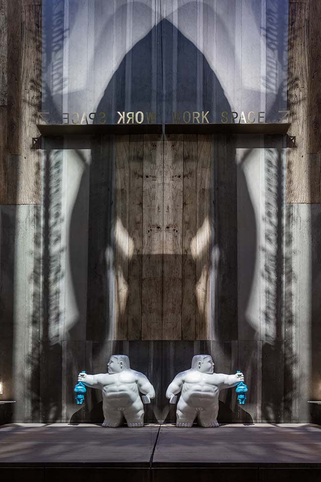
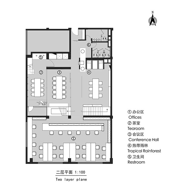
2. Zone B - “Elbow Area” - It is a brand new concept we came up with, referring to the cooperation area where we can interact with business partners. Besides, it was arranged in the middle sector with independent entry and exit.
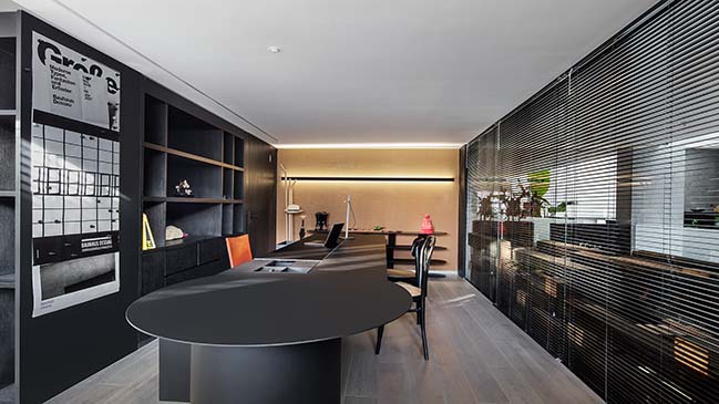
3. Zone C - “Image Area” - Since this area represents the company image and delivers its spirit to clients, it was planned in a key area of the overall space.
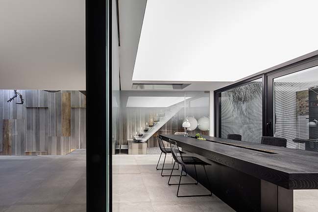
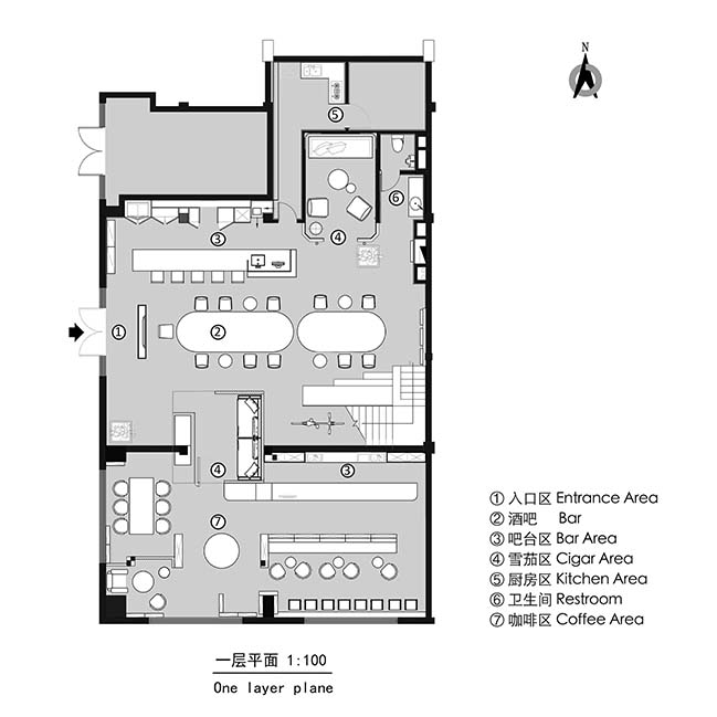
4. Zone D - “Experiment Area” - In order to maximize the efficiency of social time, a commercial area for relaxation and social intercourse was set up as an experiment field.
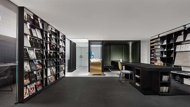
5. Zone E - “Self Area” - In this area, I shall immerse the whole of me in tranquility and solitude. Without any interruption, designing should be the only company for me.
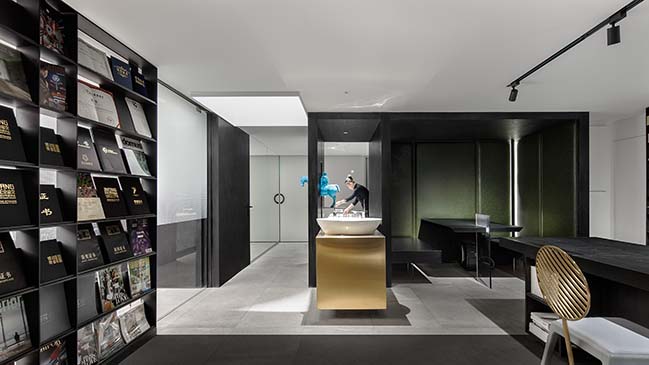
Step Three - Implementing the spatial planning scheme in proper ways
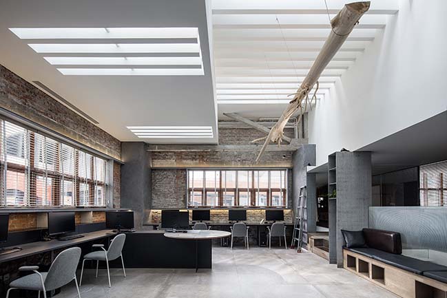
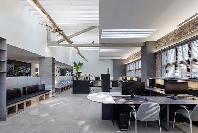
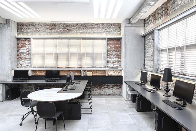
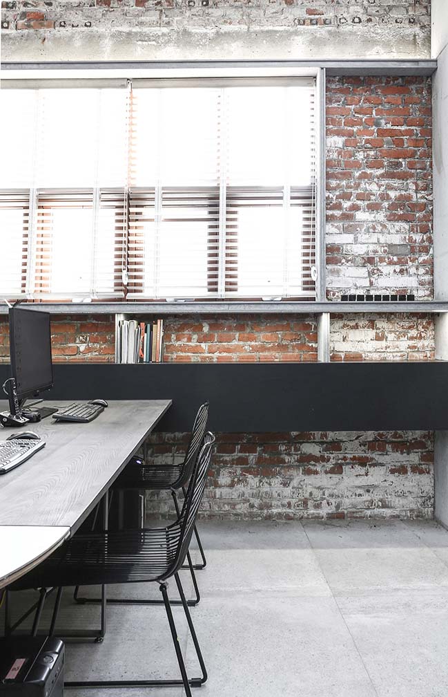
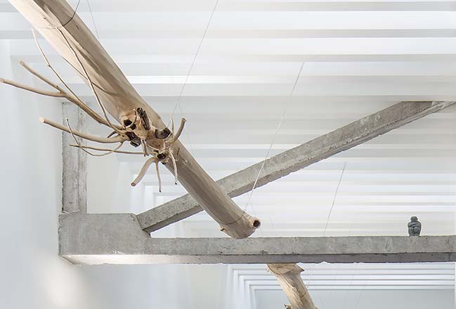
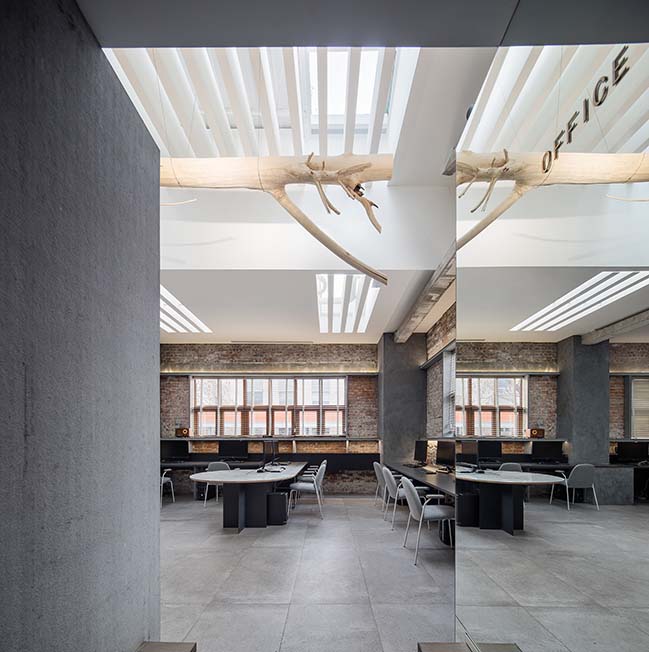
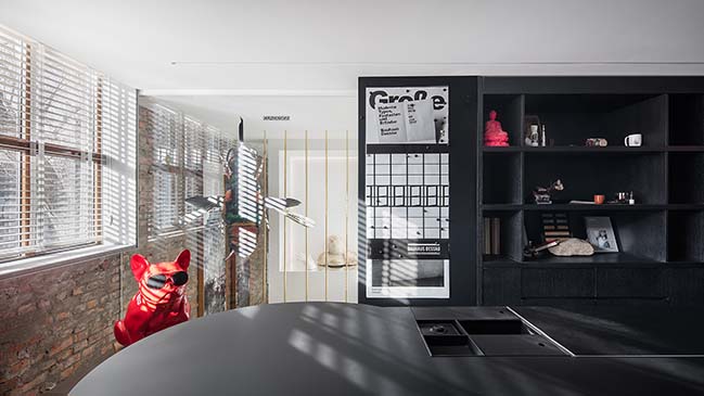
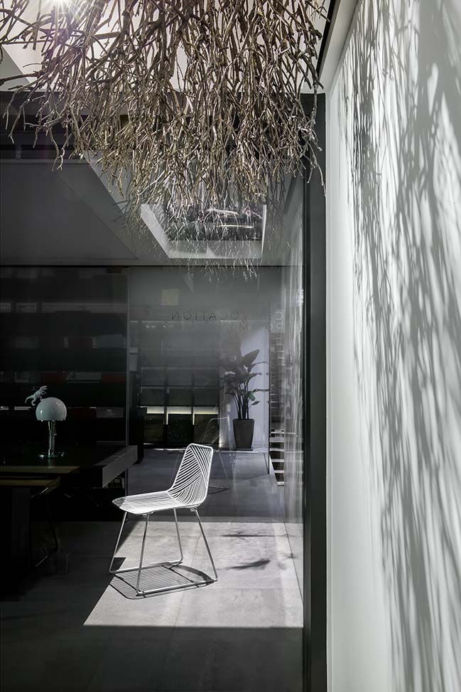
1. We chose the area which enjoyed the most sunlight in the attic to be Zone A. This section is spacious and fit for all the major team members to work at. The original brick walls were left untouched and only a shutter grille was added to the ceiling. The sunlight-oriented spatial design in this area makes the shutter capable of adjusting indoor light. In this section, we also hung a tree which was divided into two parts. Lighting was set behind the tree so that the light reflected on the ceiling gets softer and provides illumination for the whole section. Besides, this suspended tree embodies designers’ contradiction between sense and sensibility.
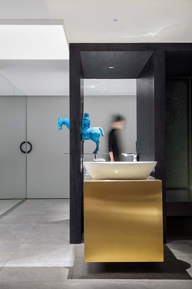
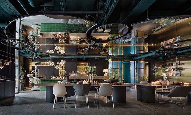
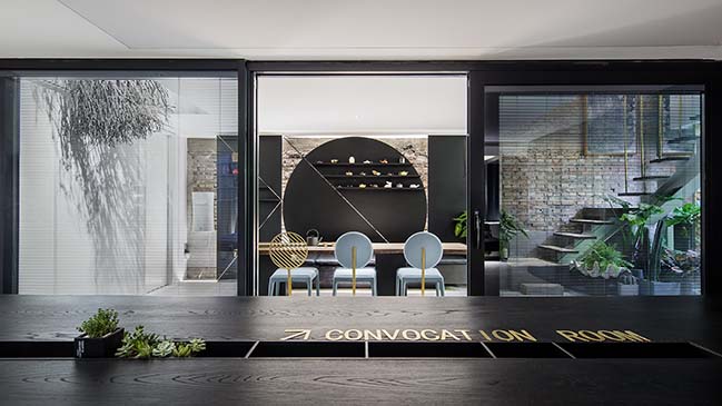
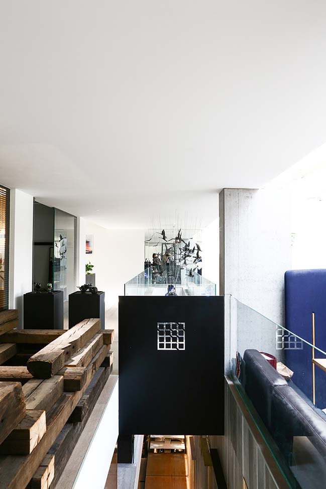
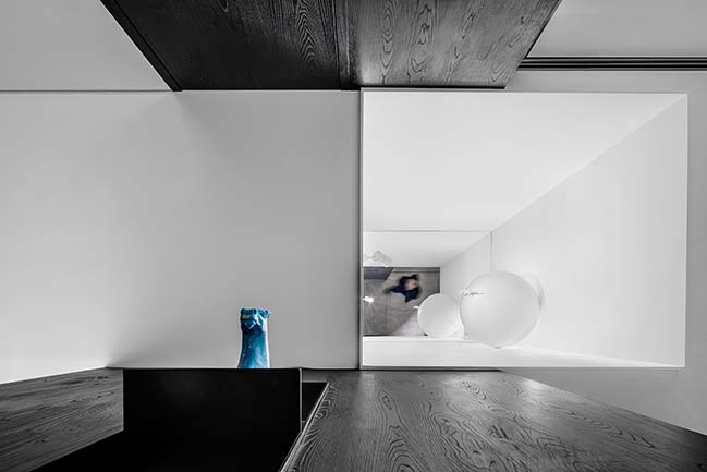
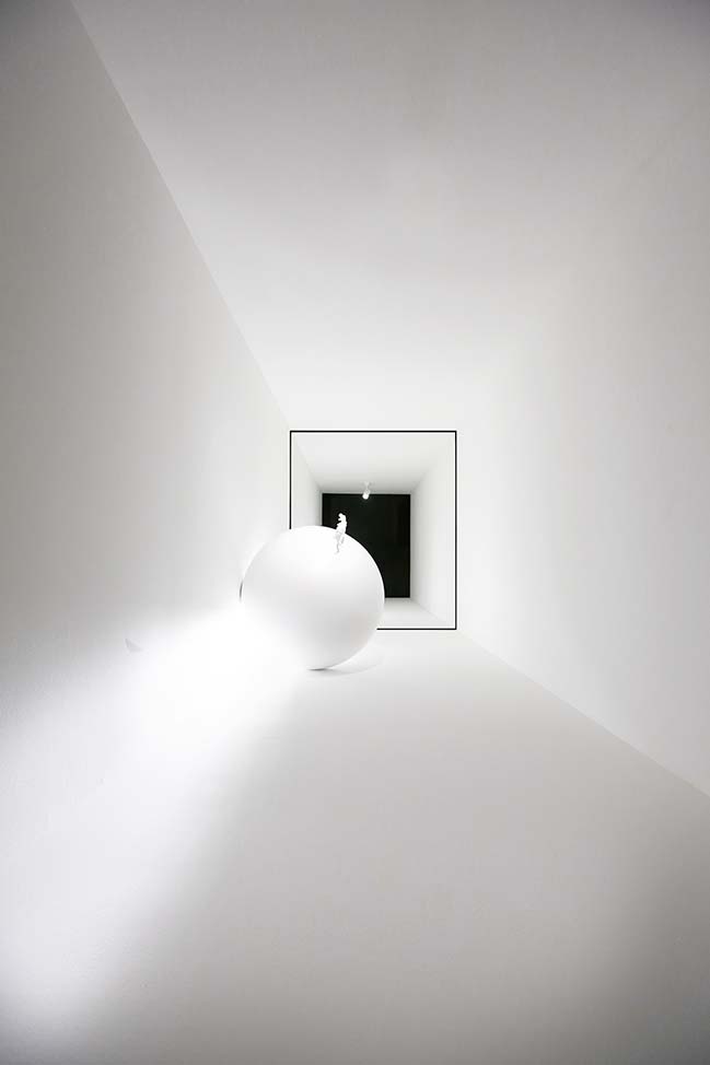
2. To realize the intended function of Zone B, we took advantage of the five-meter floor height to build a loft. In this way, we have two extra areas with nearly 300 square meters on the second floor. All of our cooperators can enter the second floor to communicate with designers through the separate doorway. For the convenience of negotiation, we also arranged small conference rooms and material sample areas. As for decoration, considering that the storey height of the second floor is only 2,300mm, the ceiling design is even more crucial to integral visionary effects. We dug a patio leading up to the third floor and laid a mirror at the bottom of it. With the five-meter height of the patio and the reflection in the mirror, we are able to get a square space with ten-meter visual extension. To help distinguish reality and virtuality, a sphere installation was put inside the patio to generate mirroring and vividness. On the ceiling of the conference room, we placed a transparent fish pool. In this way, when daylight is cast on the pool, a beam of variegated light will appear in the conference room, making the low space more lively.
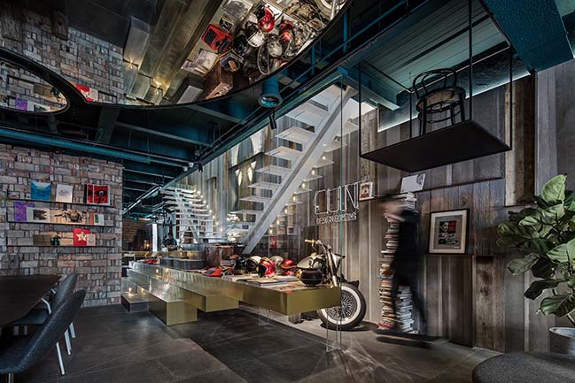
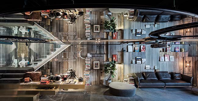
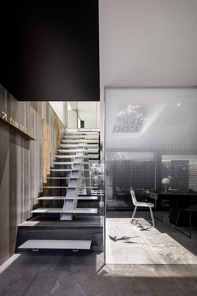
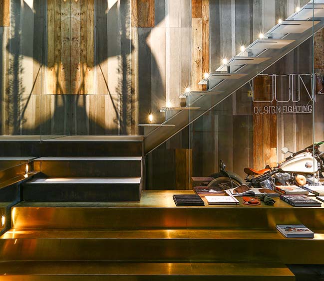
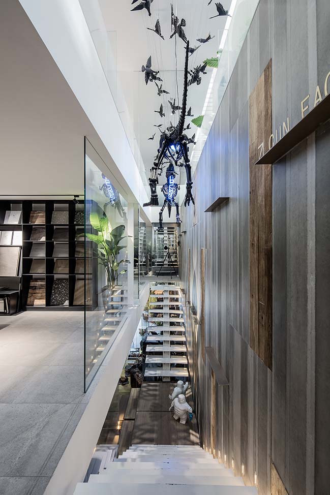
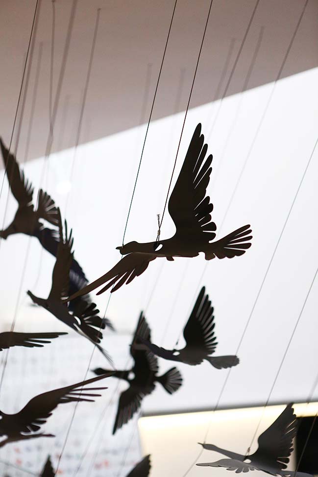
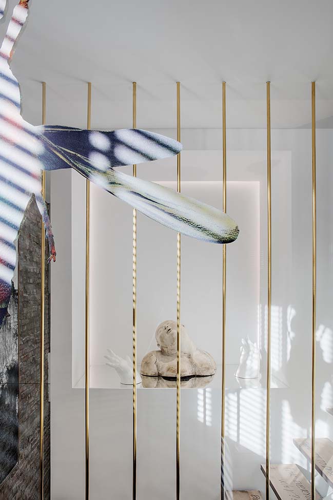
3. A staircase with panoramic mirror connects the second floor and the first floor. The reflection of mirror together with the stair itself forms a V shape. Above the stair hangs a tyrannosaurus together with a flock of birds, creating a dreamy scenario. The staircase provides the best position for shooting pictures of the office. Since the staircase mainly serves as a channel, the decoration won’t disturb quietness or affect office efficiency. In other words, Zone C embodies the temperament of the company.
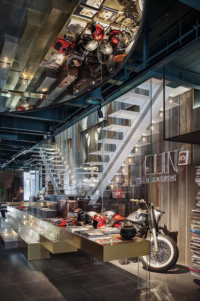
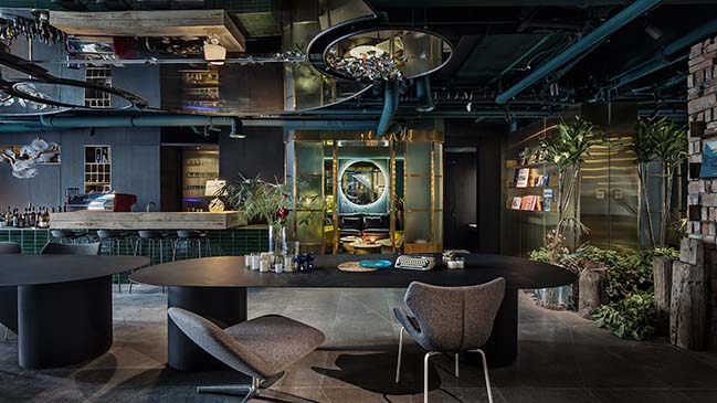
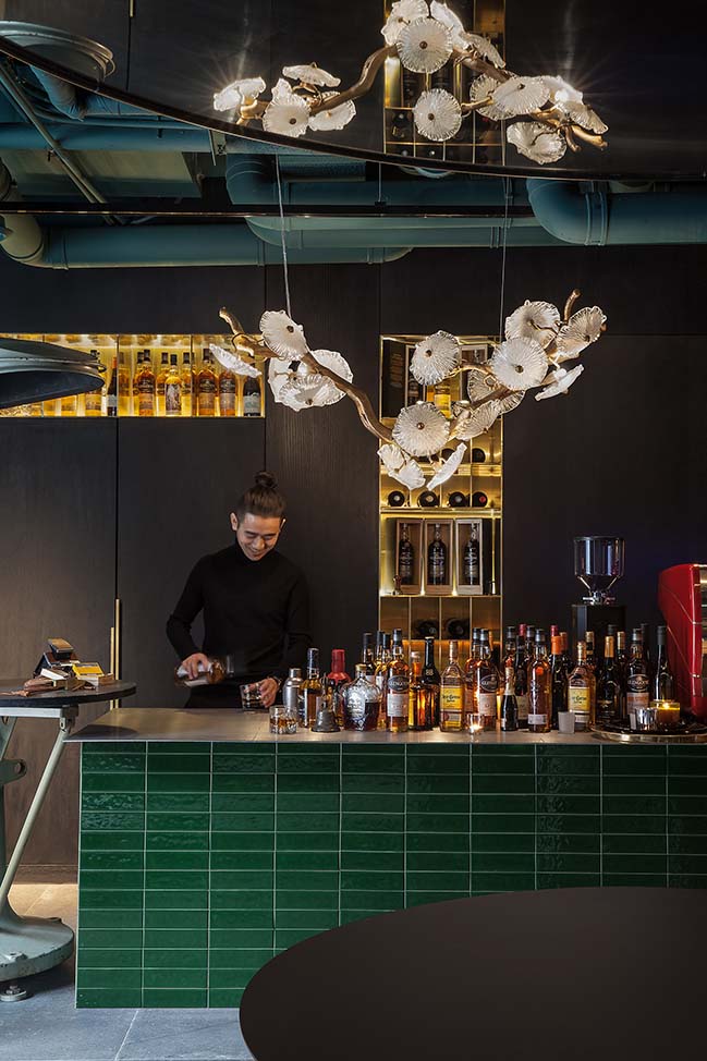
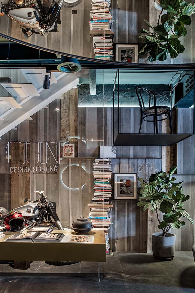
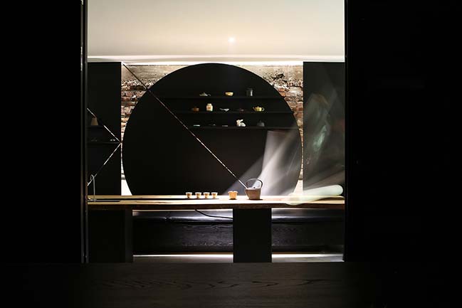
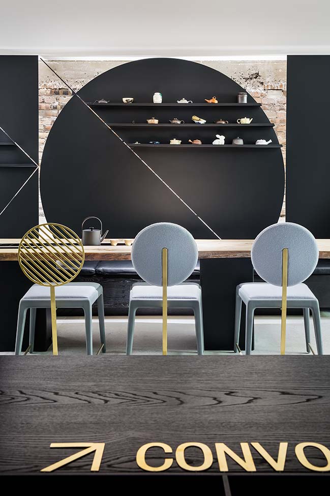
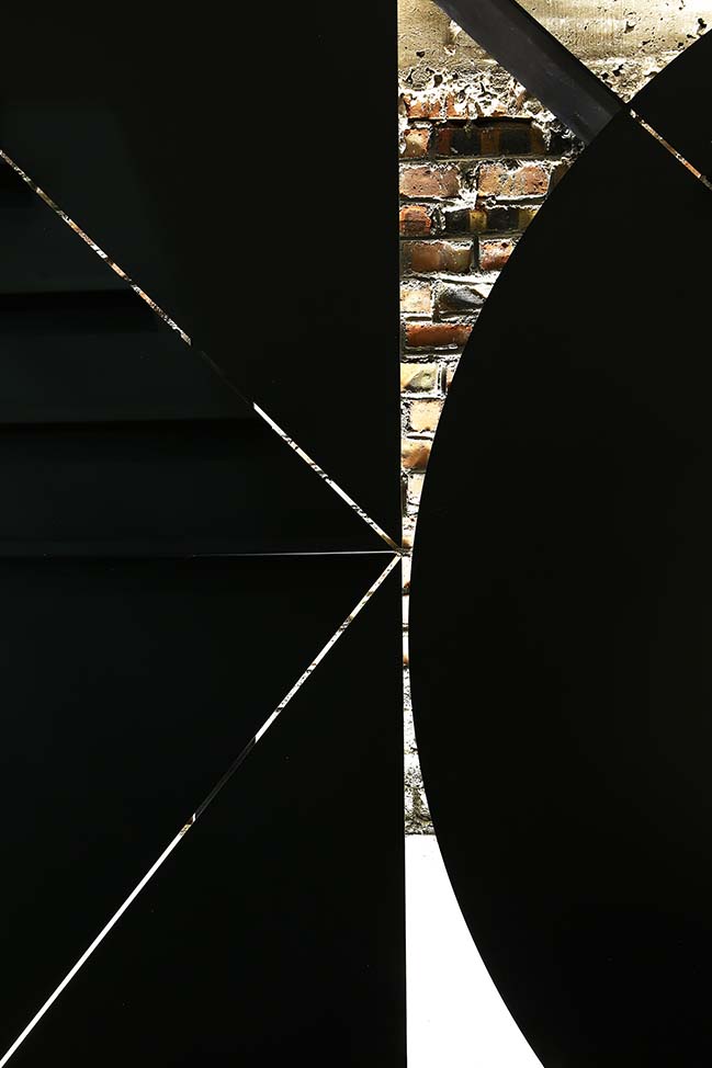
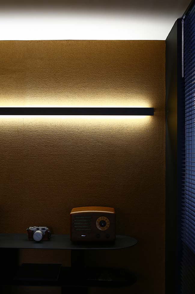
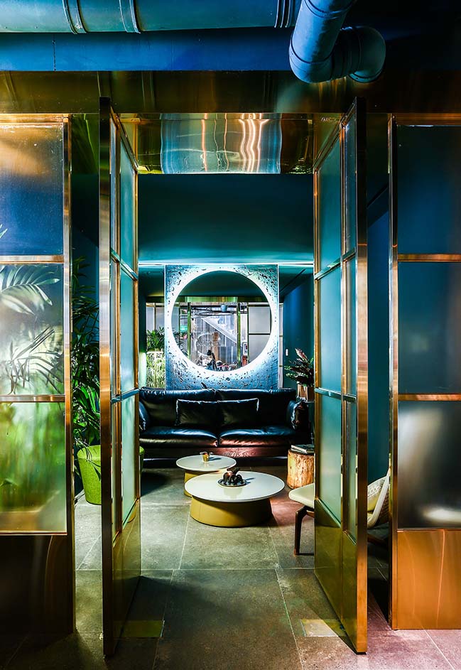
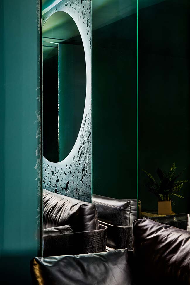
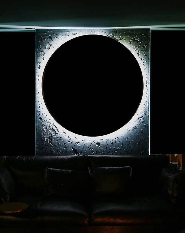
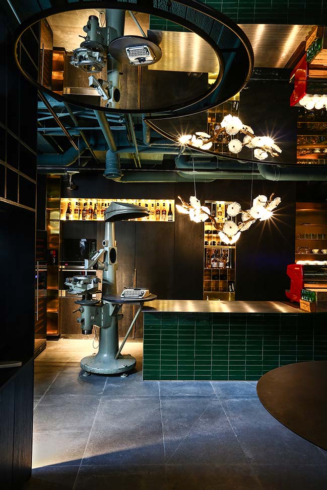
4. We built a bar on the first floor equipped with two removable tables. Sometimes we organize activities or gatherings in the bar, saving time for traveling to other places. And during the day, we can host our guests and hold some investigative conferences with clients or large internal meetings there. For soft furnishing, we bought an old machine, a possible device used in industrial design in the past, from the previous owner of the factory, Carl Zeiss AG. Our colleagues also brought their favorable personal belongings to the bar to make the place closer to us. Inside the small compartment, there is a round mirror on a cracked wall. Those cracks resemble the surface of the moon and are products of the break-and-restructure technique.
5. I intentionally made my own office small so that I could do nothing but my design work there, thus promoting productivity. My desk was also designed by myself. The front of the desk is a round table 1,100mm across, which allows a quick discussion of proposals among four people. At the backside of my office, there is a separate stairway leading to tearoom downstairs. This newly-formed loft within the thirty-square-meter space satisfies my demand for personal creativeness and reception. Kind of a treat for myself.
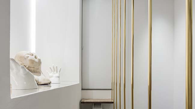
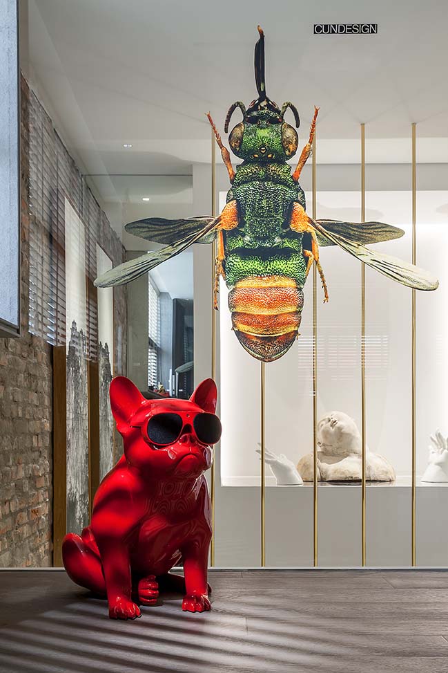
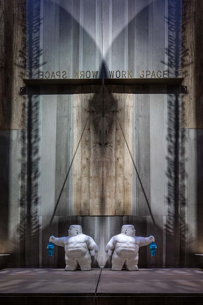
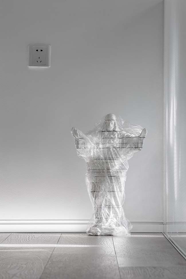
6. A space lack of art is full of coldness. At the end of the decoration, we found many appropriate artworks to adorn the place. Those artworks are like intimate friends, igniting every corner.
From objective identification to scheme planning and implementation, we have completed the design and decoration of our workplace by teasing out the design logic. Even though the style is not necessarily my favorite, the place is suitable for the operation of our team. I believe that when designers are designing our own places, we should think of ourselves as clients first, and then as designers. This is all I want to share with you.


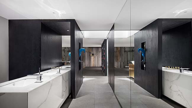
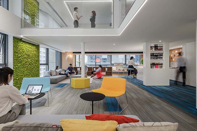
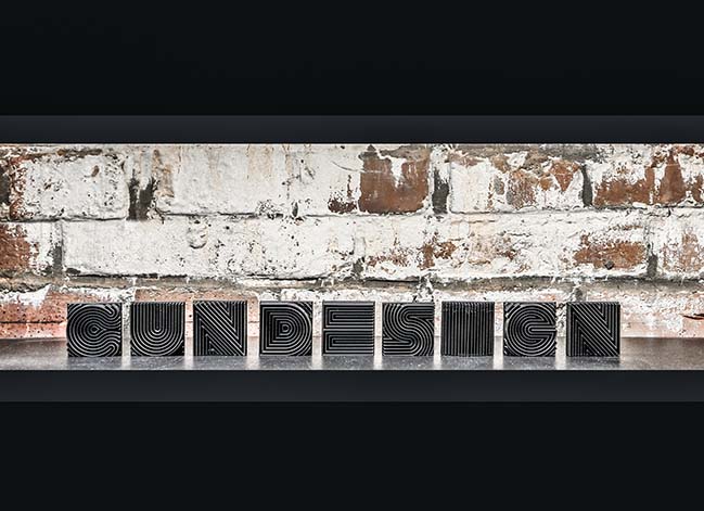
CUN Design presents their new office in Beijing
10 / 14 / 2018 Almost every designer once has complained there being no client who can give him/her the complete freedom to give full play to creativity
You might also like:
Recommended post: Apartment 1405 in Melbourne by Winter Architecture
