02 / 14
2019
The new office layout, reflecting the creativity and collaborative nature of their process, has dramatically improved Informa’s workflow and productivity.
Architect: Dubbeldam Architecture + Design
Location: Toronto, Canada
Size: 16,000 sq.ft.
Project Team: Heather Dubbeldam, Andrew Snow, Scott Sampson
Photography: Shai Gil
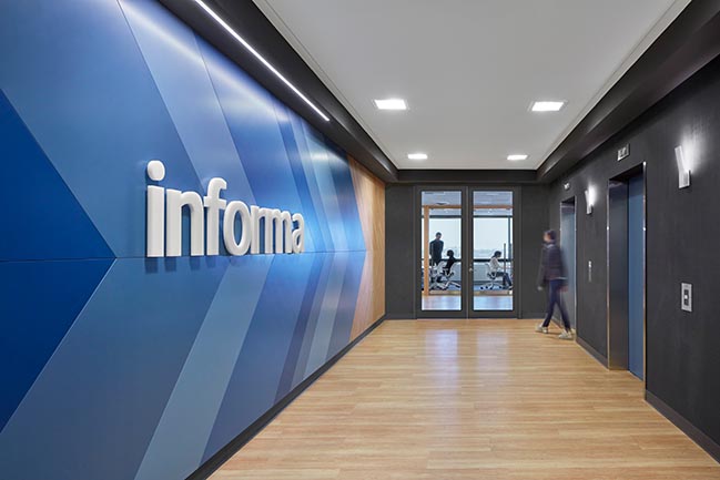
From the architect: Informa Canada produces and manages over 45 annual conferences, trade and consumer shows in the construction, design, craft, art, real estate, and furniture sectors, including the Interior Design Show, IIDEXCanada, the Artist Project and Fan Expo. Informa is known for their global and holistic approach, offering unparalleled opportunities for industry insight from around the world, with a mandate of innovation and design excellence in their exhibitions. The fit-up for Informa’s Toronto expansion into one of midtown’s Class A office buildings comfortably accommodates a growing team of 110 employees in a 16,000 s.f. floorplate.
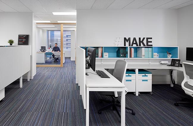
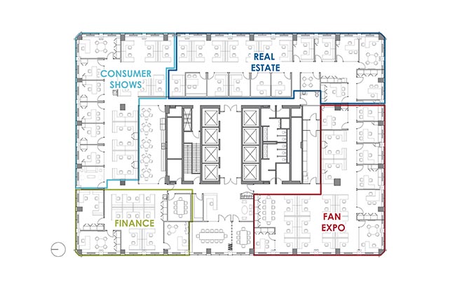
Informa’s department teams working in different sectors (real estate shows, consumer shows, Fan expo, finance department) were previously isolated from one another, and with communication and productivity decreasing it was necessary to integrate the teams into a more collaborative environment. The new layout divides the department teams into coloured quadrants which are visually identified by bold coloured accents in the Teknion workstation furniture and wall graphics. The workstations are located around the perimeter to provide access to views and natural light. Private offices and meeting rooms have glass partitions to allow for borrowed light in adjacent interior spaces. The new office layout, reflecting the creativity and collaborative nature of their process, has dramatically improved Informa’s workflow and productivity.
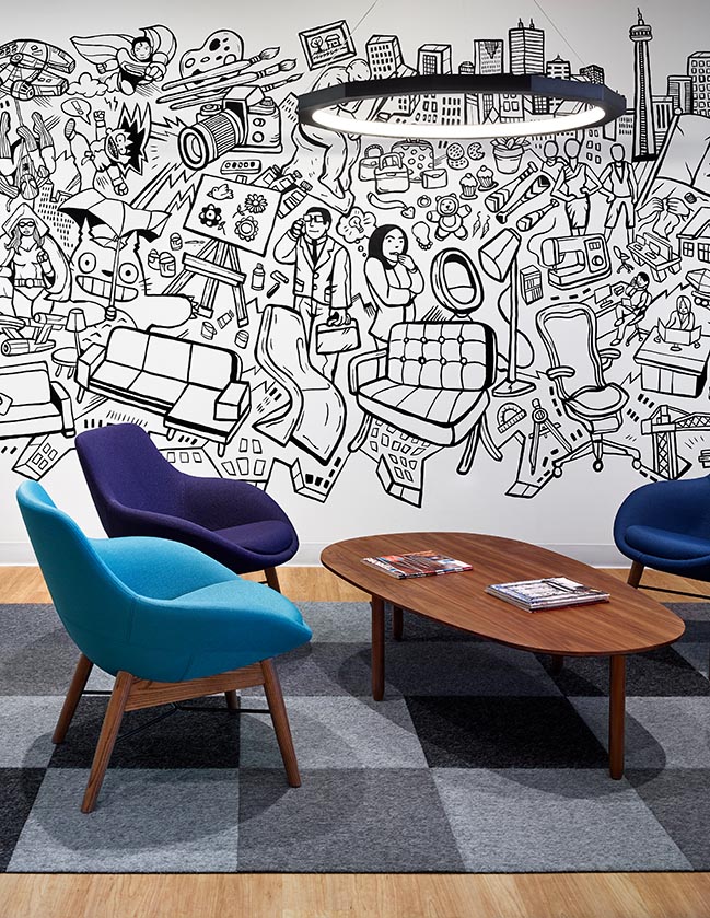
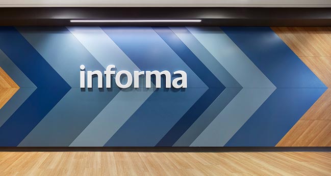
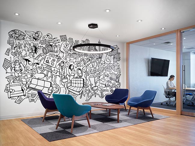
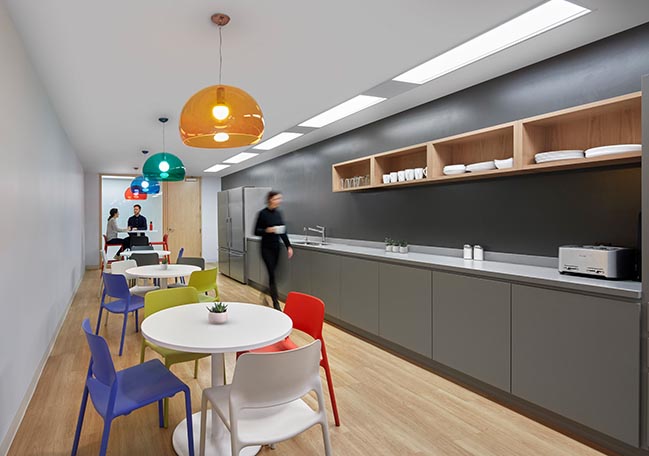
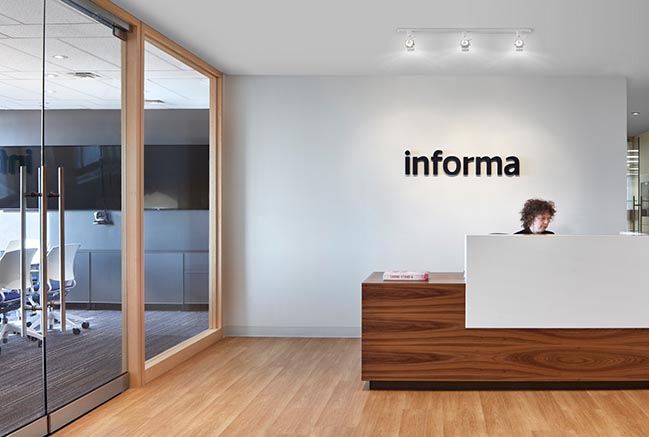
In the elevator lobby a directional graphic in the company’s brand colours directs guests to the reception area where a mural by local artist Mike Parsons depicts themes from some of Informa’s exhibitions. A fresh material palette of light wood to add warmth in a corporate environment combined with deep hues of blue in the furnishings and linear carpet incorporate Informa’s brand colours and contrasts with the white walls and workstation furniture. Similarly, in the communal kitchen, splashes of colour from the furniture and light fixtures offset the neutral grey AyA cabinetry and countertop. The result is a space that successfully communicates Informa’s brand and its transition from a disconnected and poorly lit environment to an open workspace flooded with light.
YOU MAY ALSO LIKE: Slack Toronto Office by Dubbeldam Architecture + Design
Infroma Toronto by Dubbeldam Architecture + Design
02 / 14 / 2019 The new office layout, reflecting the creativity and collaborative nature of their process, has dramatically improved Informa's workflow and productivity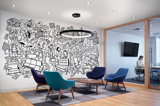
You might also like:
Recommended post: Devils Glen by StudioAC
