08 / 16
2019
This project, for a London-based infrastructure research organization, was guided by two fundamentally practical needs...
Design Firm: The Office as a Project
Location: London, UK
Year: 2018
Project size: 4,500 ft2
Photography: Peter Landers, The Office as a Project
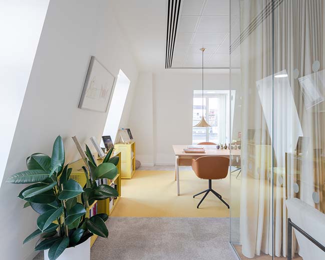
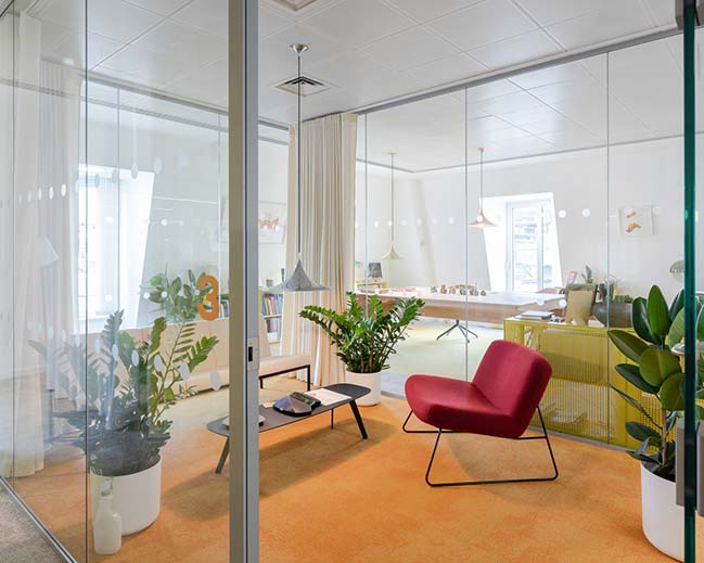
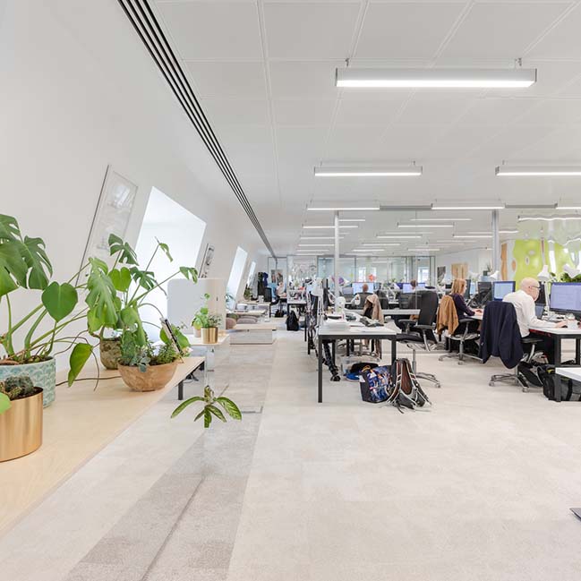
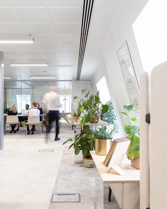
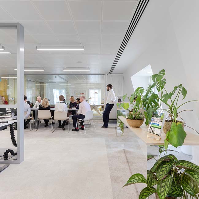
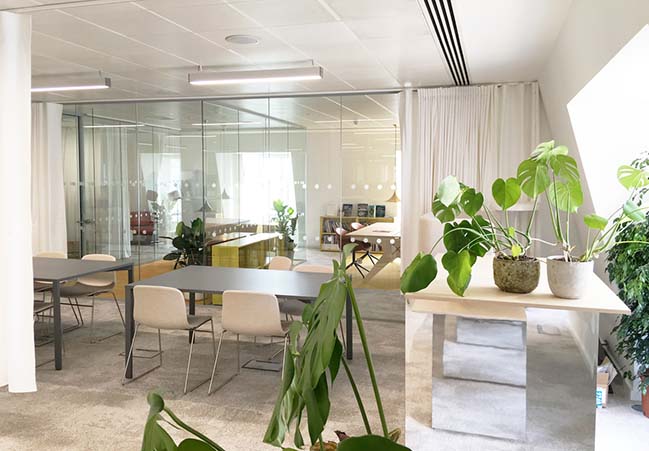
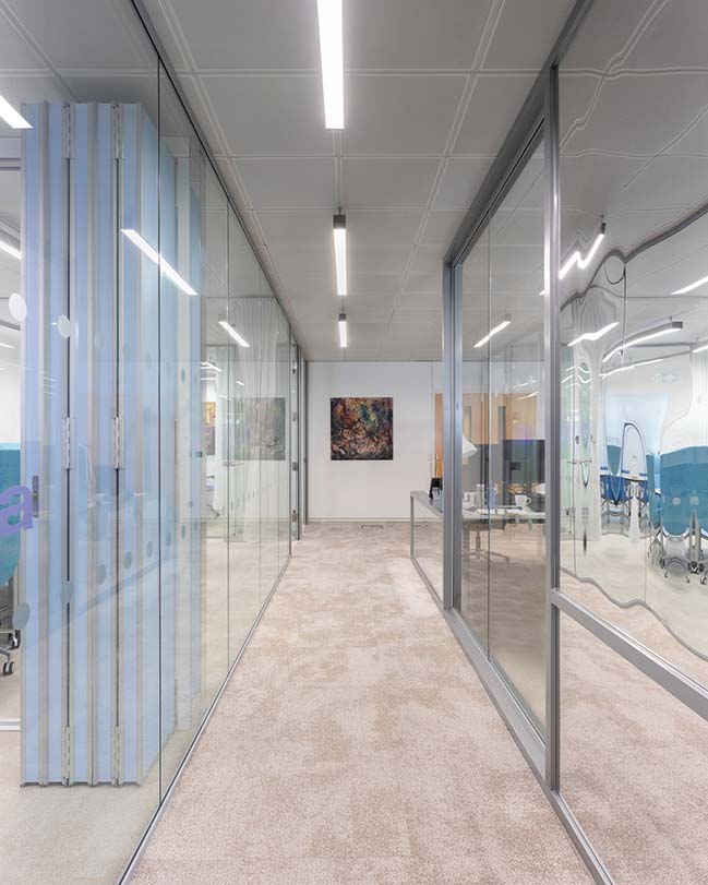
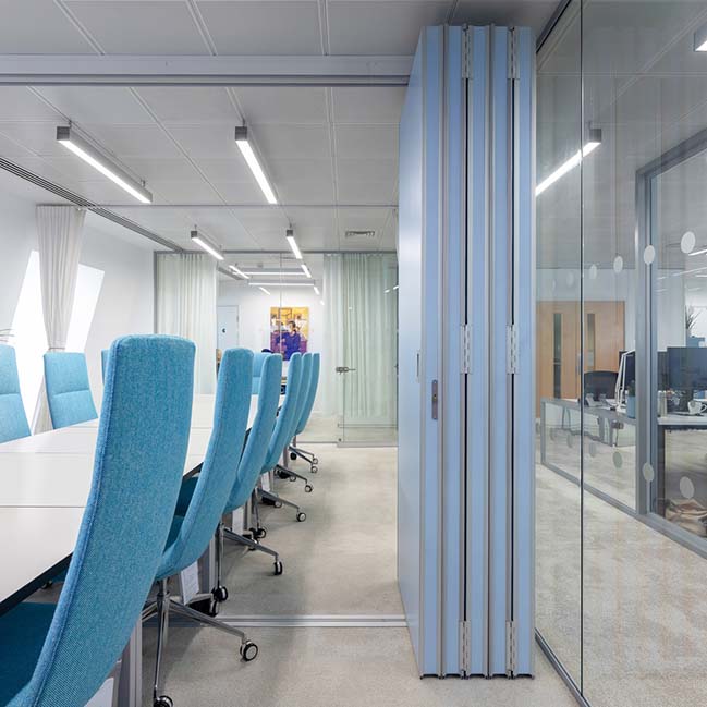
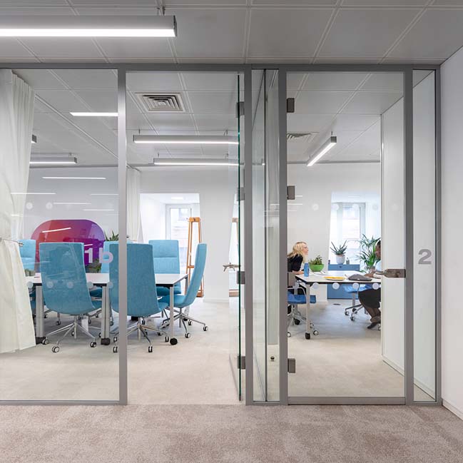
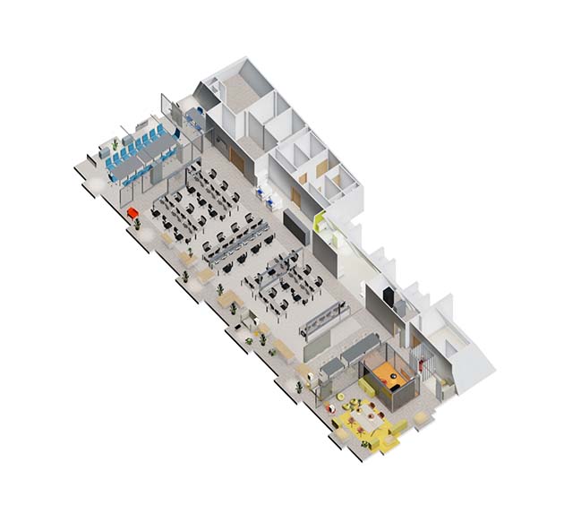
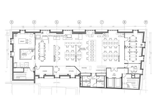
1. Maximizing natural light & sense of space - While only 4,500 sf, this primarily north-facing mansard space was required to host up to 45 workers at peak moments. A sense of space & daylight were thus primary concerns. Glazed or mirrored partitions throughout maximize the sense of space while the orientation and design of elements in the space serve to maximize daylight. Nearly all elements (curtains, partitions) run north-south in an effort to maintain as much northern light. Despite the apparent contradiction, these strategies enable both openness and privacy.
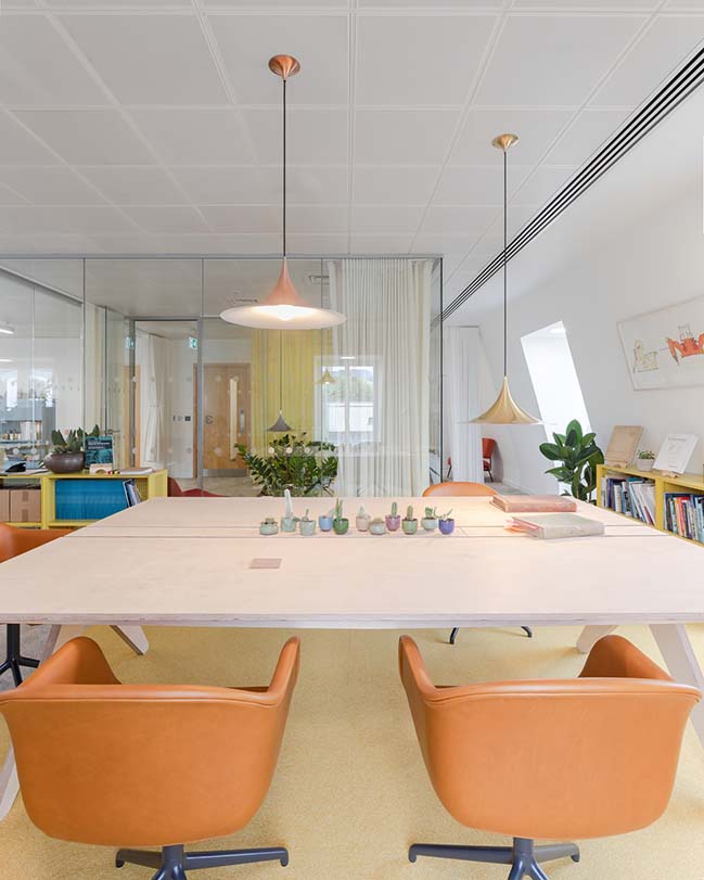
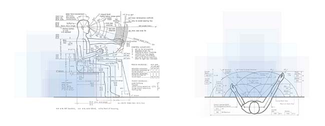
2. Accommodating the work of the researcher - With workflows and teams largely structured around research papers and reports, the work of this organization involves temporary teams and flexible work routines, requiring much more concentrated work & reading space than a typical office. There was also a need for a range of meeting types—from a weekly all-hands meeting to many small informal discussions throughout the day. A variety of environments were designed to accommodate these, despite the small size of the office.
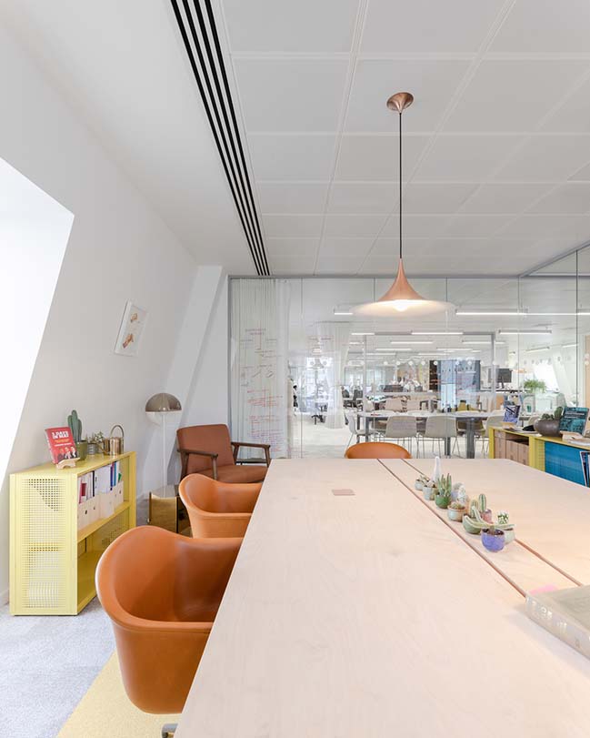
We organized workshops with employees to understand these unique program conditions, resulting in a design that explored the entire spectrum of work environments—from semi-open (but varied) desk areas to quiet library reading spaces, from informal stand-up meeting counters to corners just wide enough for a private phone call.
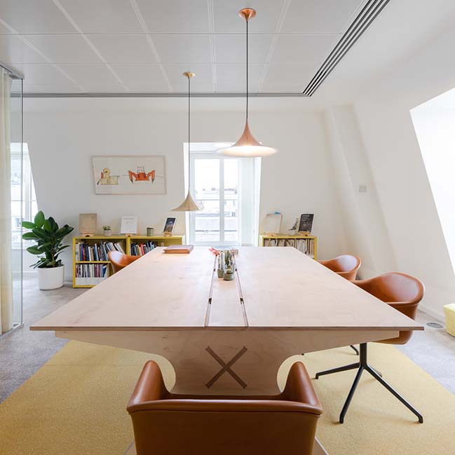
Transparent & mirrored partitions, movable curtains and mirrored millwork are the only architectural interventions in the space, emphasizing a desire to do the minimum possible while achieving the maximum effect. The use of subtle reflections that confuse but do not disorient creates a sense of visual privacy, allowing workers to hide in plain sight. Subtle differences in the views from each direction give an element of uncanny reflection, in an attempt to playfully double the relatively confined space.
YOU MAY ALSO LIKE: Second Home London Fields by Estudio Cano Lasso
YOU MAY ALSO LIKE: ALEKSA studio designed flagship stores for eyewear brand For Art's Sake in London and Shanghai
YOU MAY ALSO LIKE: Lead8 to Design Hong Kong International Airport T1 Renovation
London Research Office by The Office as a Project
08 / 16 / 2019 This project, for a London-based infrastructure research organization, was guided by two fundamentally practical needs...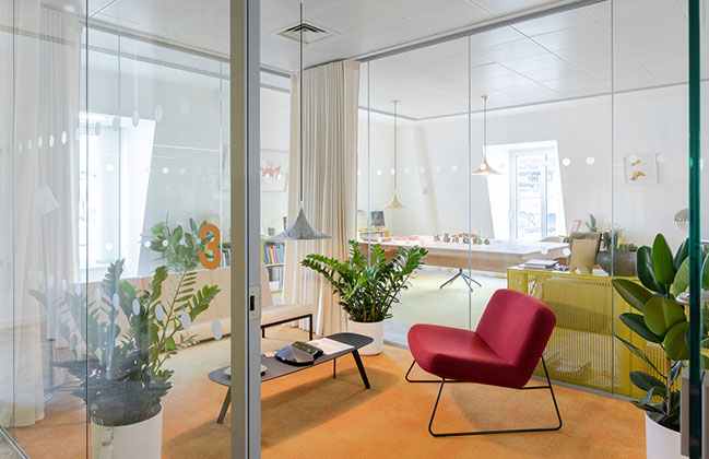
You might also like:
