08 / 23
2018
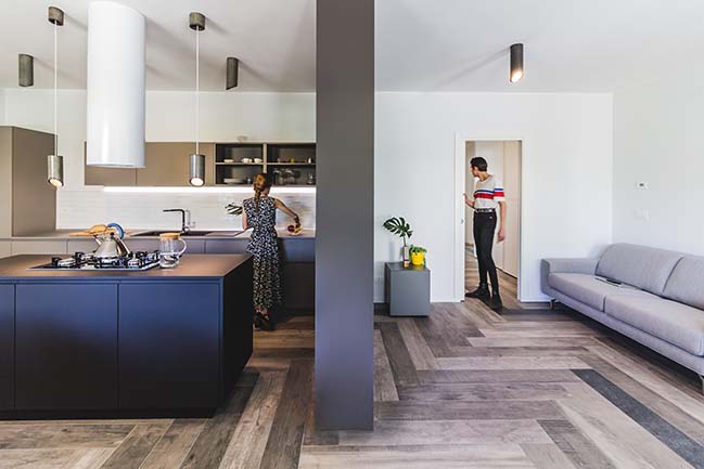
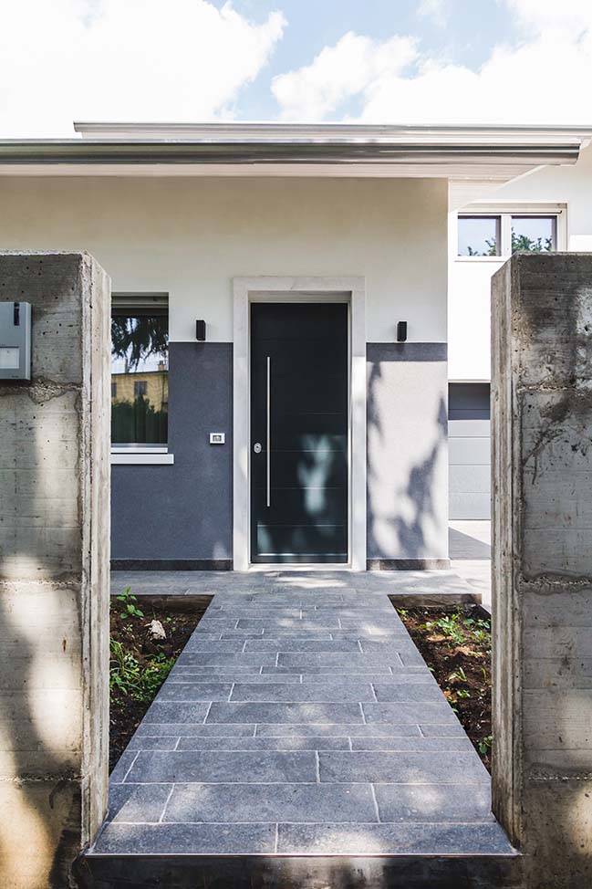
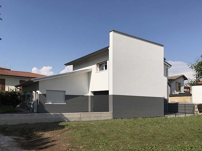
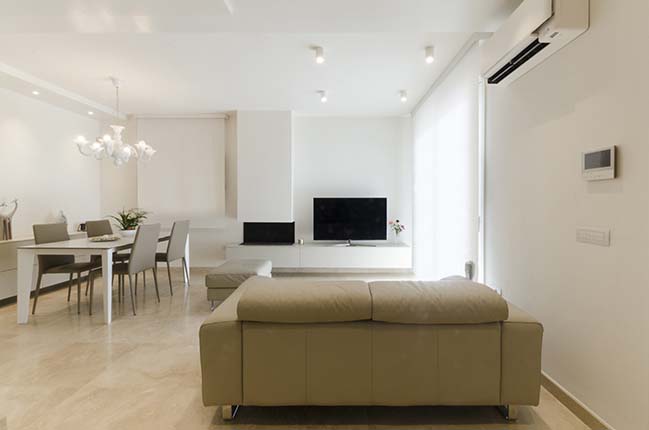
Designing a smart space, both elegant and intuitive was the intent in So & So Studio’s recently completed home for a blind woman in Thiene, Italy.
Architect: So & So Studio
Location: Vicenza, Italy
Year: 2018
Area: 232 m2
Photography: Stefano Calgaro
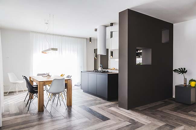
From the architect: When their client was ready for what she called “home” for fifty-five years to change, the designers elected to implement a natural process of adjustment and way-finding for the vision impaired woman to navigate her new space.

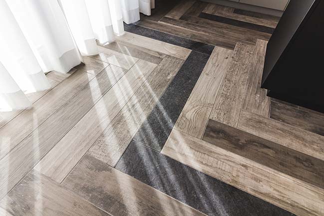
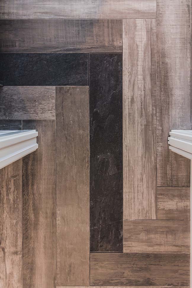
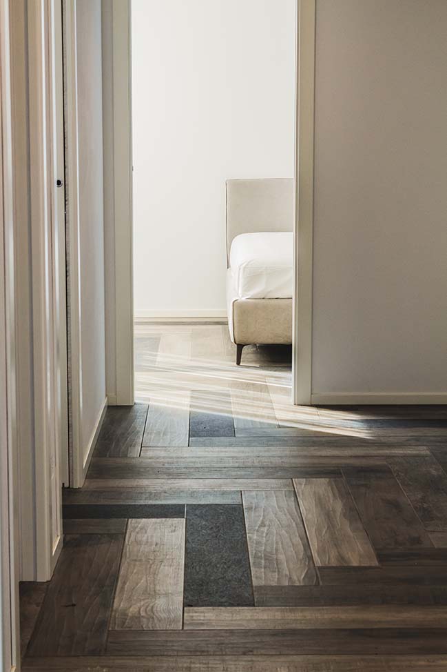
For a blind homeowner, the process of learning a new environment is vital to not only the function of the space but to the daily life within that home. So from day one, the overarching theme of the project grew out of a simple glyphic language. Realized through thorough material selections of stone and porcelain, So & So Studio aimed to find the perfect balance of textures to guide the end user of the home between program elements using an embedded map system.
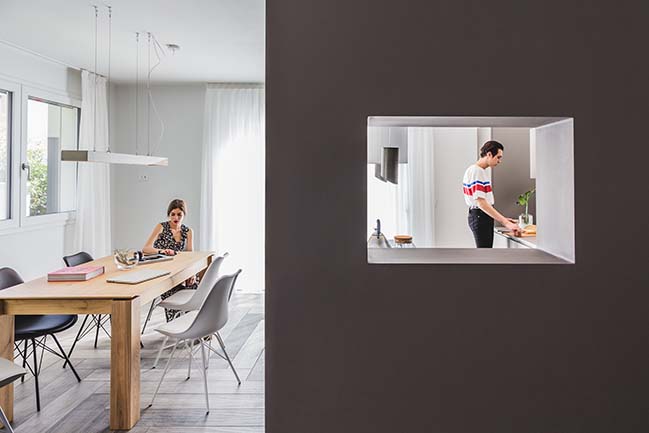
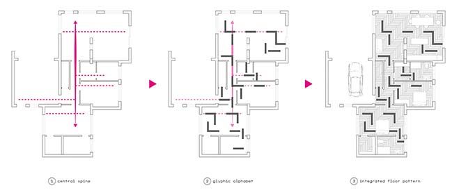
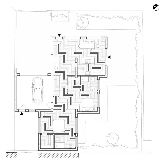
The first step in the design was to orient the spaces around a singular corridor spine, minimizing any potential maze effect and ensure efficient movement throughout the house. At the three main points of the central path, the entrances are located, giving access from the garage, the front door and the back patio. The central hallway connects the two main spaces, the bedroom and kitchen, through the entire house, with nodes along the way for the guest room, bathroom and living room.
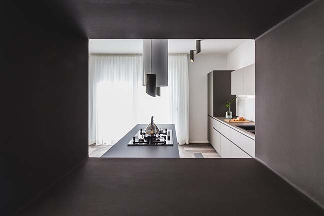
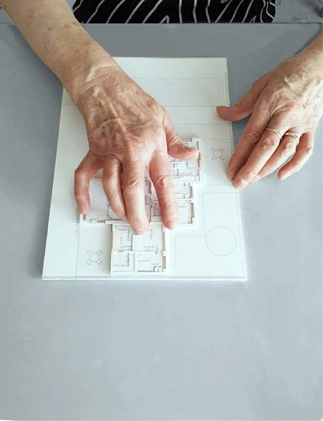
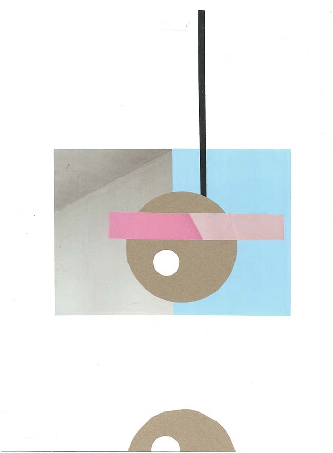
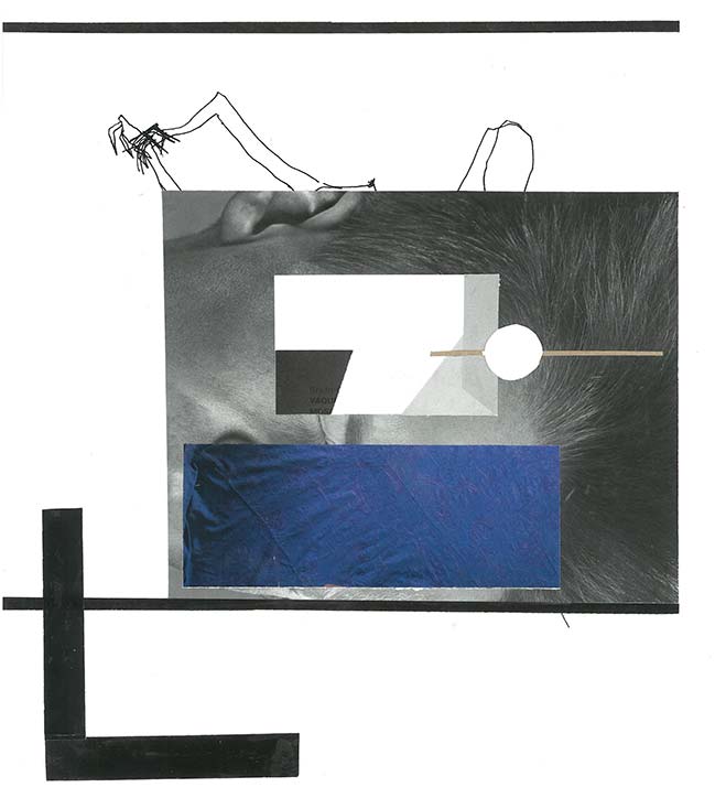
Within this house, they worked directly with the client to map out her daily habits and typical path. This ensured an intuitive organization of the home and helped to ease the transition of daily activities between her two houses; old and new. Each daily use or activity became a node in So & So Studio’s house map. They then needed to incorporate within the design a language to communicate their design decisions to the client for physical use. This process began first in the way they explained their ideas to the client. The designers continued to use the digital world to work and design, but utilized the physical world in model form as the tool for communicating any changes to the layout.
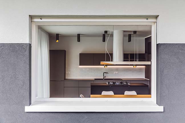
By eliminating door thresholds and unnecessary material change, So & So Studio created a spatial continuity throughout the house to strengthen the clarity of program nodes within the map and ease the client’s learning curve, moving into her new home. The end result expressed in each node for the client: a glyphic alphabet of simple rules in the floor of the house. In using a textured stone tile within the floor pattern, program nodes are accentuated and a system of way-finding has been activated.
> You may also like: Black Mirror in Milan by GOSPLAN Architects
> You may also like: Tiny House 11sqm in Paris by Batiik Studio
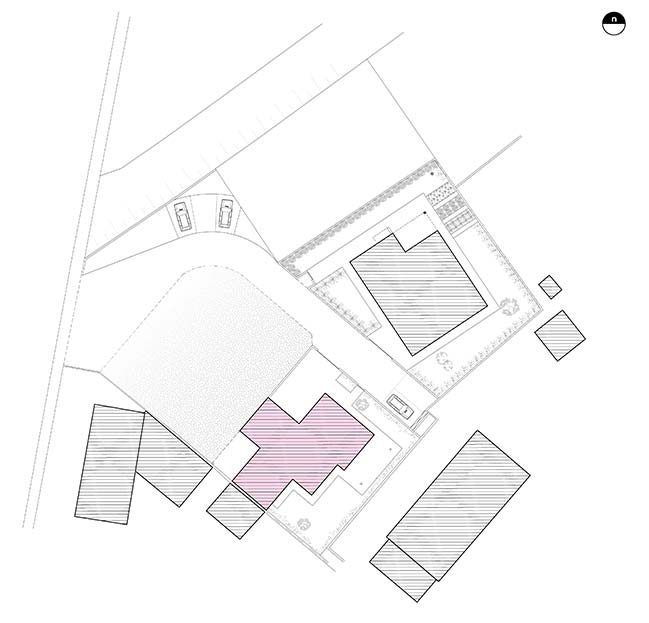
So & So Studio completed a home for a blind client in Thiene
08 / 23 / 2018 Designing a smart space, both elegant and intuitive was the intent in So & So Studio recently completed home for a blind woman in Thiene, Italy
You might also like:
Recommended post: Seahaven Residence by Idle Architecture Studio


![Modern apartment design by PLASTE[R]LINA](http://88designbox.com/upload/_thumbs/Images/2015/11/19/modern-apartment-furniture-08.jpg)


