04 / 17
2023
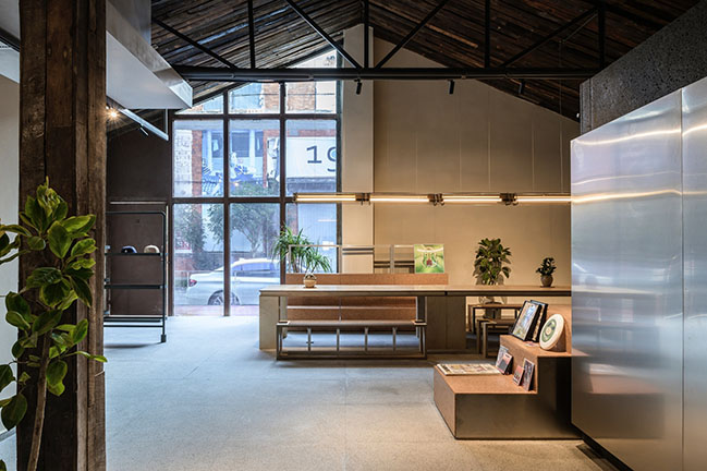
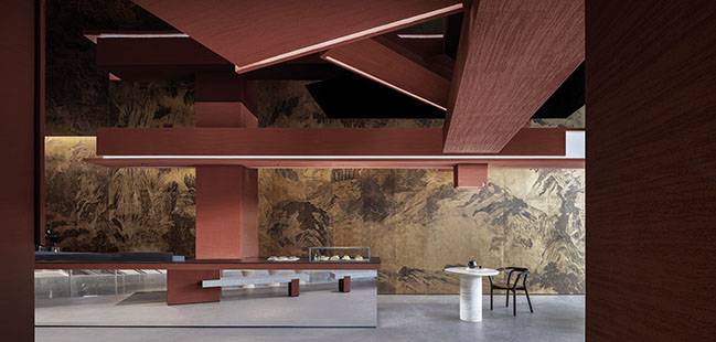
EK Design creatively reinterpreted the space by renovating the spatial layout and combining new ideas with old structures. By making use of the terroir of tea, the design team also transformed traditional spatial experiences and created a dynamic conflict that appeals to younger generations and engages them in tea culture...
> Heytea Zao Flagship Store (Nantou) by CCD
> PEAK TEA by ONEXN Architects
A sketch of tea culture through contrasts
In China, tea is more than a beverage.
It is a cultural heritage.
Tea has been out of fashion among young people for quite some time. For businesses in the tea sector, how to breathe new life into tea and attract people's interest to understand and consume it has become a priority. How to win over young people? In other words, how to attract them?
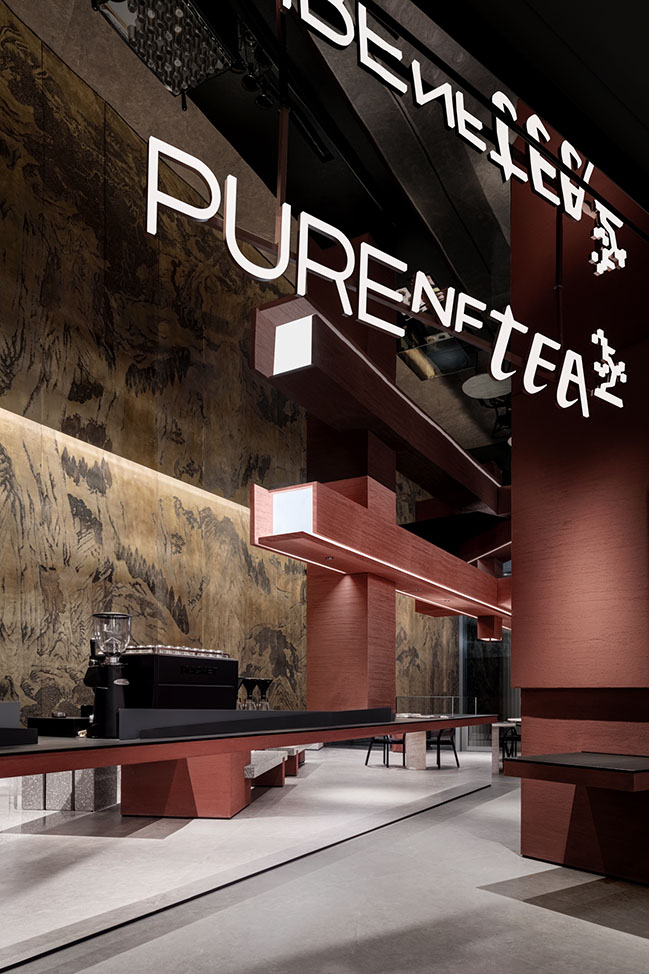
"Create conflicts and contrasts to induce interest"
PURE NFTEA is a tea brand situated in C Future City, Futian District, Shenzhen. Owned by a young entrepreneur whose family has been in the tea business for decades, with their own tea plantation and factory, the brand's name "PURE" is a transliteration of "Pu'er". As a young individual, the client hopes to interpret tea culture in a fresh way, challenge young people's perceptions of Chinese tea, introduce tea to the younger generation, and establish a trendy tea beverage brand that appeals to them.
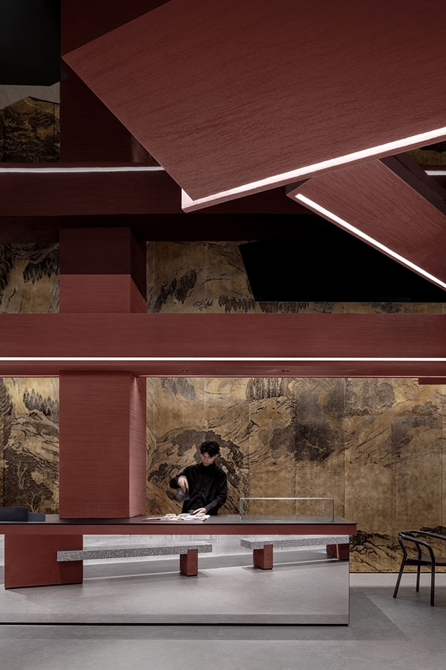
Every scenario is a dramatic narrative.
"We aim to let tea culture speak to young people rather than asking them to learn about it." To that end, EK Design creatively reinterpreted the space by renovating the spatial layout and combining new ideas with old structures. By making use of the terroir of tea, the design team also transformed traditional spatial experiences and created a dynamic conflict that appeals to younger generations and engages them in tea culture."
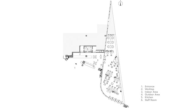
The space is comprised of both indoor and outdoor areas, both of which have a triangular horizontal plane. In terms of spatial relations, the tea store and the shopping mall where it sits mutually attract traffic. Therefore, the designers faced more challenges in creating an independent style, but also had more freedom to put inspiration into practice, which means "more openness, freedom, and creativity".
NO.1
Go with the flow
Make use of the existing conditions rather than hiding them.
"How should we present the space? What perspective should we take? What more can the design generate?" Bearing those questions in mind, EK Design chose to work with the existing conditions and approached the design in a natural manner.
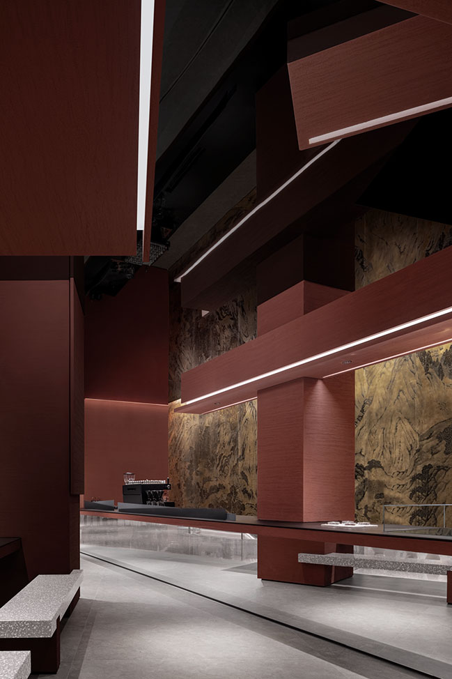
To tackle the challenge of the acute triangle horizontal plane, which is considered a "negative space" in architecture, the design team maximized the use of the space while minimizing the sense of narrowness.
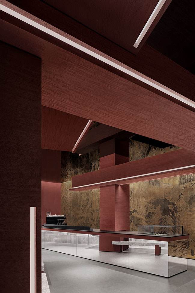
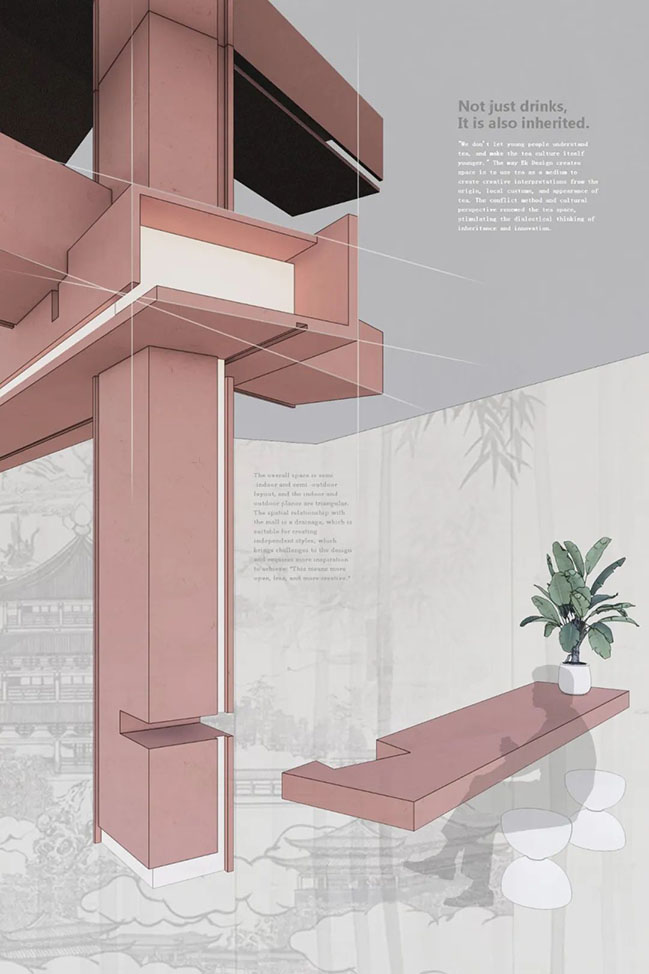
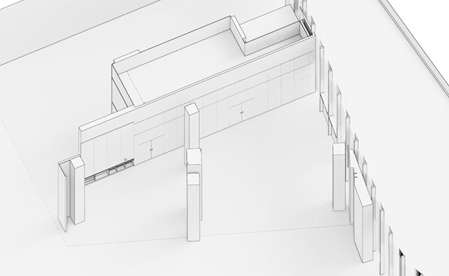
First, the designers utilized the existing conditions by adding beams, which are parallel to the triangle, to the existing columns and creating new decorative columns at the joints. The next step was creating passages out of the angles, thus making use of the corners.
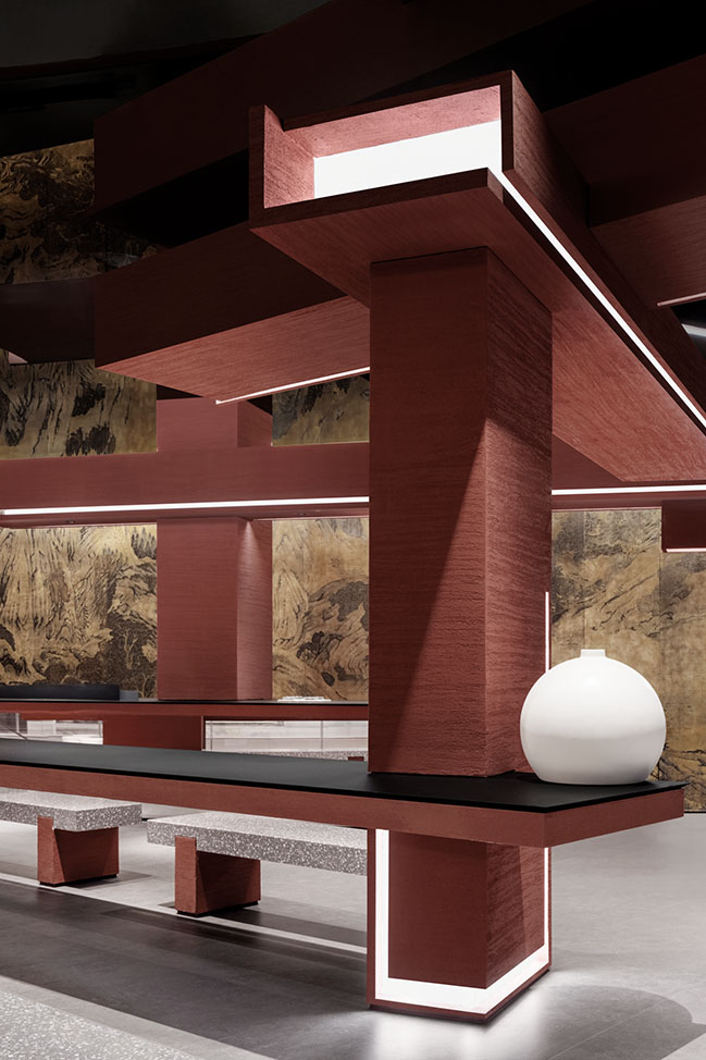
In this way, an asymmetrical yet balanced frame was constructed on the horizontal plane, defining a new space in a deconstructive manner.
One side of the triangle becomes a display and operation platform to keep the kitchen out of sight. One side becomes the storefront and bar counter to connect with the public area of the shopping mall, and the other side is left open to connect with the outdoor space and embrace nature.

NO.2
Deconstruction
Chinese Lego blocks — mortise-and-tenon structures, a flexible joint in architecture
"The Sun (tenon) and Mao (mortise) represent the Yang and Yin elements in Chinese philosophy. The changes in mortise-and-tenon structures reflect the evolution of Chinese architecture." The design team used mortise-and-tenon structures as joints between beams and columns to create a flexible frame on the vertical dimension.
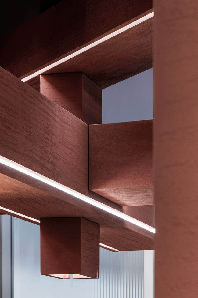
Rather than adopting the traditional array arrangement of mortise-and-tenon structures, the design team opted for an irregular structure in a deconstructive way. This resulted in an asymmetrical balance between the floor and elevation, infusing the space with a sense of modernity.
Beneath the weathered and rough texture of the columns lies the source of lighting, symbolizing the future and technology, and creating a stark contrast between the past and the future.
NO.3
Painting
The beauty of calligraphy and painting lies in the spiritual connection, which cannot be achieved by merely the superficial form.
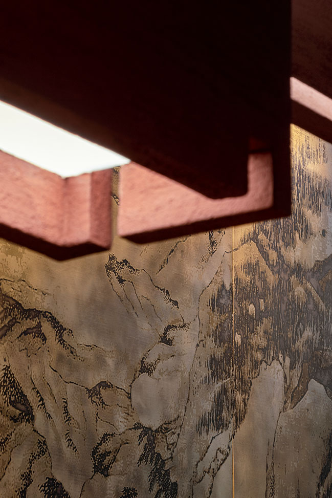
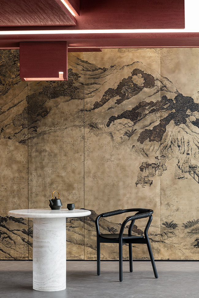
The tea mountain, enveloped in mist and drizzle, stands tall with its undulating outline. Looking closely at the painting amidst the tea fog, customers will see the beauty of traditional China in spring, with refreshing scenery and abundant vitality.

The painting is inspired by the "Along the River During the Qingming Festival" scroll, and features a contrasting blend of realistic and romantic elements. It incorporates three ancient paintings, namely, "Shanglin Park", "Huishan Tea Party" and "Tea Extraction", and has been edited to combine both modern ideology and traditional copper plate printing techniques.
This painting represents the romantic ideals of ancient Chinese culture through its composition and spatial arrangement, creating a sense of affinity and harmony within the space.

NO.4
Red soil
The terroir code hidden in Yiwu Tea Mountain
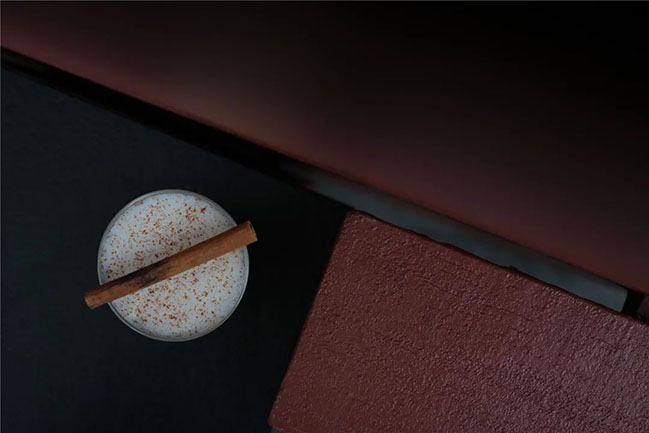
The red soil of Yiwu has a saturated color that resembles Pu'er tea. It is the perfect soil for nourishing Pu'er trees. In the project, the design team extracted the natural colors of both the soil and tea to showcase the unique terroir of Pu'er and the rich history of Chinese tea.
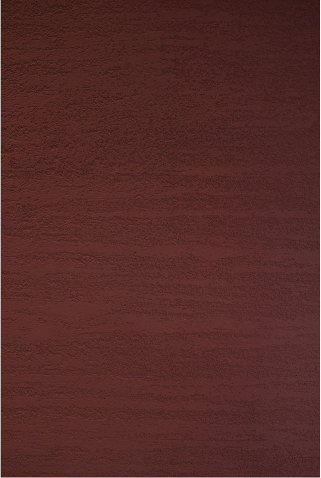
Weathered red soil has a mottled texture that gives off an ancient vibe. The red finishes replicate the weathered fracture surface of the soil visually and tactilely. The black volcanic stone slabs create an interesting contrast with the "red soil", depicting the ancient natural evolution process.
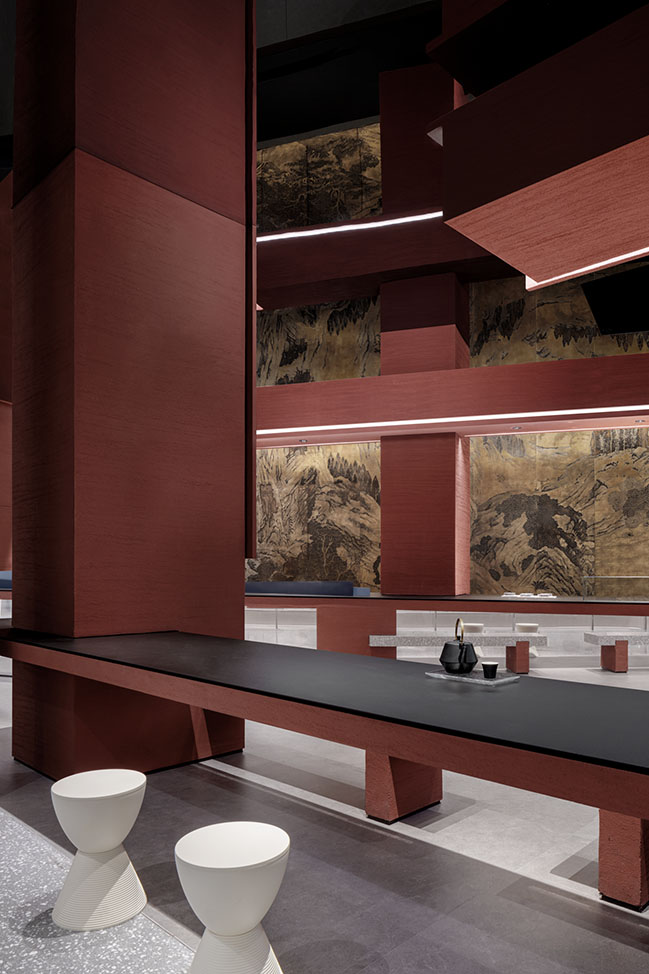
NO.5
Fusion
A city embraces its sunsets as well as its sunrises
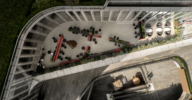
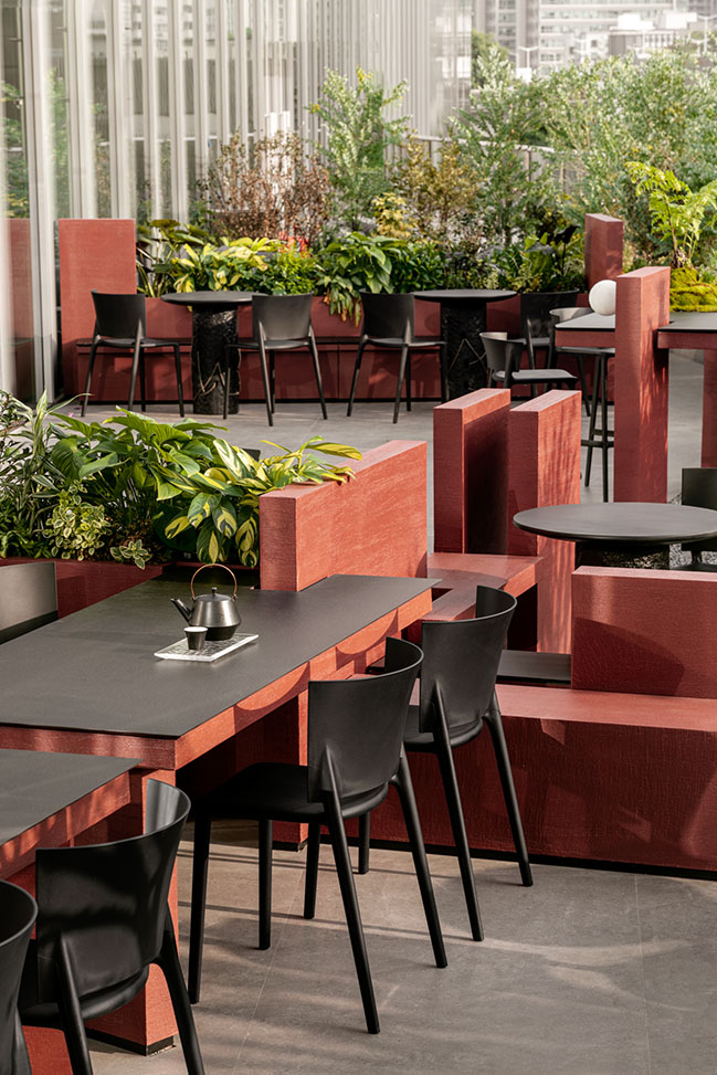
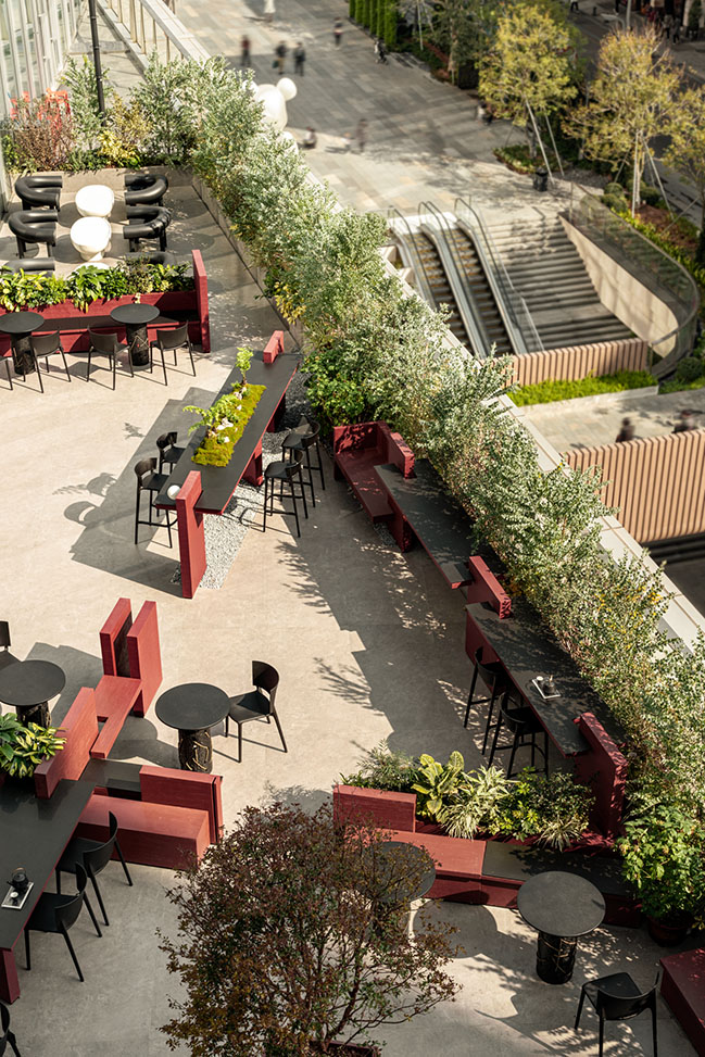
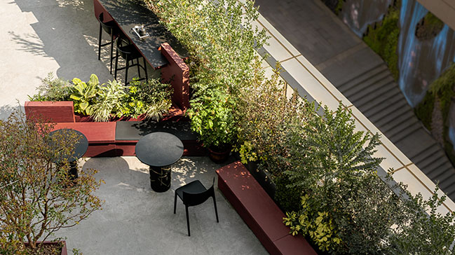
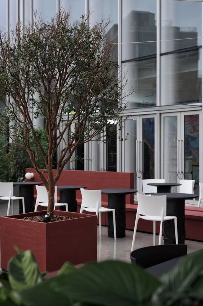
The triangular outdoor space, enclosed by mortise-and-tenon modules, is connected to the indoor area. The low, flexible structures provide both seating and partitioning.
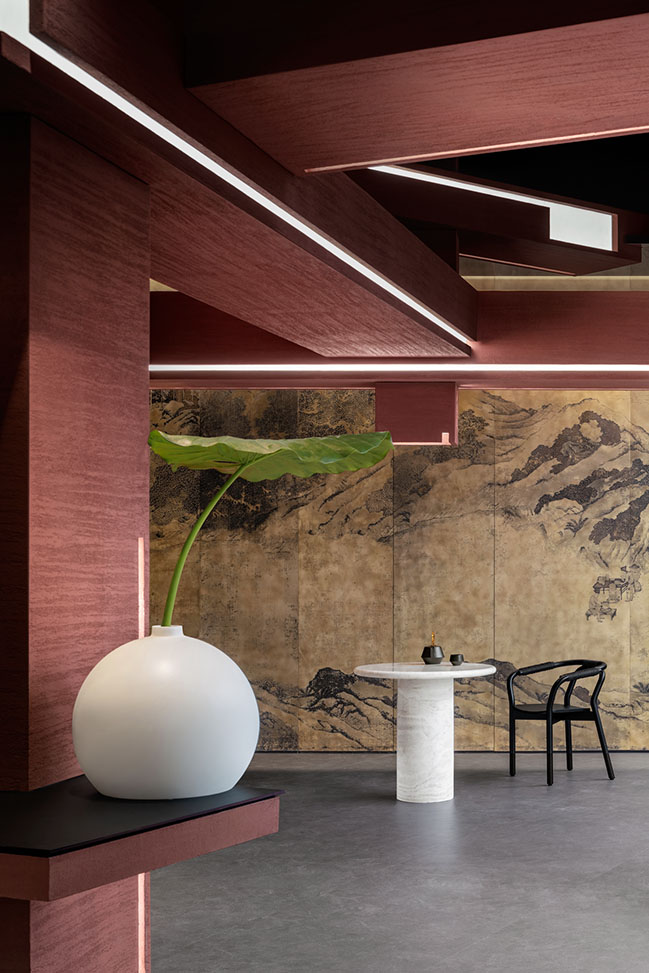
As the tea store incorporates innovative tea beverages and socializing functions, it's designed with a variety of seating options. The bar seating seamlessly blends with the existing beams and columns, almost as if it's an extension of the environment. The asymmetrical booth structures are arranged in a harmonious manner, and tables are strategically placed in the corners to fully utilize the space.
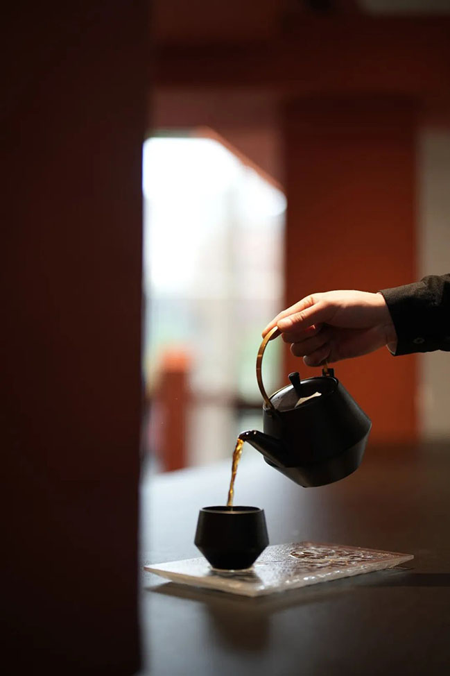
PURE NFTEA provides a welcoming and relaxed environment for all guests, whether they're young people socializing with friends or seniors enjoying some quiet time alone. With spring just around the corner, a visit to PURE NFTEA to experience the joy of tea brewing in the beautiful, sunny weather is highly recommended.
Design Firms: EK Design
Location: Shenzhen, China
Year: 2023
Area: 200 sqm
Design Team: YuQiang & Partners
Soft Fitting Design: PP Design Gallery
Photographs: Jack Qin, Hongyan Zhang

PURE NFTEA by EK Design & PP Design Gallery
04 / 17 / 2023 EK Design creatively reinterpreted the space by renovating the spatial layout and combining new ideas with old structures. By making use of the terroir of tea, the design team also transformed traditional spatial experiences and created a dynamic conflict...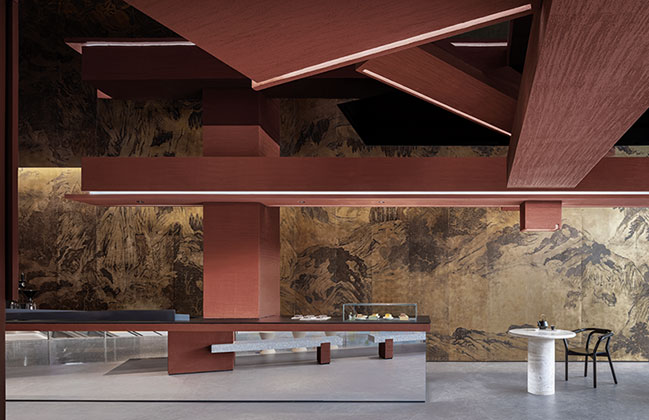
You might also like:
Recommended post: Colourful apartment by Egue y Seta

