09 / 14
2019
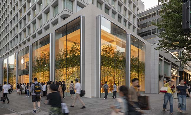
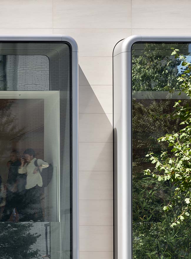
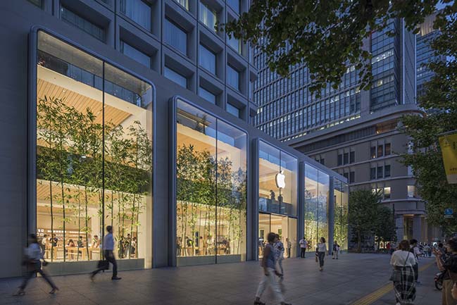
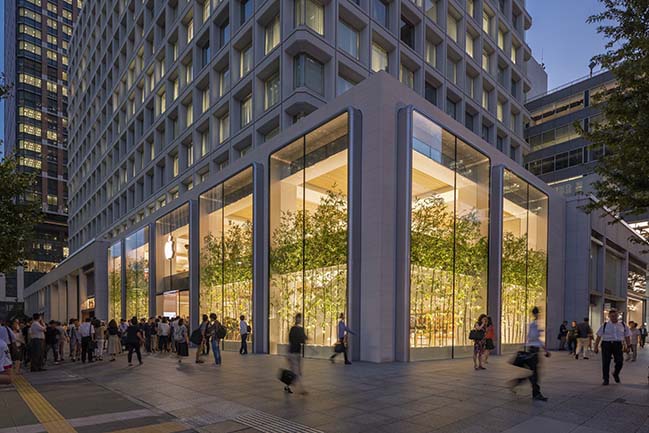
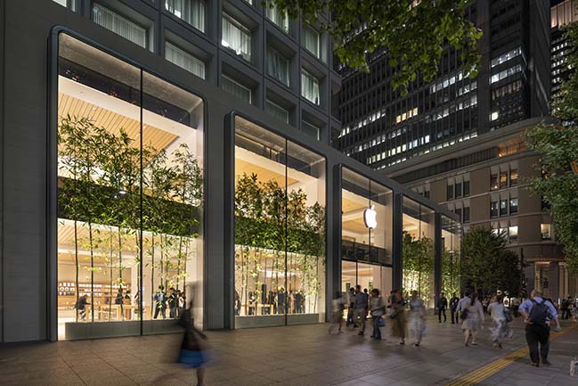
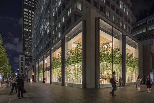
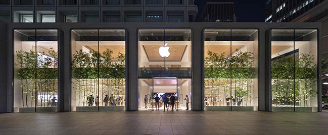
Apple Marunouchi, located in the 1973 Mitsubishi Building adjacent to the busy Tokyo Station, opened to the public on Saturday, 7 September. Inspired by the expressed structural grid of the building, its refined aesthetic embodies an honesty of materiality, with the beautifully cast aluminium vitrines blending the inside and outside.
All photos © Nigel Young
The design is the result of a close collaboration between Apple’s teams led by Sir Jonathan Ive, chief design officer and the integrated engineering and design teams at Foster + Partners.
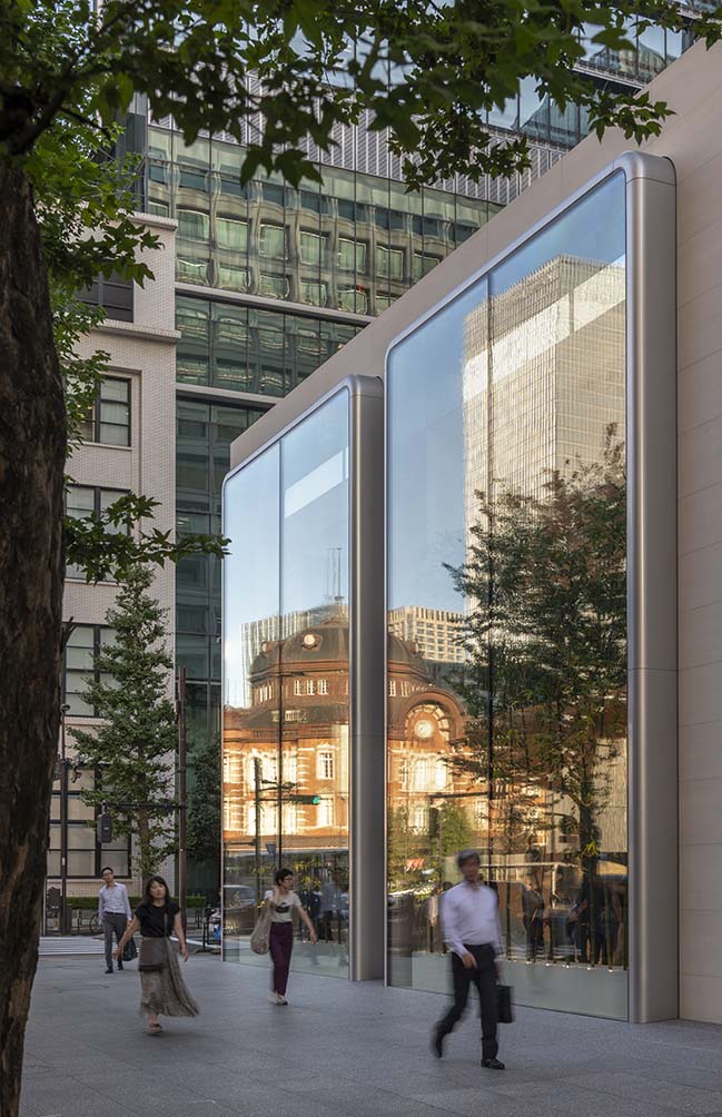
Sir Jonathan Ive said: “I love the simplicity of the space. There is an honesty in terms of how the structure of the building, the green bamboo, and the transparent vitrines all come together to form a light-filled volume that is full of life.”
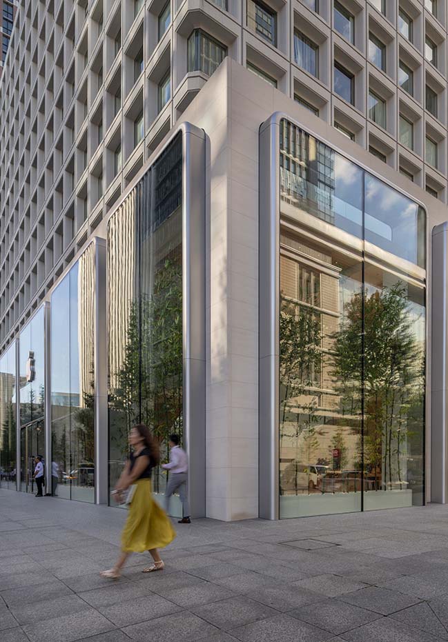
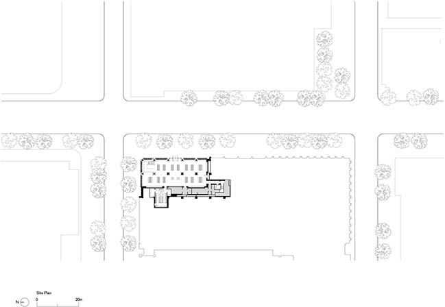
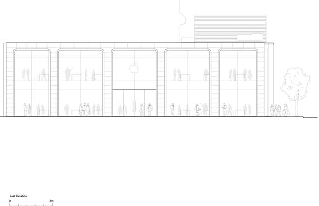
Nestled within the central district, close the one of the city’s most famous parks – the Emperor’s Palace – the store occupies an important urban site. Visitors alighting at the station have a direct view of the store from across the road, with the main entrance situated along Route 402. The expressed structure of the high-rise building offered the opportunity to create a unique facade, which is defined by innovative two-storey ‘vitrines’ providing a distinctive showcase for Apple.
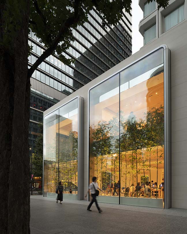
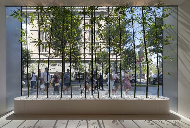
The glass vitrines have been designed to enhance the existing row of perimeter columns that envelop the store. They are made from aluminium that has been specially cast to obtain the 3-dimensional rounded corners. Local bamboo has been specifically planted in the vitrines to add life and greenery to the spaces within the store as they rise up to conceal the soffit of the upper level. A mirrored panels along the spandrel on the upper levels further add to the generosity of space, reflecting the bamboo and the vibrant street life of the surrounding area.
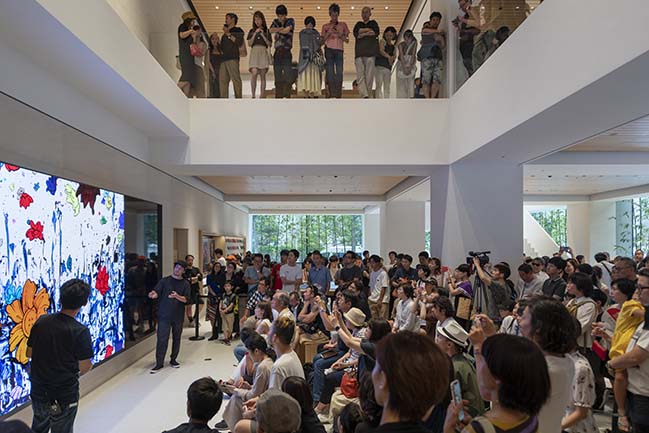
Stefan Behling, Head of Studio, Foster + Partners said: “We wanted to create a restrained presence amid the bustle of Tokyo. The beautifully crafted aluminium vitrines define the boundary of the store and Apple’s presence, offering everyone walking by a glimpse into the store. The structural grid gives the entire volume a certain rhythm, while the calm interior is enhanced by the bamboo that lines the perimeter.”
The existing tower structure is rendered with white plaster, a traditional technique used in Japan, to blend in with the rest of the interior spaces. The entrance is fronted by a large video wall at the far end that marks the Forum, which is situated within a double-height space that offers visual connectivity between the two levels of the store.
Access to the upper level is via a sculptural staircase located to the right of the entrance, which was assembled on site. Clad with white-painted aluminium and featuring terrazzo treads, the staircase blends in with the light-filled interior. The ceilings are clad with white ash timber that adds a sense of warmth to the space.
YOU MAY ALSO LIKE: Foster + Partners and Apple Aventura create a new social focus for Miami
YOU MAY ALSO LIKE: Apple Xinyi A13 - An inviting pavilion in the heart of Taipei by Foster + Partners
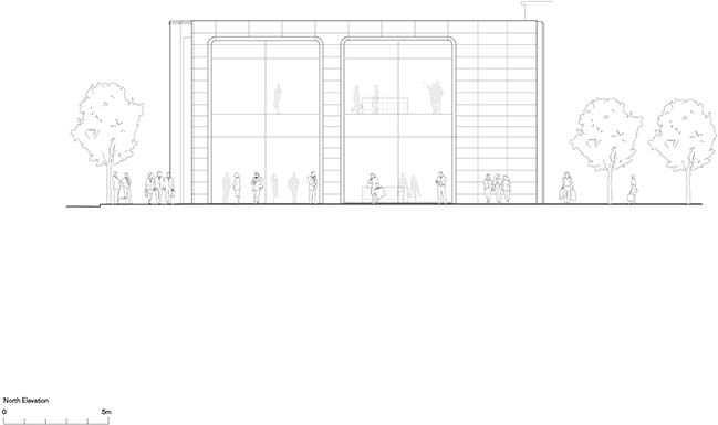
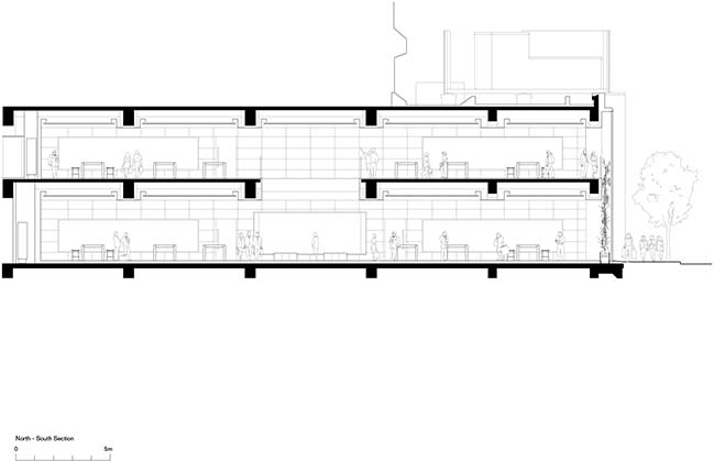
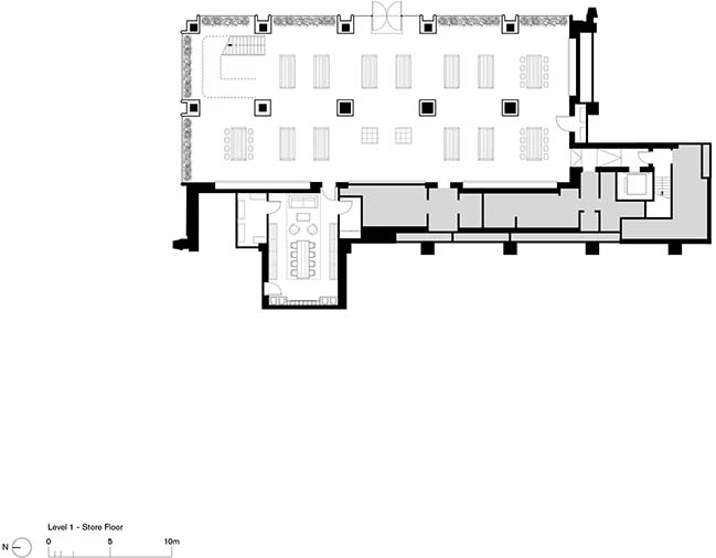
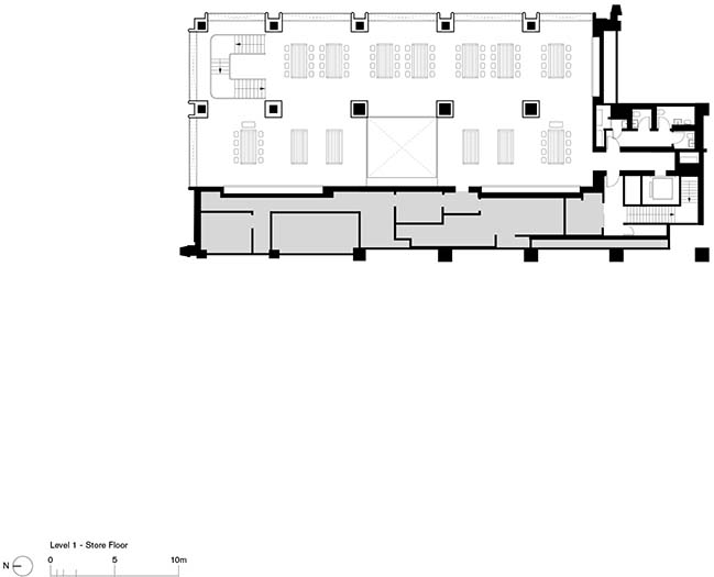
Apple Marunouchi creates a restrained presence in the heart of Tokyo
09 / 14 / 2019 The design is the result of a close collaboration between Apple's teams led by Sir Jonathan Ive, chief design officer and the integrated engineering and design teams at Foster + Partners
You might also like:
Recommended post: Beylikduzu Valley and Bridge
