06 / 13
2019
In the movie Charlie and the Chocolate Factory directed by Tim Burton, we witnessed a journey of imagination full of tasty stimulations. Cheese, with its tiny holes and color of yellow, is comparable to the rich and mellow flavor of chocolate. By choosing this delicacy as the main concept to design "The Dessert KITCHEN", Towodesign produced chemical reactions among food, visual impression and emotion, and created a unique space that provides fantasy experiences.
Design: Towodesign
Location: B1, REN HE TOWN MALL, Chengdu, China
Year: 2018
Area: 69 sqm
Chief designer: He Mu
Design team: Ren Wei, Sun Meng, Zheng Liyuan
Photography: Towodesign
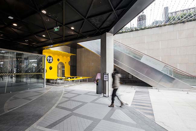
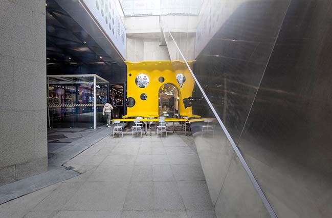
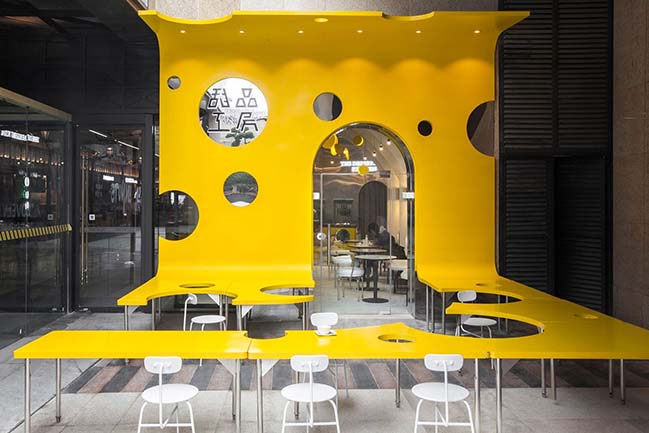
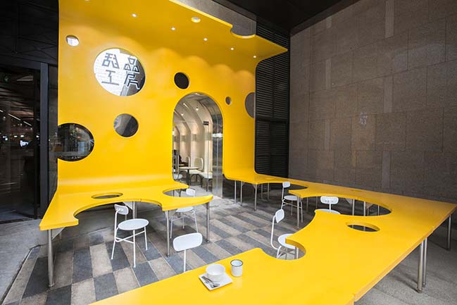
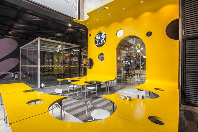
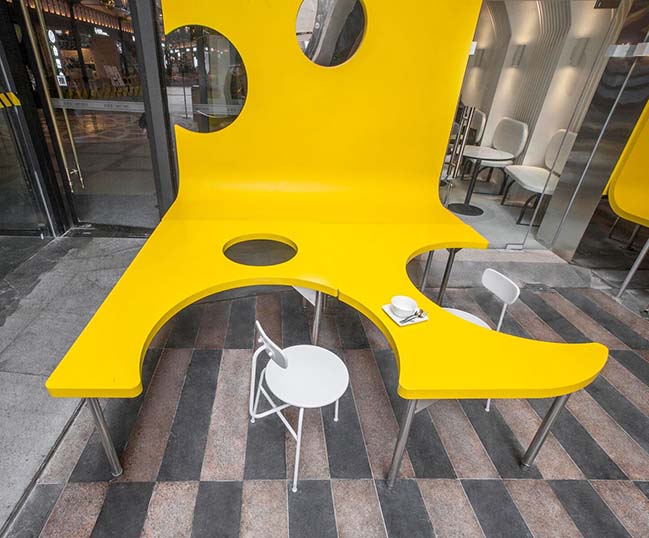
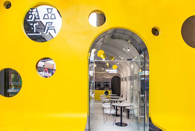
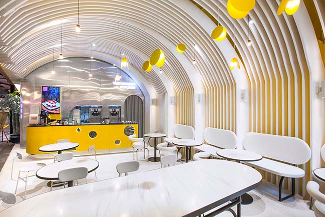
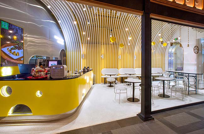
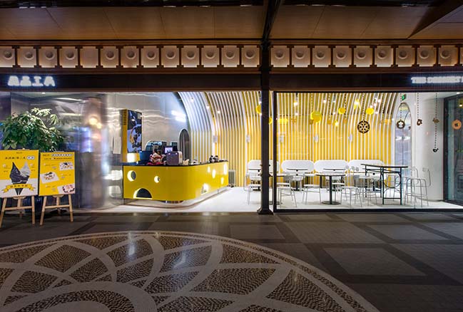
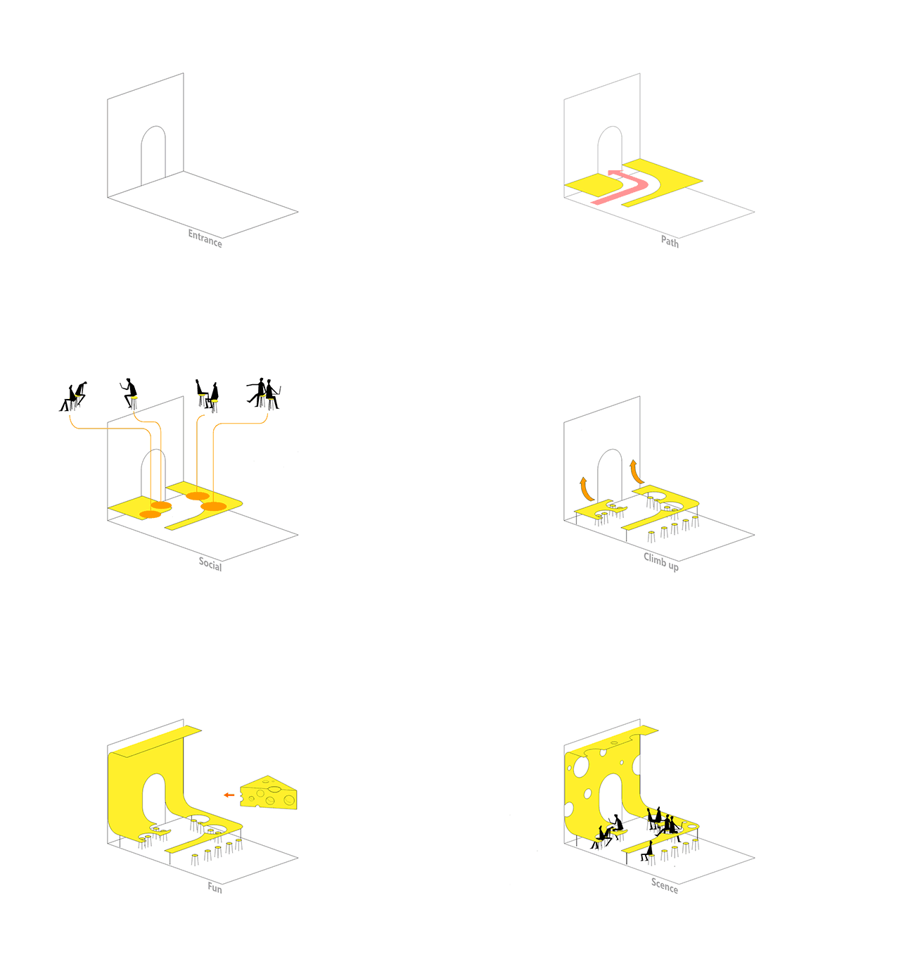
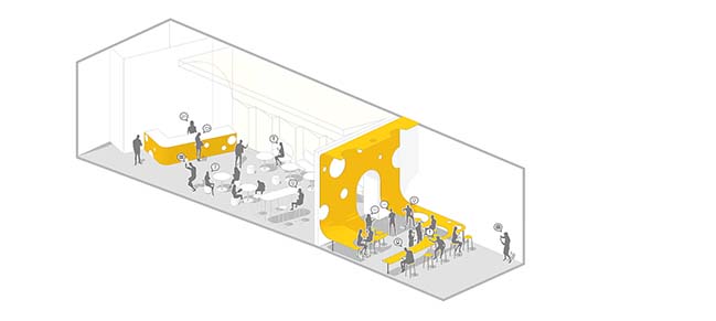
Project's description: The dessert shop is located in the sunken square of a mall, close to its main entrance. From a commercial perspective, it's necessary to give the store a striking visual impression to attract customers. A large yellow table extends from the outside eating area to the interior, and even up to the shopfront where the logo is set.
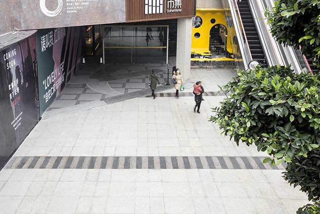
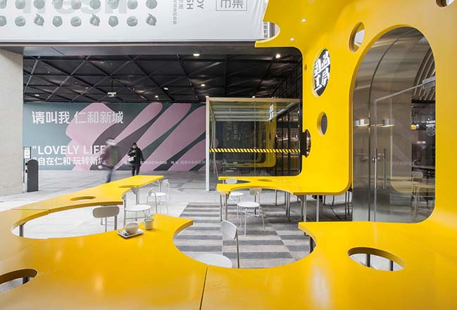
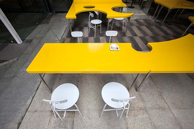
The surface of the table is characterized by holes, similar to those of cheese. Customers are flowing elements in this area, making the holes variable, sometimes full, sometimes empty. It’s as if SpongeBob was turned into a huge cheese. The outside eating area, like a sculpture, has a strong sense of existence, becoming a visual highlight on the underground square of the mall. The openings of the table were designed based on functionality, which also encourage people sitting next to each other to interact and chat.
Satisfaction not only for the Stomach, but also for Life
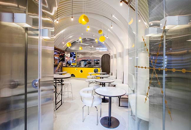
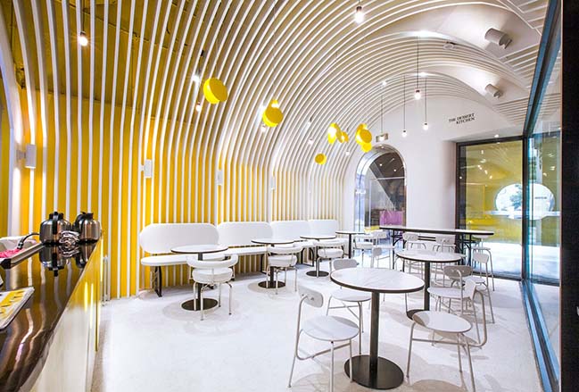
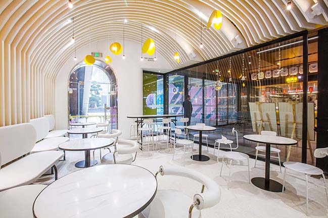
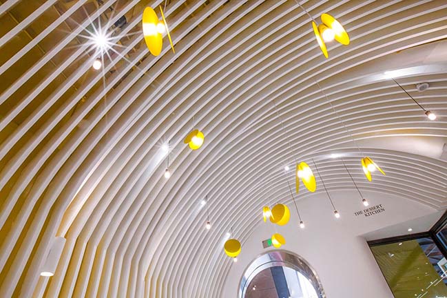
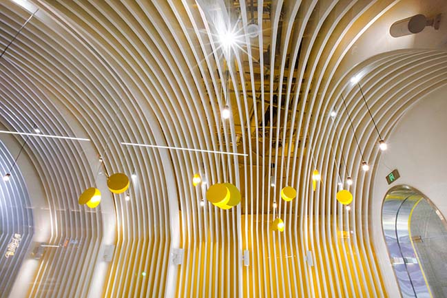
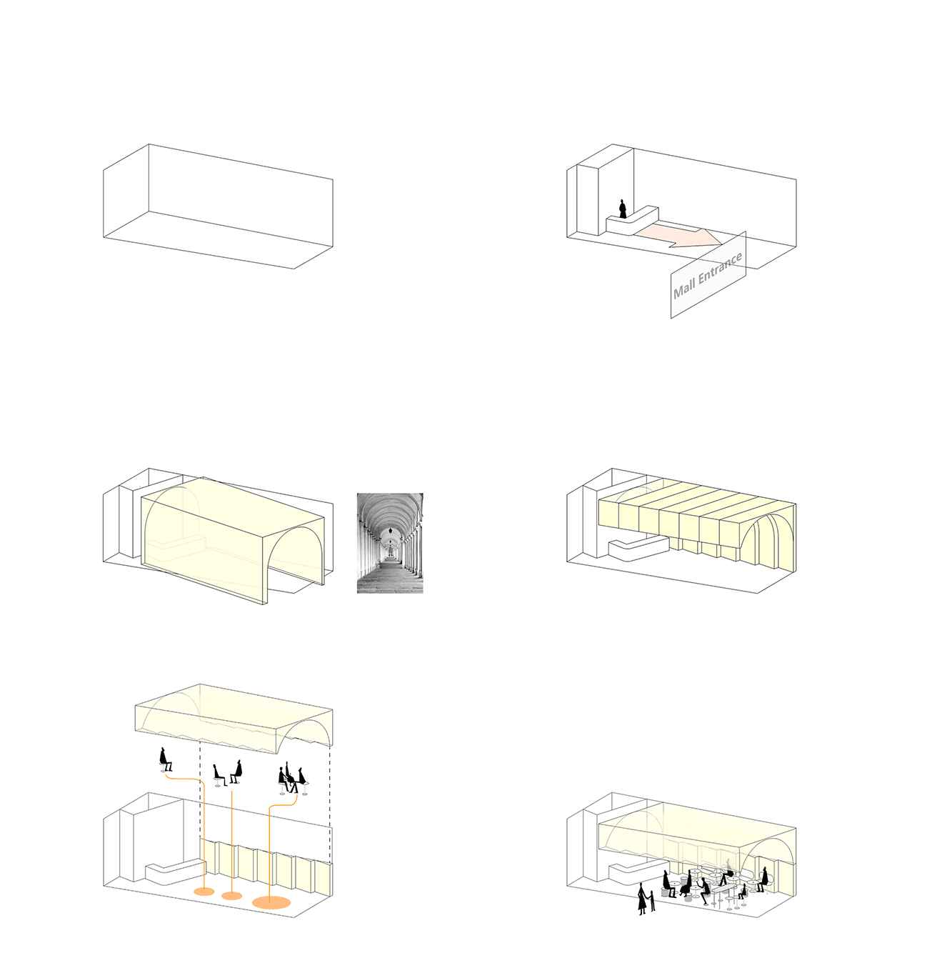
Starting from the fact that people gain life energy from food, Towodesign intended to create a dessert heaven with a church-like interior structure, full of a sense of "ritualism". Elements of towering domes of churches were applied to the ceiling, which consists of several vaults in line with the trapezoidal plane of the site. Considering the concealment of the air conditioning vent and creation of a visual hierarchy, the ceiling presents a grid-like appearance, which also strengths the rhythm of curves.
The white grid well matches with the yellow backdrop wall, showing a proper balance between order and affinity. Teatime is like a ritual in life, which can be enjoyed in this imaginative church-like space of peace and sweetness. The bar counter also features the elements of cheese, echoing the structural eating area outside. The interior furniture presents round or curved shapes, adding flexibility to the space and enabling the customers to enjoy the feast of visual and gustatory entertainment.
YOU MAY ALSO LIKE: 10° home in Shanghai by TOWOdesign

YOU MAY ALSO LIKE: Dr. Bravura Bird's Nest Drink & Dessert Store by Towodesign
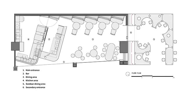
Dessert Kitchen by Towodesign
06 / 13 / 2019 Towodesign produced chemical reactions among food, visual impression and emotion, and created a unique space that provides fantasy experiences
You might also like:
Recommended post: Naci Topcuoglu Science Center by Studio Vertebra
