05 / 16
2019
The “Metropolis” style has rich line decorations, which are recognized by most people for its momentum and lush top crown. In the DoThink · Hangzhou 2022 Sales Center, the designer broke the traditional “Metropolis” concept, injecting new elements into the “Metropolis” style, showing urban fashion and avant-garde style with a simple and bright space atmosphere.

Interior Design: DA Group
Location: Hangzhou, Zhejiang Province, China
Year: 2018
Area: 870 sq.m.
Interior furnishing design: DA GROUP
Art/design instruction: Luo Yufeng
Furnishing instruction: He Wen
Photography: THREEIMAGES
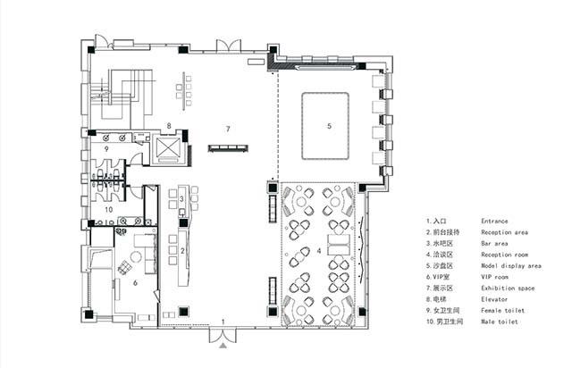
From the architect: In the interior design, the designer made full use of the space of the existing building to redesign, in order to create an indoor space with reasonable layout, smooth movement, comfortable and elegant feelings, and conducive to business management. For example, the designer made full use of the advantages and disadvantages of the main structure of the interior building, through the different forms of partitioning, the space was divided into one virtual space after another, so that the space of different functions can be independent of each other, and also can maintain the overall sense of consistency in the circulation of large space.
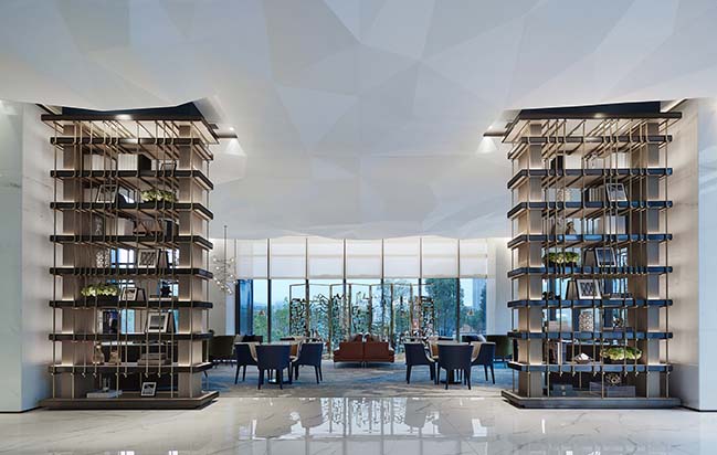
The building space of the sales office is relatively square, and the designer used the exquisite and wrought iron bookshelf and marble wall to divide the space into sections, so that the cubic indoor space forms different space scenes.
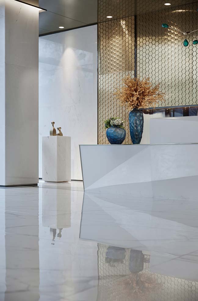
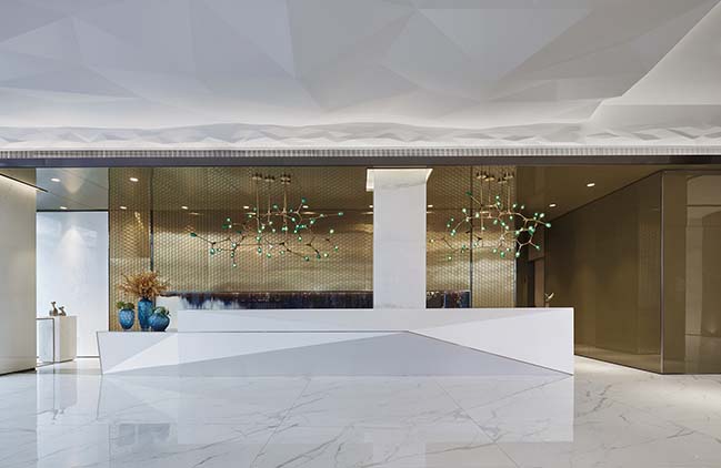
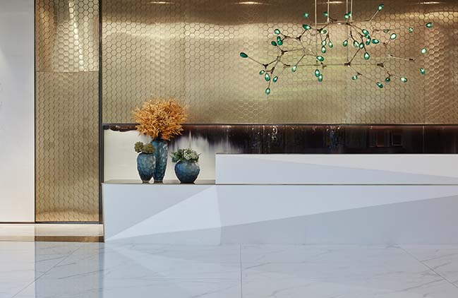
Another eye-catching place in the sales office is the background wall of the reception area, the design of the hexagonal honeycomb elements, with a light and simple reception desk, and a glass chandelier make the space simple, gorgeous and elegant design tone.
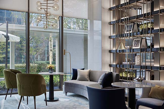
In the negotiation area, the sapphire blue is used as the main color, and the bright colors of yellow and green are added to enrich the space level. The softly-lined sofas are arranged in an orderly manner in the space, neutralizing the toughness of the linear lines of the space, but adding a bit of active enthusiasm. The designer also used exquisite metal hollow screens in the space layout, echoing the space materials and color tones, and building several functional spaces that are connected to each other.
In the construction of the sand table, the large metal lighting made up of geometric lines and block surfaces reflects the main theme of the space. It shows a feeling of being different from the coldness of modernism. The simple shape , the exquisite texture , makes it generous and smooth, simple and perfect , revealing a low-key luxury.
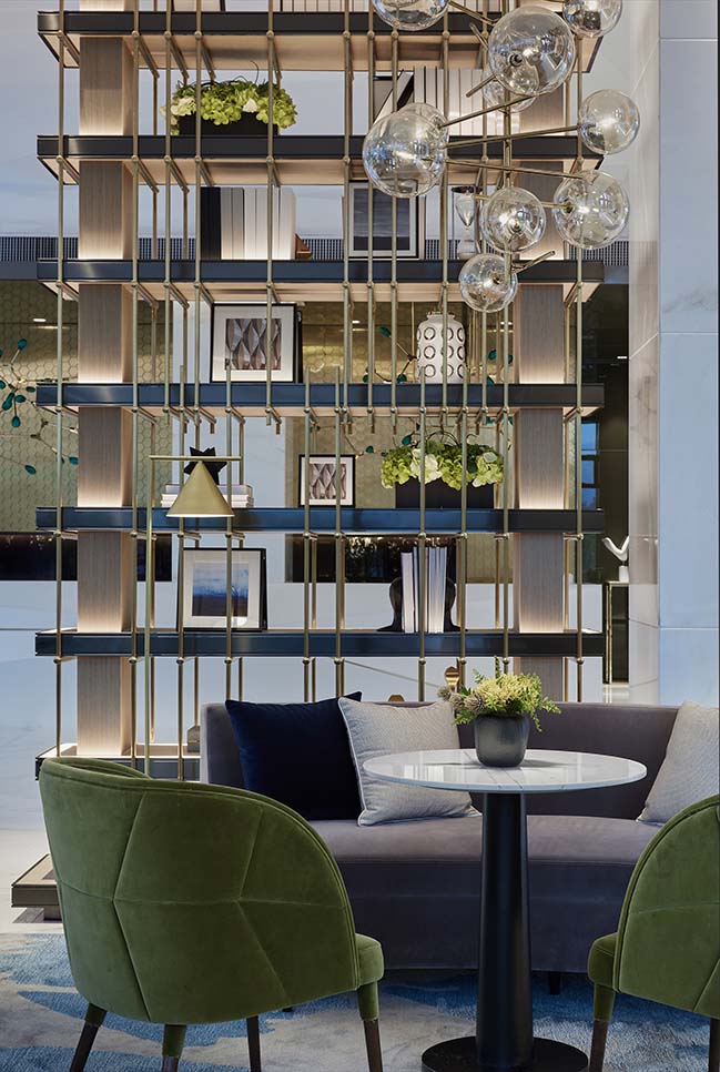
The design of the VIP room is a good description of what is the beauty of space. That is, it evolves by the essential elements that have been carefully selected, from the form to the spiritual purification, rather than just some simple surface decorations.
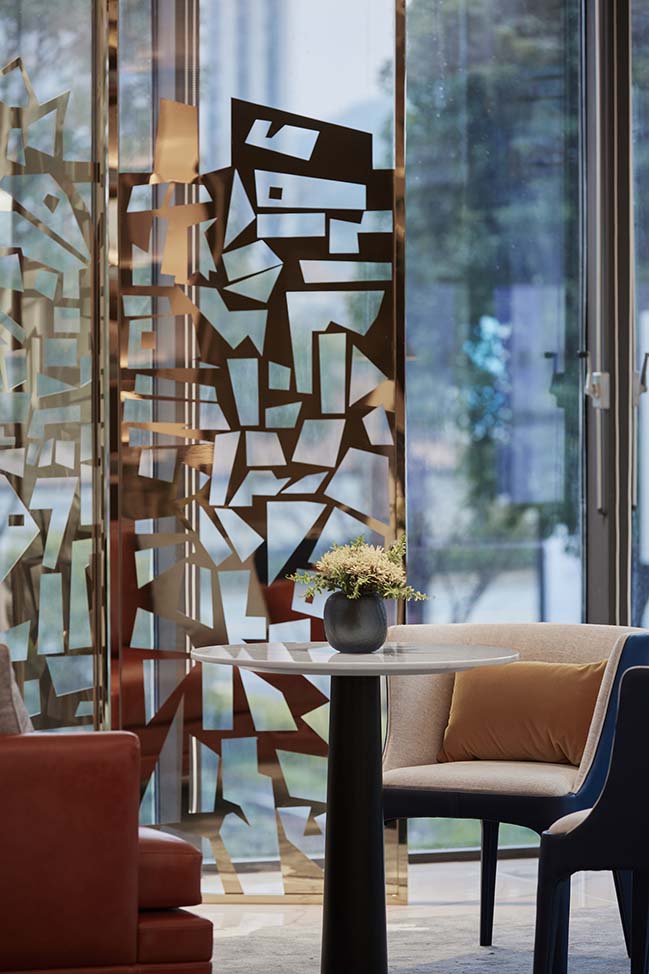
The project is located in the silver Lake Science Park. The project will focus on technology and innovation in the future. This means that more young white-collar workers become the main customers. Returning home from a busy job, they are more eager to take the noise off and let all their senses stretch freely in silence. Therefore, we take “regaining quiet from the busy,” as the starting point of the design of the whole space, and then create a stable and comfortable atmosphere through concise design words.
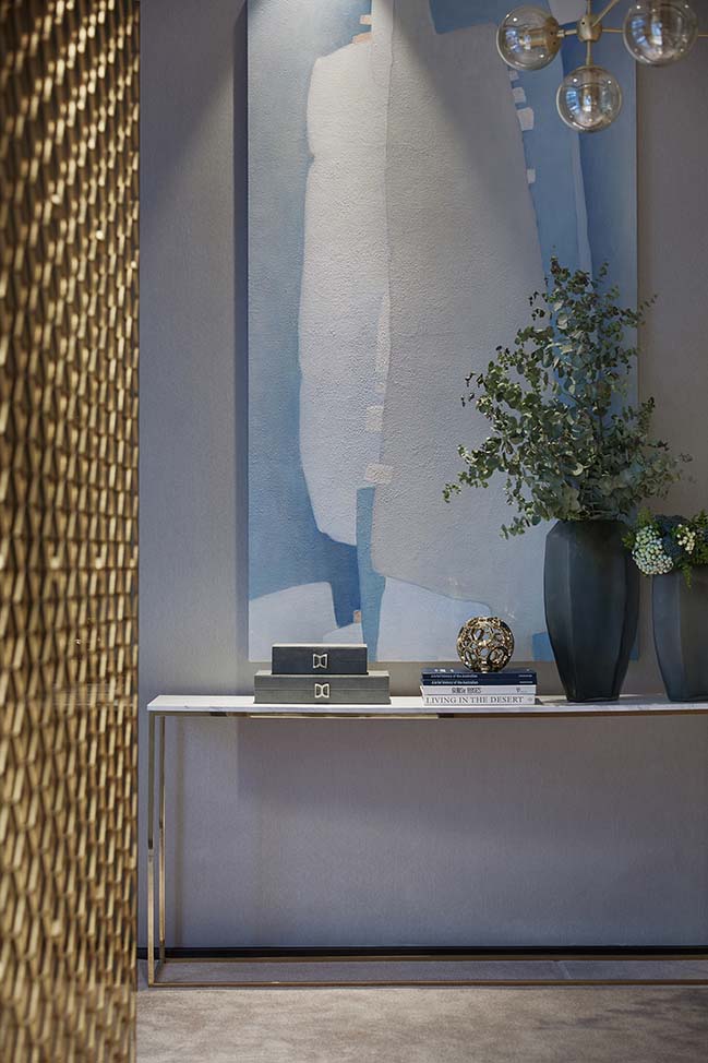
The overall space is dominated by pale and white color, with different shades of blue superimposed on it. And it changes among multiple levels in a simple space, and at the same time makes the small space more transparent. We feel an infinite call in the blue and the desire for purity and detachment.
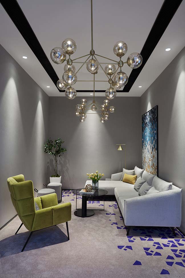
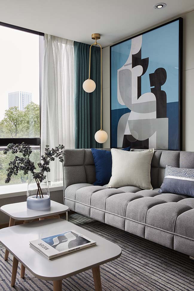
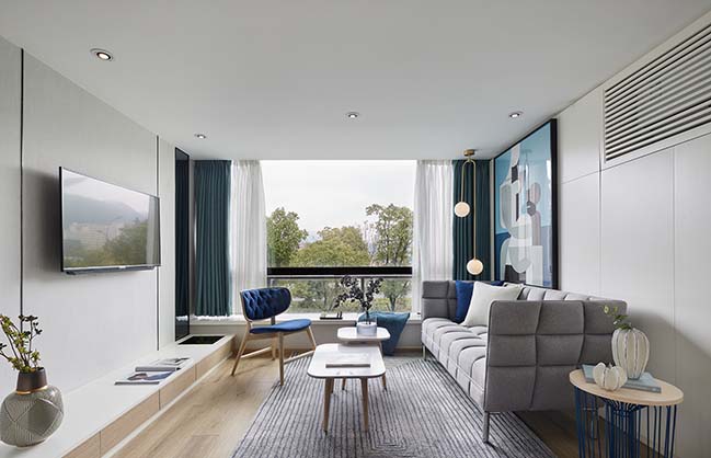
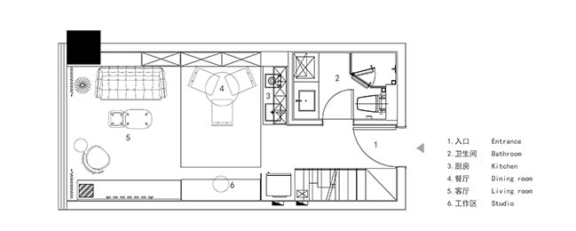
In the living room a large glass window is introduced to alleviate the feeling of depression of the small apartment. When the light is spilled into the space, you can enjoy an afternoon nap and the fun of the chess. The overall shape of the furniture is simple, but without losing the details. Line decoration, buckles and other processes reflect our pursuit of details, but also meet the residents' pursuits of design and quality. Decorative paintings form abstract human figures through color blocks, breaking the rational framework of the original lines, bringing a touch of fun and agility to the calm and harmonious space.
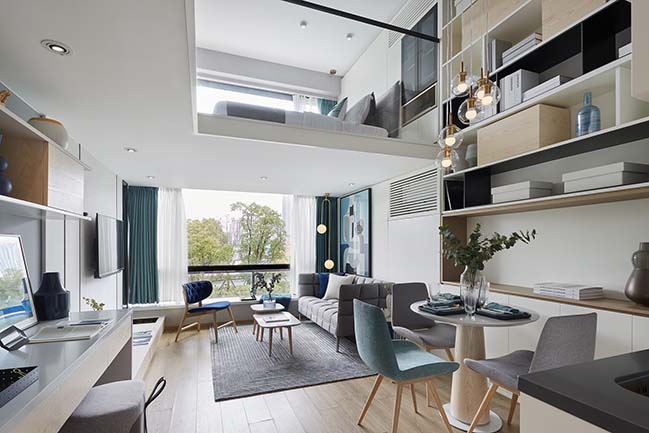
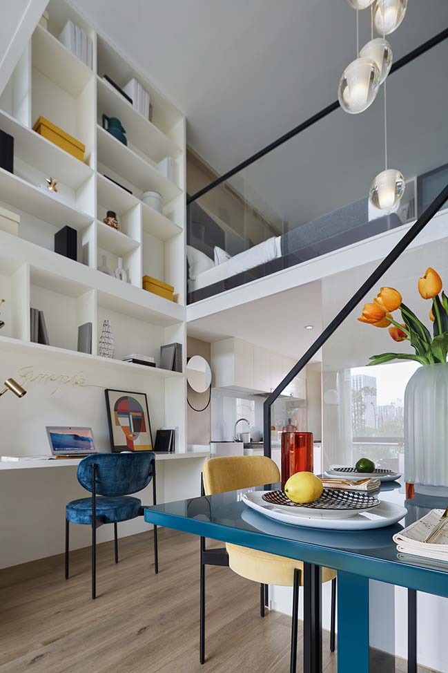
Vision rises up along the chandelier, and extends to a two-story bookcase, providing residents with a large storage space, which can also be used as a record of life or travel, or as an art collection space with full of possibility.
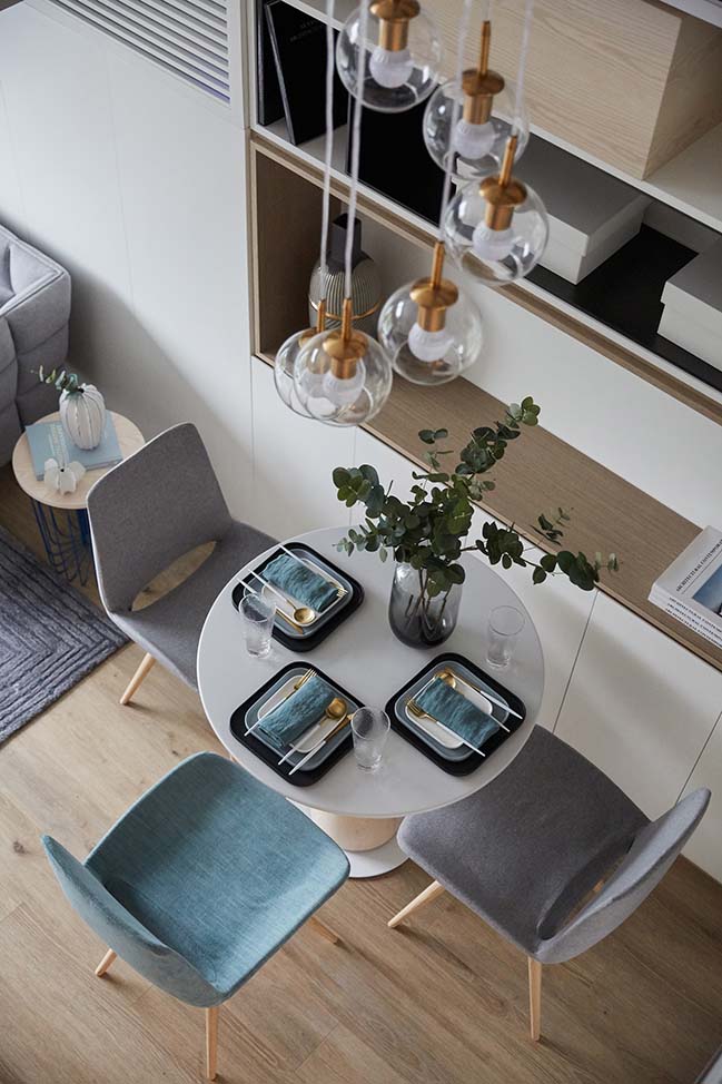
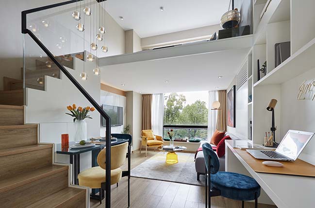
The dining room is connected to the living room, which makes full use of the space to meet the basic needs of life. The vision rises along the glass chandelier and extends to a two-story, large bookcase that provides residents with ample storage space. They can place books he reads while they are free, or souvenirs brought back from travels. The space here is a record of life or travel, being full of possibilities.
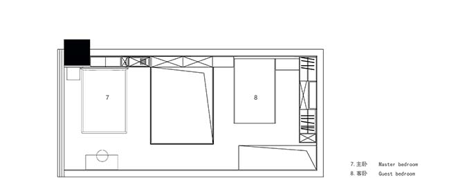
The bedroom on the second floor continues the blue tone of the first floor, giving a comfortable and relaxing feeling. A bottle of aroma can be placed to add sentiment of life. Living in such a space lets the tiredness of floating in the world be placed and comforted.
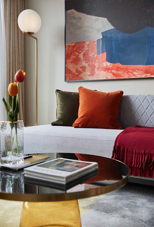
This case is designed for a young woman who is engaged in fashion editing work, and she makes friends on weekdays, and is enthusiastic and lively. We start with color; red defines enthusiasm for space, yellow reflects the liveliness of space, and blue-green collides with the former to create more colorful space colors. Transforming identity and self-assertion into a spatial form and a new life posture, thus she depicts the personality of the occupant in three dimensions.
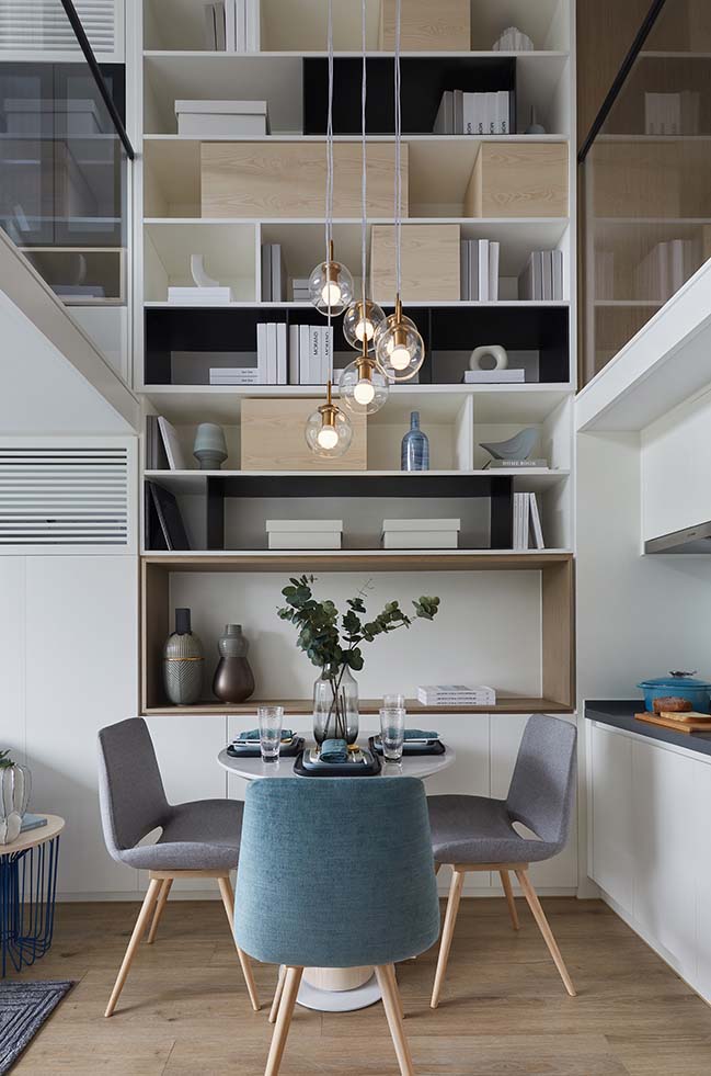
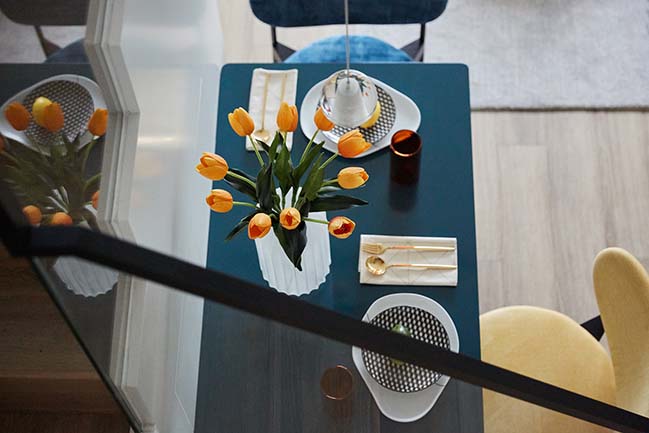
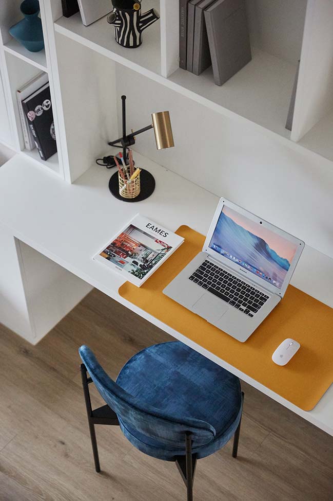
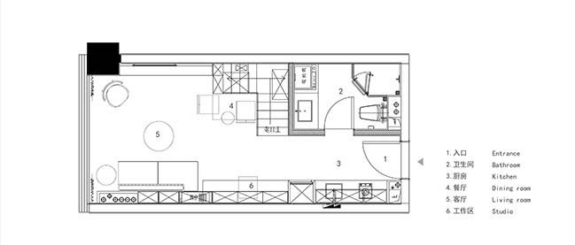
The dining room uses the color of the collision to brighten the rich space, designing the art device with lights, such as a dream crystal ball chandelier, falling from the second floor, creating a romantic atmosphere, connecting the upper and lower layers to make the space more overall. On the side of the dining room is a desk, on which there is a two-store cabinet, and the large storage space meets the hostess's hobby of collecting fashion magazines and handicrafts.
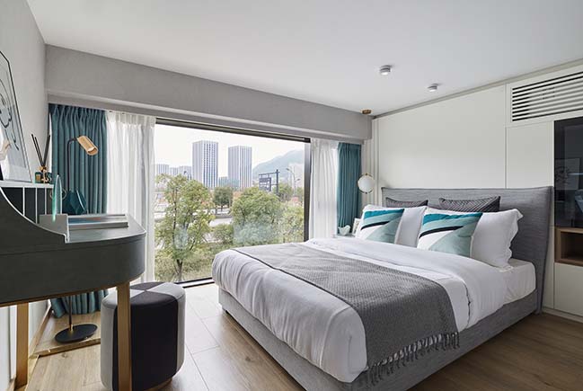
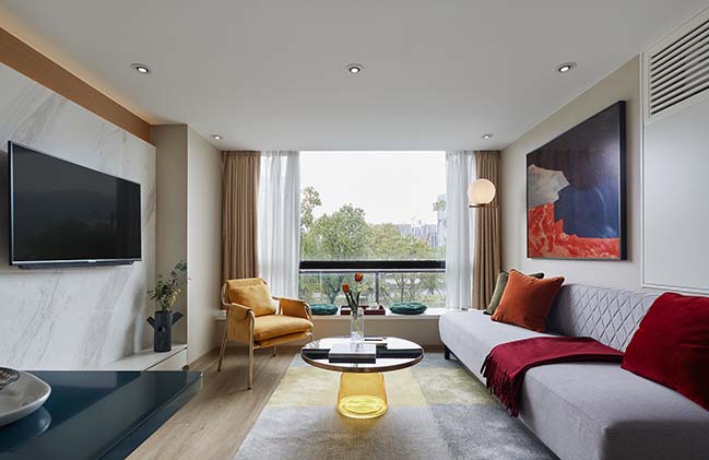
From a design perspective: the living room uses a minimalist style of armless sofa, which does not increase the visual crowding. The multi-person sofa, bay window and single sofa are connected into one, which maximizes the seating space. Starting from the feelings of the characters, Imagine sitting in front of the bay window, the sunshine is scattered through the glass, the hostess and her bestie gather together and chat, toasting, which is a kind of enjoyable pleasure.
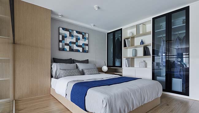
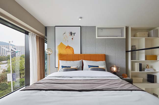
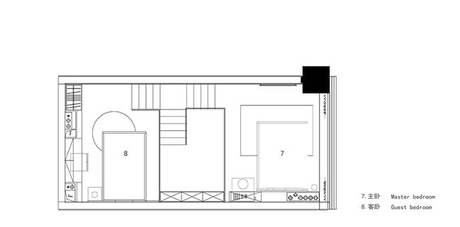
The second floor is a resting space, and the relatively soft colors are more reassuring. The large size of the main bedroom is warm yellow, lively and bright. Catering to the hostess's fashion editor's character setting, the design of the bedside table chooses the retro suitcase shape, and it enriches space color and character personality with a large female-themed decorative painting, which invisibly extends the overall space color style, highlights the hostess's Fashion avant-garde and self-assertion.
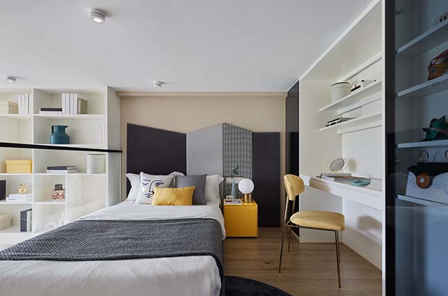
Fashion editing is a job that requires more inspiration and beauty, and is intended to pursue new things, so we want to have a different design in secondary bedroom from the previous bedroom. Under the idea of not using the traditional bed back, what kind of design is more suitable for the personality of the occupants? In the end, we chose a more diversified and interesting bed screen made up of different cutting angles and different fabric materials, which made it rich in space and fit the character. At the same time, the second bedroom has more storage space, and it is a good choice to collect and display the costumes and bags that the hostess loves. The home is a space of self and should also reflect the self. From the perspective of self, design has its meaning.
YOU MAY ALSO LIKE: DOTHINK·JIUXI ELEGANT MANSION Life Experience Center by GFD
YOU MAY ALSO LIKE: Xi'an VANKE · RUYUAN Sales Center by ONE-CU INTERIOR DESIGN LAB
YOU MAY ALSO LIKE: Sino Ocean - Oriental World View Sales Center by Waterfrom Design
DoThink · Hangzhou 2022 Sales Center & Show Flats by DA Group
05 / 16 / 2019 In the DoThink · Hangzhou 2022 Sales Center, the designer broke the traditional Metropolis concept, injecting new elements into the Metropolis style
You might also like:
Recommended post: Dubai Expo 2020 Sustainability Pavilion by GRIMSHAW
