07 / 13
2018
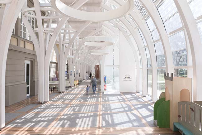
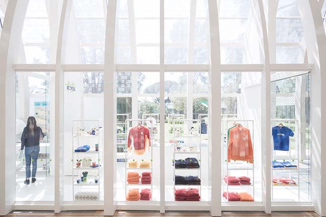
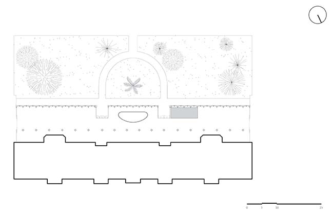
Margine presents Bettino, the new pavilion dedicated to the sale of the merchandising products of the Meyer Foundation is located inside the homonymous Pediatric Hospital of Florence and it is part of the gallery that was recently constructed between the east and west body of the original building.
Architect: Margine
Client: Fondazione Ospedale Pediatrico Meyer
Location: Meyer Pediatric Hospital, Viale Pieraccini 24 – Florence, Italy
Year: 2018
GFA: 40 sqm
Project Team: Giulia Marzocchi, Enrico Durante
Contractor: Perrottagroup
Photography: Pietro Viti
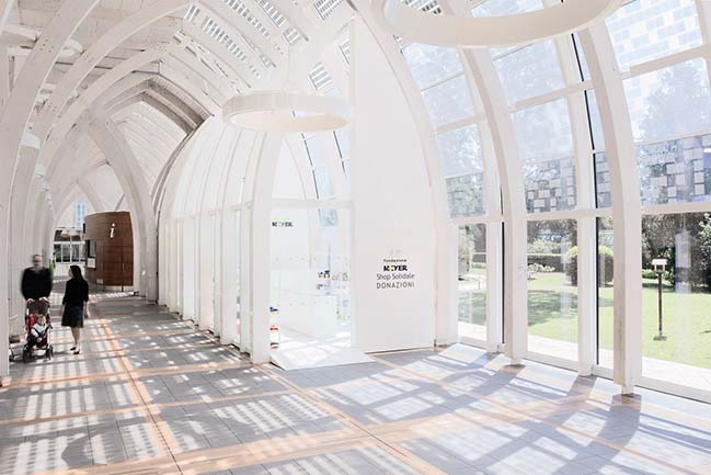
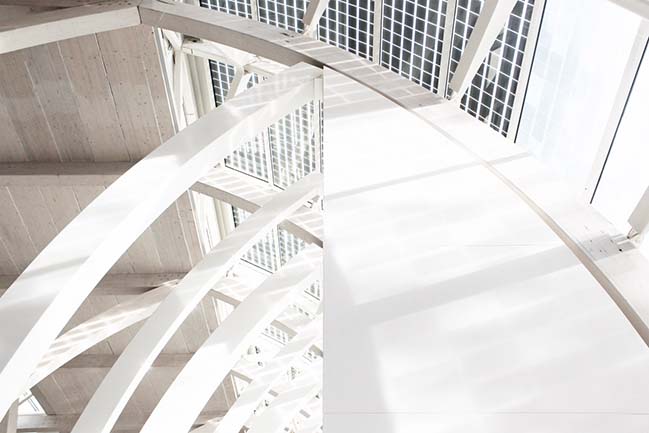
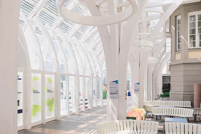
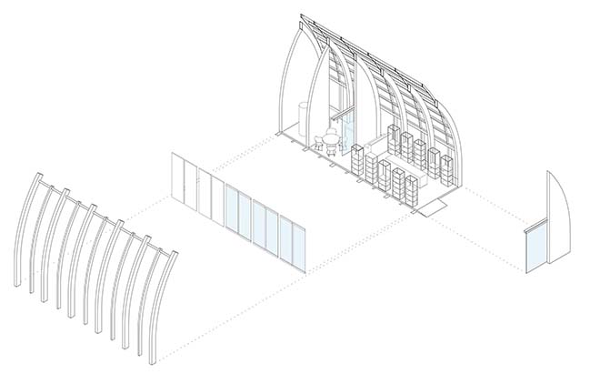
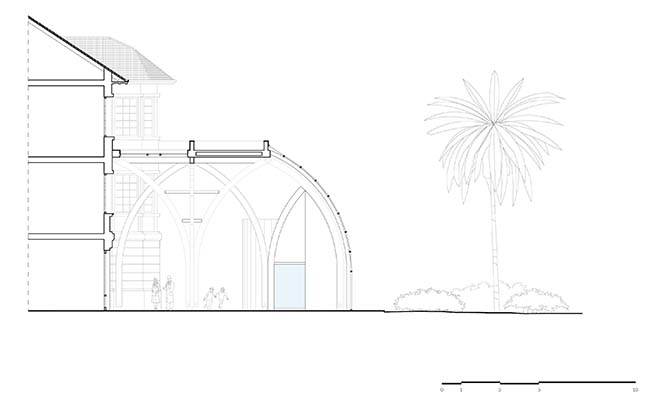
From the architect: The pavilion is presented as a laminated wood structure, surmounted by a continuous steel and glass façade in visual connection with the four hectares of the garden, which surrounds the hospital. The interior is characterized by the rhythmic repetition of a wooden structural system, composed of main and secondary ogival arches that reach a height of over 10 meters.
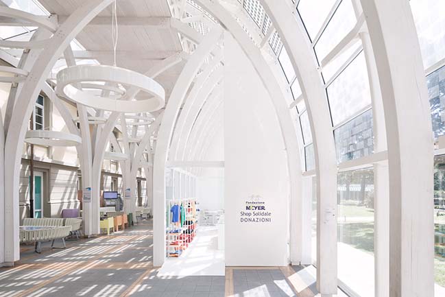
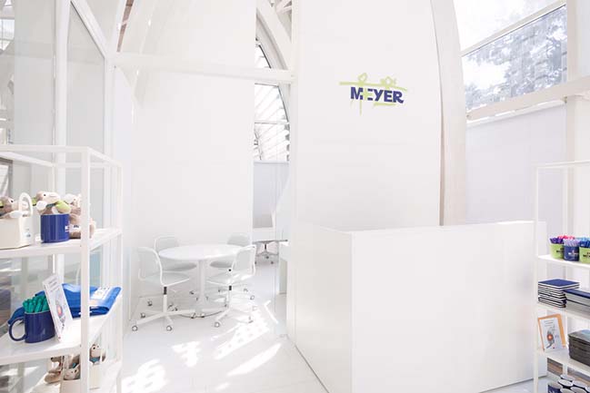
The pavilion designed by the young studio, is synonymous with the gallery by respecting the tight rhythm of the ogival spans. A counter-arc symmetrical laminated wood system constitutes the backbone supporting the windows, while a series of white laminated wood sails functionally divides the interior space. Arranged across the gallery at the center line of the ogive, the sails preserve the open and permeable character of the structure.
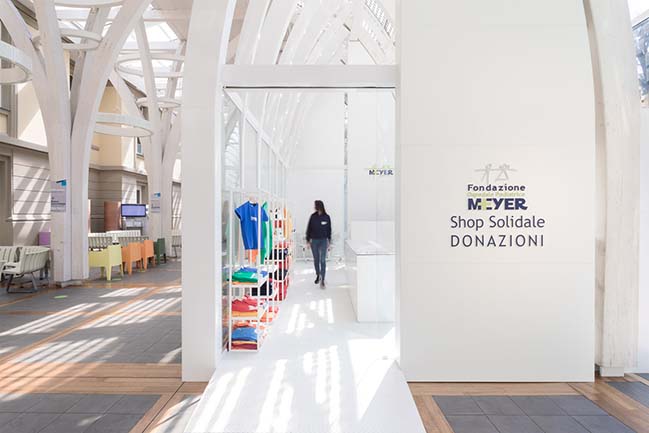
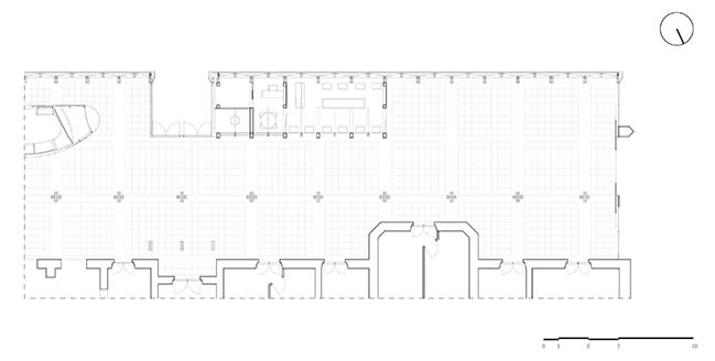
The formal lexicon of the gallery is reinterpreted in the pavilion to outline a protected yet transparent volume, which houses an exhibition and sales area, plus a more private area equipped with work stations for the employees and a small warehouse-wardrobe. The tailor-made interior furnishings are designed to be flexible, mobile and reconfigurable according to needs.
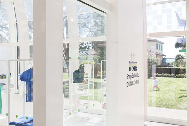
From a structural point of view, the pavilion is a self-supporting modular steel system consisting of a pre-assembled metal slab dry-assembled on site, which rests on the existing flooring and bears the elevation structure load. The foundation slab is concealed by a floating wooden plank floor, while the vertical pillars are located in the interspace of the sails.
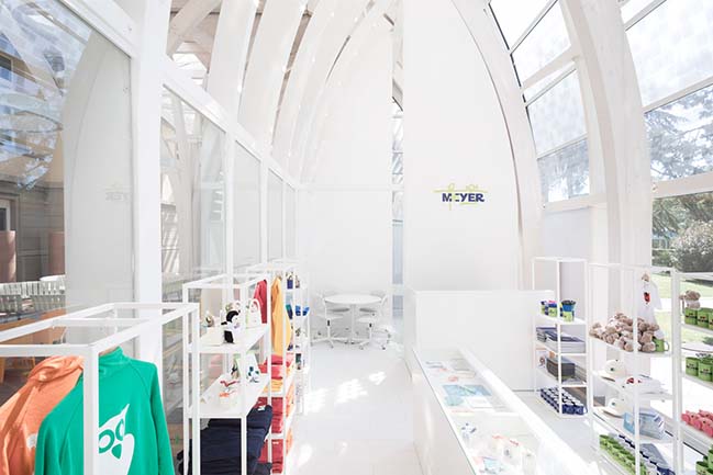
The lighting of the internal space consists of a system of LED spotlights embedded in the lower ribs of the arches and gives diffused illumination to the interior space, in addition to the abundant natural light of the glazed gallery.
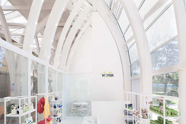
All the materials used, from galvanized steel to laminated wood, are glossy white, in contrast with the matt white lamellar wood of the gallery. This contrast in treatment creates an interesting play of refractions that captures visitors’ attention and highlights the new intervention, which has been harmoniously inserted into the whole.
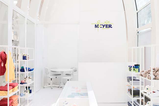
With a measured and rational elegance, borne of an extraordinary sensitivity, Margine has created a pavilion that celebrates lightness, grafting decisively and delicately, with a deep respect for pre-existing form and substance.

> You may also like: Carlo Ratti Associati's Garden Pavilion with the Four Seasons opens in Milan

> You may also like: Vatican Chapel by Flores & Prats
Margine unveils a pavilion for the Meyer Pediatric Hospital Foundation in Florence
07 / 13 / 2018 Margine presents Bettino, the new pavilion dedicated to the sale of the merchandising products of the Meyer Foundation is located inside the homonymous Pediatric Hospital
You might also like:
Recommended post: Nat's House in Sydney by Studio Prineas
