07 / 12
2018
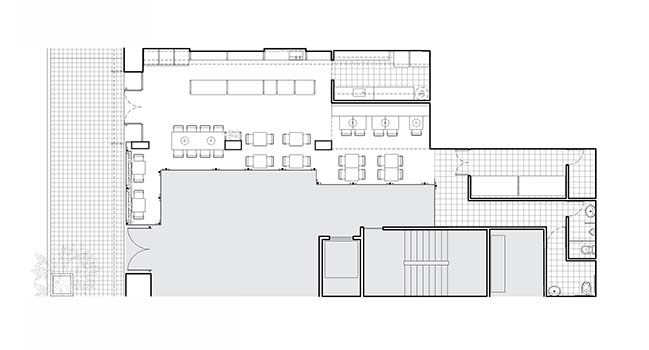
This work commissioned consisted of the installation of a cafeteria for a chain of franchises with the particularity that the client wanted to change the brand image and adapt the proposal to an urban dynamic environment that had a young public coming from nearby universities.
Architect: SY Architects
Location: Córdoba, Argentina
Year: 2016
Area: 140 m2
Team: SY, Rodrigo Schiavoni, Adán Yenerich
Collaborators: Alejandro Mendoza Brizio
Photography: Gonzalo Viramonte
From the architect: During this process, it was necessary to agree on the changes with the Company Departments of Marketing and Architecture. This and the fact that we counted with a limited budget conditioned great part of the decisions taken.
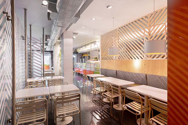
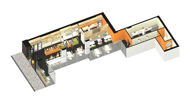
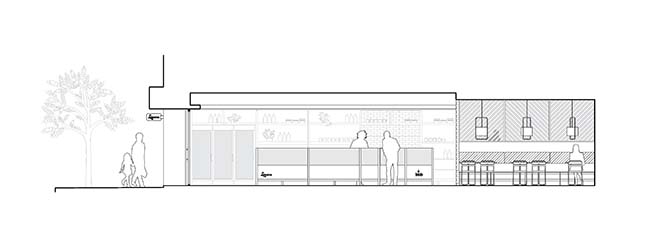
The premise is placed on the ground floor of an office building. It is deep with little natural light and its dark floors accentuate that feature. Due to this, all the strategies were aligned in order to create an illuminated and warm atmosphere, from redesigning the furniture, varying the colors board to using materials in an effective way.
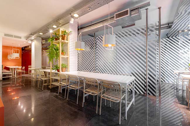
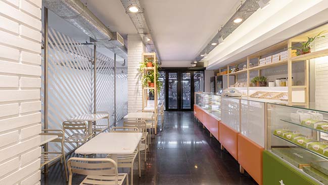
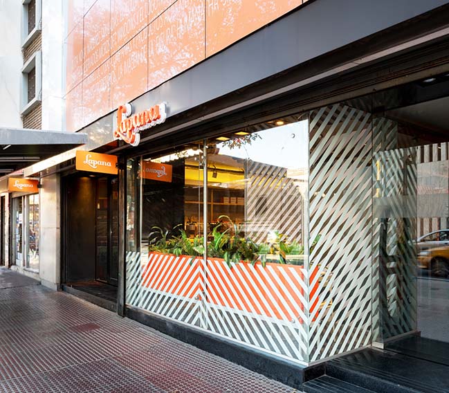
Originally, this premise did not have an entrance from the street so it was necessary to build one. In order to do it, we redesigned half of its façade and there, we placed the new entrance doors. The other changes were limited to the adding of partitions, the execution of new installations and the application of coatings.
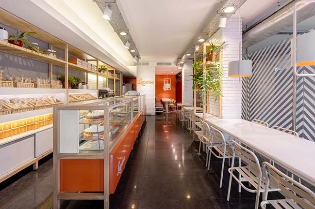
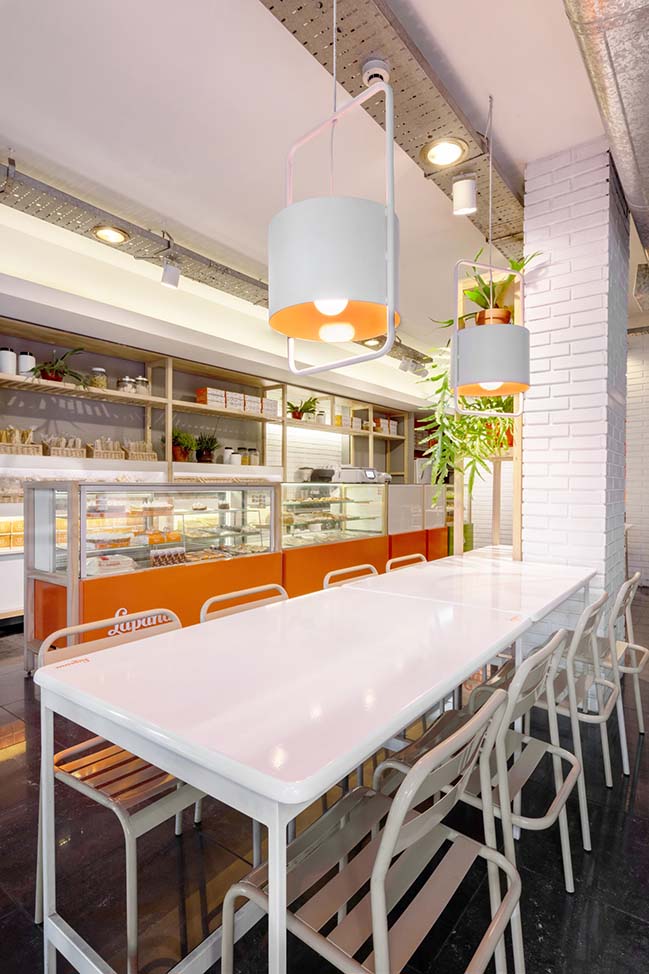
This chain of cafeterias supports great part of its brand identity on the orange, brown and cream colors. We suggested a few changes to provide a fresher and renewed air. We replaced brown with grey; we kept the orange and the cream colors as the base for this identity and incorporated white color in a high proportion.
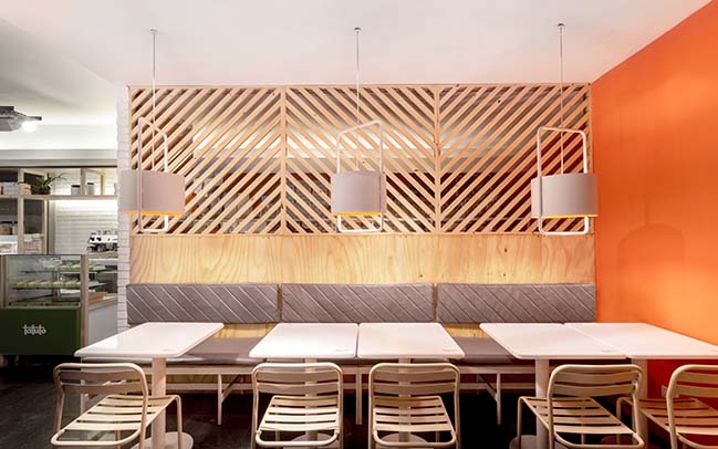
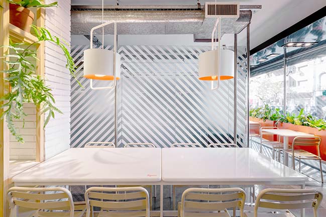
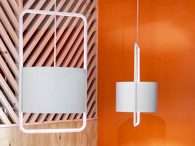
This new chromatic mix was mainly applied on the furniture, the tables, the continuous bench and the chair. This was designed from the classical chair for terraces and we called it Mediterranean chair. The hanging lamp is also a design that was developed for this cafeteria and we called it Aló.
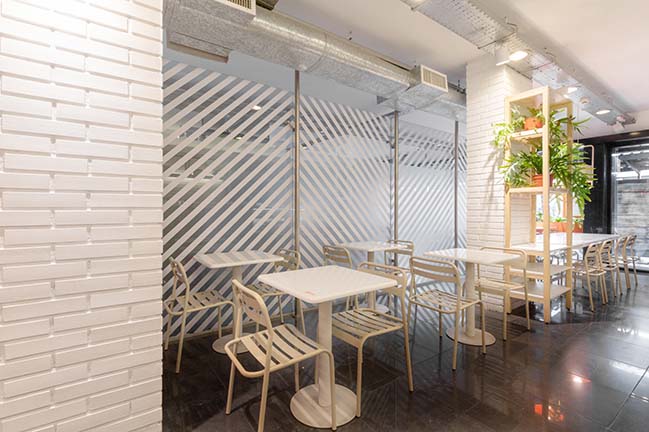
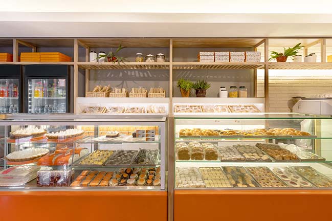
We used two materials to create a relationship with the bakery business, natural wood and brick coating. With a strip of impregnated timber, we made the shelves, the closure of the baking sector and the legs that were added to the exhibitors provided by the company. The bare brick effect, made with a ceramic coating painted in white was placed in small surfaces but is still very present in the perception of the atmosphere.
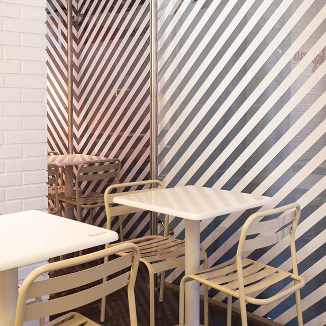
We used a 45-degree striped pattern to solve the partition that separates the building from the entrance hall. This was not feasible to be modified. This simple and economical graphic resource, with white and frosted stripes allows for the light to enter, blurs the partitioning wall breaks and it becomes an element that provides great personality and identity to the proposal.
> You may also like: PONTE VECCHIO food shop in Argentina by EFEEME arquitectos
Cafeteria Lapana by SY Architects
07 / 12 / 2018 This work commissioned consisted of the installation of a cafeteria for a chain of franchises with the particularity that the client wanted to change the brand image...
You might also like:
Recommended post: Apple Store in Zorlu by Foster + Partners
