11 / 30
2021
The concept for renovation was to create a clear language between old and new, to leave traces and history of the existing building, whilst inserting a series of new contrasting elements...

> Xi'an Vanke • Metropolis Sales Center by ONE-CU Interior Design Lab
> Xi'an VANKE · RUYUAN Sales Center by ONE-CU INTERIOR DESIGN LAB
From the architect: Vanke · City Growth Hall is located in the 'Eastern Suburb Memory' in Chengdu. The original building held the Hongguang Electronic Tube Factory, a state-run factory which was founded in 1958 which produced oscilloscopes and kinescopes for the military. The old factory was left to ruin whilst the other neighboring buildings have become part of a thriving cultural and design hub.
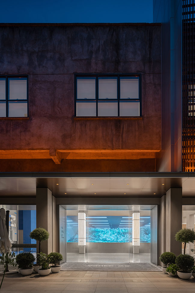
Our concept for renovation was to create a clear language between old and new, to leave traces and history of the existing building, whilst inserting a series of new contrasting elements.
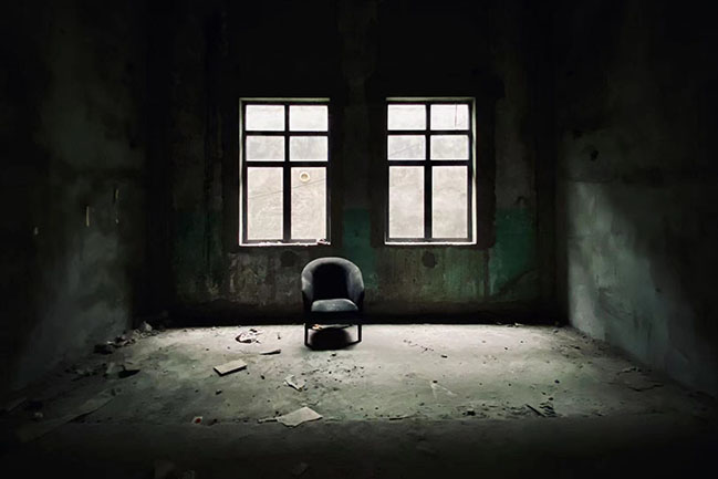
Before renovation. Photo © MDO
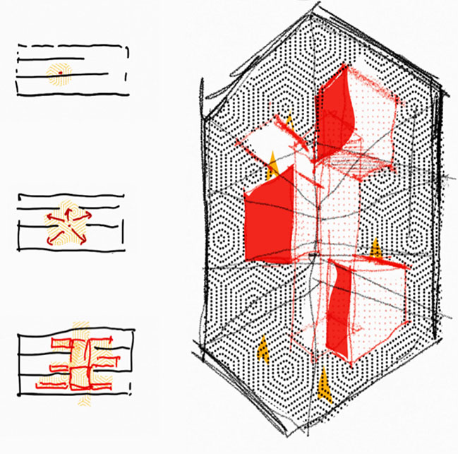
The oscilloscope became the genesis of the design, and the burst of energy was extracted as the element of the design, both formally and metaphorically connecting back to the relationship with the "Get Chengdu Learning Center", whose purpose is the spread of knowledge through digital and physical mediums. This explosion of energy was seen as the spatial concept of the "Big Bang of Knowledge".
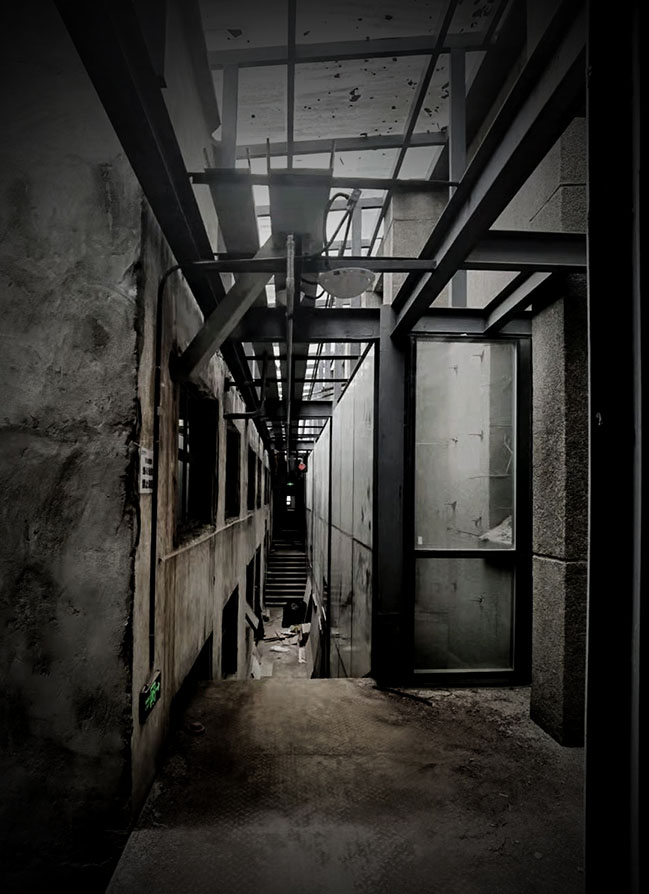
Before renovation. Photo © MDO
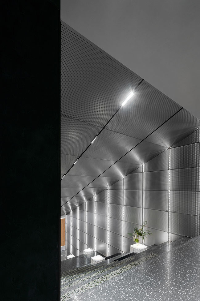
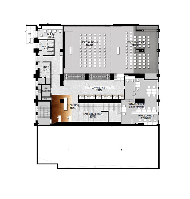
The explosion begins in the centre of the old structure. The energy splits to form new spatial forms, which are mapped to all corners of the old factory, interspersing with the historic walls and column networks. They are connected by the central staircase which serves as the social "heart". In the explosive proliferation of space, technological materials and lights clash and blend with the old factory building, bringing new sensory impact and dramatic feeling to visitors.
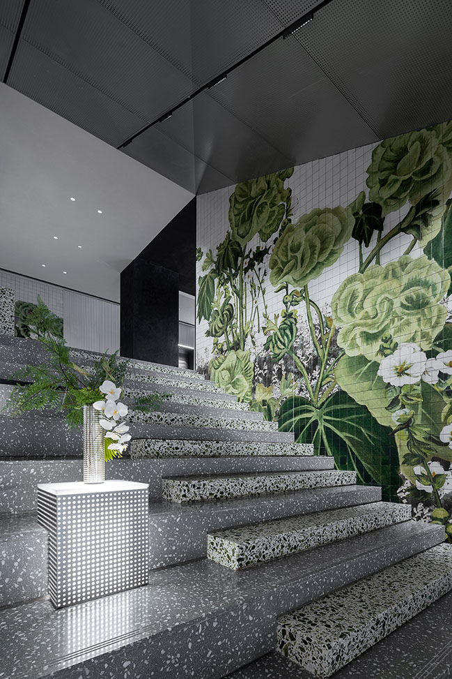
The staircase acts as the social hub and the means of distribution through the 3 floors. The stairs are designed to be wide to allow for informal meeting and relaxation spaces. We are interested in the idea that different people and functions can meet and occur in this blurred space.
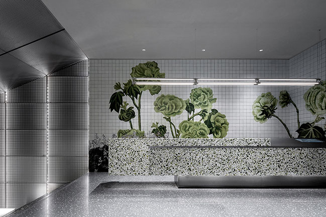
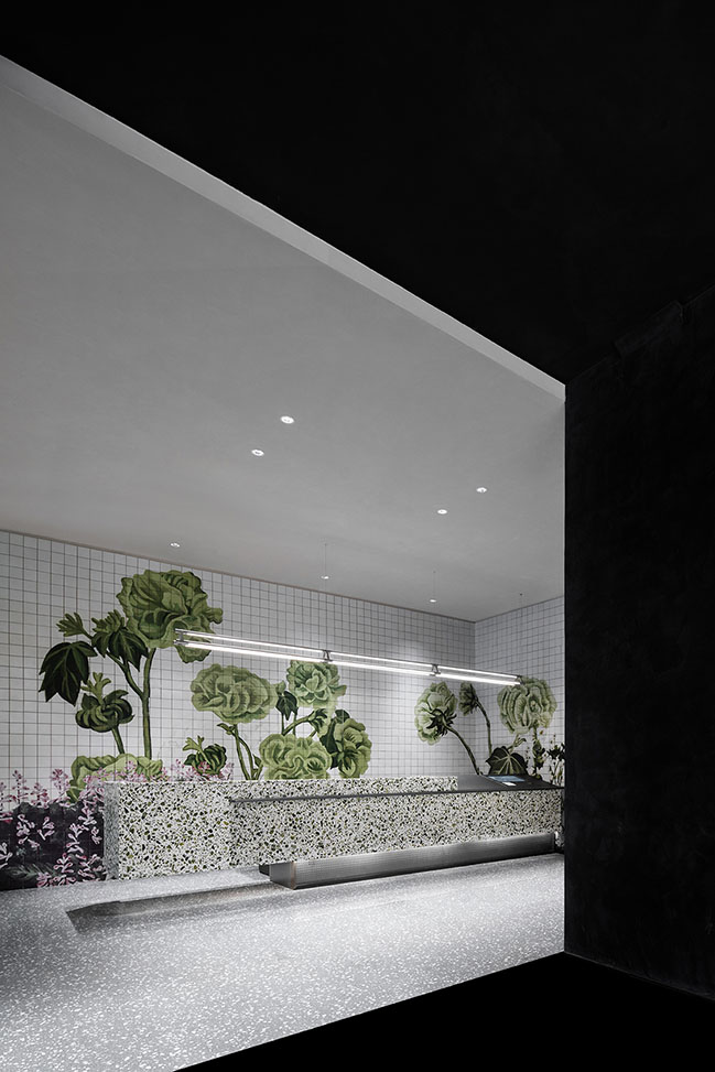
Lining the stairs is a customized ceramic tile will depicting clusters of hibiscus mutabilis found locally in Chengdu which inspired by the poem 'The wet red patches in Chengdu's twilight, are flower branches, heavier but bright'.
Hibiscus flowers will gradually change from white to pink as the time of day changes. The artist uses the shades of green and the density of flowers to express the blooming of hibiscus in a day, and record the various forms hibiscus by oil painting. After being photographed and re-composited, the huge picture will be printed on tiles.
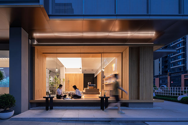
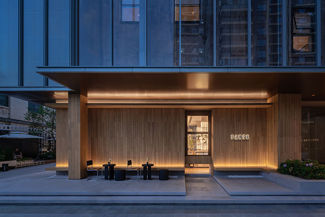
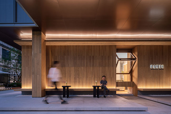
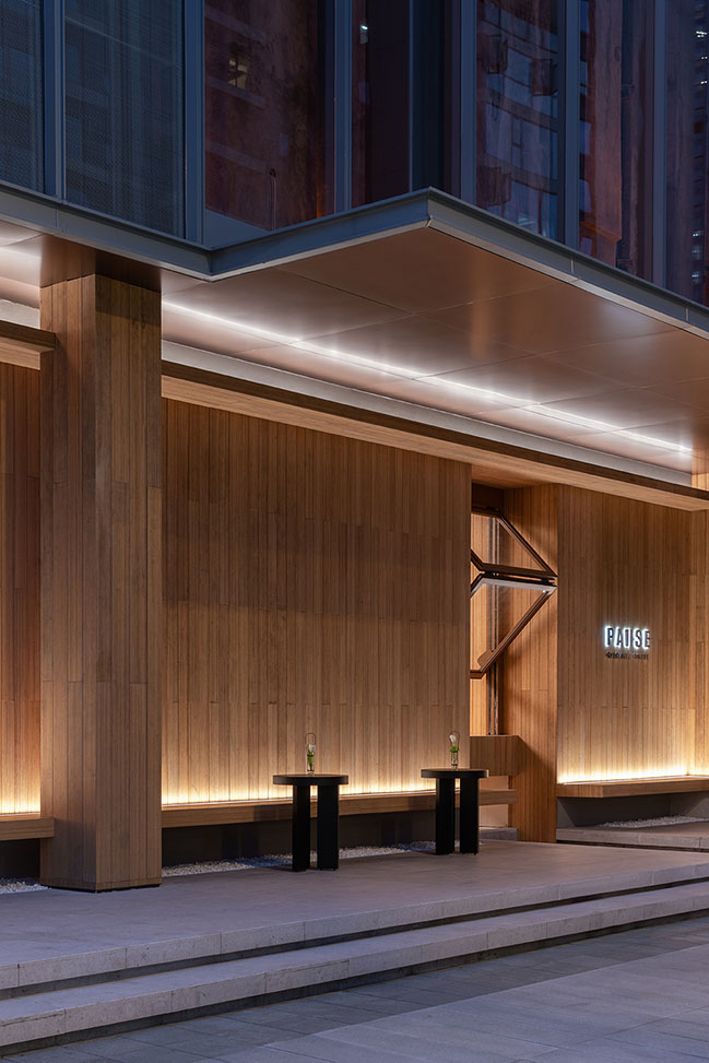
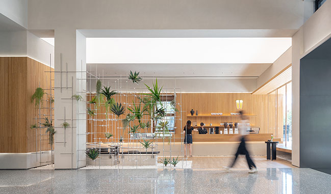
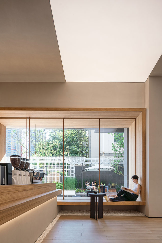
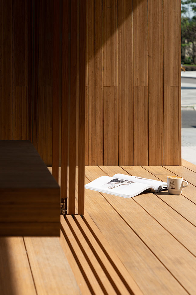
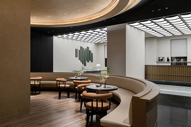
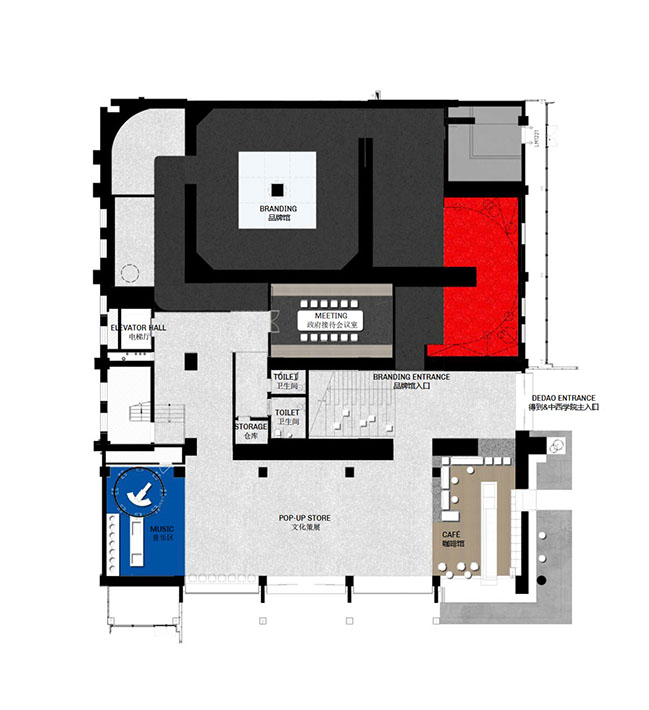
On the ground floor we inserted a cafe as a public function which blurs the boundary between inside and out. The form is conceived as a layered bamboo box inserted into the grey concrete structure. The layers are folded out to create space for sitting, for tables and for serving coffee to the street.
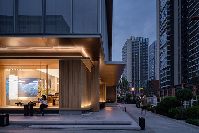
Along the perimeter is a deep bamboo seat which bridges from inside to outside, creating a relaxing space for passerby to stop and relax and take coffee. A large picture window with a sliding glass screen can open up on warmer days, creating a strong visual connection between the city and the interior which blurs the traditional boundary.

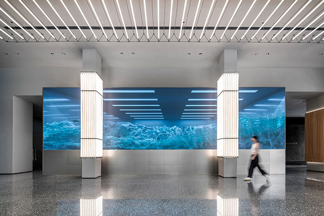
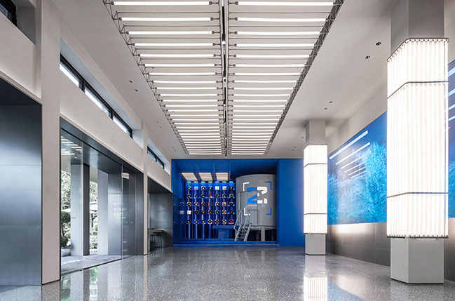
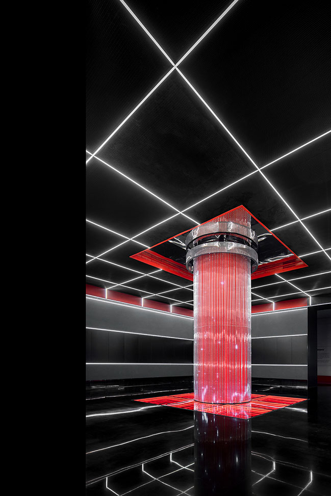
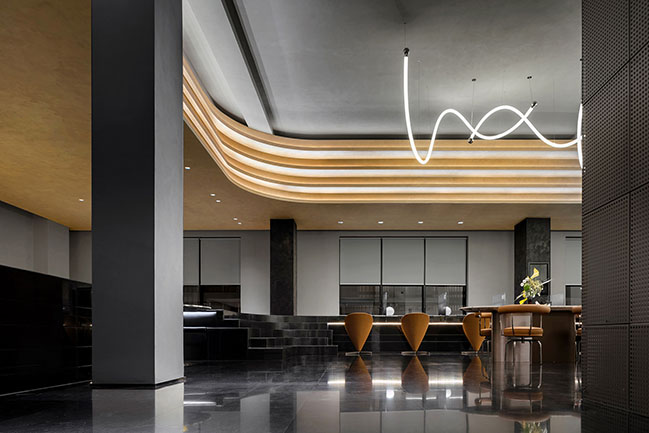
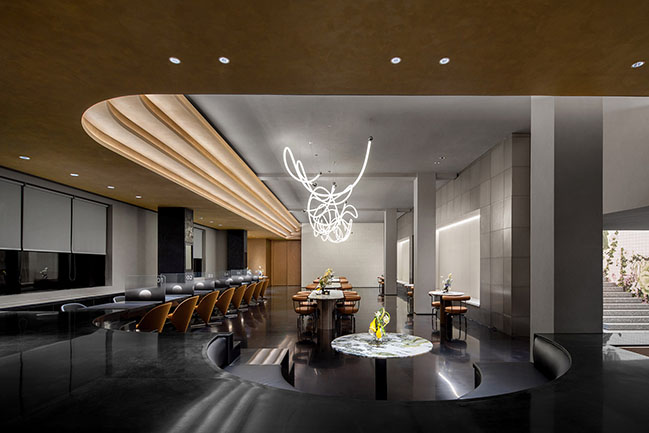
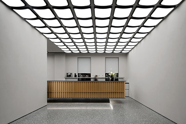
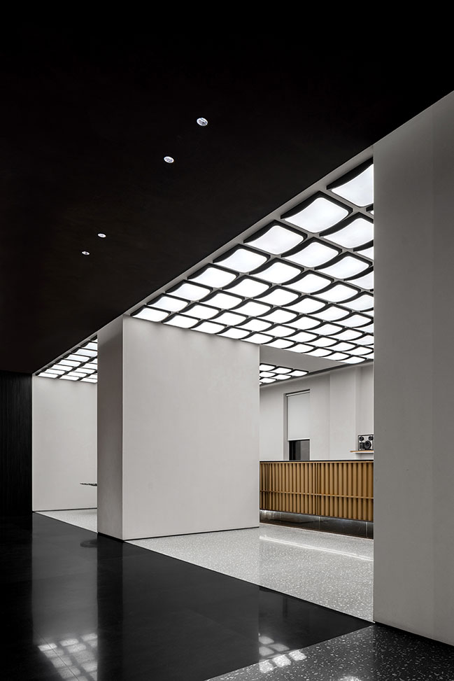
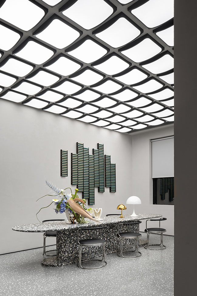
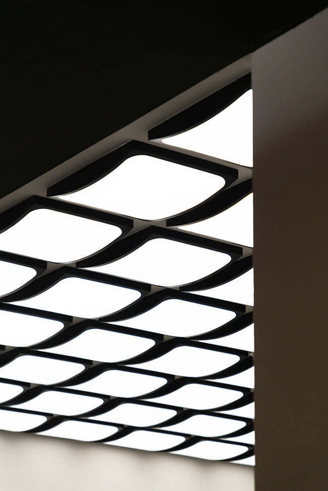
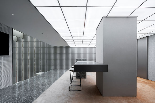
The ground floor is designed as a flexible event space and pop-up store which connects the branding centre to the city. The grey tones of the existing structure are balanced with new elements, a giant digital screen, vertical column batten lighting and suspended lighting array which drew inspiration from the line wave of the oscilloscope.
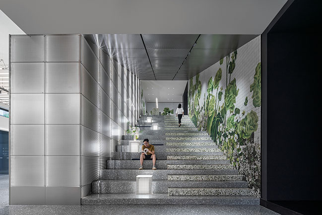
The long digital screen acts as a dynamic 3D wall, its constantly changing appearance creates a fluid and dynamic space. At night the colors of the screen can transform the mood and tone of the environment.
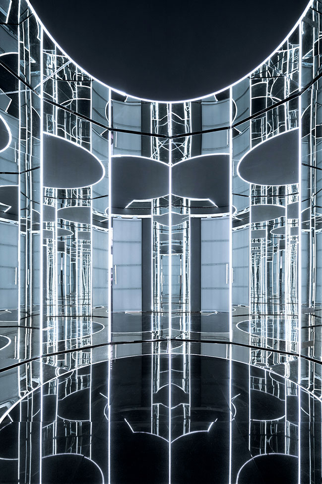
The space is flanked on either side by the coffee store and a DJ station, which allows the space to be transformed into a party space at night. In the DJ area, the old water tank is transformed into a hall of mirrors giving guests a unique opportunity for taking photos.
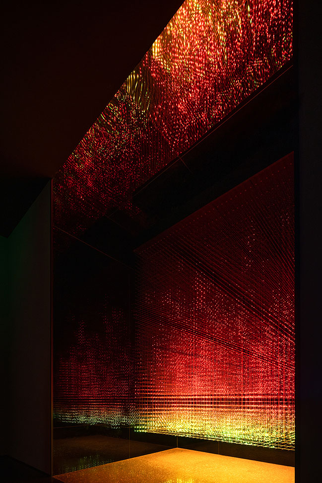
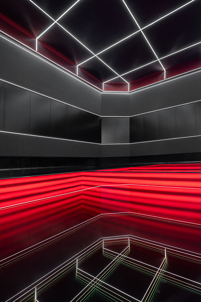
In the branding, exhibition hall the light and form of the oscilloscope screen are used to define space and form a darkened environment. The light leads the visitor through the exhibition and the subtly changing light patterns create a rich sensory experience.
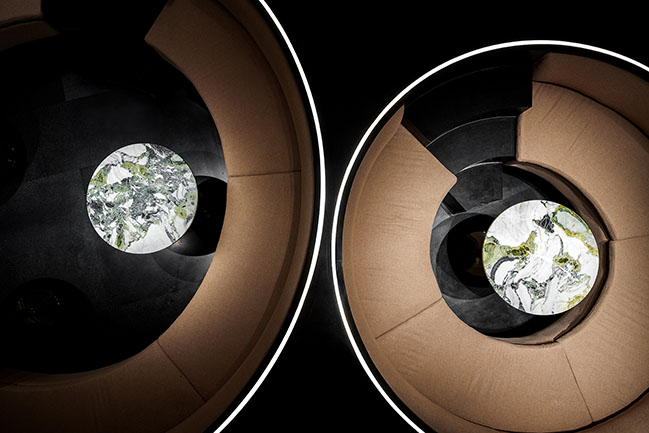
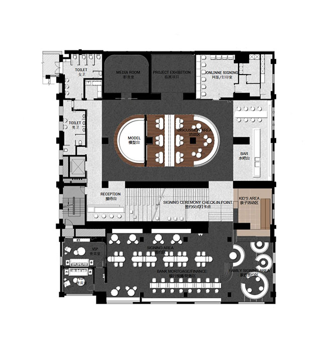
Vanke's signing and negotiation area is located on the second floor of the old factory. Here, we use the entire space as an oscilloscope, and the energy is expressed with golden lines which form fluid volumes, extending to every corner of the space in the form of waves. The gold color contrasts strongly against the existing concrete frame.
In an homage to the site history of manufacturing, the ceiling of the bar includes an installation made up of rows of black and white light cathod-ray televisions. When you look up, you can see these neatly arranged "picture tubes", we think of rows of products on the production line, and we are reminded that this is the birthplace of China's first black and white picture tubes.

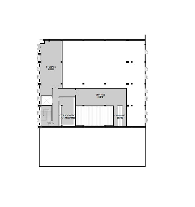
The Chengdu Learning Centre on third floor serves as the source of the "Big Bang of Knowledge", where the power of youth and the future are expressed through the bold use of materials and lighting. The lighting starts in the staircase, the social heart of the project, and radiates out through the upper levels, spreading a youthful sense of energy and enthusiasm.
Architect: MDO (MORE DESIGN OFFICE)
Developer: Chengdu Vanke
Location: Chenghua District, Chengdu City, Sichuan Province, China
Year: 2021
Area: 2,970 sqm
Design Directors: Justin Bridgland, Jaycee Chui
Main Designers: Danqing Yi, Di Chang
Design Team: Da Gao, Wanyang Song, Luwen Zhang, Mengwen Yu, Huijie Jiao
Soft Decoration: Momo Dong, Zhenyan Yu, Yao Ju
Graphic Design: art/graphics service
Multi-media Design: Silkroad Visual Technology Co., Ltd.
Project Manager: Andy He, Zhiyuan Wang
Photography: Vincent Wu
Vanke · City Growth Hall by MDO (MORE DESIGN OFFICE)
11 / 30 / 2021 The concept for renovation was to create a clear language between old and new, to leave traces and history of the existing building, whilst inserting a series of new contrasting elements...
You might also like:
