11 / 02
2019
With consumption upgrade in China driving iteration of commercial scenes, Towodesign, a Chinese design studio which excels at reorganizing spaces in a balanced and coordinated manner, created a unique experiential store that fuses retro atmosphere and contemporary elements in downtown Shanghai.
Design Firm: Towodesign
Location: 7F, No.1728, Nanjing West Road, Shanghai, China
Year: 2019
Area: about 800 sq.m.
Chief designer: He Mu
Design team: Sun Meng, Hui Zhongqi, Xu Xiaoyu
Photography: Towodesign
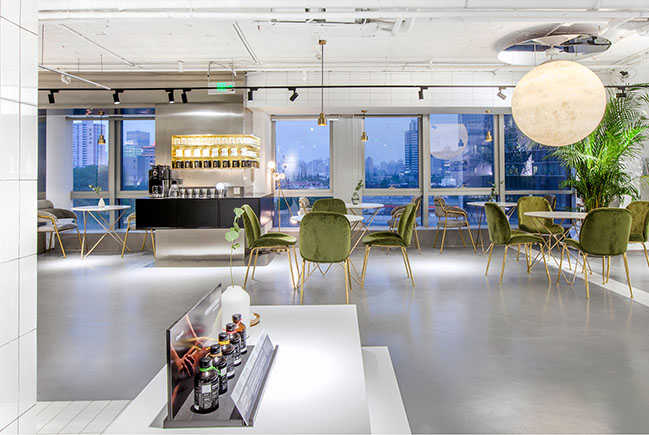
Project's description: The project is situated on Nanjing West Road, Shanghai, adjacent to Jing’an Temple which boasts a history of more than a thousand years. The designers retained a large area of concrete floor in the original space, and added bespoke metal elements to the interior, with a view to striking a balance between roughness and exquisiteness.
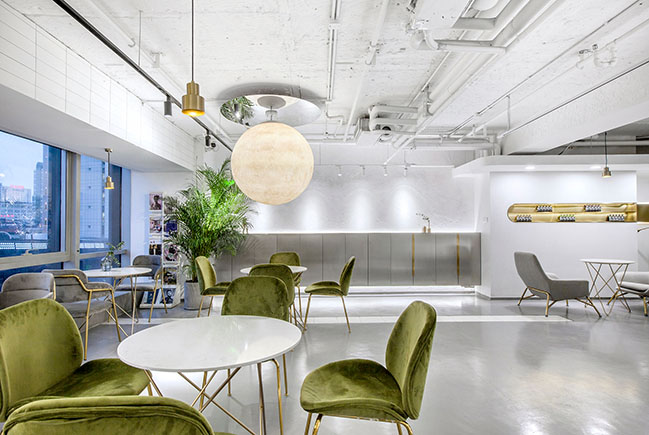
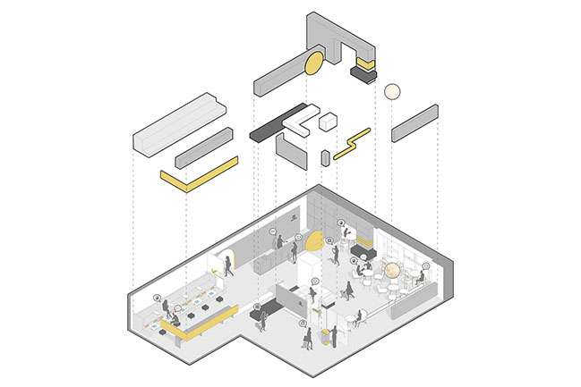
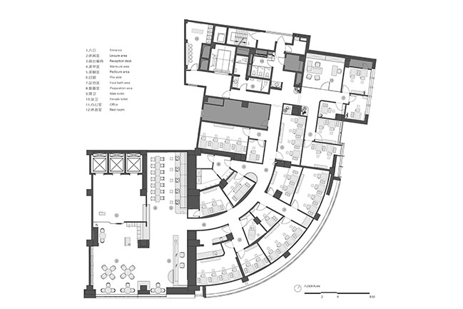
With an area nearly 800 square meters, the overall space contains various beauty service areas for manicure, foot bath and spa, etc., and integrates functions for socializing, recreation and entertainment. Interior spaces with different themes and charm extend and interweave with each other flexibly, seeming to bring consumers into a “space-time tunnel”.
I. Austere tone
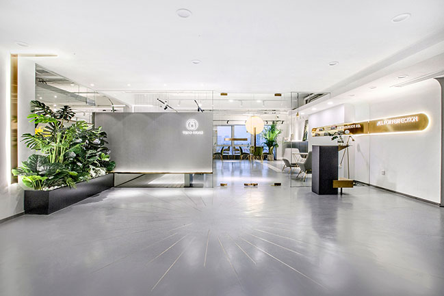
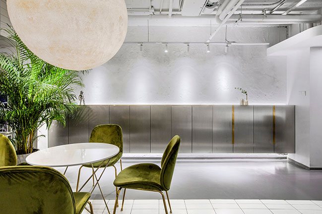
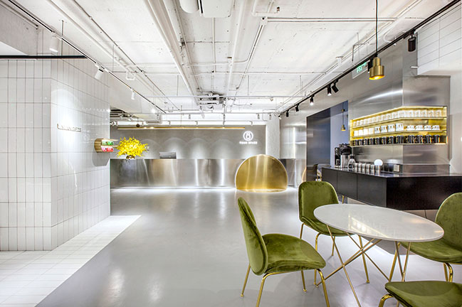
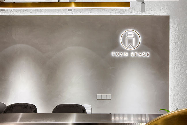
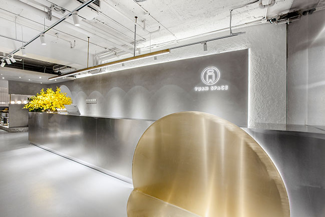
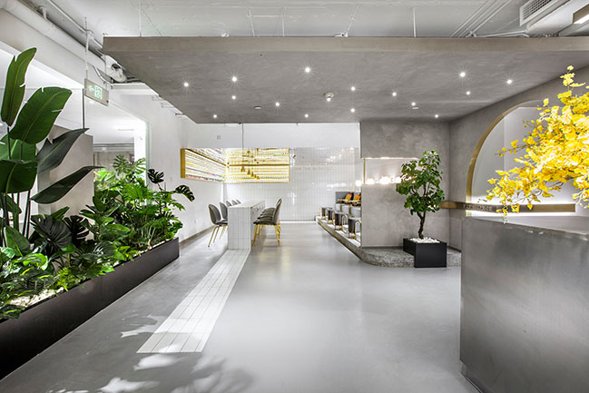
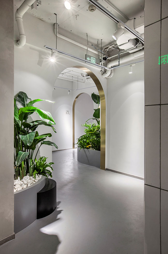
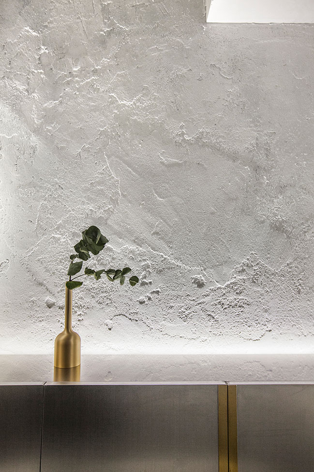
At the entrance area, the concrete backdrop wall, cement floor and metal reception desk together set an industrial tone. The round installation at the reception desk area and other round elements throughout the space echo the theme of the brand — “YUAN”, which means “round” in Chinese. Since the floor height is merely 2.7 meters, no decorations are added to the foyer’s ceiling, with exposed cement, pipes and wires producing austere visual impressions.
II. Integration of inside and outside
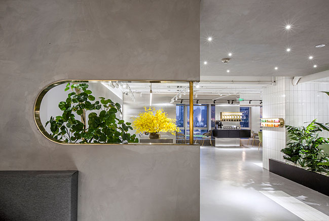
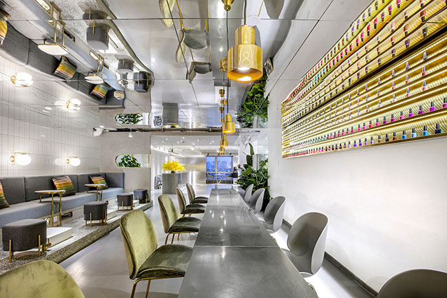
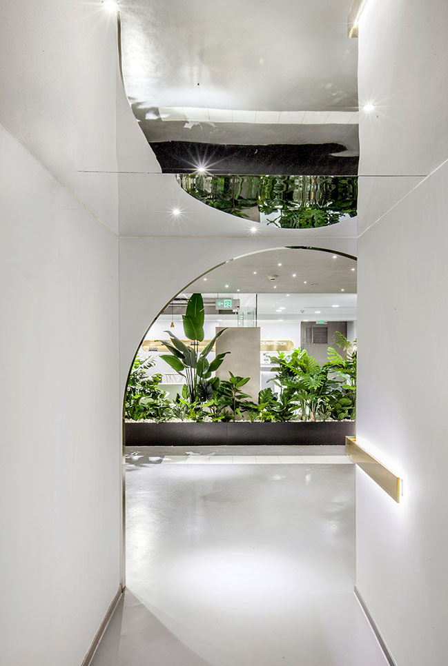
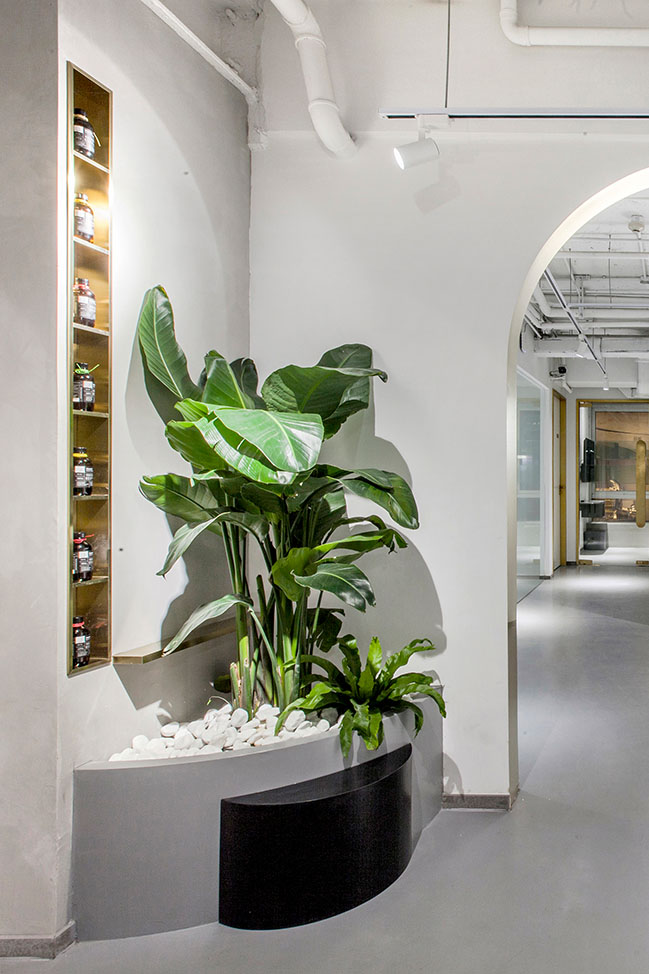
A leisure & bar area is set between the entrance and the cashier’s area, which functions as a transitional space for customers to enter major consumption spaces. Large French window brings urban landscape and daylight in, thereby narrowing the distance between people and nature. This area’s simplistic design style and attribute of sharing effectively weakens the feeling of strangeness, and dotted green plants also makes the space more intimate.
III. Smooth transition
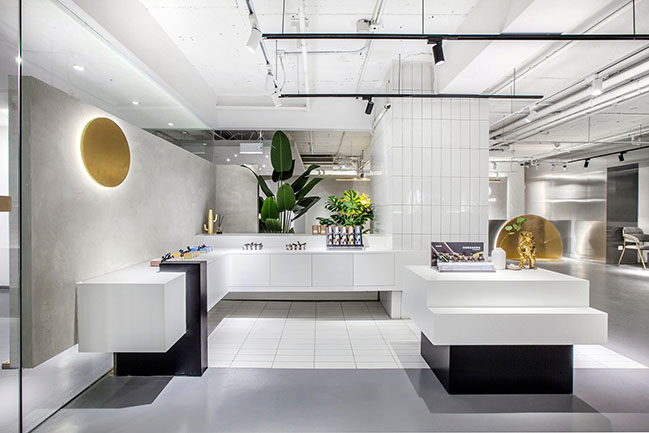
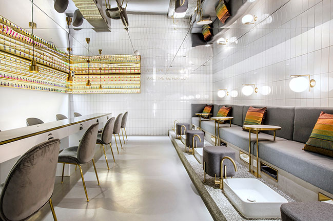
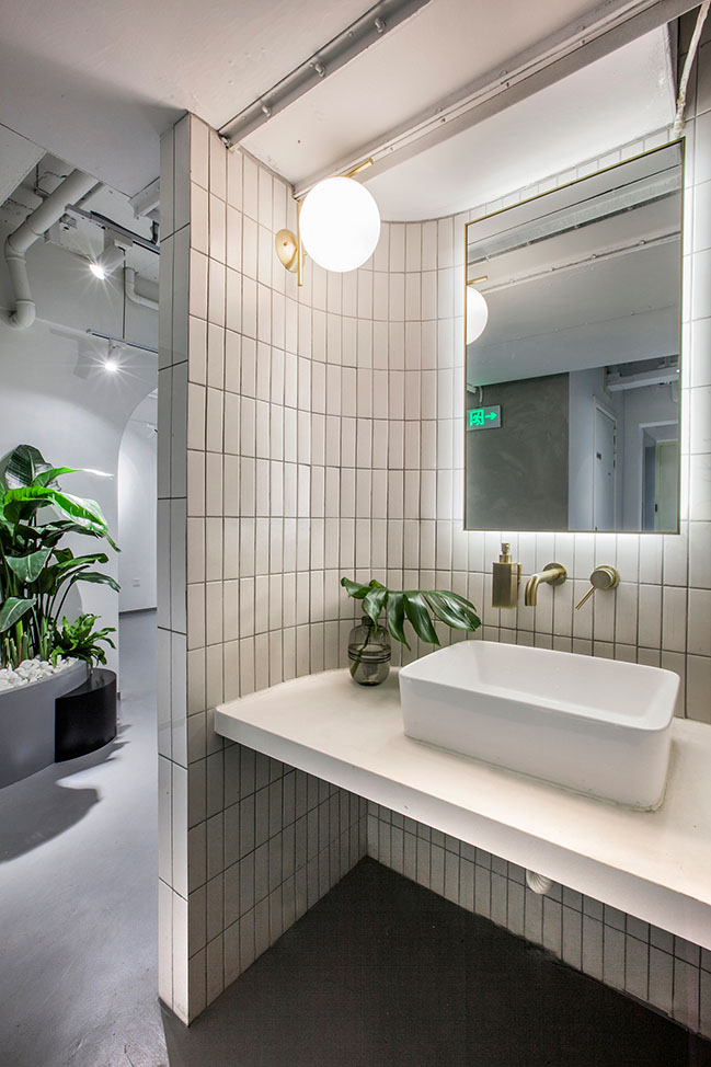
On the opposite side of the bar area are manicure area and pedicure area. Small pieces of white tiles extend from the floor to manicure desks, which guides customers’ sight line and route implicitly. The wall clad in white tiles constitute a bright and clean backdrop. Besides, the elevated terrazzo platform demarcates pedicure area and manicure area clearly, whilst ensuring visual interaction. White tiles and terrazzo, as classic retro elements, set the stage for a time travel in the space.

IV. Fusion of the new and old
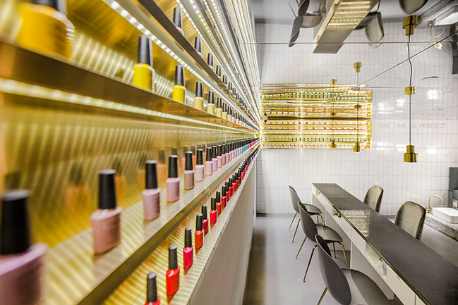
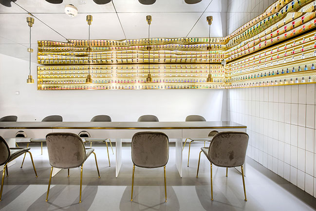
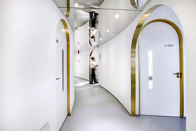
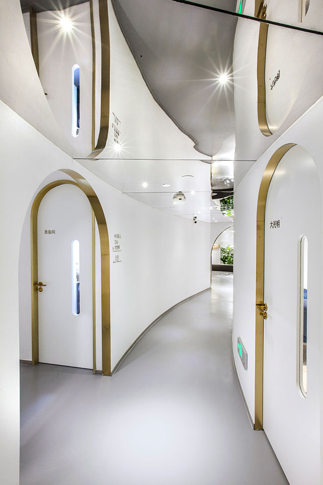
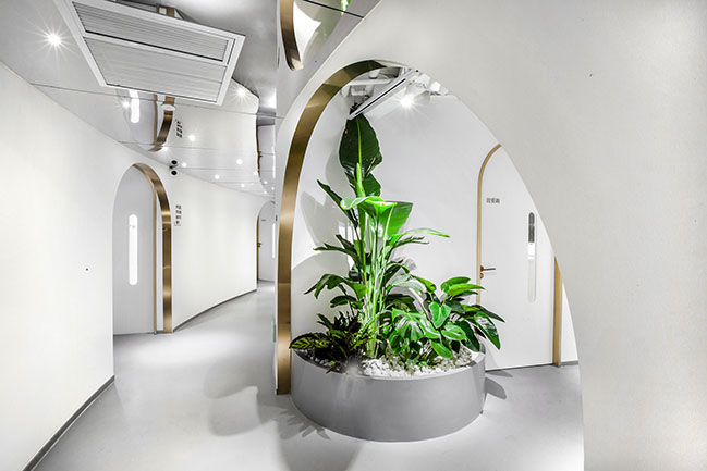
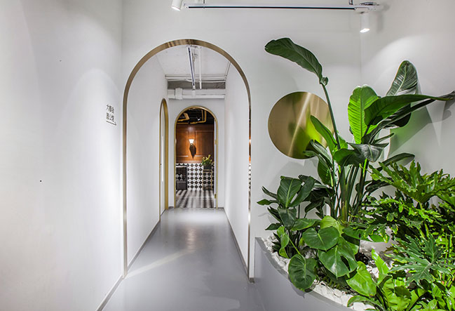
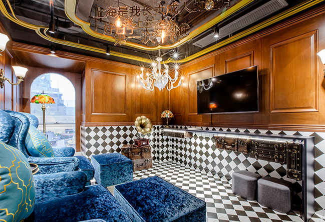
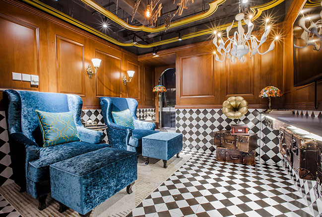
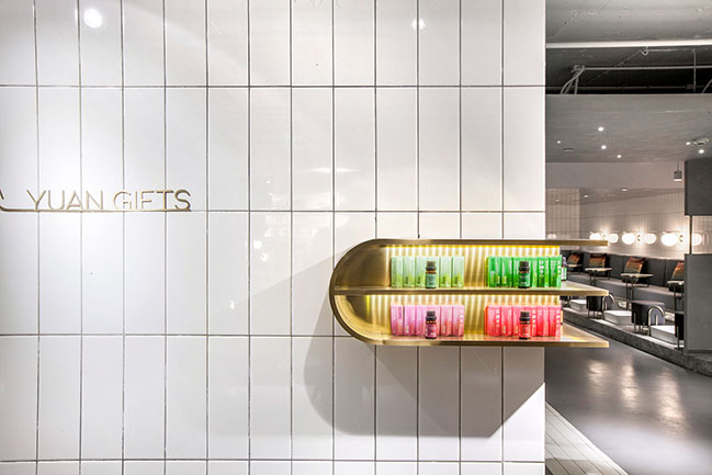
Brass lines can be frequently seen within the space, from embedded product display shelves to the arched door openings along the corridor. The corridor features a curved circulation route and reflections by mirrors, which alleviates the oppressive feeling caused by the low ceiling and extends the space visually. The room of old Shanghai style is finished with deep-colored wood and square black & white tiles, with Klein blue velvet sofas, hand-cranked telephone and gramophone producing an immersive and nostalgic scene.
YOU MAY ALSO LIKE: Dessert Kitchen by Towodesign
YOU MAY ALSO LIKE: Dr. Bravura Bird's Nest Drink & Dessert Store by Towodesign


YUAN · Space by Towodesign
11 / 02 / 2019 With consumption upgrade in China driving iteration of commercial scenes, Towodesign, a Chinese design studio which excels at reorganizing spaces in a balanced and coordinated manner...
You might also like:
Recommended post: Luxury villa by HYLA Architects
