07 / 18
2019
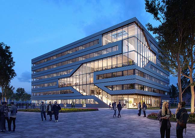
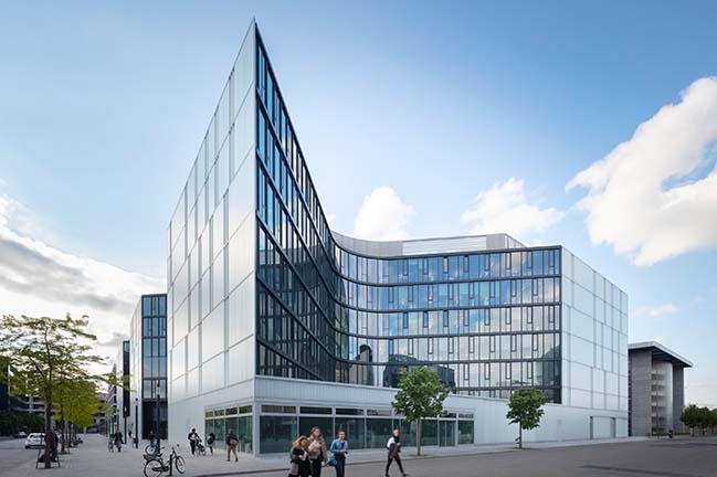
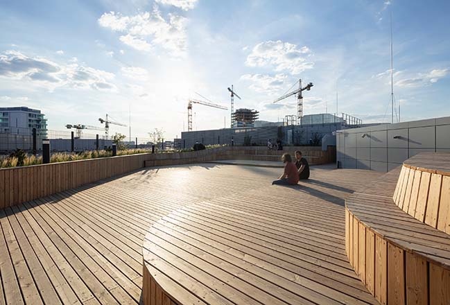
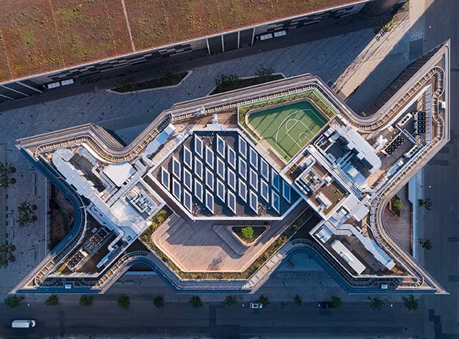
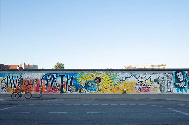
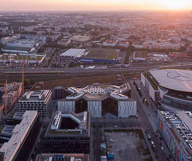
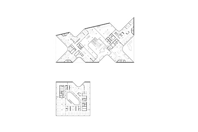
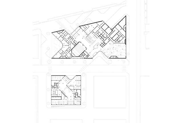
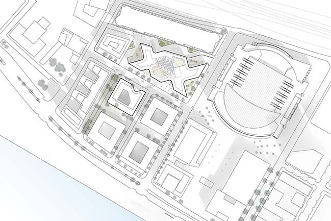
The new Zalando Headquarters consists of an ensemble of two buildings that form the heart of the company’s new campus in Berlin-Friedrichshain, neighbouring the “Mercedes-Benz-Arena” and the East Side Gallery.
Architect: HENN Architekten
Client: Zalando SE
Location: Berlin, Germany
Year: 2019
Size: 59,000 sqm
Interior design: KINZO
Structural engineering: BuroHappold Engineering
MEP: BuroHappold Engineering
Fire protection: hhpberlin
Building physics: Müller-BBM
Lighting design: Bartenbach LichtLabor
Landscape architecture: Atelier Loidl
Photography: HGEsch Photography
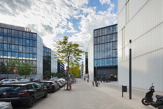
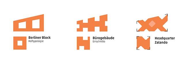
From the architect: Rather than forming an closed block, the design of seven-storey volumes, accommodating a total of 43,000 m² of office space, create a striking expression the company’s identity which assumes an open and transparent presence in the city.
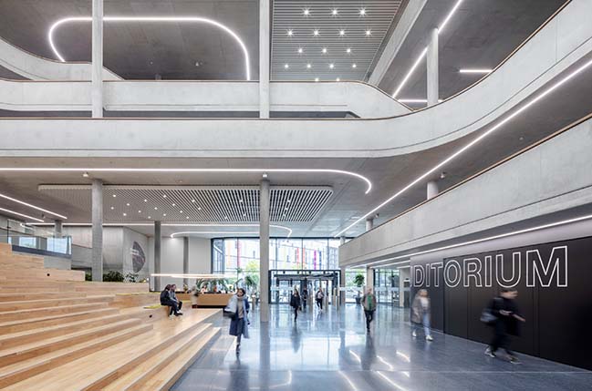
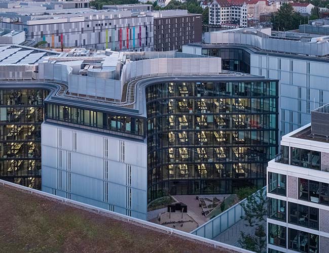
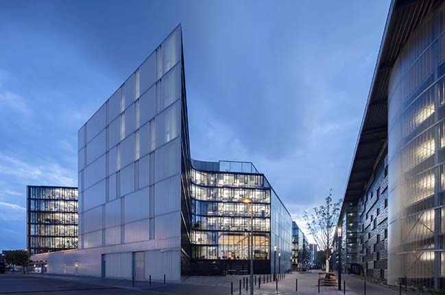
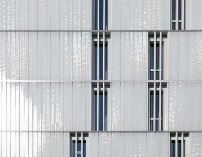
The wrap-around glass façade which embraces the carved architectural volume like brackets, is a fundamental part of the design. It is this reinterpretation of the traditional Berlin block, created by rotating the building layout diagonally to the urban-development plan, that enabled a design solution to be found with which the building unfolds towards the city.
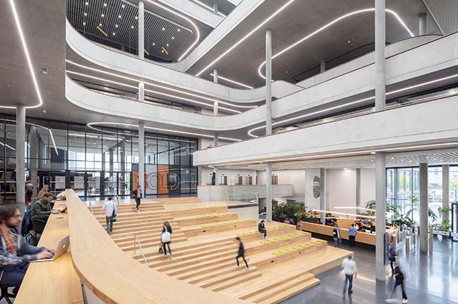
In this way, the interior courtyards shift to the perimeter of the site, enabling a fluid transition between the offices and the public spaces, in turn affording larger views both into and out of the building by virtue of the transparent and translucent facades.
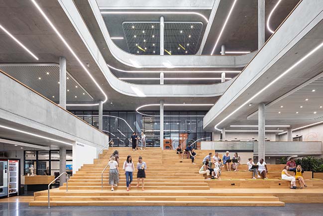
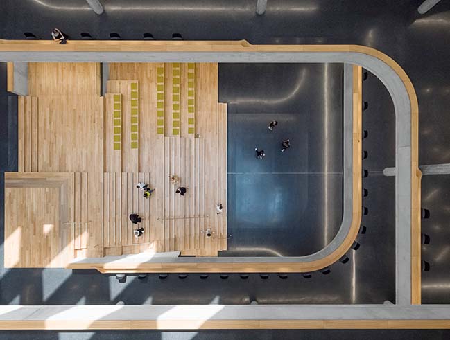
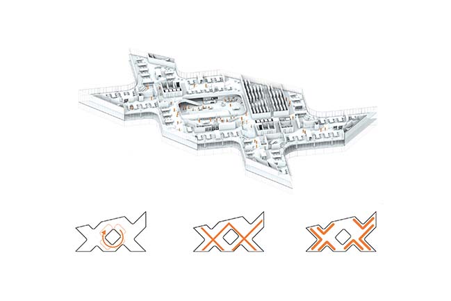
The core of the main building is the central atrium, which shifts its openings along its vertical ascension, thus drawing daylight to the public areas below. The central lobby is flanked by a grand staircase with integrated seating and lounge areas which can also be used for events.
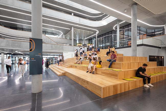
The atrium in combination with the adjacent auditorium, create a spatial continuum that extends over numerous floors, thus enhancing the user’s flexibility. Conference and training zones, next to a café and the staff restaurant, additionally dock onto the overall complex.
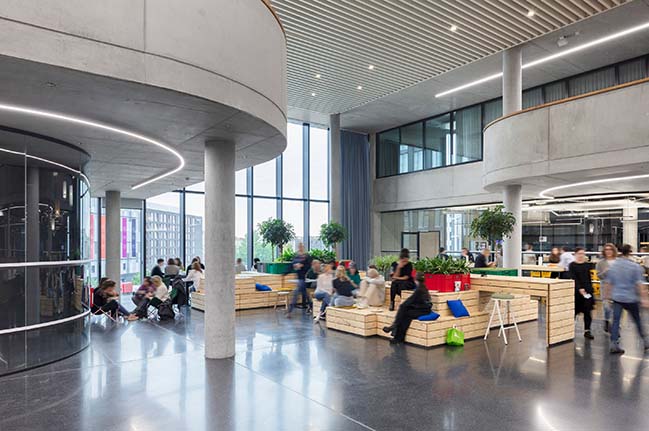
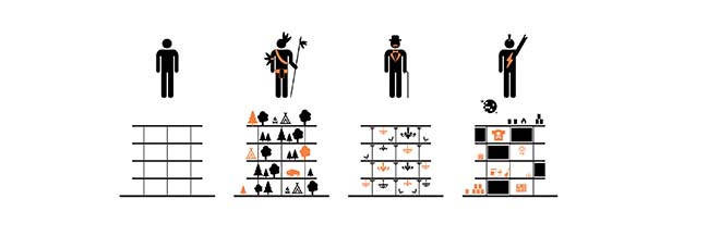
The choice of the analogy between the digital network society and a bustling market place is no coincidence. From kitchens and sports areas to child care facilities, the building’s occupants can find everything that makes living and working both easy and pleasant.
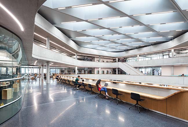
The unique spatial configurations of the interior, achieved by the interlocking double high spaces around the atrium establish an unexpected dynamic atmosphere. Irregularly dispersed, this generates either multi-storey open spaces or more intimate zones for seclusion that meet the set criteria, namely the intermixing of the work zones so as to amplify an agile, communicative atmosphere.
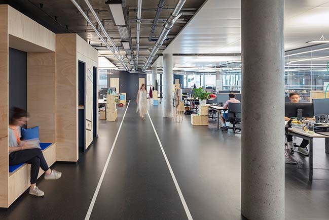
Even during the competition process, it became immediately apparent that the architecture had to create a stage for a versatile “occupation” and convertible use of the building. It is not the office or the individual workspaces that are the spatially defining criteria; rather it is the route by which they are reached that is paramount.
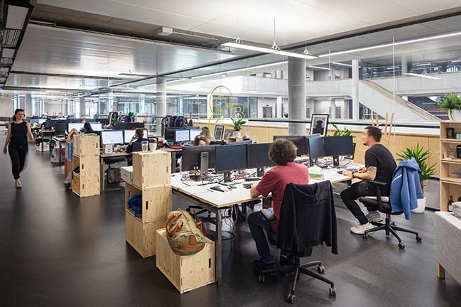
Sustainable office worlds provide flexible communication areas that promote creativity and interchange. The spatial organisation of the offices on the upper floors is deliberately organized with both concentration and interaction zones in order to accommodate the shifting needs of the staff and to meet the differentiated uses.
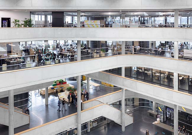
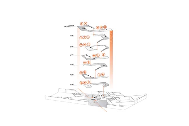
The considerable depth of the building is broken up through the skilful layering of the program, whereby the various functions – from the lobby to the roof terrace – group themselves around the atrium in the form of a double-helix. In the so-called “living rooms”, social interaction is encouraged through varying spaces for exchange such as co-working seating landscapes, kitchenettes with wooden tables and bar stools, a balustrade with space for laptops and a view out over the whole campus. This exchange, and the connectivity between these communal areas on the individual floors, is additionally magnified through the open stairway.
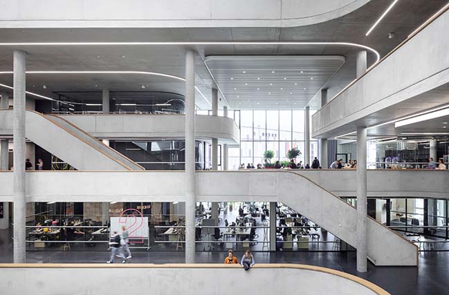
The campus work zones – which are called “neighbourhoods”– can be effortlessly adapted to quickly shifting teams. Besides fixed work stations, areas were conceived in which the staff can find seclusion to undertake concentrated work.
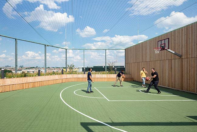
At the same time, opportunities for exchange always stay possible. Radiating from this interactive core, the work atmosphere along the length of the neighbourhood transforms into calm concentration and retreat zones.
The various different office areas are connected by “catwalks”. Inspired by the city’s boulevards and the iconic design of their namesakes, the catwalks structurally interconnect the different areas and enable interactions and networking across all levels by means of meeting zones and encounter spaces. In this respect, it was important that during the competition the Berlin office KINZO joined the architectural design team and formulate the interior-space concept.
The overall atmosphere of openness and transparency, coupled with the wide-scale spatial impact and the various visual relationships (both within the building itself and reciprocally from and to the urban surroundings), allows the size of the building volume to step discreetly into the background. At the same time, the inner structure creates a congenial proportionality for the users, yet nevertheless a flexibility for the constantly shifting functional demands.
YOU MAY ALSO LIKE: New Gucci Headquaters in Milan by Piuarch
YOU MAY ALSO LIKE: Swarovski Manufaktur by Snøhetta


Zalando Headquarters by HENN Architekten
07 / 18 / 2019 The new Zalando Headquarters consists of an ensemble of two buildings that form the heart of the company's new campus in Berlin-Friedrichshain...
You might also like:
Recommended post: House 1413 by H ARQUITECTES
