04 / 18
2023
Architensions has redesigned a townhouse in the Fitzrovia district of Central London, transforming the structure into a seven-story envelope for open space and light...
> Woodsome Road, Mews Houses by The DHaus Company
> The Picture House by NOTO Architects Limited
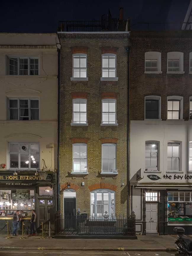
From the architect: Built in the 18th century and originally brought to life as a terraced house, the building is narrow and vertical; such qualities can lend an air of confinement to a structure and make divisions between floors feel stark. The storied nature of the townhouse might, too, be seen as a parallel to the dense and bustling city center in which it is located. Buildings of this sort are common in London, and the young couple living in this one were interested in challenging their home’s sense of spatial constraint and its original hierarchical division rooted in traditional domestic norms. Working with Architensions, they sought to uncover fluidity by facing and playing with the verticality of the house, and inviting qualities of light and openness to occupy more central roles in the space.
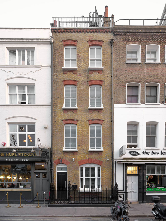
Architectural ideals of Victorian homes were modeled on circumscription and propriety, with functions of rooms being defined by pre-ordained roles of gender and class. In homes that could afford to separate their occupants to such extremes, women, men, children, and servants were kept apart from one another in the interest of bolstering socio-political power dynamics within the home’s private sphere. This history plays a critical role in Architensions’ transformation of the townhouse, as the studio is broadly focused on challenging patriarchal traditions in the interest of designing a more collective and inclusive domestic sphere, a sort of “transgressive domesticity”.
“Since we started to work on the project we felt we inherited the history of the building, the textures as memories of the past, uncovering all its layers but also social constructs, and using them as tools,” says Alessandro Orsini, co-principal, about Architensions’ relationship to opening up the space physically and, in turn, philosophically. “What can we learn from what is already there? Slowly we started to insert our own design elements in dialogue with these histories, the original joists, masonry walls, facade openings, etc.”
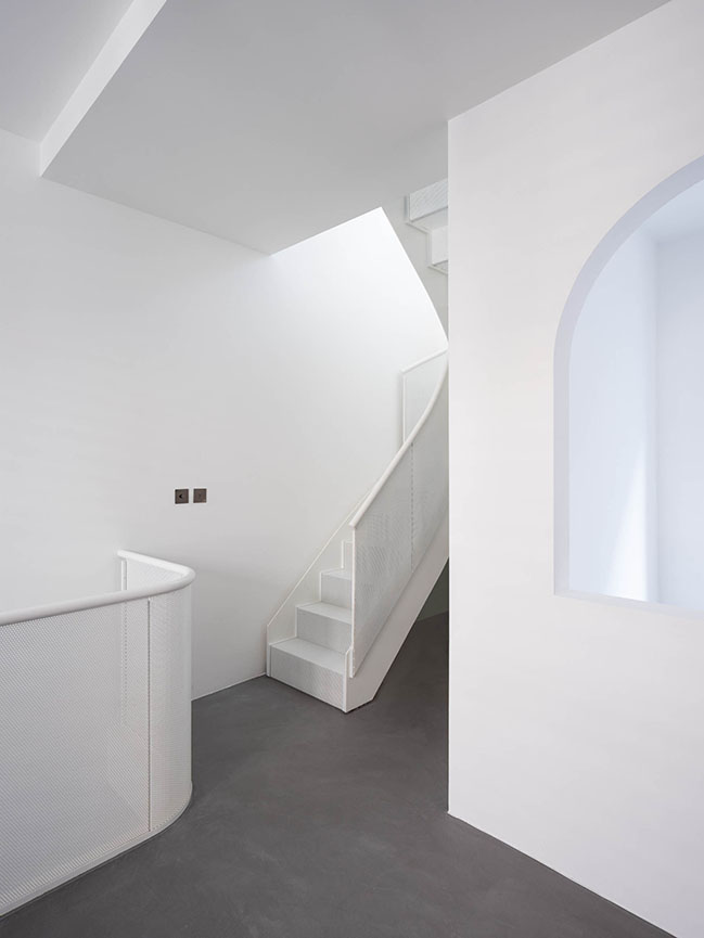
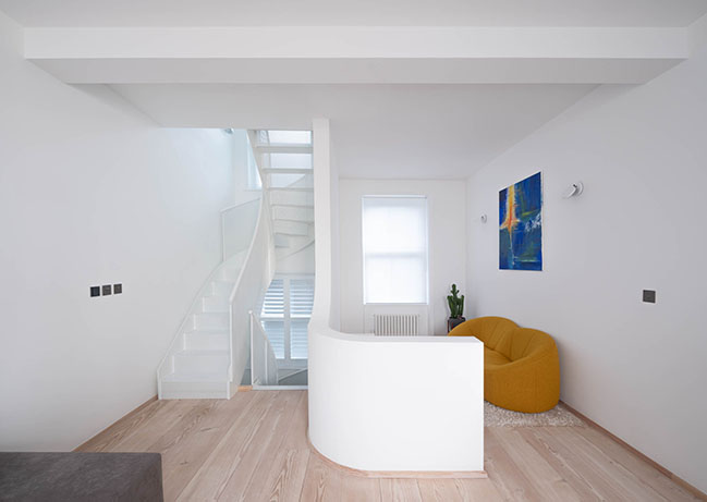
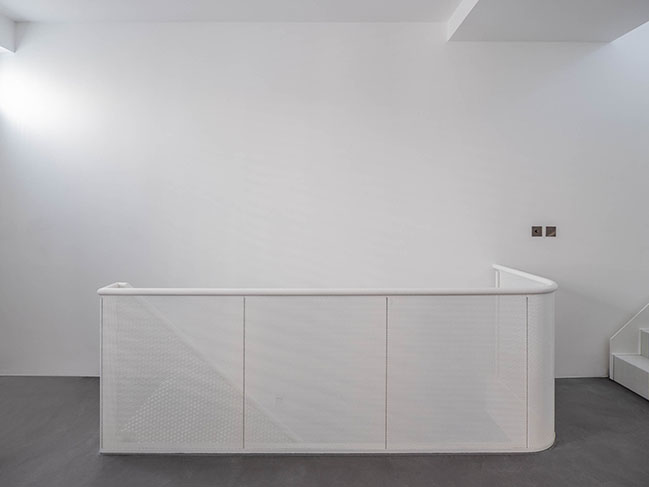
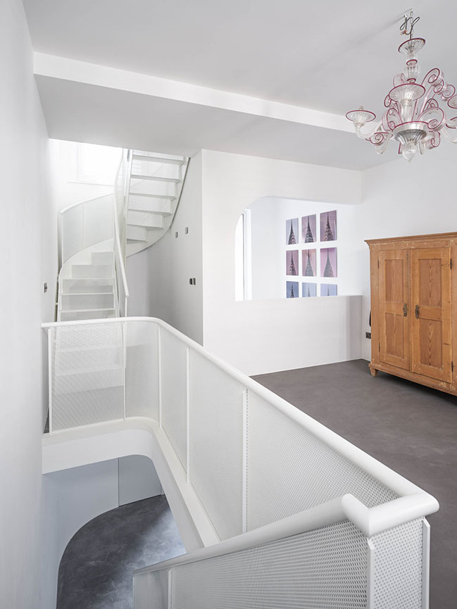
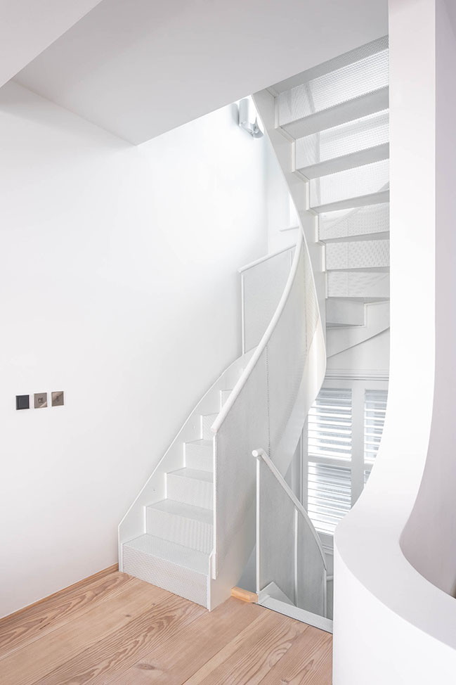
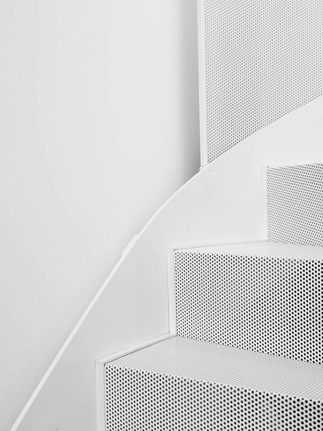
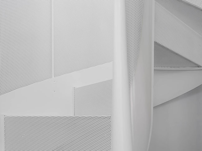
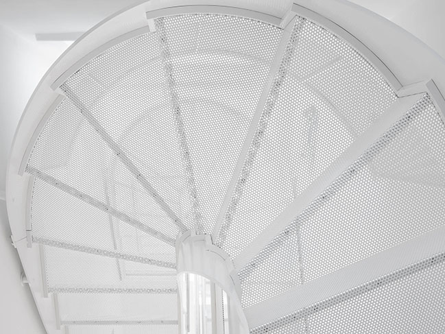
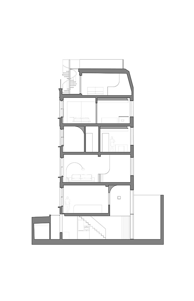
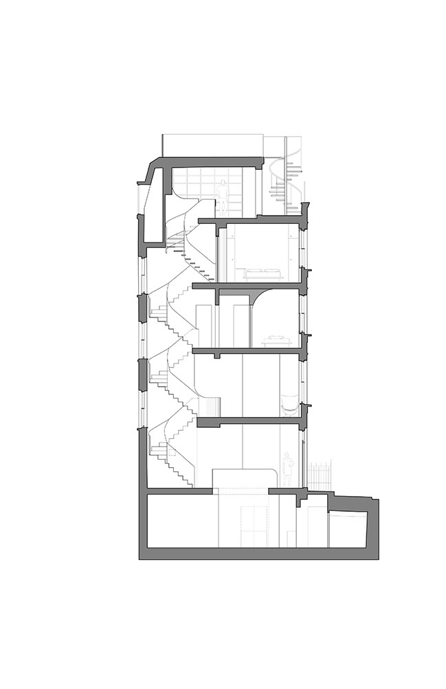
Much of the building’s original envelope was maintained in the design approach to the transformation, with structural changes being primarily internal. The key to these internal updates lies in the presence of a new main staircase, which runs from the entrance level to the uppermost interior floor. The staircase that was present prior to Architensions’ transformation blocked a significant amount of natural light from entering the house, as the building’s southern windows faced directly into the staircase shaft. The newly installed ribbon staircase is made of white-painted, micro-perforated steel mesh, and offers a drastic shift where the presence of natural light is concerned. Now, sunlight that enters through the southern windows is diffused through the stairway’s porous metal, and reflected off of and emphasized by its white color.
“Every floor has a different light condition but all the floors have natural light,” says Nick Roseboro, co-principal. “That was actually the prompt from the client, to maximize the natural light on each floor. The insertion of the new stair allowed us to use the stair shaft’s windows as a luminous element in communication with every floor and in dialogue between history and the new.”
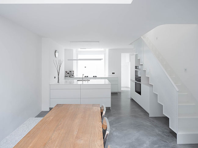
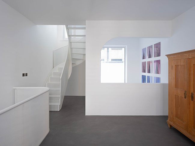
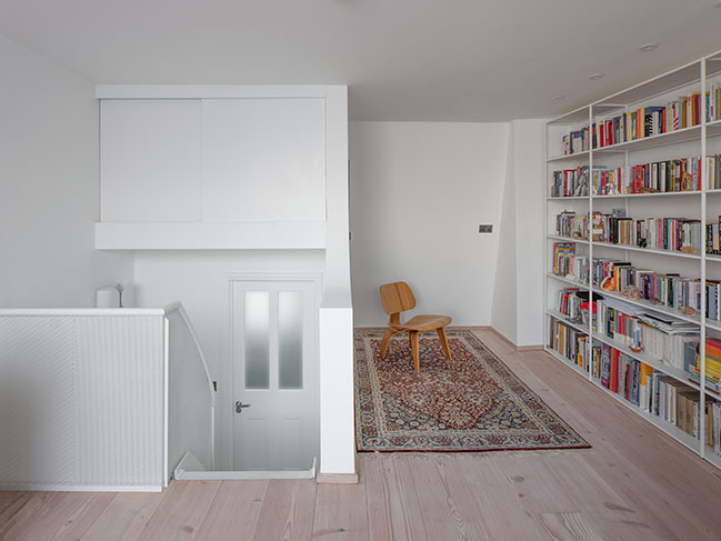
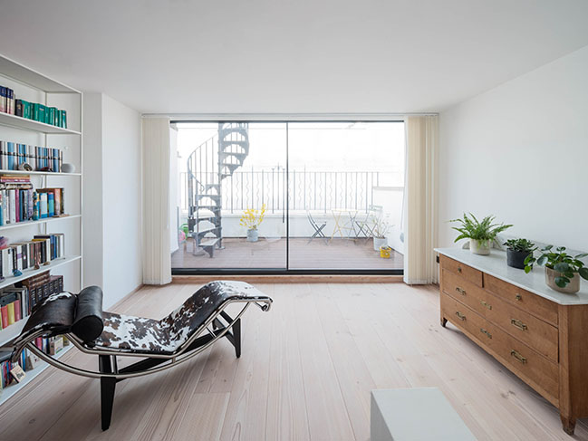
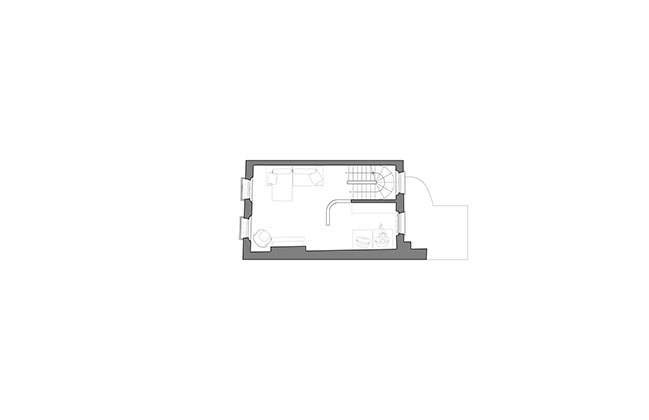
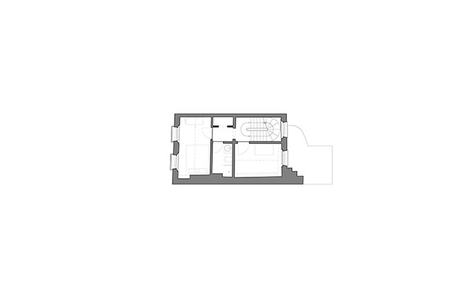
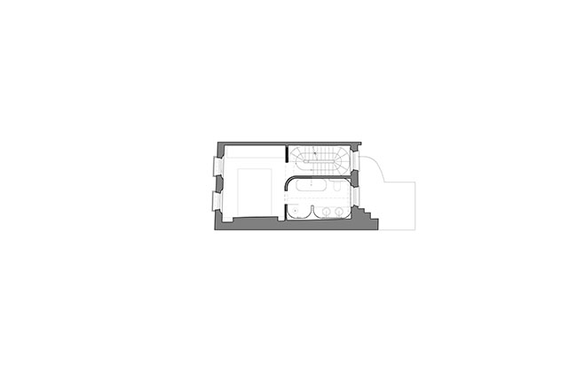
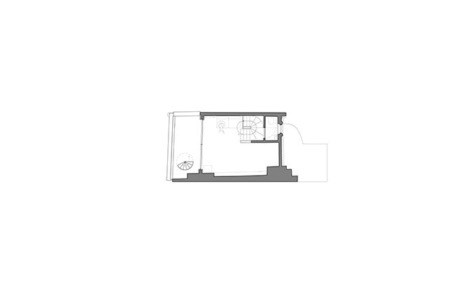
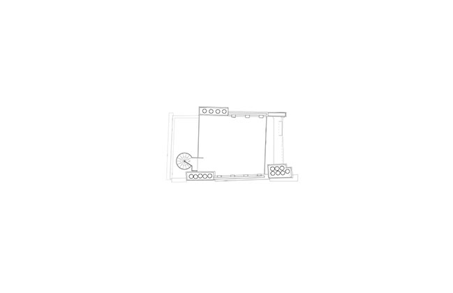
This main, continuous staircase not only offers a welcome brightness; in its steel materiality it grounds the home, and in its vertical continuity makes a statement about the structural and aesthetic roles it plays. As a fluid artery connecting the different functions of five floors, the staircase adds an element of commonality that allows to unfold the kind of transgressive domesticity that Architensions aims to achieve. Above the entrance level, the first floor houses a living room and tucked-away reading area, while the second has a guest room and study. On the third is a private, main bedroom, above which is located a library. Through a seamless sliding glass door on the fourth is a front terrace with an exterior staircase leading to a rooftop.
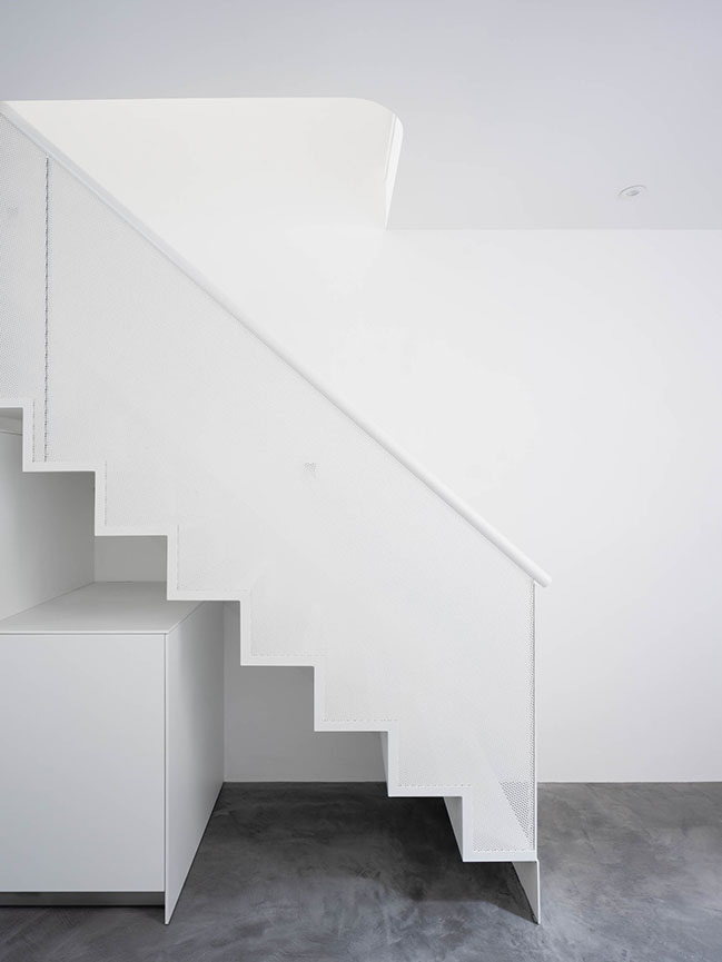
In the interest of creating a sense of expansive openness within the building’s verticality, Architensions worked to make living spaces as open as possible, avoiding sharp angles and harsh divisions between areas. This continuity between floors by way of the internal staircase is essential to the pursuit of openness and the transformation of the original spatial fragmentation. The stairs also function as a piece of furniture that the clients can use for casual seating—they might sit on a stair at the entrance level and take off their shoes before ascending to one of the upper floors, or catch a bit of warm daylight while resting on a step before one of the southern windows.
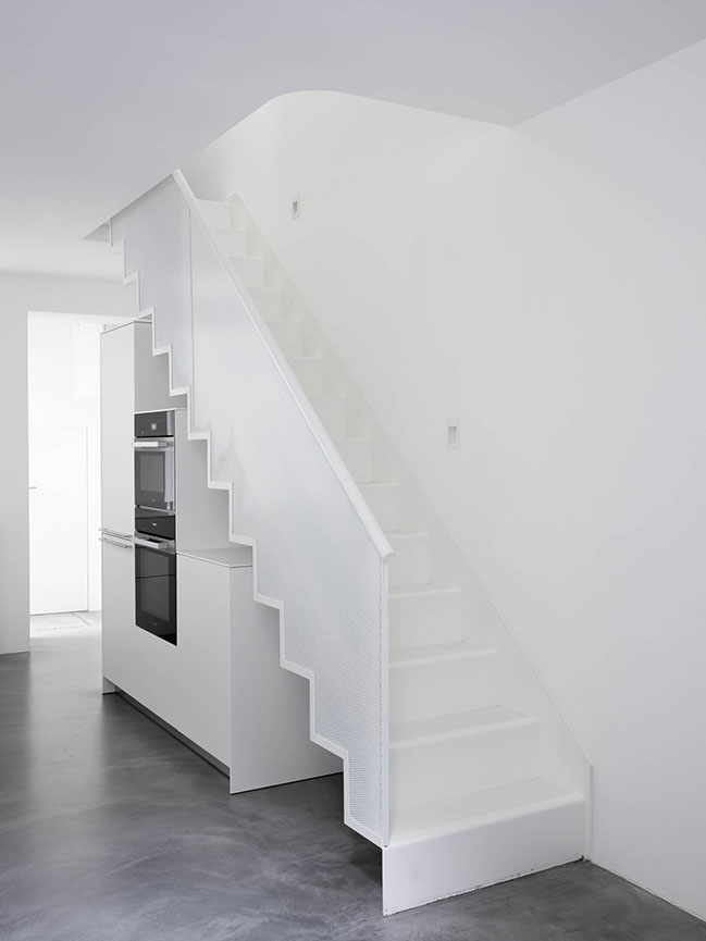
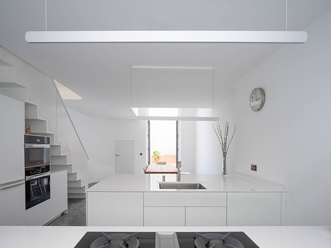
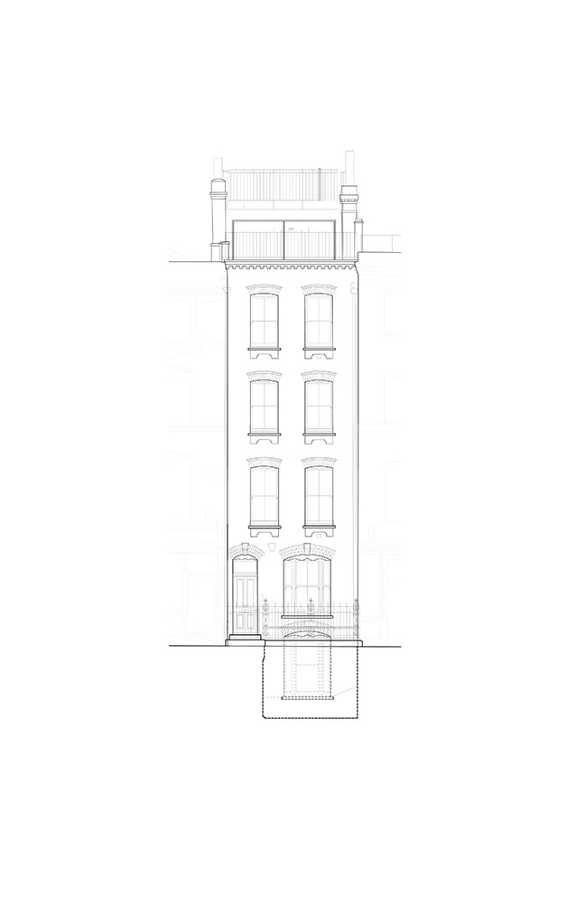
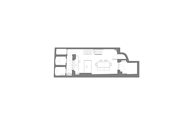
Changes made to the basement also exemplify the prioritization of light in the transformation. Down a new straight set of stairs, which begins at the entrance level, one finds the basement area, containing the kitchen and dining room, brightened by way of an outdoor courtyard beyond the dining area in back, and a glazed rear façade running from the basement to the entrance level. Meanwhile, an opened-up areaway, previously an outdoor space exposed to the elements, has been merged with the basement to illuminate the kitchen, and represents Architensions’ only alteration to the original envelope of the building, which was realized through the studio’s close collaboration with London’s Landmark Commission.
Architect: Architensions
Location: London, UK
Design Team: Alessandro Orsini, Nick Roseboro, Annalaura Pinto, Jihye Son
Structure: Format Engineers, James Solly
Acoustics: Sound Matters, Fabrizio Filippi
Photography: Michael Vahrenwald/ESTO

Architensions Designs Townhouse of Seven Stories in London
04 / 18 / 2023 Architensions has redesigned a townhouse in the Fitzrovia district of Central London, transforming the structure into a seven-story envelope for open space and light...
You might also like:
Recommended post: Little House by mwworks architecture+design
