04 / 22
2020
The apartment was a very true to its time postcard from the 50's. An ugly tile and granite fest spreading through too many tiny bedrooms...
Architect: Egue y Seta
Location: Girona, Spain
Year: 2019
Area: 172 sqm
Team: Daniel Pérez, Felipe Araujo, Covadonga Díaz, Marta Elizagaray, Diana García, Maria Escobar and Mireia Lucas
Builder: Zuñiga Construcción
Photography: VICUGO FOTO
Project's description: One could say their cozy flat in Barcelona had it all, square meters, charm, views and location, but guess what, she always thought it lacked something all the same. He would tell her “you can´t have it all”, and she would explain that it wasn´t a matter of having it all but rather a need of “putting her finger” on whatever was what she was lacking.
The matter would haunt her whenever it could: Picking up the kids from the umpteenth after school activity of the day or whenever she would log into that real state app to kill some time and for sport.
Any given Sunday, as they were returning from Girona, before leaving the station, as they were waving her in-laws good-bye, it suddenly hit her: that flat is not lacking an ensuite bedroom, neither hardwood floors nor an open plan live-in kitchen…What your home is missing is a good pair of grandparents. Her husband said he didn´t know one single designer who could design one of those and they had a good laugh. They forgot the whole thing until destiny managed to put the issue back on the table (or in his mobile screen).
—Doesn´t your mom look great in this photo? She seems to be into selfies and all...¡How sweet¡
—I know, but... C´mon babe!... Look closer... That´s not what im want to show you…
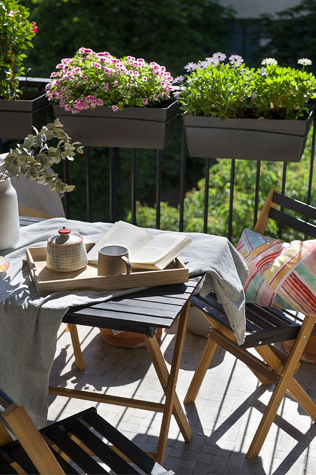
—What then? Is it the geraniums? Oh, that´s right¡ These are the ones we brought that weekend we... Don´t they look just fab right there in the balcony?
—Yes, darling, but please, focus...
—How about you just tell me what it is exactly that i need to be looking at?
—The sign!!! Right behind her. Hanging from the neighbour’s balcony handrail. Look! It says “FOR SALE”.
—It does...
—“It does”? Is that all? Didn´t you say this place was lacking grandparents? That the baby sitter, the summer camp and the umpteenth afterschool were draining us out?
—I did, but… That flat… who knows… I know we´d have your parents next door, but that flat might be lacking all the rest.
—C´mon! Same building, same floor… It can´t be all that different from my folks’… It´s like three times this… my three brothers and i grew up there…
—I get it, Hon, but… I´m not sure I’m following… Are we to quit our jobs here and look for something there? Is that what you have in mind?
—We might not have to…We might as well come and go… Commute…
—Hundred and something k´s, Darling! Over two hundred each day… I´ll say no more.
—With AVE is just over half an hour... I, myself, within Barcelona, driving through the jam at la Diagonal… spend way over that.
—I know, but… that´s an awful lot of money, isn’t it?
—Not necessarily. There are monthly passes that… Price of housing there, compared to renting here…I mean… At the end it might all be roughly the same or even less… The baby sitter, summer camp, the umpteenth afterschool activity, remember?
—So much for that, but… we´d need to give it a spin, wouldn´t we? Wouldn´t that be like a huge renov?
—It might… or not… But in that case i do think i know a couple of designers that could help us with that…
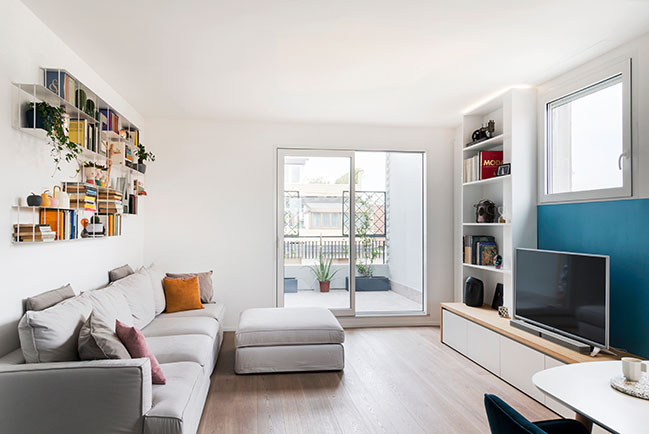
The apartment was a very true to its time postcard from the 50´s. An ugly tile and granite fest spreading through too many tiny bedrooms, all filled up with tons of dark and heavy wooden classic Spanish furniture. Not all was so “black and white” though. The place, despite its excessive partitioning, had all together a very generous size, and nearly every room looked over nice views bathed in lots of natural light.
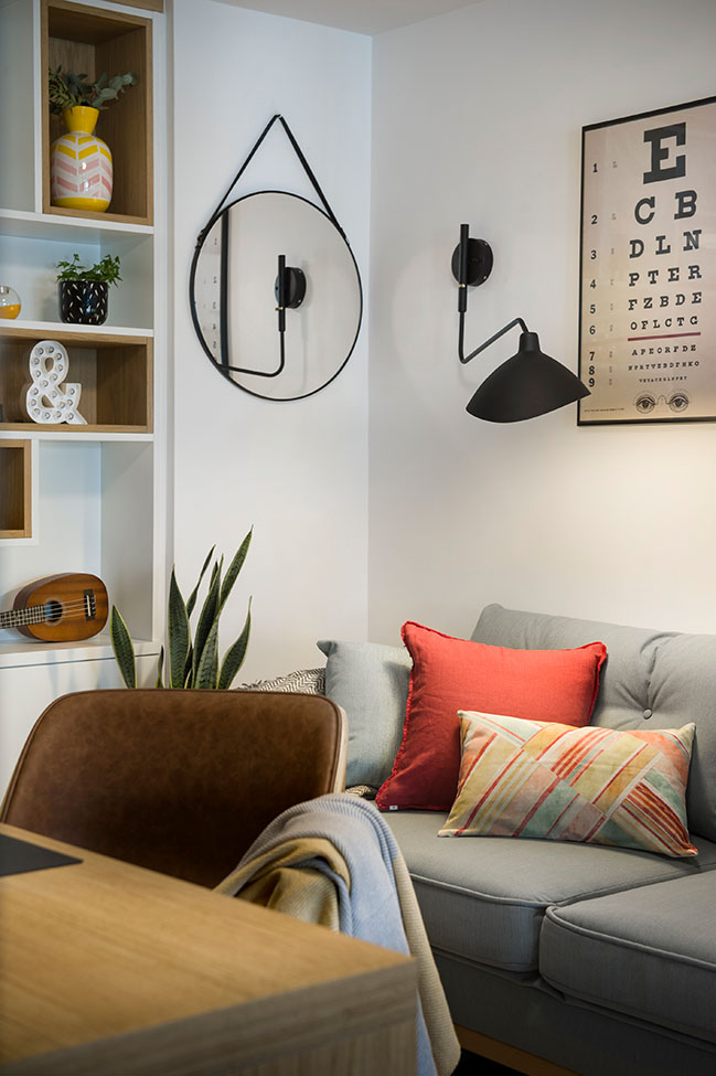
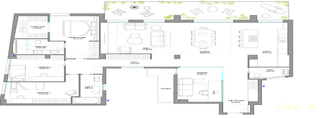
The task then consisted in stripping down all ceilings and floors while re-thinking the location of most walls, according to current life-styles.
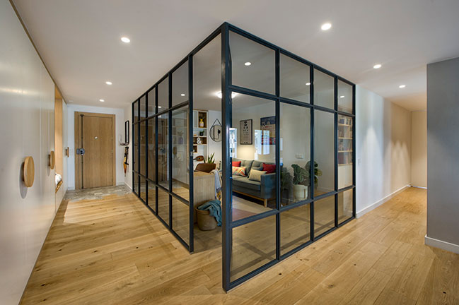
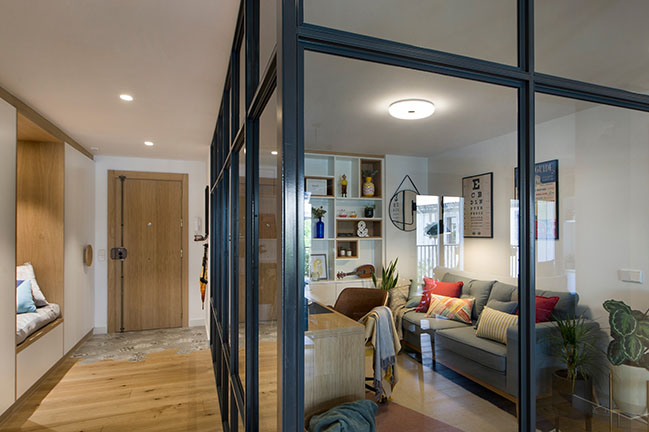
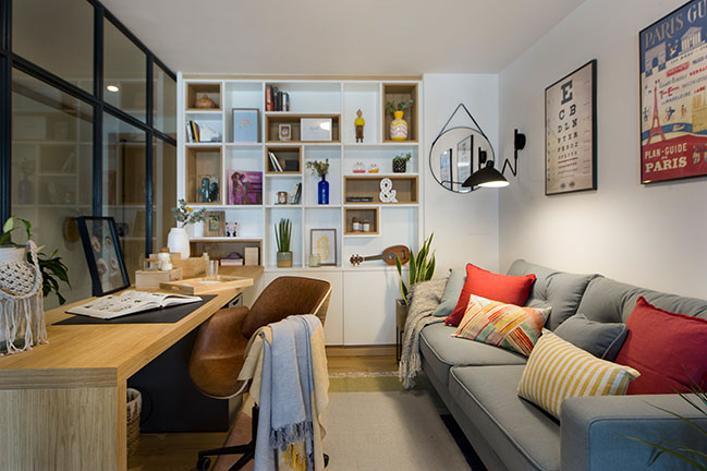
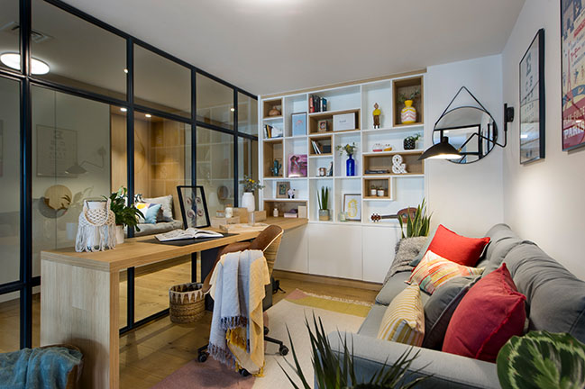
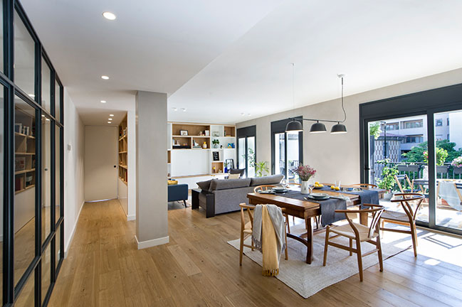
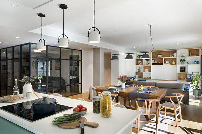
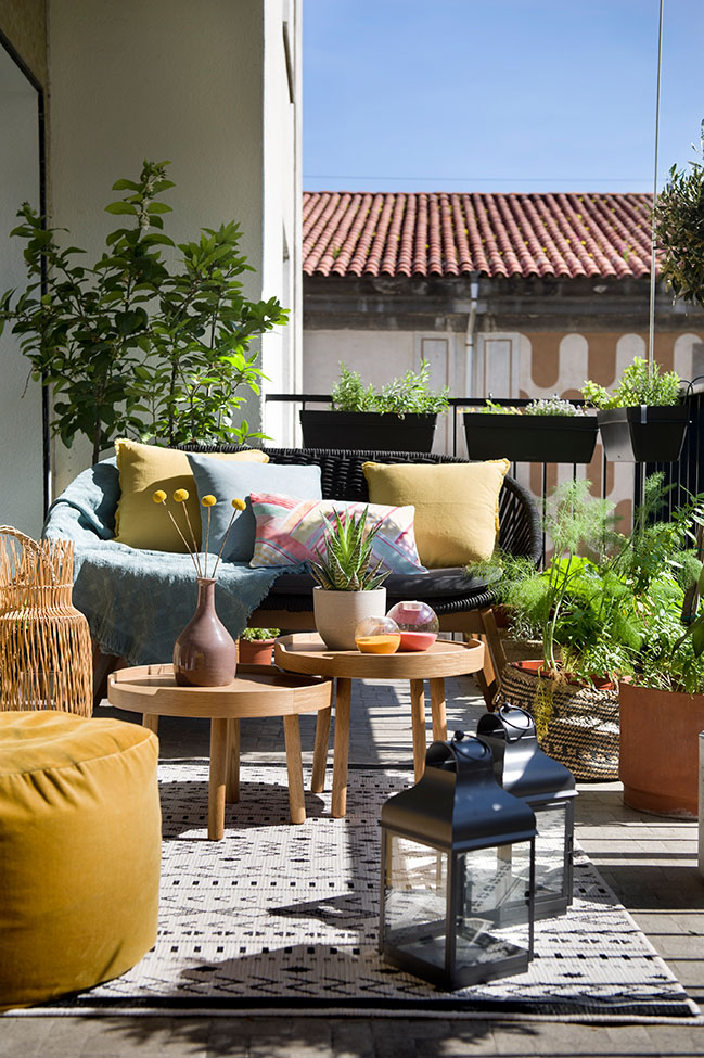
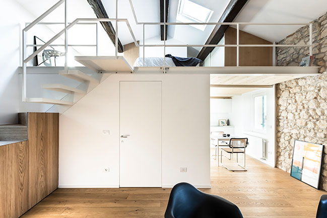
There, were an oversized laundry room use to be located, we ended up setting a home-office behind crystal walls. When its curtains are shut, it turns into a guest room. When these are open it allows you to work while enjoying the light and views coming from the dining room and its balcony – terrace.
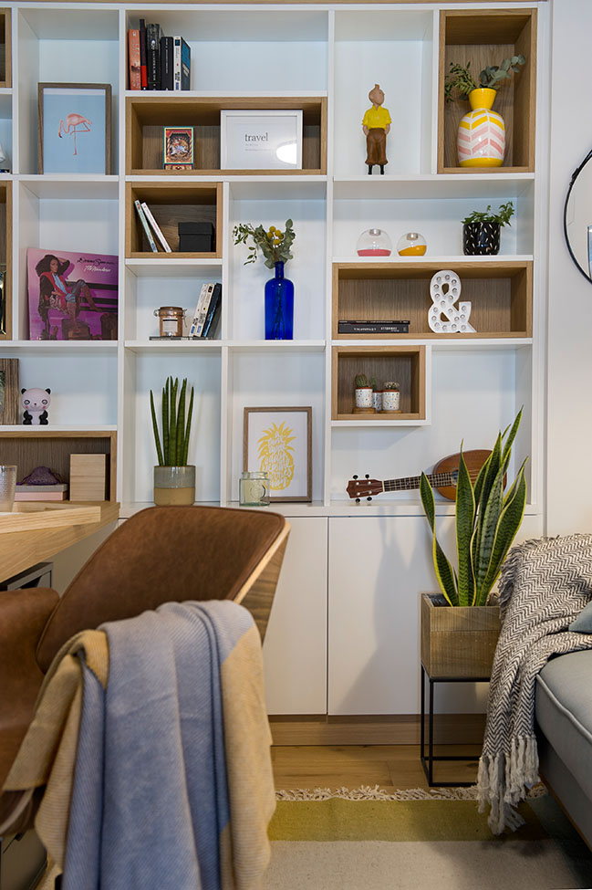
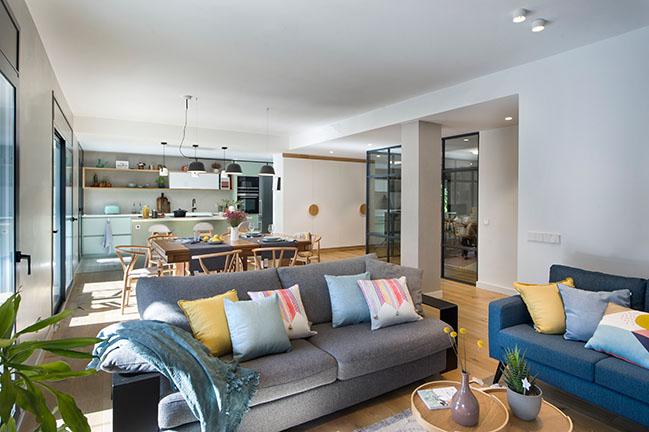
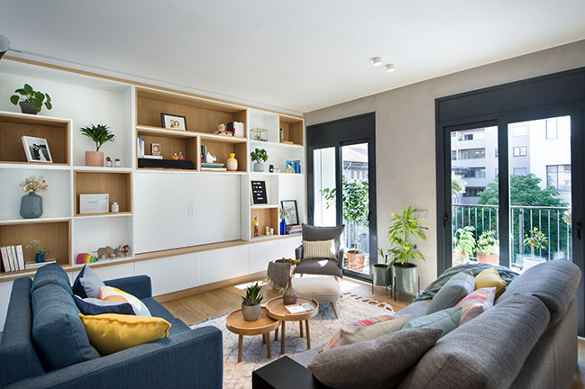
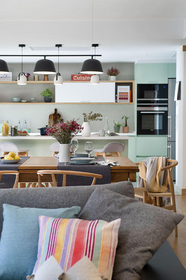
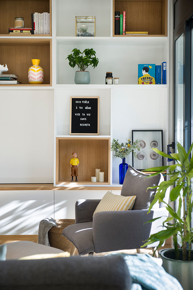
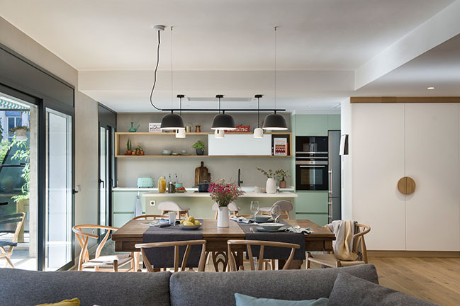
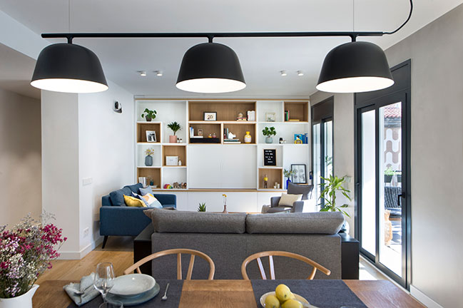
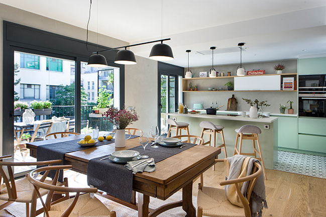
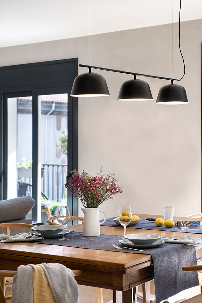
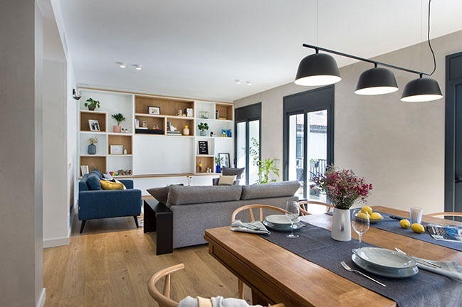
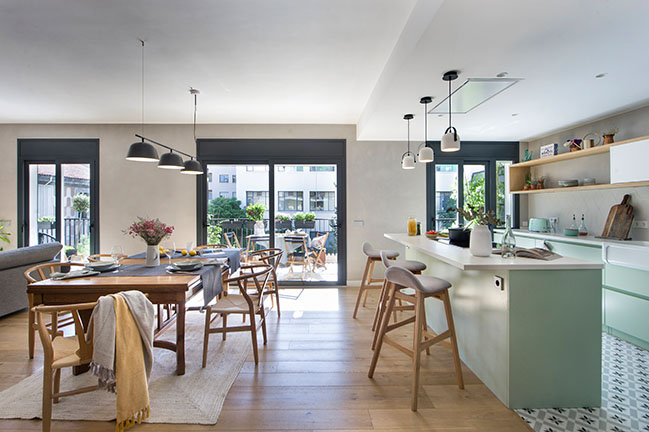
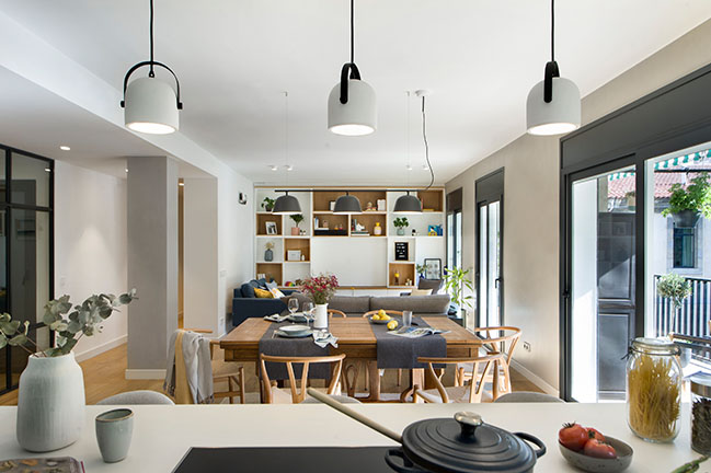
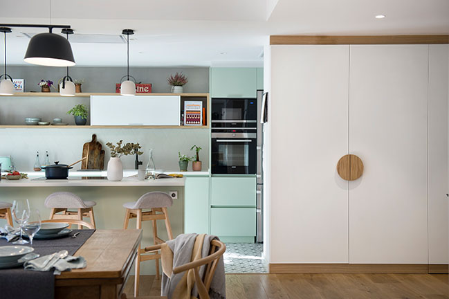
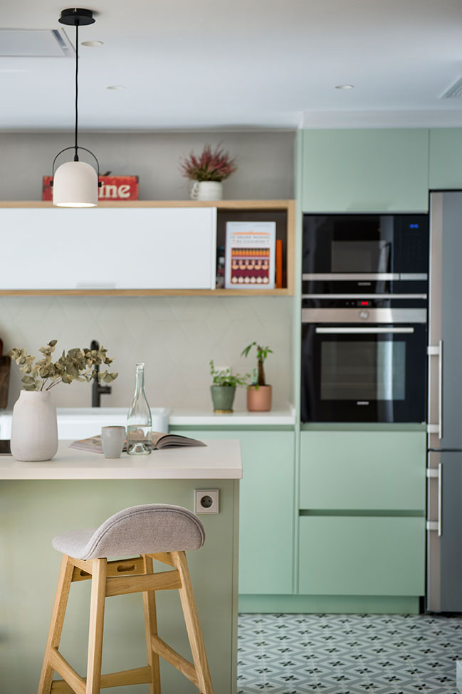
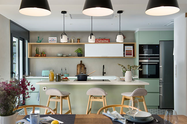
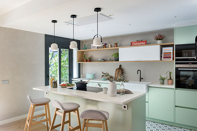
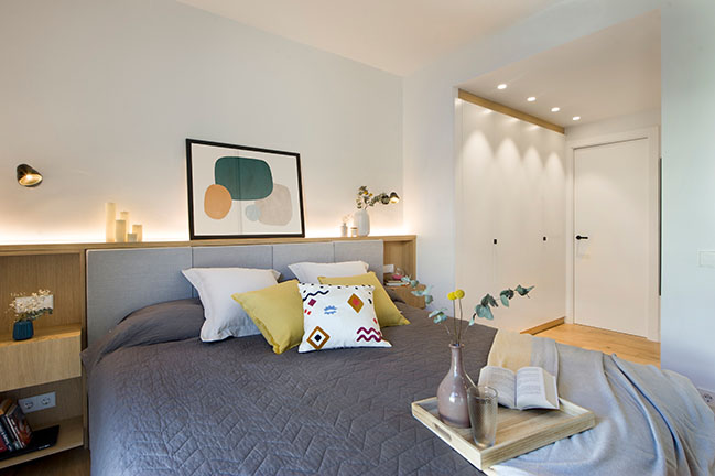
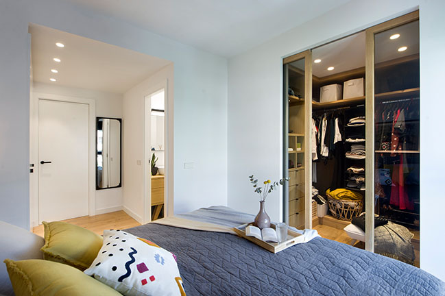
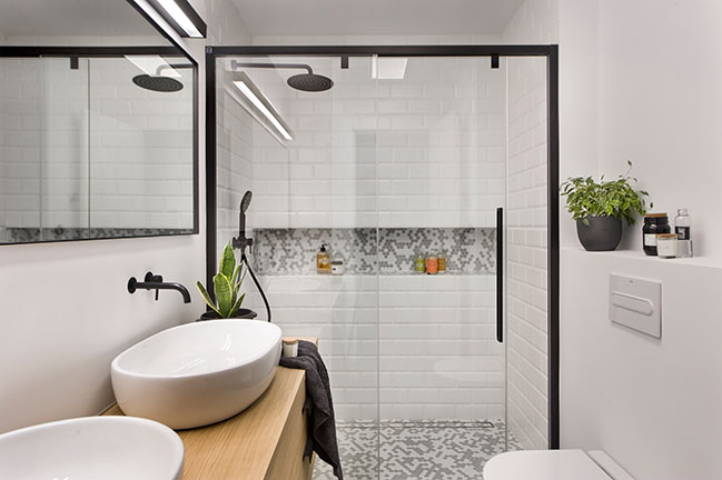
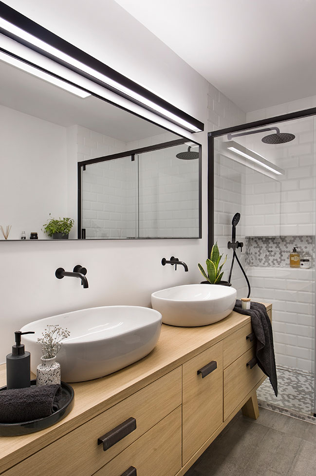
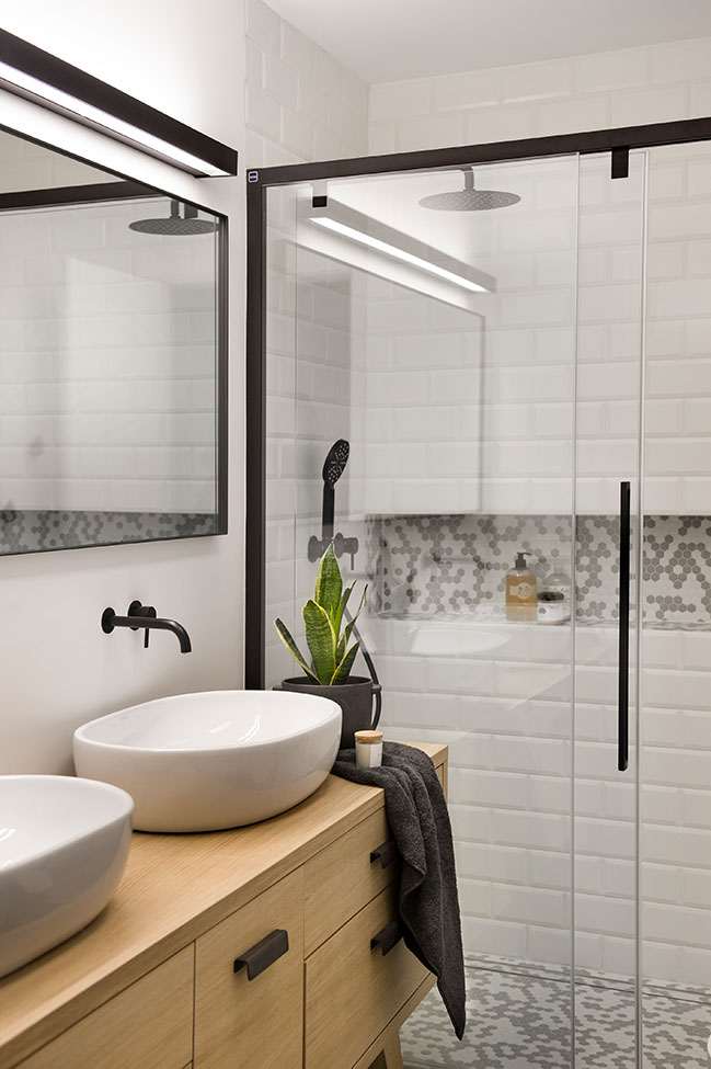
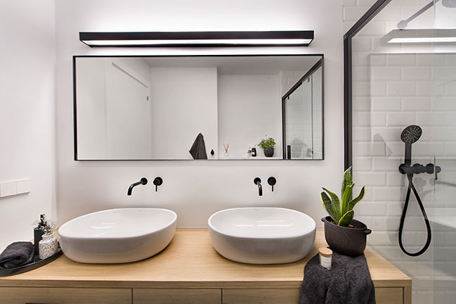
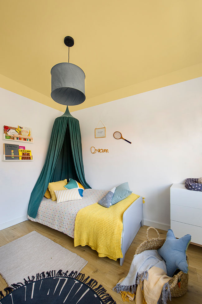
Three formerly small bedrooms were merged into a generously sized quite happening living-dining-kitchen space that also integrates to its layout the surrounding circulation spaces in order to make it look even bigger and more extroverted. Inside, within the more intimate half of the unit, two of the original bedrooms provided the square meters for the new ensuite masters bedroom including a walk-in closet and double sink bathroom. Right next to it, the former clothes line patio saw its windows isolation properties upgraded so it could be turned into one of the children´s bedrooms.
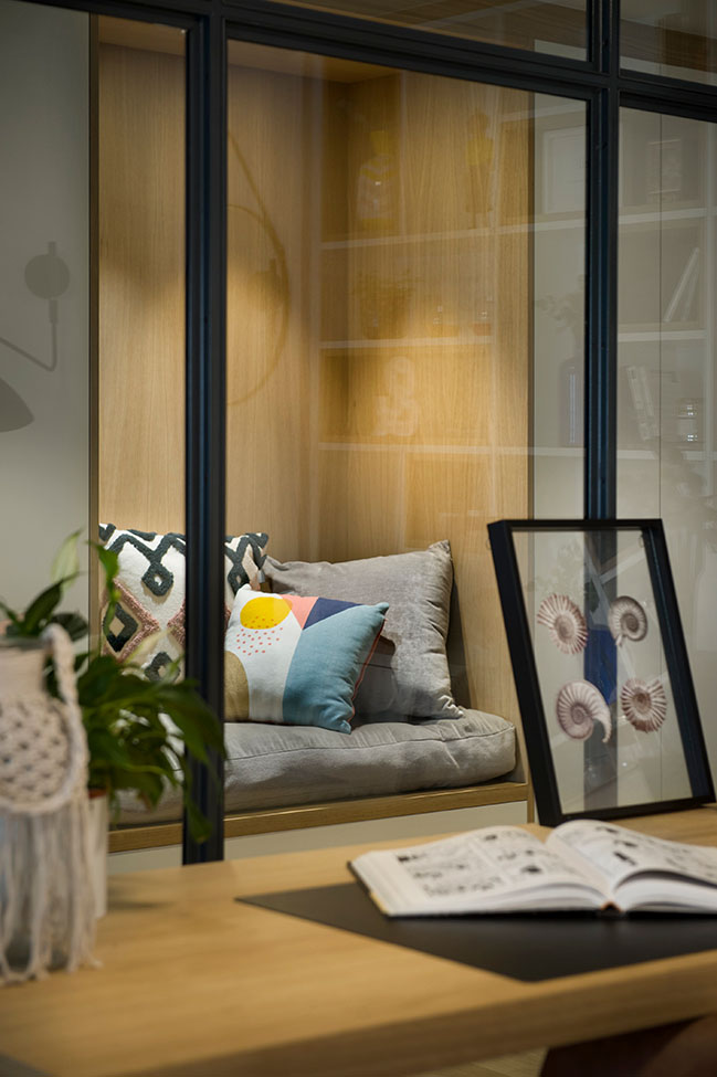
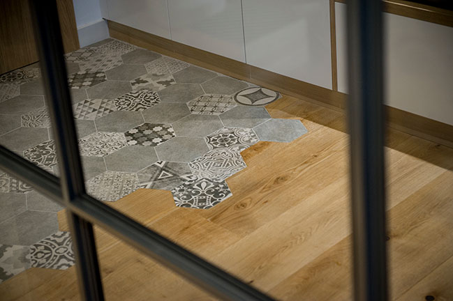
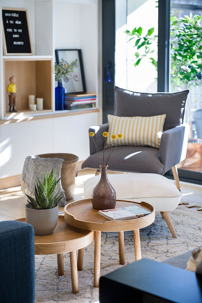
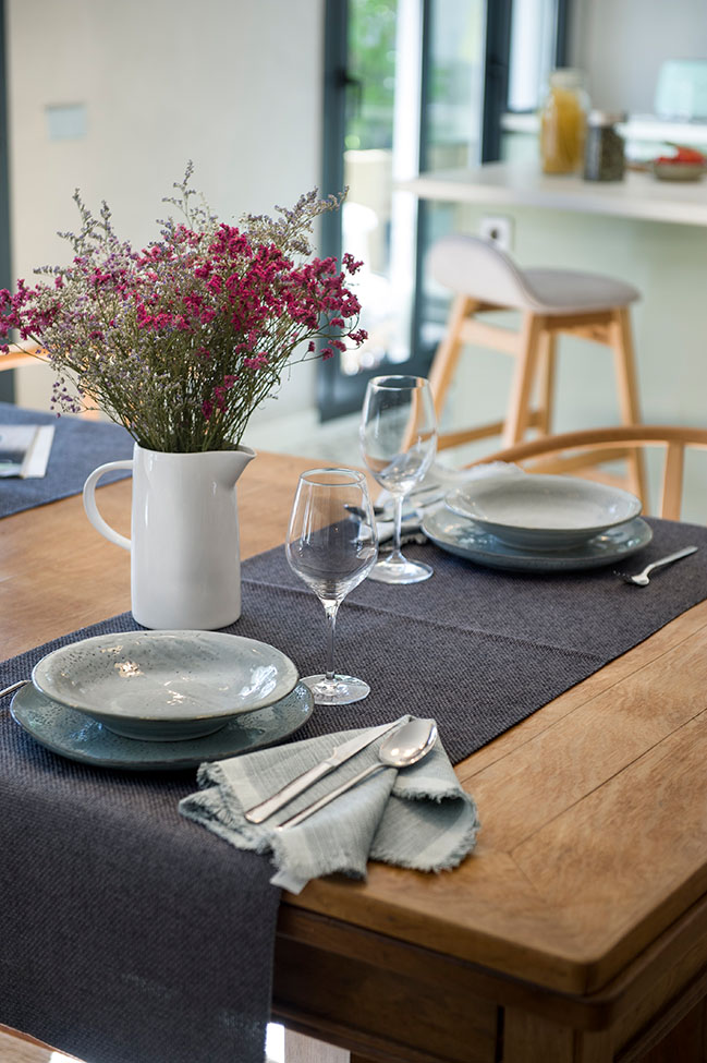
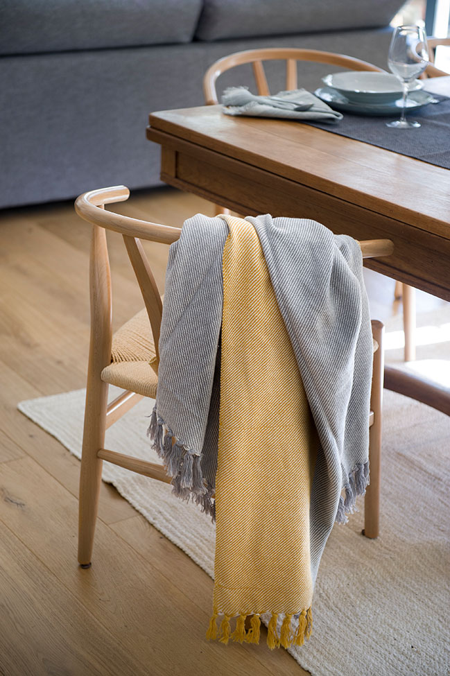
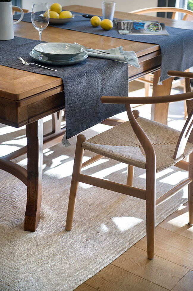
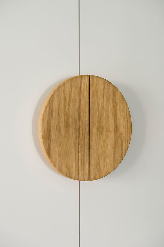
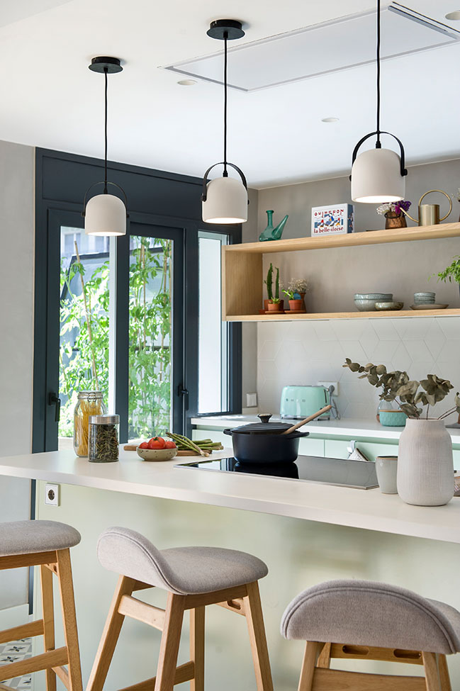
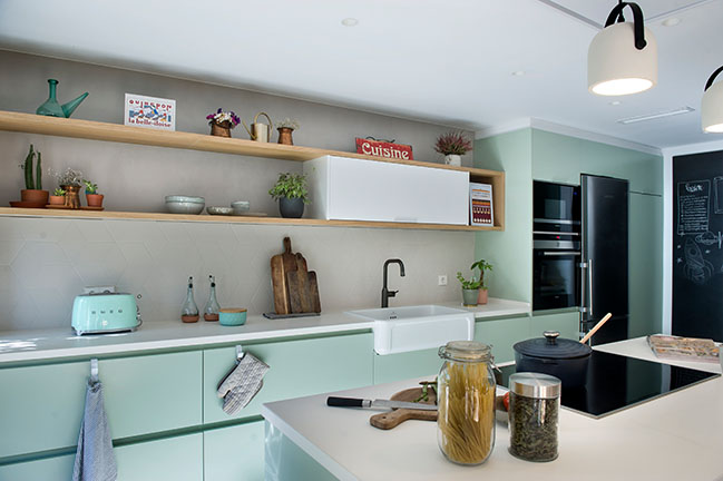
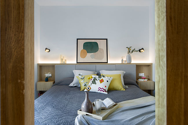
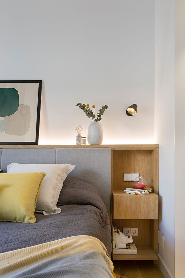
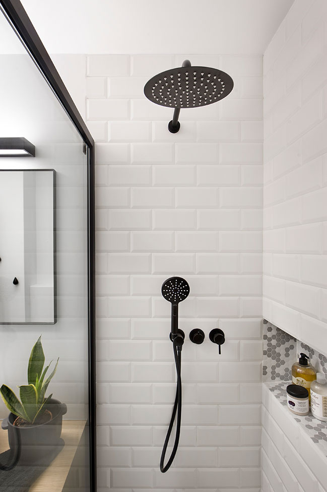
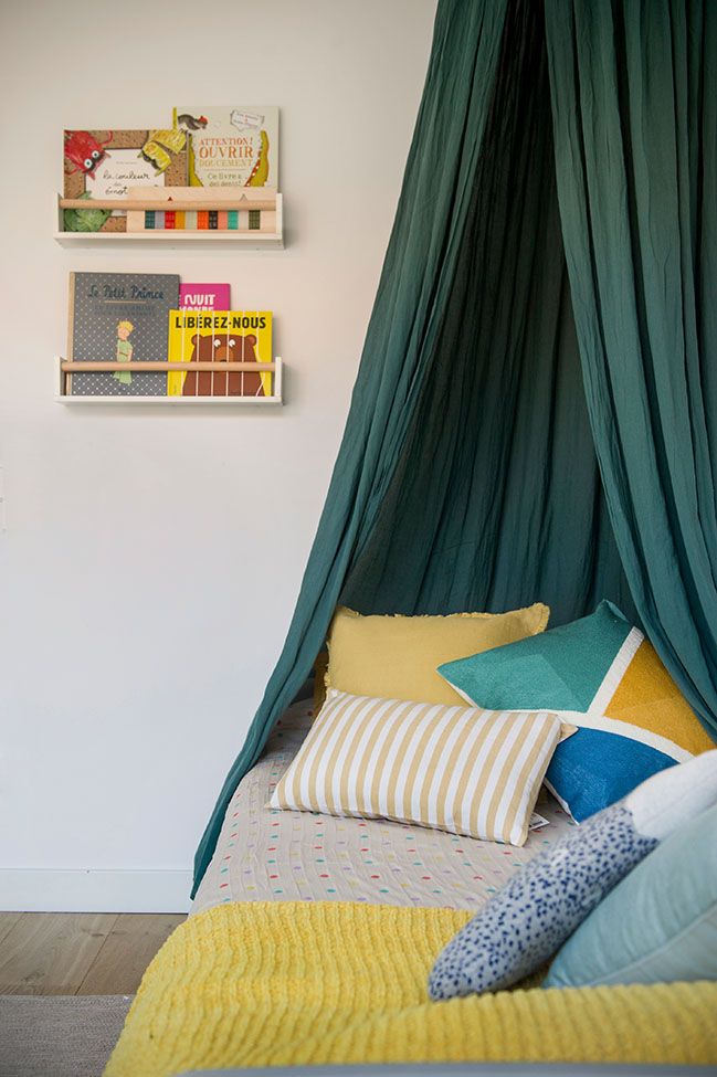
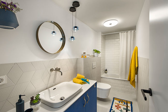
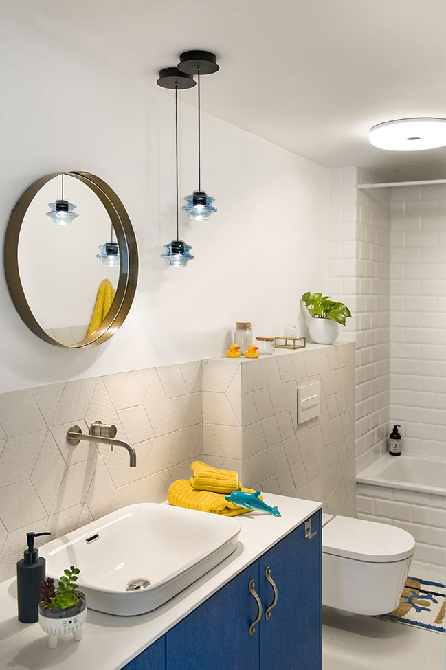
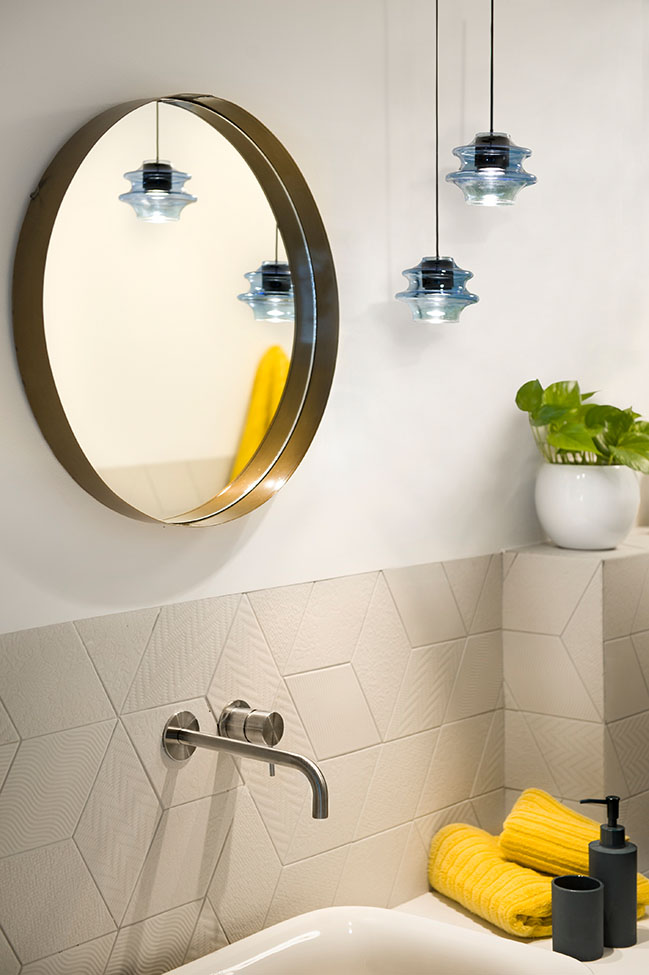
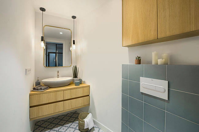
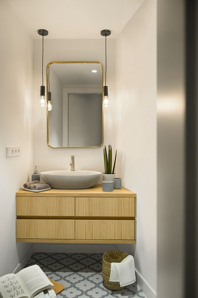
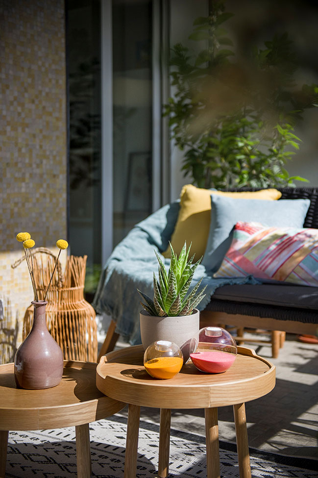
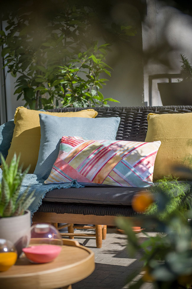
Style wise, the choices combined little by little the needs of warmth and lightness along with those hints of colour, pattern and texture clients wanted to incorporate within their new relocated home.
There is however, in this home, something extremely precious and valuable that photos cannot convey. Something even better than the fanciest covering or the most famous furniture piece. In this place there are grandparents you can´t possible “design” or replace for better ones for they turn any place into a home just by being there.
There are those who have good neighbours, and can therefore consider themselves very lucky. But those who get to call the next-door lady “mum”, are definitely the luckiest of them all. That´s worth commuting, teleworking, moving and renovating… For everything is little when compared to the chance of truly “going back home” at the end of each day.
YOU MAY ALSO LIKE: Private Sunset by Egue y Seta
YOU MAY ALSO LIKE: The Traveler's Refuge by Egue y Seta
YOU MAY ALSO LIKE: 46sqm studio apartment in Poblenou by Egue y Seta
Back Home by Egue y Seta
04 / 22 / 2020 The apartment was a very true to its time postcard from the 1950s. An ugly tile and granite fest spreading through too many tiny bedrooms...
You might also like:
Recommended post: Topo House by Martin Dulanto Arquitecto



![Modern apartment design by PLASTE[R]LINA](http://88designbox.com/upload/_thumbs/Images/2015/11/19/modern-apartment-furniture-08.jpg)


