07 / 06
2017
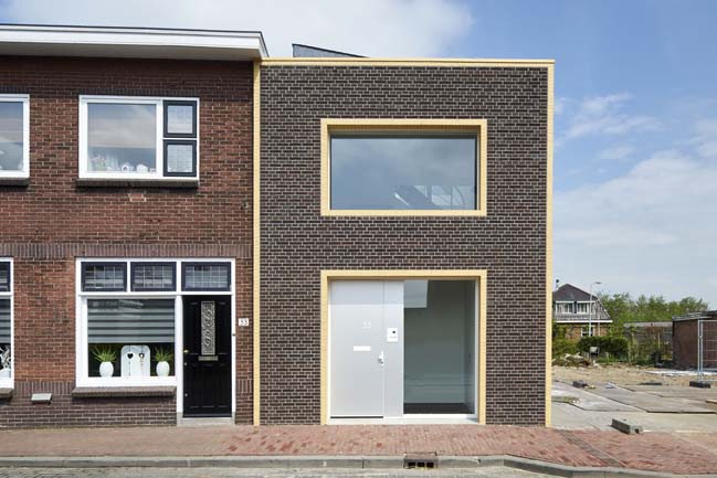
This house has completed by RV Architecture for a retired couple who want the house with the blending in a new contemporary house into this complex historic setting of the Tolstraat.
Architect: RV Architecture
Location: Meerkerk, the Netherlands
Year: 2017
Area: 180sqm
Lead Architects: Ruud Visser, Fumi Hoshino
Photography: René de Wit
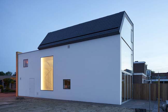
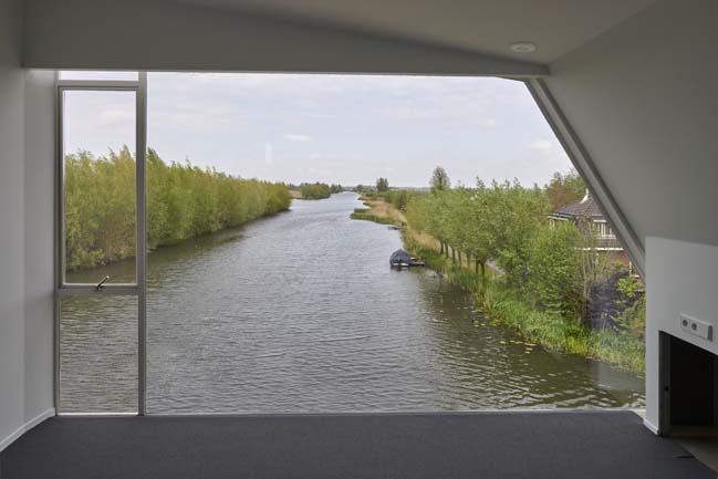
From the architects: The lady of the house grew up in the former house on the same lot. For her this is a location filled with memories. One of her favourite things was the beautiful view on the backside of the house, almost invisible from the front.
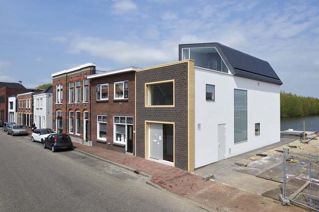
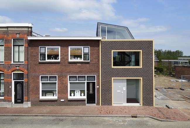
The facades of the buildings in the Tolstraat are lined-up very strictly lengthwise to the street. In this way forming a compact wall of individual façades. The entrances of the houses are directly on to the street, making it look like a shopping street of a medium-sized town. Yet at the same time, the Tolstraat feels slightly disorganized. This gives it its rural atmosphere. Small volumes and elements have been built up the houses during the cause of time. Making it a mix of 'variegated concatenation' of annexes, sheds, roofs and fascias.
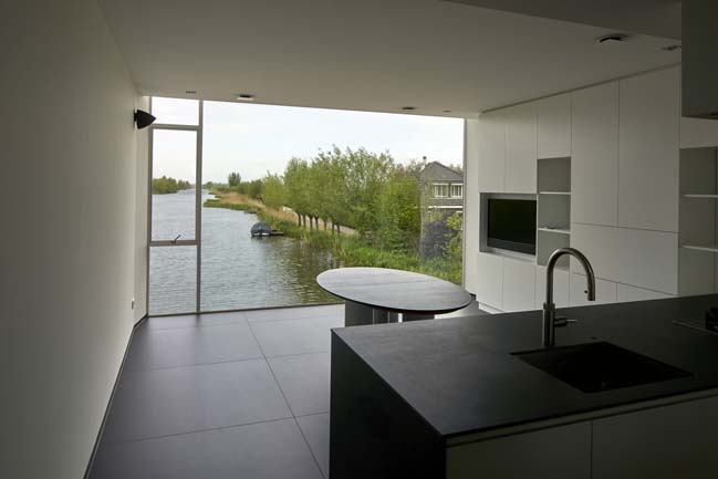
The back of the lot is situated along a nature reserve called 'De Zouweboezem'. This is a 700-year-old excavated water-reservoir to aggregate the water from a huge area. From De Zouwboezem, the water is pumped into the rivers by windmills. The windmills now long have disappeared, yet once there were as many windmills on this location as on the famous Dutch 'Kinderdijk'.
The main challenge in this project consisted of 'how to blend in a new (contemporary) house into the complex historic setting of the Tolstraat?'
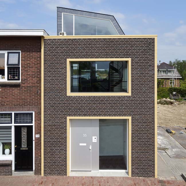
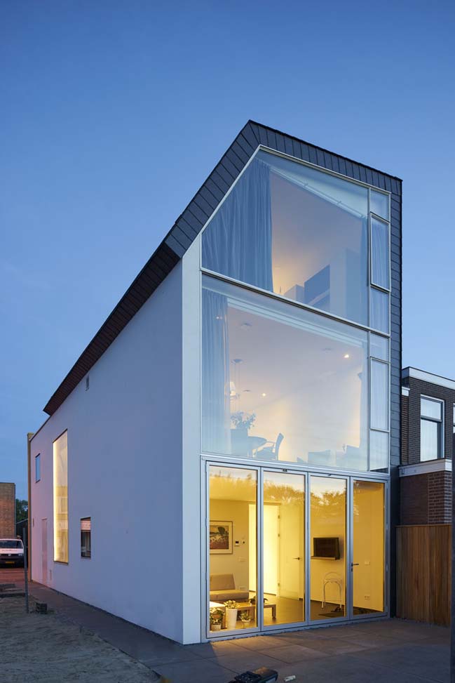
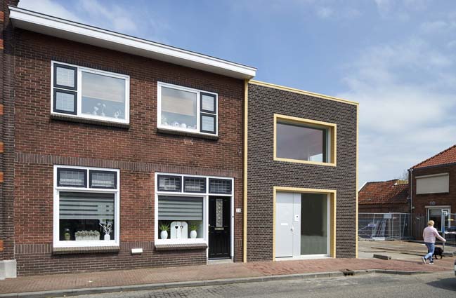
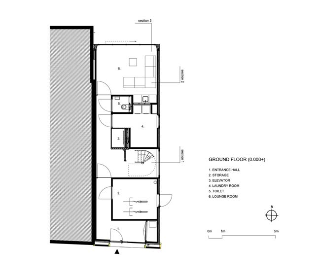
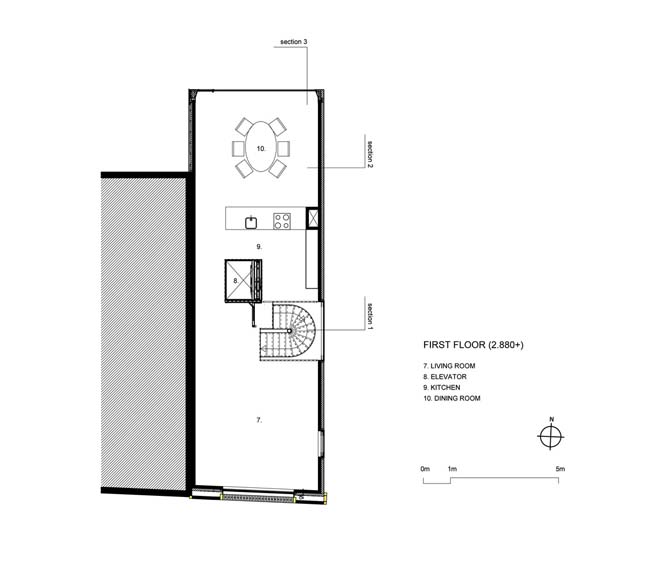
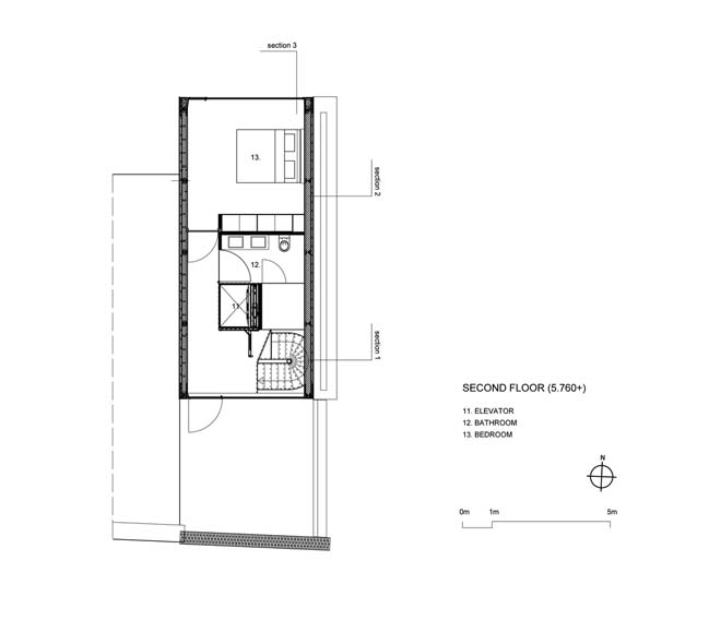
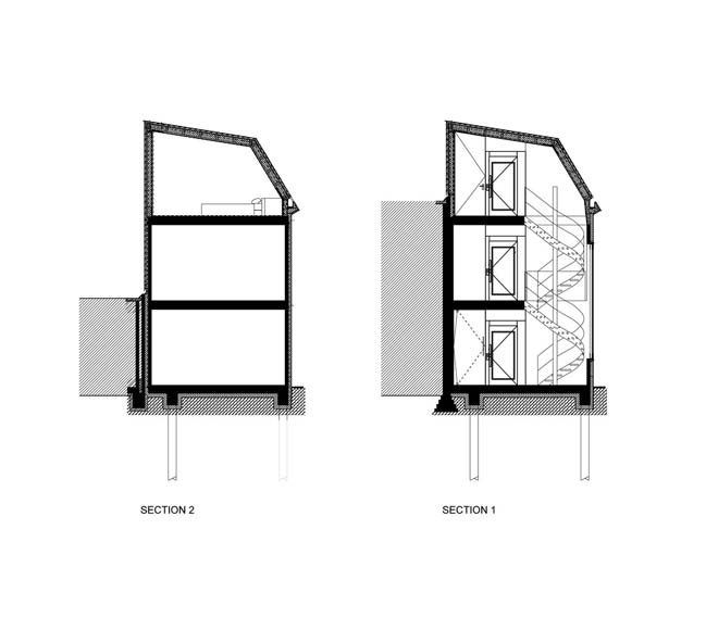
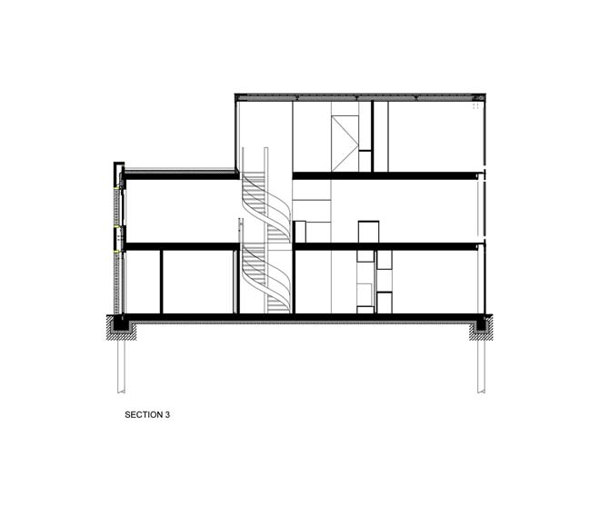
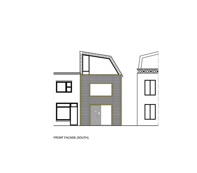
We decided to work with the local village character of the street by not approaching the house as a single stand-alone object. we divided the body of the house into three distinct parts. Every part is made of a different material, each already to be found in the adjacent facades in the Tolstraat.
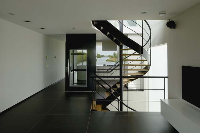
Part 1: The brick front-façade along the Tolstraat.
Like the adjacent façades we opted for a sham façade. The colours of the bricks we used (red-brown and yellow) are exact copies of existing façades in the street. Yellow and orange bricks were used in the early 1900th as ornaments around the windows and as horizontal lines in the façades. This adds 'a scale between the scale' of the street and the cluttered village scale of doors, annexes and fascias. In our concept we decided to use this in-between scale in a wayward and contemporary way.
Part 2: The white plastered sidewall.
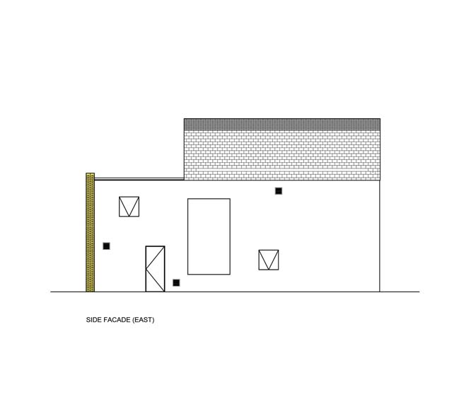
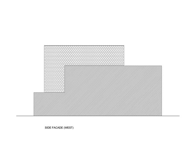
The white plastered sidewalls are commonly used in the street to prevent small alleys to feel dark and unfriendly. The lot adjacent to the house now is open but eventually a three-storey apartment building will be built here. With the white plastered sidewall we take into account that the future alley will be friendly and bright.
Part 3: The grey slate roof.
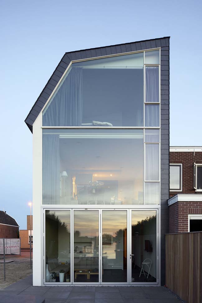
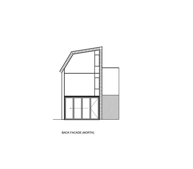
The height of the coping and the roof-gutter was limited. The regulations were fit for a gable roof on top of two stories. That's why we shifted the roof. The coping is on the dividing-wall, the gutter on the adjacent wall of the neighbours. Therefore the roof folds - like a telescope - towards the view on the back. In this part we adapted the colour of the surrounding roofs: grey. Yet because our roof has a large vertical part, we choose to use slates. The back façade is opened up completely to optimally enjoy of the view on the water of 'De Zouwboezem'.
> V12K03: Private house in the Netherlands
> Transform a traditional house into a contemporary residence
House in Meerkerk by RV Architecture
07 / 06 / 2017 This house has completed by RV Architecture for a retired couple who want the house with the blending in a new contemporary house into this complex historic...
You might also like:
Recommended post: Sheet Apartment in Milano by ITCH studio
