03 / 11
2019
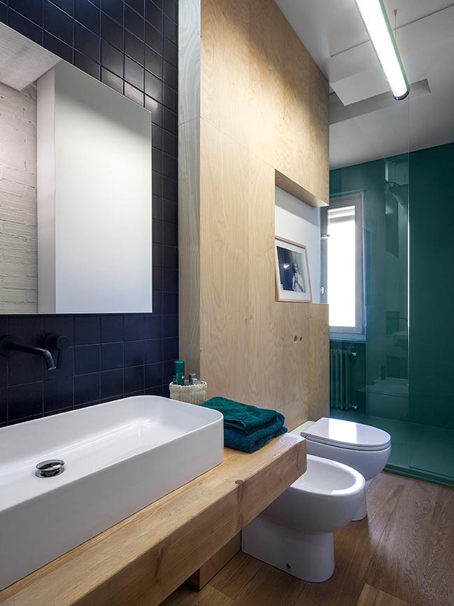
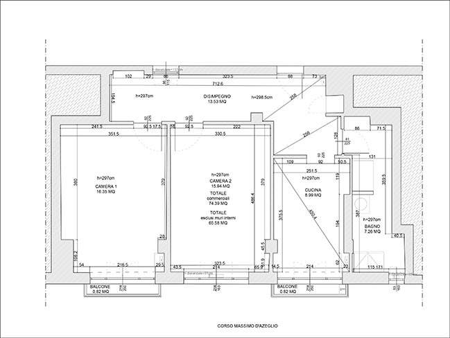
This intervention is part of our double project in a same building. They have the exact same starting plan. They are two twin residential units, respectively the 5th and 6th floor of the same building. Even the internal conditions were the same.
Architect: BLAARCHITETTURA
Location: Turin, Italy
Year: 2016
Area: 85 sq.m.
Project: Alberto Lessan, Jacopo Bracco
Project Team: Mattia Venir, Massimiliano Kufahl, Thomas Pepino, Ruben Martinez
Photography: Beppe Giardino
From the architect: Operatively we faced this project in the opposite way. The approach to the two projects was rather antithetical. Despite having both a type similar client, a young couple, we decided to treat the distribution issue in different way.
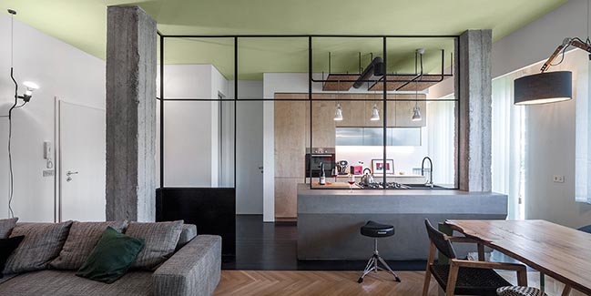
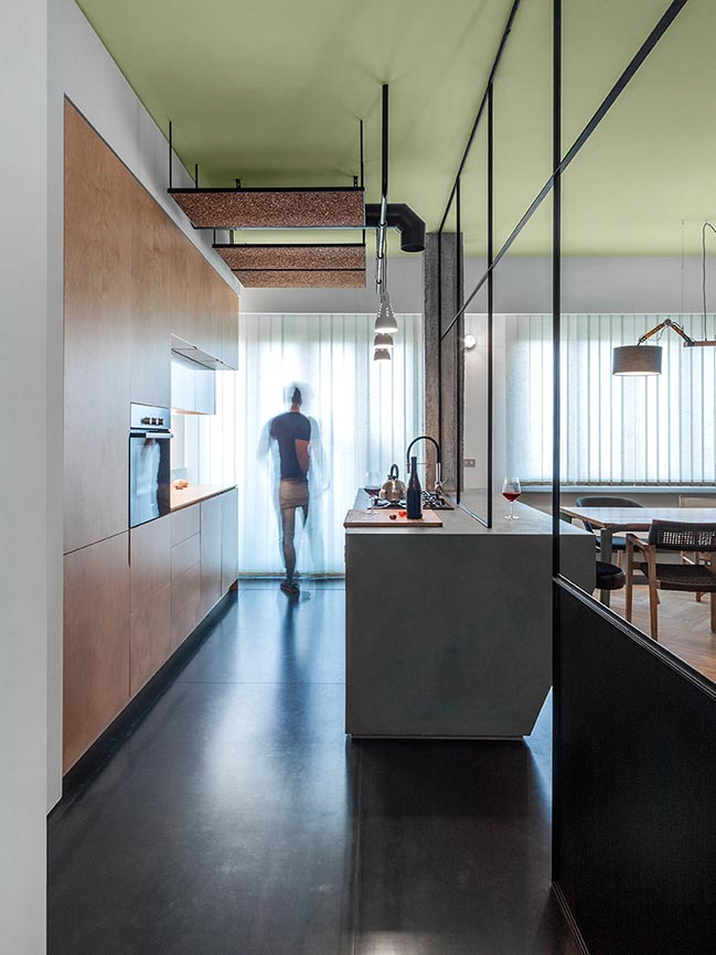
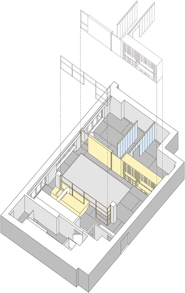
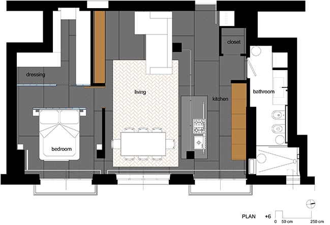
While the open area of PORTLAND is invaded by a falling meteorite (concrete cube), MORRISSEY is sectioned by bi-dimensional planes, which define spaces slicing the available volume. This operation generates separate areas: the living room, the kitchen, the bedroom and walk-in closet.
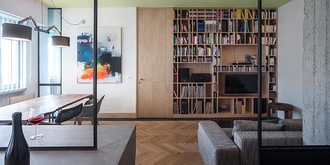
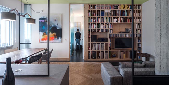
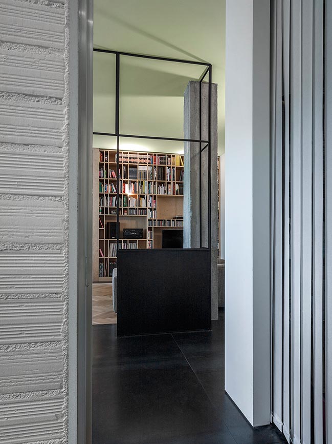
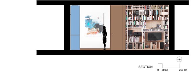
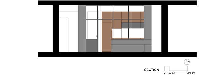
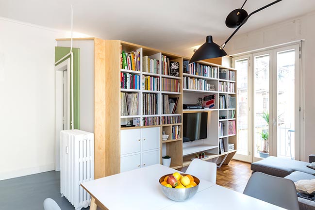
The use of bi-dimensional plans that section the available volume generate different spaces. This device creates an explorative path. The living area and the sleeping area are separated by a wall equipped with a bookcase made out of birch, where the size of each compartment is defined by the height of the elements (plus space for the fingers).
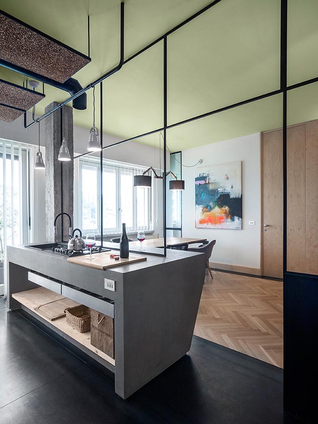
The generated spaces are for vinyls (31cm), compact disks (13cm), DVDs (19cm), magazines and journals (34cm), comics and books (21cm). The vertical scan is generated by the alternation of a rhythm of three measures (9cm, 13cm, 22cm), which establishes a proportionate sequence. The Living-kitchen space is fragmented by a frame in iron that has a function of filter. The intention was to visually divide the space and make independent the kitchen area.
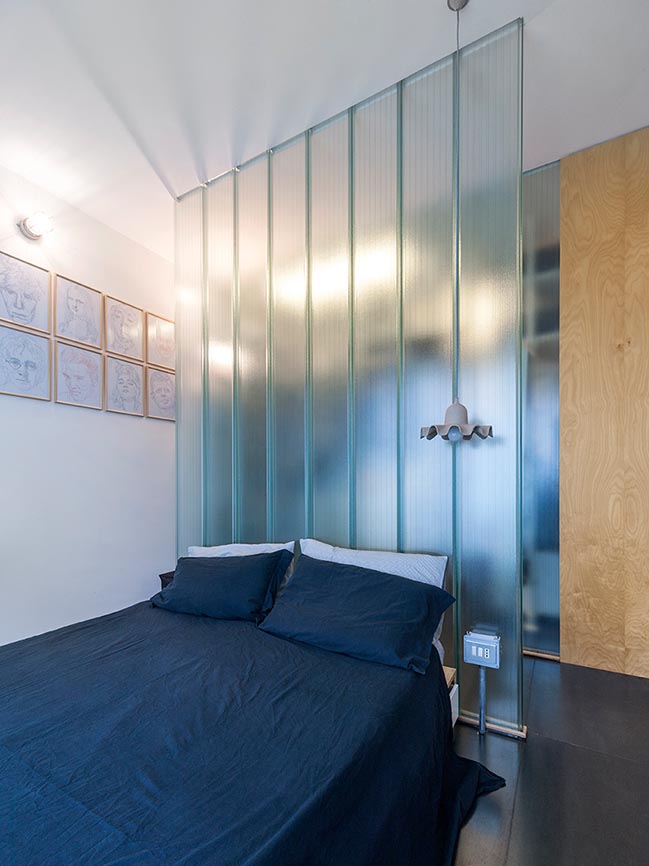
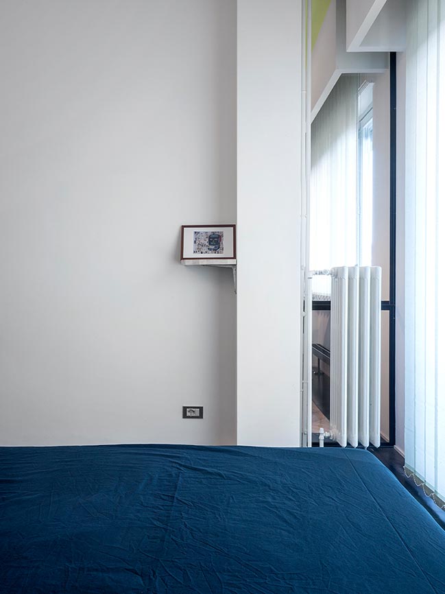
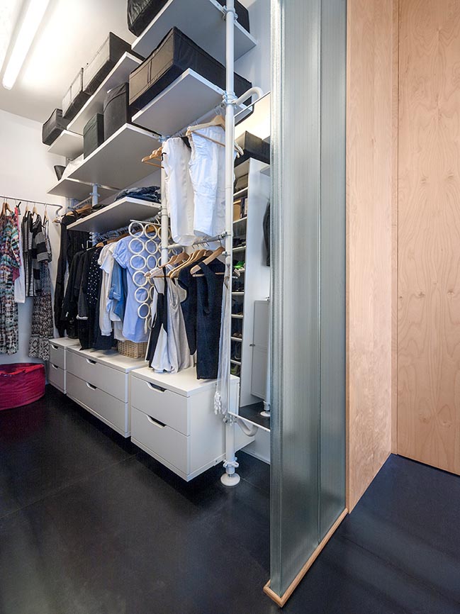
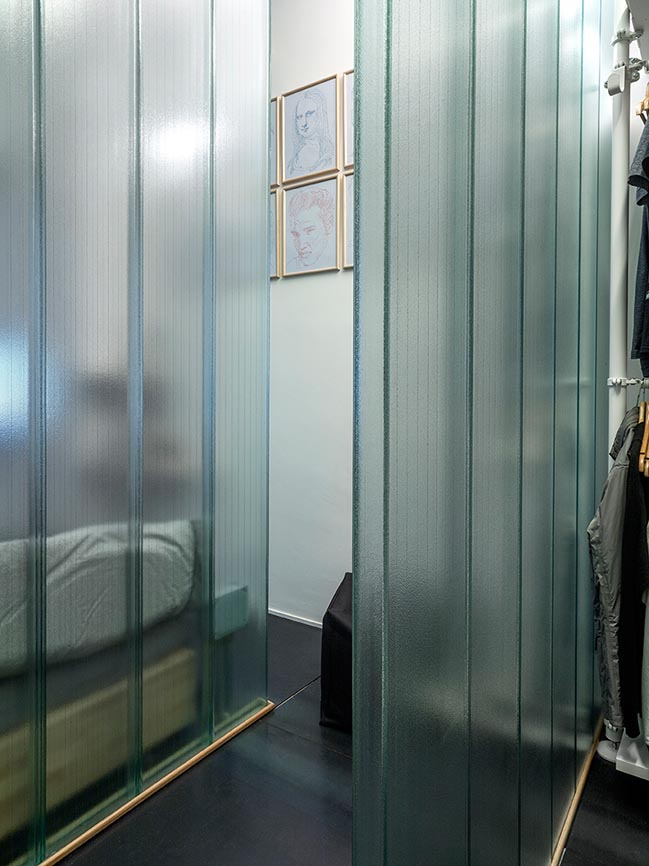
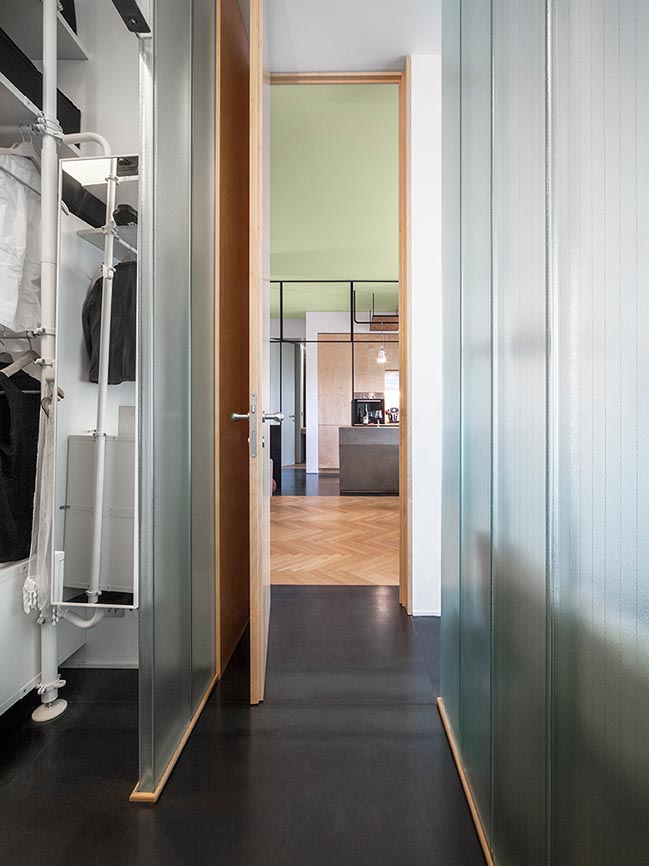
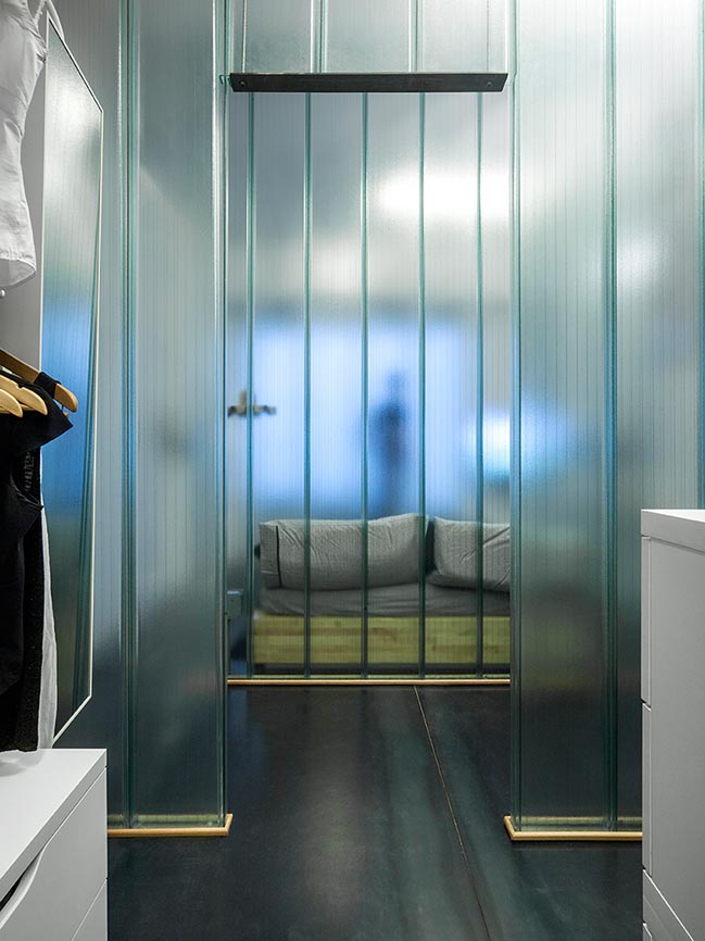
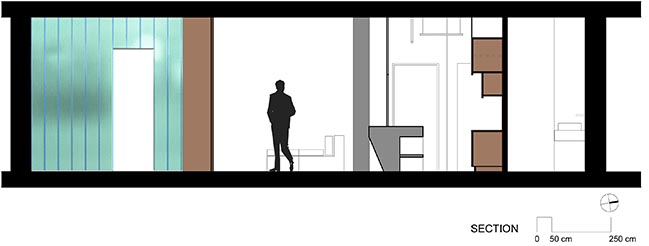
The sleeping area is a wide space where the wardrobe acquires almost 50% of the space. The entire surface is divided in two, so almost equivalent of the area where the bed lies is the same where clothes and shoes are stored. The division of space is left to a wall made of U-GLASS, a structural glass used in industry, which allows the light to penetrate where another material would not have allowed.
[ VIEW MORE BLAARCHITETTURA'S PROJECTS ]
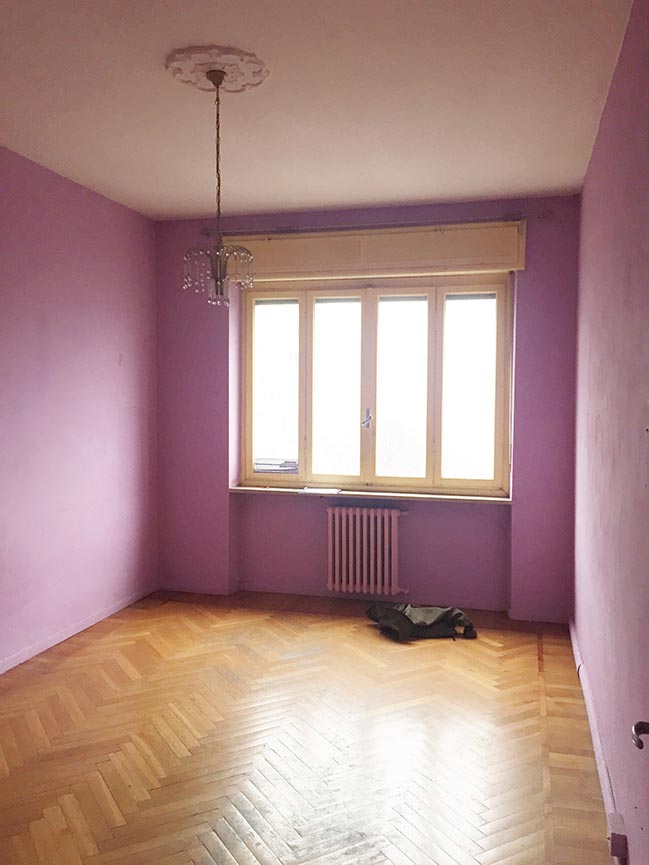
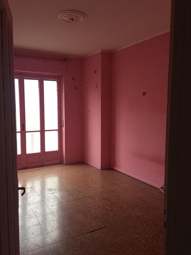
BEFORE RENOVATION:
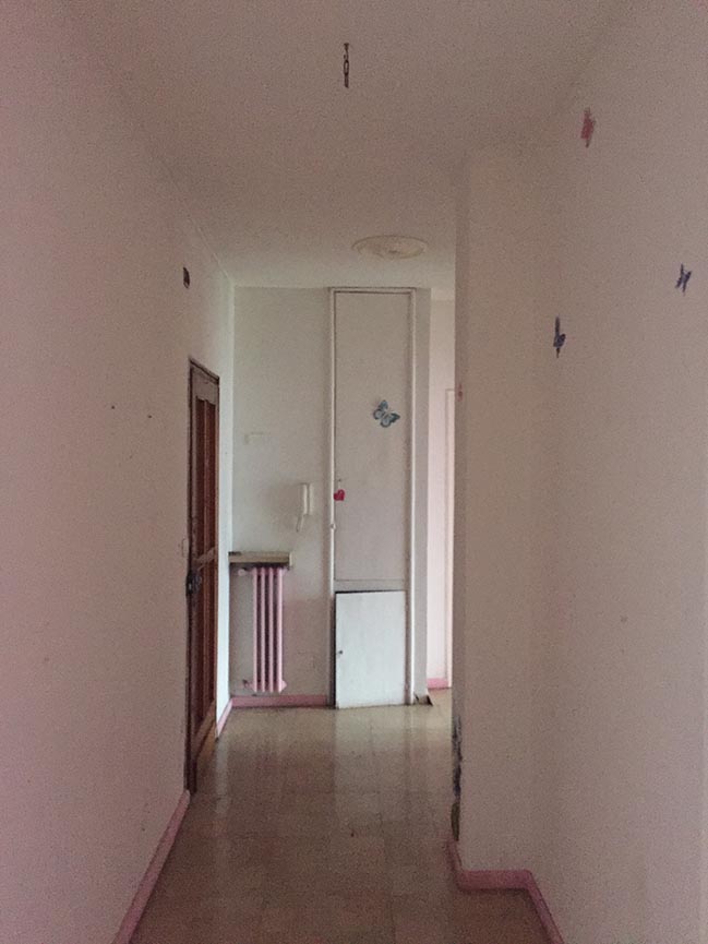

Morrissey by BLAARCHITETTURA
03 / 11 / 2019 This intervention is part of our double project in a same building. They have the exact same starting plan. They are two twin residential units, respectively the 5th and 6th floor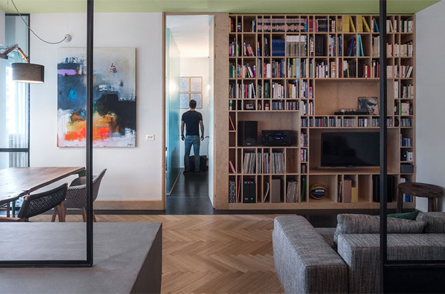
You might also like:


![Modern apartment design by PLASTE[R]LINA](http://88designbox.com/upload/_thumbs/Images/2015/11/19/modern-apartment-furniture-08.jpg)


