10 / 30
2017
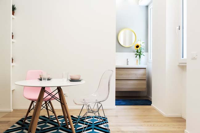
TAAAC! Apartment is a small 29.5sqm apartment designed by Planair Studio with sliding movable elements that can guarantee different spatial combinations depending on the different uses.
Architect: Planair Studio
Location: Navigli, Darsena. Milano, Italy
Year: 2017
Team: Danilo Monzani, Fulvio Giannotti, Andrea Zammataro
Net floor area: 29.5sqm
Photography: Luca Broglia
From the architects: The apartment is located in a recently revitalized Milan area, through the project for the regeneration of the Darsena basin. In a very touristic context, such as the current area of Via Savona, Tortona and Darsena, the intervention will have a receptive function. It is, therefore, to be understood as a project that re-qualifies as a property investment in order to propose the property on the short and medium term lease market.
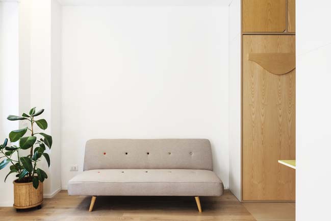
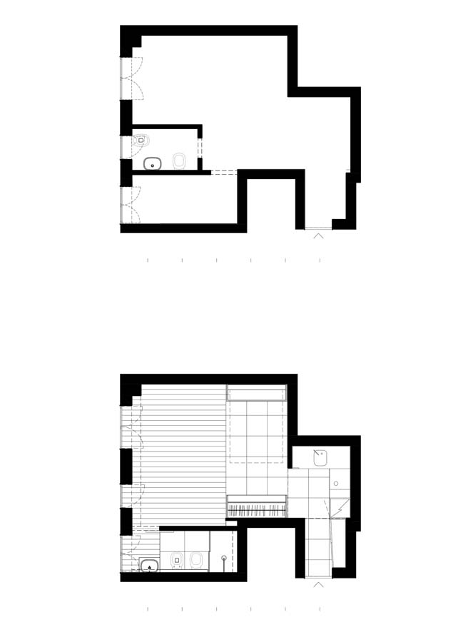
The state of fact presents a property characterized by a small bathroom, which divides a small kitchen area with the rest of the space left at openspace. The strange shape of the main space before the works, and its unordered form, were of very difficult use and with bad quality. The division of spaces and natural light sources contributed to the creation of a fragmented and very not illumined space.
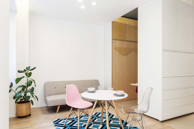
In houses, uses are repeated and the needs of the inhabitants move within a path marked by a very slow evolution. If we think, within the typologies of architecture, home, perhaps it is the one that has less changed in times. This old typology had to be systematized with the needs of travelers and the small investment budget. Above all, the lack of space (the net surface is 29.5 square meters) led the design to be matched with all the contemporary themes of micro space or existenzminimum.
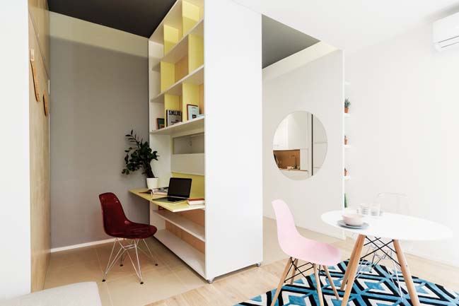
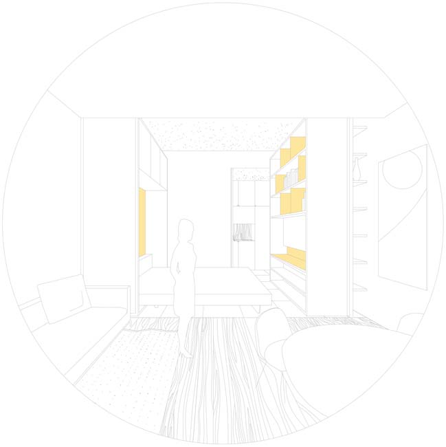
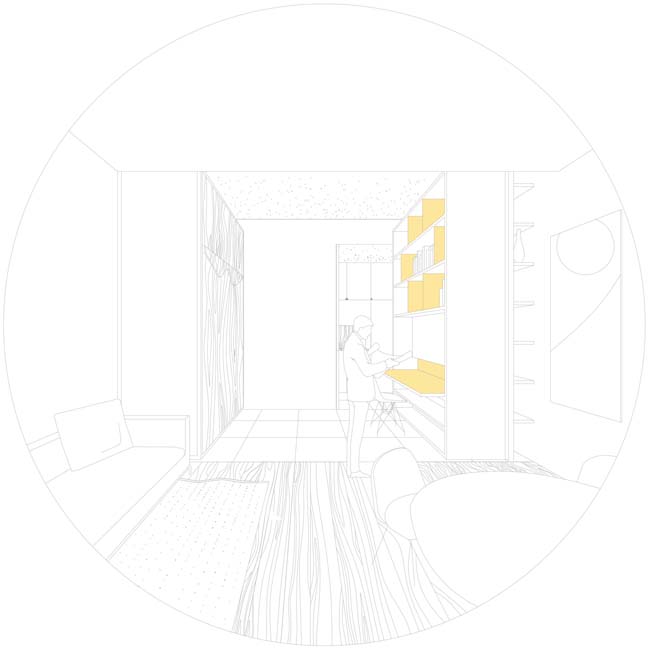
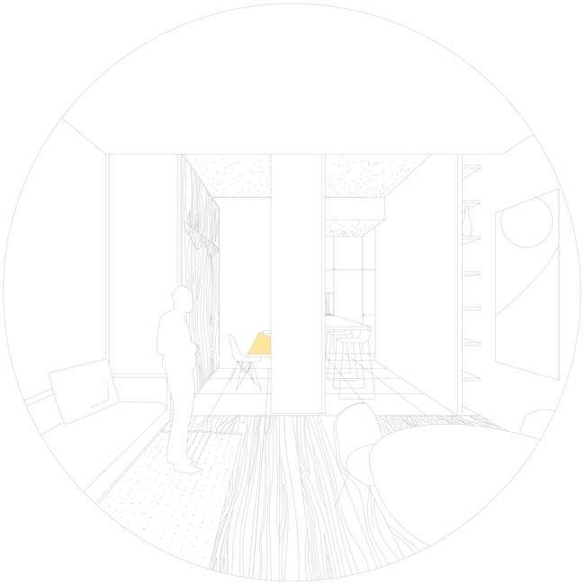
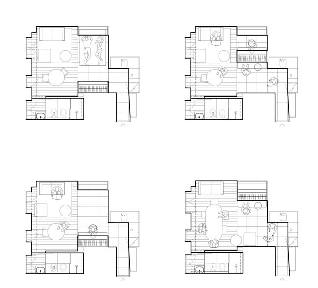
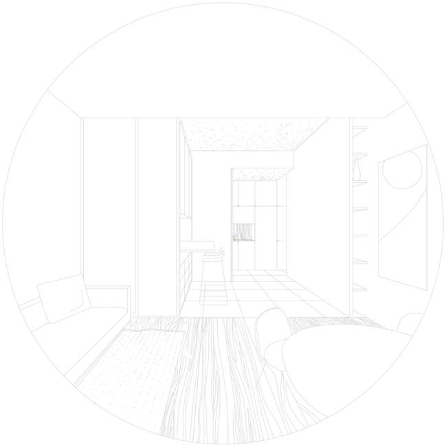
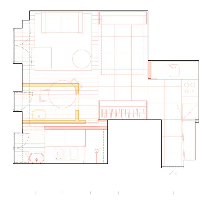
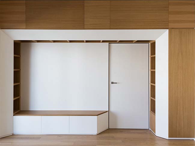
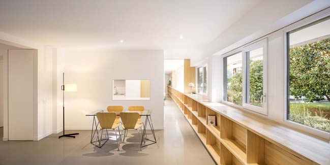
The short-medium term tourists require homes that can guarantee the same comfort as a stable home. To leave free the biggest amount of space, we decided to place the various service areas, such as kitchen, entrance and bathroom, on the edges of the main space, far away from the light from the large windows. Starting from these fixed points, we added sliding movable elements that can guarantee different spatial combinations depending on the different uses.
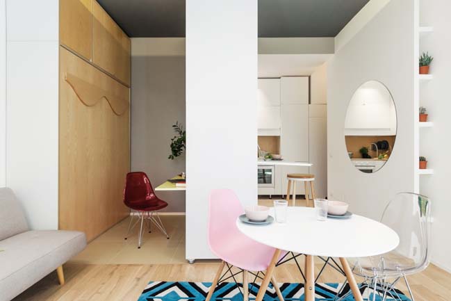
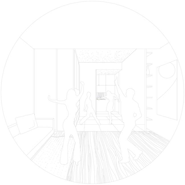
For some reasons, there was scope for experimentation; we wanted, from the beginning, the design to incorporate somehow magic and play in an interior domestic space. The acceptable contemporary urban flat consists of many enviroments: Entrance with supporting furniture, Kitchen (no mini kitchen), Snack area (better if island), Dining area (also able to welcome many guests on special occasions), Living and relaxation area, sleeping area (alcove, or bedroom), Wardrobe closet, Study area for work remotely, Bathroom with full wall shower, etc. But we didn’t have space to fit all together in.
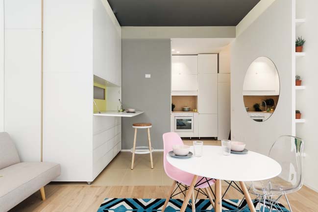
In the existenzminimum flat, to ensure the presence of the different environments, it is necessary to work on time. Only a few uses can take place at the same time or close distance, most household activities are regularly carried out in fairly orderly succession. Desire and necessity have led to a home that changes magically, which is never equal to itself, which opens and closes, depending on the hours of day and natural light.
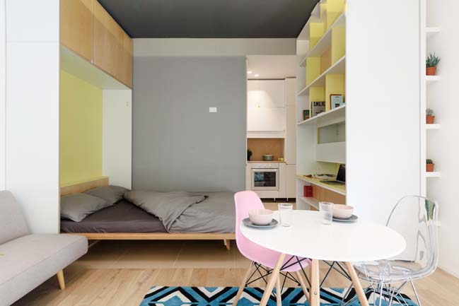
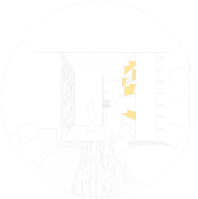
From a formal point of view, the project consists of two differente storage types: fixed and mobile. Those fixed have service spaces and functions such as a closet, a kitchen and a laundromat. Those movable features temporary functions such as the study area and the breakfast / lunch desk, and the walk-in closet. The domestic space is divided into three different areas, one with fixed cabinets, one with sliding and tilting cabinets, and one without any large elements and furnished with furniture.
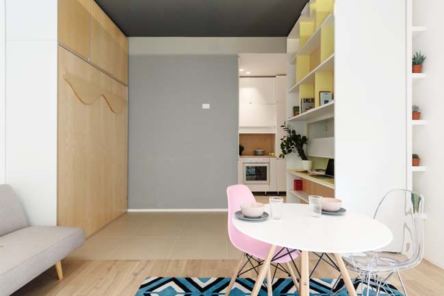
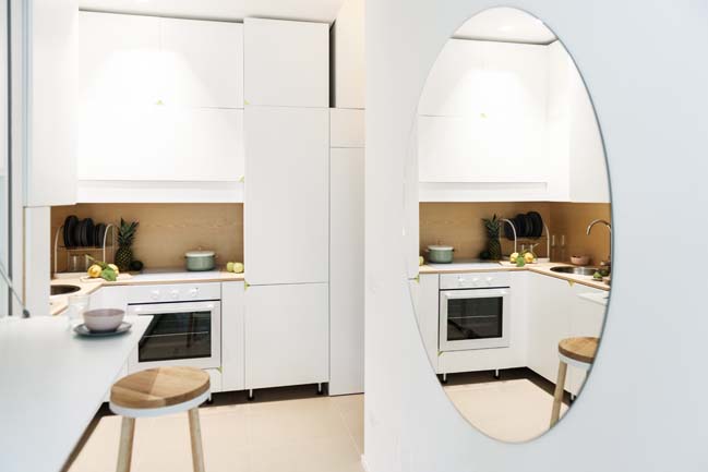
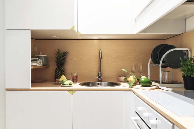
The floor is on natural tones of wood and ceramic beige. These two materials, though dividing into two primary spaces, build a visual chromatic continuity that unifies the various parts. The big tiles are used in the entrance area, in the kitchen and under the movable storage; this because in those areas is needed a strong and without maintenance floor.
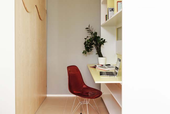
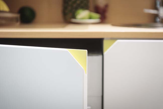
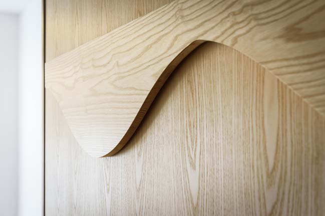
The cabinets are in painted MDF, and the finish is mainly white opaque lacquered; some yellow vivid notes emphasize handles milled.
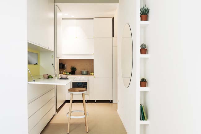
The inner atmosphere is formally identified by the stylistic unit of fixed furnishing elements, capable of incorporating different functions and features within its compositional logic. Furnishings are also something else: space limits and fixed scene, but are also tool boxes and functional elements that allow vacuum to be inhabited according to the most stringent needs.
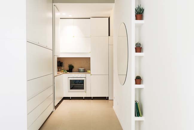
The project strategy aims at solving technical, functional and ergonomic issues with an inclusive logic within fixed and movable furniture elements to highlight the breadth and variety of main space.

> Functional micro studio by mode:lina
> 309 sqft small apartment by LAAB Architects
TAAAC! Apartment by Planair Studio
10 / 30 / 2017 TAAAC! Apartment is a small 29.5sqm apartment designed by Planair Studio with sliding movable elements that can guarantee different spatial combinations
You might also like:
Recommended post: Ocean Residence by Heusch Inc


![Modern apartment design by PLASTE[R]LINA](http://88designbox.com/upload/_thumbs/Images/2015/11/19/modern-apartment-furniture-08.jpg)


