09 / 17
2019
The Client’s brief is for a home of 7 Family members of three generations. The Client’s desire was to have a luxurious home with contemporary design, an iconic landmark in the locality and also a home that can house all the memories, happiness, love and laughter of their children and the grand children.
Architect: Radical Architecture Design Consultants
Location: Pondicherry, India
Year: 2019
Gross built area: 4,800 sq.ft.
Lead Architects: Janani Manivel, Manivel Rajan
Design Team: Mohammad Nihal, Faizur Rehmaan
Engineering: BASE Engineering Services
Contractor: Radical Architecture
Photography: Studio Zero 7
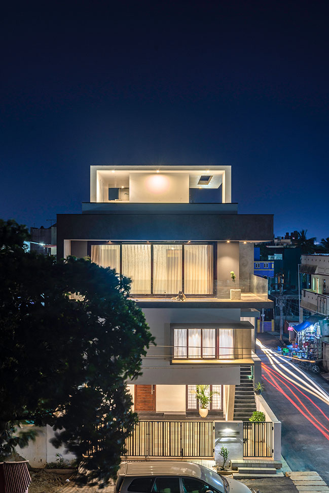
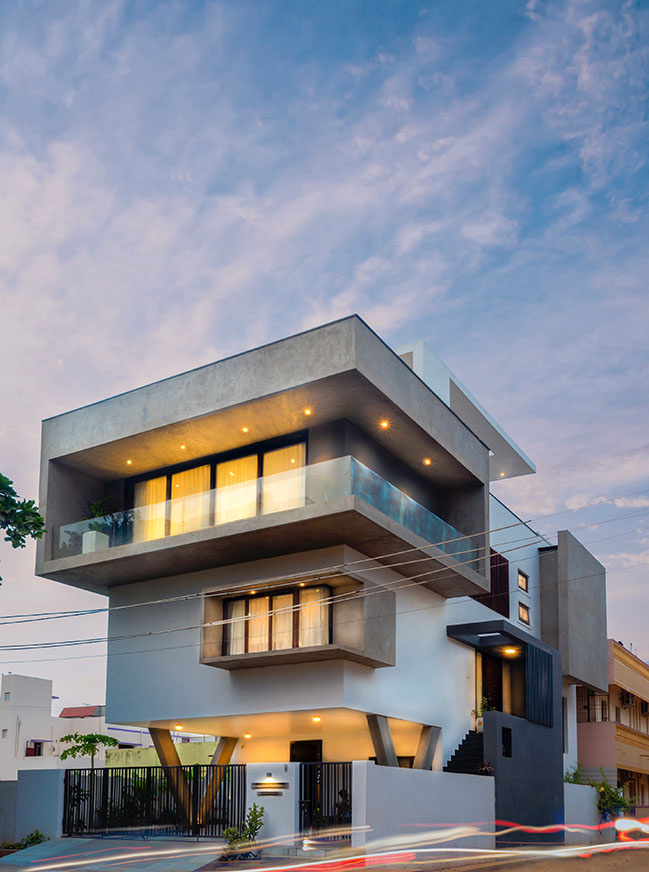
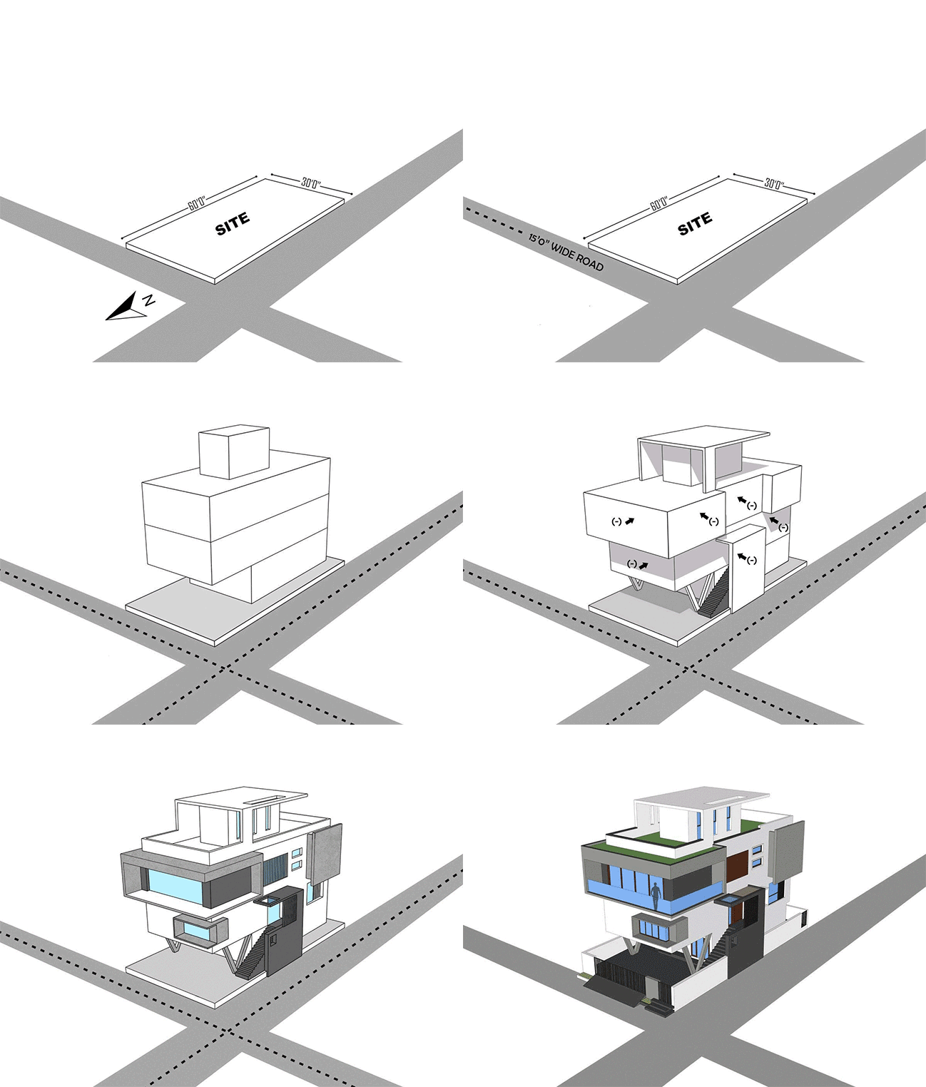
From the architect: The site is north facing and is located in a Residential Neighborhood near to IG Square which is a prominent location in the coastal city of Pondicherry. It is a corner Plot with 30 feet wide roads on the North and West sides. The Client’s expectation was that Pondicherry being a French city of prominent French heritage buildings, his residence should strike a contrast to its heritage mimicked surroundings.
The site being 30 feet wide and 60 feet long, the client’s concern was to expand the constraints of a smaller plot and to make the site and consequently the house appear larger.
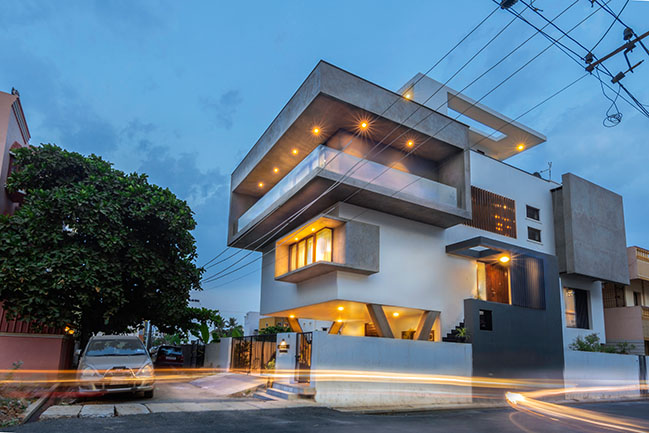
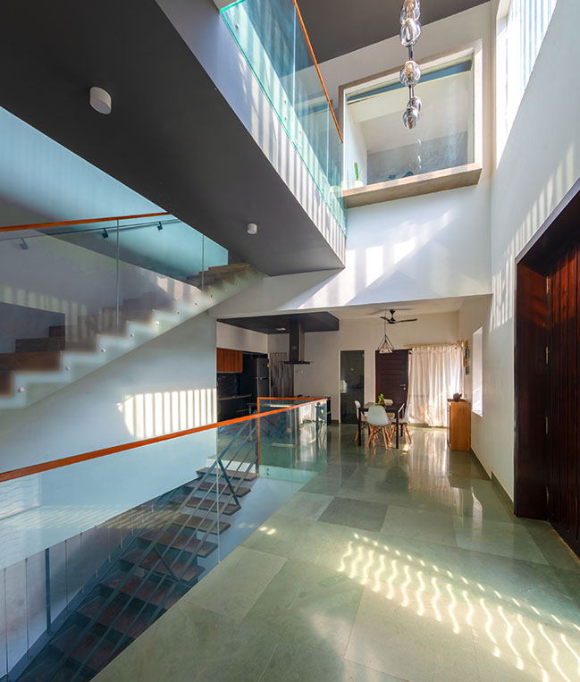
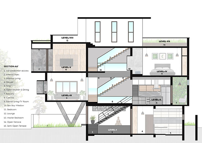
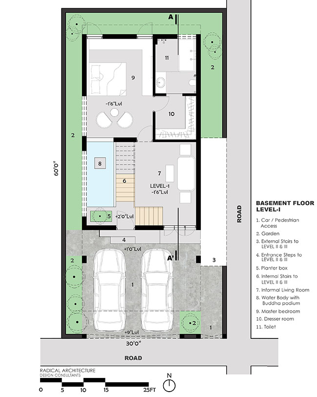
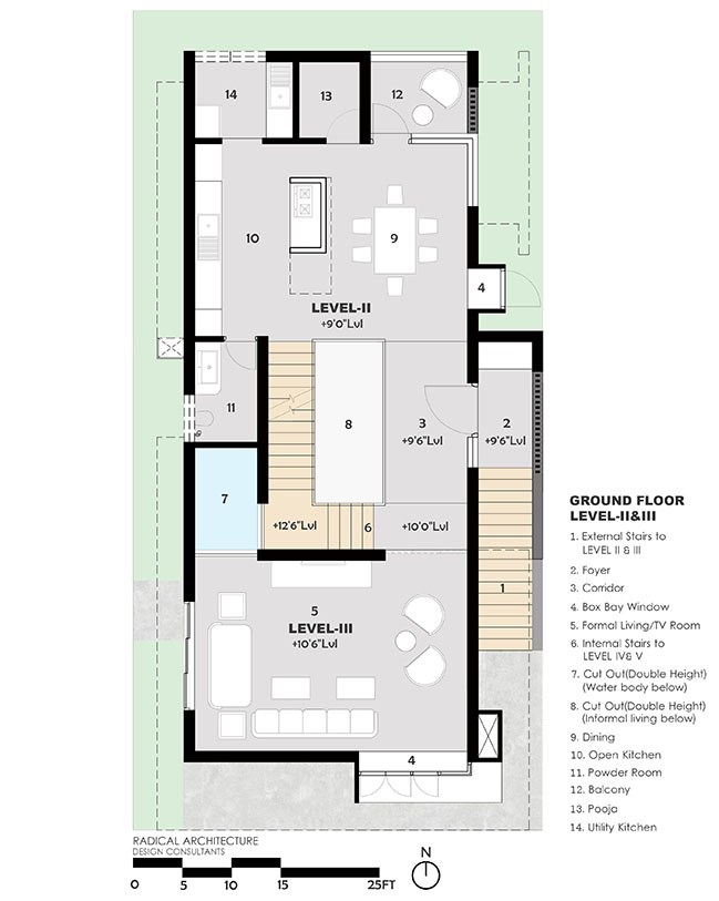
The “V” House is totally a 3 floored structure with requirements being split in Basement, Ground and First floor. The bedroom for the elderly generations and the lobby for them are organized at the Basement floor. The Kitchen, the Dining, the Family entrance lobby and the Living room has an open-plan arrangement. This makes the interior spaces blend into each other seamlessly. The column-free and the partition-free interiors enhances the flow of the Kota stone flooring for the entire floor plate. The transparent nature of the spaces in the ground floor allows unobstructed visual connections across its large floor plate and even the uninterrupted diagonal views also.
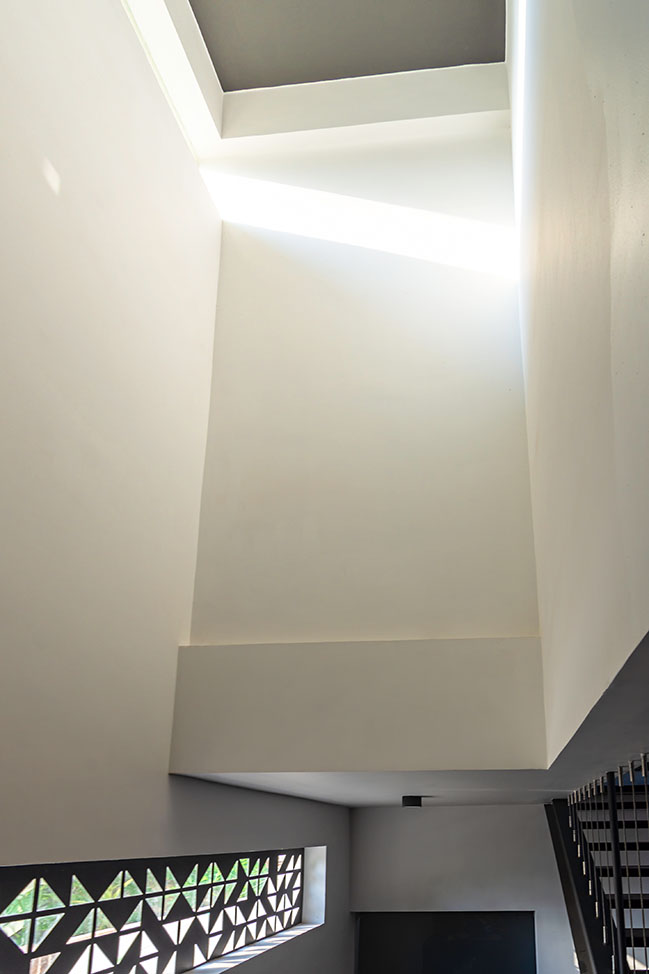
The “V” House is a residence that is blended with many different spatial experiences in a small site. We have planned the circulation inside the Home through varied volumes scaling Double-Height and Triple-Height spans. These varied volumetric spaces borrow in a lot of Natural light flooding through the strategically placed windows. The residence edifices multiple lobby area, four bedrooms and a Living room. The soul of the house is the Double volume lobby in the ground floor which penetrates sumptuous natural light to the open layout of the house.
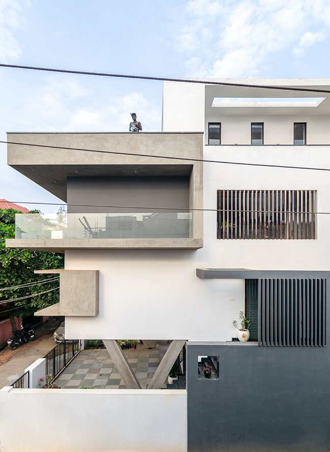
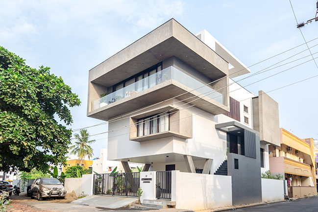
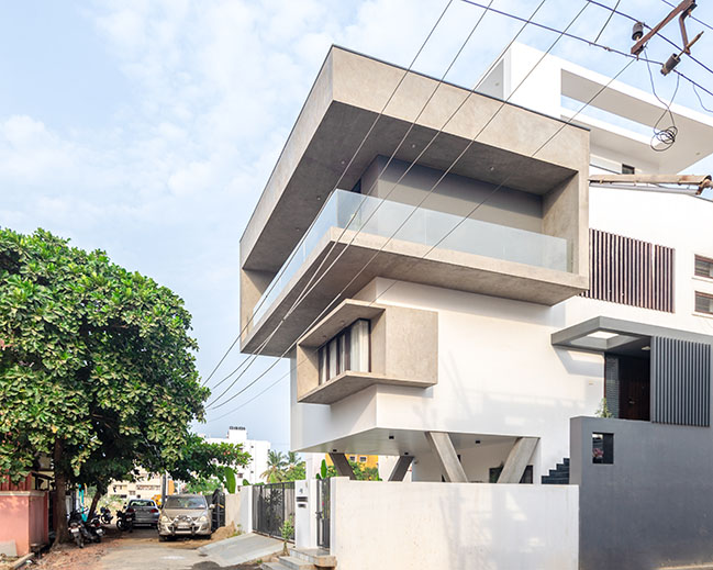
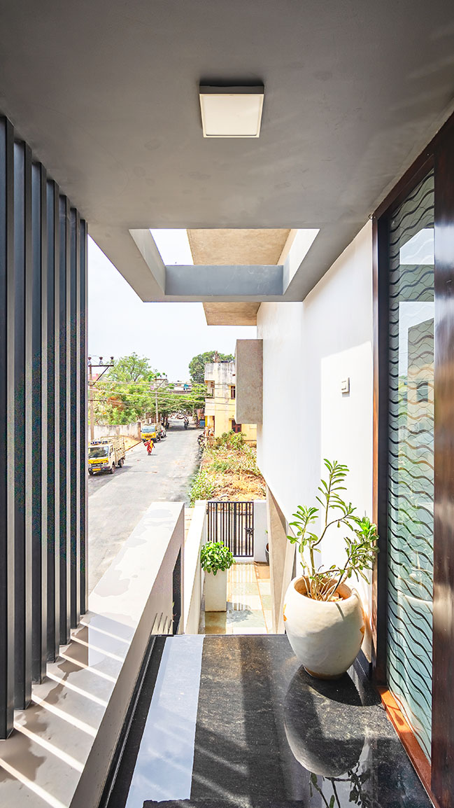
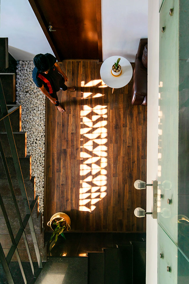
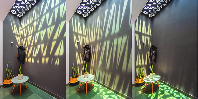
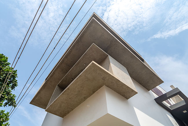
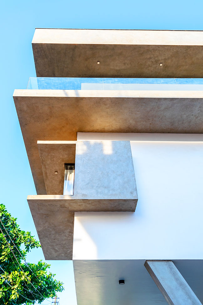
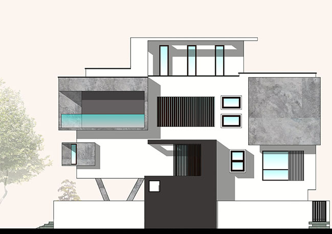
The first-floor form modulates and responds to the greenery outside thus being extroverted and being uninhibited in character than the other bedrooms in the home. The “V” House blurs the threshold between exteriors and interiors. The house takes in the sky and it’s varied hues in various multi-volume spaces. The sun creates magical atmosphere in the house at every hour. The louvered glass windows and the patterned sky-light negotiates between the enclosed spaces inside and the sunny sky outside. These enclosed spaces are dappled with varying patterned light and shadow at every hour. During these moments the house acts as an Introverted object. The projecting cantilevered floor slabs and the jutting out corner windows in elevations not only adds the unique modern vocabulary to the exteriors but also it acts as a “Sky-Piercer” shading the building from direct radiation and to bring in ample natural light.
Zoning:
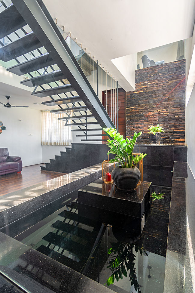
The House has two entrances. The entrance in the basement floor is for the elderly parents to their bedrooms and their exclusive lobby to meet their personalized visitors. The other entrance on the ground floor is at the west side for the other users of the Home and their visitors. A water-body is introduced into the lobby in the basement to add to the sense of tranquility and peace to the space.
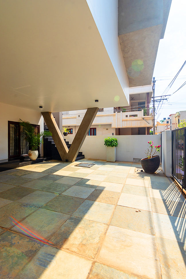
The entry to the home is announced by a 25 feet x 25 feet cantilevered and intermediate barrier- free slab supported by two “V” Shaped columns only. The 12 feet high Car-Portico with Uninterrupted span gives a grand feel of entrance. This in-turn with the huge cantilevered mass of Ground and First floor aided the look and feel of the building to appear larger.
Staircase:
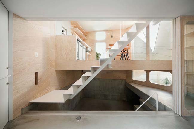
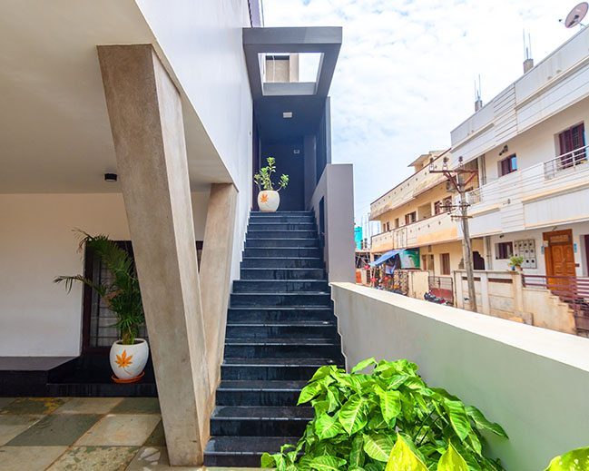
The staircase from basement to ground floor is made of mild steel. It’s a zero-heavy steel staircase made to give a minimal feel to the basement lobby space. The other elements of the space like water-body, patterned slit-window and indoor plants are provided to maintain the tranquility of the space since this space being mostly accessed by the elderly members of the family. Therefore the staircase is deigned to be not space-consuming and not visually heavy. Only the superficial layer of the mild-steel is allowed to naturally rust to considerable shade and rust-arresting sealers are applied to avoid further rust. The rusted staircase with patterned slit window in the background and the walnut wooden flooring in the foreground accentuates the Rustic Architecture milieu of the space.
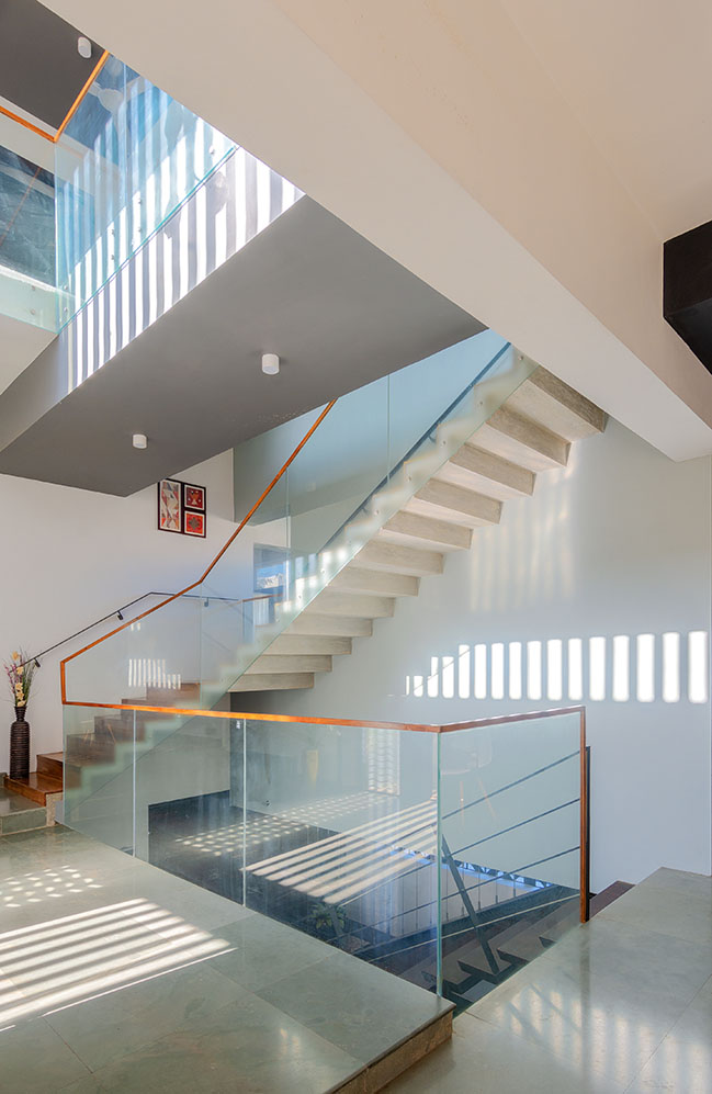
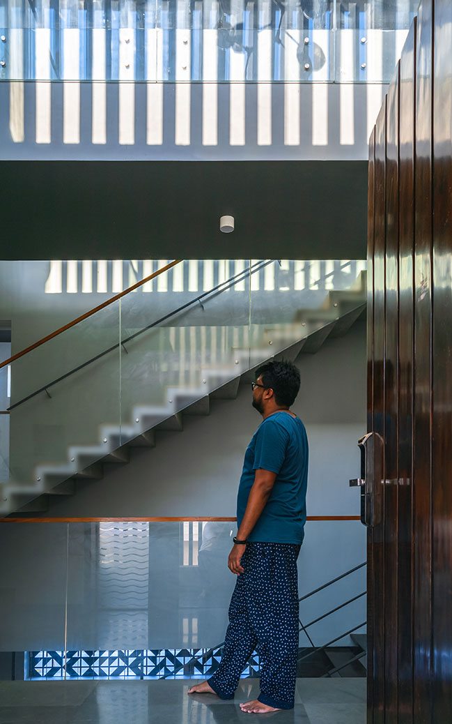
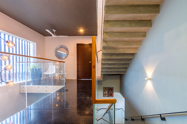
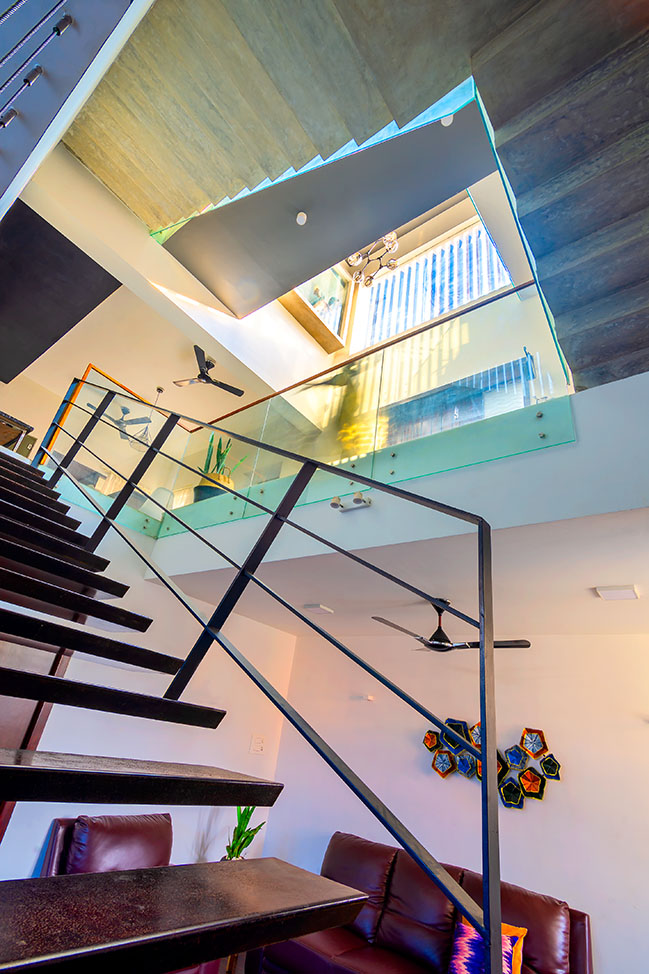
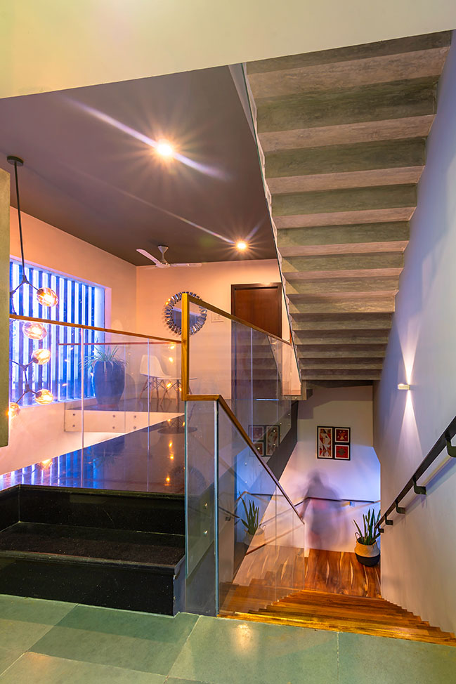
The other two staircases are made of Slim and zero-heavy ferro-cement concrete. The mix of Extra clear tempered-glass and the frosted- tempered glass balustrades are provided to enhance the barrier-free visual connectivity in the interiors. A minimal handrail made of teak wood is fixed on the glass balustrades. This detail though its presence is felt minimal yet it accelerates the dynamicity of the staircase.
Kitchen:
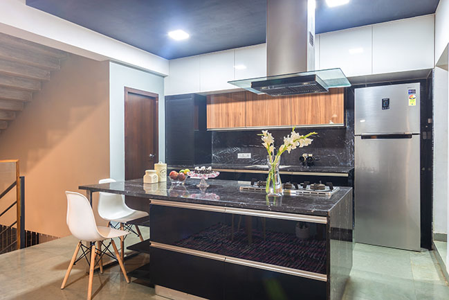
The client desired for a black themed and an open kitchen. So we designed an Island kitchen with an island counter with cooking-range and this counter acts as a breakfast counter also. The kitchen counters and wall are cladded with imported “Black Marquina” Italian marble. It’s a custom designed modular kitchen according to the client’s needs and desires.
Bridge and the Central-court space:
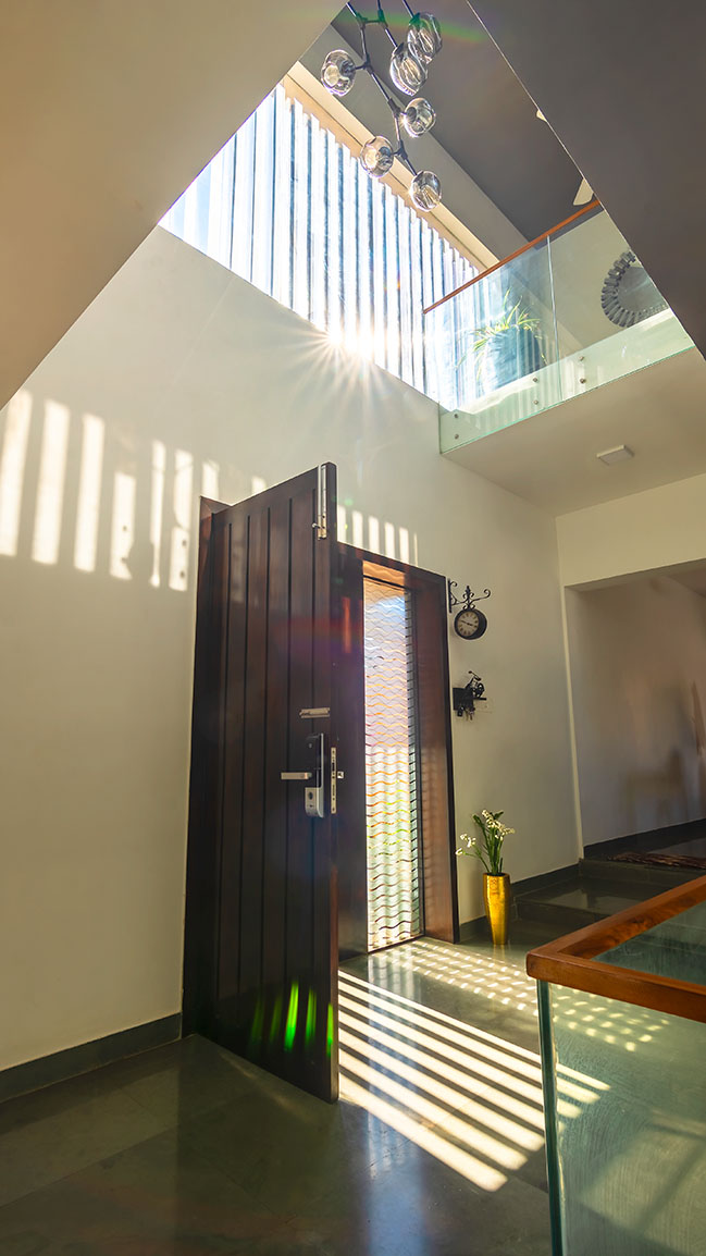
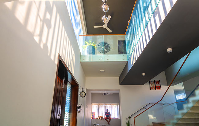
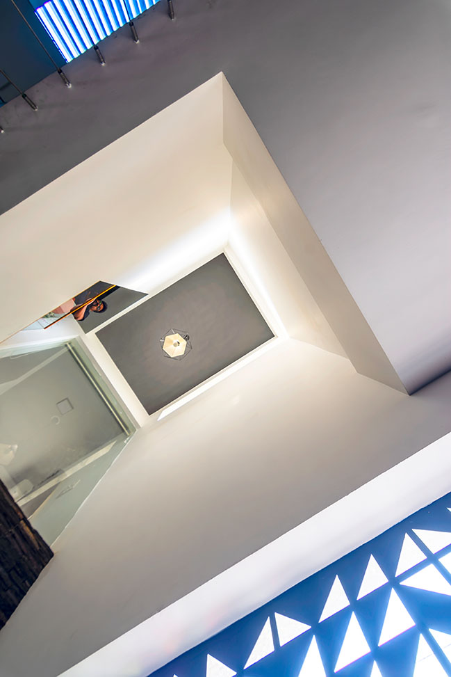
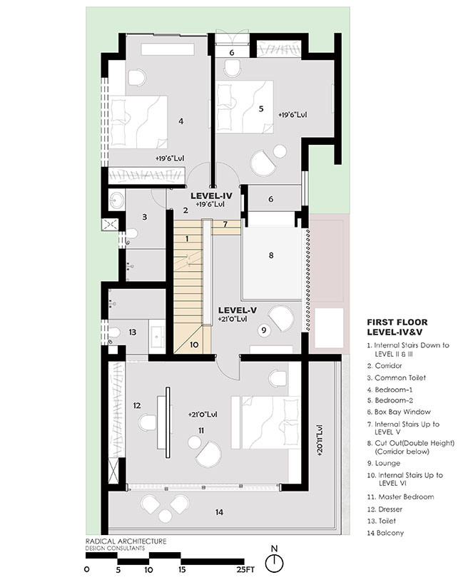
The bridge connects the three bedrooms in the first floor. It also forms a casual space where the siblings can gather for a quick meet-up from their adjacent bedrooms instead of going to the Living room in the ground floor. This connecting bridge gives a dynamic aesthetics to the double height lobby. The bridge being wrapped with “Black galaxy granite” and “Gray painted” surfaces possesses a striking presence in the Soul-space of the home which is the double height entrance lobby. The bridge is placed in-between the cut-out and the staircase like an “Axis” and dissects the core of the home asymmetrically. The chandelier in the central court with the natural light bleeding inside with louvered shadows compliments the poised Asymmetrical harmony.

Interior Palette:
The overall material palette is limited to natural kota-stone, black galaxy granite, engineered wood and teak wood for floorings along with exposed cement concrete finish and simple white painted wall surfaces. The flooring on the basement is engineered wood and kota stone, while on the ground floor it is Kota stone all over, whereas on the first floor it is the combination of Black-galaxy granite and kota-stone flooring.
The blue of the sky bleeds into the gaps between the teak panels as the vertical louvers. These teak-wood vertical louvers outside the fixed windows serves as an adornment for the building façade and also acts as a security and shading device.
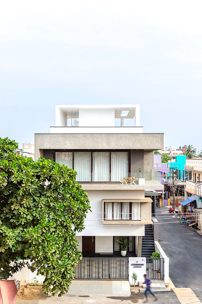
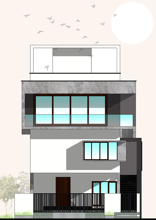
The windows are made of UPVC American-walnut finish. The private master-bedroom of the first floor draws its light from the sky through its “wall to ceiling” sliding doors. This sliding system is a bespoke custom designed glass doors customized for 18 feet width and 18 feet height. It’s made for of pure imported teak and toughened-laminated glasses as per our Architectural specification. These glass doors don’t have any grills because the view through these windows to the “Indian almond tree” in front of the site is “Cinemascopique”. This bedroom has a huge spill-over patio with wood patterned vitrified tiles. The patio being a spill-over space of the master-bedroom or being a stand-alone deck is controlled by this authentic wooden sliding system.
Exterior palette:
The dominant exterior color palette of the house is white with hues of gray that strikes a contrast to its colorful surroundings. The exposed cement concrete finish is counterpoised by the white plastered minimal rectilinear forms. Glasses, exposed cement concrete finish, white and gray painted mass, American walnut shaded joineries form the minimal exterior palette.
Conclusion:
This project took a major part of our time studying the following aspects like,
Natural lights and its behavioral patterns in interior spaces; “Joint family culture and heritage” yet with a contemporized twist in a well-known Heritage town of Pondicherry; “Building BIG” in a considerable small-plot ; Training the local-based workmanship for techniques like ferro-cement construction, zero-weight steel fabrication, exposed cement concrete finishing and also about unobstructed visual connectivity between multi-volumes interior spaces.
Projects like this leave behind beautiful and remarkable memories of their making and thus producing an “Elegant Luxury” for a “Shift of Timelessness”. This is a home for a family to re-energize after a toiling work-day and re-engage with their family members and friends in the “Tier 2 Laid-back and yet a bustling city” like “Pondicherry”.
YOU MAY ALSO LIKE: House in the Golf Course by Radical Architecture Design Consultants
YOU MAY ALSO LIKE: Sun House By SAV Architecture + Design
YOU MAY ALSO LIKE: Sapovilla 116 By Conarch Architects

The House of Radical Architecture at Pondicherry
09 / 17 / 2019 The V House is totally a 3 floored structure with requirements being split in Basement, Ground and First floor...
You might also like:
Recommended post: Optimize space for a small townhouse in Japanese style
