04 / 17
2019
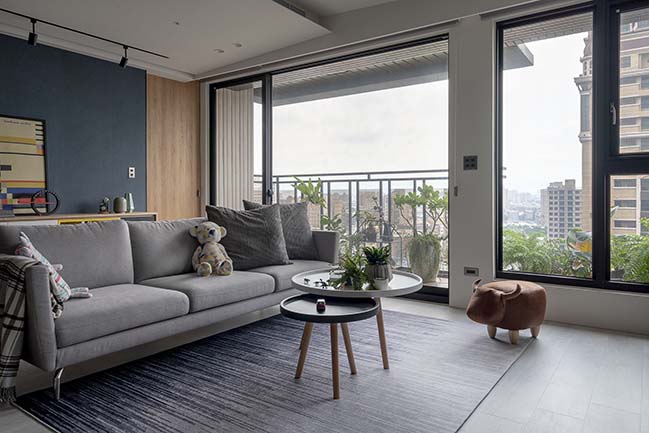
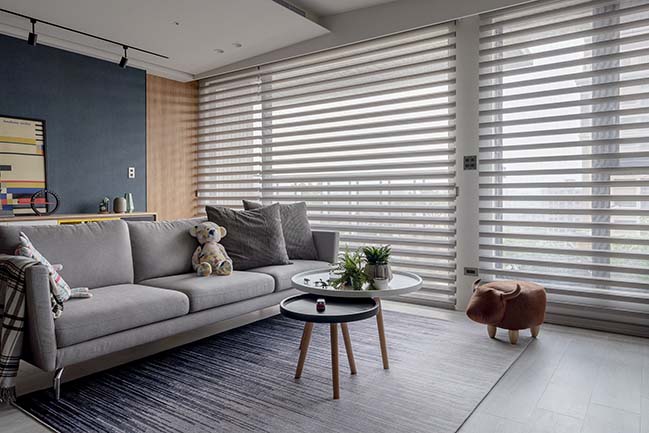
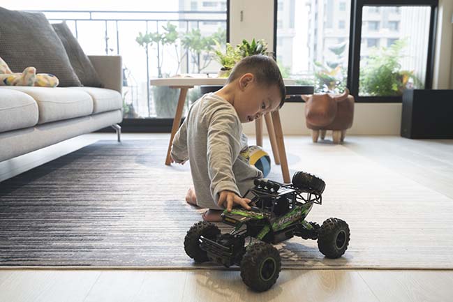
Located at the 14th floor of a newly built high-rise apartment in Taoyuan, this flat has a good view and gets much sunlight. The owner is a young couple who has a two-year-old active boy. This is their first home.
Architect: AworkDesign.Studio
Location: Taoyuan, Taiwan
Year: 2018
Photography: AworkDesign.Studio
From the architect: The owner does not want to change the “three-bedroom, two-living-area” floor plan, in hopes of accommodating visiting family members or friends, and saving an extra children’s room. They allow the designer to freely exercise his discretion, as long as he adopts their preferred home elements for interior design, and takes the safety of a preschooler into consideration.
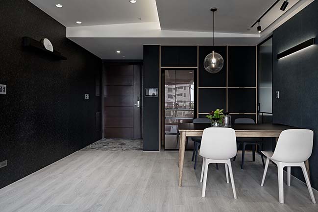
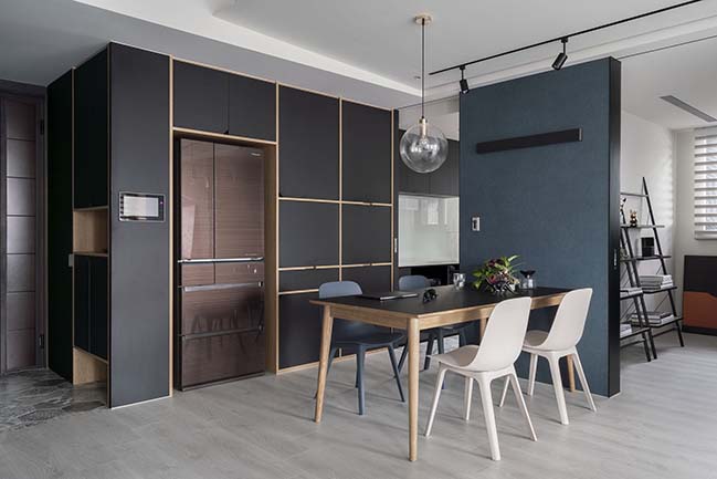
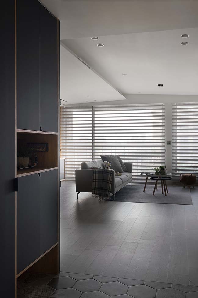
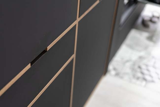
The foyer consists of the grey regular-hexagon area and two black walls. At one side is a giant cabinet made out of black Melamine Plywood for the storage of shoes and miscellaneous stuff. The other side is covered with black embossed wallpaper. Walking through this foyer, you may gladly find the natural light and greenery ushered in by French windows. This adds a lively atmosphere to the open space.
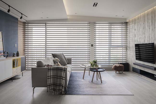
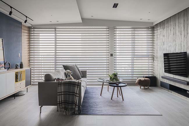
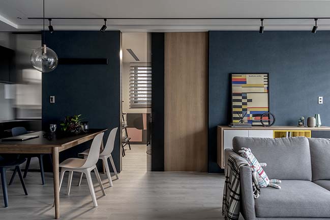
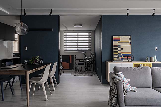
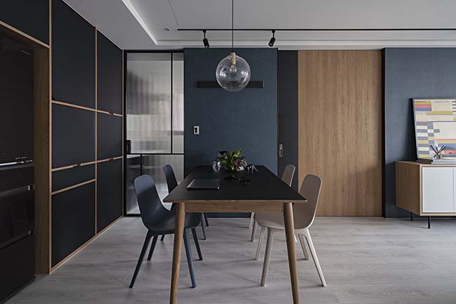
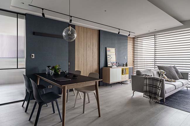
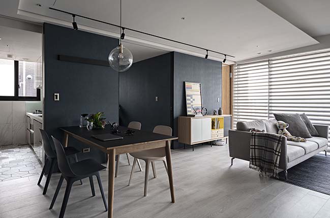
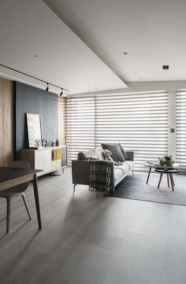
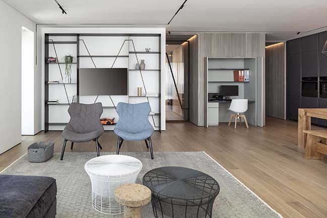
An oblique-cut white ceiling was built to create spaciousness possessed by an eave. The interior facades are made out of subdued-tone material, which serve as a contrast to the ceiling. This gives a sense of depth to this area. A trapdoor and sliding door are installed at the left side of the open space, in order to add fresh liveliness to the kitchen, study, and guest bedroom. The wall is mainly painted with dark blue.
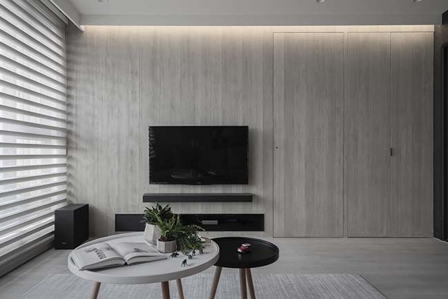
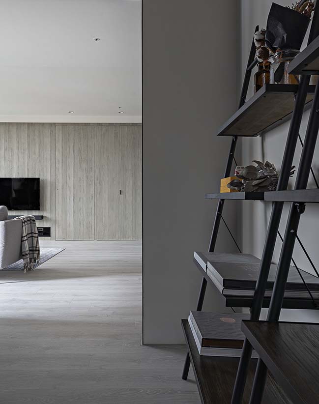
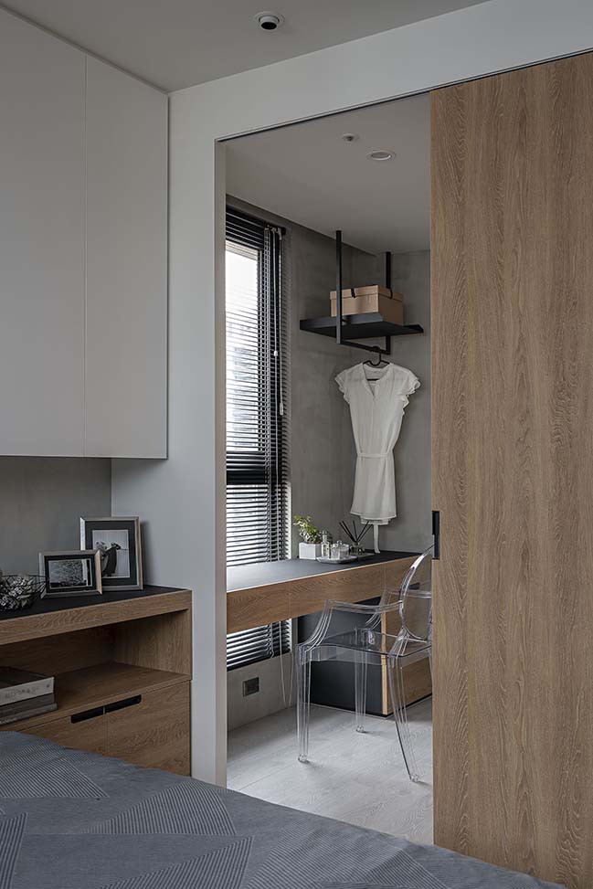
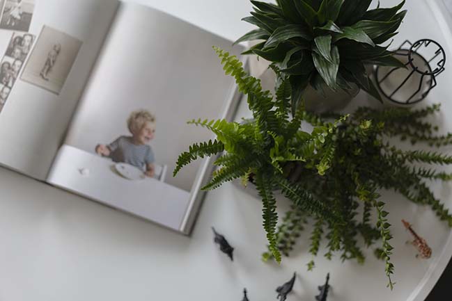
The door planks are added with oak veneer and glass, which ushers in more light and a sense of warmth. The study now serves as a semi-open space, where the adults and the kid play and have fun. At the right-side, the TV wall was painted with faux finish, so as to conceal the door of the master bedroom and storage cabinets, and make the wall look clean.
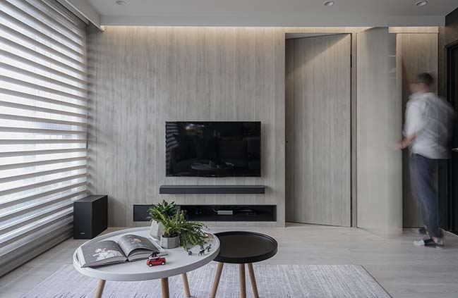
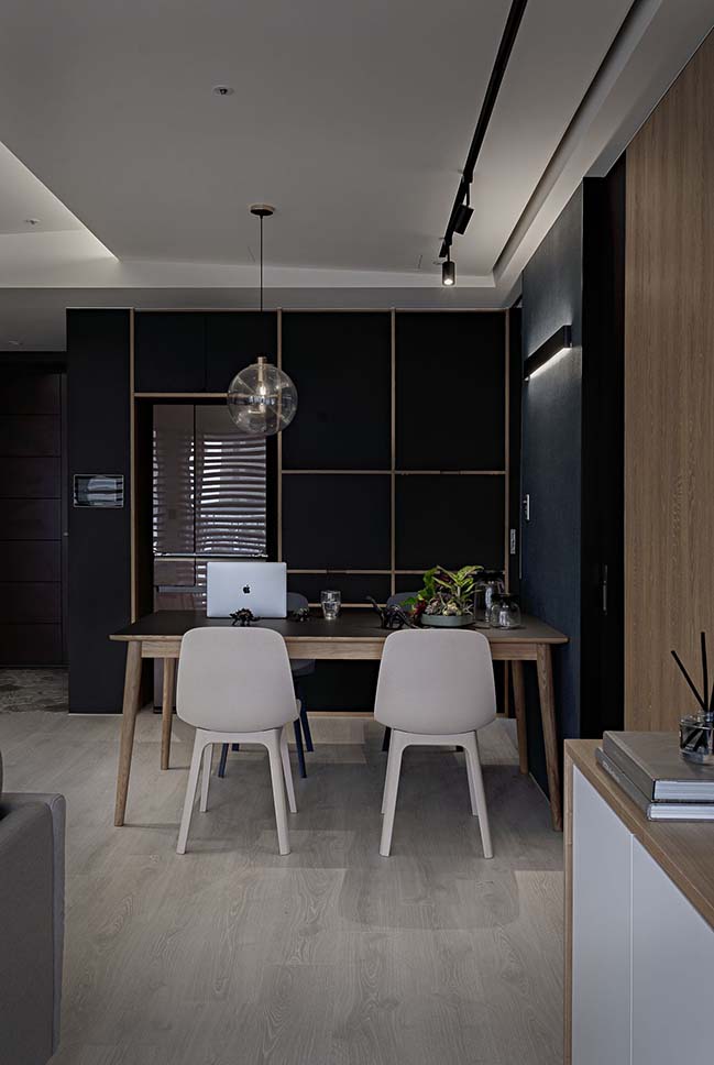
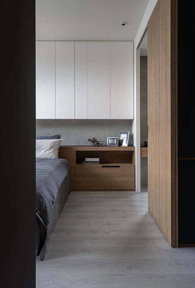
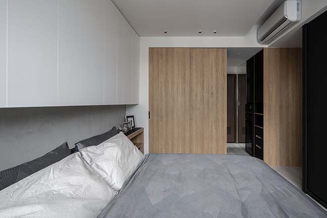
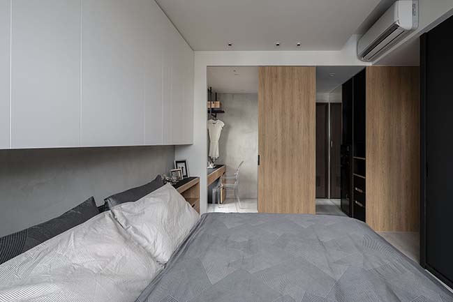
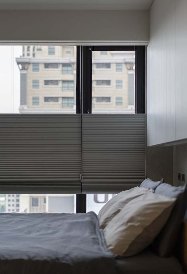
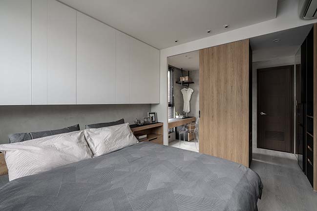
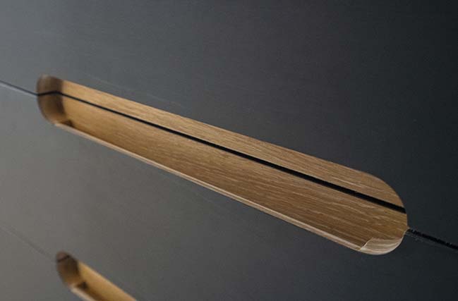
Apart from the giant black cabinet at the foyer, there is a cupboard used to stash cooking utensils and kitchen tools in the dining room. A fridge is also placed in this area, so the wife may have more storage space. The master bedroom’s style resonates that of the open space, and is furnished with enough cabinets. Fewer types of movable furniture, on the other hand, are placed in this area in order to keep the kid safe. The walk-in closet (most loved by the wife) was of a circular shape, which helps to compartmentalize different items and gives more light at the same time.
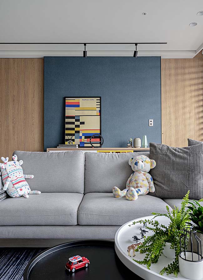
By employing various renovation materials, the overall space was meticulously designed to create a cozy environment where natural light, lively contrasts and some blankness can be found, and the expectations of the dwellers can be met.
YOU MAY ALSO LIKE: Y House in Taipei by AworkDesign.Studio


YOU MAY ALSO LIKE: The Mermaid's by Marty Chou Architecture
YOU MAY ALSO LIKE: Muzha Micro Flat By Phoebe Sayswow Architects
YOU MAY ALSO LIKE: View The Scene By Peny Hsieh Interiors

W Apartment by AworkDesign.Studio
04 / 17 / 2019 Located at the 14th floor of a newly built high-rise apartment in Taoyuan, this flat has a good view and gets much sunlight...
You might also like:
Recommended post: Nautilus Eco Resort by Vincent Callebaut Architectures




![Modern apartment design by PLASTE[R]LINA](http://88designbox.com/upload/_thumbs/Images/2015/11/19/modern-apartment-furniture-08.jpg)


