10 / 20
2021
> PPG Flagship Store by FOSHAN TOPWAY DESIGN
> OSSO Showroom by FOSHAN TOPWAY DESIGN
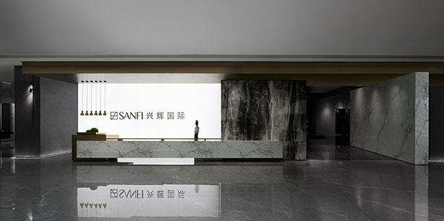
Project's description: Headquartered in Foshan, China, SANFI is a long-established tile brand. Along with drastic changes in the market over the years, it has gained new vitality after transformation, integration and reorganization. The designers hoped to show such a process of transformation in the brand's headquarters through an artistic way.
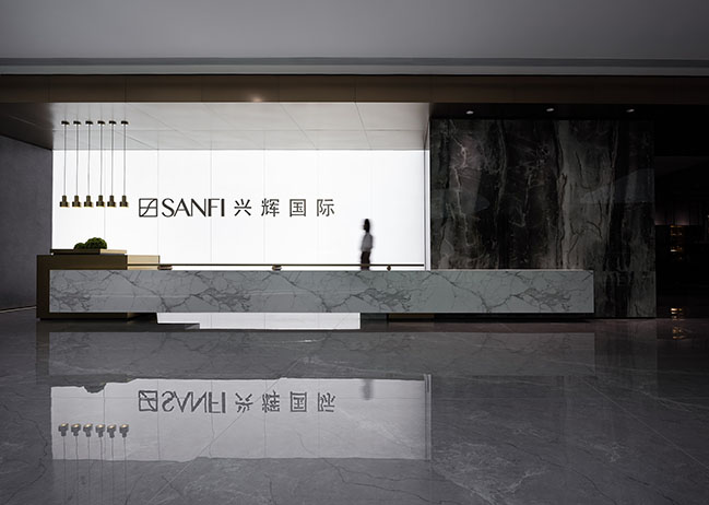
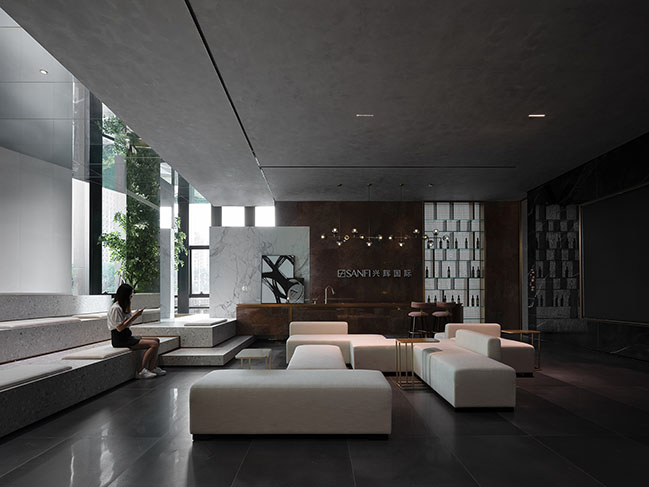
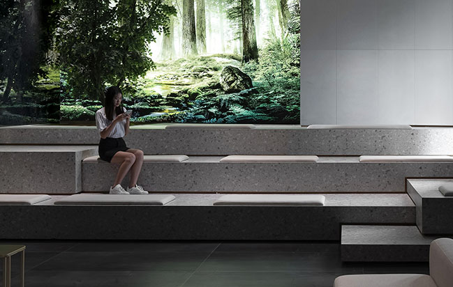
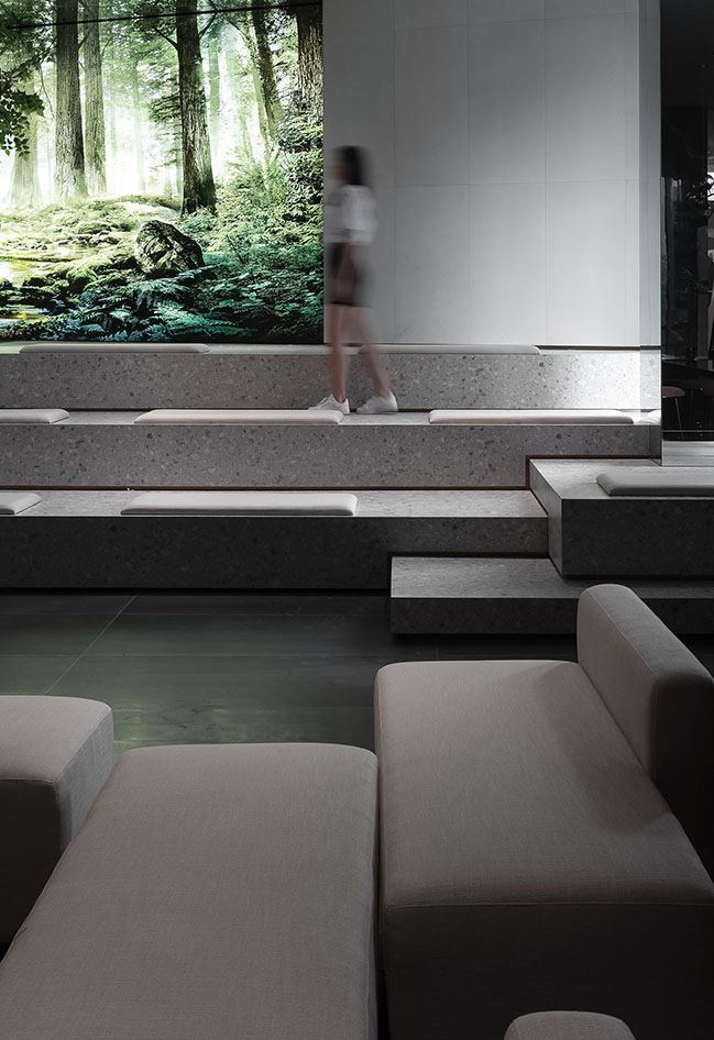
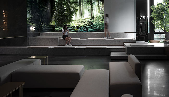
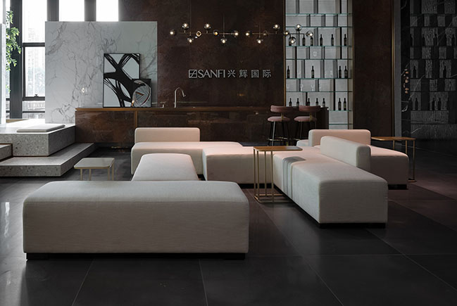
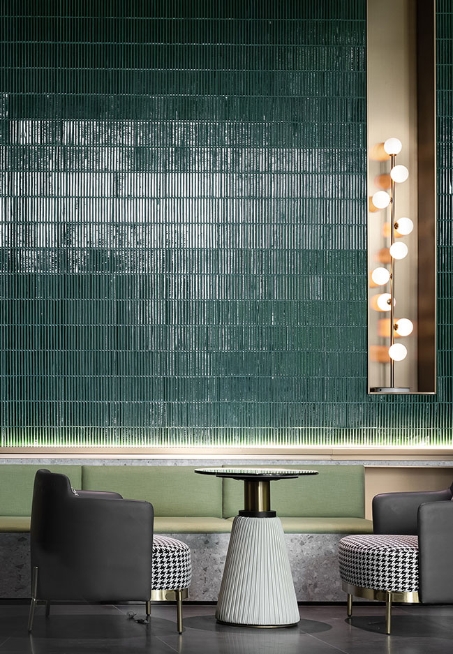
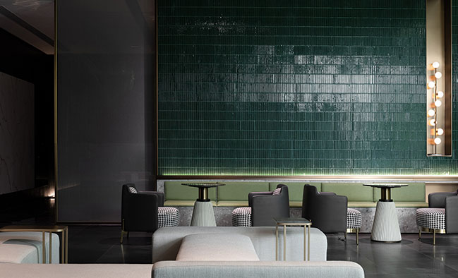
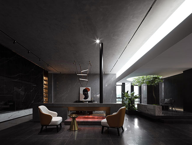
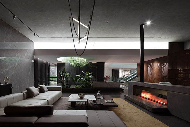
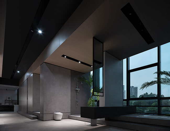
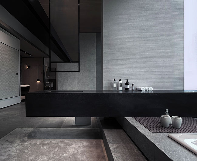
The classic combination of black, white and gray stone materials set a simple, neat tone in the lobby, and also embodies the brand's superior craftsmanship in reproducing the textures of natural stones. The marbles with continuous grain, the matte tiles with cement-like textures and the glossy metal tiles show the brand's pursuit of diversified, quality products. The designers stacked the three types of materials in the form of solid blocks, to present an interweaving state.
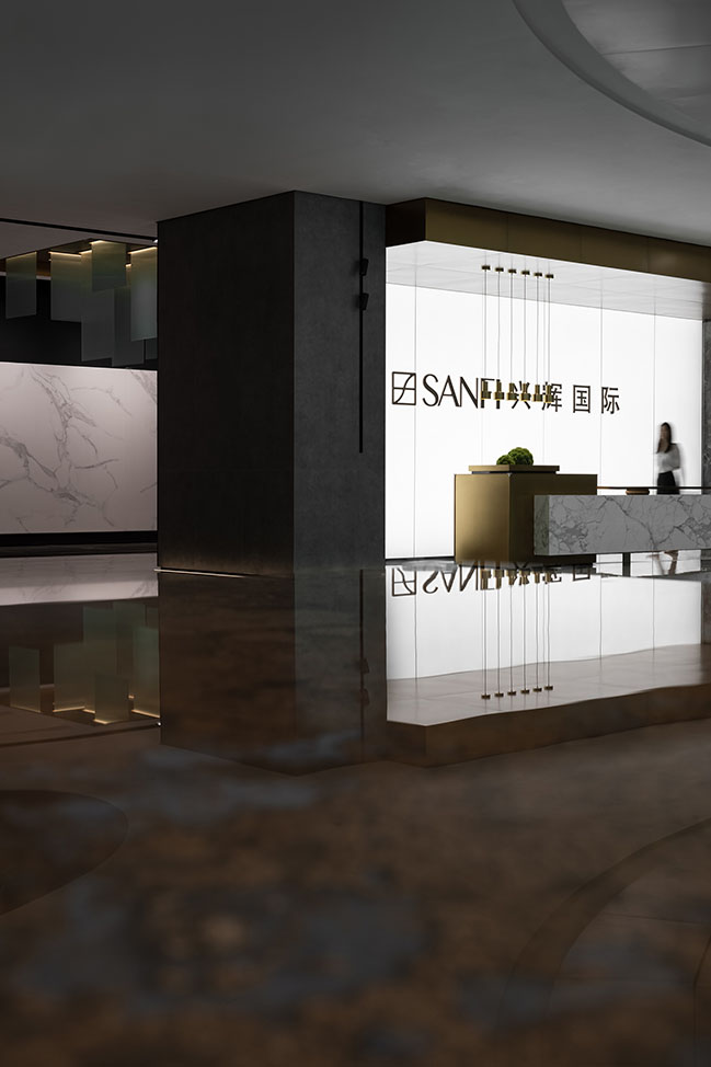
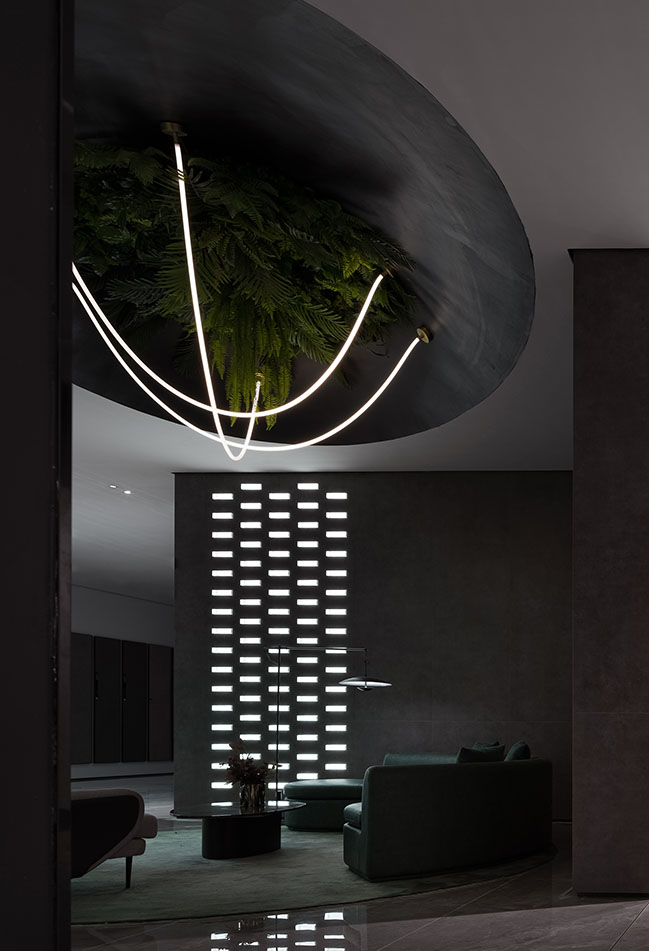
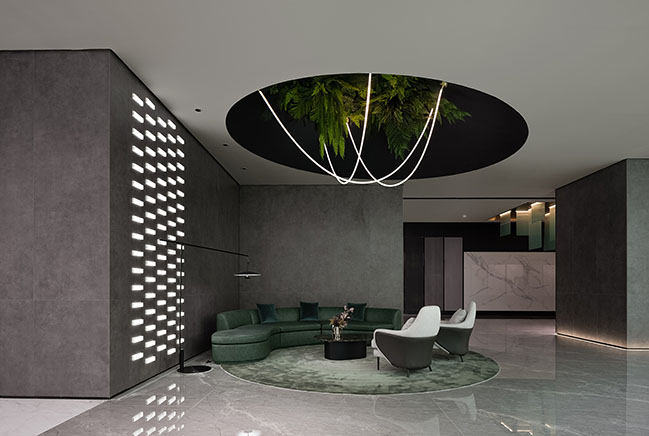
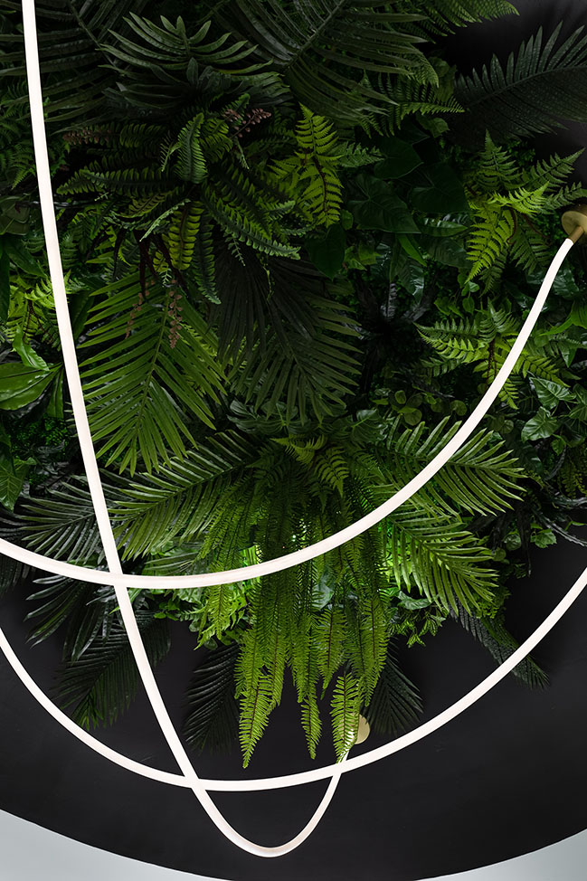
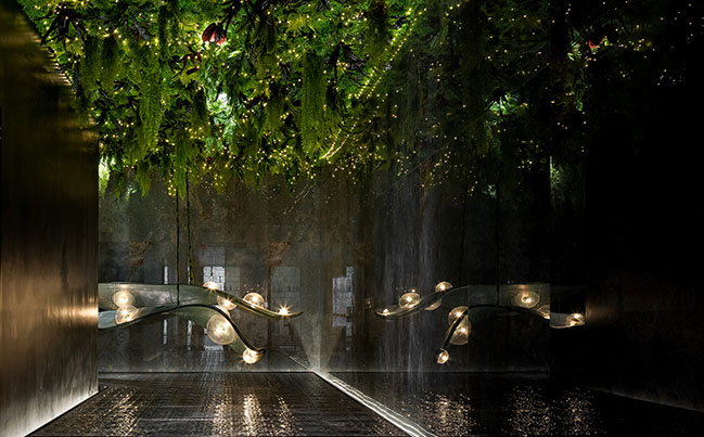
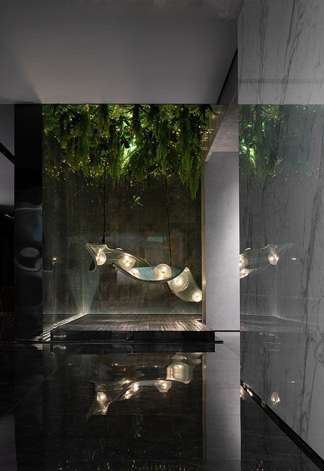
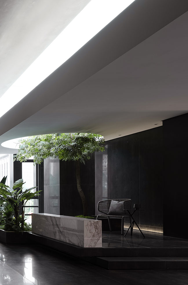
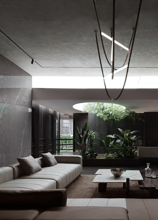
The design not only shapes the space, but also creates atmosphere. The ceiling of the lobby is embellished with veins and fern. The wall clad in cement-like coatings is matched with transparent glazing, which produces a natural, tranquil spatial atmosphere. The greenery evokes the reverence for nature and reflection on life.
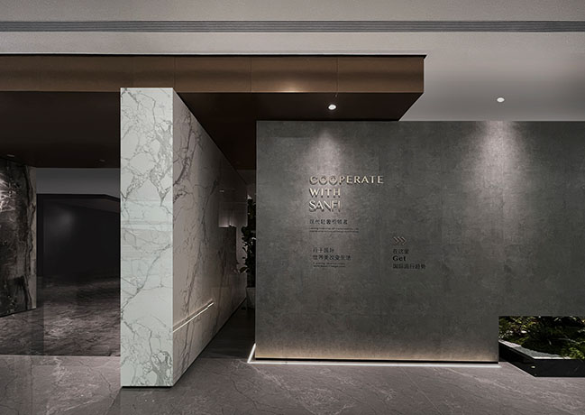
Lightweight light strips create a fluid rhythm, and links different scenes and guides visitors to feel artistic charm. Complemented by lighting, the interweaving, stacked structures and openings in the space produce a sense of order and layering.
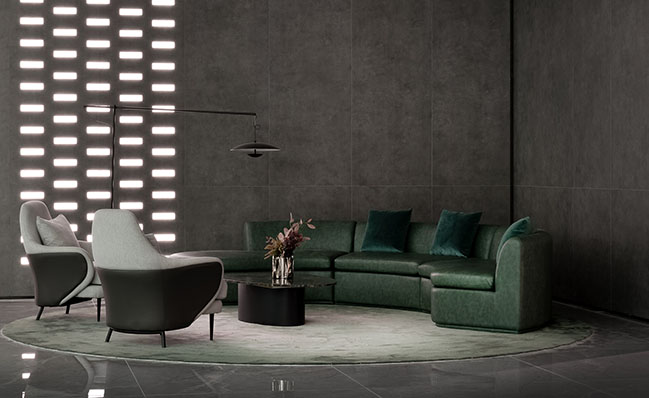
The spatial design emphasizes the contrast of solidness and void, the match of textures, varying light and shadows, and the fusion of warmth and technology, to extend the spatial experiences beyond the physical realm.
Wind
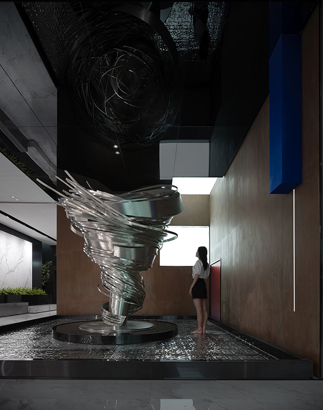
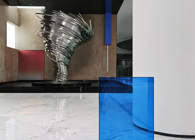
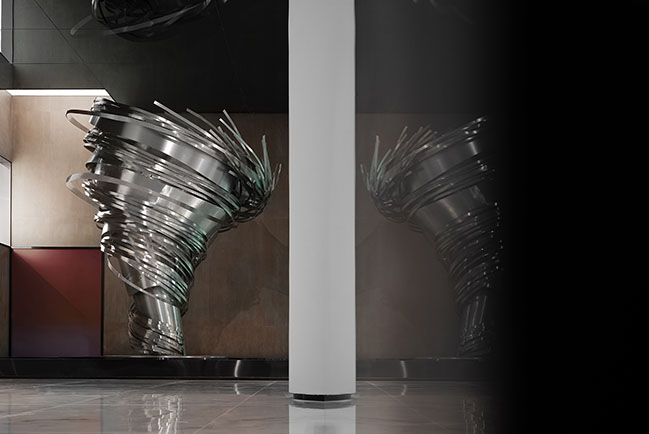
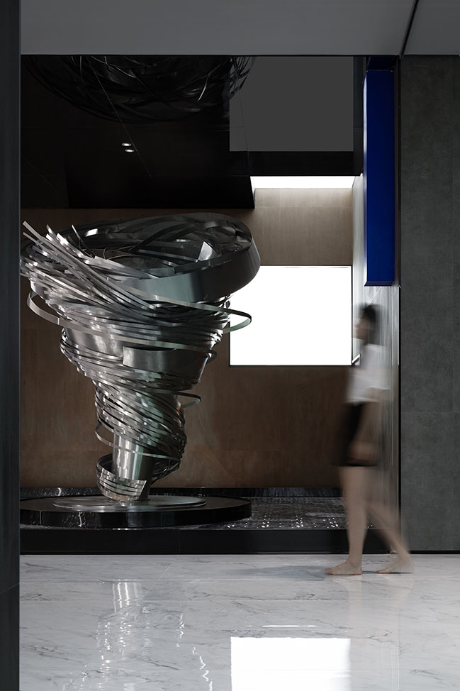
In Dialectics of Nature, Friedrich Engels explained that development is a spiral rise, which often recalls the form of tornado. The design team brought in a tornado-shaped art installation to express the tortuous path of the brand's development, and to highlight the theme of the space as well.
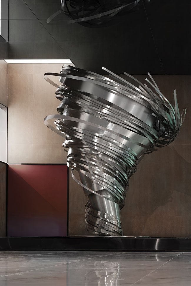
The art installation shows strength, visual aesthetics and dynamics. The "tornado" spreads out in the space and continuously spirals upwards, which represents endless vitality and the brand's strong momentum of growth.
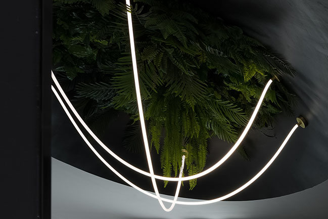
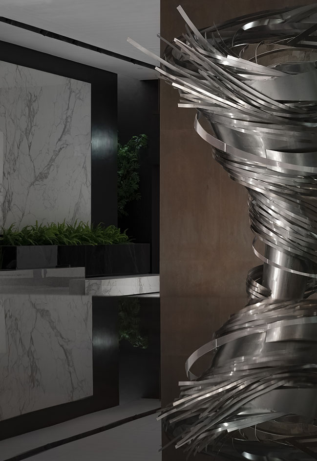
The installation comprises components of different forms, which produce curves on its surface through twisting and reorganization, hence echoing the shape of whirlwinds.
The linear elements generate a sense of continuity in an abstract manner, and create dynamic visual tension through superposition, extension and interpenetration. It creates a weightless outer space-like experience.
Surreal wonderland
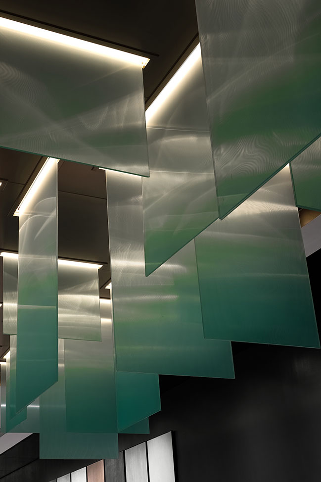
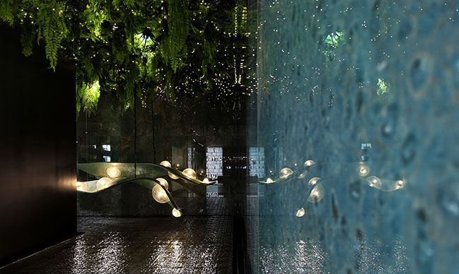
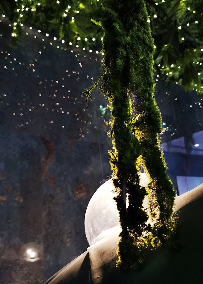
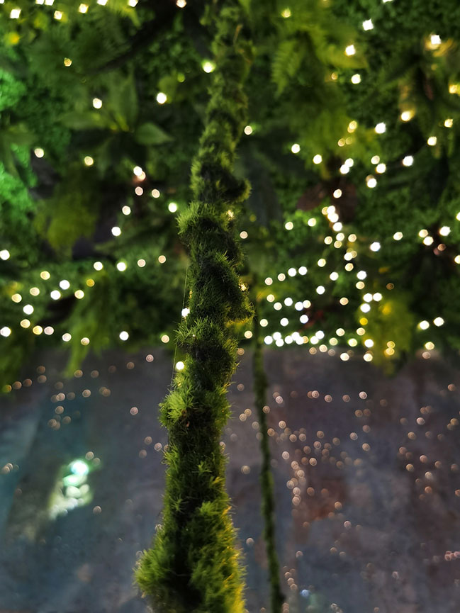
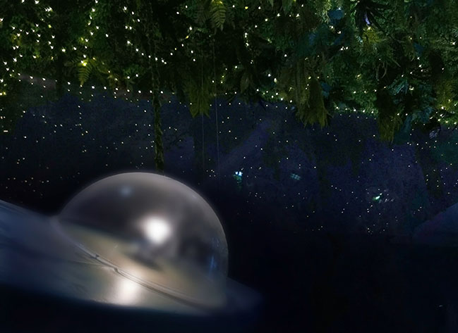
The designers adopted rippled stainless steel and a series of starry sky-themed adornments to create a surreal wonderland. The art installation made of green glass-fiber reinforced plastic appears like a space ship that navigates in the starry sky. Vines suspend in the air, and "alien creatures" shine like glowworms.
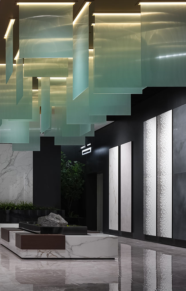
Here, the physical boundary seems to disappear, and people seem to be brought into Pandora Planet. Mirrored materials are utilized to blur the real and virtual. The design is intended to create a dialogue between the past and future, and to imply the pursuit of the unknown and eternity.
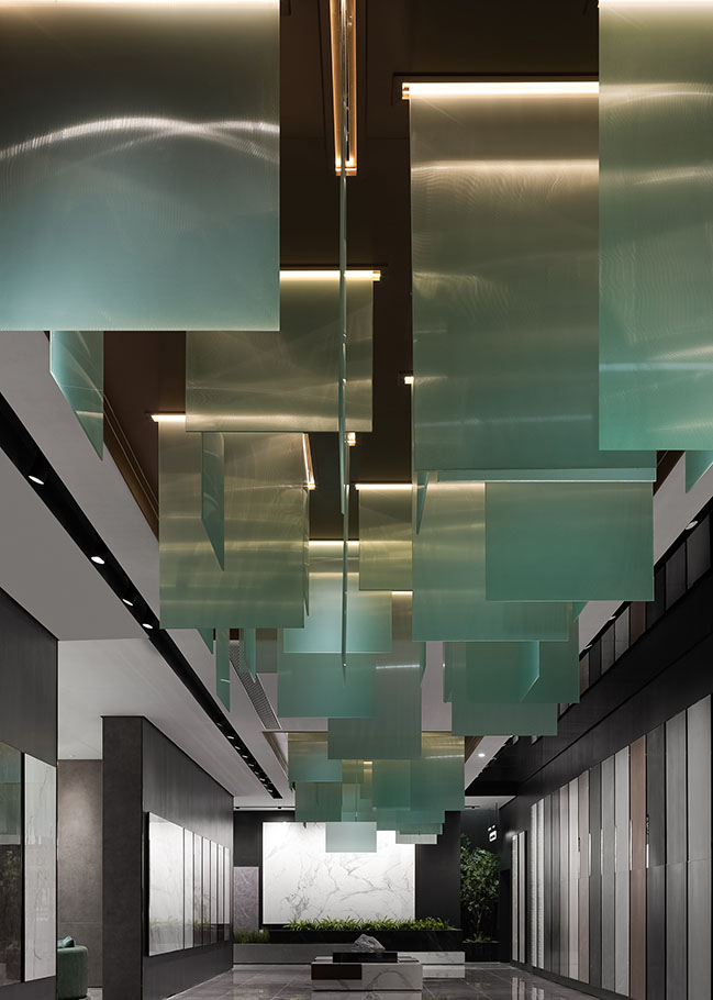
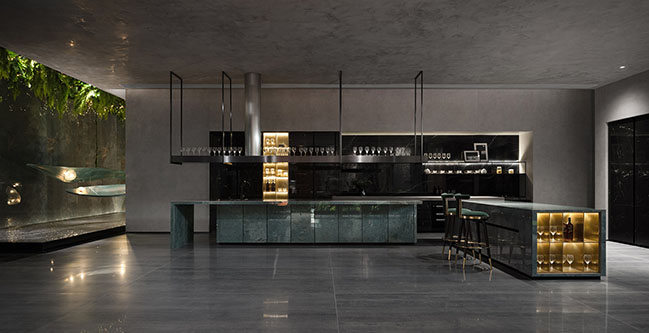
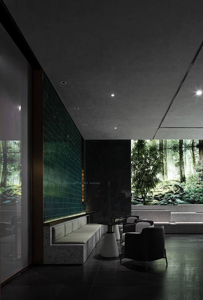
The kitchen display area is finished with elegant gray sintered stone panels and luxurious green stone boards, which are combined with artistic natural landscape to create a unique home setting for display and highlight the distinctive aesthetics of products. The design creates a cool, mysterious spatial ambience, and fuses varying aesthetics through contrasting colors and textures. The space not only offers novel experience, but also carries cultural implications. The designers hoped to create a space that is warm, pure and stimulates interaction. Light is a design highlight. Light and shadows interplay in the space, showing an artistic aesthetic.
Tranquility
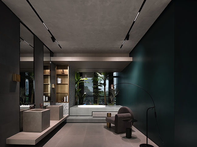
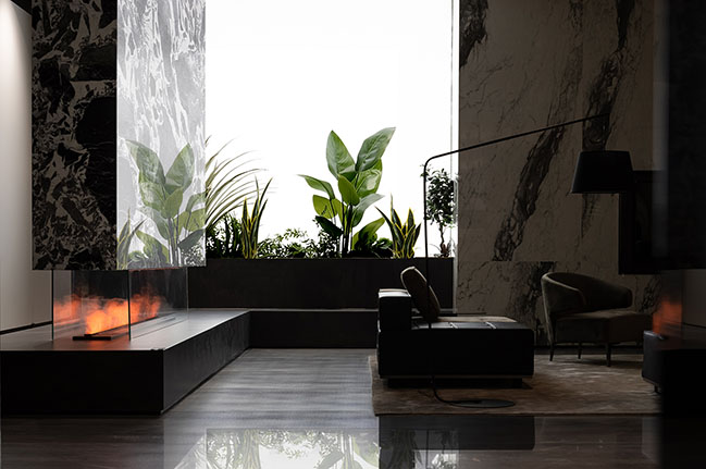
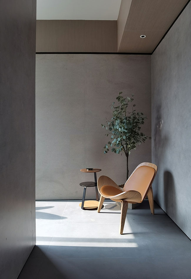
The design fully makes use of varying light, and combines it with simple materials to form poetic, natural scenes that evoke resonance between people and the environment. The space blends the city's cultural context with poetry and nature. All details reveal the respect to nature and space.
The space is pure, clean, without elaborate, excessive decorations. The design team intended to integrate the space with architecture, landscape and nature, to create a serene environment where people can gain inner peace and feel, perceive everything around.
The large window brings in outdoor natural landscape. Lush plants, changing light & shadows and bright sunshine adds vigor and charm to the lobby, and form an "oasis".
Design Firm: FOSHAN TOPWAY DESIGN
Location: Foshan, China
Year: 2021
Area: 8,000 sqm
Chief Designers: Wang Zhike, Li Xiaoshui
Design Team: Lu Zhongwen, Qiu Wenfeng, Huang Jianhe, Lan Jingwei, Lai Yuqin, Liu Yangzhu, Zhou Yinghong, Zhang Yazhou
Text: Lan Jingwei
Photography: Ouyang Yun
YOU MAY ALSO LIKE: ARTLAND Exhibition Hall by FOSHAN TOPWAY DESIGN
YOU MAY ALSO LIKE: VERO Ecological Tiles Exhibition Hall & Headquarters by Foshan Topway Design



SANFI Headquarters by FOSHAN TOPWAY DESIGN
10 / 20 / 2021 The designers hoped to show such a process of transformation in the brand's headquarters through an artistic way.
You might also like:
Recommended post: Lake House 01 by Alex Pettas Architecture
