03 / 17
2022
The strategy is using a sloping block to lead the space, then developing the plan and details of each part...
> A residence on the hillside - Donghulin Guest House by Fon Studio
> WAA Riverside Gastropub design by Fon Studio
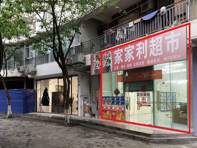
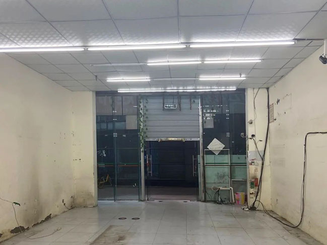
Project's description: People are nowadays amazed by the vitality and renewal speed of Chengdu while walking through the communities. The “proper” site is quite interesting because of densely distributed new & old Communities along lively Palladium Street. Commonly, pioneer's retailing space next to a long-running breakfast shop or an assortment of hardware stores, such growth is the charm that this city brings to everyone.
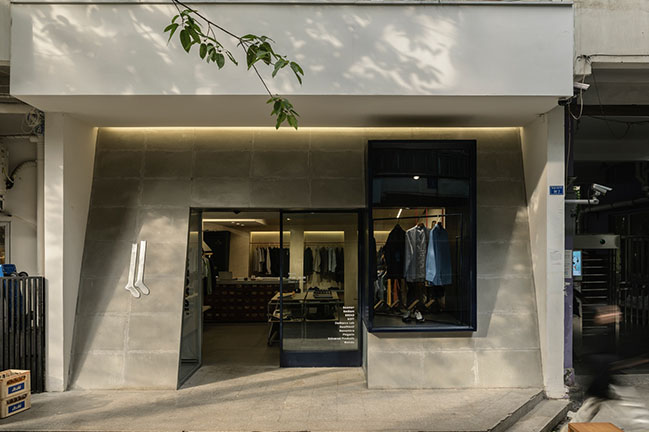
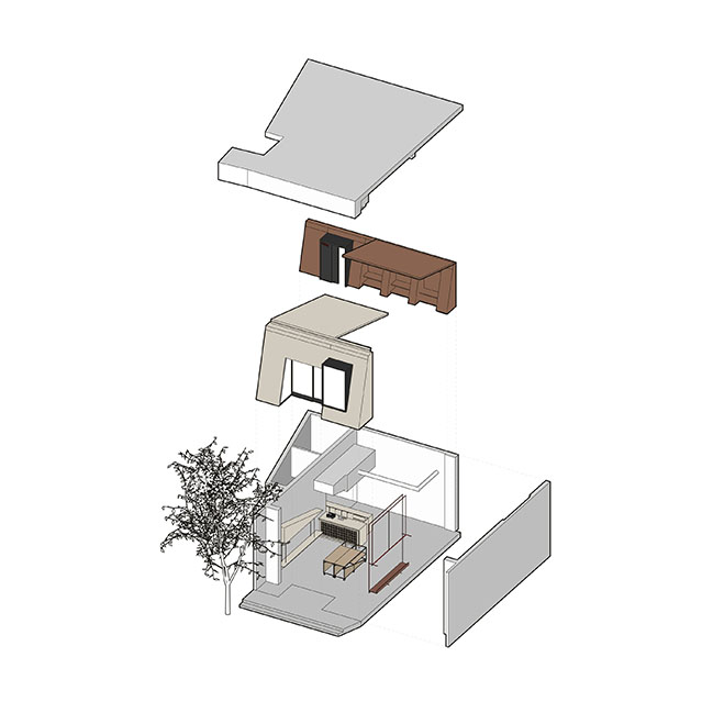
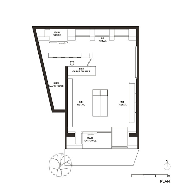
The manager already had a brand in business for three years next to the one to be designed. “proper” is different from the original and accepts a new method to build a product display. There are no special requirements, but more emphasis on the "city boy" style of the clothes they pick. So that the strategy is using a sloping block to lead the space, then developing the plan and details of each part.

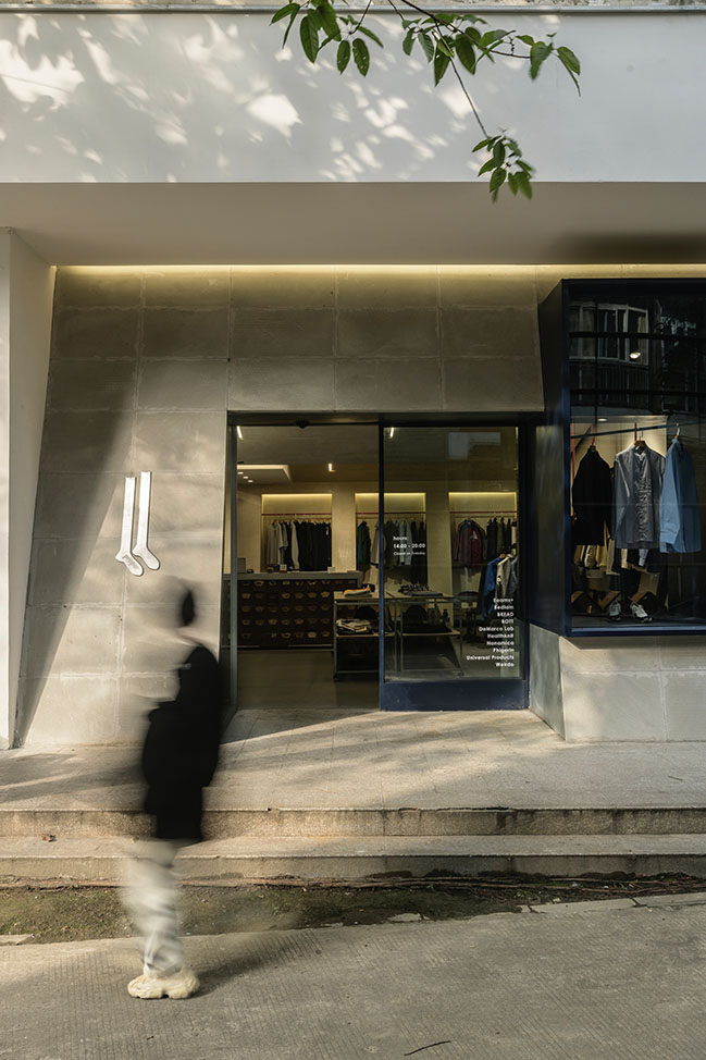
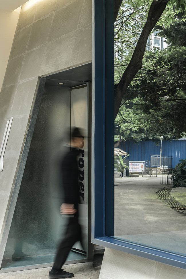
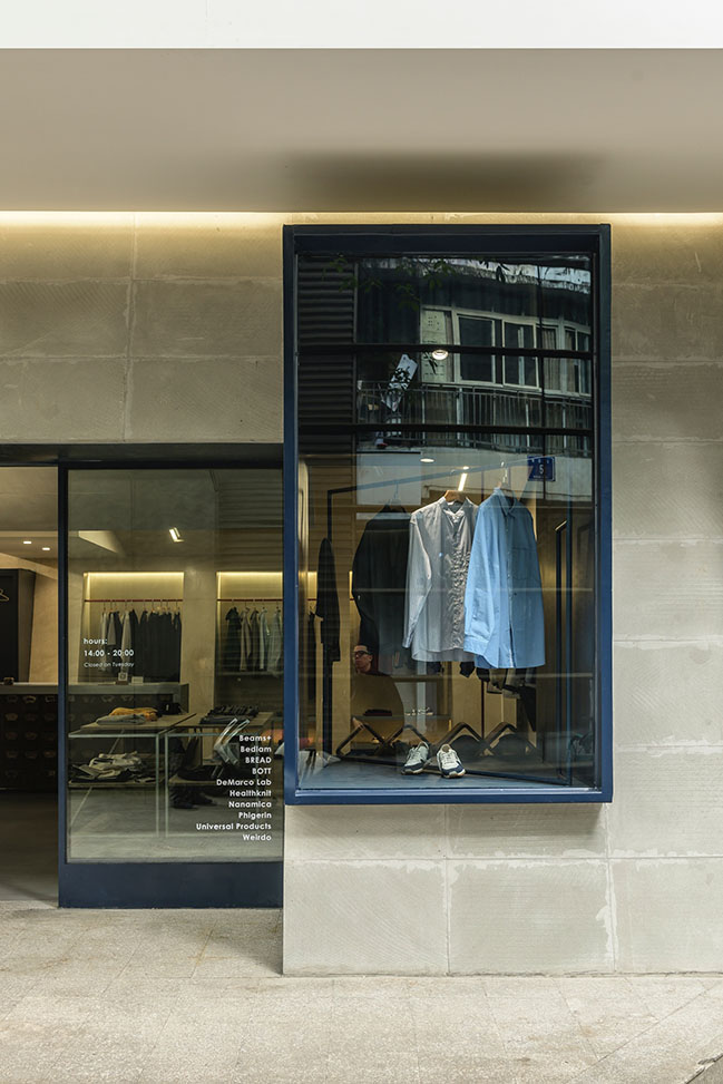
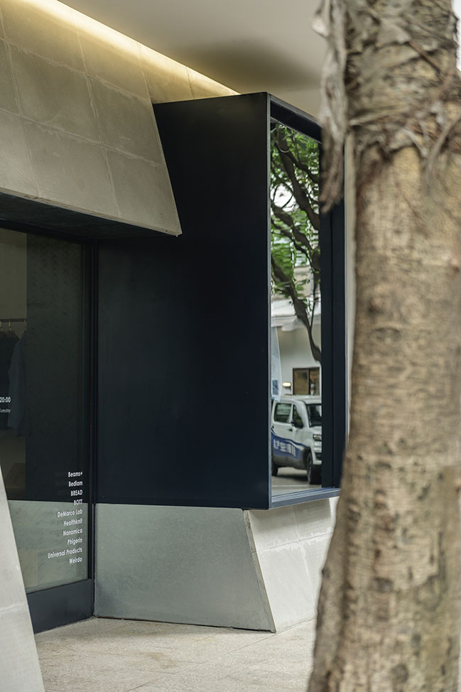
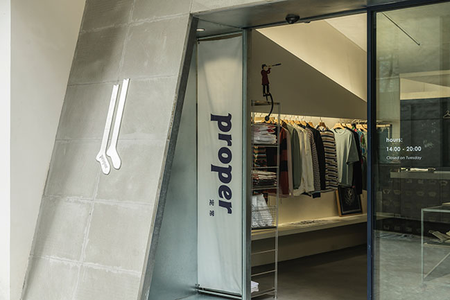
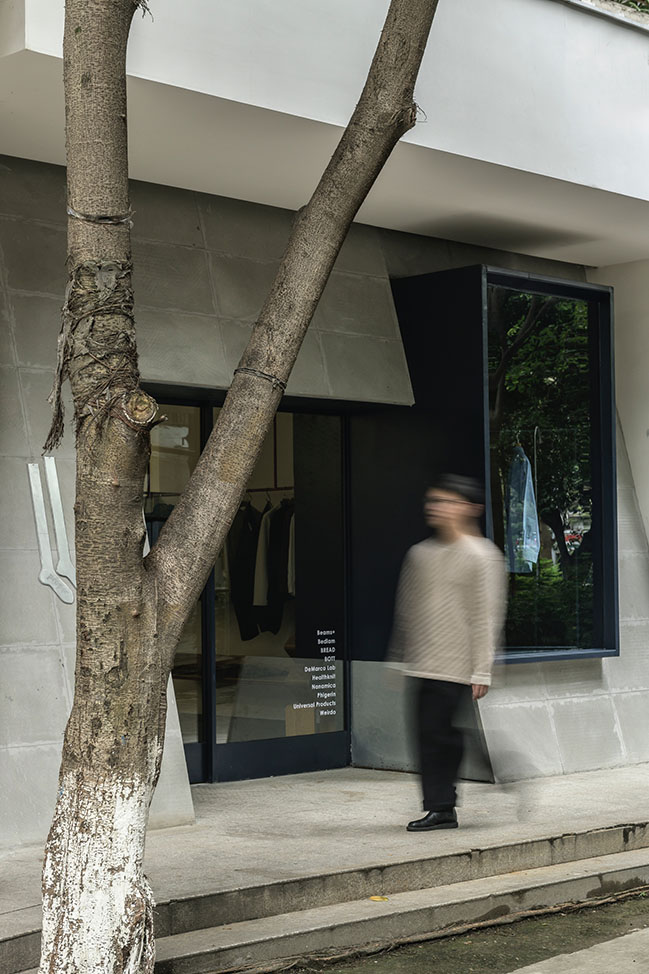
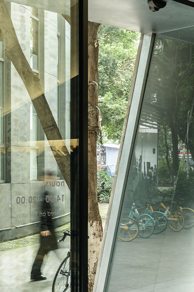
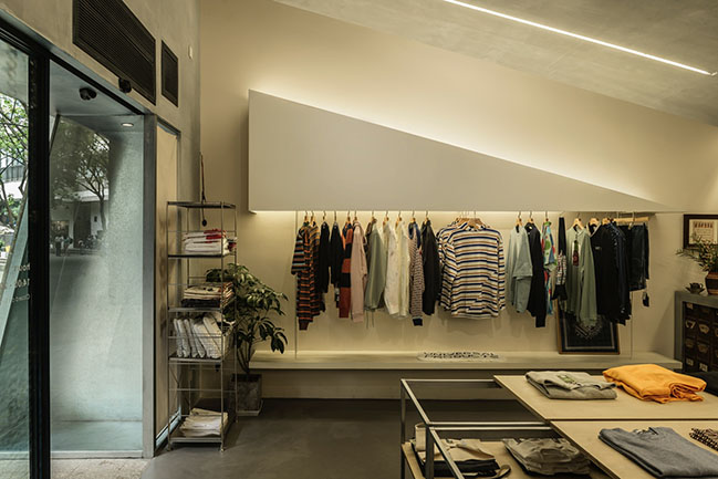
With the shape changes, the entrance façade has a certain personality among commercial spaces to the street. With the natural texture of sandstone, the store tries to reflect the soft part of the urban texture. At the same time, display windows and the entrance space are juxtaposed vertically and moderately respond with the interior space. Since the need of displaying fashion formats is the focus of space design, a relatively ample window area is left, which can cooperate with the changes of different themes and size combinations.
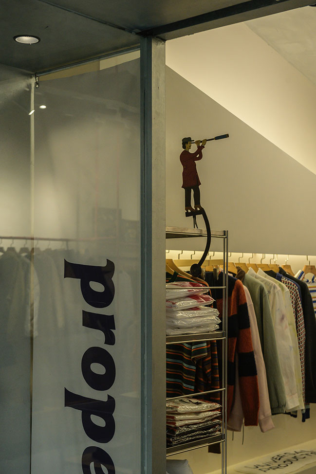
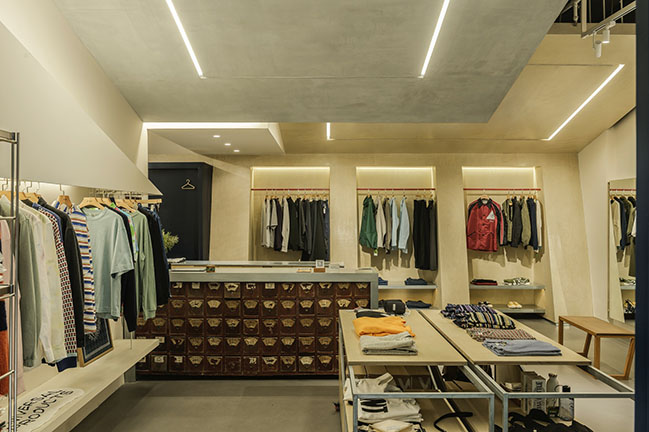
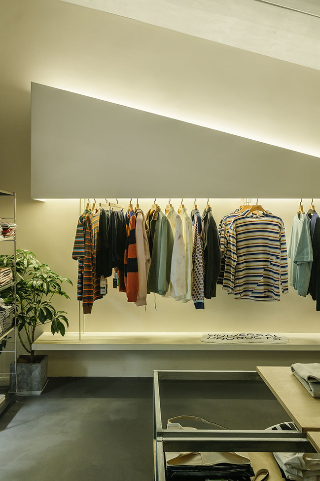
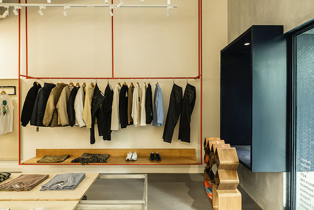
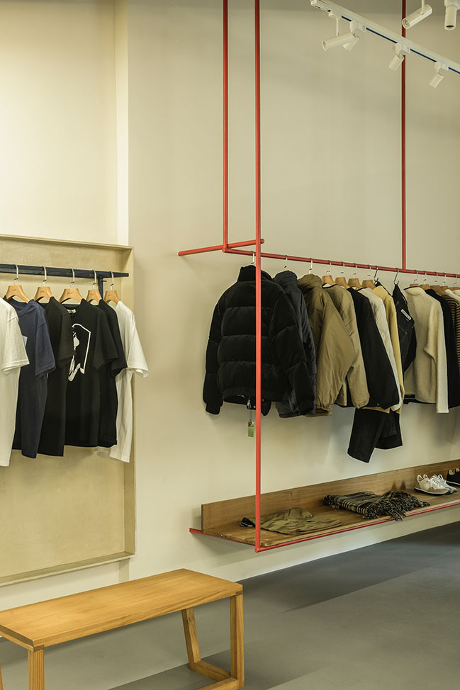
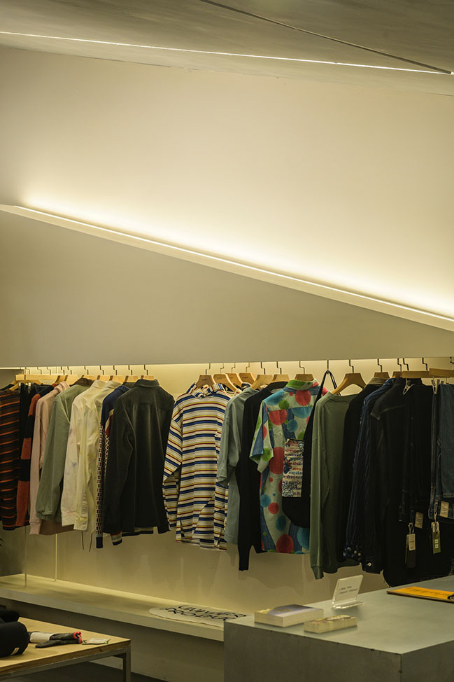
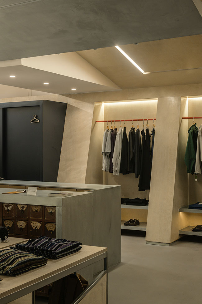
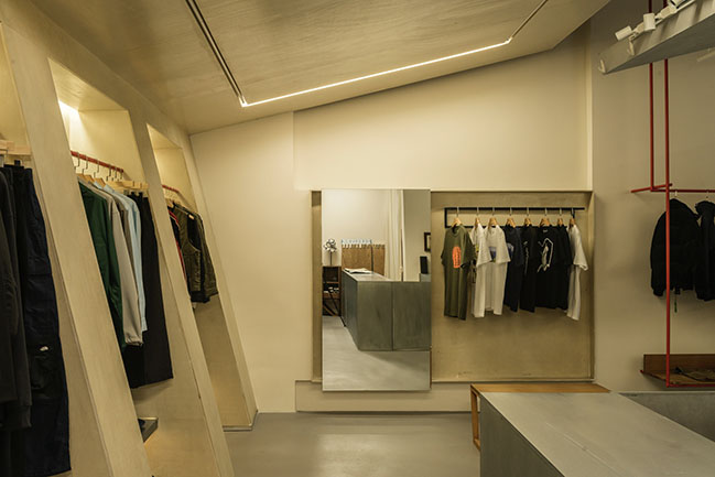
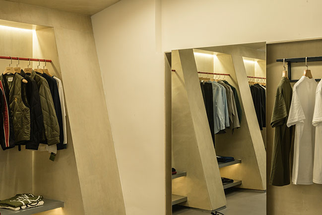
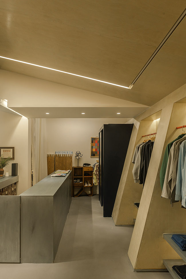
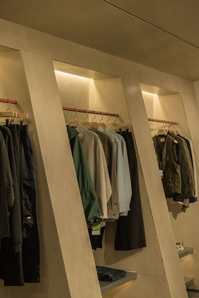
In the compact interior space, three main walls are divided into the core display area for brand selection. Among them, the same sloping roof shapes a right angle, forming an interesting connection. We intentionally designed different forms of displaying racks to create richness in a limited space. The west wall responds to the inclination of the overall space, and the white balances the full color of the clothes. As for the hanging rod design on the east side, red lines provide energy to the elevated space.
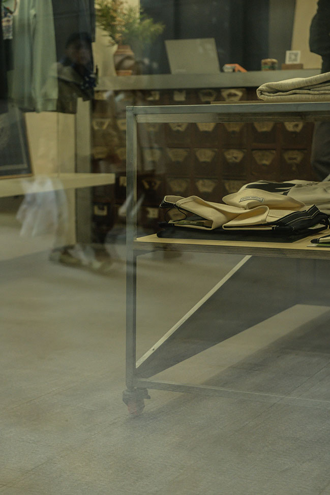
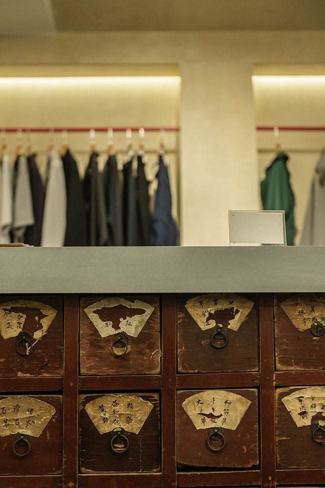
The medicine cabinet at the front desk, used by the manager in the early days of the brand establishment, is the only old texture. Under the wrapping of a modern design language, this cabinet full of traces of time will continue his passion and memory for this space. The adjoining fitting room is a dark blue volume that responds to the window space embedded in the façade. The mobile table placed on the ground adds a flexible space for the goods displayed in the store. This multiple combination method finally shows a relaxing experience for “proper” operation and the guests.
Putting the scenario back into the business community, we can always find a balance between regular and free. All functional designs are centered on people's purchasing experience, and geometry is used to create a unique aesthetics of “proper”.
Design Company: Fon Studio
Client:& proper
Location: Qinglianshanglu, Jinjiang District, Chengdu, China
Year: 2021
Building Area: 79 sqm
Team: Jin Boan, Li Hongzhen, Luo Shuanghua, Zhang Jingyi
Photograph: Fon Studio


The Sloping Balance Space - proper Concept Store by Fon Studio
03 / 17 / 2022 The strategy is using a sloping block to lead the space, then developing the plan and details of each part...
You might also like:
Recommended post: House in Mexico by Peter Pichler Architecture
