07 / 07
2019
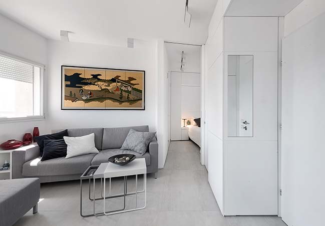
A couple whose children have left the family nest leaves behind a detached house in the suburbs in favor of a 50-square-meter apartment in an old building overlooking a busy road in Ramat Gan.
Architect: XS Studio for compact design
Location: Ramat Gan, Israel
Year: 2018
Area: 50 sqm
Photography: Amit Gosher
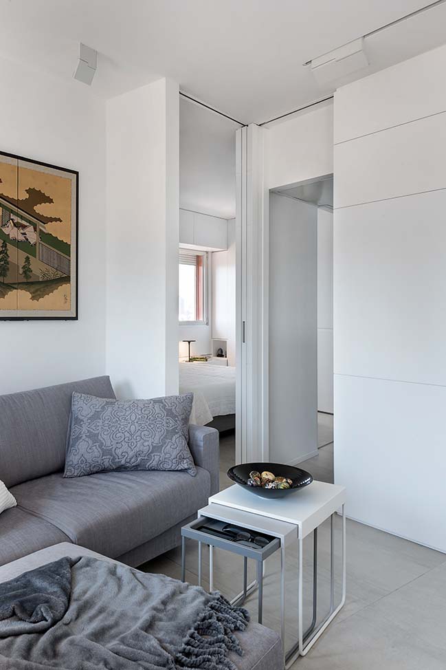
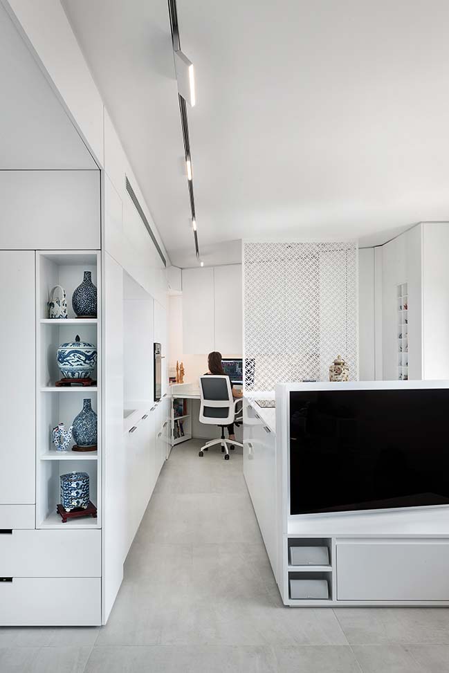
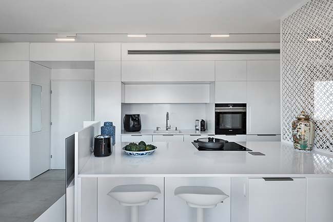
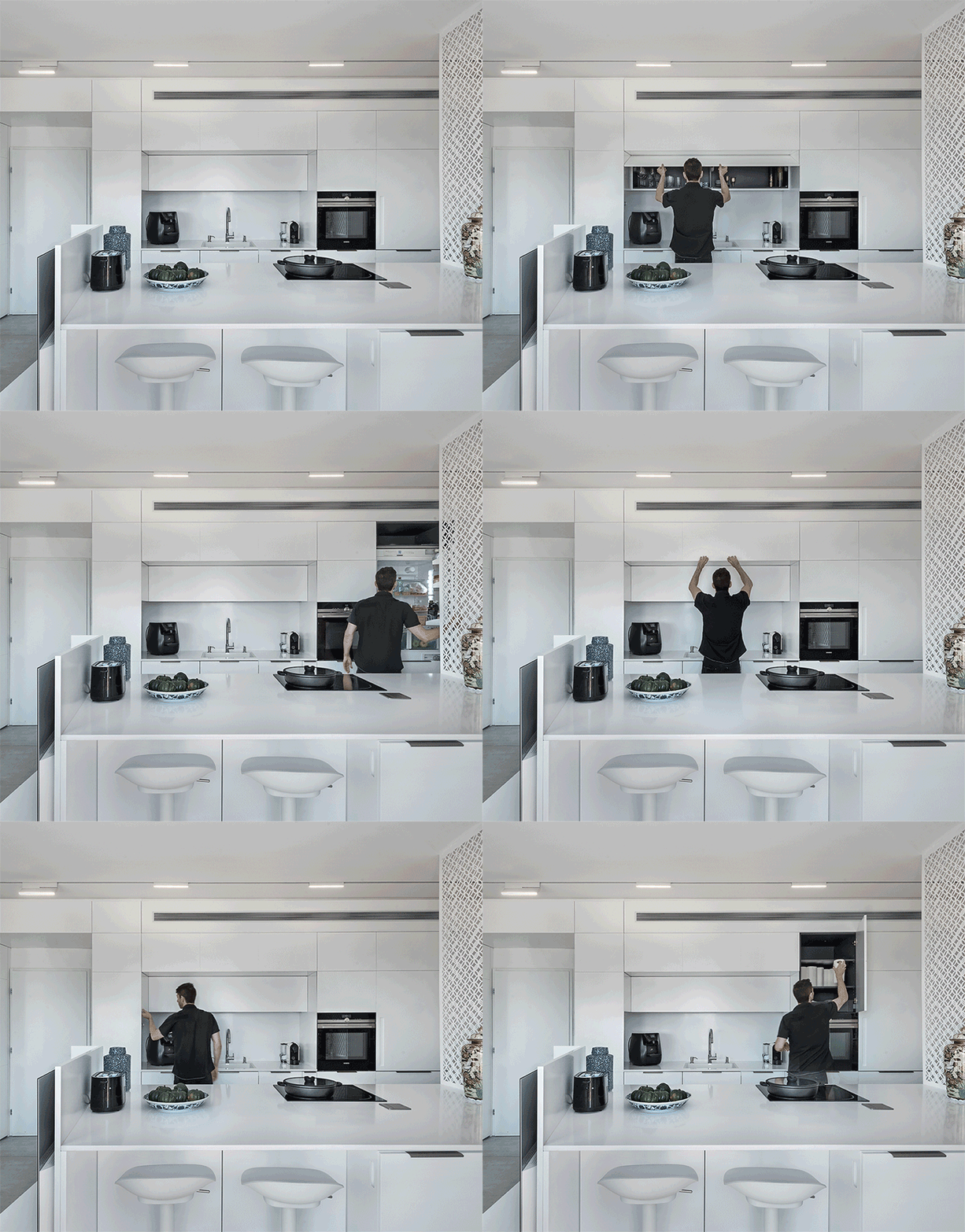
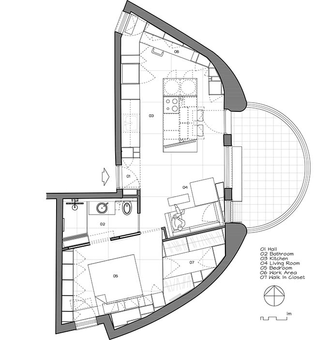
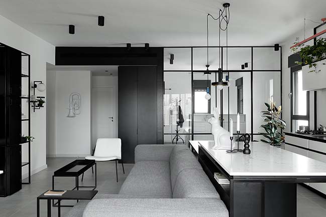
From the architect: In a narrow, long, and small space with challenging geometry (diagonal, rounded walls) our goal was to keep the space clean; to allow carpentry work to absorb the challenging geometry; to blur out the borderlines between the different spaces. In this kind of space there is no room for borderlines (walls / rooms / definitions). The kitchen flows into the den and the den is exposed and not fully outlined as a distinct space. Only a delicate white steel partition separates the two.

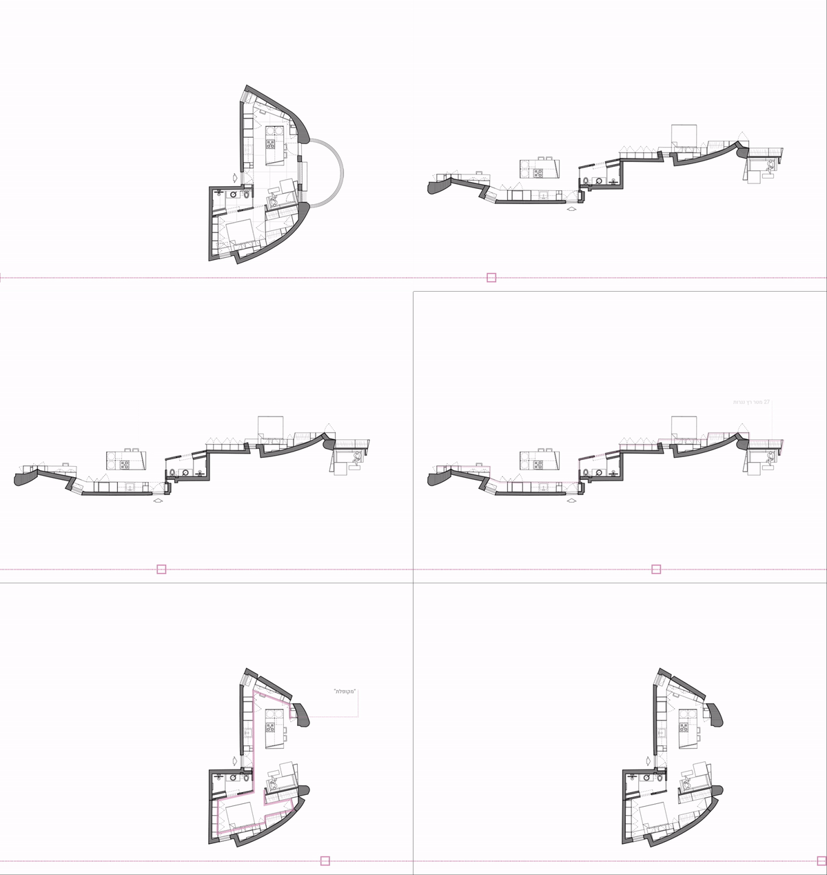
We don't typically show alternative designs that we discuss with our clients during the design process. Since understanding and dividing this space posed such a tremendous challenge, and since the process has brought up so many questions pertaining to the way of living in such a fine-tuned space, we chose to offer a glimpse into the stages we worked through in this project.
Wall/Partition: Observe the evolution of a partition. From endless walls to zero walls (except one wet space); one wall was brought back later on in the final plan at the back of the couch to moderate the impact of the carpentry work and to leave room for artwork.
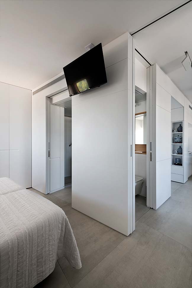
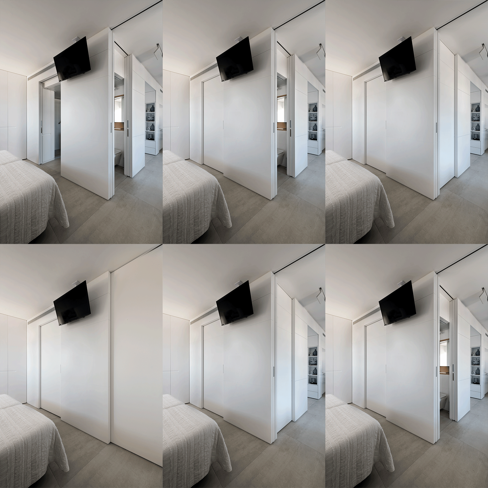
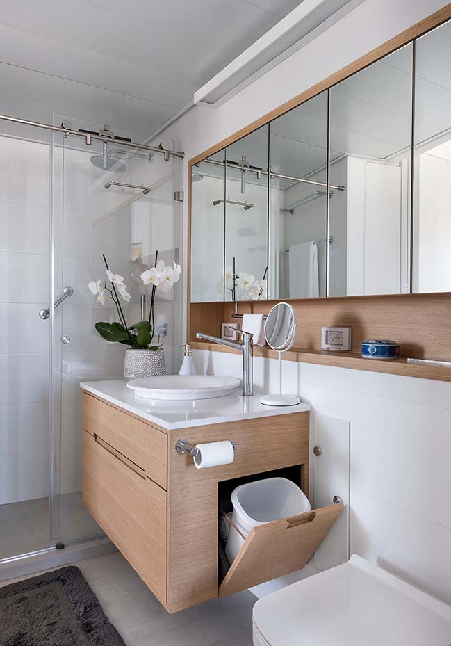
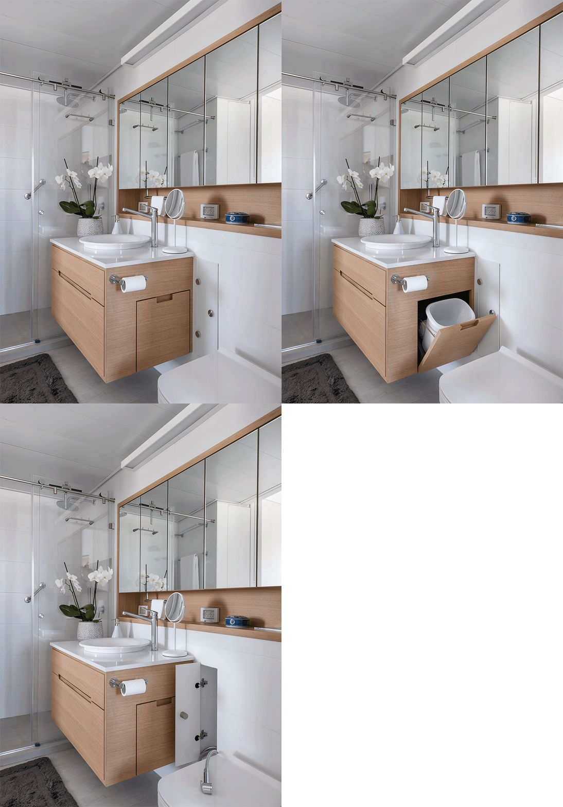
The materialization of the overlapping space in the wet space area can also be observed. We have evolved through several stages: from separate guest and private bathrooms, to giving up on the guest bathroom, we ended up with the perfect combination - a bathroom that can serve both the homeowners and their guests (thus saving a lot of space).
The process here was fascinating. The changes we have made together with the homeowners were the product of openness and flexibility on their part, their cooperation, and a mutual desire to take full advantage of every inch in the apartment.
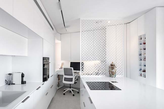
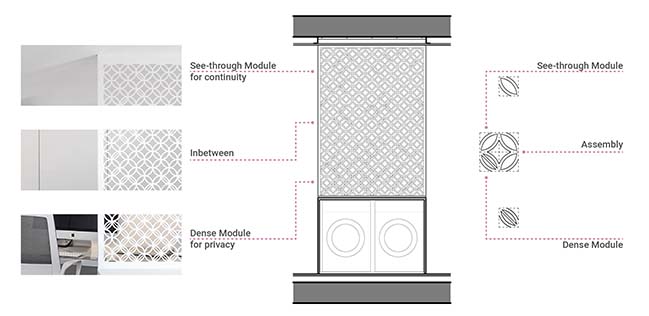
The partition underwent many evolutions. The goal was to create a refined see-through partition which would offer privacy for the den while allowing light to come through and offering an open view of the entire space. Various materials and textures were considered before settling on steel with the chosen texture. Once texture and material were chosen, there was the question of scale. We created a few mock-ups and, finally, the partition was born. We were then faced with the question of connecting the partition to the island counter top and to the ceiling.
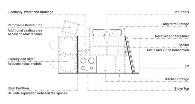
At first sight, the island may appear exceptionally large given the limited space around it. Well, the island has many surprises in store. The largest of which is that its width was determined by the washing machine and tumble drier. It is 125 centimeters wide, allowing both appliances to sit snugly one next to the other. On its opposite side, the wall of the island hosts the TV, thus delineating the edge of the adjacent living room.
The TV is not parallel to the island, but sits at an angle, since the wall behind the couch is also diagnoal and it was important that we interact with it. What can be more convenient than to get home and toss the bag onto the island - which also happens to be the center of the home?
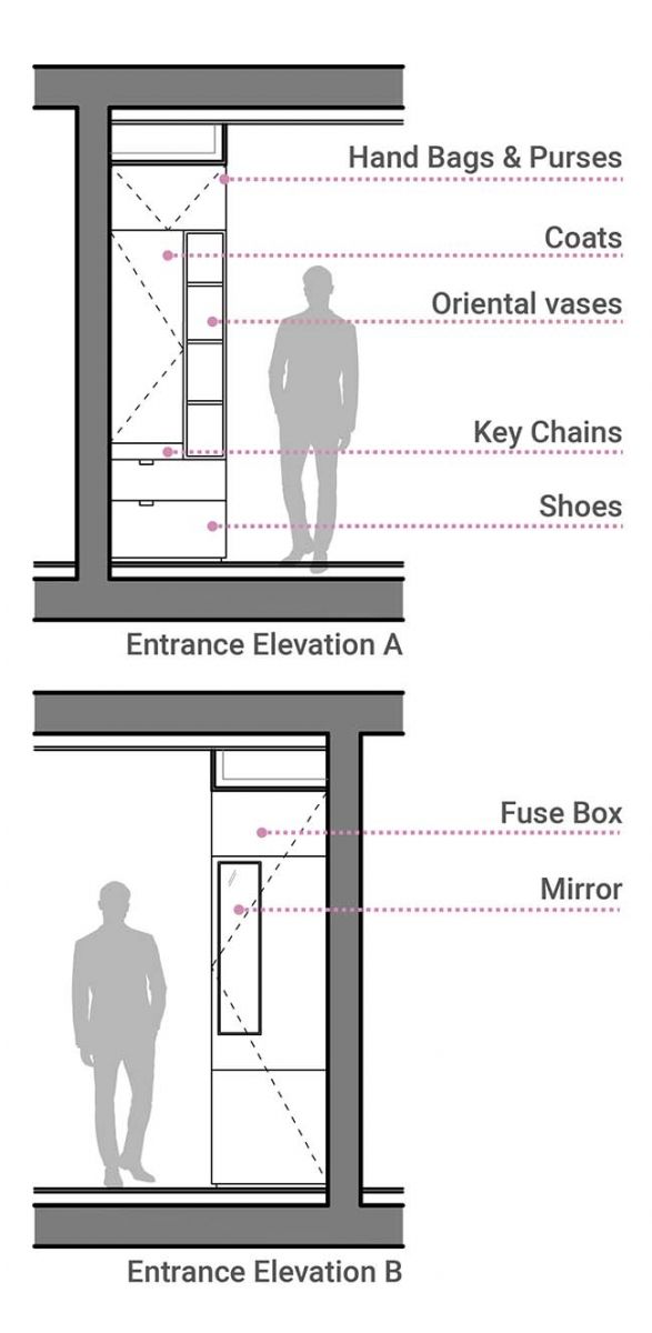
In such a small home it is important to make use of every available space for functional purposes. By the entrance there is designated storage space for bags and, underneath, drawer storage, facing a small mirror for getting ready before leaving the house. All of these elements constitute the entrance (and exit) ritual and keep the clutter away from the central island.
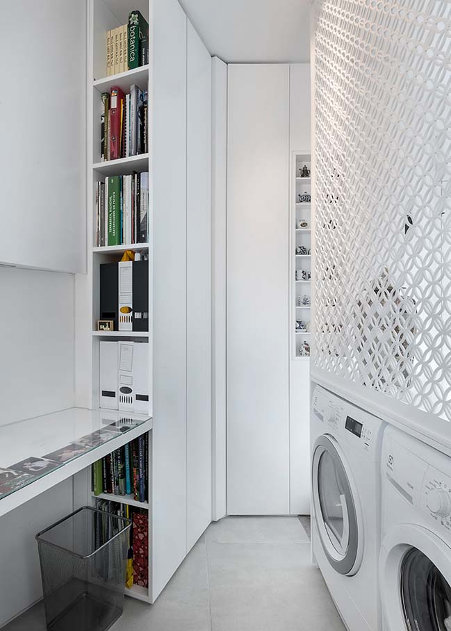
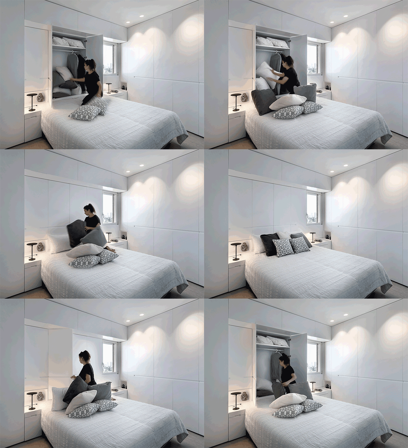
The difference between all the cute Japanese homes we see on Facebook real life is that, in the end, we like to store, to keep, to hoard. We do not have naked spaces where people sit quietly to meditate. We have stuff. Lots of it. Going back to our 50 square meter apartment and moving out of the spacious house in the countryside, we must find storage space. New and creative options were considered. Pullout storage boxes are placed underneath the island behind the seats; an extra storage layer is added instead of toe kick space; and the height of the apartment was also used fully.

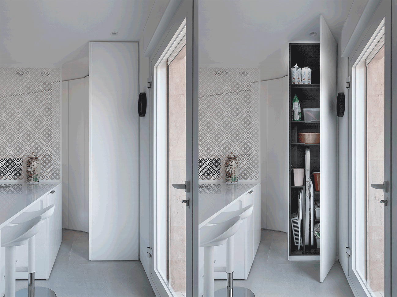
Where will we keep the cleaning equipment?
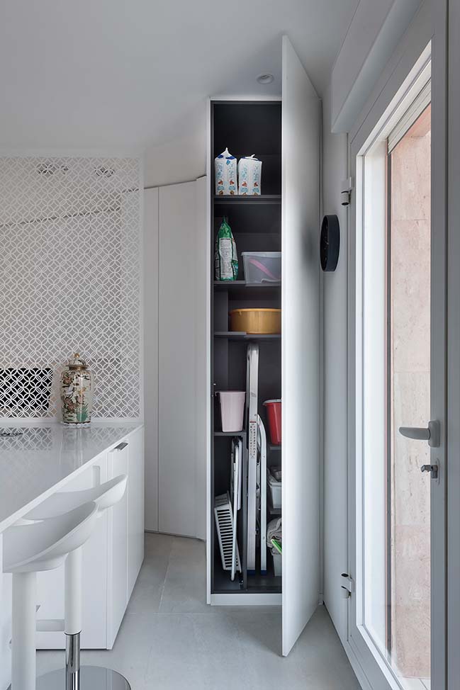
One of the challenges in compact apartments is to find storage space for the broom, dustpan, ladder and other cleaning accessories. There is no service room, and we couldn't even find space for a service cabinet. A service cabinet side - that we can afford. So the edge of a cabinet, which is the den which is also an extension of the kitchen, hides a small service area.
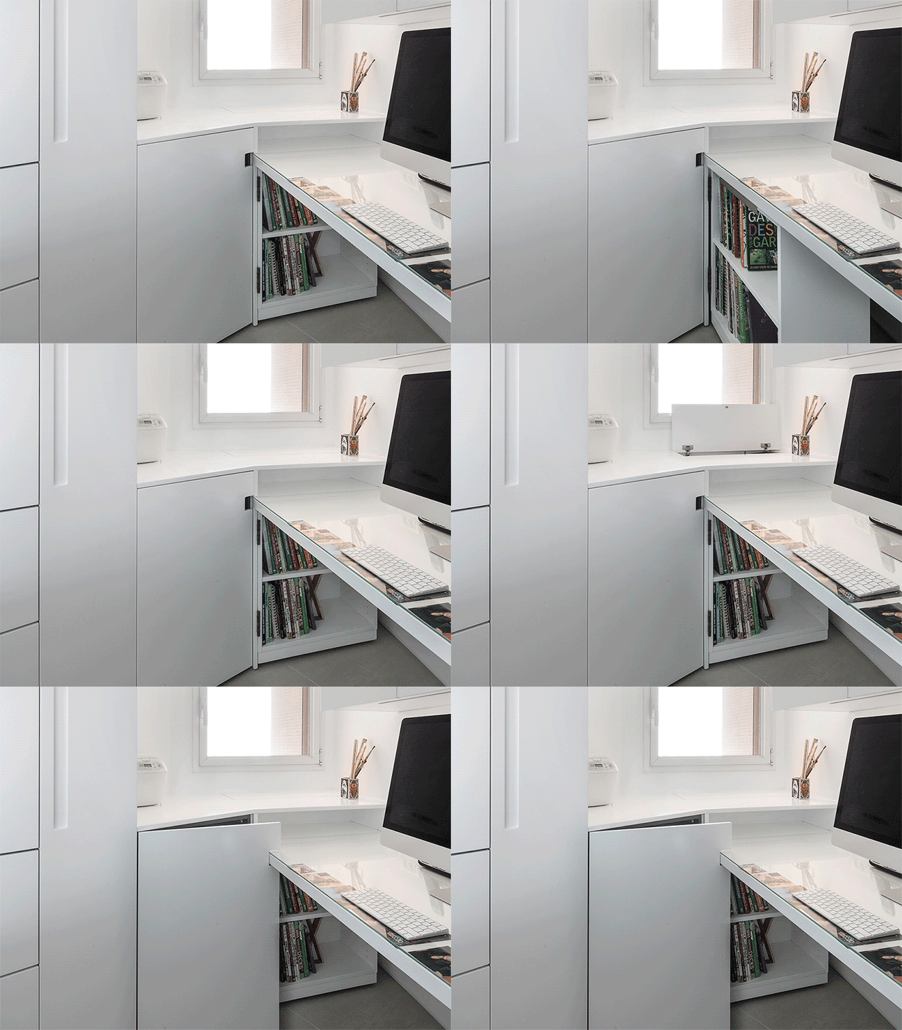
The Death of the dead corner
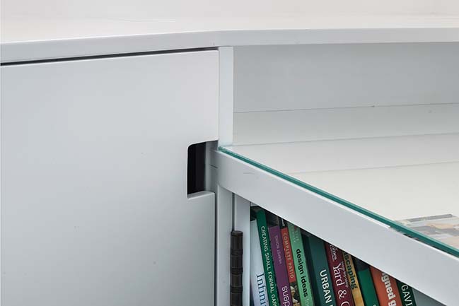
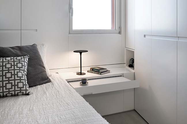
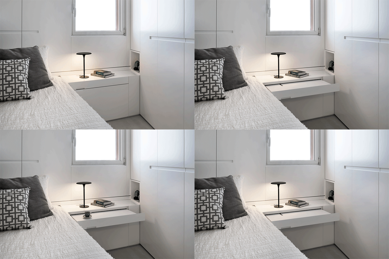
The term "dead space", which refers to unreachable areas, typically in the kitchen, is dead. Instead, the space next to the desk was used from three different directions. Room for the printer at the top (underneath the window inside the niche), a pullout book cabinet and additional storage space behind it (long-term storage since it's really hard to reach), We've also created a handle for the cabinet, allowing to make use of the cabinet which would otherwise be impossible to open because of the angle it creates with the desk.
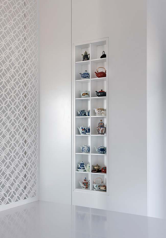
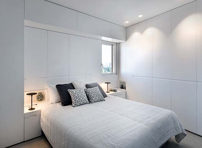
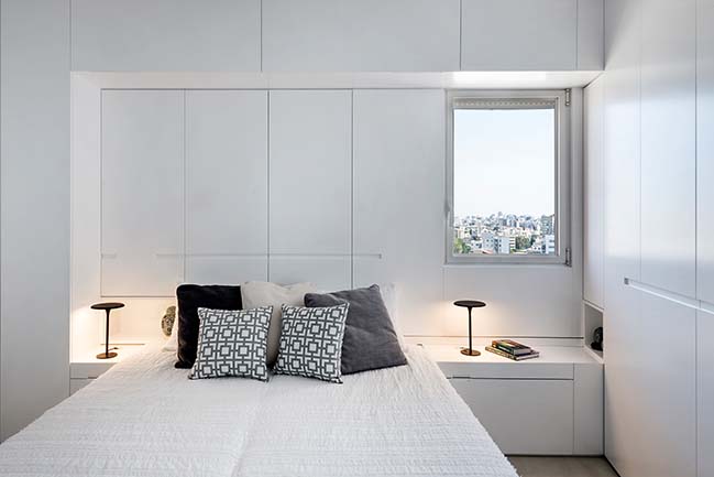
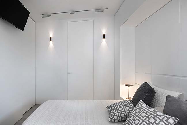
White was the color of choice for both the walls and carpentry work with hardly any exceptions. It serves as a toned-down backdrop to the miniature collections the family keeps from when they used to live in Japan.
YOU MAY ALSO LIKE: Men in Black by XS Studio for compact design

YOU MAY ALSO LIKE: Penthouse in Ramat Hasharon by Studio Erez Hyatt
YOU MAY ALSO LIKE: WB2: 57m2 apartment in Katowice by Czajkowski Kuźniak Architekci
Folding It Up by XS Studio for compact design
07 / 07 / 2019 A couple whose children have left the family nest leaves behind a detached house in the suburbs in favor of a 50-square-meter apartment in an old building in Ramat Gan
You might also like:
Recommended post: The tallest skycraper in Africa


![Modern apartment design by PLASTE[R]LINA](http://88designbox.com/upload/_thumbs/Images/2015/11/19/modern-apartment-furniture-08.jpg)


