04 / 04
2022
Outstanding commercial space motivates the brand and the design team to reinforce each other for win-win results, which is perfectly demonstrated by the cooperation between AD ARCHITECTURE and TRONGYEE_FASHIONS...
> Red Box by AD ARCHITECTURE
> ANBONG HOME by AD ARCHITECTURE
From the architect: Four years ago, TRONGYEE_FASHIONS, a conventional clothing brand rooted in downtown Shantou for more than two decades, entrusted AD ARCHITECTURE to design a store for its sub-brand TRONGYEE. Since completion, it has become a leading fashion store in the local market, and has helped the brand to gain a great leap in both sales and influence.
TRONGYEE's first store
This time, based on the client's new demands for upgrading TRONGYEE, AD ARCHITECTURE was entrusted again to conceive a new retail store. Xie Peihe, the chief designer, gave a more "adventurous" solution for the project.
Confident adventure
It is unquestionably that the success of TRONGYEE's first store has brought new inspiration to Shantou's retail sector, and has helped popularize the concept of "Designer clothing boutique store" to local consumers. This time, AD ARCHITECTURE hoped to inject new artistic elements into the brand through conceiving the new store.
When Ms. Lu, the director of TRONGYEE, discussed with chief designer Xie Peihe for the first time about the design of the new store, positioned the store as an attempt of the brand to enter shopping mall from traditional commercial street, and hoped it to be controlled at 80 square meters with a low investment.
The new store's design determines the brand's future position and expansion direction. After an in-depth investigation of competing brands around the site, the chief designer boldly proposed that it was necessary to construct a store with at least 200 square meters to help the brand stand out among other competitors in the mall and it was essential to activate a powerful and appealing visual identity for TRONGYEE to occupy the market and lay a solid foundation for shaping an artistic brand image.
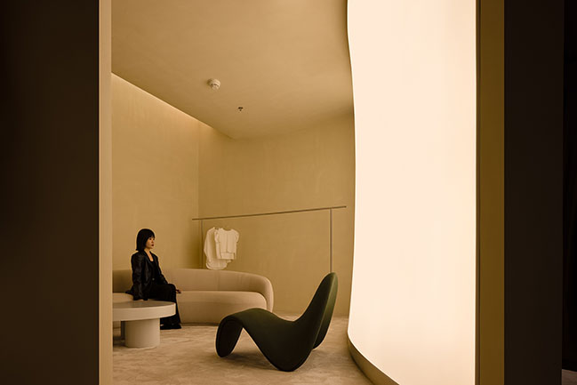
AD ARCHITECTURE explored the spatial design strategically. The seemingly adventurous design scheme is based on the design team's rich experience and keen insight into the market, which captures the market dynamics unknown to the client. With professional expertise and skills, the design team created a store image for the brand to attract high-net-worth consumers.
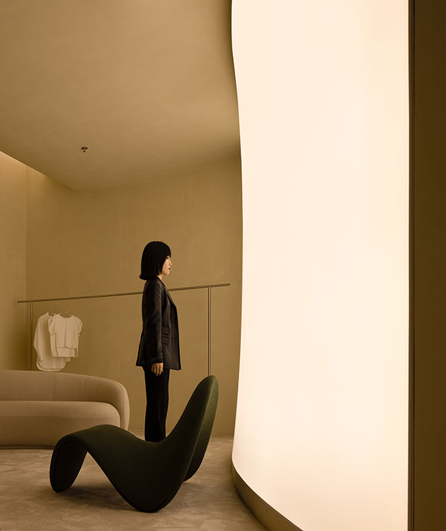
Present the space with art installation expressions
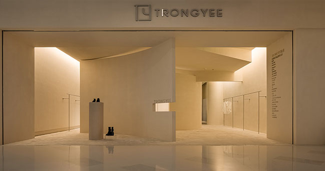
After determining the design direction, AD ARCHITECTURE decided to construct this 280 square-meter commercial space by applying the expressions of art installations and meanwhile incorporating modern aesthetics.
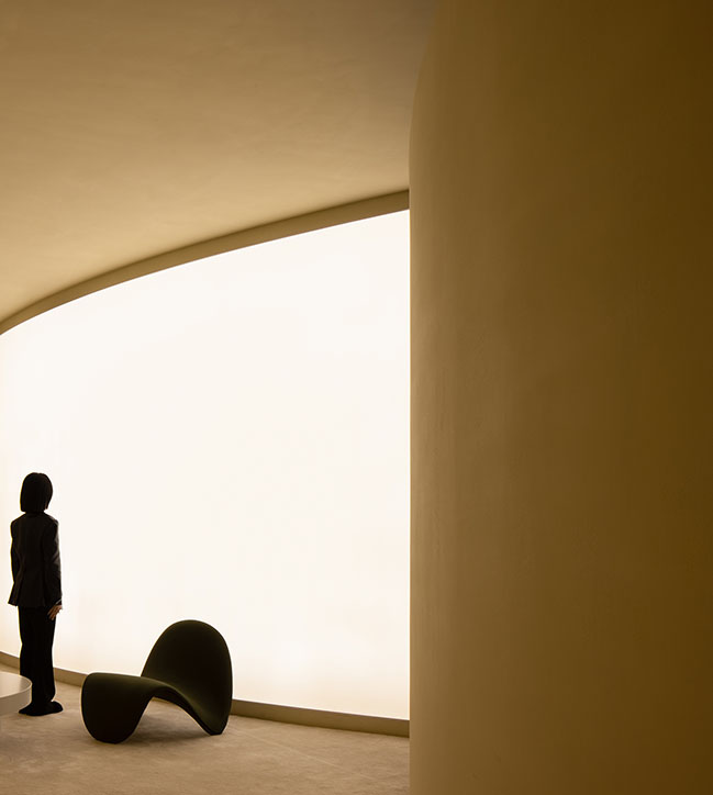
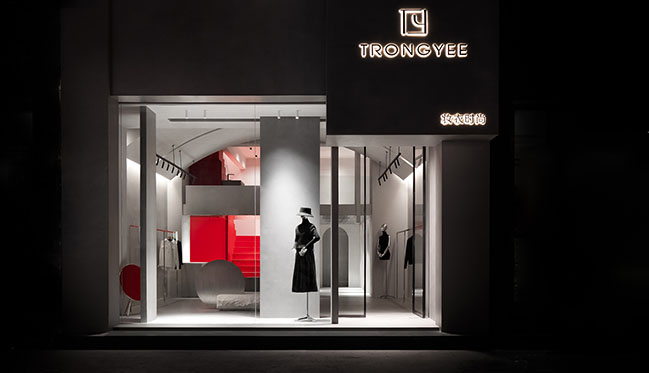
The storefront is an important part of commercial space design as it directly presents the store's image. Commercial space design usually adopts display windows to convey brand's identity and style.
However, AD ARCHITECTURE broke the conventions, and intended to attract passers-by's sight line into the store through the unique door form, which produces an open yet mysterious, intriguing visual effect. The uniquely-designed storefront forms a contrast with other neighboring stores. The design team expected to convey the artistry and aesthetic values of the brand to consumers by combining the space with products.
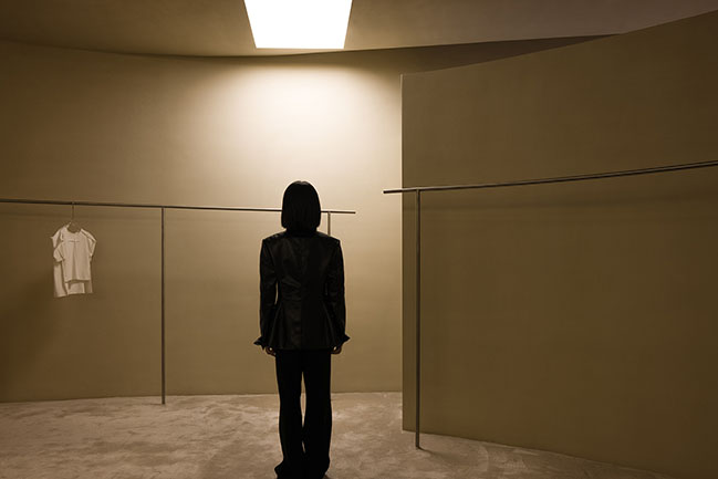
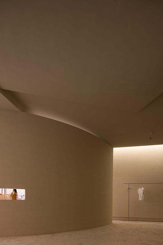
"The curved surfaces in the space are like silky and mellow cloth, which are unknown explorations and possibilities probing into the logic of rules in free changes, aiming to capture new strengths and surprises." - Xie Peihe, Chief Designer
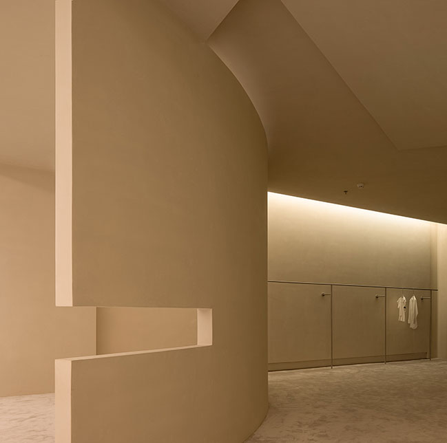
Restraining and set-back forms
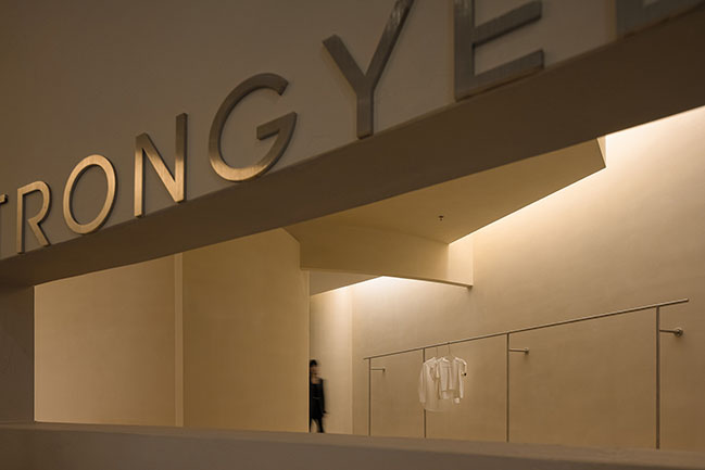
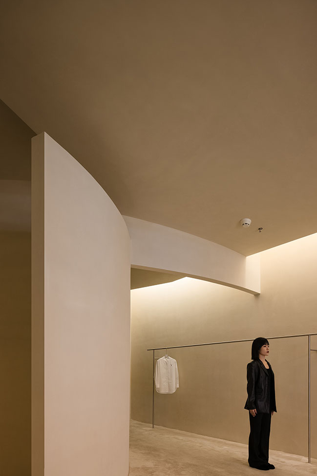
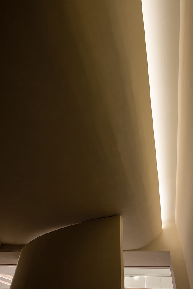
The spatial organization and behaviors stimulated by it have always been an important medium of brand strategy and commercial deployment. The design team applied set-back forms and curves to organize the exploration area, which enriches the expressions of the space and creates visual illusions. The integration of space and products motivates people's curiosity to enter and explore the store, revealing a vivid and diversified space. Stimulating people's snooping desire is a way of strengthening commercial space's attraction.

Garden touring experience
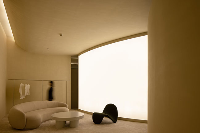
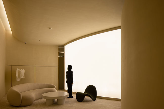
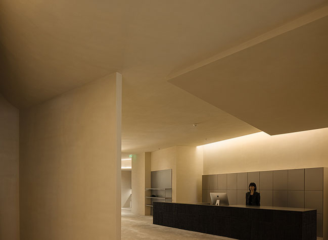
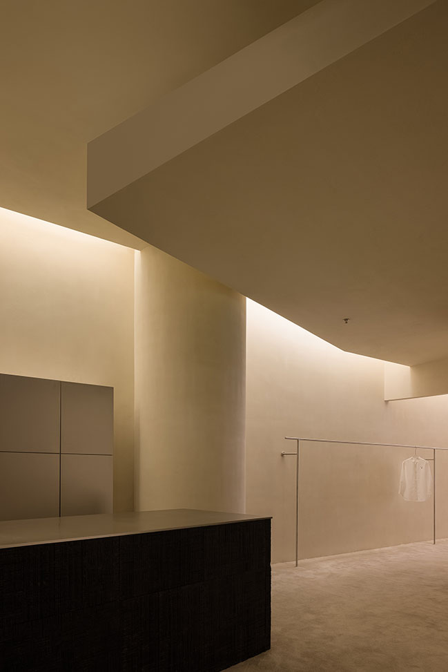
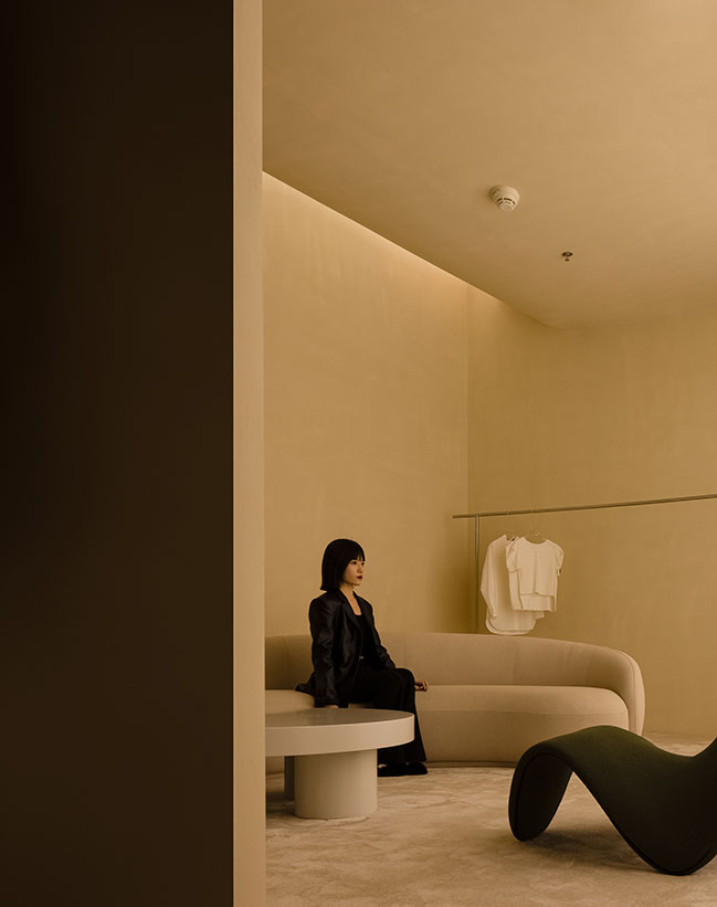
The overall space is dominated by a light yellow tone to alleviate the three-dimensional feeling brought by colors, so as to turn the artistic space into a low-profile backdrop to highlight products.
The free spatial layout provides customers with a relaxing and pleasant feeling and a shopping experience like strolling in a garden, which is the focus and purpose of the spatial design. The combination of gorgeous and plain shades generates a dramatic tension, and results in a serene yet fervent spatial atmosphere that is isolated from the noisy surroundings.
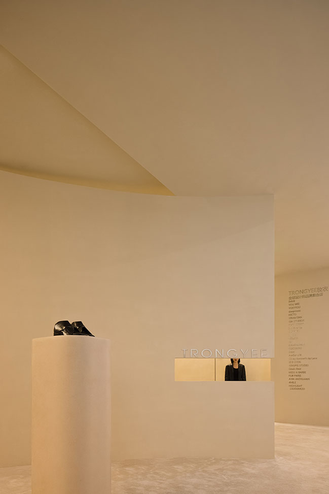
Rhythm and system
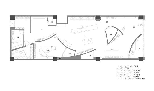
The shopping experience is divided into four stages, where consumers explore curiously when entering the store, linger at the central area, enjoy a private and premium shopping experience in the VIP area, and finally proceed to the inner live streaming area. Each stage is arranged based on the thinking of the commercial sales system. The space can be shifted as a show venue as needed to provide a site for new product launches every year and promote sales most efficiently.
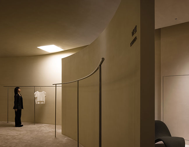
Blurred boundaries
The central area accommodates a mix of clothing, jewelry and other products, thus the design focuses on stimulating customers' desire to purchase commodities. The area is mainly used for product display, but other functions like cashier desk, product introduction, reception and fashion show are included to blur the functional boundary.
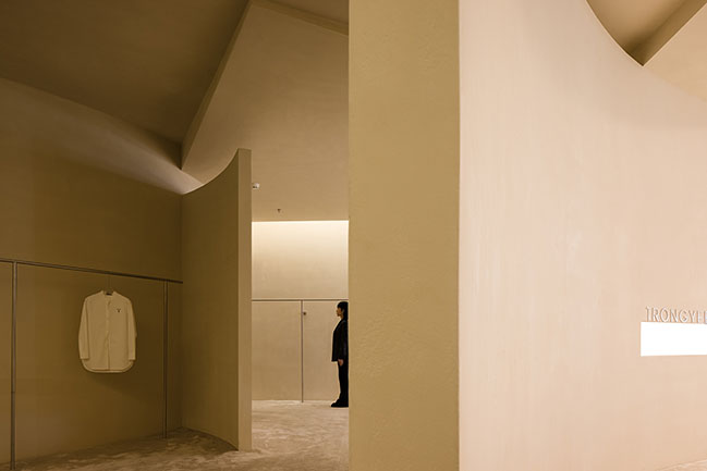
The arrangement of the fitting rooms is an innovative exploration of functional layout of fashion stores. The originally centralized fitting rooms are redistributed in the whole space, which, in return, effectively improves the convenience and efficiency of shopping, offers a more joyful shopping experience for customers, and shortens the service distance.
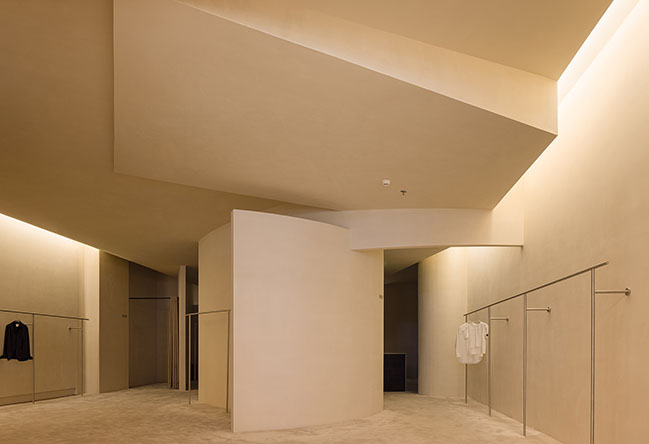
Soft spatial experience
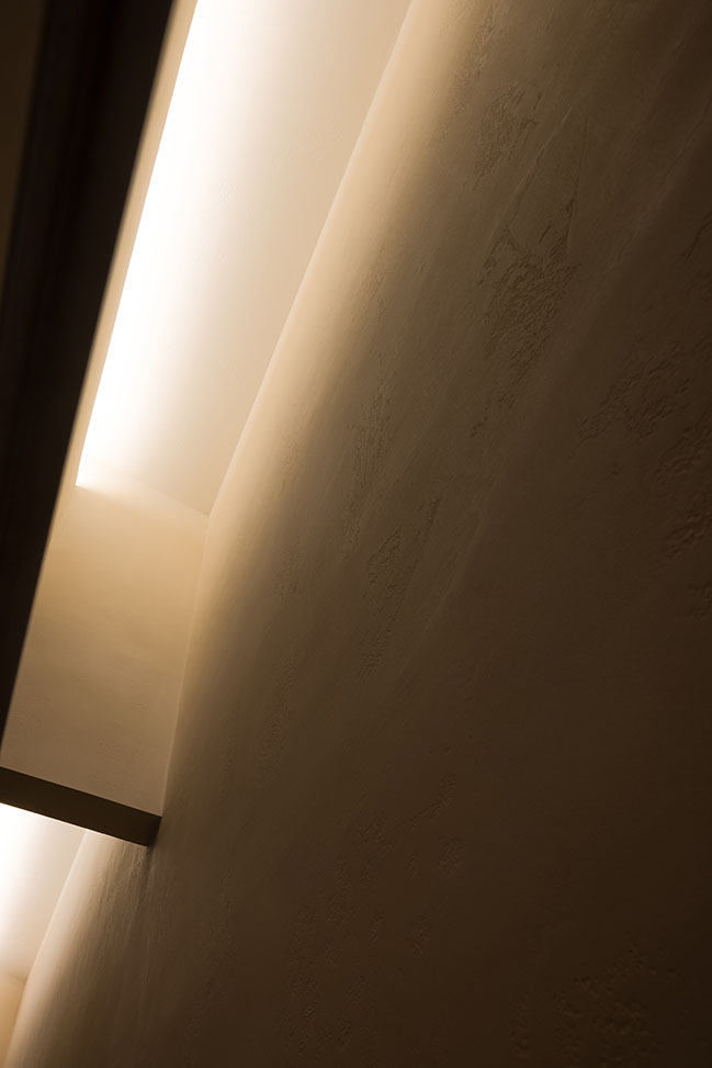
For material and color selection, the design adopts feminine elements featuring comfort and softness. Large areas of artistic paint combined with the carpet reveals tactile, quality textures.
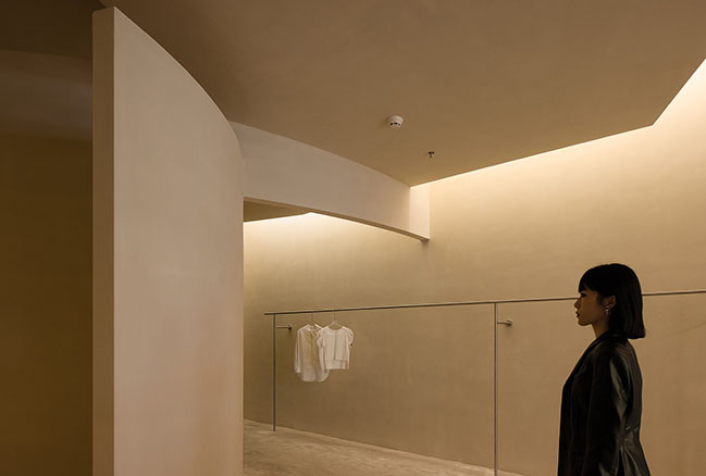
Exclusive and noble experience
Next to the central area is the VIP reception room with a reservation system. Open to VIP customers, this area displays separately-selected garments and has an independent fitting room. Coffee, fruit and one-on-one shopping service are offered exclusively for VIP customers to enjoy a private and noble shopping experience.
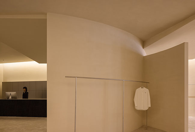
Combination of online and offline retail
Incorporating a live streaming area has become one of the new standards for retail stores. In light of the noise caused by live streaming activities and the disorder by preparation outside the camera, the design team separated the live streaming area from the sales area by locating it next to the storage room at the innermost end of the space. It is convenient for live streaming display without interfering with goods preparation and delivery, showing the best brand image and identity both online and offline.
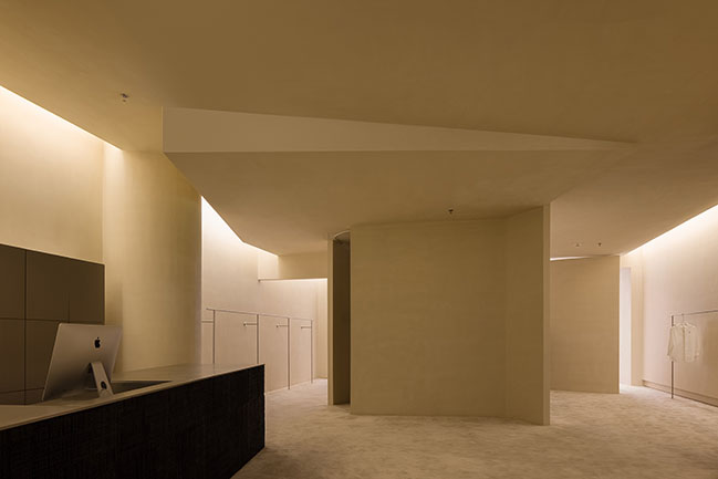
After the project is completed, TRONGYEE, as a new brand entering The Mixc, Shantou, has been the sales champion of the shopping mall since the new store's opening. The project is an exploration of sustainable value for future urban commercial spaces. AD ARCHITECTURE conceived the design solution by taking commercial value and practice as the basis, and eventually, through cooperation with the client, created a commercial space that is derived from the core of the brand TRONGYEE.

Architect: AD ARCHITECTURE
Location: Shantou, Guangdong, China
Year: 2021
Area: 280 sqm
Chief designer: Xie Peihe
Photographer: Ouyang Yun
TRONGYEE (The Mixc, Shantou) by AD ARCHITECTURE
04 / 04 / 2022 This time, based on the client's new demands for upgrading TRONGYEE, AD ARCHITECTURE was entrusted again to conceive a new retail store...
You might also like:
Recommended post: Lan Handling Technologies by cepezed
