01 / 10
2021
Through this project, AD ARCHITECTURE attempted to accentuate Oriental spatial emotions and philosophy via Western design logic...
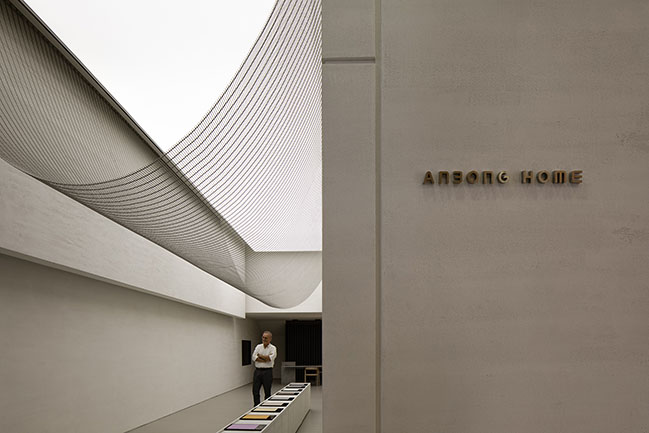
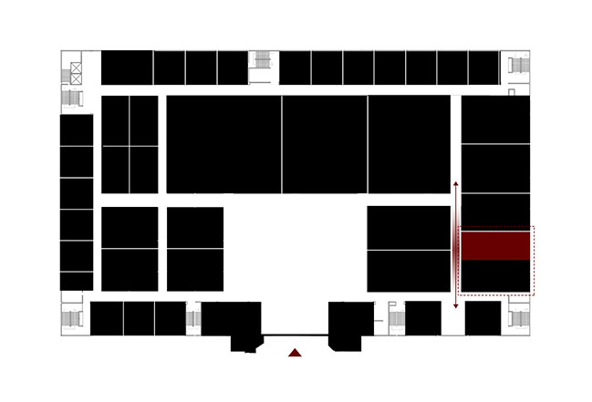
Project's description: ANBONG HOME is a showroom for Italian paint brand TULLIO, situated within a building materials mall in Shantou, China. It's next to the secondary entrance of the mall. The design of its surrounding stores features many common elements such as signboard, stainless steel, marble and glass, and shows an old-fashioned style and strong commercial atmosphere.
Before the launch of the project, the client was hesitating about renting the site, which is a shop space shared by two tenants. The half space available for the client is at the more inner area, which offers poor visibility. This posed a great challenge to the design - that's why the client wavered over whether to rent the space or not. For the design team, the challenge was to figure out how to break the restrictions of the original space and attract customers.
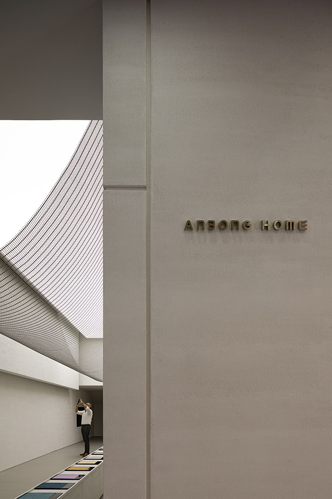
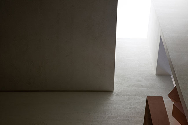
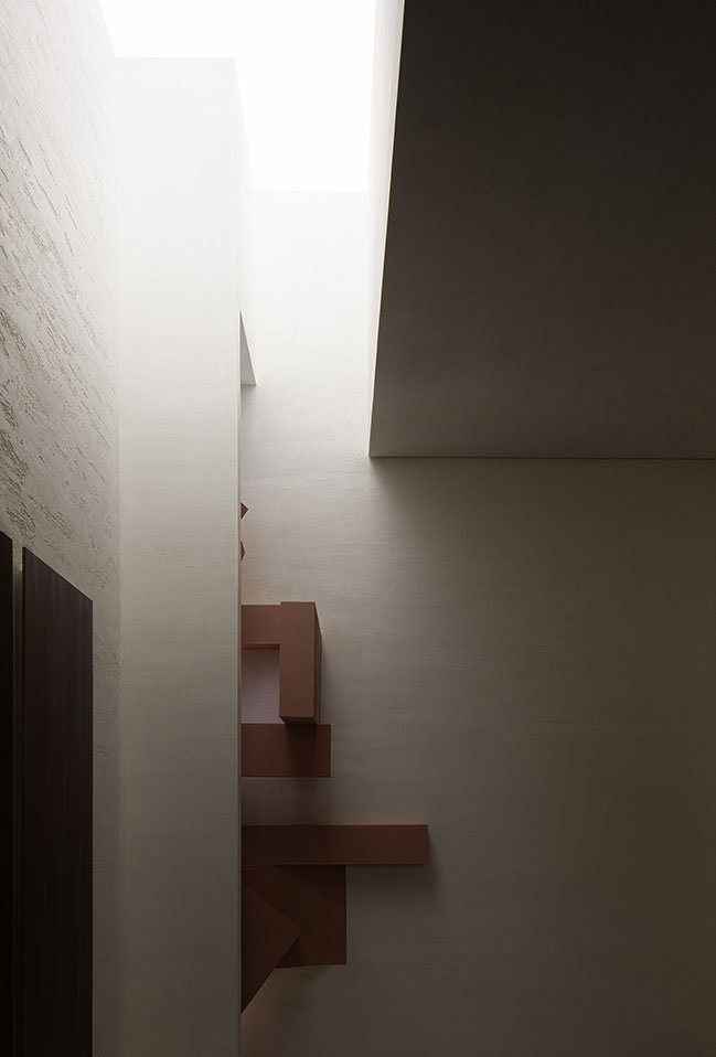
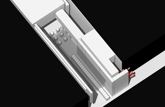
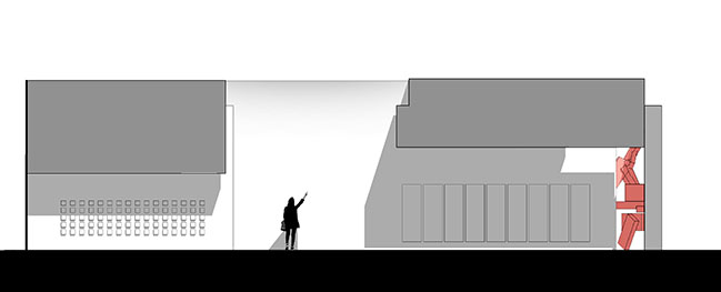
To tackle with the unfavorable position, the client communicated with the other tenant, who finally gave in and leaved an area, which opens up the view to the inner showroom. AD ARCHITECTURE adopted pink structures in this area, to produce strong visual effects and attract sight lines of customers.
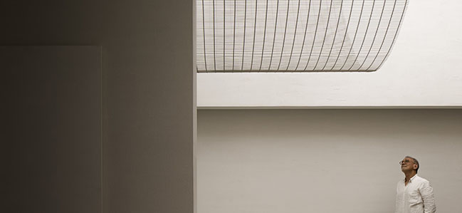
As conceiving ANBONG HOME, the designers tried to break with conventions and create the unexpected.
Customers enter the mall through the main entrance and walk out via the secondary entrance, which is close to the project site. After they passed through plenty of old-fashioned stores, they will encounter with ANBONG HOME, which is a big surprise. It feels like that someone suddenly meets an endless and exciting prairie after a long journey in the city.
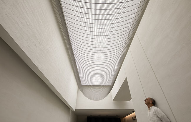
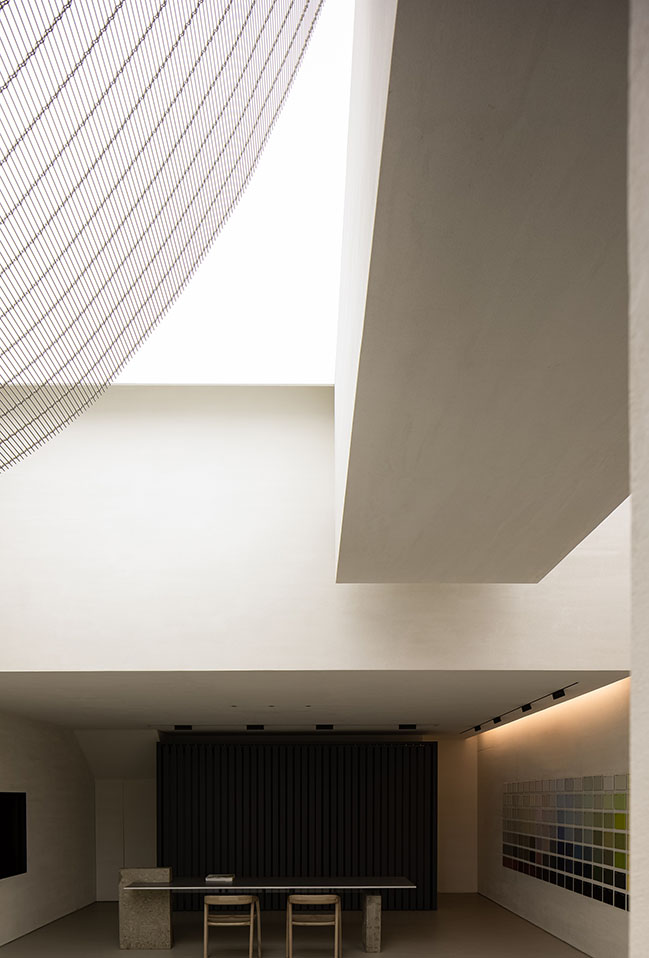
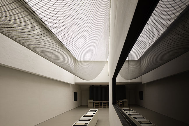
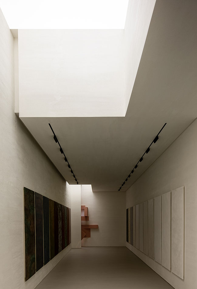
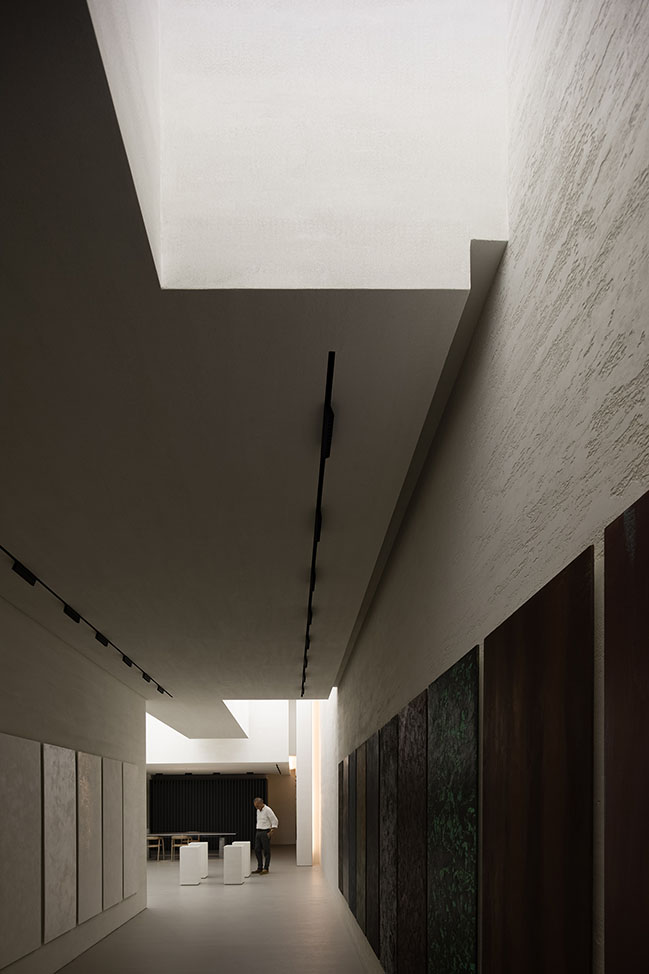
The showroom offers a unique aesthetic, looking like an art gallery. The spatial design highlights the artistry and quality of the space, while also accentuating the close fusion of materials and space.
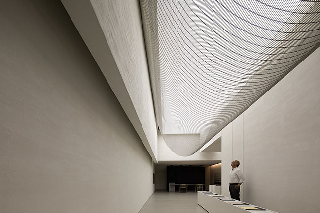
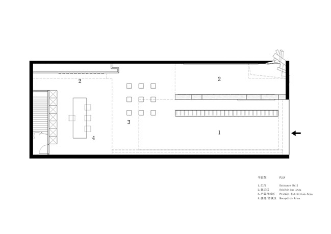
The main challenge of spatial transformation was how to break the limitations of the site, eliminate the oppressive feeling and create a breathing space. Based on the linear plane of the space, the design team divided the front part into two sections, in order to create an introverted space that gradually opens up the view and expands towards the inside.
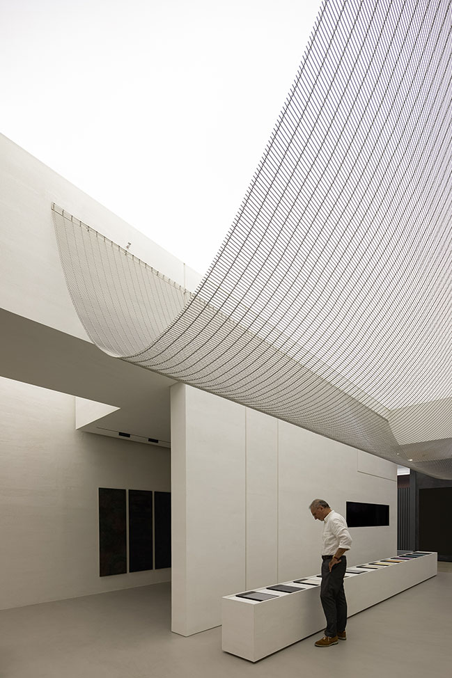
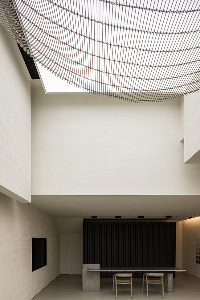
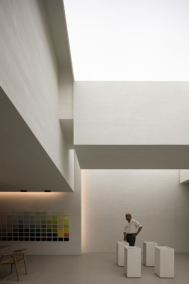
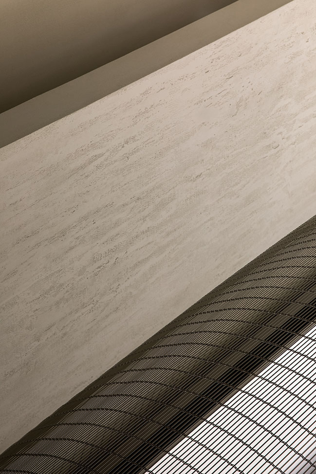
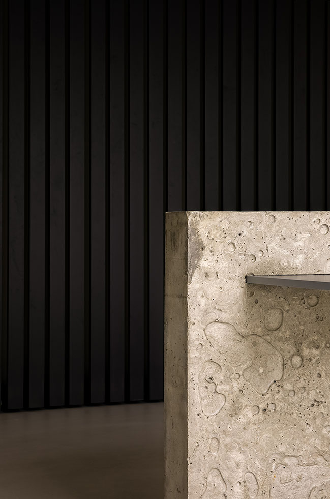
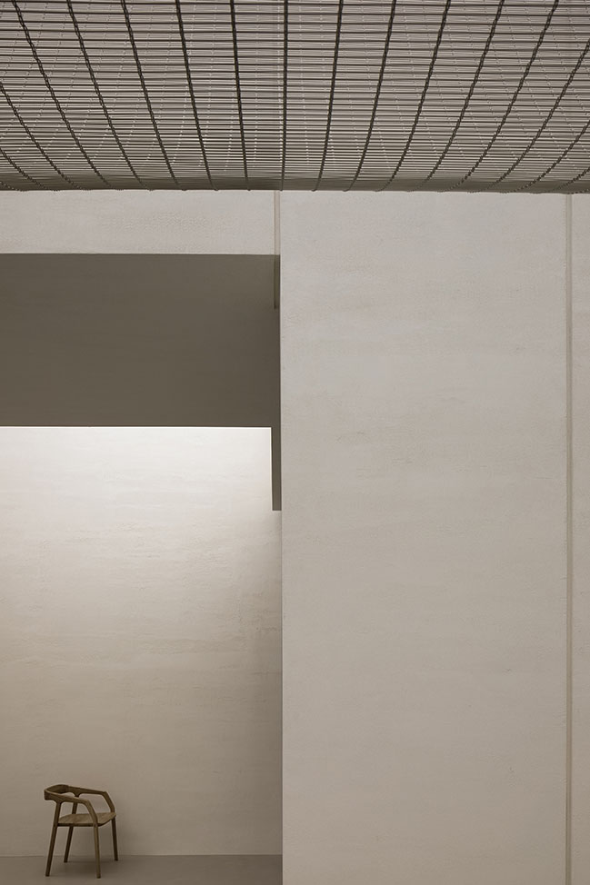
The reception and cashier desk is a bold attempt, which responds to the changing ways of payment in commercial field. The space was made simplistic and free of adornment, in order to encourage visitors to feel materiality, lighting and the space itself. The only furniture at the reception area showcases the contrast between concrete and aluminum-like paint finish, and highlights flexible, diverse material textures.
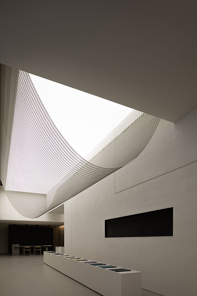
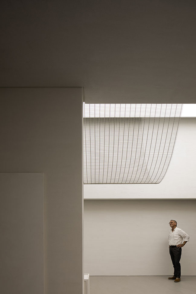
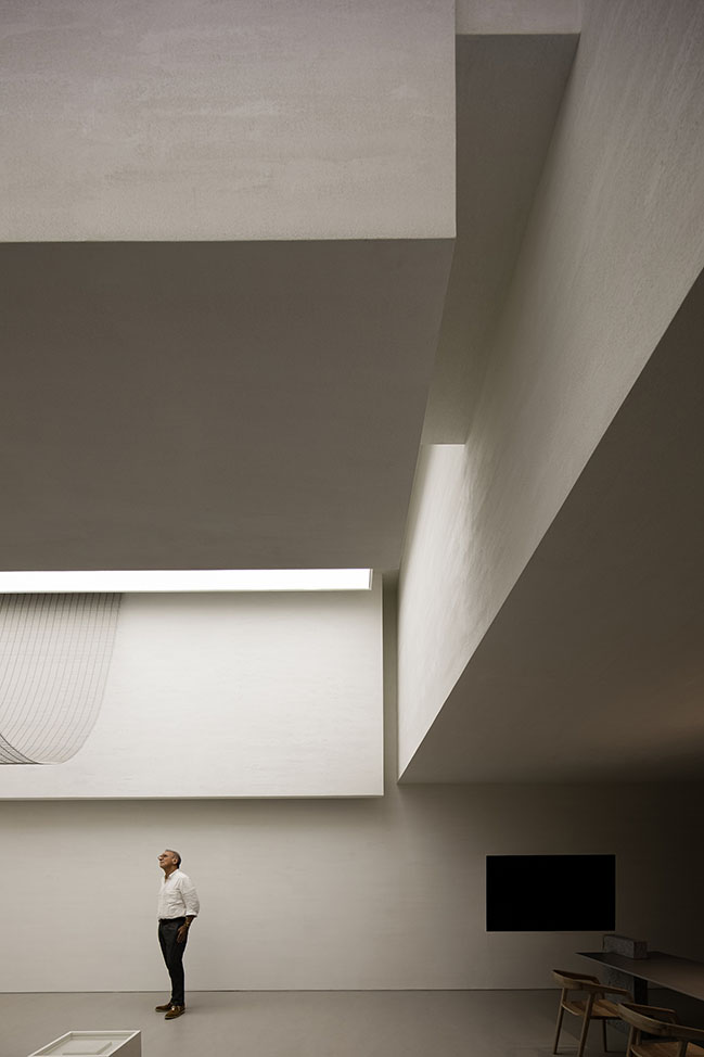
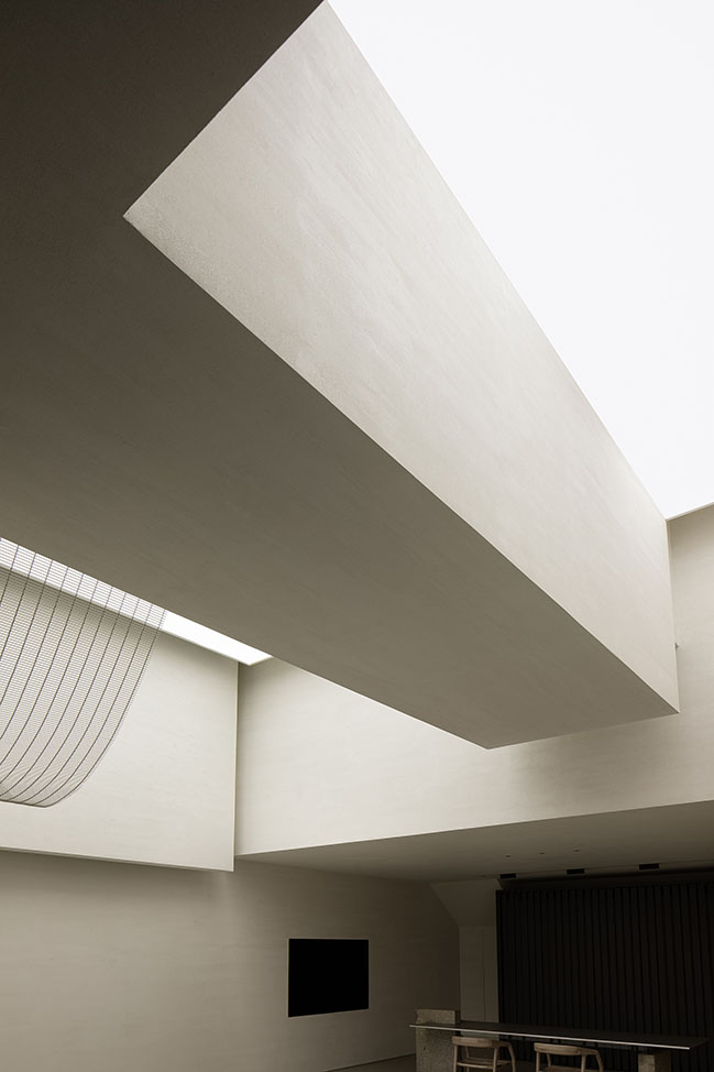
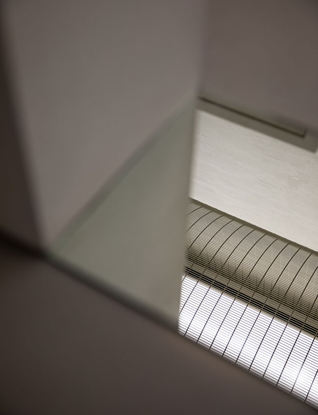
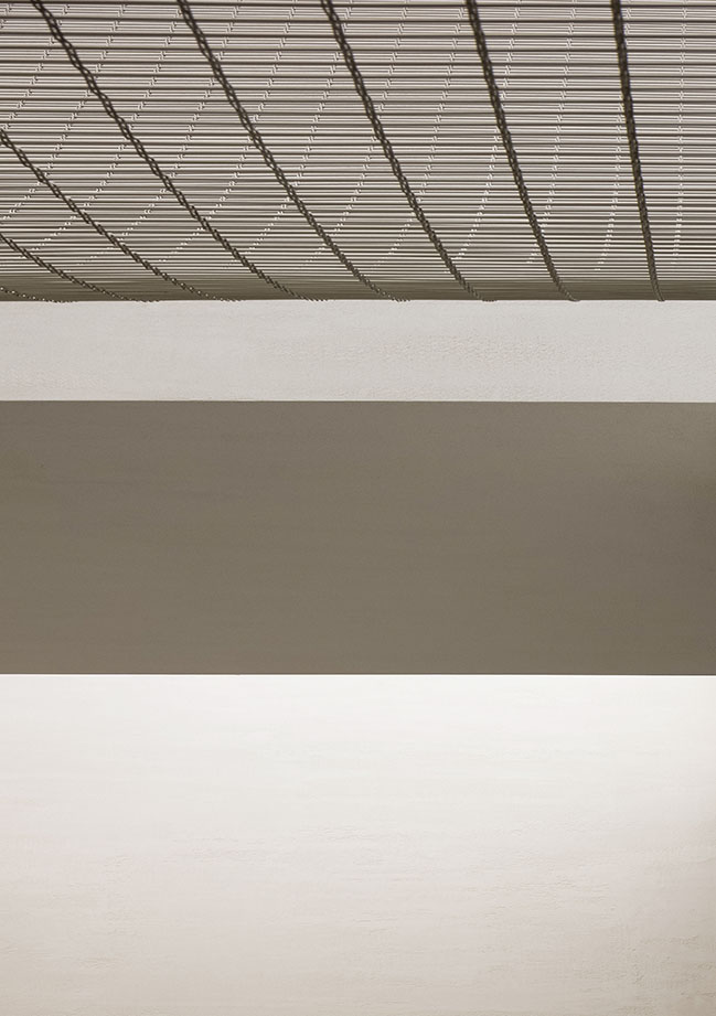
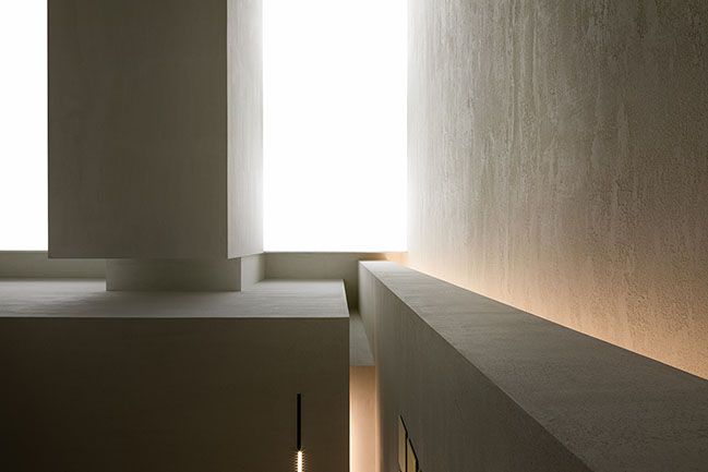
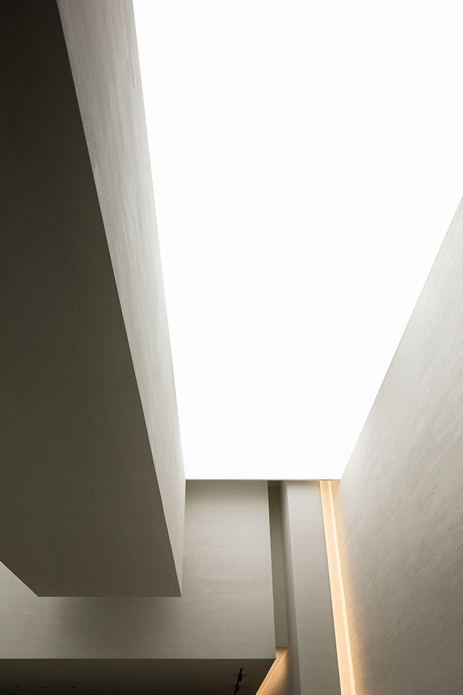
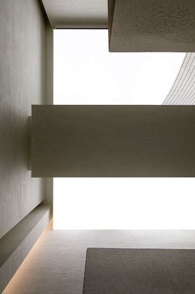
The transformation of the ceiling was based on full consideration of structures and pipelines. In this way, the design team produced a high ceiling, which makes the space appears lofty. The curved metal net hanging in the air and the stretch ceiling above together enrich the relationship between light and space, and evoke visitors' curiosity and desire to explore it.
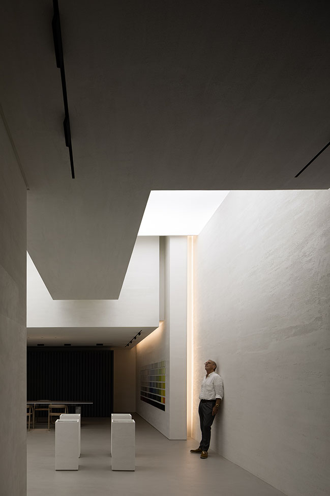
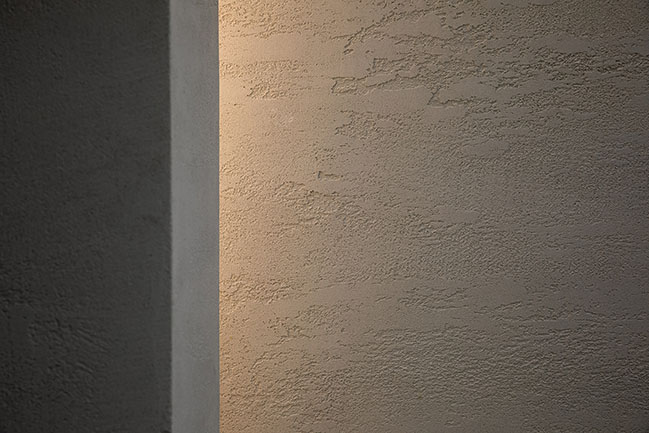
The space is a container, and the design team tried to explore the expressions of handmade paint products. Customers are encouraged to feel the space and the charm that products exude in it, and then to read the products in detail.
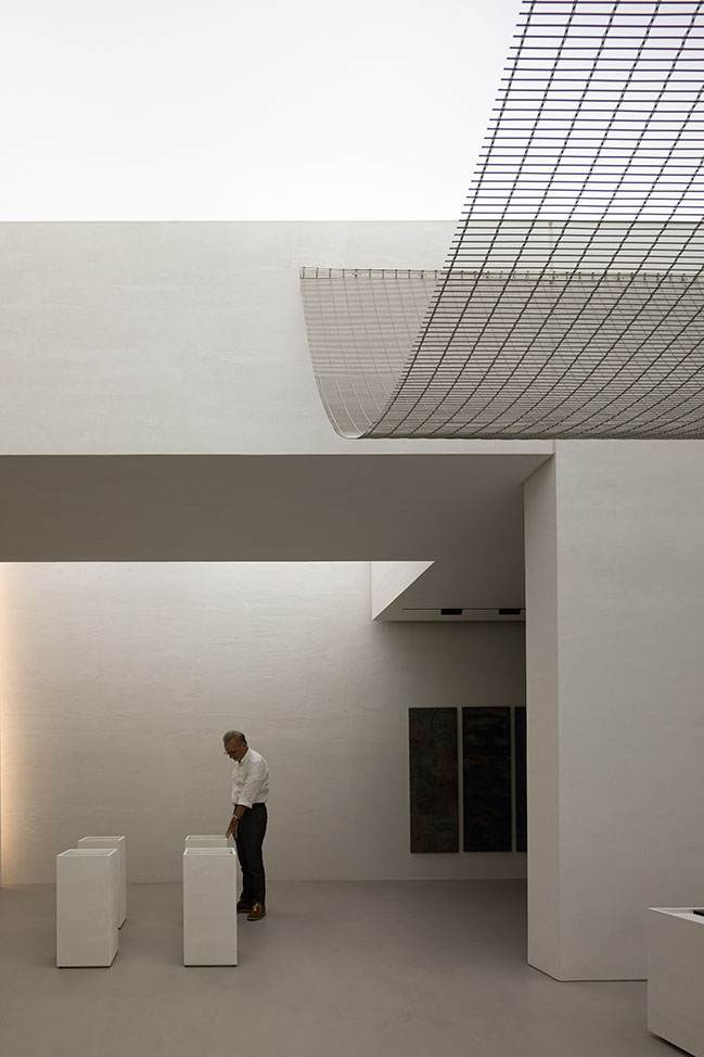
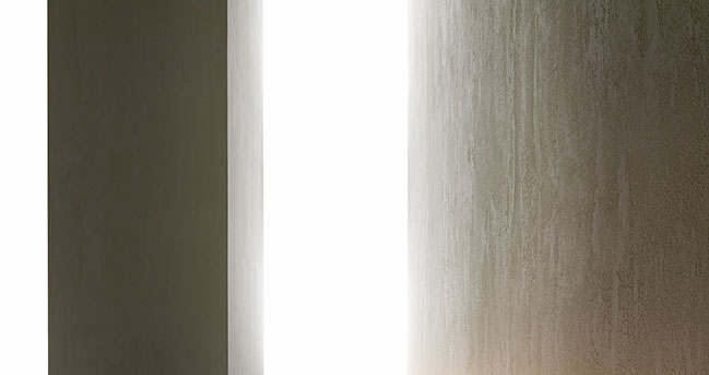
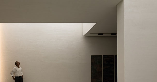
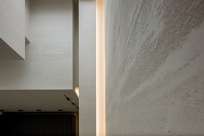
The space features an expansive and bright feeling, natural textures and light. The designers emphasized the interaction between space and people, greatly changed the original spatial structures, coordinated materials, structures and colors, and created new fluidity between architecture and space.
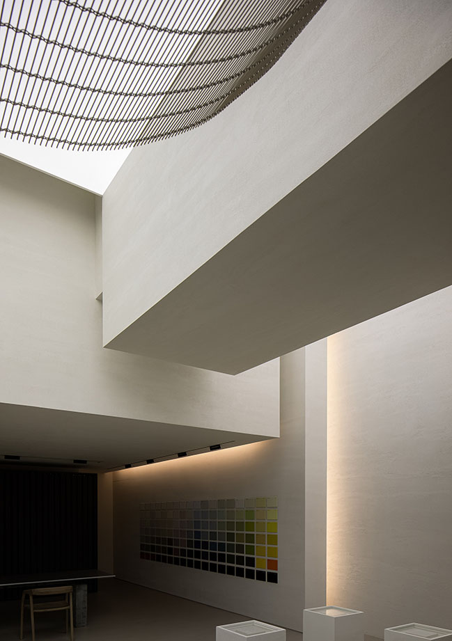
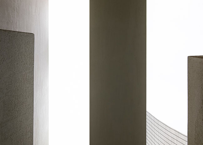
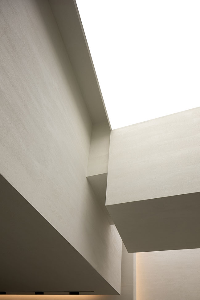
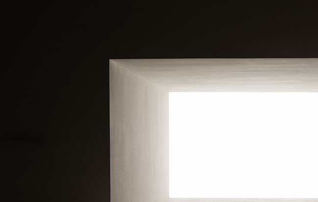
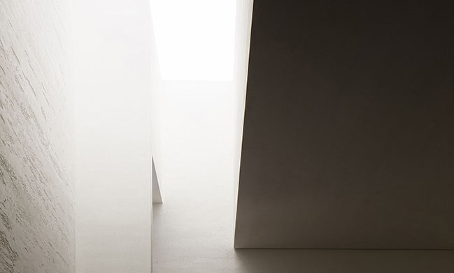
Geometric shapes in the space are elegant, simple and touchable, creating a floating and free ambience.
Through this project, AD ARCHITECTURE attempted to accentuate Oriental spatial emotions and philosophy via Western design logic.
Architect: AD ARCHITECTURE
Client: Mauro Malfatti
Location: Shantou, Guangdong, China
Year: 2020
Area: 200 sqm
Chief Designer: Xie Peihe
Photography: Ouyang Yun
YOU MAY ALSO LIKE: Novacolor Paint Showroom by AD ARCHITECTURE

YOU MAY ALSO LIKE: TRONGYEE Boutique by AD ARCHITECTURE

YOU MAY ALSO LIKE: XZONE Office in Shantou by AD ARCHITECTURE
ANBONG HOME by AD ARCHITECTURE
01 / 10 / 2021 Through this project, AD ARCHITECTURE attempted to accentuate Oriental spatial emotions and philosophy via Western design logic...
You might also like:
