08 / 27
2020
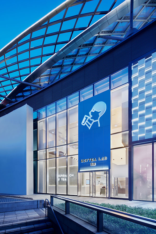
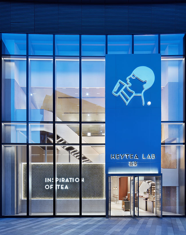
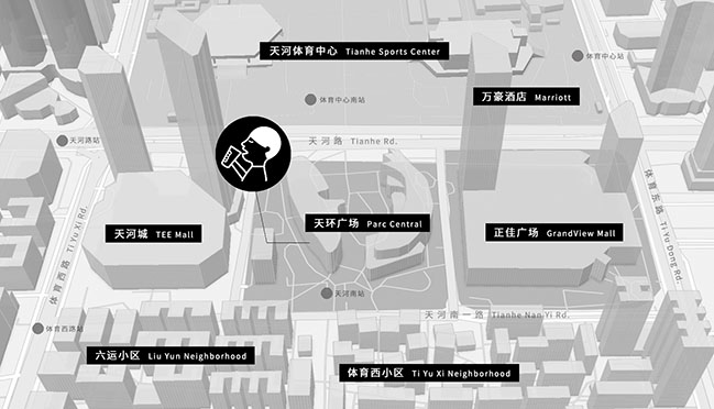
The project is the first HEYTEA LAB store in Guangzhou, situated at Parc Central, a luxury mall in the heart of the CBD...
Design firm: Leaping Creative
Client: HEYTEA
Location: Parc Central, Tianhe District, Guangzhou, China
Area: 350 sqm
Chief designers: Zen ZHENG, Xiaowen CHEN
Participating designer: Penghui YANG
Installation designer: Minghao LIANG
Project managers: CC CHEN, Dongzhi YOU
Photography: Zaohui HUANG
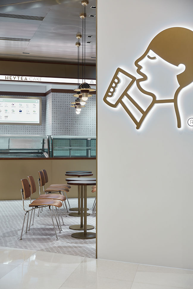
From the architect: Since 2018, HEYTEA’s young and cool DNA has been going deep into consumers’ minds through working with different designers to give each of its stores a distinctive image. Currently, the brand is continually exploring new themes and design styles for its new stores, with a view to opening up new possibilities to revitalize traditional Chinese tea culture.
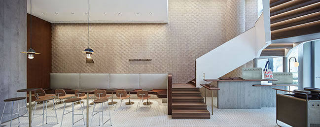
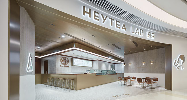
The project is the first HEYTEA LAB store in Guangzhou, situated at Parc Central, a luxury mall in the heart of the CBD.“HEYTEA LAB” is the brand’s flagship store with presence in China’s first-tier cities such as Shanghai, Shenzhen and of course Guangzhou. Taking tea-drinking spaces as the medium, it aims to strengthen the connection with local culture and share the brand’s story with young people.
Across the road from Parc Central is an open old community built in the 1990s. The site is a place where the leisurely lifestyle of the old neighborhood and the fast pace of modern urban life merge. Guangzhou is well-known for its tea-drinking culture, and tea houses everywhere in the city have become a carrier that embodies the locals' life philosophy. Gathering with friends to enjoy a cup of tea and dim sum in a carefree mood has long been a norm in the local people’s daily life.
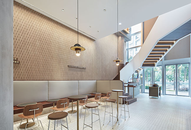
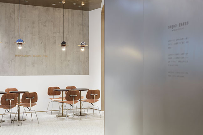
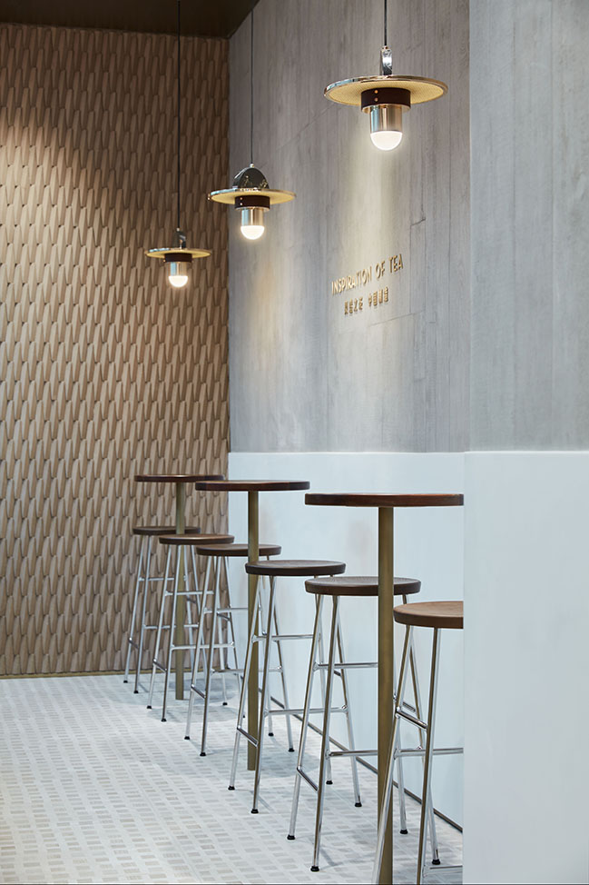
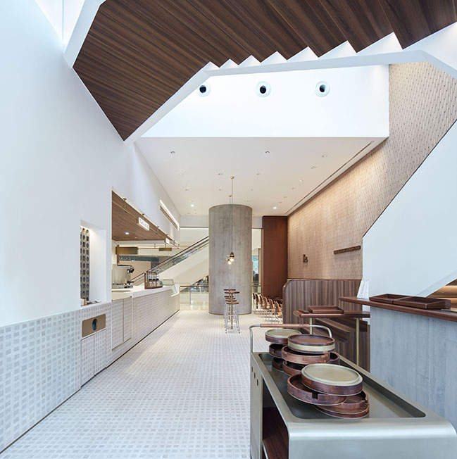
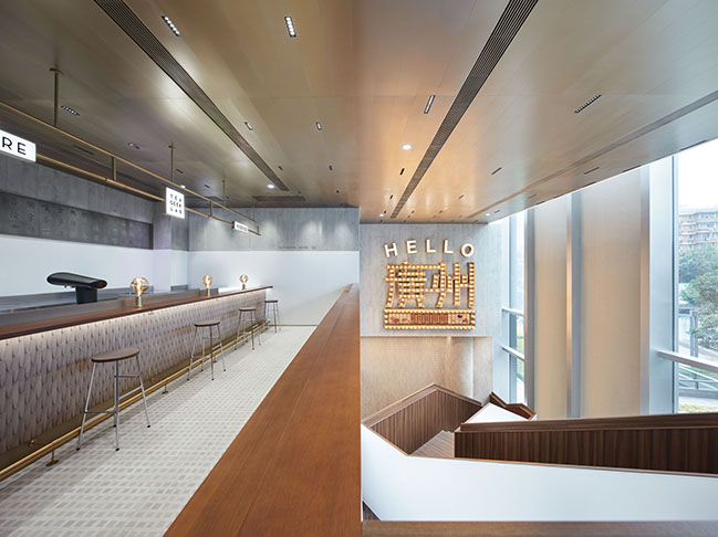
Taking cues from the local culture and leisurely lifestyle, the design team identified “tea house” as the theme of this store, and focused on creating a cozy yet intimate space which allows customers to spend time there. The space is dominated by white and natural wood hue, with the double-height glass curtain wall bringing in ample daylight.
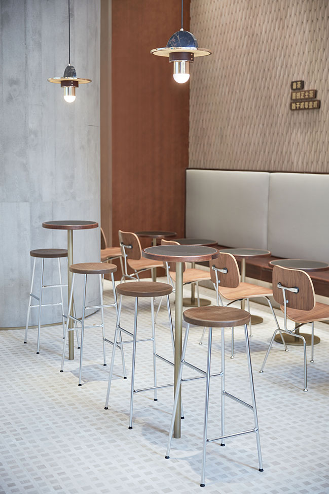
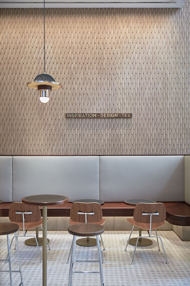
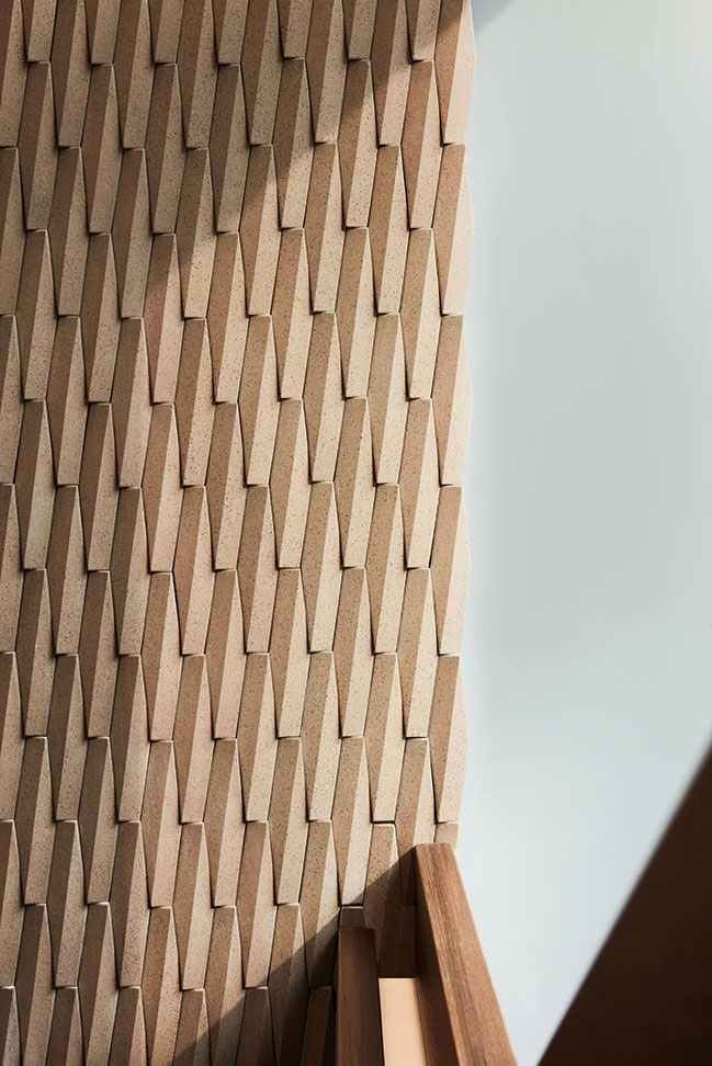
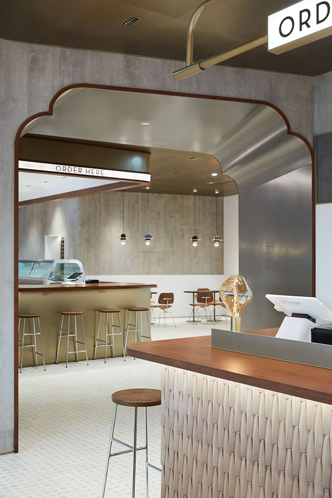
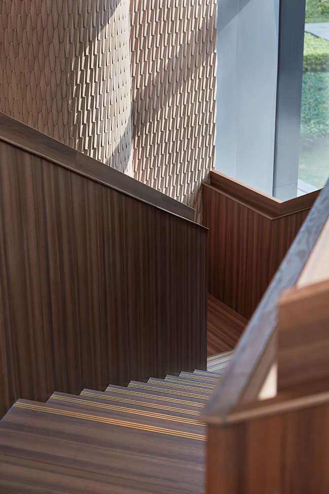
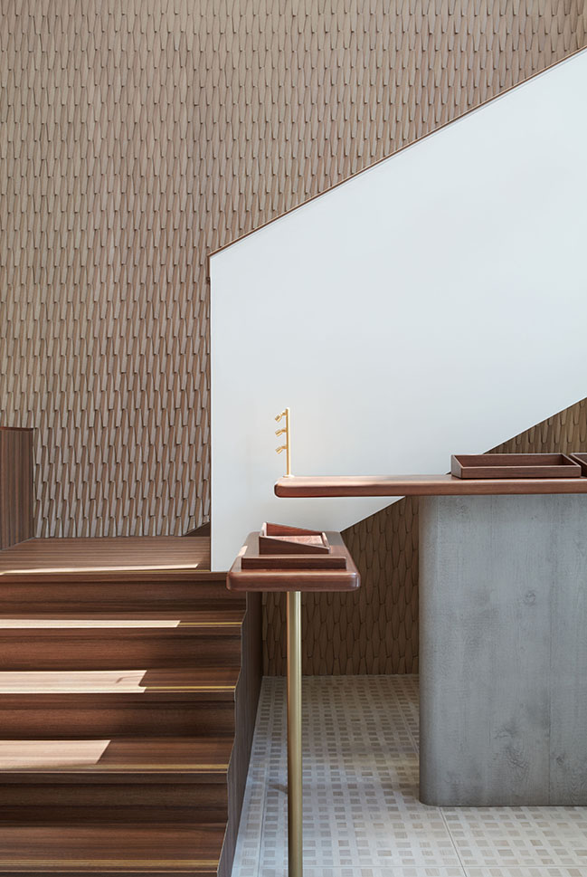
Both the improved tile floorings and the two kinds of bespoke handmade bricks on walls draw inspiration from traditional Cantonese architectures. They are replications of traditional materials and craftsmanship based on contemporary design, and at the same time integrate exquisite and austere textures. The door opening references the common form of doors and windows in traditional local arcade buildings, with its dark-colored decorative lines highlighting the “mark” of local buildings.
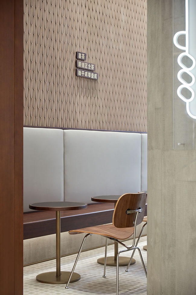
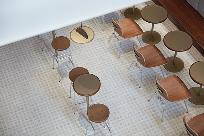
The furniture is characterized by classical forms prevailing in the 1980s and 1990s. The metal chair legs, wood-grain veneers and artificial leather backrest feature typical Southeast-Asian style and carry the local people’s childhood memory. In addition, famous Cantonese idioms about tea drinking such as “One cup accompanied by two pieces” and “Drink a cup of tea and have some dim sum” are added onto walls, functioning as adornments while also resonating with local young people.
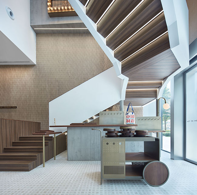
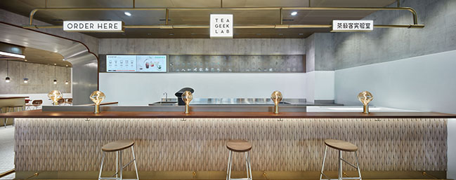
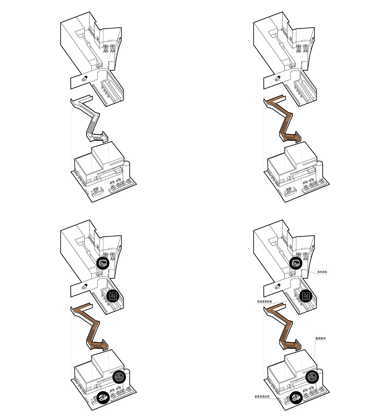
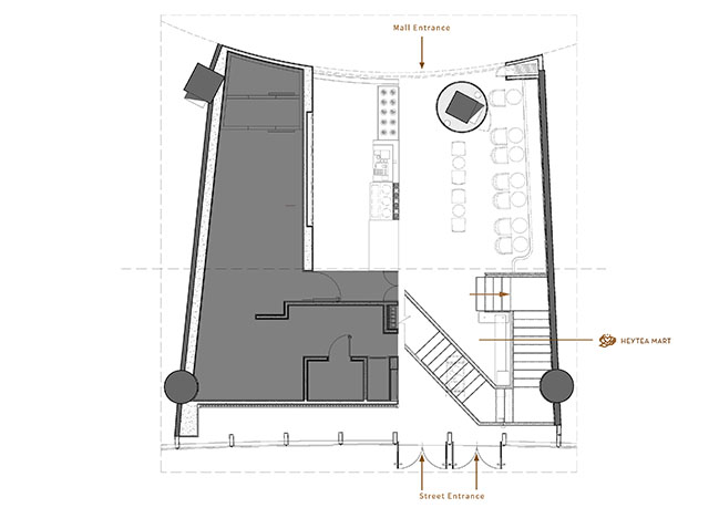
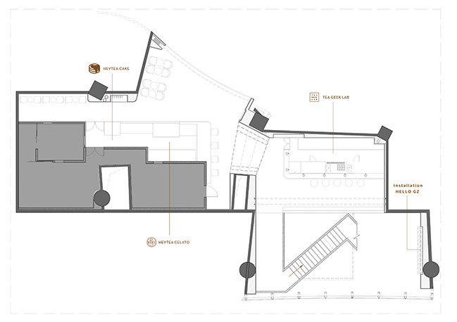
Besides the bar counter that serves basic tea drinks on the first floor, there is a TEA GEEK LAB and a dessert counter on 2F. In addition, “HEYTEA Department Store”, an area selling the brand’s derivatives such as tote bags and cups is also set in the space. The two-storey space occupies an area of about 350 square meters. The space on the first floor is very limited, which needs to accommodate not only the kitchen, bar counter but also the staircase and a certain number of seats.
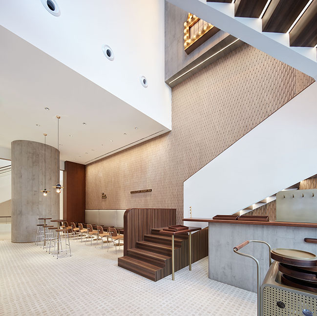
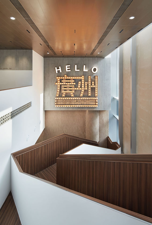
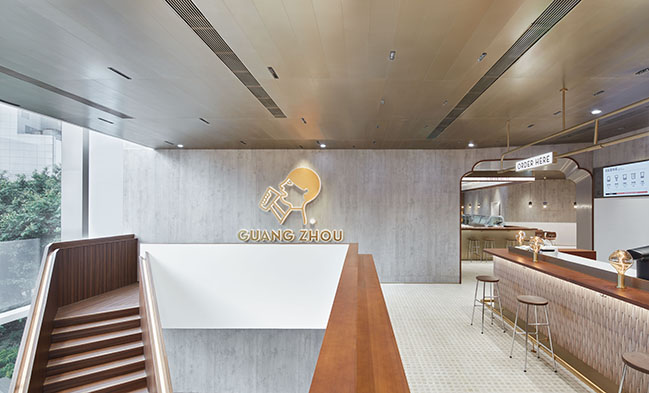
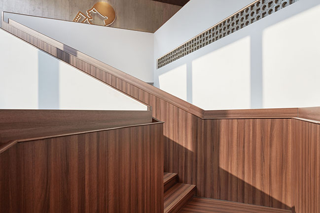
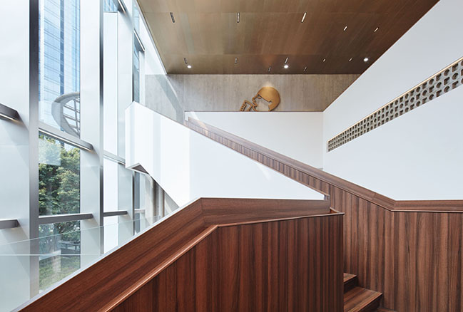
The ceiling is 9.7 meters high, so a conventional “Z”-shaped staircase may cause unpleasant experiences due to too many zigzags. Besides, it may take up too much space on the first floor, leaving little area for arranging seats. Based on those considerations, the design team took advantage of the height difference between the kitchen and the ceiling of the first floor, and eventually created an irregular staircase.
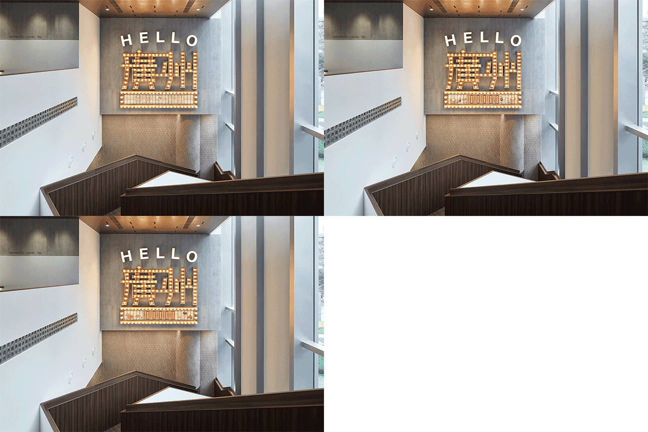
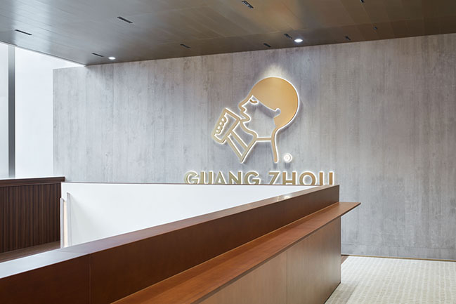
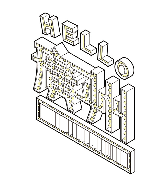
In summer afternoon, the staircase provides an ideal setting for taking photos. The brand logo and the art installation “Hello Guangzhou” are respectively set on the walls in the stairwell, creating diverse and fun experiences for customers as they walk up and down stairs.
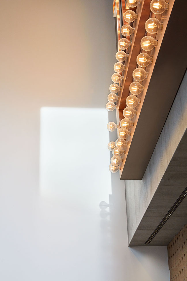
The art installation features an exquisite and retro-style form, and shows varying visual effects via the triangular-prism-shaped structures of old-style signboards. Names of HEYTEA’s popular tea drinks are presented on the revolving structures, which simulate the appearance of dim sum panels used for taking orders in traditional local tea houses and help to enhance the image of this landmark HEYTEA store in Guangzhou.
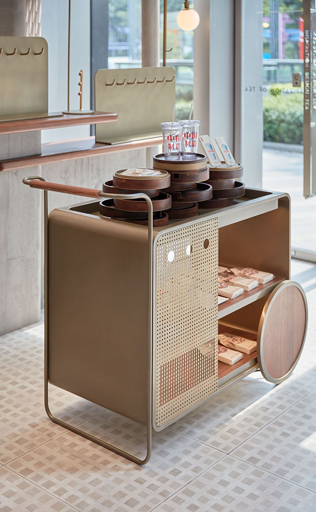
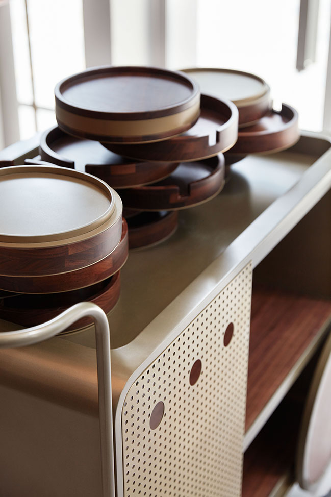
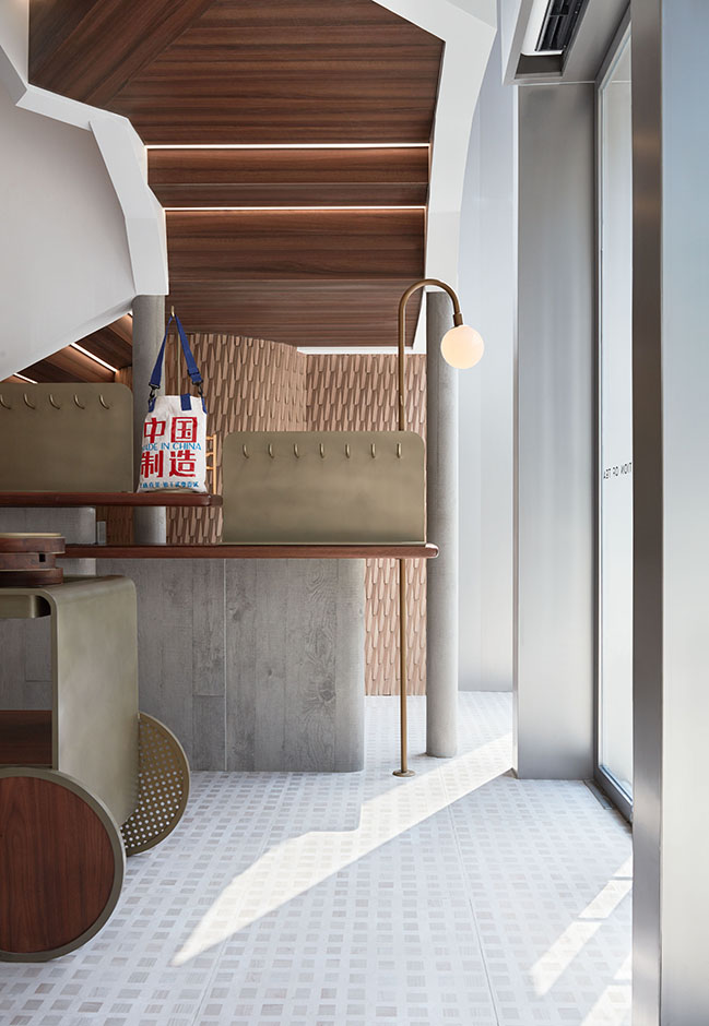
HEYTEA DEPARTMET STORE,i.e. the area selling the brand’s derivatives, is placed at the foyer close to the street. It makes full use of the space under the stairs, and forms a small semi-enclosed area via the shelf and island counter, thereby generating a retailing atmosphere. Centering on the theme “tea house”, the design team reinterpreted iconic elements of traditional tea houses such as cart and steamer, to create storytelling scenes.
YOU MAY ALSO LIKE: SUOFEIYA WORKSHOP by LEAPING CREATIVE

YOU MAY ALSO LIKE: HEYTEA LAB (Shenzhen OCT Harbor Store) by TOMO DESIGN

Heytea Lab Guangzhou by Leaping Creative
08 / 27 / 2020 The project is the first HEYTEA LAB store in Guangzhou, situated at Parc Central, a luxury mall in the heart of the CBD
You might also like:
Recommended post: Residence C.A. by W&Li Design
