04 / 08
2019
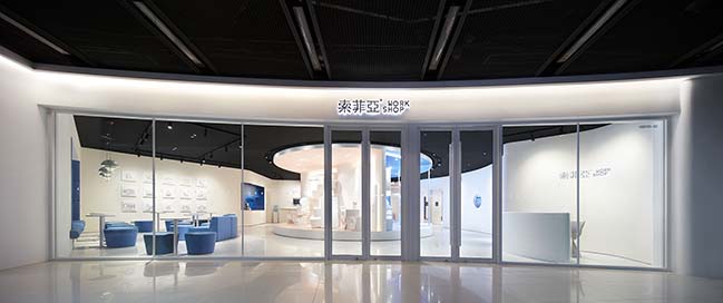
The new concept store of the full-house furniture customization brand SUOFEIYA is situated at one of the most popular shopping-malls with largest number of visitors in Tianhe CBD, the commercial center of Guangzhou, China. Designed by LEAPING CREATIVE, the innovative retail space aims to explore a new mode of experience in the ever-maturing furniture customization industry.
Design Firm: LEAPING CREATIVE
Location: Guangzhou, China
Year: 2018
Area: 200 sq.m.
Design Director: Zen ZHENG
Project Manager: CC CHEN
Brand planning &visual identity: CC CHEN, Qilin HUANG, Wenting XIAO, Evan CHEN
Spatial design: Jiying LIANG, Ruixue LIU, Dingling YAO, Yu CHEN
Interactive installation design: Qilin HUANG, Ying LAN, Mincong HUANG
Model stylist: Zoey
Video production: Jank Production
Photos of interior spaces: Zaohui HUANG, 20Animagis
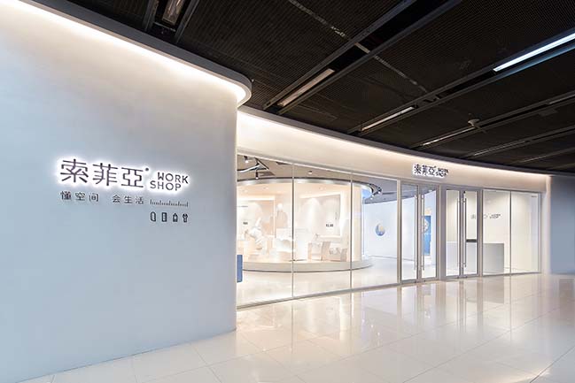
Project's description: Currently, most furniture retail stores in China display products in various sample rooms which normally requires a large scale of showroom space, which is infeasible for this project since the site only occupies an area of 200 square meters. However, with great insight, the design team think that the core competitive advantage of a furniture customization brand does not merely lie in individual products, but more importantly in a comprehensive service system that integrates products design, manufacturing, home delivery and installation.
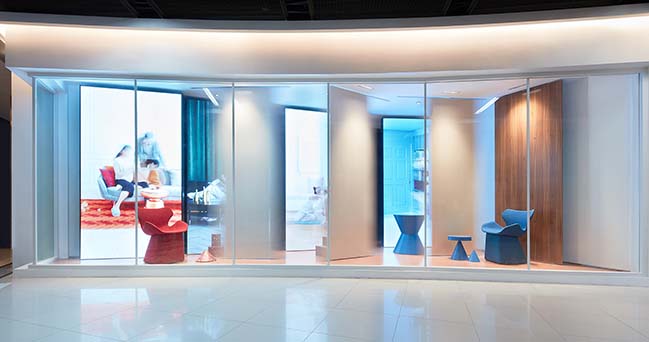
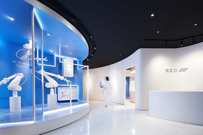
So the key is to figure out how to innovatively convey the brand's service advantages, and to create impressing customer experience in the limited space. Coordinating store concept, visual identity, floor planning, interactive installations, and marketing strategy, LEAPING CREATIVE came up with the theme of “WORKSHOP” to guide the project.
01 Workshop: first-hand experience and joint participation
The "WORKSHOP" concept is based on its core idea of "experiencing first-hand, participating together and inspiring mutually", which is considered an innovative retail mode to provide customers with quality lifestyle proposals.
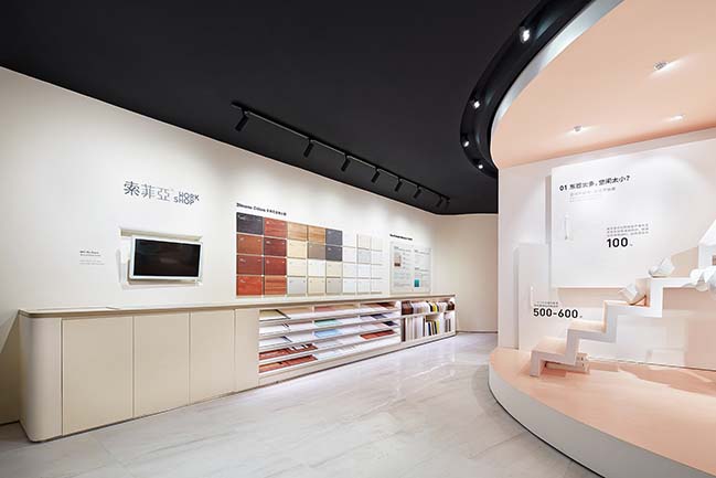
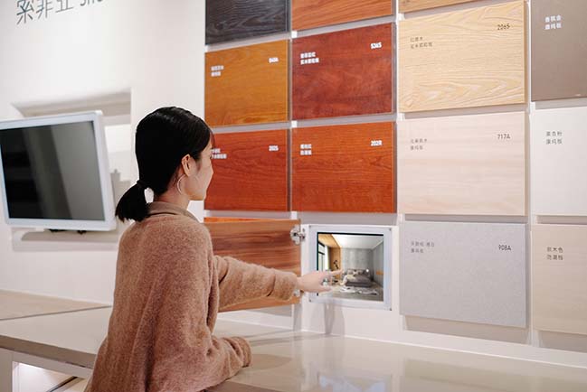
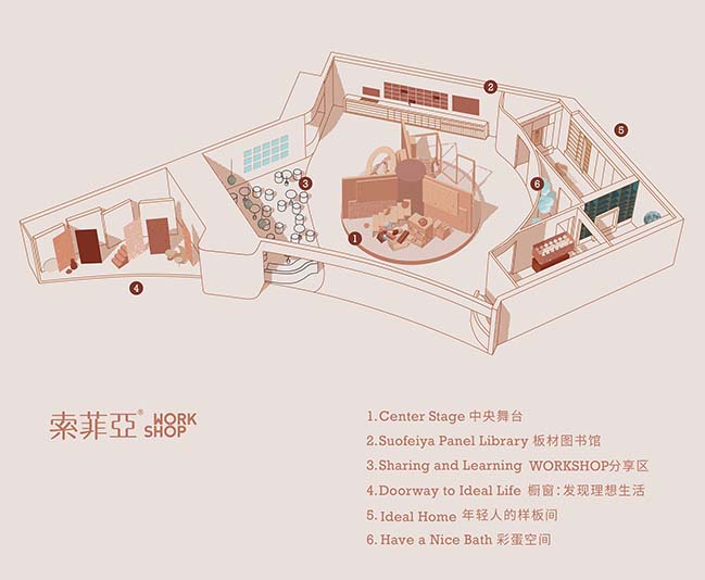
As planning the layout, the designers added a "Panel Library" area and a "Sharing and Learning" section in the space, in addition to the main area for displaying the brand's advantages of services. The "Panel Library" uses multimedia to help visualizing how those materials can be utilized in their homes, and the "Sharing and Learning" area is a dedicated space for lifestyle advisers to share their experience, which makes the WORKSHOP an "inspiration station" that allows a group of people to participate in sharing activities together and thereby spark inspirations through communication and interaction.
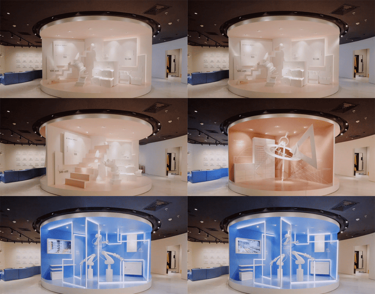
02 Storytelling installations
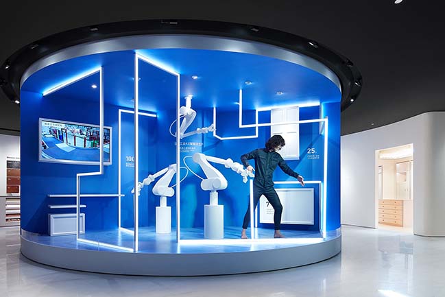
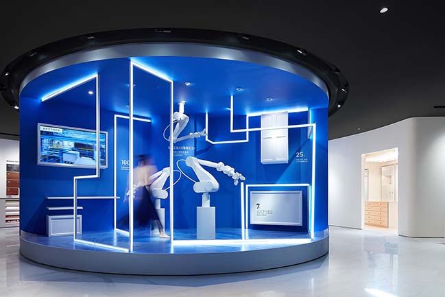
One of the major goals of the WORKSHOP is to acquaint customers who have no idea of home decoration and furnishings with the brand's advantages in terms of furniture customization. As opposed to the conventional practice of introducing services by salespersons, the designers tried to let installations in the space to tell the stories.
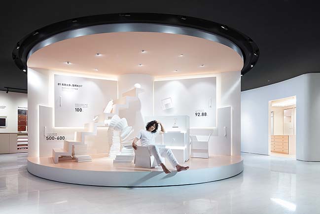
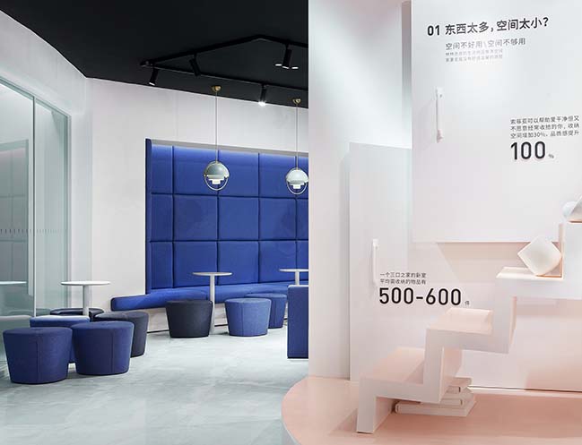
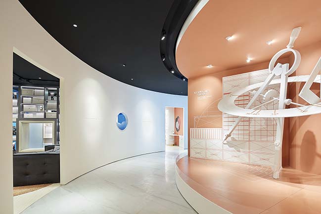
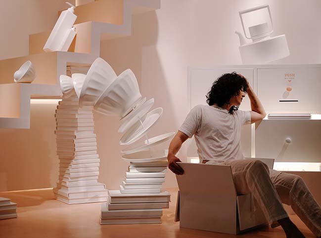
To that end, they ingeniously made use of the large column at the center area of the original space that faces the entrance, and created a rotating circular stage around it. Featuring installation design approach and dramatic expressions, the stage consists of three sections that respectively present the three steps in the service process. The first section starts with an exaggerated scene where household items are stacked disorderly, which focuses on embodying a common dilemma in people’s daily life, especially in large cities — too many articles in the limited living space yet redesign and redecoration is far from easy, thereby aiming to strike a chord with customers as they stepping into the WORKSHOP.
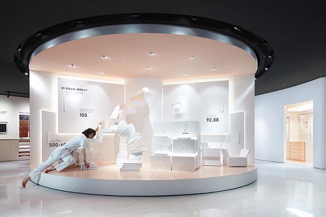
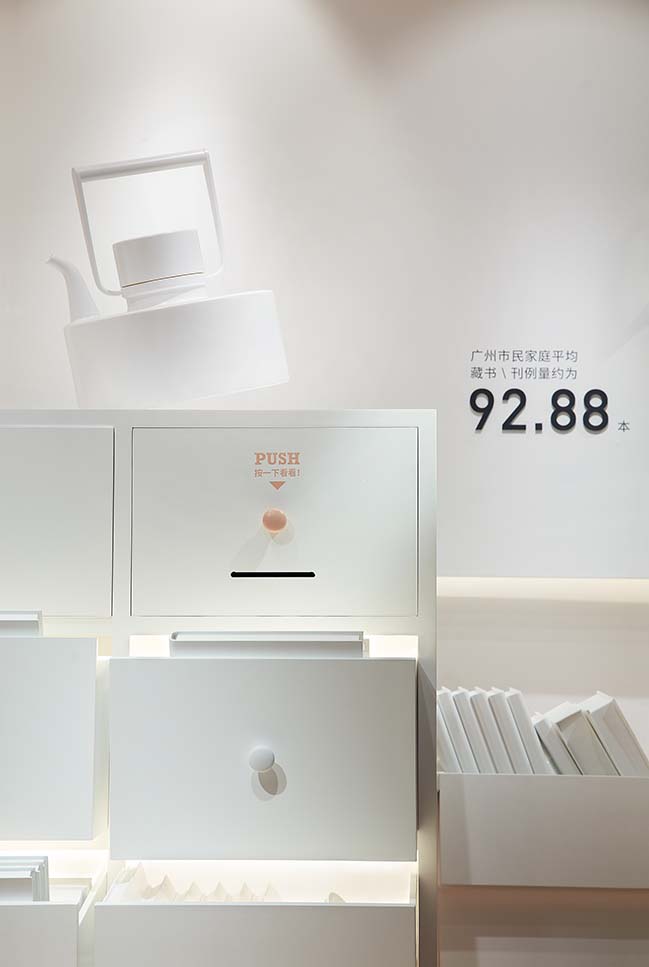
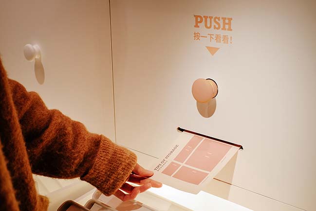
There are some surprising interactive details on the stage. When pushing the handles of cabinet drawers, cards with storage tips would come out. The double-layer cards mimic the form of closet, so that the customers can get practical information by flipping the upper layer cards like opening a closet door.
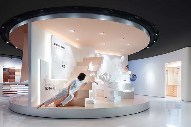
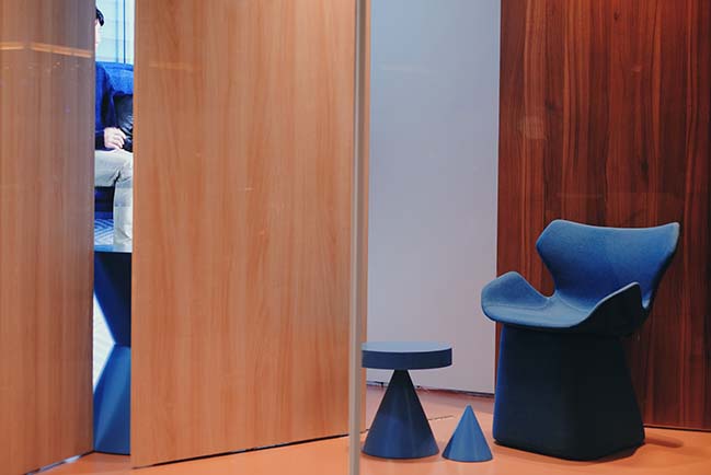
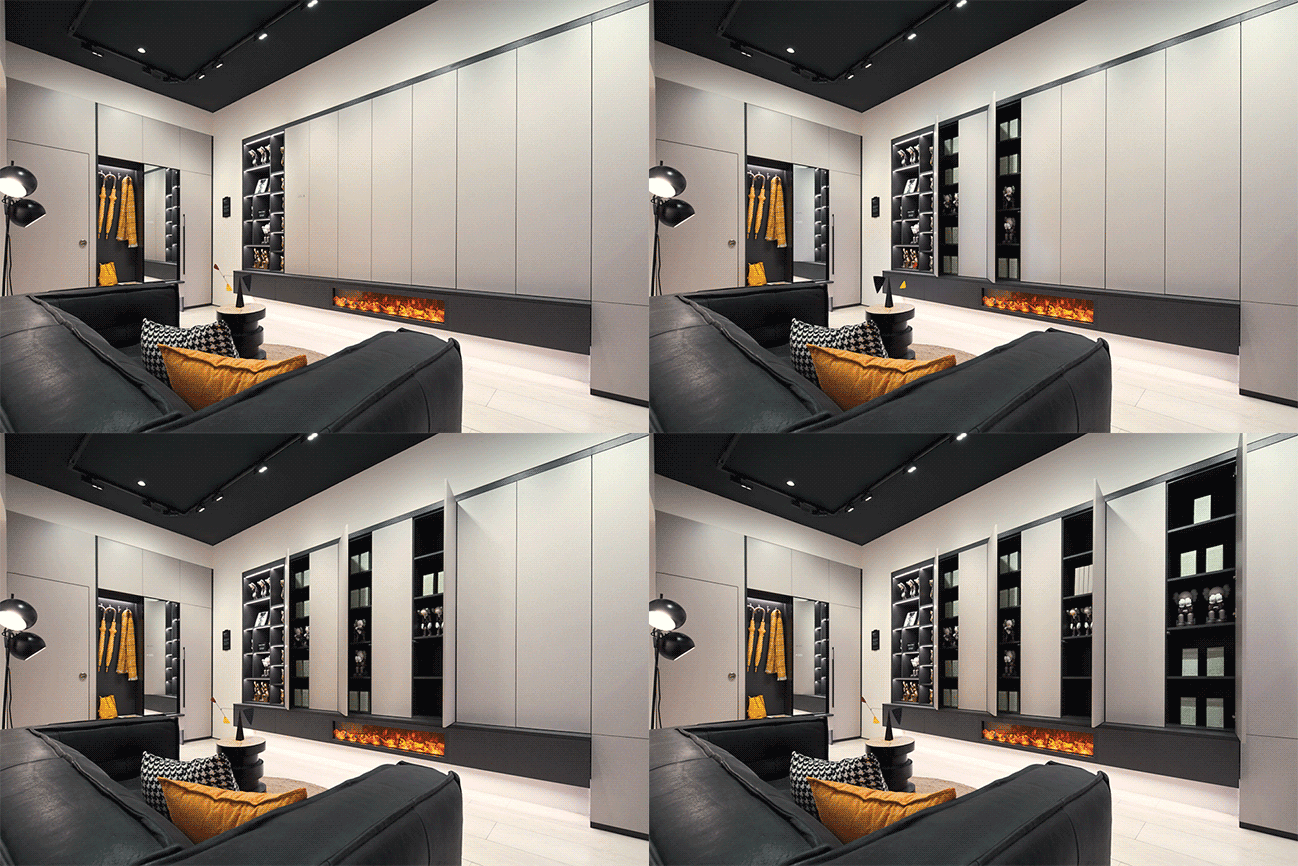
On the other hand, the store window display installation also refers to the door-opening motion. The cabinet door panels in the front keep moving back and forth to reveal the video screens randomly. The videos keep playing the life scenes of singles, young couples, families of three and other family types in turn. Through such design, the designers hope to convey the connection between quality lifestyle and the products both provided by the brand.
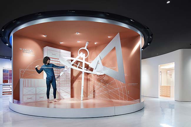
03 Showrooms that well fit into urban young people's lifestyle
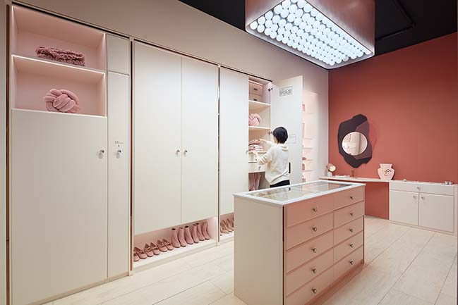
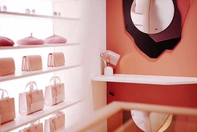
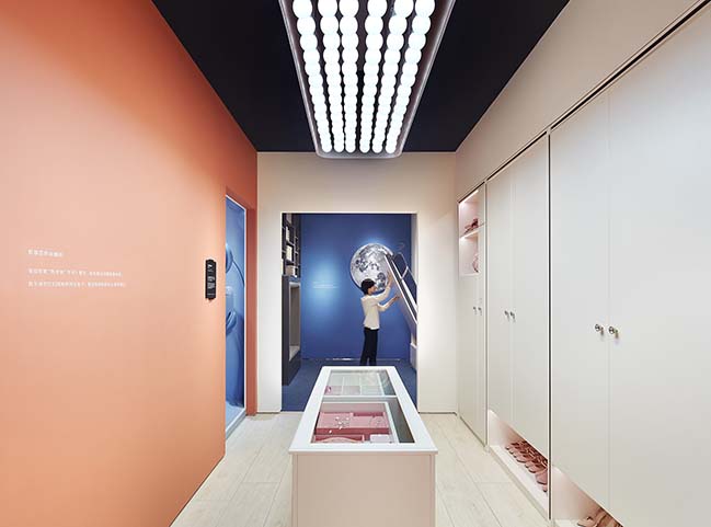
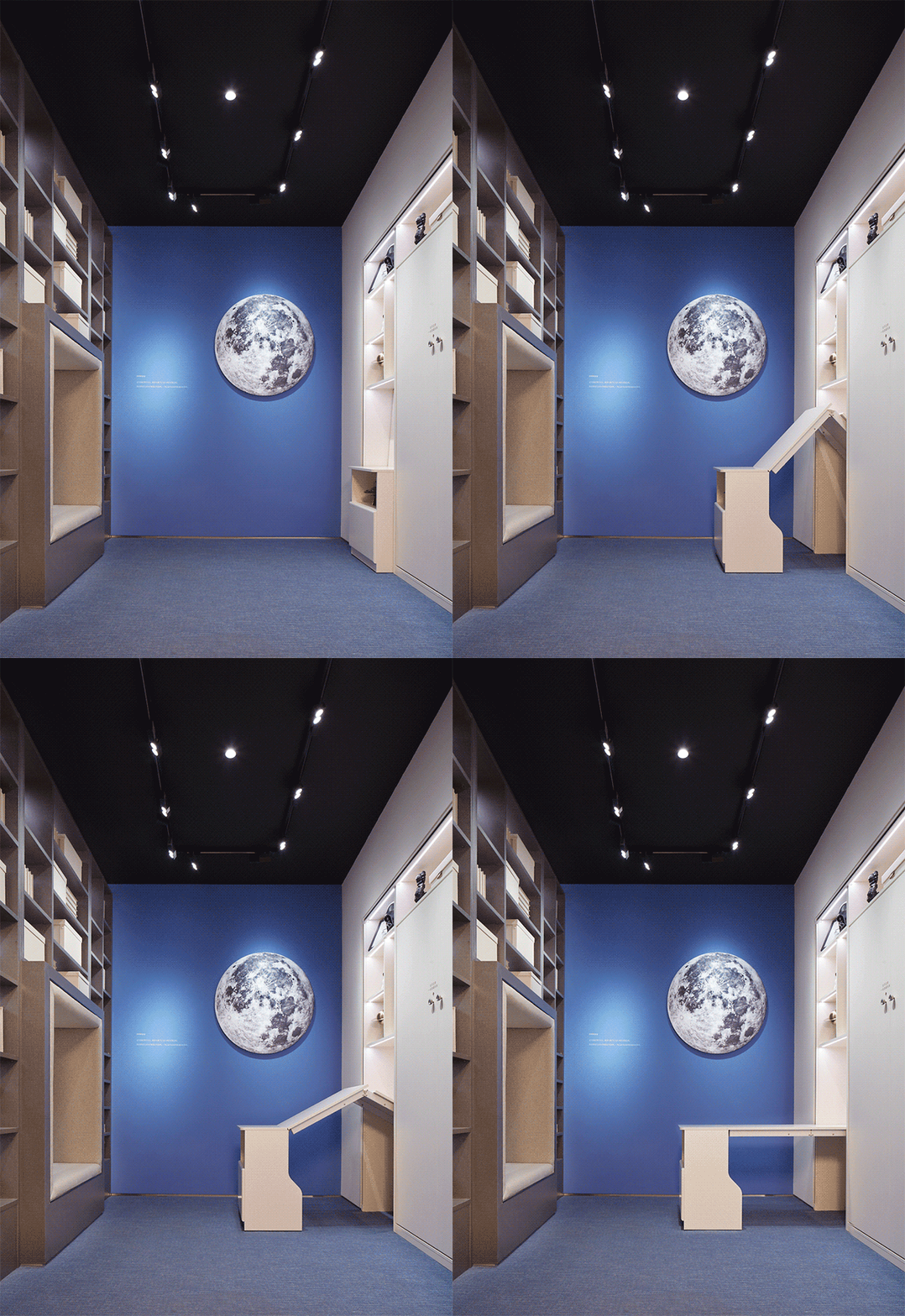
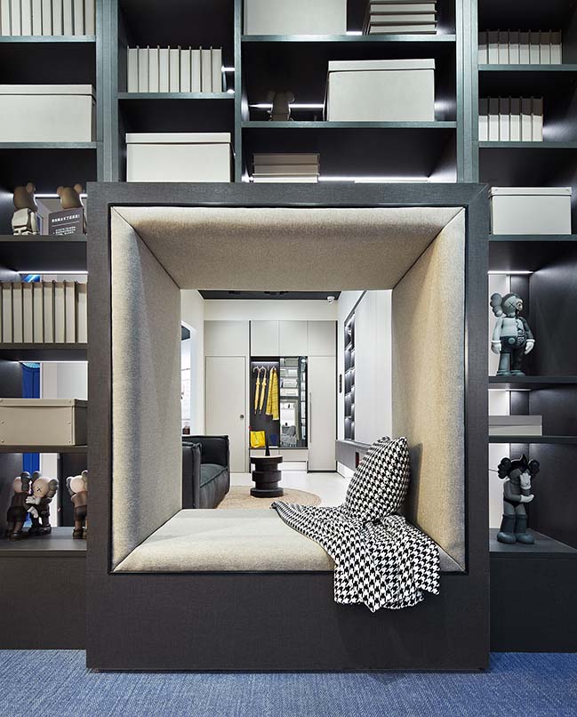
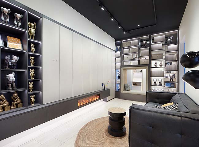
The WORKSHOP has three special storytelling sample rooms that were designed based on common scenes of urban life, including a walk-in closet for girls who are enthusiastic about shopping, a study & bedroom for literature-loving young males and a living room for families keen on stylish items collection.
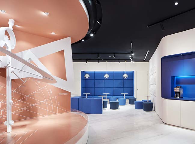
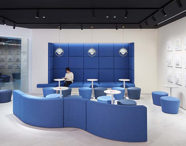
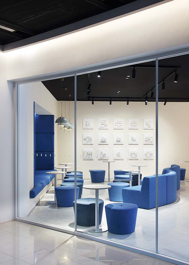
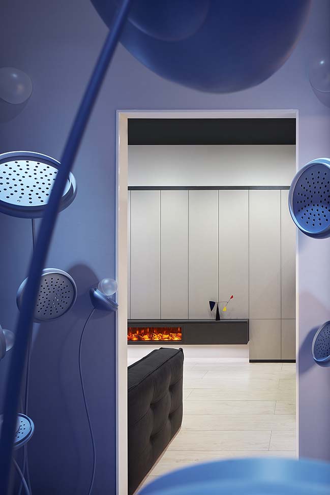
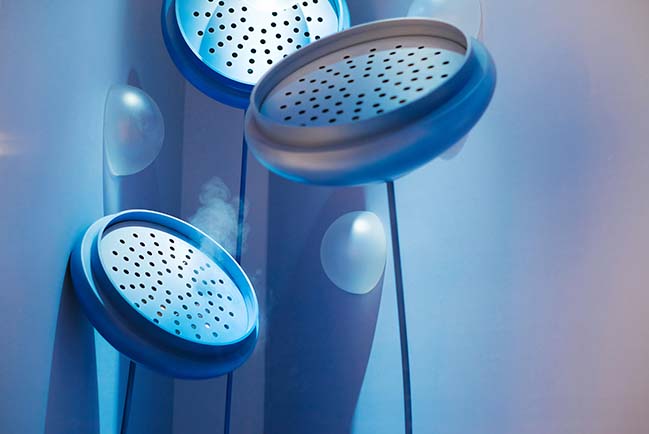
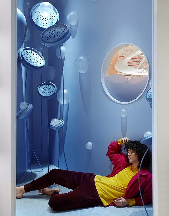
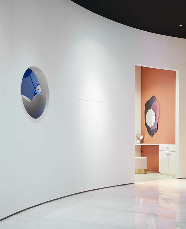
The intersection angle of the three showrooms forms a triangular area, which features a blue corner with bubbles, pleasant fragrance and audio effects, making it a bonus space. Its arc-shaped wall and the round window echo the circular center stage outside it.
04 Full-range and unique experience created through unifying visual effects
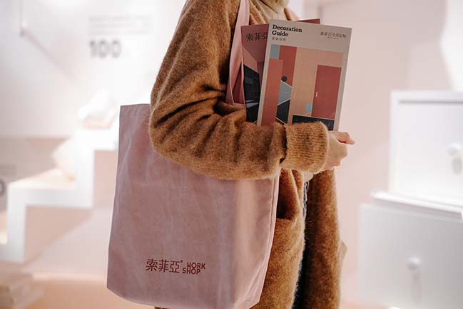
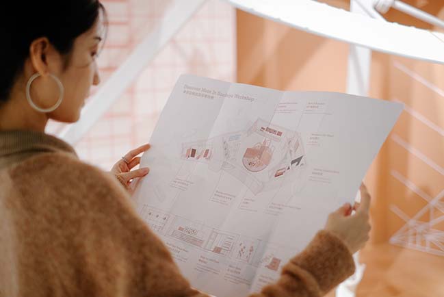
In order to build a unified brand image, the brand logo and icons as well as the supportive materials in the WORKSHOP were all designed by LEAPING CREATIVE. Exploration Guidebook is accessible to customers, making the experience of exploring the space more novel and giving it a ceremonial sense. Besides, the paper gift bags and velvet tote bags are helpful to bring the unique experience out of the store and communicate to more target customers.
YOU MAY ALSO LIKE: Shrine of Whatslove by Wutopia Lab
YOU MAY ALSO LIKE: Le Méridien Zhongshan from BLVD International
YOU MAY ALSO LIKE: United Cycling Lab & Store by Johannes Torpe Studios
YOU MAY ALSO LIKE: White Comedy of Xi'an Zhongshu Bookstore by Wutopia Lab
SUOFEIYA WORKSHOP by LEAPING CREATIVE
04 / 08 / 2019 Designed by LEAPING CREATIVE, the innovative retail space aims to explore a new mode of experience in the ever-maturing furniture customization industry
You might also like:
Recommended post: Al Saif Residence by ROMA International
