11 / 25
2018
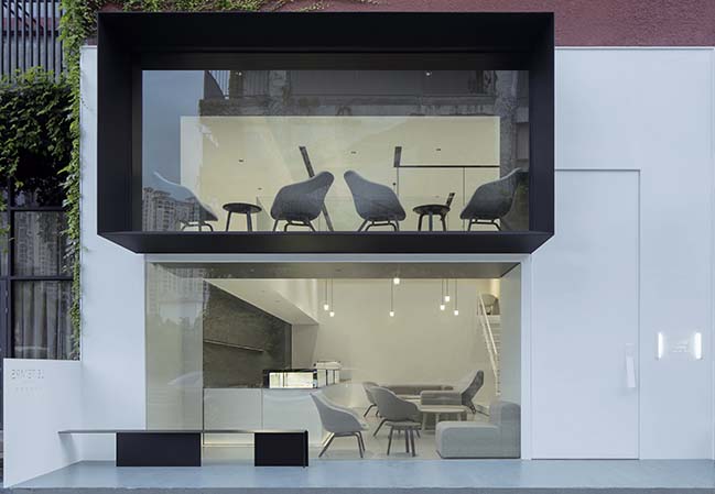
Le Temps Pâtisserie is a popular dessert shop in Fuzhou which has been operated for several years. “LE TEMPS” are French words, with the meaning of “time”. The shop owner chose this name because she hoped that both pleasure of enjoying desserts and profound memories could be permanently preserved in spite of passage of time.
Architect: DC. Design
Location: Fu Zhou, China
Year: 2018
Area: 260 m2
Chief designer: Xie Suting
Design team: Xie Suting, Yu Xiyao
Design assistant: Chen Shengzhong
Installation & display: Xie Suting, HAY
Lighting design consultant: Xu Fengbing
Photography: Xia Zhi
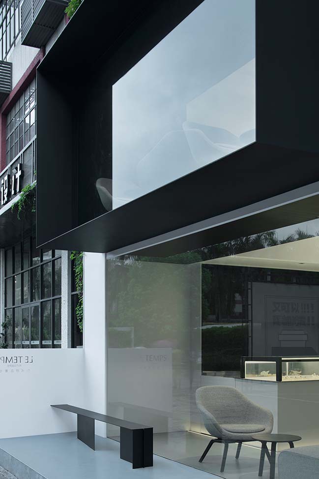
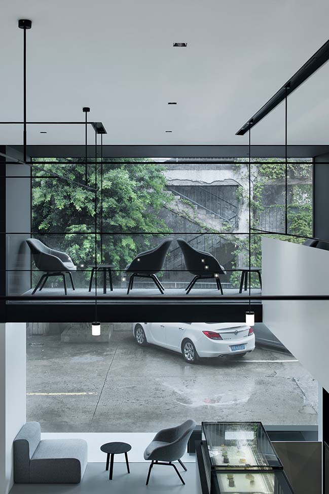
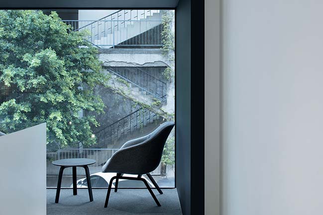
From the architect: Rebirth - The shop is situated in an old plant within a creative industrial park which was repurposed from a factory zone. The old building features nostalgic charm, with mottled walls covered by green ivy leaves.
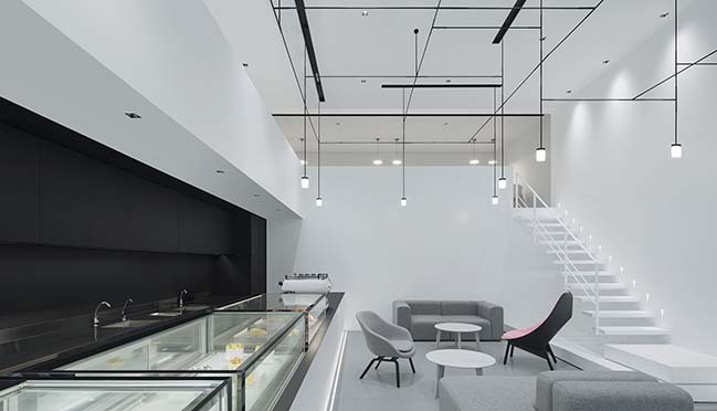
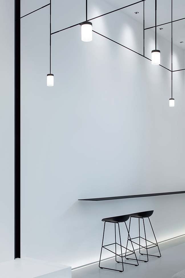
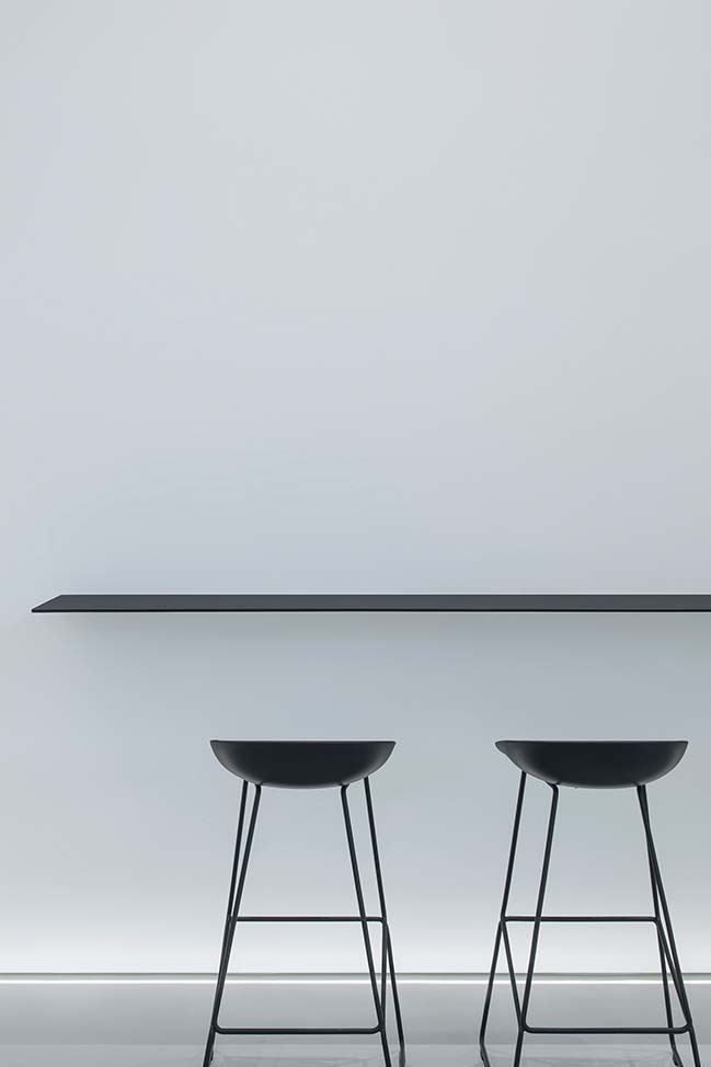
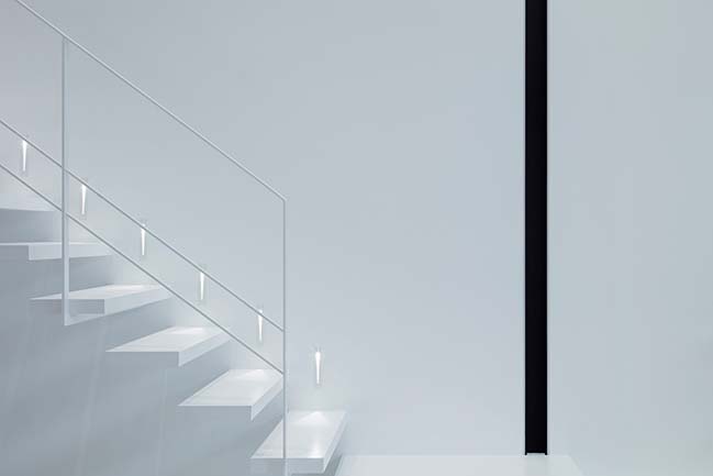
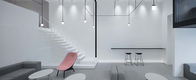
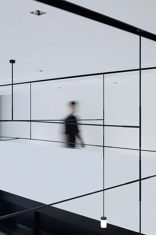
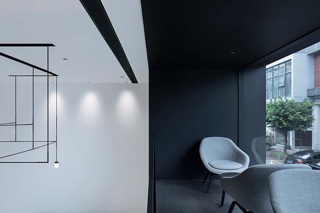
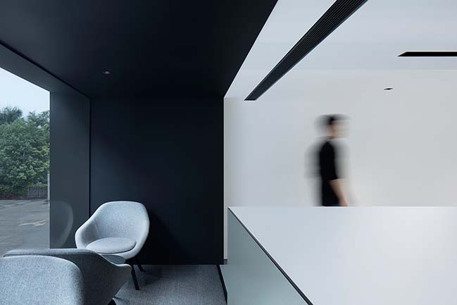
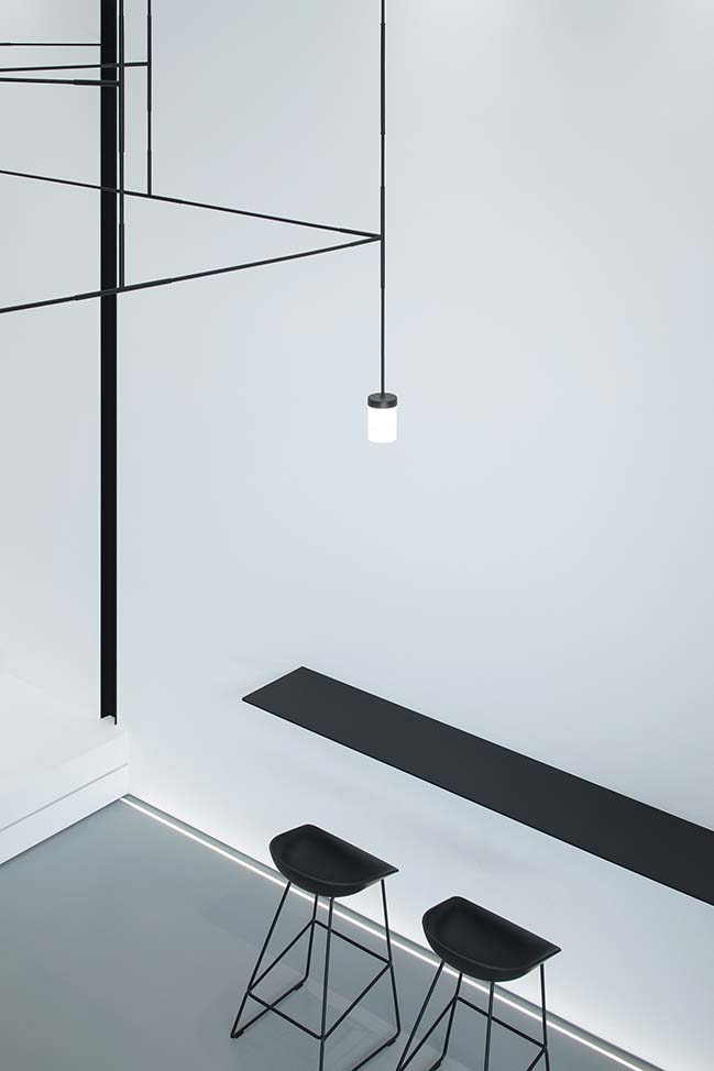
As described in Bible, “God said, Let there be light. And there was light.” Light is the prerequisite for us to perceive the world, which can also comfort our mind. The design team introduced full natural lights into the space and kept large area of the walls in white. In this way, daylight penetrates the windows, falls on the black bar counter and creates fascinating interactions of lights and shadows, thereby forming a unique environment completely different from the outside, making people calm and relaxed.
Through integrating new design elements into the old building, designers gave it a rebirth. Injected with vitality, the shop provides people with abundant and delightful experience.
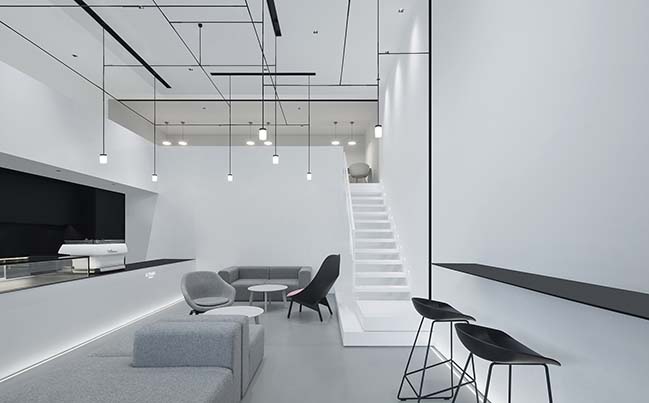
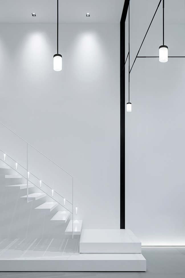
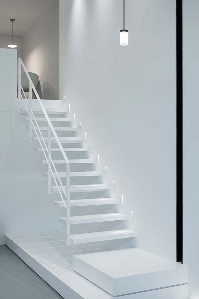
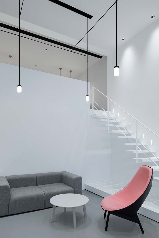
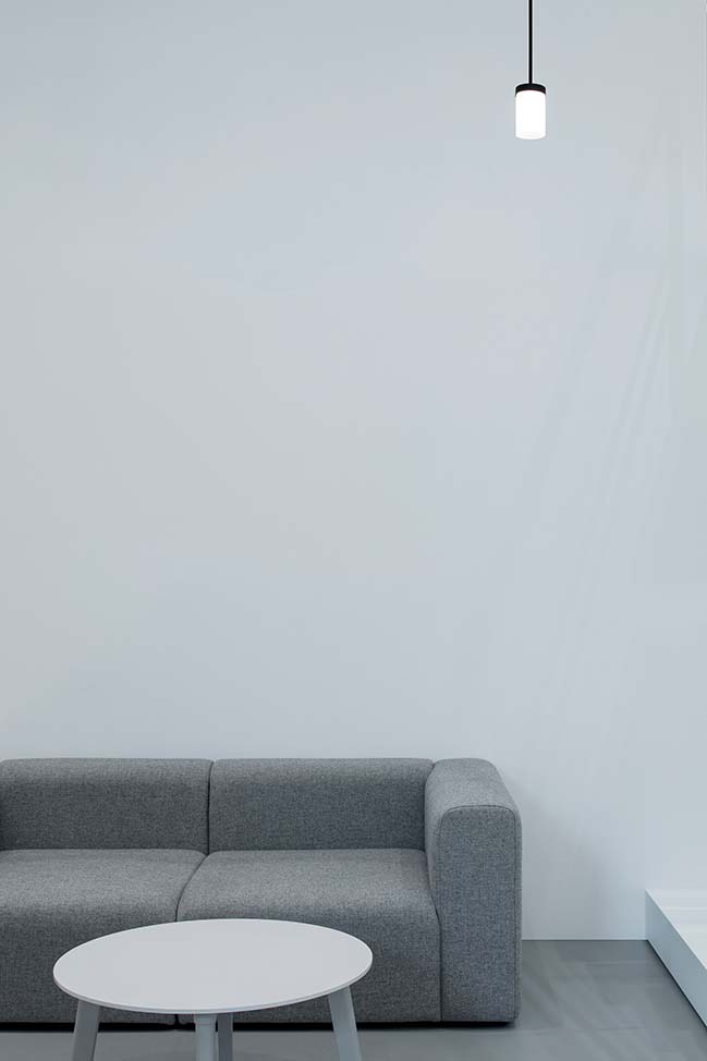
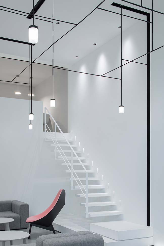
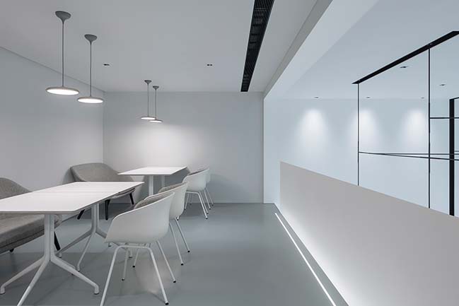
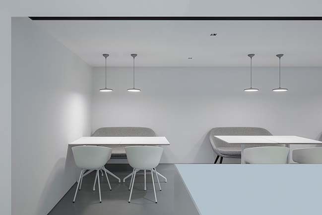
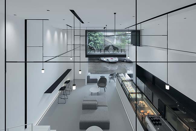
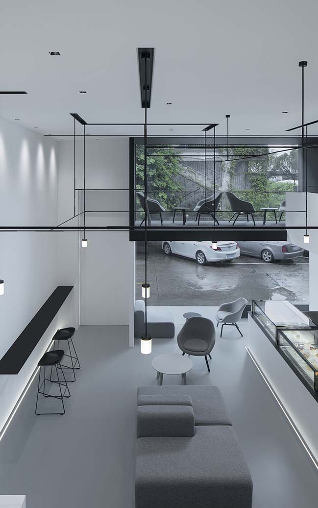
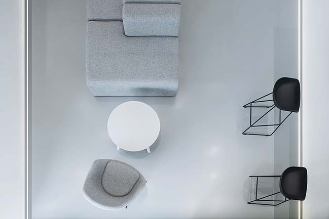
Less is More - The entire space features a palette of black, gray and white. Items used in the shop are exquisite and simple in design, such as furniture from HAY, and utensils of BELOINOX, CUTIPOL MOON, 1616 ARITA and STELTON EM77. The interior design presents a modern and minimalist style that is rarely seen in dessert shops.
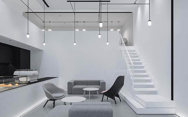
The shop owner is particular about details. As she said, “Each kind of dessert has its own cooking rules. A tiny difference in ingredients may lead to different tastes. As for a dessert shop, the interior space serves essential function and plays a key role. Therefore, great importance should be attached to its design and details.”
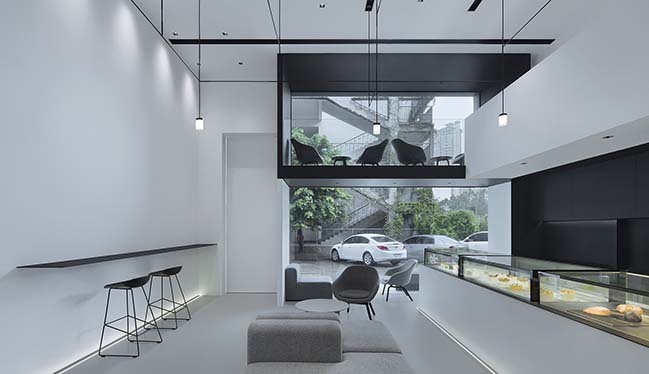
However, she and designers agreed that dessert was the priority for the shop. So the space was designed in a minimalist style with white, gray and black as major hues, keeping a low profile to highlight desserts. In this way, the interior design doesn’t “steal the show”, but sets off desserts and embodies the brand concept.
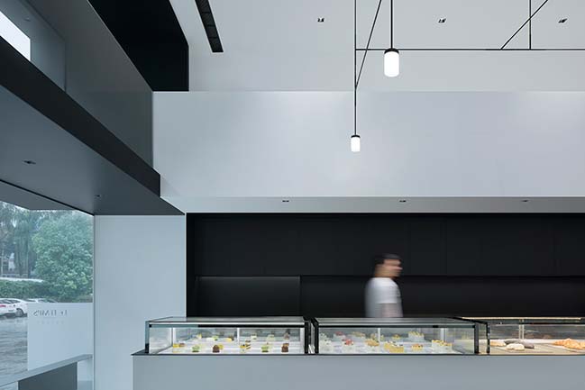
For the spatial structure design, the design team also applied the concept of “Less is more”. There were some columns with uneven surface in the original space. After much deliberation, the team decided to dismantle these columns, thus creating a “clean” space without any superfluous structure.
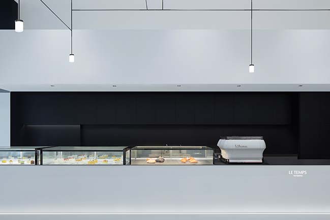
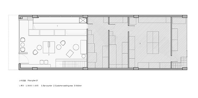
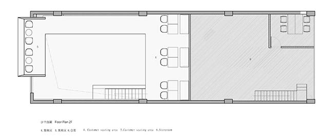
Fun - The main space consists of three “boxes”. The black one makes people feel calm, while the white one is refreshing. And the gray box (the seating area with a hue of gray), is of storytelling glamour. The three boxes with different colors are interpenetrated with each other, adding a sense of layering to the overall space. As people move in the space, they can enjoy diversified and interesting visual experience.
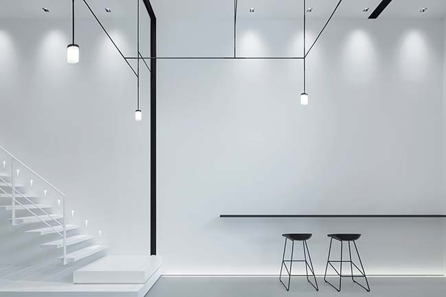
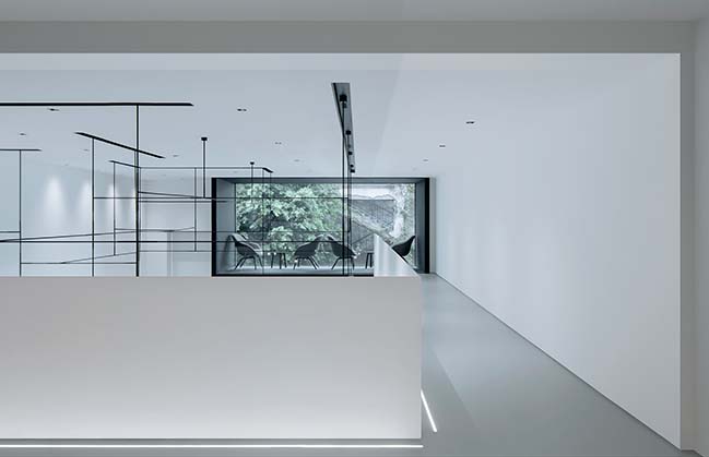
The long and relatively narrow hallway was designed with no decoration. Such “blank leaving” design leaves room for imagination. The large French window brings full natural lights into the space and enables customers to enjoy the outdoor view whether in the daytime or at night.
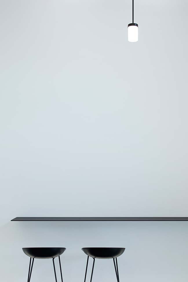
Sitting by the window, enjoying beautiful outside view as well as tasting yummy and delicate desserts, people can have a wonderful time in Le Temps Pâtisserie. A heaven of sweets makes the time spent here sweet.
> YOU MAY ALSO LIKE: Chengdu Panda Reserve by Sasaki
> YOU MAY ALSO LIKE: OPEN's UCCA Dune Art Museum Completed
> YOU MAY ALSO LIKE: TREESSUN Floor Exhibition Hall Design by TOWOdesign
> YOU MAY ALSO LIKE: M-Cube Shopping Centre in Beijing by MVRDV
Le Temps Pâtisserie in an Old Plant by DC. Design
11 / 25 / 2018 Le Temps Pâtisserie is a popular dessert shop in Fuzhou. The design team introduced full natural lights into the space and kept large area of the walls in white
You might also like:
Recommended post: Mindalong House by A Workshop
