09 / 17
2020
The design team aims to display 200 paints’ textures and colors harmoniously in a 180-square-meter space, and attract more customers through eye-catching exhibition and wonderful experience...
Architect: AD ARCHITECTURE
Location: Shantou, Guangdong Province, China
Year: 2020
Area: 180 sqm
Chief designer: Xie Peihe
Photography: Ouyang Yun
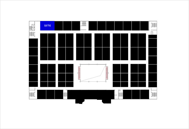
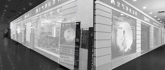
Project's description: The project is located at a mall's corner, which seems like a forgotten area because of its low person flow. Therefore, changing this situation is a very important part of the design strategy.
Novacolor was established in Italy, and originated from developing some natural mineral paints that have a long history. The design team aims to display 200 paints’ textures and colors harmoniously in a 180-square-meter space, and attract more customers through eye-catching exhibition and wonderful experience.
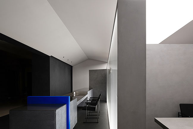
1. Free plane
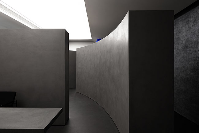
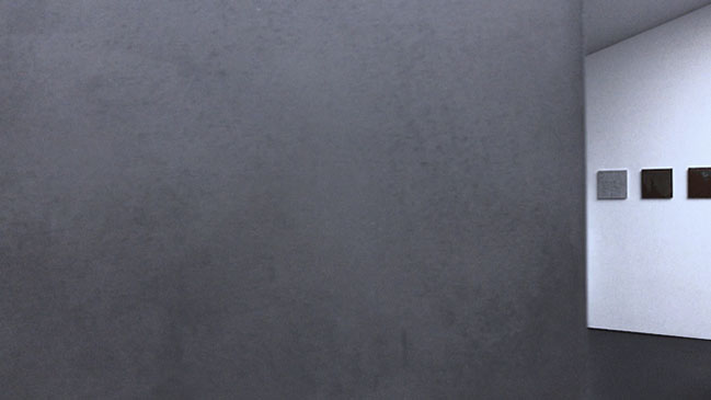
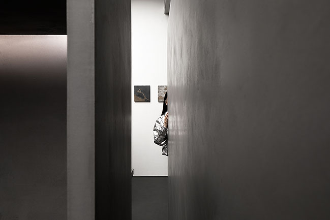
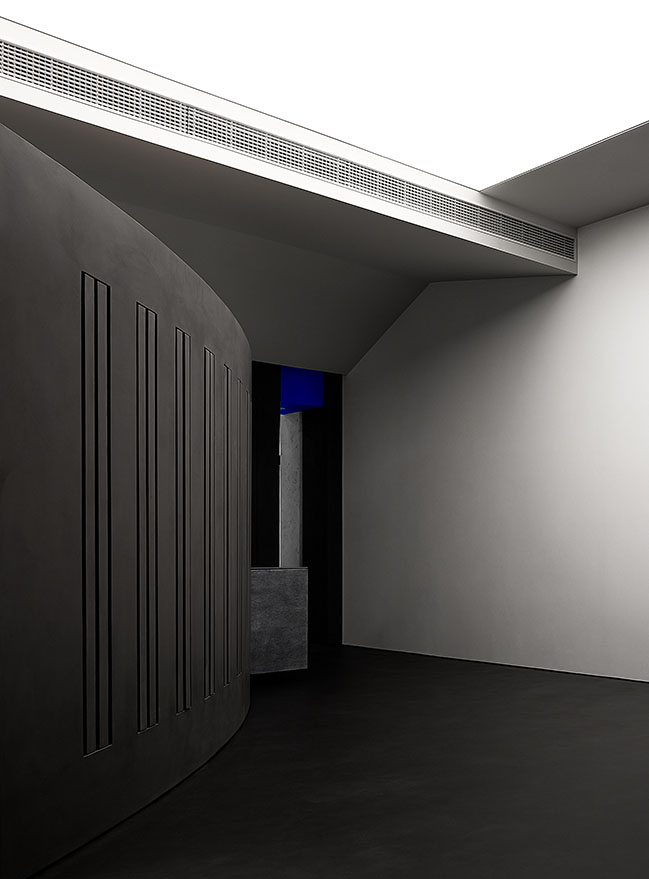
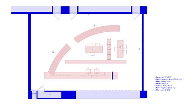
Irregular geometric lines are intertwined or separated. These contradictory lines constitute a free and open geometric plane, laying the foundation for a smooth and freely flowing space. The simple geometric volume, non-decorative elevation and the mystery of peeping through the gap present a new atmosphere for the space. The whole spatial pattern can be imagined from small details.
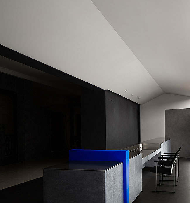
2. Breath
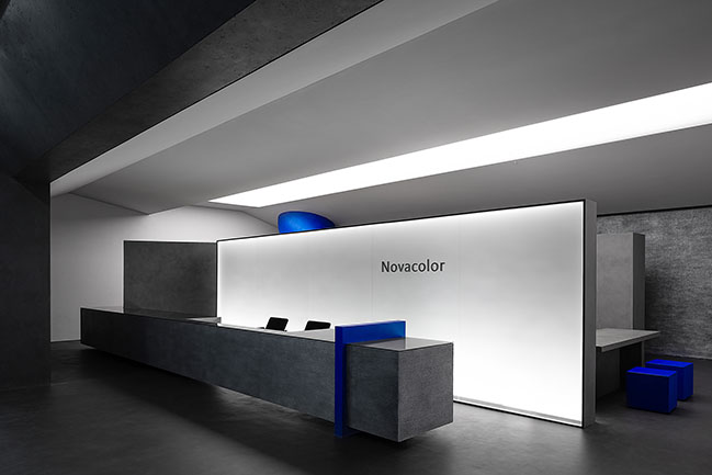
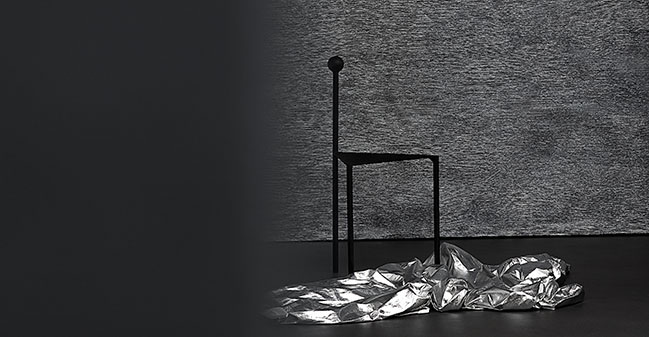
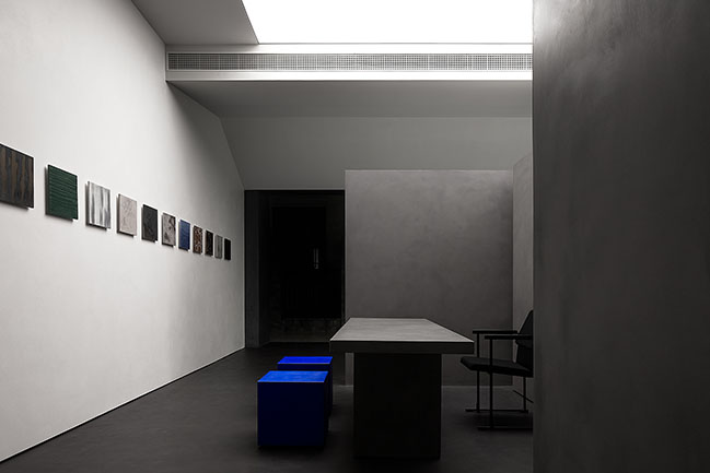
Generally, a space is enhanced by proportions, shapes, material, light and details, but this time, the focus of the space is material, which needs to be exhibited. The space provides people with more opportunities to communicate and interact. The natural white color, gray cement texture, silver metallic paint wall and the black travertine wall of the entrance are organically integrated in the space.
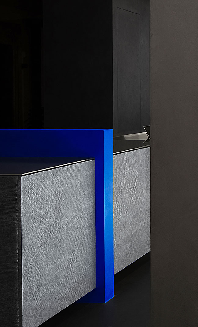
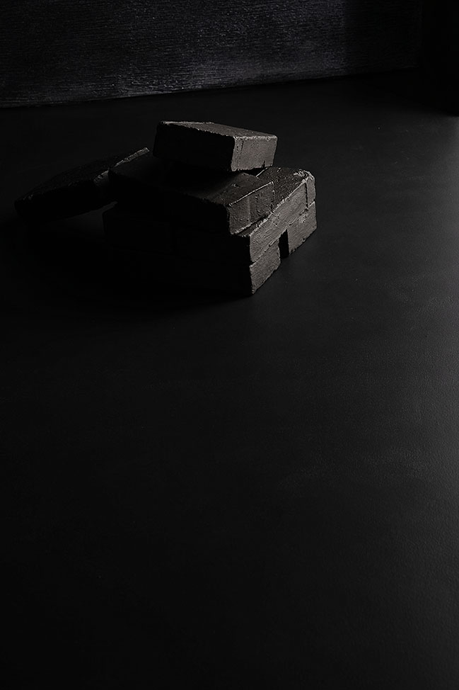
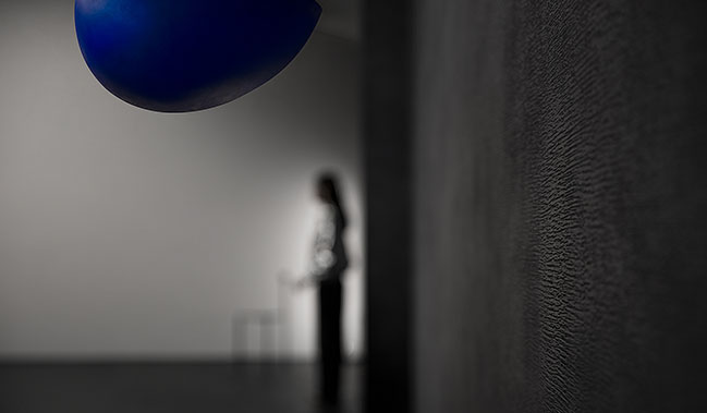
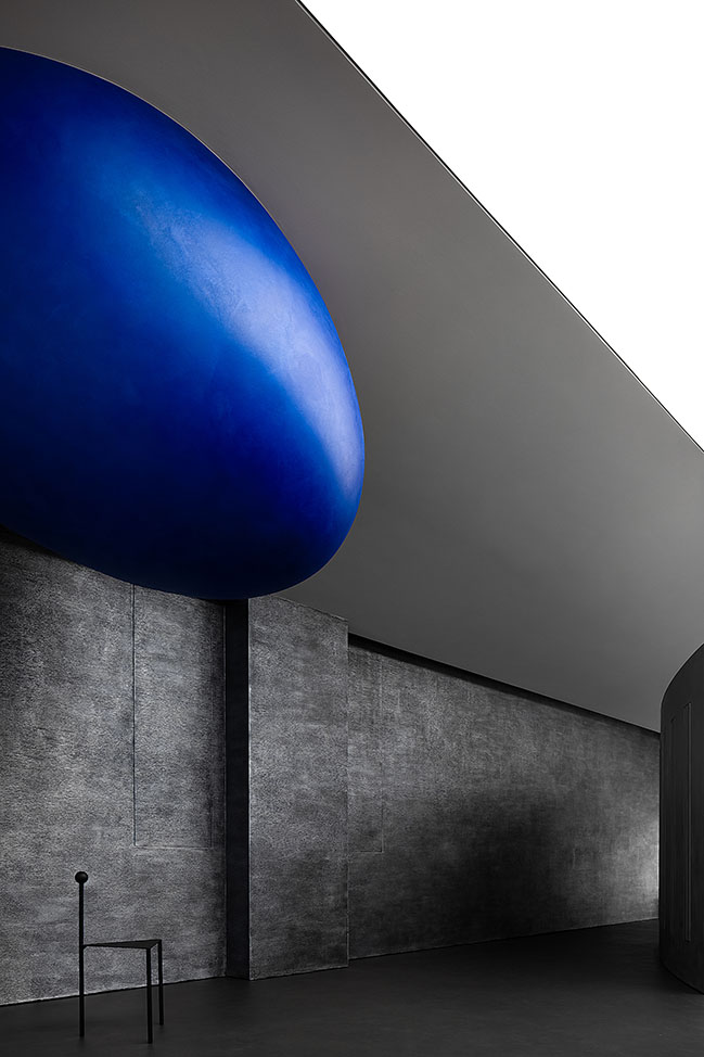
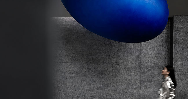
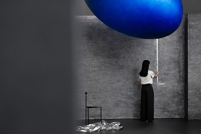
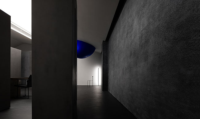
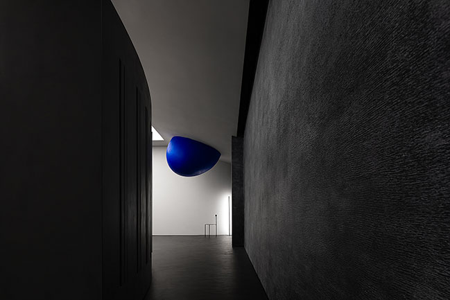
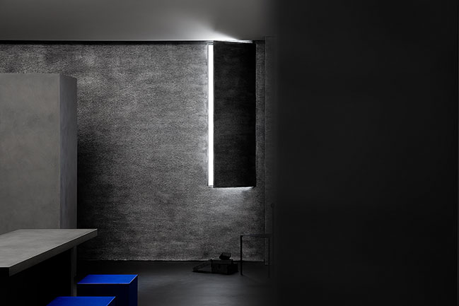
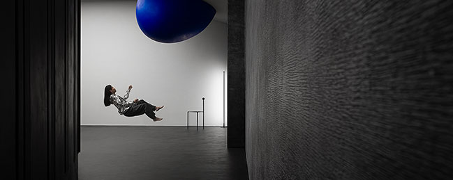
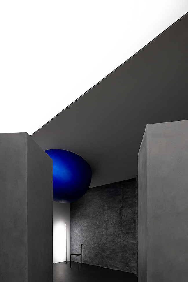
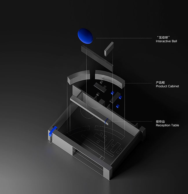
The display cabinet separated from the top is the only element that divides the space. The small blue ellipsoid is set at the highest point of the corner and able to create fascinating interactions with visitors, which emphasizes the mystery and fun spirit of the space greatly. The stacked rectangular bricks on the floor attempt to show the black metallic paint with rough texture, intending to express the diversity of paint and various emotions. In this way, people can really feel the space and materials are breathing.
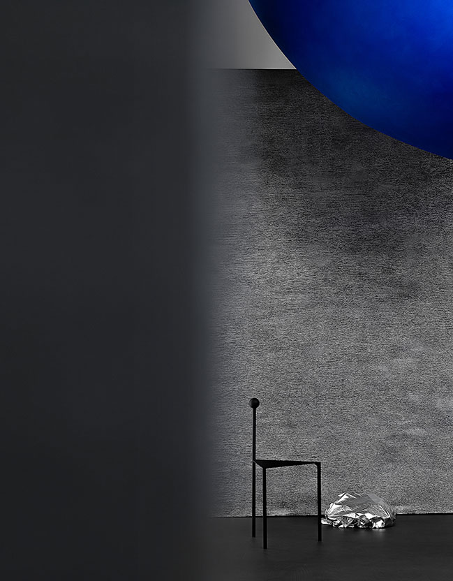
3. Visual planning
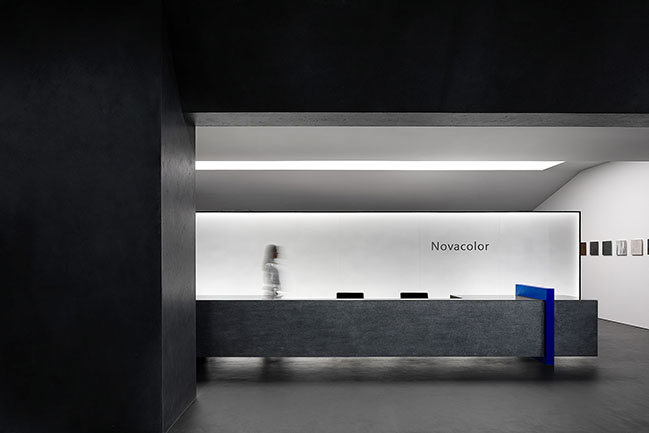
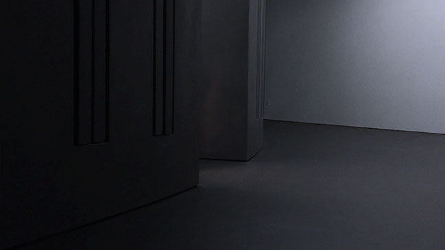
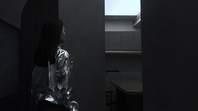
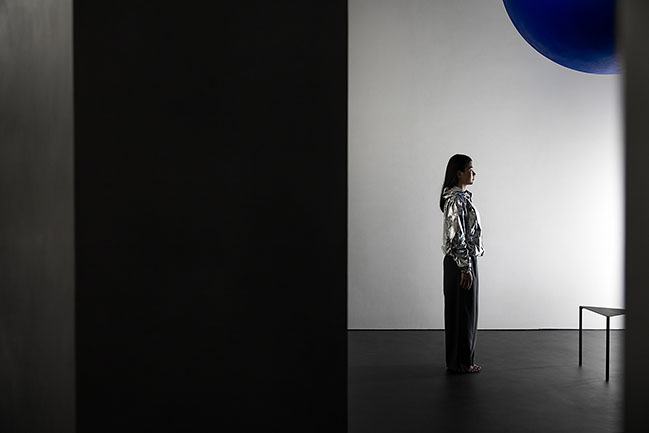
The transitional space's opening is specifically downsized, which is a clue to enter a world of different emotions and styles. A small opening can stimulate people's interest and imagination. The small blue ellipsoid hung on the top echoes with the curve of the plane and generates a strong sense of power.
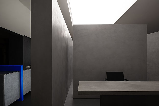
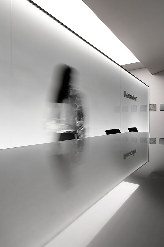
A flexible space is divided by a sphere. In the space, people are the focus. This is an open area with strong spirit, in which people can communicate with the space. The blue ellipsoid and the blue plate embedded in the reception desk are like two loners whispering to each other, forming a balanced feeling. The perceptual area is created through the meticulous geometric order. It’s a place of contradiction and coordination.
4. Contradiction
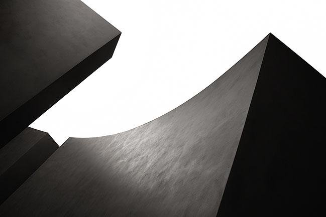
In terms of material, the natural concave-convex metallic texture and the blue sheepskin texture create a contrast. Meanwhile, more than 200 material templates are employed in a low-key way to demonstrate their conciseness in the space. An artistic paint showroom is presented through contradiction.
5. Cinematic and dramatic light and shadow
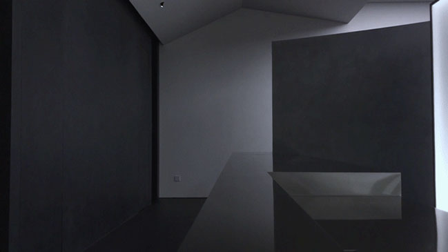
Light is an important medium for expressing the emotion of a space. Tesioned membrane structure is applied in a large area to emphasize the softness of light. On the one hand, the structure enhances the products' lighting effect and weakens the shadow emotionally, which forms a kind of dramatic silence. On the other hand, the light and shadow are partially intensified to express the texture of the material and the restless feeling of the space. A repressive power is likely to be released.
This time, the team regarded the design as an aesthetic practice, and tried to do something heart -touching.
YOU MAY ALSO LIKE: TRONGYEE Boutique by AD ARCHITECTURE


YOU MAY ALSO LIKE: AD ARCHITECTURE designed their new office in Shantou

YOU MAY ALSO LIKE: XZONE Office in Shantou by AD ARCHITECTURE














Novacolor Paint Showroom by AD ARCHITECTURE
09 / 17 / 2020 The design team aims to display 200 paints' textures and colors harmoniously in a 180-square-meter space, and attract more customers through eye-catching exhibition and wonderful experience
You might also like:
Recommended post: Panasonic Flagship Store by Say architects

