09 / 23
2018
On Saturday May 12 2018, the new Perth Children’s Hospital opened to patients, staff and the community. The Architects for the design of the hospital, JCY, Cox Architecture, and Billard Leece Partnership, with HKS Inc, wish to congratulate the State, the people of Western Australia and everyone who worked on the project on the opening of this world-leading facility. Truly worth waiting for.
Architect: Cox Architecture
Client: WA Health and John Holland
Location: Perth, Australia
Year: 2018
Project size: 78,000 m2
Site size: 26,737 m2
In association with: Billard Leece Partnership, JCY, HKS Inc
Cox Team: Fernando Faugno, Steve Woodland, Greg Howlett, Rebecca Carrick, Eldon Borkwood, Paul Chauvel, Gary Giles, Louise Buckingham, Luke Gay, TP Nguyen, Natalie Geier, Phil Nicols, Jerome Monty, Yvette Petit, Jarvis Pinto
Key Consultants: Norman Disney & Young, Aurecon
Contractor / Builder: John Holland
Photography: Shannon McGrath
NATURAL INSPIRATION
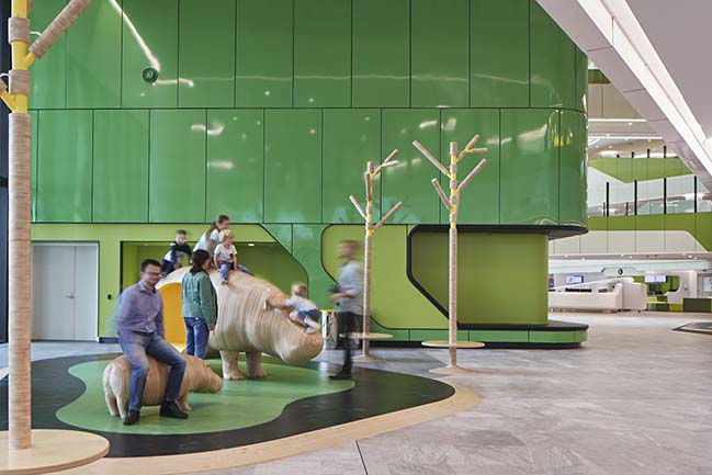
Driving along Winthrop Avenue, the animated lighting of artist Stuart Green’s “fizz” sculpture and the green façade instantly identifies the children’s hospital, a visual wonderland for families driving past at night. Vast areas of north facing glass enable the child and their family to catch a glimpse of the sculpted forms, artwork and play areas, reducing the anxiety of the child to their environment.
The design team’s starting point was to anchor the Hospital in its unique surroundings. The nearby flora and fauna of King’s Park inspired a concept for the building based on petals and a stem.
Fernando Faugno (Cox) said: "The composition of the building is directly inspired by nature. The elegant floral forms of Kings Park have been key in the general, shaping of the building and the curvaceous sculptural forms carry through the general theme of the architecture. The design has a gentle flow which adds to its humanity and sense of welcome.
"Embedded in the organic structure of “stem and petals”, the arrangement of the building emerges as a fluid, connected, sculptural piece.
"The fanning petals house the children’s ward, maximising natural light and views to the south and east. Each petal offers every room natural light and vistas to sky and land.
"The meandering ‘stem’ connects the petals and forms a primary movement gallery through the building. Filled with activity and light, the gallery becomes the social spine of the project, connecting all its diverse array of functions and activities."
Mark Mitchell (BLP) said: "The form also emerges from an ideal layout for patient observation. Open centres to the building generally afford the perimeter for patients’ and families’ use, and the central area of each of the wings are more open for staff to observe, work and provide support across the unit. So the two concepts came together pretty nicely from a form optimisation perspective."
The new Children’s Hospital will be among the best in the world, yet is uniquely Western Australian.
LIGHT
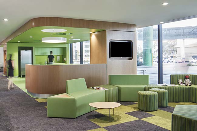
Fernando Faugno (Cox) said: "One unique quality of Western Australia is its quality of light, there’s quite an intensity about the light. Wherever you are in the facility, you are connected to that sense of light. But equally, we needed to control it. The incorporation of a double skin façade on the east and west façades that houses most of the clinics, laboratory and teaching spaces allows for not only maximising views to Kings Park but also controlling glare and heat. The facade itself is quite an animated façade, changing appearance during the course of the day as the motorised louvres open and close, tracking the sun path. The beautiful colours of the Kings Park bushland have provided the inspiration for the buildings palette – a uniquely crafted range of local colouring which delivers vibrancy and freshness to the hospital and its face to the world. The gently curving forms provide animation and intrigue as one moves around this significant structure."
UNIQUELY WESTERN AUSTRALIA
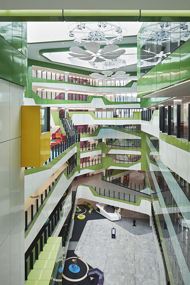
Mark Mitchell (BLP) said: "We talked a lot about the concept of finding the small, beautiful object within the vast landscape. The idea that there’s a gem or jewel inside a huge expanse of something else, that seems to be a uniquely Western Australian thing. The design was conceived as a response to that – a small special space within the vastness of the landscape.
"The interior colourways reference the incredible bursts of colour from the wildflowers that sweep through Western Australia every year. Instead of focussing a colour in a particular area, there are bursts of a lot of colours."
A CHILDREN-FIRST APPROACH
A hospital visit can be a very daunting experience for a sick child. Hospitals are vast buildings, which are often associated with a bombardment of signs and other information, long endless corridors, noisy waiting areas, and those awful smells. It’s understandable how a child’s anxiety can increase significantly on their way to see a doctor. This is where Perth Children’s Hospital is different.
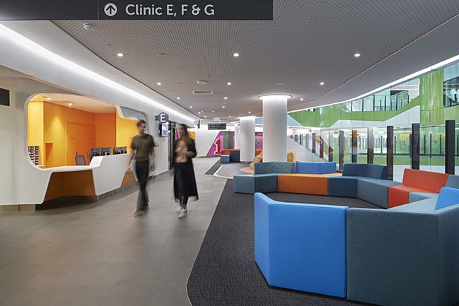
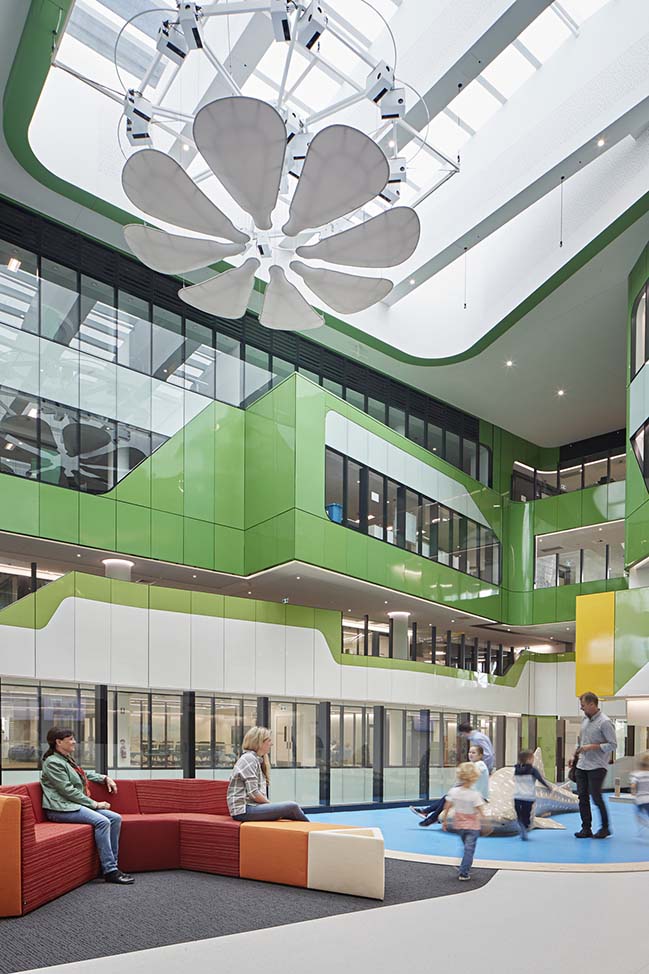
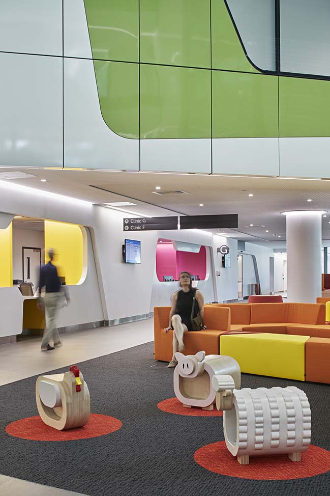
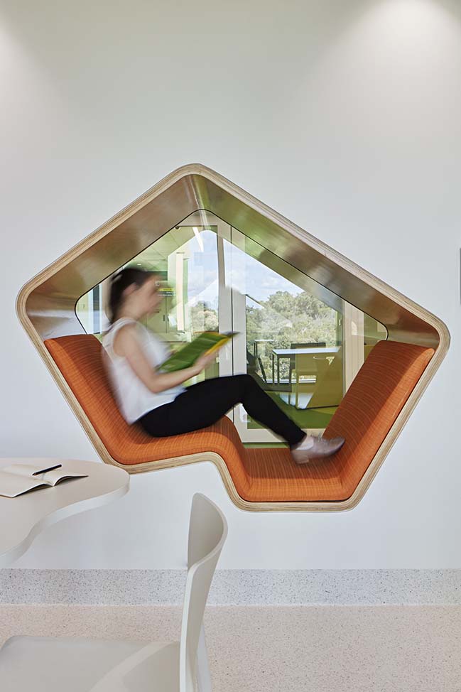
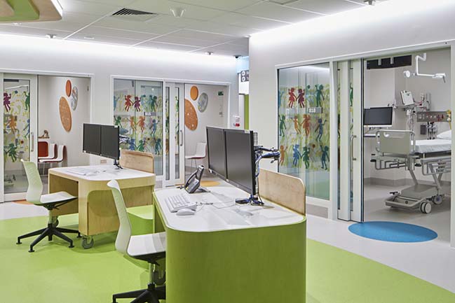
Everything from the journey into and through the hospital to the finest details have been considered and recalibrated for a child’s perspective; from lowered window seats to pops of colour and visual treats which are at the level of the child and for them alone, and may even be missed by the adults. The interiors are not themed as such, but designed as a series of destinations, with bright colours and organic shapes marking prominent landmarks along the way. The reception desks appear carved out of a single shiny warped form. The seating pod areas are not just for sitting, but for climbing, hiding and exploring. Geometric cut-outs (which double as window seats) mark the entry to each of the play therapy areas. The staff stations in each of the inpatient areas are designed as treehouses.
Andrew Rogerson (JCY / Cox) said: "There’s fun and whimsy in the building throughout, such as the window seats… but also in the ceilings along the bed corridors, where there are details in the ceilings. So, if a child’s lying on a bed travelling through the facility, at least there’s something to look at and a bit of wonder as they pass. These design solutions are about removing some of the anxiety."
PLAYFUL
The atrium space at the heart of the hospital is a hive of activity and wonderment. It is easy to find the playful main reception desk inside the main entry. It has been designed so that there are no visual impediments to seeing even the smallest of children. Looking up into the atrium, suspended mobiles reflect sparkles of light through the space, providing a cascade of kinetic petals throughout the day, and the rolling and bulging forms of the balconies around the central space suggest a place of play rather than sickness.
DESIGNING FOR PATIENTS AND FAMILIES
More than 75 percent of the patient rooms are single rooms allowing the child and their family the privacy and control to own their room for the length of their stay in hospital. The room is also designed to reduce a child’s anxiety and is created from the perspective of a child in their bed. From here, the child can see out the window with some fantastic views, many of them across Kings Park and to the Swan River. There is a family zone under the window with enough space for a parent to stay overnight, and for siblings to play. At Perth Children’s Hospital, families are provided with an environment where parents are welcomed and made to feel at home with their child.
Mark Mitchell (BLP) said: One of the main differences between a children’s hospital compared to an adult hospital is not just the way it looks, but how the family become key participants in the care process. Parents tend to know a lot about their child’s “normal” state, so they become a bit of a gauge of their kid’s progress. That’s why they’re encouraged to stay as long as possible, to participate in the care.
SUPPORTING CARERS
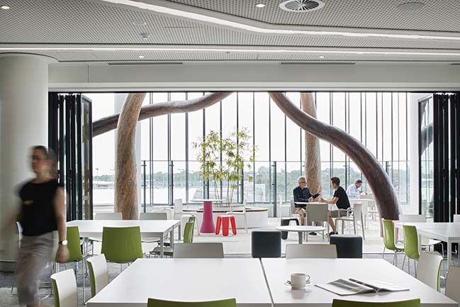
Caring for sick children requires a special kind of person; people who are patient, understanding and intelligent. It is important that these carers are also supported in an environment that offers them a safe (and efficient) work space where they can continue to develop and learn, along with stress reduction through amenities, respite areas, daylighting/views, exercise areas/access to the park, landscaping androoftop gardens.
Mark Mitchell (BLP) said: "From the earliest stages, we discussed the importance of having staff only spaces – places where staff can concentrate without the constant need to be looking after parents and kids and their families. The office space is quite collegiate, instead of being heavily divided into specialty units, to encourage greater crossover and collaboration between the different specialists and between the educators, researchers and clinicians. You never know what “eureka!” moments may spring out of those chance conversations.
AN AMAZING TEAM
A project of this scale, importance and complexity takes the contributions of thousands of people. The architectural team worked in close collaboration with the Managing Contractor, John Holland throughout the project.
Andrew Rogerson said: "Having the design team located in a project office with John Holland’s team from the beginning meant we collaborated closely at every stage of the project and so the contribution of each team was much more effective"
Clinicians, families, and other key stakeholders made enormous contributions to the design, sometimes in unexpected ways.
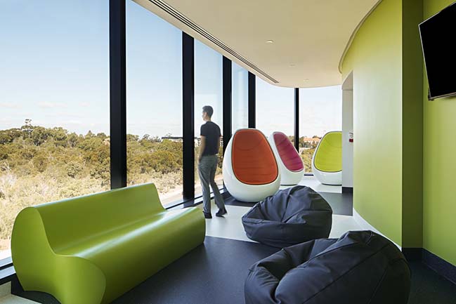
Mark Mitchell (BLP) said: "We must have had over a thousand user group meetings. We engaged in some fascinating conversations with the clinicians, who were so critical for engagement on the project, and they were just brilliant in their insights. As well as their inputs beyond the clinical spaces, just looking at best practice in so many different ways – from a sustainability perspective, from an interiors perspective. As a result, I think this hospital has jumped ahead of the pack. Patient and family facilities are up there with the best in the world."
Fernando Faugno (Cox) said: "I think credit must go to the State and all its stakeholders. Their intention from day one was to create the best facility in the world, and they had a devoted, passionate team highly focussed on improving the lives of patients, families and staff.
Over 200 design professionals worked on the project.
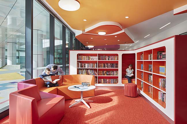
Andrew Rogerson (JCY / Cox) said: "One of the things that impressed me about the team was that a number of them had a very real connection to PMH [Princess Margaret Hospital], either they’d been there as children or they had relations or children who’d been there, so there was an incredible dedication within the team as well. And I think that pays off and you can see the manifestation of that dedication in the design."
Mark Mitchell (BLP) said: "It’s one of those projects where everyone went the extra yard, because it has such a direct relationship with doing the right things for the next generation."
Fernando Faugno (Cox) said: "You only get an opportunity like this once in a lifetime.. To work on this project was so very special. And it’s a true legacy project for Western Australia, so to be part of that scale and scope of endeavour is extraordinary."
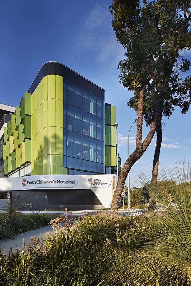
Perth Children's Hospital by Cox Architecture
09 / 23 / 2018 On Saturday May 12 2018, the new Perth Children Hospital by Cox Architecture opened to patients, staff and the community
You might also like:
Recommended post: Hanoi Lotus by deciBel(Architecture)))
