04 / 01
2020
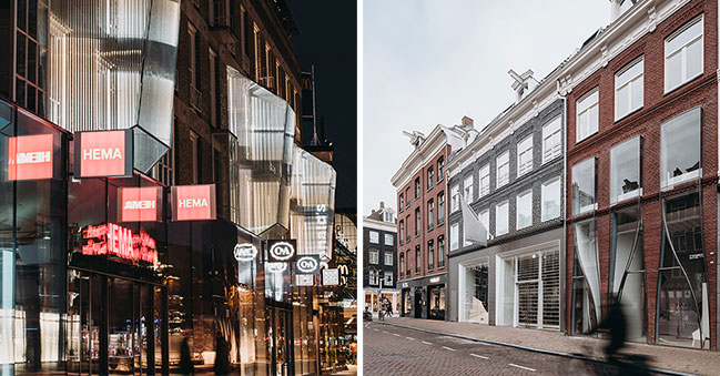
UNStudio has recently completed two remodel projects for retail outlets in the Netherlands: the 18 Septemberplein renovation in Eindhoven, and a second complete facade remodel on the P.C Hooftstraat in Amsterdam.
All photos © Eva Bloem
18 Septemberplein renovation in Eindhoven
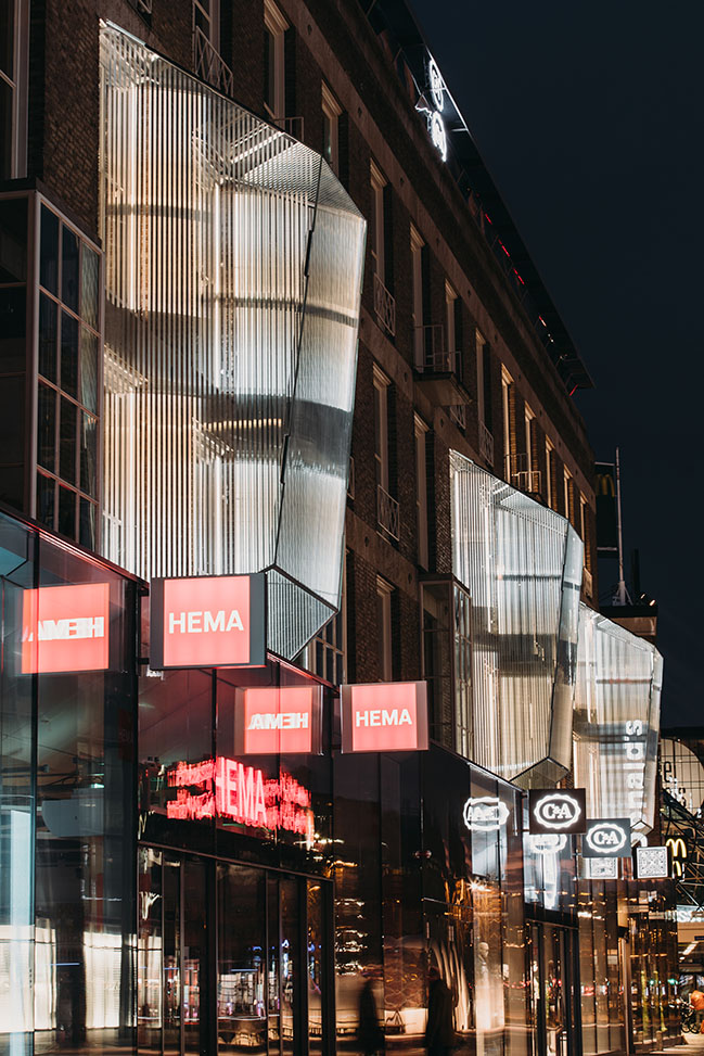
As part of Pan-European retail real estate investment manager Redevco’s redevelopment of the 9,000 m2, four storey 18 Septemberplein C&A building (a significant piece of protected post-war architecture), UNStudio was invited to restore and connect this historical building to its existing urban context.
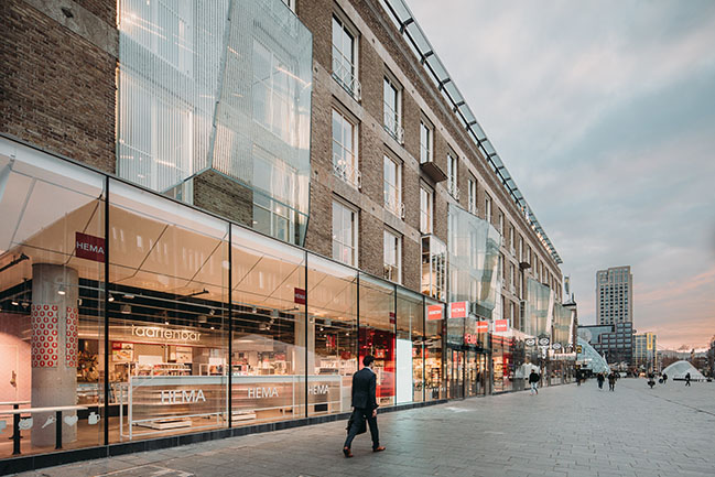
Designed by Jan van der Laan and opened to the public with great fanfare in 1952, the C&A building was long held in high regard. However numerous alterations were made during its lifespan and the building is no longer considered dominant today. The modern addition of large, eye-catching entrances to underground bicycle parking facilities have also obstructed views to the building, with the result that it can no longer adequately express its identity, nor display a clear and recognisable storefront.
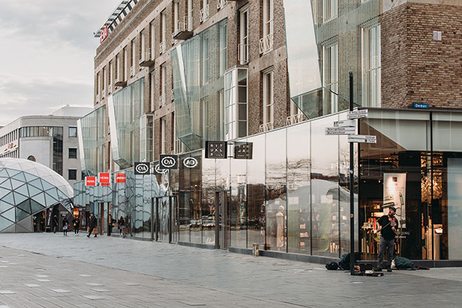
For this central refurbishment project, UNStudio therefore imagined a rebranding and a modernisation of the precinct. A cultural historical analysis of the building was carried out and design interventions were proposed based on the building’s historic values and the rhythm and ideas of the original architect. The philosophy of reducing material use to create lightweight structures formed the starting point for investigating the use of structural glass in the refurbishment.
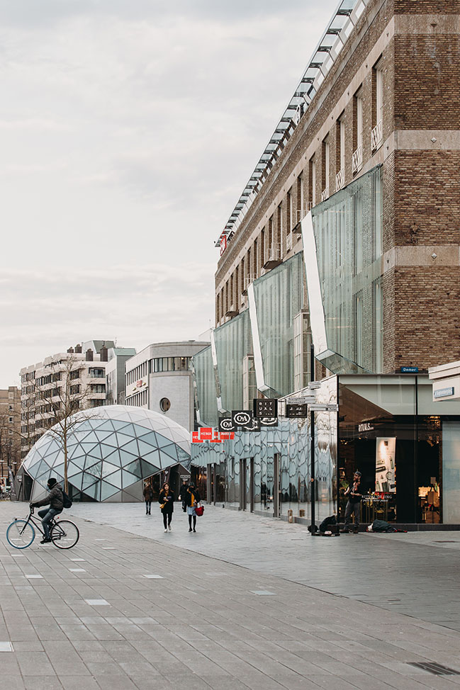
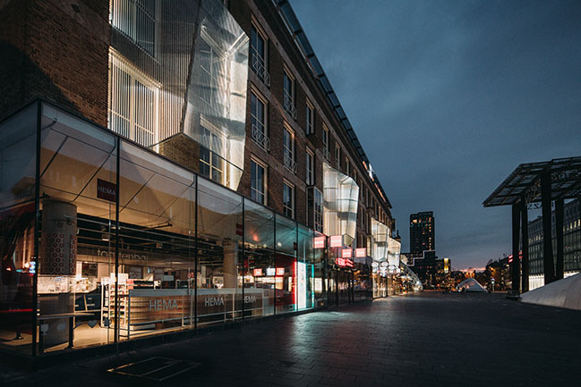
UNStudio’s interventions include the repositioning of an entire floor in order to create better floor to ceiling heights and the return to a transparent glass plinth, as originally designed by Van der Laan, During the building’s lifetime, an extension was added to the roof. In UNStudio’s refurbishment, the roof is returned to the strong modernist aesthetic of the original design, while large illuminating glass motifs are installed on the facade, to celebrate Eindhoven’s design heritage, alongside its contemporary reputation as a centre of tech innovation.
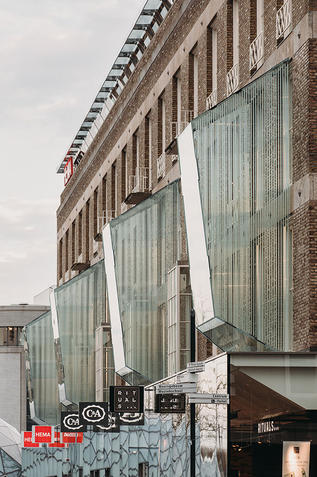
Ben van Berkel: “As ‘the City of Light’, Eindhoven is the perfect place for innovation. The use of glass in the C&A building not only creates a light construction, but it adds variation of depth to the otherwise flush plane of this historic facade. During daytime, the glass boxes act as ‘eyes’ to the public square, allowing the building to interact and communicate with the public, while at night the animated light installations suggest that the building is breathing as it illuminates the square.”
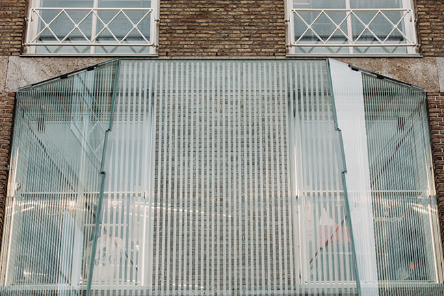
These large glass additions take the form of a series of light-filled installations, which celebrate and complement the existing extruding windows on the north facade, whilst also serving to draw the gaze of passers-by towards the building.
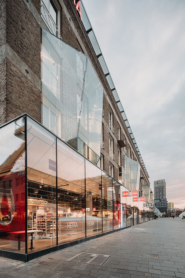
An experience of light
Reflectivity and sheen are added to the facade through the ambitious construction of four large glass structures. At 5.5 meters wide, 7 meters high and weighing 3000kg each, these illuminated windows appear to float on the surface of the monumental facade. This effect was achieved through a close collaboration between ABT, Si-X and UNStudio, which resulted in the creation of interlocking and glued connections that form an ‘invisible’ support and mounting system.
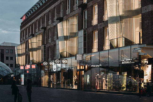
This type and scale of glass facade construction has never before been realised in the Netherlands. In order to make the glued construction possible at such a large scale, the team undertook one a half years of extensive research - and of trial and error - before finally finding a solution that could provide the level of craftsmanship and engineering precision required.
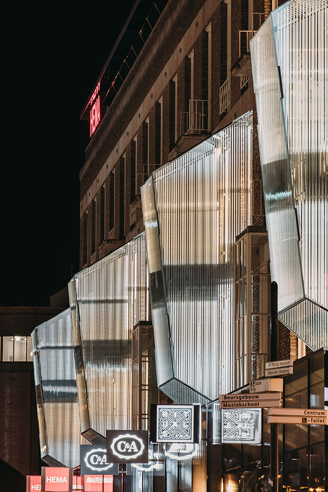
Angled at 10 degrees to maximise visual connections at street level, the glass structures are illuminated by LED lighting – designed by the Dutch artist Arnout Meijer - which is reflected and diffused by a thin film on the inside of the glass. Optical effects created by this film form patterns of light, which appear to alter as people move across the square. As such, the original design motif of protruding glass windows is used to emphasise the heritage of the C&A Store, whilst strongly identifying it with The City of Light.
P.C. Hooftstraat 140-142 remodel in Amsterdam
The Brick Pixelation
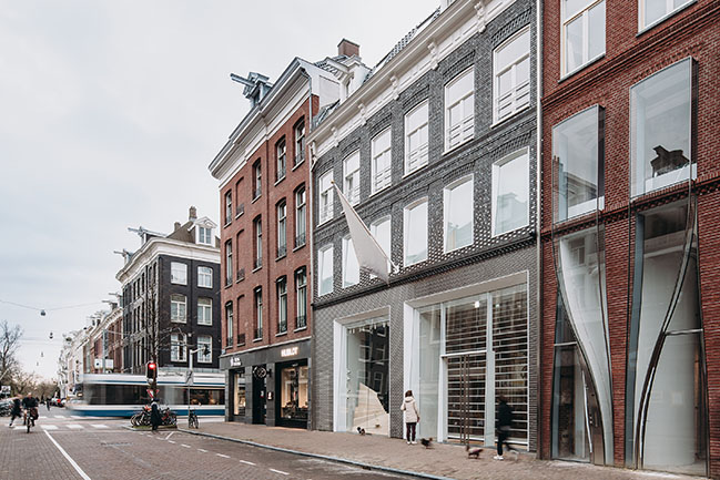
Textured and transparent, laced and illuminated, The Brick Pixelation Facade at the P.C. Hooftstraat 140-142 embodies the intricate, crafted details epitomised by couture clothing. Cast stainless steel bricks with glass inlays pixelate together along this partially transparent facade to create a distinctive shopfront experience on one of Amsterdam’s best-known streets.
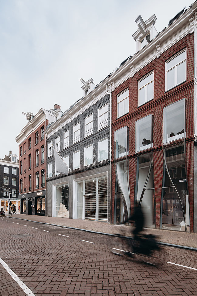
The P.C. Hooftstraat is famous for its high-end boutiques and design shops, situated between the Museum Quarter, the Vondel Park and the Oud-Zuid neighborhood. Shops along this street are a testament to Dutch design, creativity, high-end clothing and art. UNStudio’s renovation brought two separate buildings together to become one retail space, making The Brick Pixelation one of the largest retail spaces along the P.C. Hooftstraat.

Located next to its architectural cousin, The Looking Glass (also designed by UNStudio), the facade design uses cast stainless steel as its main material, and the traditional Amsterdam town house as its frame. Comparatively, this building expresses a more detail-oriented interpretation of textiles.
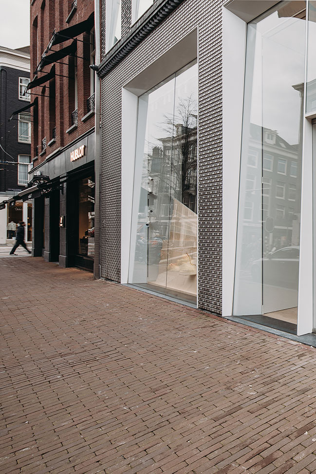
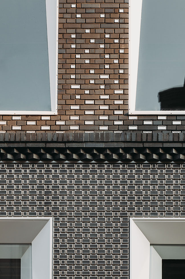
While the facade is made of custom casted stainless steel bricks with glass inlays at pedestrian level, it transitions across the second floor back to the anthracite brickwork of a traditional Dutch townhouse. As such, this veil of stainless steel bricks can be experienced differently from relational distances, while keeping in step with the architectural heritage of Amsterdam.
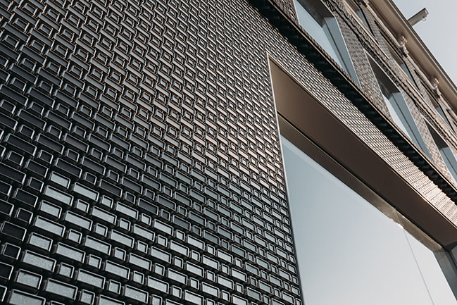
Ben van Berkel: “These neighbouring facade projects that we have designed for the P.C. Hooftstraat are principally concerned with contrasting and crafting the detail through scale and materiality. The design of the facade for 140-142 intentionally employs a more sober scale of detailing to its neighbour. At 140-142, steel bricks inlayed with glass are crafted to refine and compose the details, creating a contemporary interpretation of the traditional bricks found in Dutch townhouses. And while the windows of 138 span multiple floors and protrude outwards, those of 140-142 slant inwards and are brought back to the townhouse scale on the second floor.”
While the finished result is sensitively subtle, much experimentation was undertaken to find the correct brick size, transparency and lighting components that could create the appropriate effect on the surroundings. Although the overall sizes of the stainless steel bricks are the same as typical bricks, by tapering and softening the edges, the stainless steel bricks have a refined and intricately detailed appearance, with manually glued glass inlays.
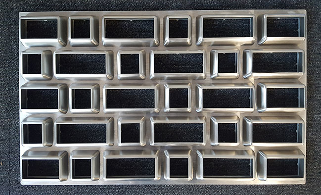
The stainless steel bricks are cast in different sizes, following a similar pattern to the traditional brick facade on the upper levels. The individual stainless steel bricks are precisely mounted onto larger steel frames, then installed on site. Operable glass windows behind the steel brick facade allow for maintenance and cleaning.
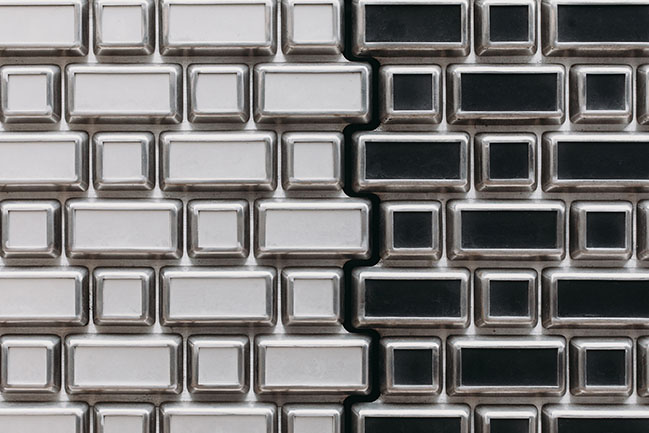
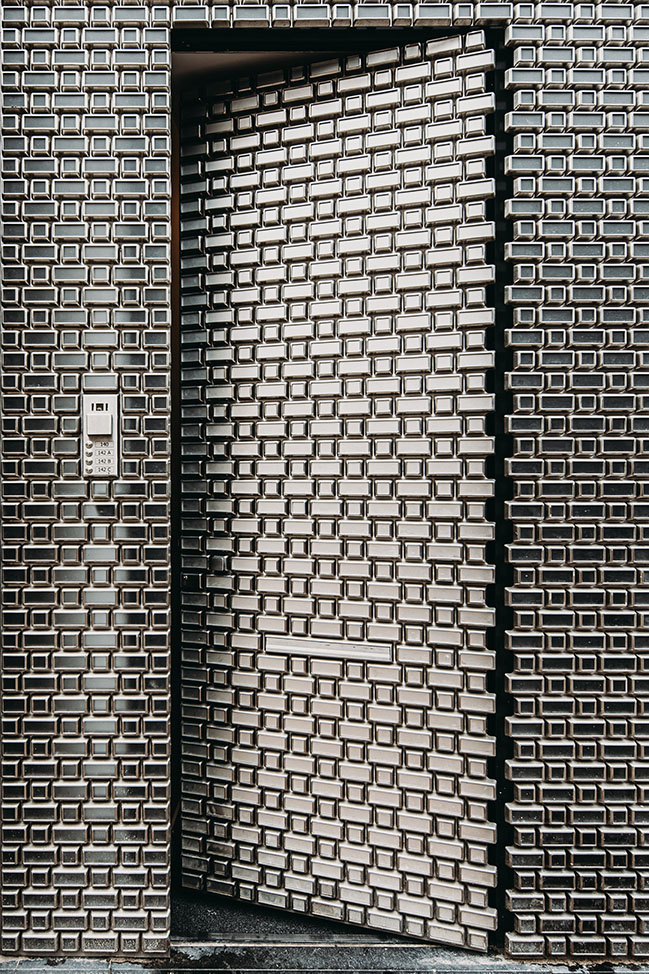
The residential entrance door is composed of the same stainless steel bricks, but with an opaque glass inlay, ensuring privacy in the apartment entrance area. The stainless steel door handle and doorbell are also custom designed to integrate into the overall facade appearance.
The white steel window frames continue into the interior. Slanting the glass panels emphasises the dynamic of the white frames, a detail which is also continued in the smaller first floor windows.
Project Credits
18 Septemberplein
UNStudio: Ben van Berkel, Gerard Loozekoot with Filippo Lodi, Jacques van Wijk and Alexander Kalachev Hans Kooij, Atira Ariffin, Emma Whitehead, Erwin Horstmanshof, Gys le Roux, Nanang Santoso, Pietro Scarpa, Harlen Miller
Project management: bbn adviseurs, Houten
Structure: SWINN, Gouda
Installations: W4Y adviseurs, Harderwijk
Architecture: Van Manen, Noordwijk
Glass structures: ABT, Delft
Light design glassboxes: Arnout Meijer Studio, Amsterdam
P.C. Hooftstraat 140-142
UNStudio: Ben van Berkel, Astrid Piber with Ger Gijzen, Marc Salemink, Sontaya Bluangtook and Pauline Caubel, Daniele de Benedictis, Chao Liu, Yang Li
Executive Architect: Architectenburo Dik Smeding BV
Facade Engineer: ARUP
Main contractor: Jan Vet b.v.

UNStudio completes two new retail remodels featuring bespoke glass designs
04 / 01 / 2020 UNStudio has recently completed two remodel projects for retail outlets in the Netherlands...
You might also like:
Recommended post: 15 before and after living room designs
