06 / 07
2022
DI Residence is the case study of meeting the ever-changing functional requirements of a home through design...
> Steel TreeHouse C By Stilt Studios - Your Home Between The Treetops
> Uluwatu: Resort-Inspired Home In Bali By SAOTA
From the architect: It wasn't until 2020 when the pandemic swept that people started to hold privacy in high regard, even from one's own family members living under the same roof. Ima, a housewife and interior design enthusiast turned to Bitte at the early times of the pandemic. She has a mission for the design studio: to revamp the interior of her house so that it better accommodates her family's needs and activities. Looking at how and why the interior was crafted, DI Residence is the case study of meeting the ever-changing functional requirements of a home through design.
While the size of the house is nowhere near to be considered tiny, the 510-square-meter area was stuffed with Ima's abundant collection of books and vintage goodies. Bitte stepped in to get the best out of the existing space with functionality taking precedence over anything else.
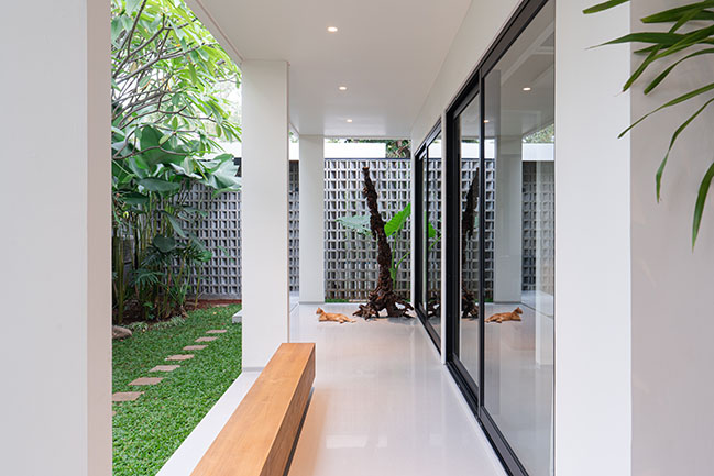
Visually, Ima and her family of four favored a mix of tropical vibes with a clean and modern style that references the buildings in tropical countries, like Mexico and Brazil besides Indonesia itself. "Ima and her children had quite a handful of references of the design they want to actualize. Our job as designers is to combine all those ideas to meet everyone's best interests," explained Chrisye Octaviani, one of the designers in charge.
The structure of the building was left unaltered, a nod to the power of interior design to boost one's home value—not monetarily, but emotionally. To begin with, Bitte reimagined the home's floor plan and repositioned the entrance from the center to the right side of the building. Other than the newly-appointed entrance being closer to the garage now, with this reconfiguration, the living room wouldn't be cut half into two sections like how it used to be.
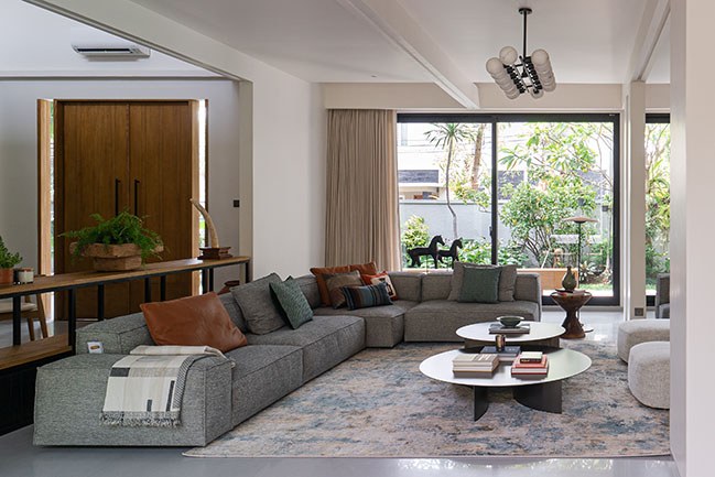
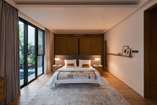
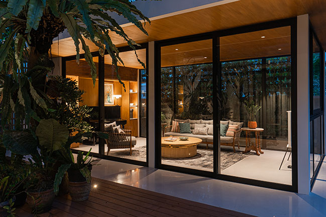
Further to the back, what was once a non-functional backyard turned into an extension of the living and dining room in the form of a semi-outdoor terrace. Apart from this terrace, the house actually came with plenty of outdoor spaces even before the remodel took place. Bitte leveraged this virtue by turning every room to face the garden and installing full-height windows, allowing the inhabitants to appreciate the splendor of their surroundings without leaving their rooms, or even, beds. "To achieve the 'tropical vibe', we made sure that the interior gets enough natural light and promotes healthy air circulation," Chrisye remarked. It is apparent that the sun shines on every room and each space gets its fair share of fresh air circulation in this household.
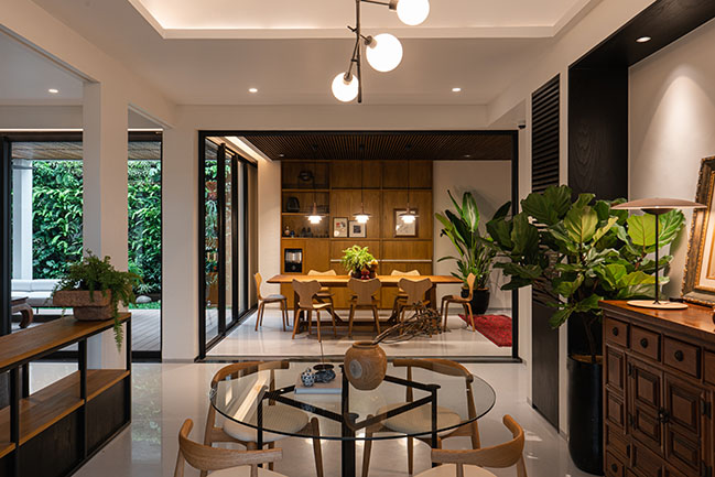
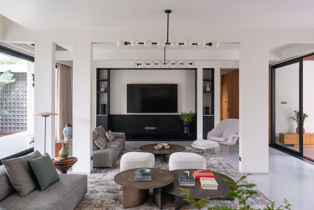
The open floor plan lets rooms flow into one another, yet privacy had just newly deemed important for Ima’s husband and children with the new working-from-home arrangement. "Ima's husband is a university teacher. They have two children; one's a student and the eldest is working. Each of them needed a private space to work and carry out their activities at home when the pandemic hit," shared Chrisye. To segment the spaces without completely dividing the rooms, partitions like space-defining rugs and large handsome shelves are placed for a more personalized setting. The resulting design is a seamless area that affords many new corners for the home dwellers to, say, hunker down with a laptop or to focus on school projects.
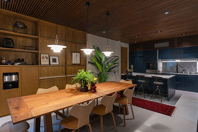
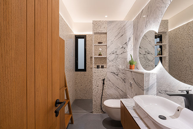
The house is painted in shades of white and light gray, creating a bright, serene atmosphere, with a touch of light brown to play up the cozy intimacy in the room. The mild hues don't necessarily translate to dull but rather a tasteful approach that gives off a sense of airiness. But it's not all white and gray; a bespoke navy-colored pantry, a creation of By Bitte, could be found gracing the place with a clashing contrast to the general house palette. "The navy pantry was not there by coincidence even though it contradicts the prominent bright tone of the house. If anything, this only signifies the important function that the pantry serves in the house," said Chrisye.
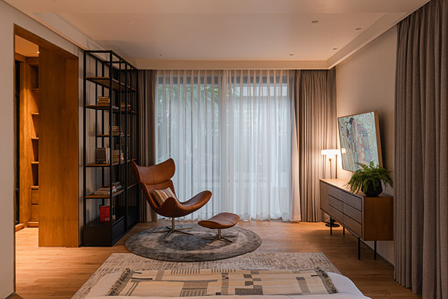
Another intentional disparity is the old-meets-new furniture choices, where Ima's vintage collections are embraced as the centerpieces of the house. Among plush sofas in the living room, for instance, they place a horse statue and a carved hourglass-shaped wooden side table, giving prominence to the vintage feel in between the much contemporary furnishings. A 70s-style multi-drawer wooden cabinet also stands tall in the far reach of the home, next to a modern glass table.
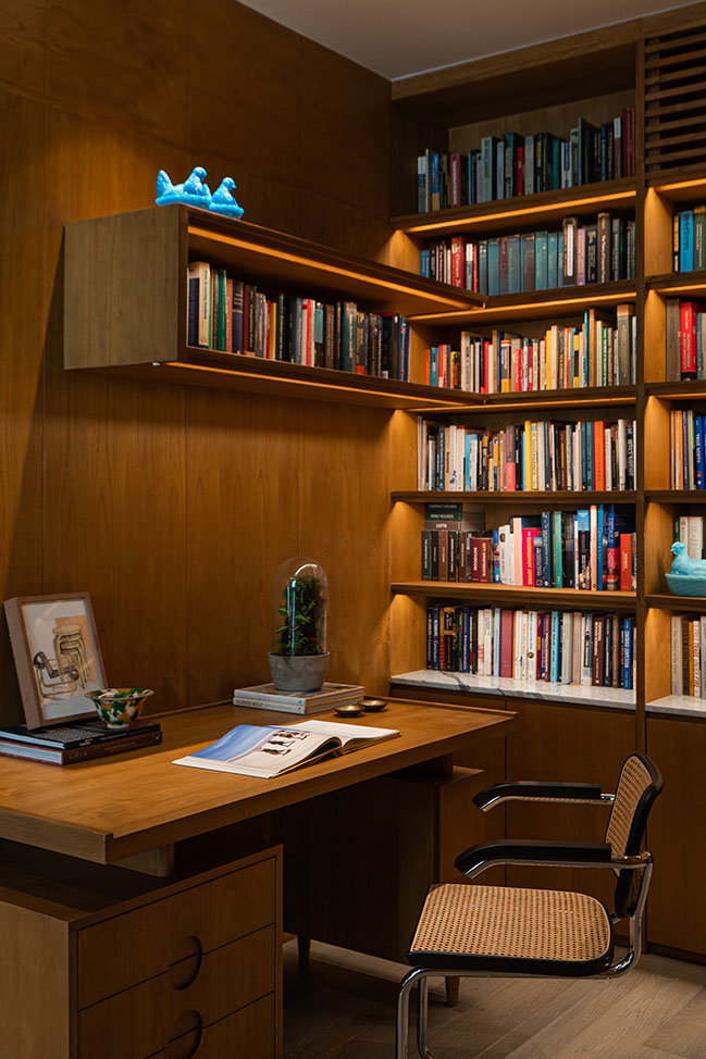
There is no constraining rule for one's living space and Bitte is well aware of this idea. Sure, following a consistent theme is important in home design, but what's more important is adhering to what really matters: it's about making the inhabitants feel seen, heard and accommodated with not a single one being left behind. And one can easily start by providing a fair balance of personal space for each of the home dwellers, as well as a communal space for everyone to convene in.
Architect: Bitte Design Studio
Location: Daerah Khusus Ibukota Jakarta, Indonesia
Year: 2021
Interior & Product Designers: Chrisye Octaviani, Seno Widyantoro, Albert Putra Alamsyah
Photography: Liandro Siringoringo
DI Residence, Bona Indah by Bitte Design Studio
06 / 07 / 2022 DI Residence is the case study of meeting the ever-changing functional requirements of a home through design...
You might also like:
Recommended post: A country home in Chievo by studio wok
