02 / 19
2019
Completed by SAOTA. Double Bay is a youthful yet sophisticated contemporary family dwelling on the Sydney Harbour shore.
Architect: SAOTA
Location: Sydney, Australia
Year: 2017
Site area: 1,097 sq.m.
Project area: 670 sq.m.
Project team: Philip Olmesdahl, Erin Gibbs & Duke Williams
Architects in Association: Tanner Kibble Denton Architects (TKD)
Interior Design: ARRCC
Contractor: Horizon
Consulting Engineers: ACOR Consultants
Landscaping: Wyer & Co
Lighting Design: Point of View
Photography: Adam Letch
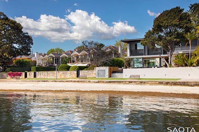
From the architect: Set in a north-facing cove in Sydney’s vast natural harbour, the site borders a recreational park and a public pier which juts out into the bay. This element forms one axis for the site whilst a pristine beach, directly in front of the site, forms another.
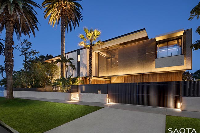
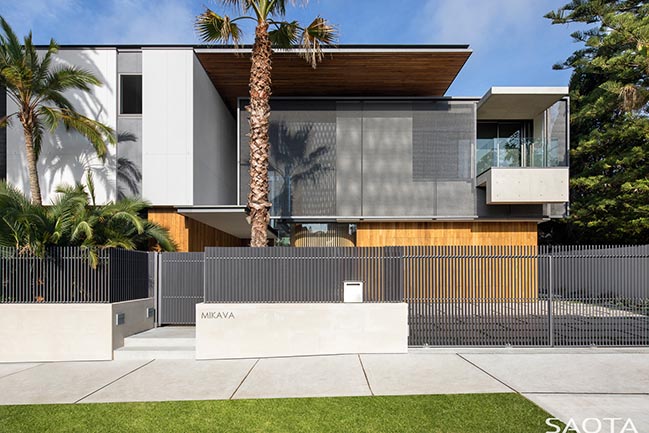
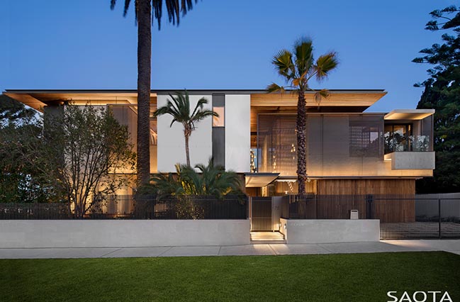
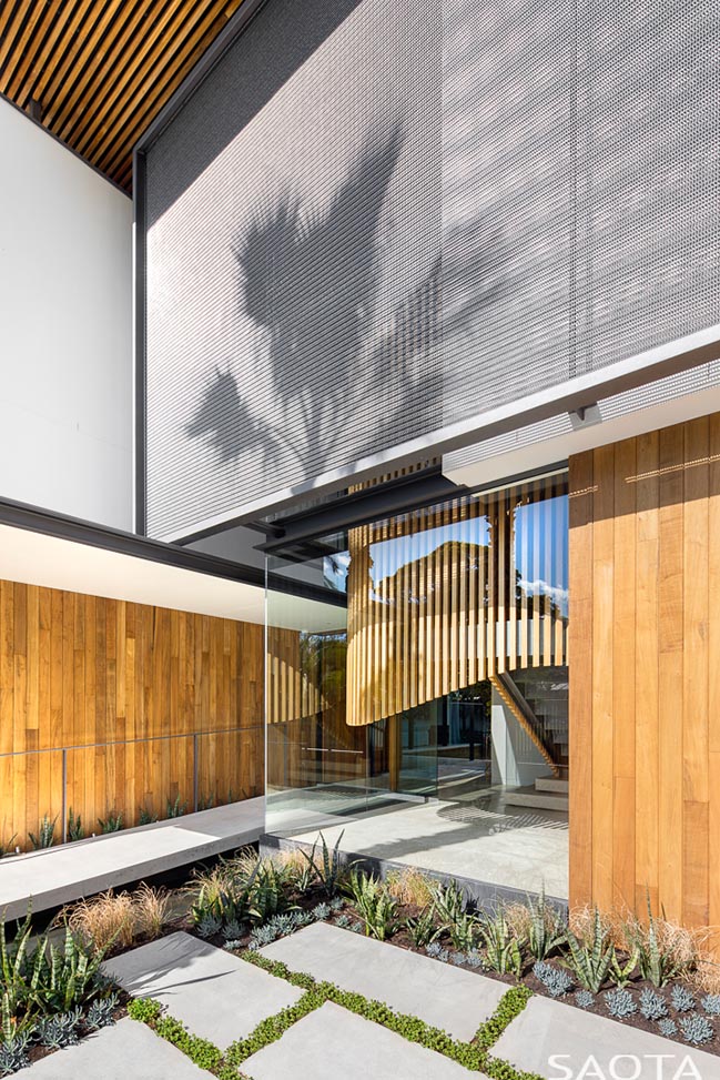
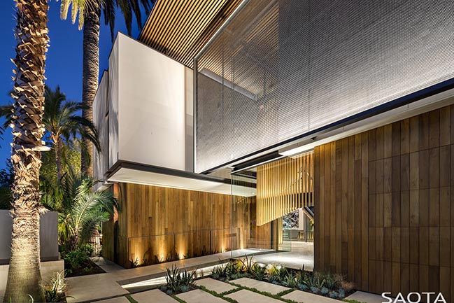
From the principle park elevation that the new building appears as a collection of planes; a play on space, privacy and threshold. Graphite grey sail screens (made from “Kaynemaile,” a polycarbonate chainmail developed in New Zealand for the Lord of the Rings movies) are rigged just off the house providing privacy from the road. Timber cladding, plastered mass walls, a wood-clad soffit and the exaggerated cill of a bay window punched through the sail screens, are layered into further planes. This game creates depth in an otherwise linear façade and provides privacy whilst maximising light and views to the park.
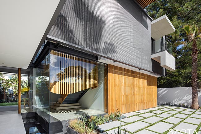
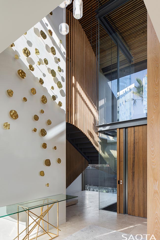
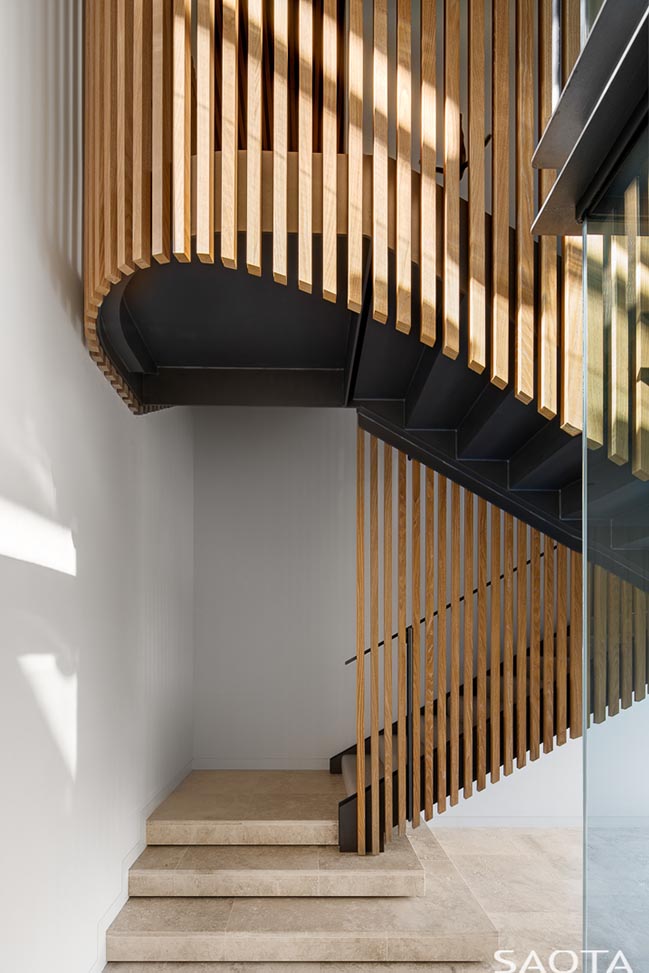
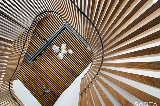
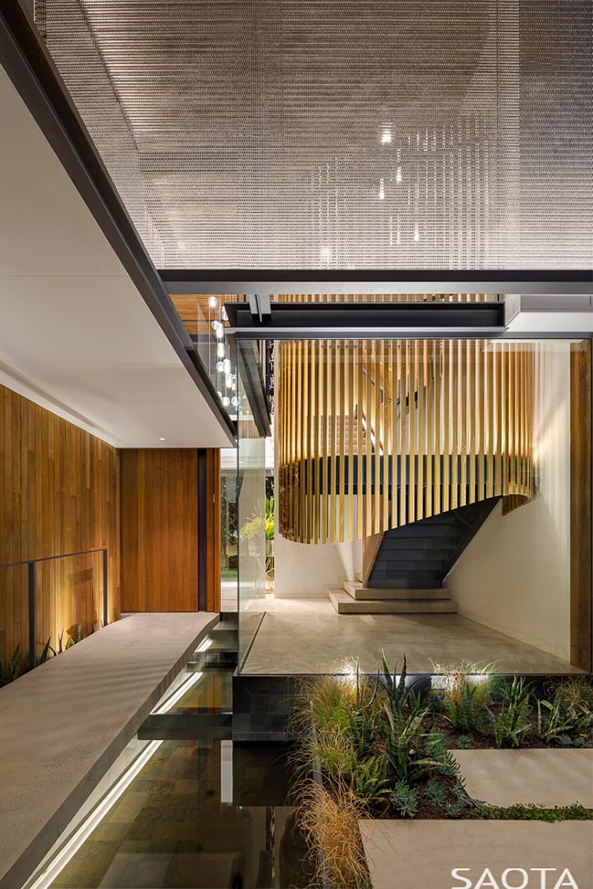
Set into this façade the stairwell is fully glazed; but wrapped protectively in a cloak of timber louvres. This gently curved outline contrasts with the surrounding crystalline box and mediates between the formal entrance and bedrooms above.
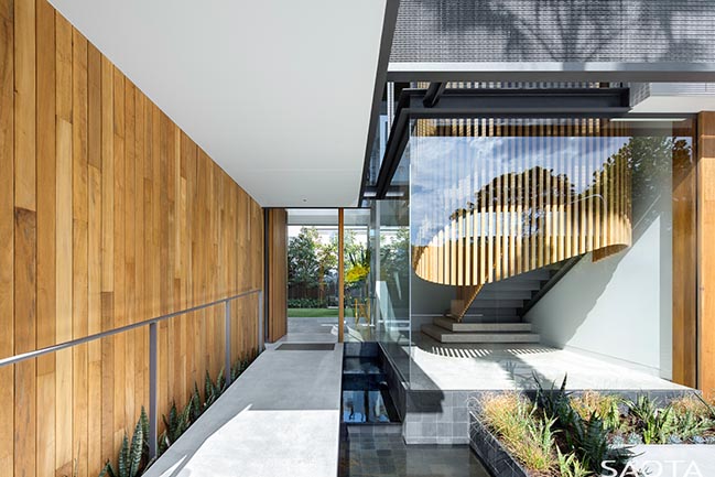
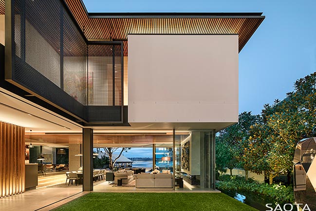
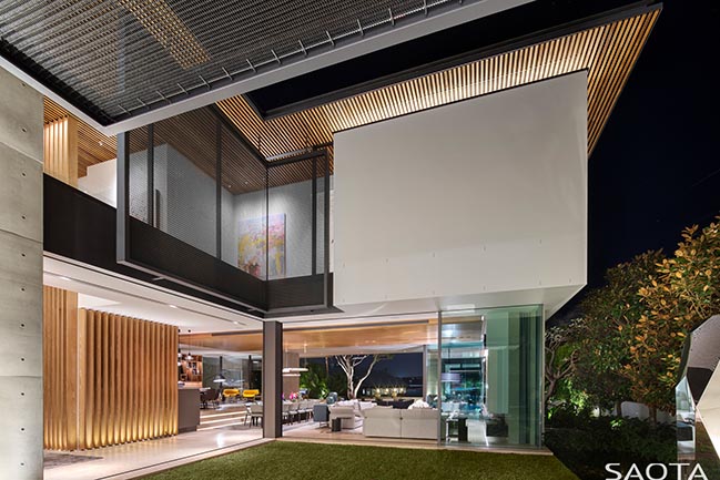
Entry is at 90 degrees to the Bay, off the park. A ramp, edged by water, slopes gently up to the front door; the little rise adding to the sense of arrival. Here the “U” shaped plan of the house becomes clear; the entrance is a link between two wings, separated by an internal garden which, like an internal harbour, allows views through the spaces to the bay beyond. Seen from the courtyard a massive blank wall of the upper storey seems to weigh on the glazed levity of the ground floor, amplifying the bay view beneath it.
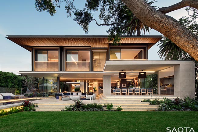
The bayside wing of the house is one open plan space. Stairs, rather than walls, delineate the raised kitchen and family dining from more formal areas. These stairs extend seawards into the garden forming a line of axis drawing the eye out to the view and providing privacy from the public road alongside. The garden is raised above the towpath to provide additional privacy from the beach and to dissolve the distinction between the garden and bay from within. This is emphasised in the pool whose orientation and extension towards the water makes a clear connection between the two.
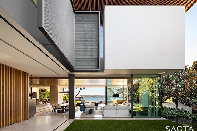
An oversailing timber roof canopy connects the street side to the garden and the beach. It permeates the interior, presenting itself at odd moments, it protects and defines the collection of internal and external spaces composed beneath. From the water it is a defining motif; expressive of lightness, reflective of the sea and the canopies of the trees.
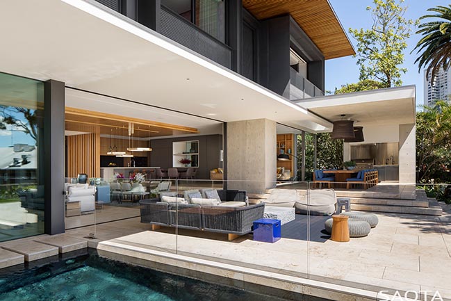
From the street and bay view, the other predominant elevation of the house, the largely glazed lower story is lost below crisp white walls, black framed window boxes and sail screens. A large Lilly-Pilly tree was preserved and frames the street side of the elevation.
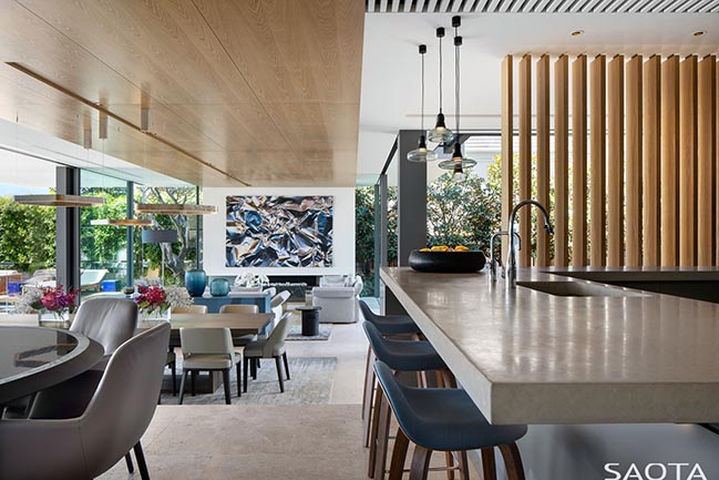
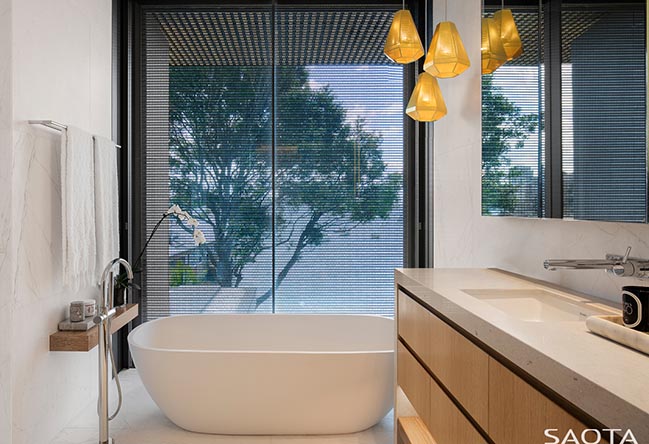
Materials were carefully chosen to site the house; the use of wood, white walls and travertine floors reflect the seaside setting. Off-shutter concrete is used as a playful accent which, like the rendered walls, appears almost soft and textured in contrast to crisp folds of screen and aluminium.
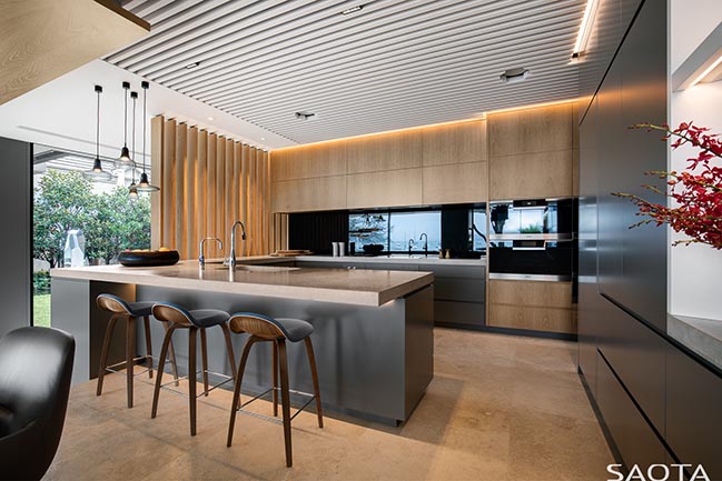
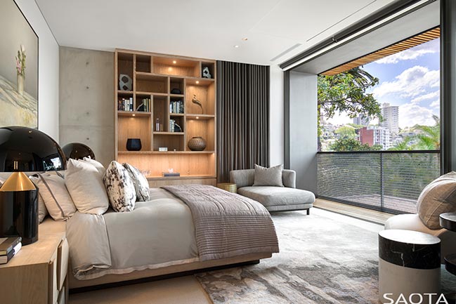
Architects, SAOTA, displayed their South African signature in this design with its sharp lines, light forms and the lush integration of nature which all combine to make the design feel at home in this special site. A playful character, the calculated blurring of boundaries and the fresh, layered composition bring into balance the domestic needs of a young family and the wow factor that this phenomenal site deserves. SAOTA’s sister company, the interior studio ARRCC, developed a refined décor palette to suit the home and complement the client’s artworks.
As architects in association, TKD worked closely with the client, ensuring that SAOTA’s detailed design was delivered and a dream home realized. Their creativity, perseverance and commitment to design excellence was a key success factor. Lighting design by Point Of View and landscaping by Wyer & Co. combined with the dedication of main contractor, Horizon, to deliver a quality home with an exceptionally high level of finish.
YOU MAY ALSO LIKE: Bridge Building in Sydney by Luigi Rosselli Architects
YOU MAY ALSO LIKE: House Pranayama in Sydney by Architect Prineas
Double Bay by SAOTA
02 / 19 / 2019 Completed by SAOTA. Double Bay is a youthful yet sophisticated contemporary family dwelling on the Sydney Harbour shore
You might also like:
Recommended post: OS House by AinP Studio
