05 / 15
2021
For this project, TGA modernized and expanded a modest tract home that the client had lived in for more than 30 years, heightening features they had always appreciated and resolving long-standing frustrations with the original design...
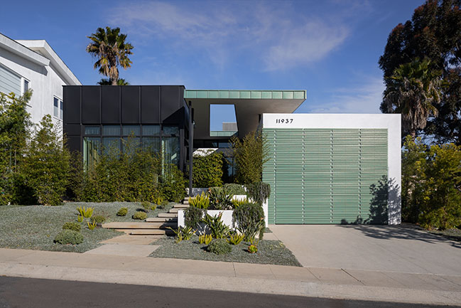
From the architect: The redesign preserves the bones of the existing structure but transforms it from a cramped, dark, and dated space into an open and daylit home imbued with mid-century modern character.
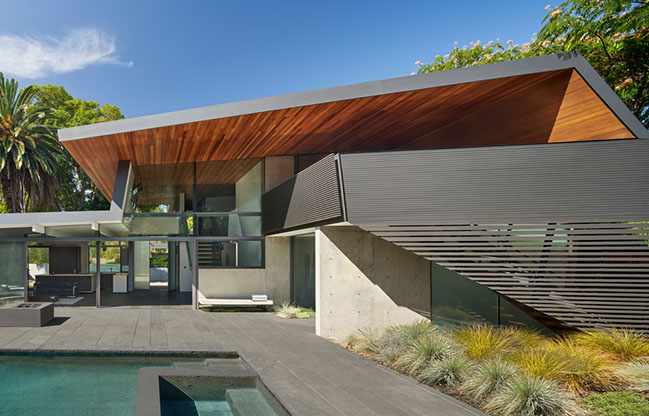
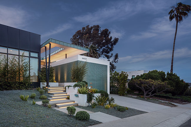
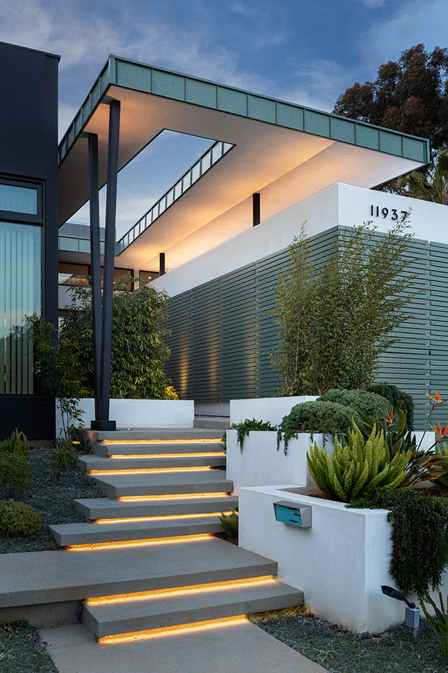
An ultra-low-profile butterfly wing roof replaces the old pitched one, clarifying the roofline and making space for clerestory windows without raising the house's overall height. The new roof uses 10x100 steel I-beams to achieve a depth of just 10 inches. The clerestory windows fill the interiors with sunlight from a high angle, enlivening the space with dramatic shadows. The windows also open a distant view to the Hollywood Sign, a landmark the clients never before realized they could see from their property.
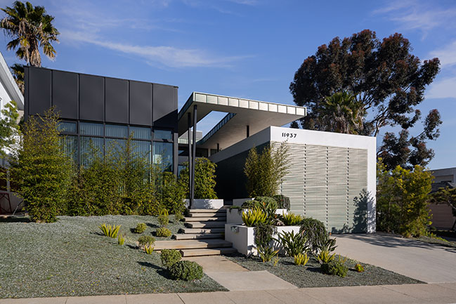
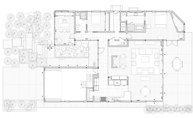
The redesign also adds a new glass-and-steel volume on what was a small and underused front lawn. The addition balances the house's massing, complementing a garage that extended awkwardly from the main structure. It makes room for a home office, a new bedroom, two bathrooms, and a laundry room. The home office is wrapped around with full-height windows that are mirrored by a steel screen added to the garage, bringing harmony to the front elevation. The butterfly roof extends over a rock garden and new entry path, bridging the addition and the garage and defining the entry sequence.
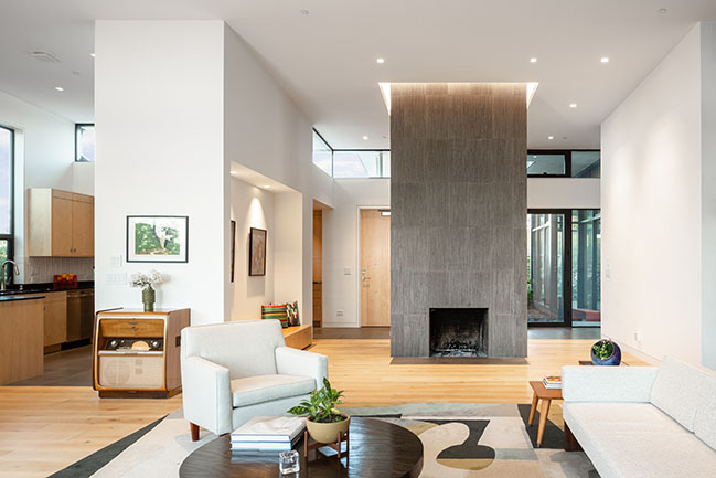
Together, the addition and garage frame a terraced rock garden inspired by karesansui, traditional Japanese landscape gardens meant to be contemplated from a single viewpoint. Here, the rock garden is overlooked by the home office. A keyhole cut in the roof above the garden creates a play of light and shadow that the client can enjoy as the working day draws on.
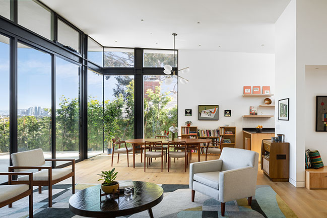
The design works with the constraints of the existing interiors—maintaining difficult-to-relocate elements like the fireplace and perimeter walls—while reimagining spatial flow to offer expansive living environments. The front door enters onto an open-plan living space with views out to the back terrace.
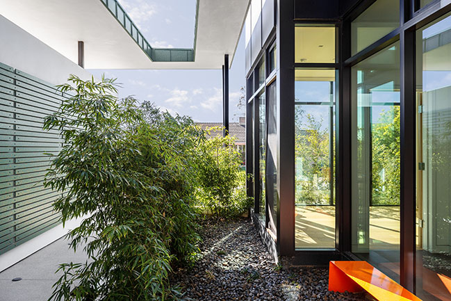
Here, TGA faced a spatial challenge: the existing fireplace threatened to disrupt the plan, but it could not be relocated because of California code restrictions prohibiting new open wood burning fireplaces in residential projects. To overcome this, TGA reimagined the fireplace as a free-standing sculptural element that defines the edge of the living space. Recalling the mid-century interiors of architects like Frank Lloyd Wright, the fireplace organizes movement around it to distinguish the living space, hallway, and kitchen as separate zones. It is finished in the same basalt stone as the chimney and features linear scores that accentuate its verticality. Deep reveals emphasize the point where it meets the ceiling, articulating how the fireplace extends through the roof as a single volume.
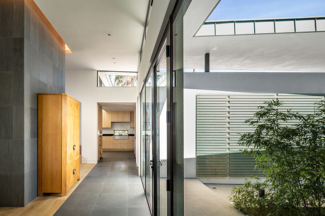
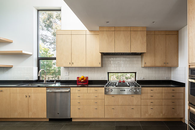
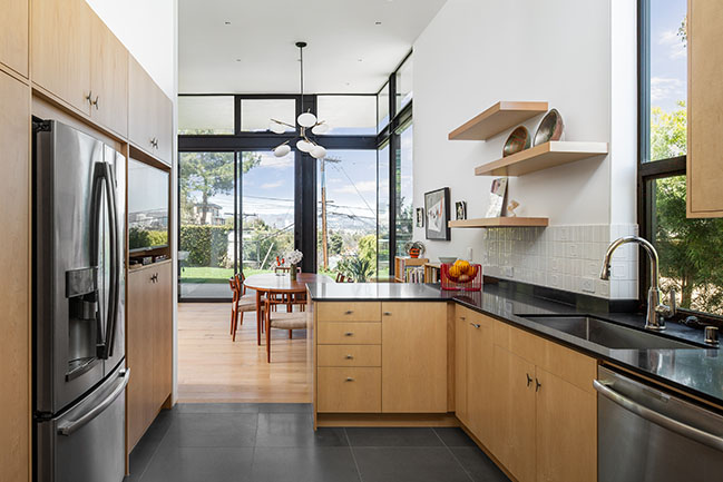
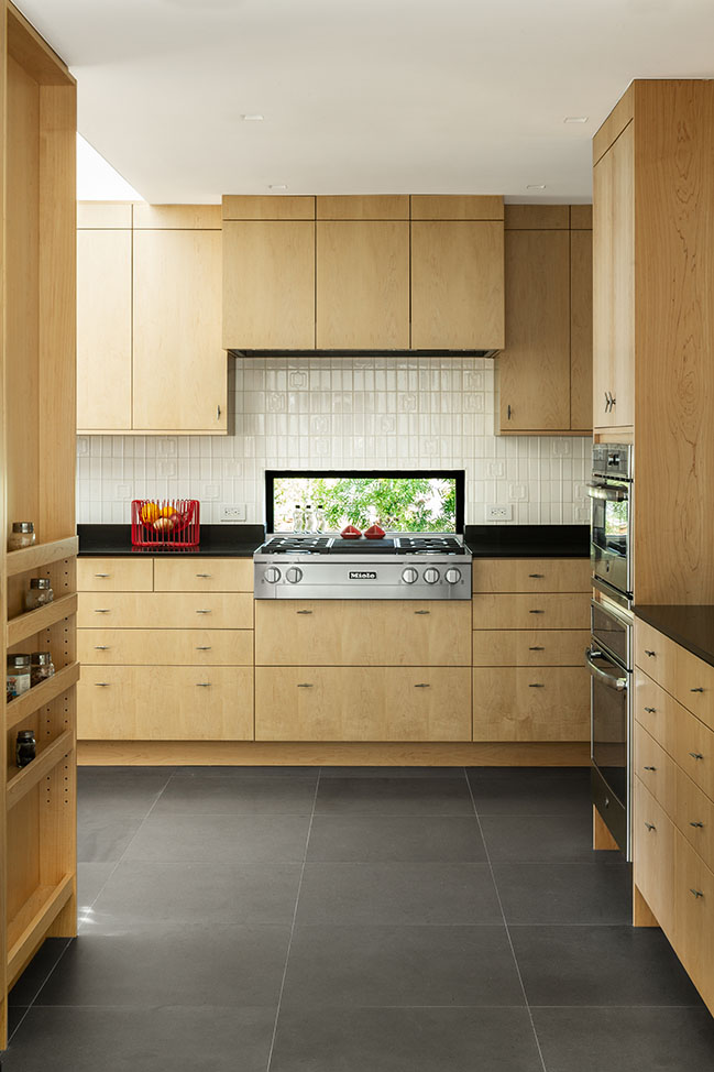
The interiors blend the rational approach of mid-century modernism with warm finishes like maple cabinetry and doors. The kitchen features custom-design integrated shelving, incorporating ample room for storage without cluttering the space. The selection of mid-century furniture throughout is complemented by the client's collection of antique radios.
Architect: Tim Gorter Architect
Location: Mar Vista, California, USA
Year: 2020
Project size: 2,956 sf
Project Management & Design Integration: QuBink, Inc.
General Contractor: William Horgan Construction
Geotechnical Engineer: Associated Soils Engineering, Inc.
Structural Engineer: Nelson Consulting Structural Engineers, Inc.
Energy Consultant: MEC, Inc.
Lighting Designer: Ann Kale and Associates
Landscape Designer: SSZ Design
Photography: W Architectural Photography
YOU MAY ALSO LIKE:
> NIU N160 by Fran Silvestre Arquitectos
> Jesolo Lido Beach Villa by JM Architecture
Mar Vista Residence by Tim Gorter Architect
05 / 15 / 2021 For this project, TGA modernized and expanded a modest tract home that the client had lived in for more than 30 years, heightening features they had always appreciated and resolving long-standing frustrations with the original design
You might also like:
Recommended post: CLAP studio creates a shopping experience inspired by Mars in Hong Kong
