06 / 21
2015
Completed in 2015 by Spamroom and Johnpaulcoss, this small apartment has just 21 sqm in Moabit, Berlin but this is a cosy house with modern style.
According to the architects: Like many buildings of its era, the original layout of the flat had been two very small but separate rooms, presumably one of them being a kitchen, with a shared toilet located in an outbuilding downstairs. In an effort to modernise the flat a previous owner had substituted the former kitchen with a more convenient private bathroom. This had the added effect of unbalancing the overall proportions of living/sleeping/cooking/washing space in the apartment.
The challenge with tacking this now disproportionate plan was to re-calculate the needs of a modern day occupant and to somehow re-distribute the space within the structural outer walls of the flat in a way that felt balanced and in doing so to maximise the potential of every available cm. A blank canvas was the only solution so all interior walls were removed as well as the many remaining surface layers of previous years.
For the clients, the newly renovated flat would ideally include a comfortably proportioned living/sleeping area, a small, but fully equipped kitchen with plenty of storage and modern conveniences, a compact bathroom complete with luxury rain-shower, large washbasin and WC and enough discreet storage to suit the needs of its new owner, with some Jugendstil design touches, referencing the original period of the flat.
The previously neglected screed-covered original floorboards were uncovered, restored and white-washed with substitute salvaged planks where needed, an insulated new ceiling replaced the dust-filled old one and all sanitary installations were re-fitted and modernised to give the flat a clean, comfortable future life. Due to the 21sq m footprint of the plan, it was necessary to rethink the spatial capacity of the flat to engage with its cubic square metre potential, i.e. its “Altbau” proportioned ceiling height. This involved stacking some elements of the programme in order to win some additional square metres.
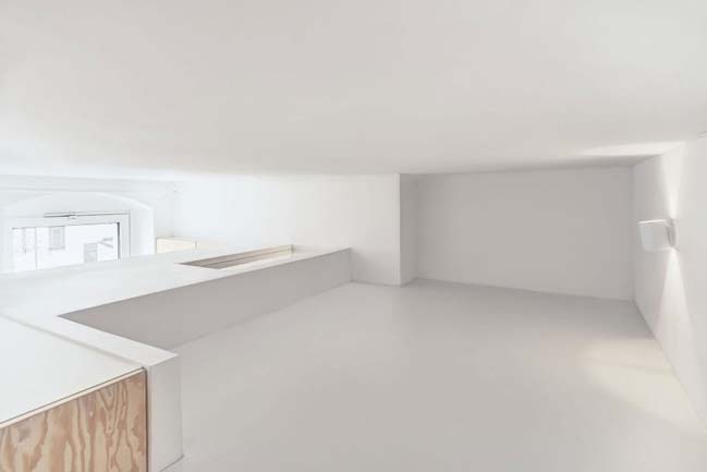
The bathroom walls and ceiling were built up to a minimum inner height in order to re-appropriate that extra space above the bathroom and entrance hallway. The upper side of the ceiling would act as a deck for a cosy sleeping mezzanine with some added storage, thus freeing up some space on the floor below for the other requirements of the brief.
The structure of this 2sq m bathroom, was key to the design as most other spatial elements are attached to it from above (mezzanine and skylight) or alongside (the kitchen cabinets, bathroom ventilation system, concealed sanitary fittings, living room storage, an entrance niche and a sliding bathroom door). The new elements were designed to sit inside the original frame of the room without touching the exterior facade or the ceiling in order to establish spatial continuity of surface and to give those surfaces a spatial identity. This room within a room served to activate all adjacent areas giving them spatial identities which could become the various zones of use for the new flat.
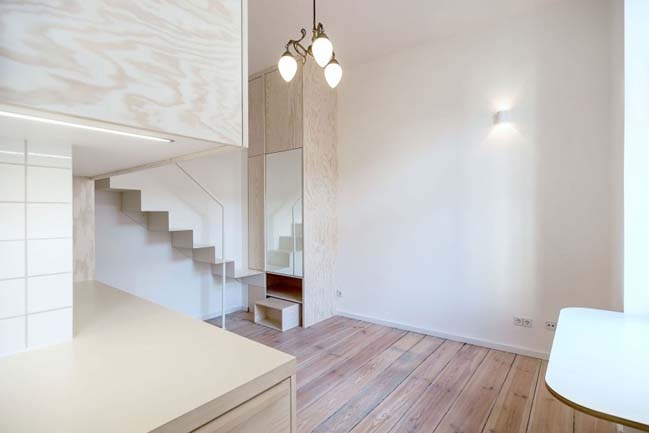
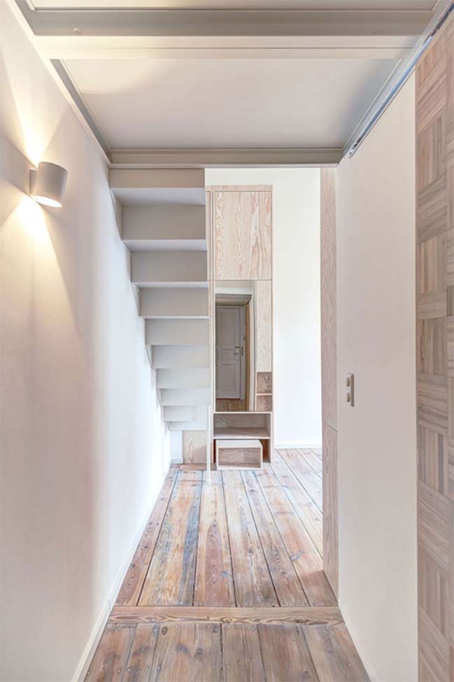
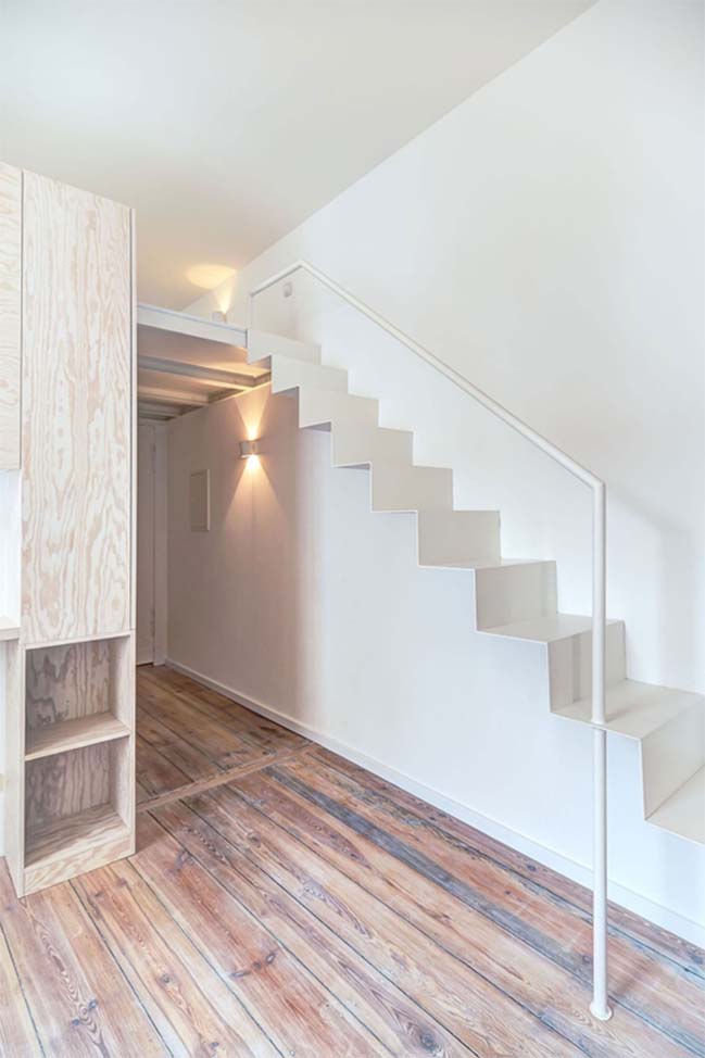
A partially cantilevered steel structure was used to build up the walls and ceiling of the bathroom cell. 8cm steel structural beams, seen from the entrance hallway, were chosen to reduce the layer of the bathroom ceiling to mezzanine floor in order to gain precious usable centimetres in the mezzanine above.
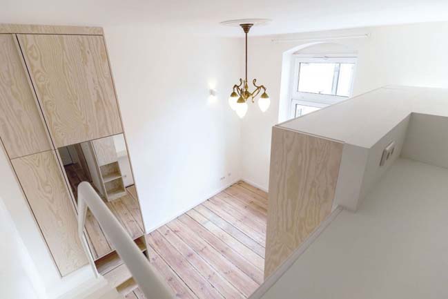
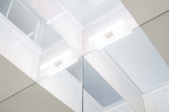
This steel structure allows the ceiling in the bathroom to have some natural light via a long upward facing skylight. The extra height offers a spatial relief in an otherwise very compact space and like all other areas of the flat, it makes use of the two windows in the main space beyond through reflected natural light. In the mezzanine area, the raised bathroom skylight frames the space to one side providing a shelf for books and laptop use without blocking views and light from the two windows beyond.
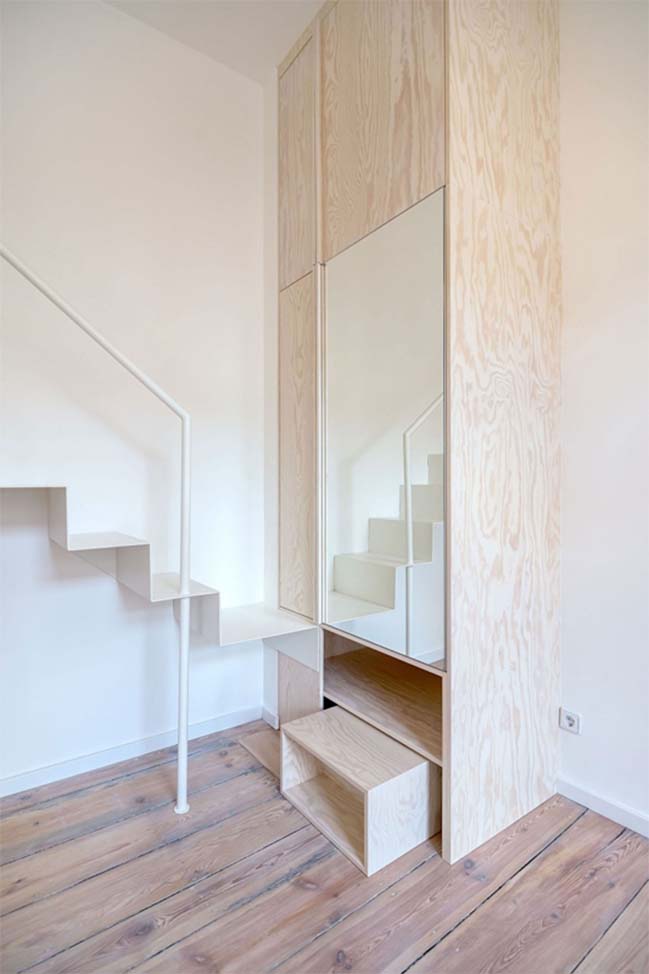
An elegant, paper-like yet robust 5mm steel staircase braced to the adjacent structural wall acts as bridge between the lower grander proportioned original floor level and the compact new upper level of the flat. Rather than use a ladder or temporary solution the reduced yet secure staircase may act as a place to store books by day or may be used as an access platform for a second room-height pull-down wardrobe stacked vertically above the main wardrobe below, again making full use of the height of the room through stacking the programmatic needs.
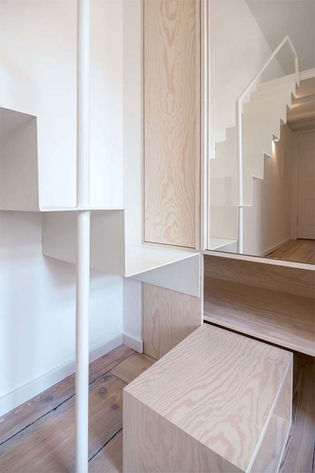
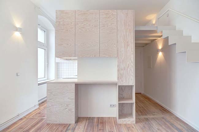
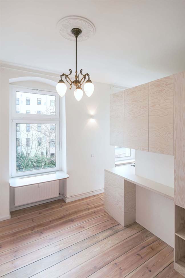
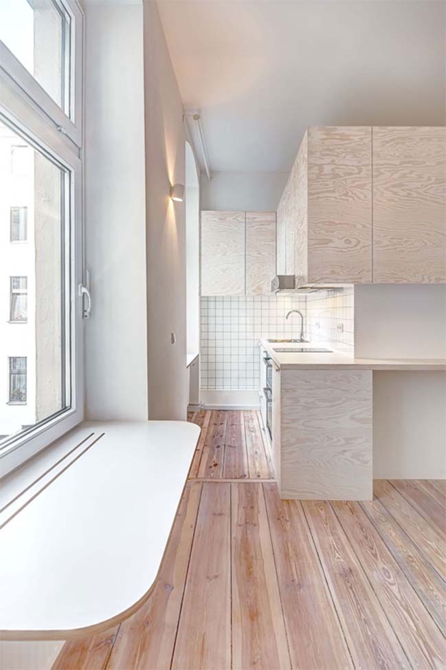
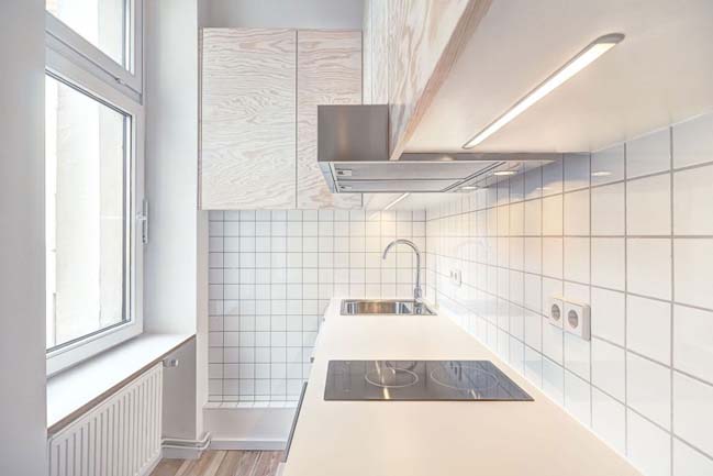
Below the living space retains the original proportion of the flat and acts as a central point of orientation of the plan with views to the entrance hallway to one side, the kitchen to the other and the mezzanine above. This generously proportioned central space was left free to be occupied and personalised by the client as all of the other functions are fulfilled peripherally. The window sill in this area was extended slightly to become a working desk with a view of the courtyard beyond and in the kitchen the other window sill becomes a useful shelf for plants.
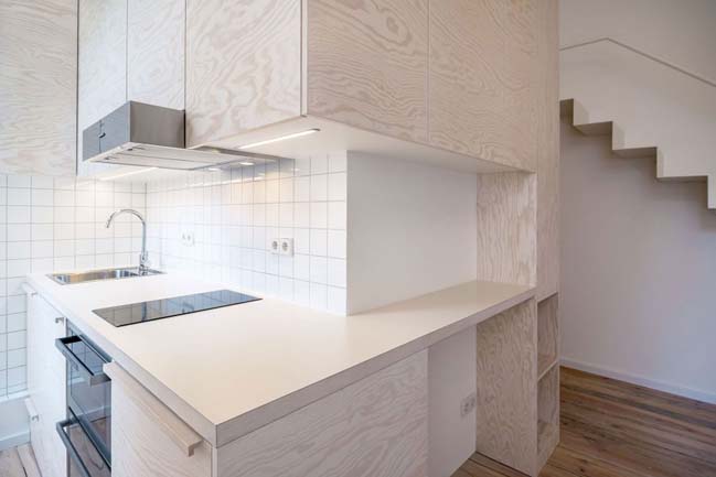
The white-washed Maritime Pine fronted kitchen, though compact in size, houses all of the conveniences and appliances required of a modern kitchen but in a reduced form. Ample storage is provided from the overhead cupboards, wrapping around the corner into the living room area. A sliding bathroom door in the entrance hallway acts as the only spatially dividing door in the flat and is built using the re-purposed inlaid Parquet salvaged from the floor build up of previous owner of the same flat.
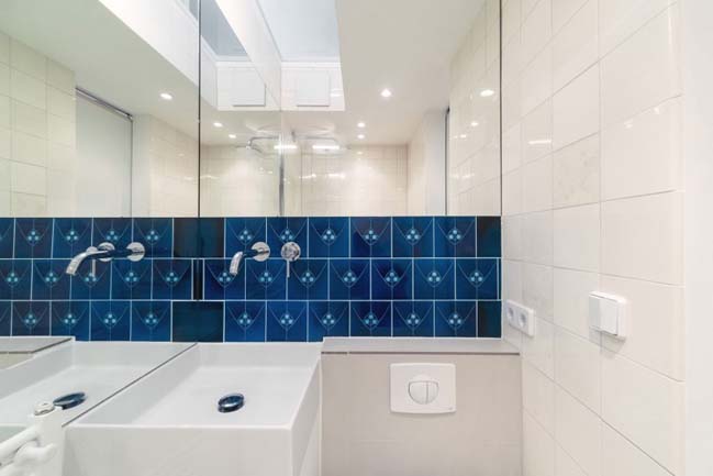
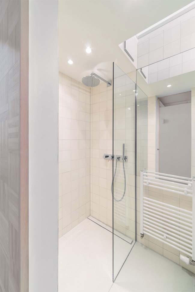
Inside the bathroom the fixtures are arranged to be as compact as possible without compromising their function. The sink (with storage below) and rain-shower are generous in size despite the small floor area and the play of natural light and mirrors creates a greatly increased sense of proportion.
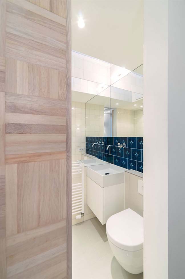
From the outset the clients wished to incorporate elements of the Jugendstil (Art Nouveau) as decorative design elements. Replica blue Jugendstil tiles were sought out and combined with calm beige antique/salvaged Craquelé tiles sourced locally adding a light depth of character to this petite bathroom.
The overall project aim was to transform a flat that felt uncomfortably disproportionate or transient and to create a well structured, light space with overlapping functions both horizontally and vertically within the confines of a single room. A space that the client could happily call her home and potentially act as a model for similar urban spatial quandaries as space becomes increasingly rare in our cities.
keyword: small apartment
Micro apartment in Moabit, Berlin
06 / 21 / 2015 Completed in 2015 by Spamroom and Johnpaulcoss, this small apartment has just 21 sqm in Moabit, Berlin but this is a cosy house with modern style
You might also like:
Recommended post: Front and Back apartment by H20 Architectes


![Modern apartment design by PLASTE[R]LINA](http://88designbox.com/upload/_thumbs/Images/2015/11/19/modern-apartment-furniture-08.jpg)


