10 / 14
2018
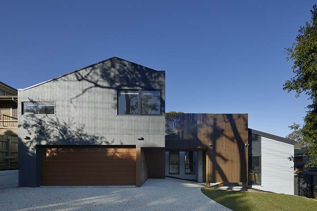
The original building, Designed by C.C. Sainsbury in 1957, is a gem. It is an unconventional example from the War Services program; which assisted veterans acquire homes. The clients sought to supplement what they loved to better accomodate their growing family.
Architect: Foomann Architects
Location: Ormond, Australia
Year: 2018
Project size: 175 m2
Site size: 460 m2
Builder: Fido Projects
Energy Consultant: Urban Digestor
Engineer: David Jones Structural Consultants
Photography: Willem-Dirk du Toit
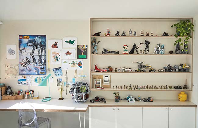
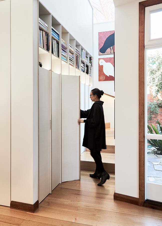
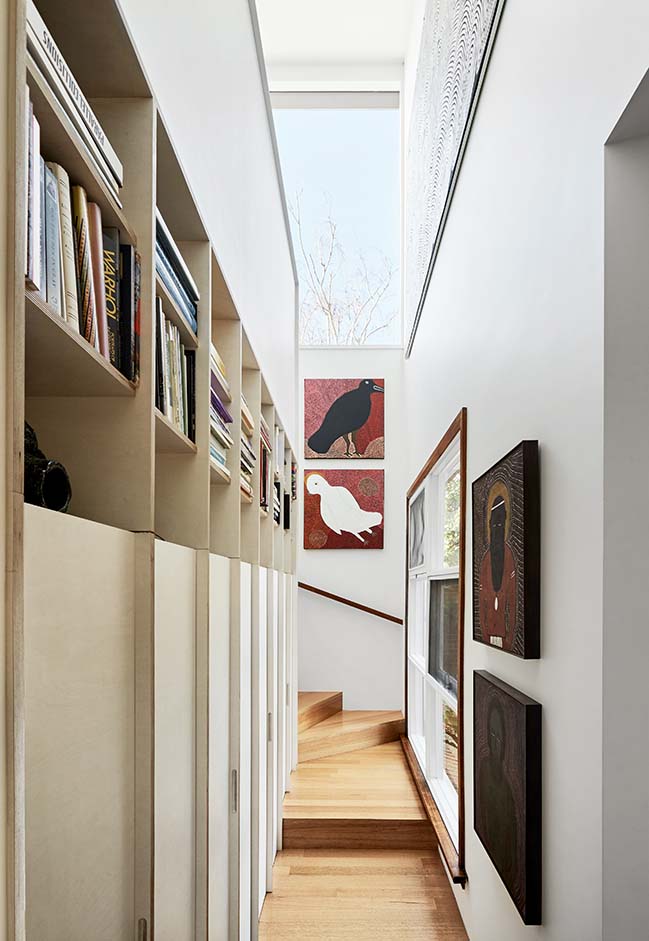
From the architect: Our brief included two matching kids’ bedrooms, bathroom, kitchen, storage and laundry. The clients asked to showcase their book and art collection and for the design to be bold.
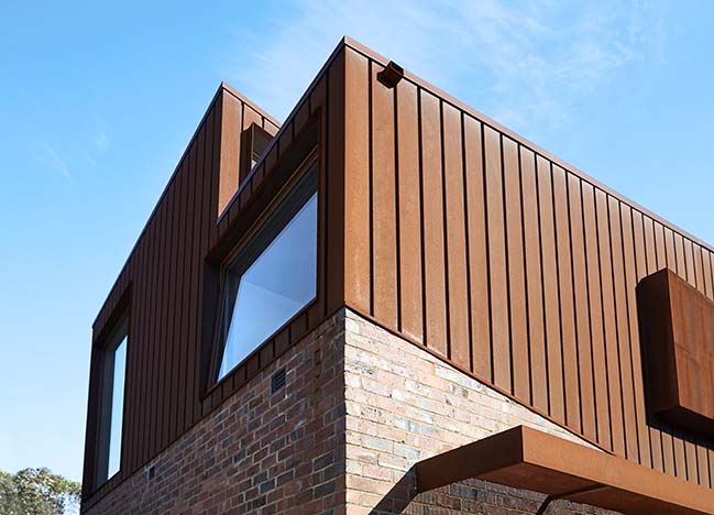
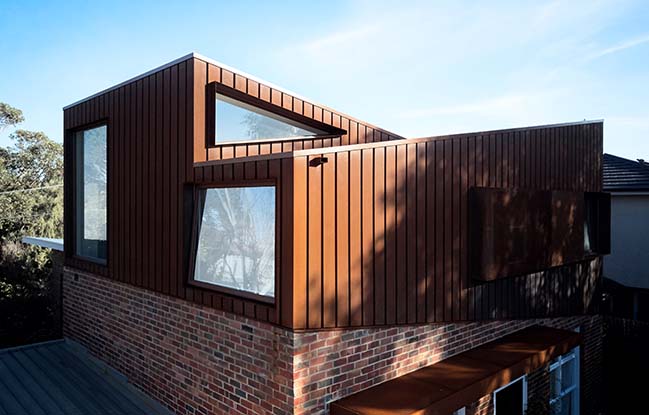
Skllion roofs and deep eaves were a challenging foundation for a second storey extension. Our intention was to preserve as much as we could while creating a cohesive and consistent feel using contemporary execution.
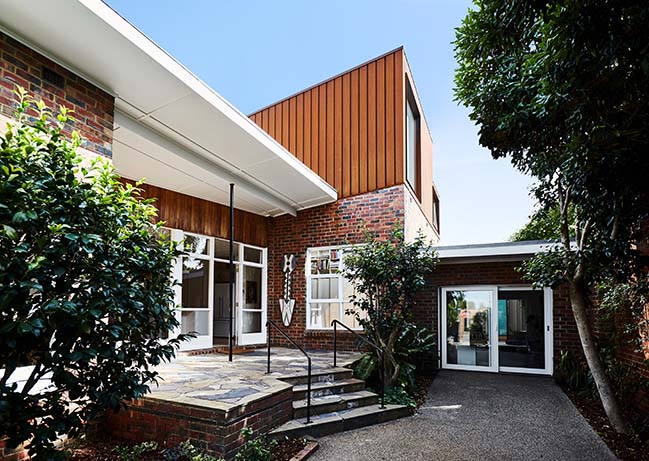
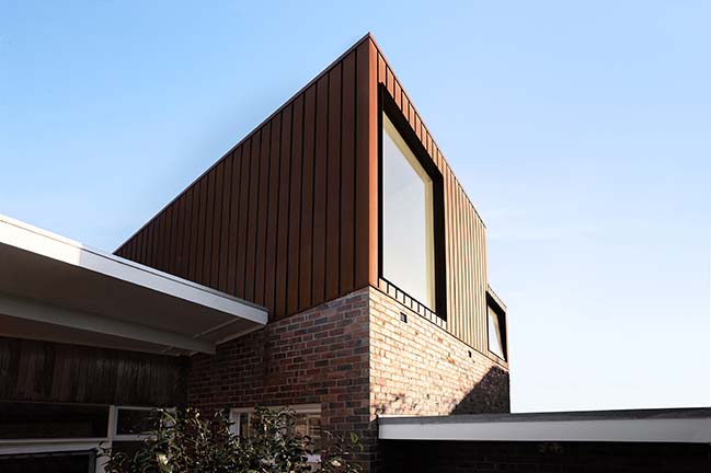
The volumes of the extension are topped with the same angle as the existing roofs to create a balanced composition. The grooved corten cladding was selected to echo existing timber details and tonally transition from the brick.
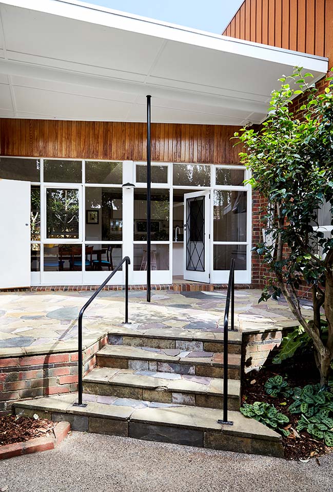
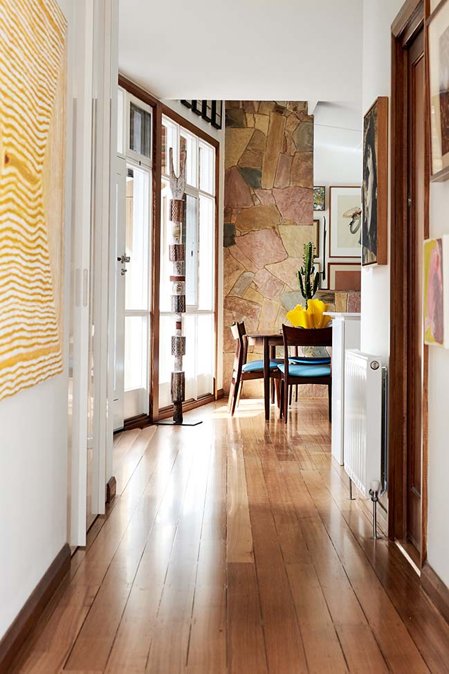
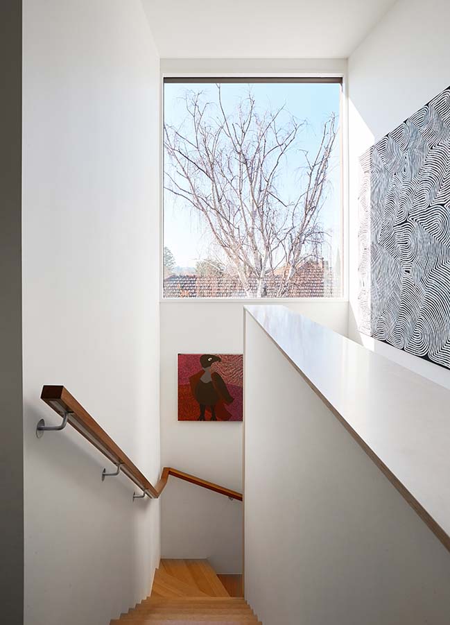
The existing plan to the rear of the home was untangled by continuing the corridor through to the north backyard. The stair was located adjacent to the entry, preserving the north facing rooms and creating a central focus.
While neighbours to the north and west contain overbearing homes; the east features a manicured garden. Views are managed through window placement and perforated screens. An east facing window at the top of the stair is at the apex of the new volume and frames a mature Silver Birch creating the key view from both floors.
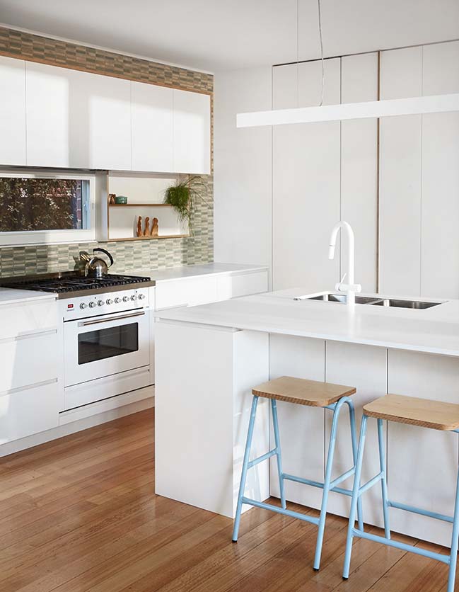
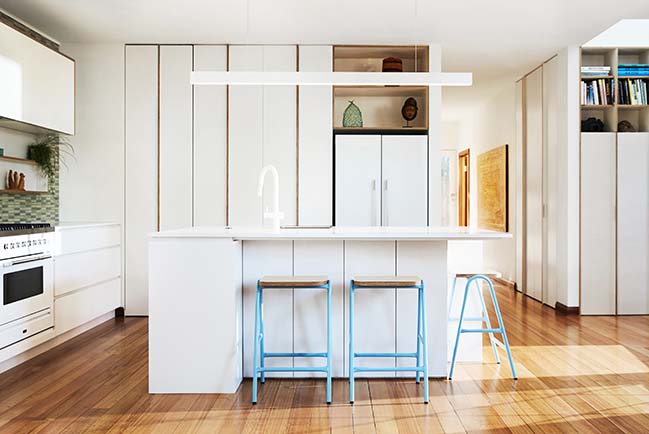
The stair skips around an existing low window and wraps a joinery insertion that displays small sculpture and books. The simple presentation of the joinery belies a complex puzzle of concealed laundry and storage. New joinery is fabricated from plywood (low emission, PEFC + FSC certified) with lighting that’s integrated and handles that are integrated or reclaimed.
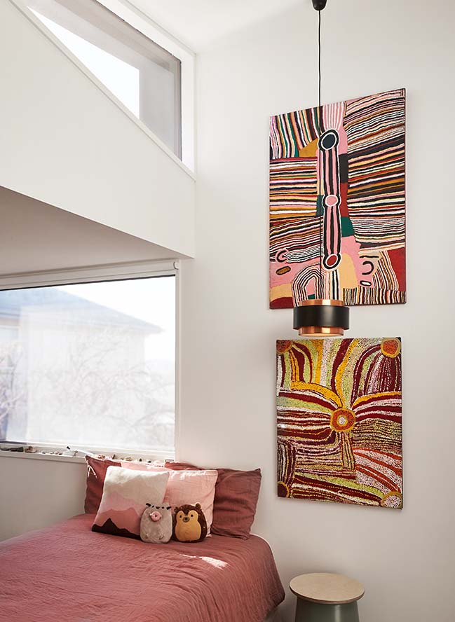
The raked volumes of the extension overlap in the centre of the kids’ bedrooms where triangular windows bring in light and sky. Passive solar design is incorporated through eaves and screens with both rooms having two openable windows and ceiling fans to allow cross ventilation and airflow.
The original home is modernist and exuberant; the extension is meant to carry this tradition and continue to endure.
> You may also like: Bellevue Hill House by Geoform Design Architects
> You may also like: House A in Perth by Whispering Smith
> You may also like: Ruby Bay House by Parsonson Architects
Mid Century House Extension by Foomann Architects
10 / 14 / 2018 A mid century war services home, designed by Architect C.C. Sainsbury in 1957, has been sensitively updated and extended by Foomann Architects
You might also like:
Recommended post: Apple Via Del Corso by Foster + Partners Opened
