01 / 26
2022
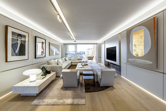
The client brief specified a strictly minimalistic approach. With the long rectangular shape of the apartment in mind, ARRCC opted to create a unified inner shell rather than a series of separate rooms...
> Silver Pine by SAOTA
> Le Pine: Family summer house in Saint Tropez by SAOTA
From the architect: This Cape Town pied-à-terre, near to the V&A Waterfront’s Silo Precinct, was conceptualised as a blank canvas for the owner’s growing collection of South African and African art. The precinct is anchored by the Zeitz MOCAA, which is not only the most significant art museum in the world dedicated to artists from Africa and the diaspora but is also a local architectural landmark designed by the UK’s Thomas Heatherwick. Much of the district’s artistic and creative character derives from its presence.
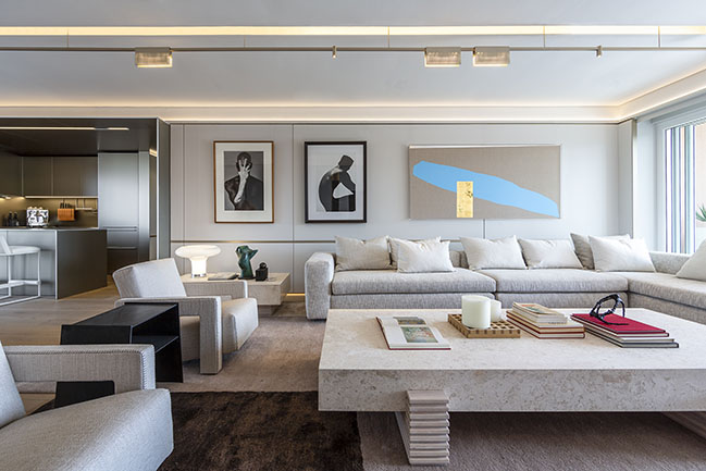
Other significant cultural and geographical markers include views overlooking the marina on one side of the apartment and natural landmarks such as Devil’s Peak (part of the city’s iconic Table Mountain) on the other. Inevitably, these contextual prompts flavoured ARRCC and OKHA’s approach to the interiors.
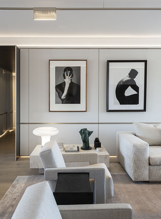
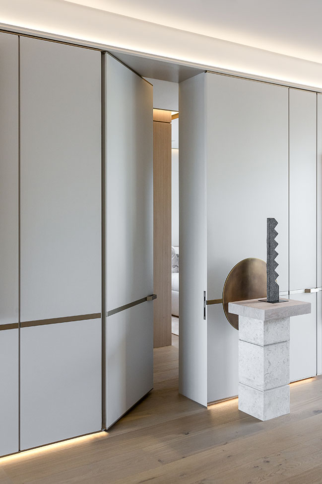
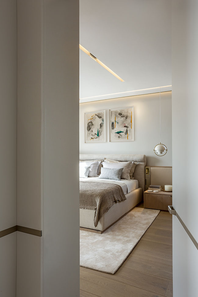
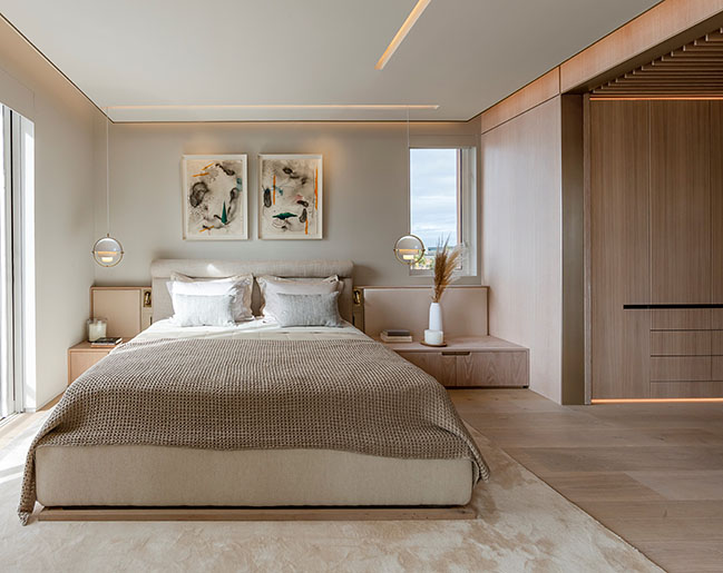
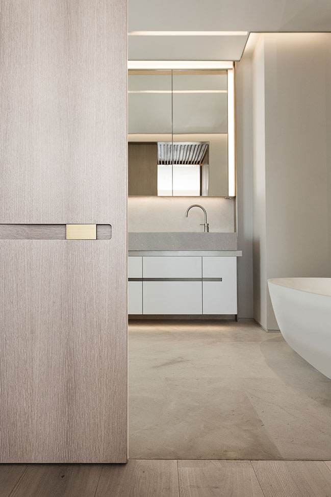
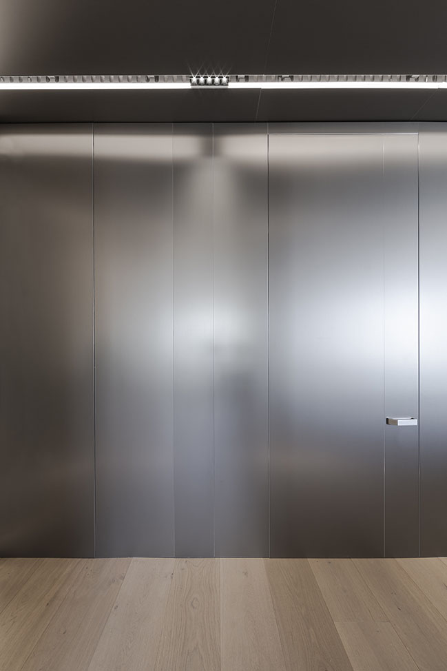
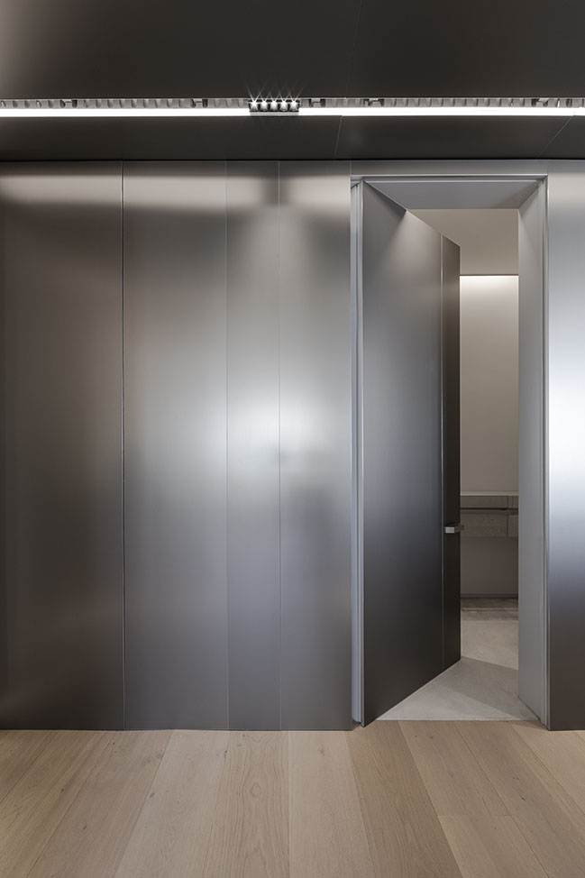
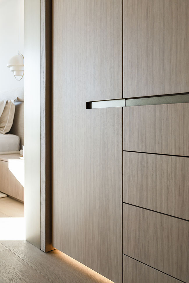
The client brief specified a strictly minimalistic approach. With the long rectangular shape of the apartment in mind, ARRCC opted to create a unified inner shell rather than a series of separate rooms. Integrated cabinetry makes it possible to conceal storage and present sleek, uncluttered surfaces throughout the apartment. At the same time, this approach created opportunities for ARRCC to redefine the interior architecture with variations in scale and volume, subtly sculpting into the living spaces to define distinct areas within the larger open-plan space.
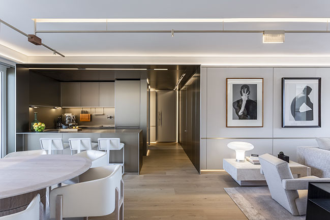
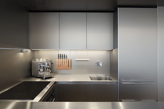
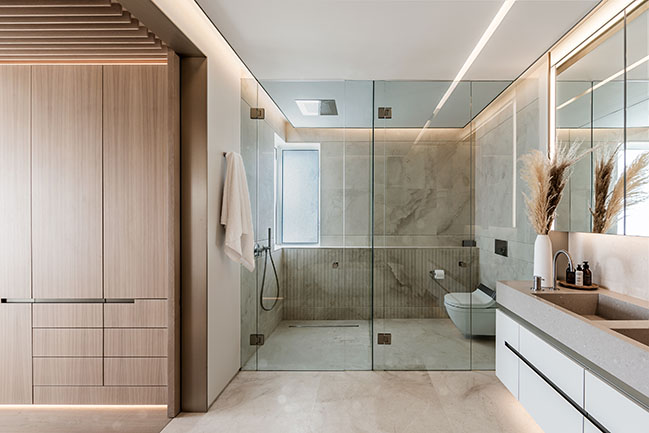
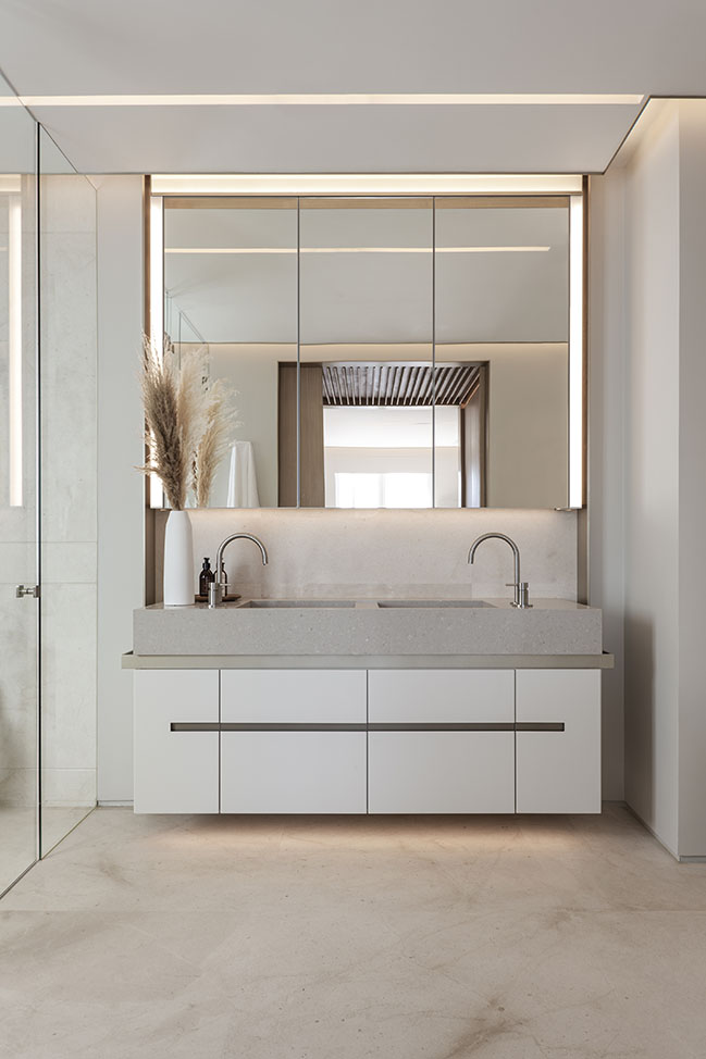
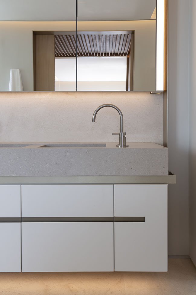
Perhaps the most clearly legible of these is the champagne aluminium-clad kitchen, which appears as a unified insertion within the larger white interior. Similarly defined volumes, however, have been created for the dining and lounge areas. This approach has been reprised using different materials in different areas in the apartment: joinery in the living space and sandstone in the bathrooms, for example, while maintaining their monolithic appearance. The transitional spaces between rooms are conceptualised as aesthetic ‘palate cleansers’, using variations in materials, texture and pattern.
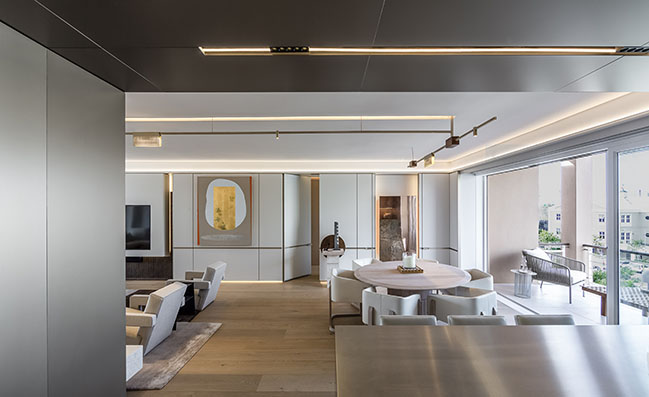
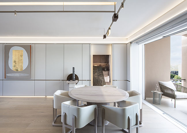
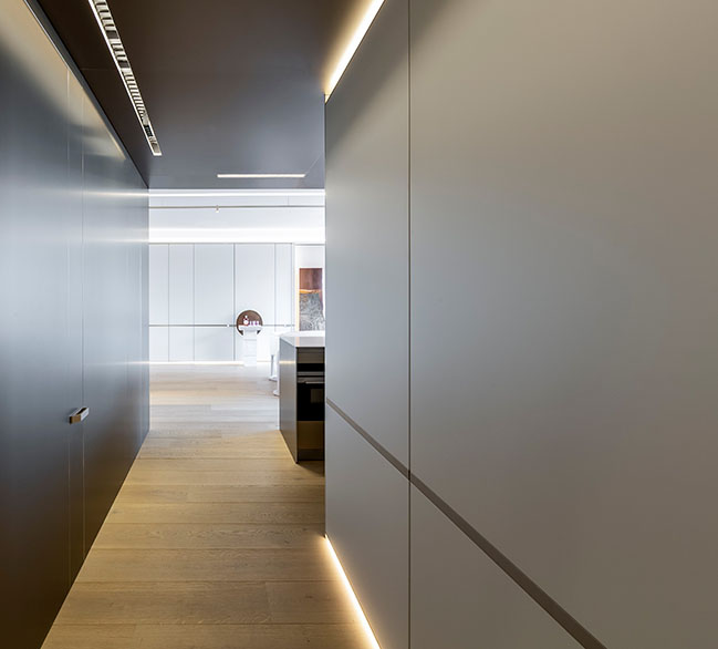
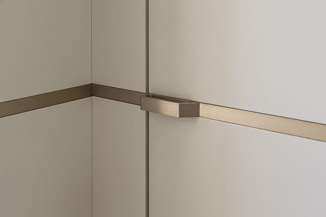
As much as a thematic or conceptual motif is possible within the pure functionalism of a minimalist brief, ARRCC devised a series of running lines integrated into the design of the joinery and lighting. These lines stop short of connecting, creating a sense of implied connectivity between spaces and elements of the interior architecture.
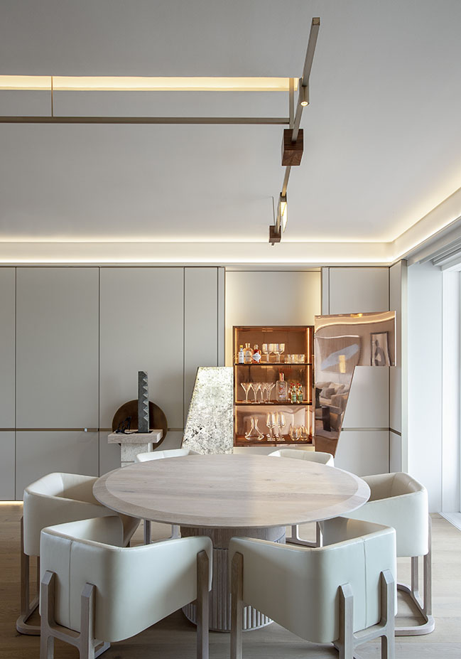
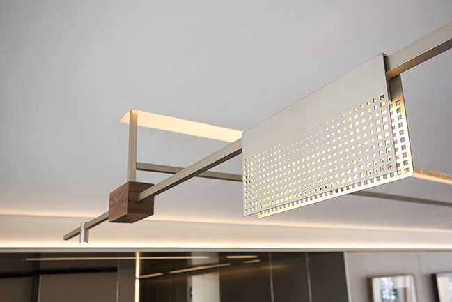
The custom-designed light fitting in the living area, on the other hand, not only functions as a ‘holding element’ but also serves as a metaphor for the approach ARRCC and OKHA took in the design of the apartment itself. Its component parts are clearly expressed high-tech refined industrial detailing such as the mesh shades, yet the natural, organic walnut blocks that connect the linear sections juxtapose a contrasting natural, handcrafted aspect of the design. Such details add a layer of sensory and emotional richness to the design without compromising the refined functionality of its concept.
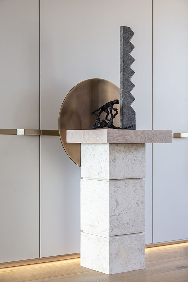
As much as the interior architecture is an exercise in carving into space, the design of the furnishings was about creating sculptural forms. The custom furnishings, such as the monolithic limestone coffee table in the sitting area, anchor and articulate the spatial experience, sustaining the approach in an inverse expression of the same formal language.
Once again, there is warmth in their elemental materiality and detailing. The coffee table in the living room might be reduced in its form, but its sandblasted and acidwashed finish is textured.
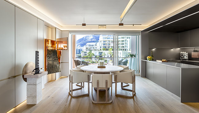
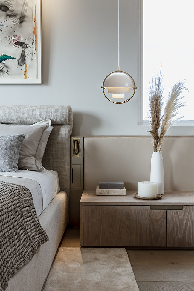
From the ribbed marble finish on the TV unit and the fluting on the base of the dining room table to the chamfered edge of the tabletop, there is a sensory layering that does not impose on the clean, calm character of the minimalism.
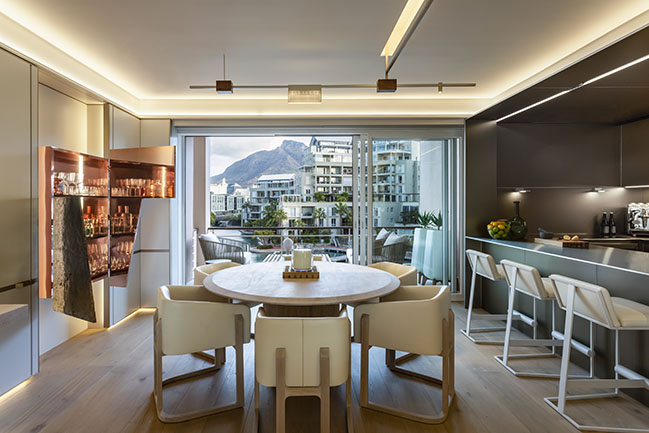
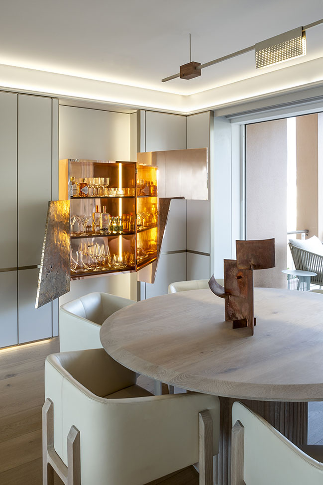
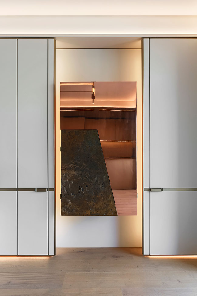
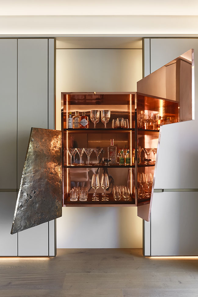
The apartment’s sense of serenity is maintained through a deceptively simple limited material palette, which becomes satisfyingly apparent only with familiarity and time. The bespoke drinks cabinet, like the feature light fitting, holds a symbolic key to the apartment’s design philosophy. Its asymmetrical doors contrast a purely minimalist mirrored surface with a heavily hand-worked, pitted and patinated metal door. Its complex texture expresses the level of detailing that goes into the creation of minimalism, which only properly reveals its nature when you interact with it.
This restraint enables a gallery-like quality that allows the art full expression, while simultaneously remaining comfortable and liveable. The apartment might appear as an enclosed unit, complete in itself, but it remains open to its context, whether the sparkling lights of the marina and the yachts on the water, or the broader artistic identity of the precinct.
Interior Design: ARRCC
Location: Cape Town, South Africa
Interior Design Team: Michele Rhoda, Daniel Du Toit, Maajidah Sait, Anna Lisa Cunningham Cooper, Leigh Daniels
Interior Decor: OKHA
OKHA Design Team: Adam Court, Luka Parkin
Photography: Niel Vosloo
Parama by ARRCC and OKHA
01 / 26 / 2022 The client brief specified a strictly minimalistic approach. With the long rectangular shape of the apartment in mind, ARRCC opted to create a unified inner shell rather than a series of separate rooms...
You might also like:
Recommended post: Ost Indoor Swimming Pool in Leipzig by gmp Architekten


![Modern apartment design by PLASTE[R]LINA](http://88designbox.com/upload/_thumbs/Images/2015/11/19/modern-apartment-furniture-08.jpg)


