12 / 08
2021
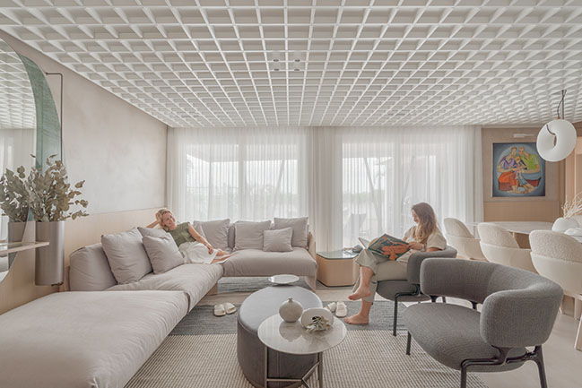
> Loft Chartier by StudioColnaghi
> Home As A Temple: The Brazilian Architect Patricia Martinez's Apartment
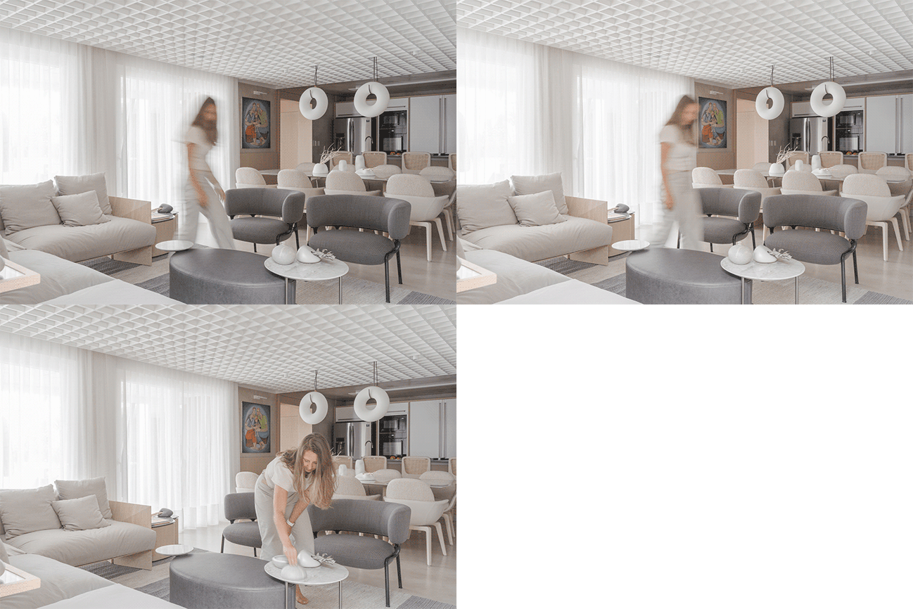
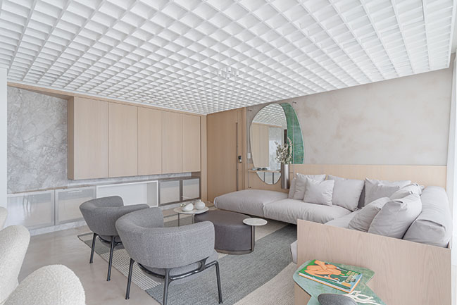
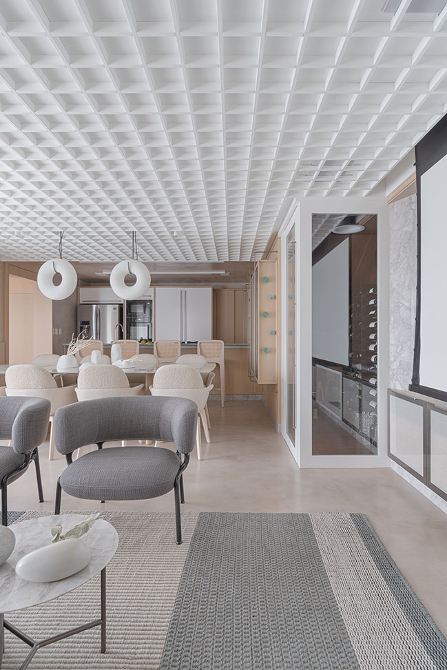
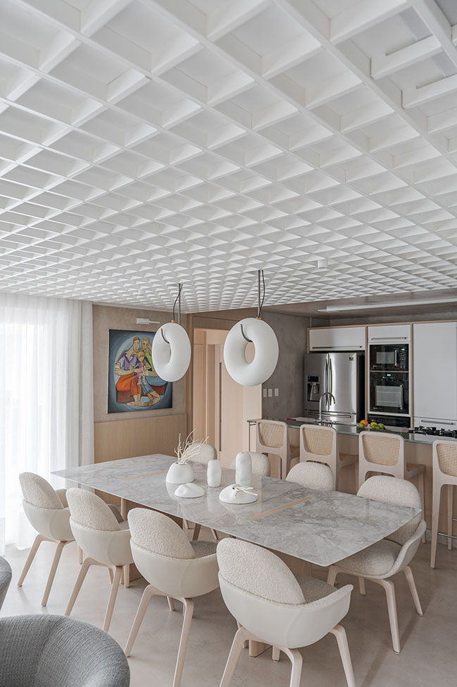
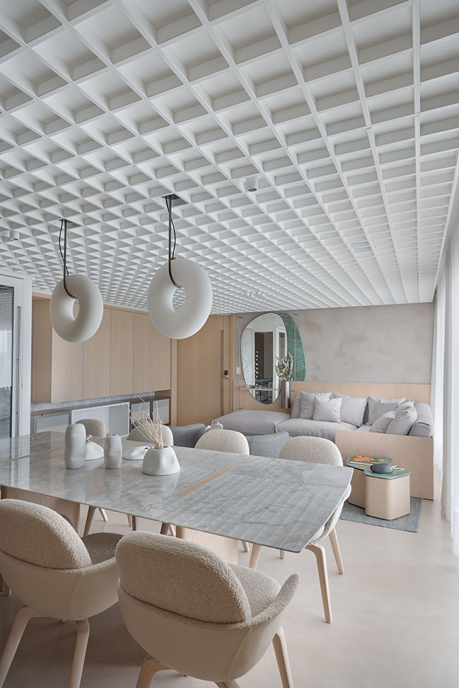
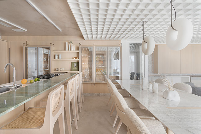
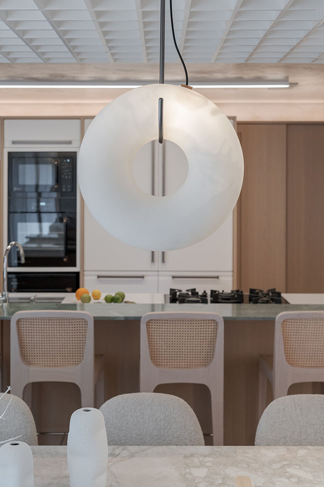
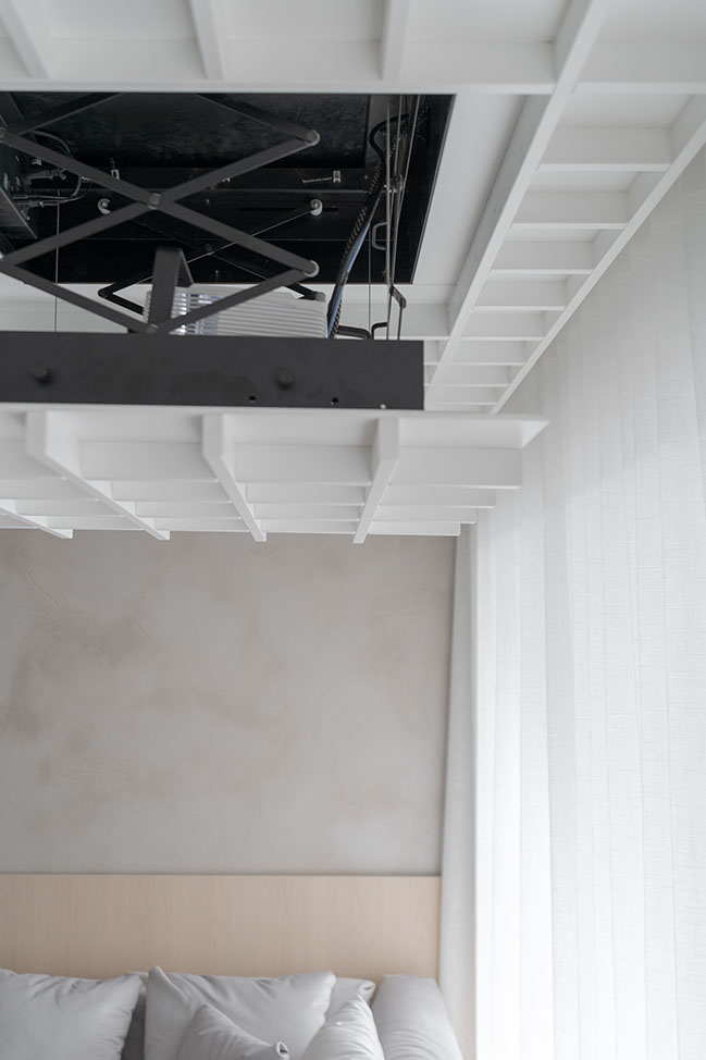
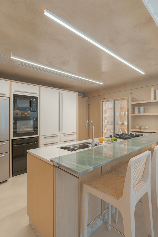
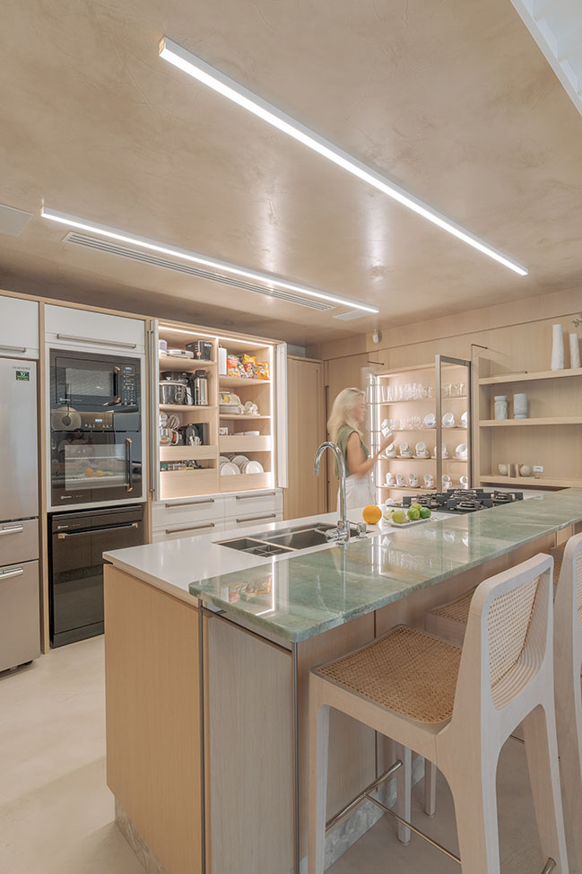
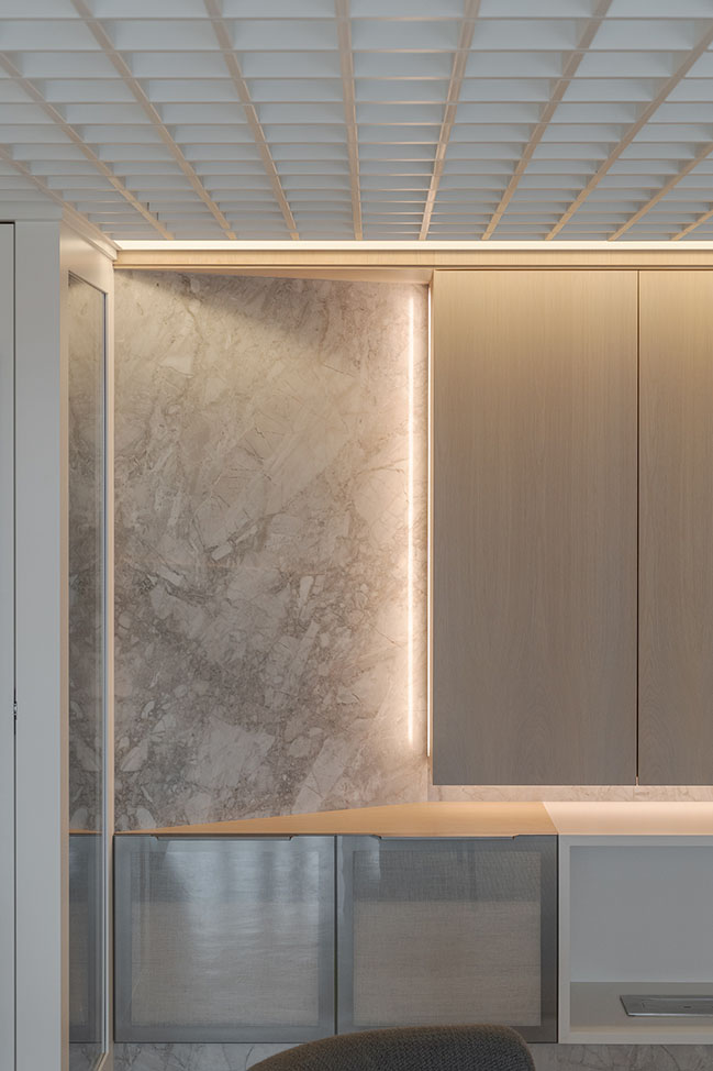
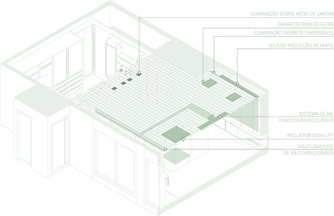
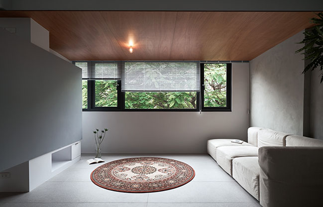
From the architect: In this project, Studiocolnaghi seek for a wide space, using few elements and a neutral color palette. The room perception is much wider than the previous configuration. This is a result of a white wood ceiling spread over the main area. In this element there are audio, video, air conditioning and light solutions.
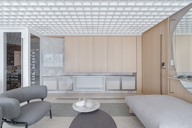
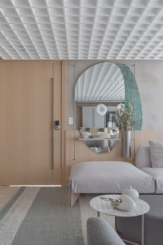
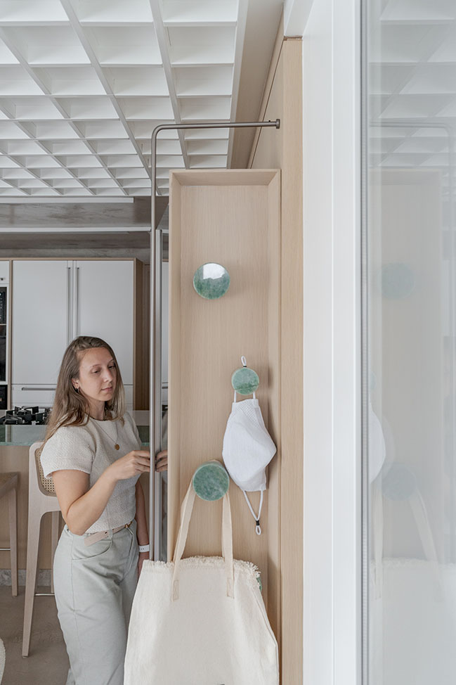
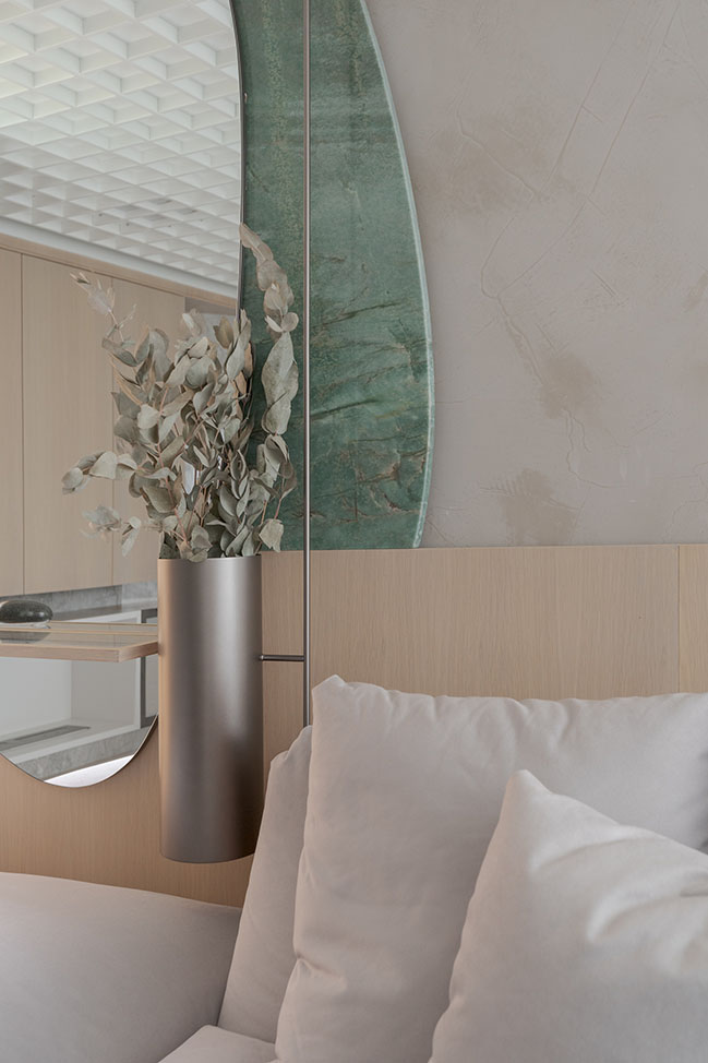
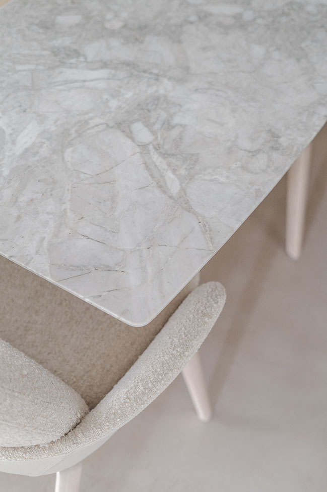
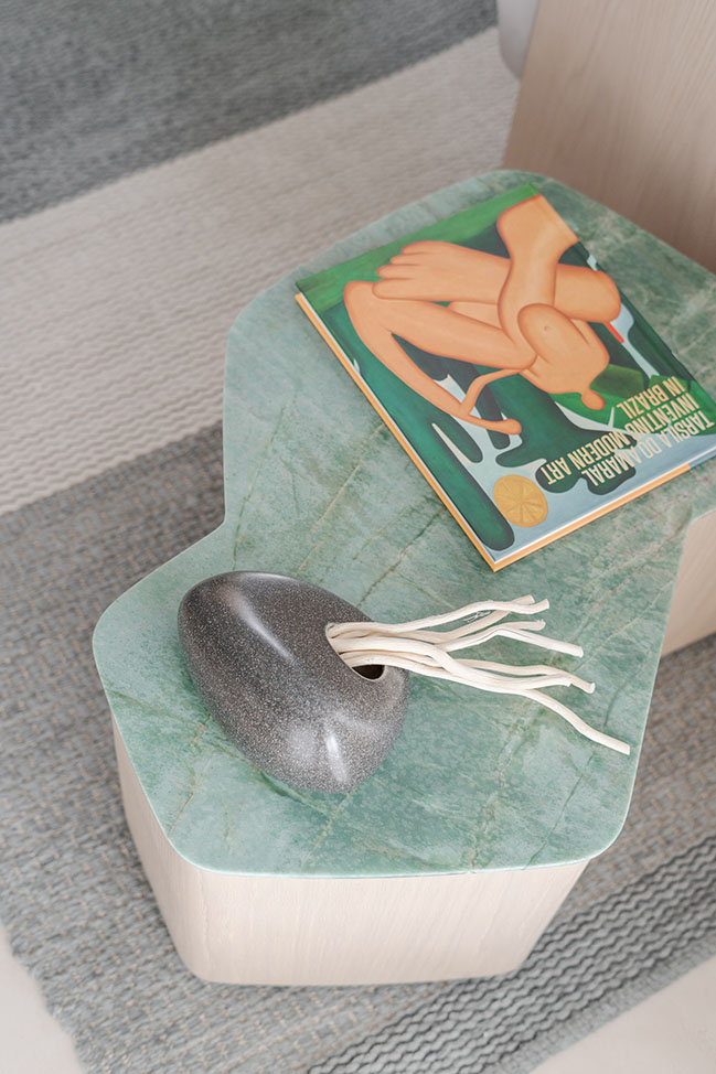
The light wood choice matches to white, creating a timeless background to the design furniture, signed by Jader Almeida for Sollos. The color touch appears on the rug, handmade customed, and emerald green marble.
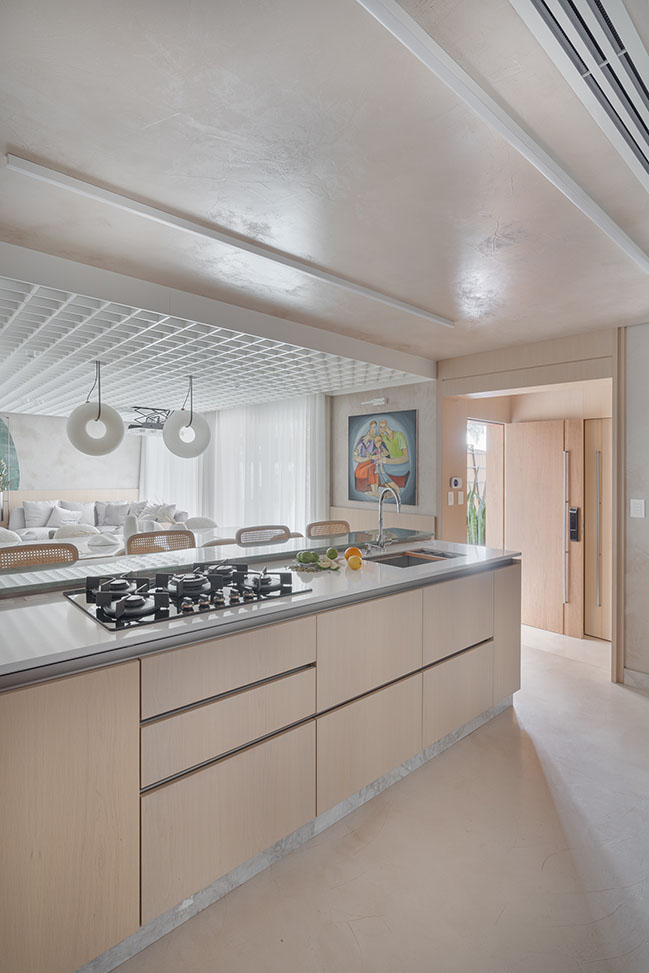
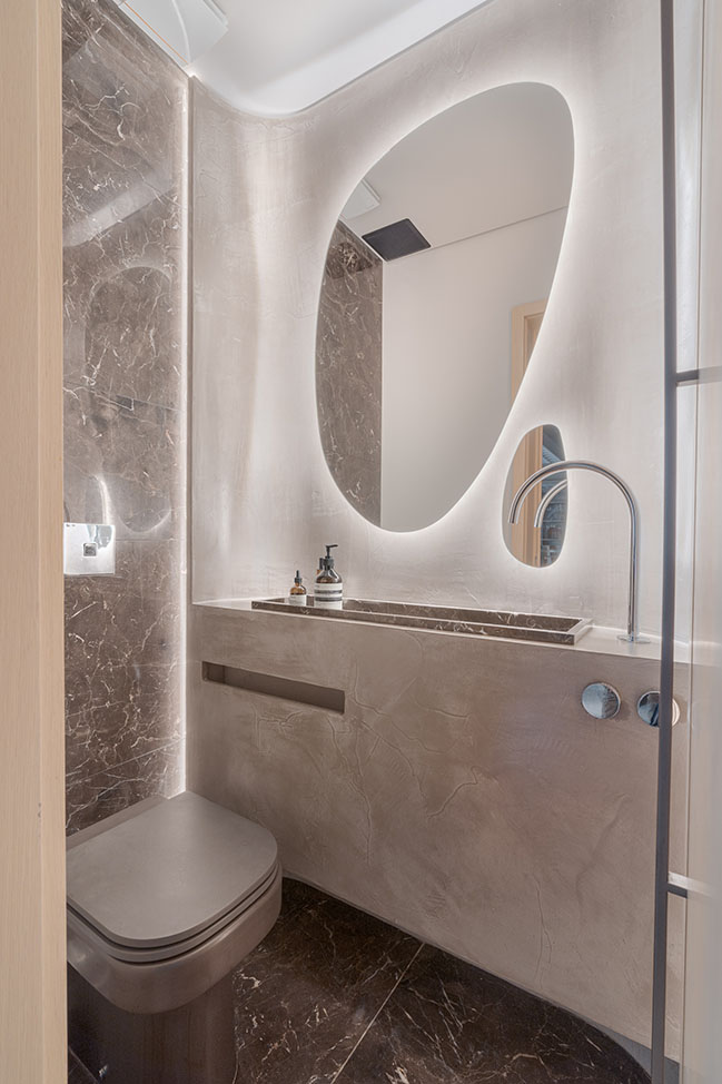
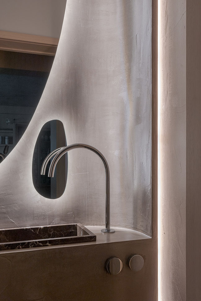
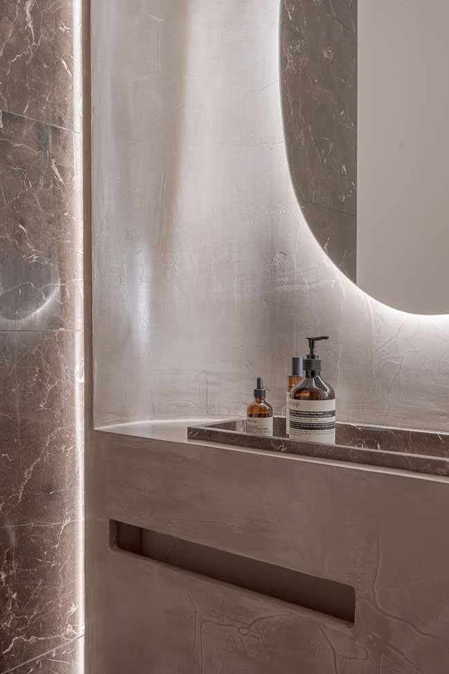
In the restroom, the project follows the same materiality as used on the floor, walls and remaining ceiling surface, a cement texture. The aim was to expand the space perception using a monolithic texture and indirect light.
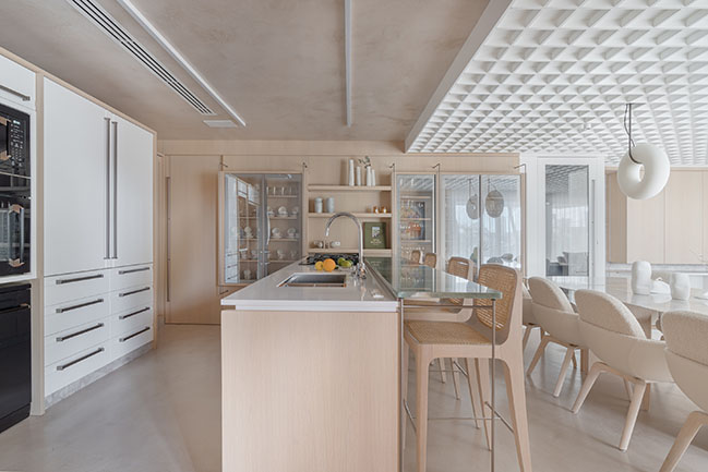
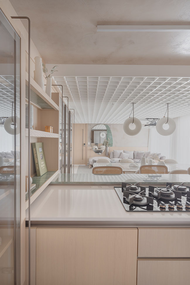
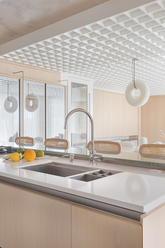
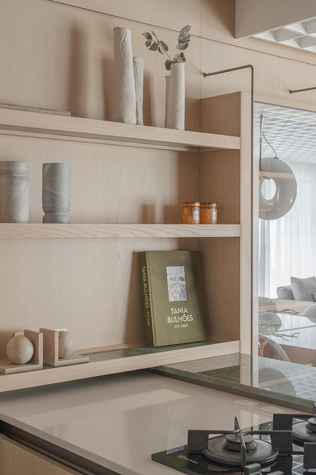
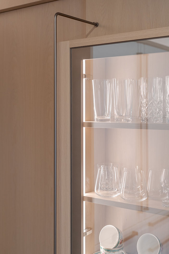
In the kitchen area, there is a glass cabinet which also serves as support to dining table. Some exclusive details were developed to this client, such as velvet cutlery drawer organizers.
Architect: Studiocolnaghi
Location: Central, Brazil
Year: 2021
Area: 60 sqm
Photography: Vinícius Ferzeli
Smoothouse by Studiocolnaghi
12 / 08 / 2021 In this project, Studiocolnaghi seek for a wide space, using few elements and a neutral color palette. The room perception is much wider than the previous configuration...
You might also like:
Recommended post: Sella Open Innovation Center by CRA-Carlo Ratti Associati


![Modern apartment design by PLASTE[R]LINA](http://88designbox.com/upload/_thumbs/Images/2015/11/19/modern-apartment-furniture-08.jpg)


