08 / 15
2022
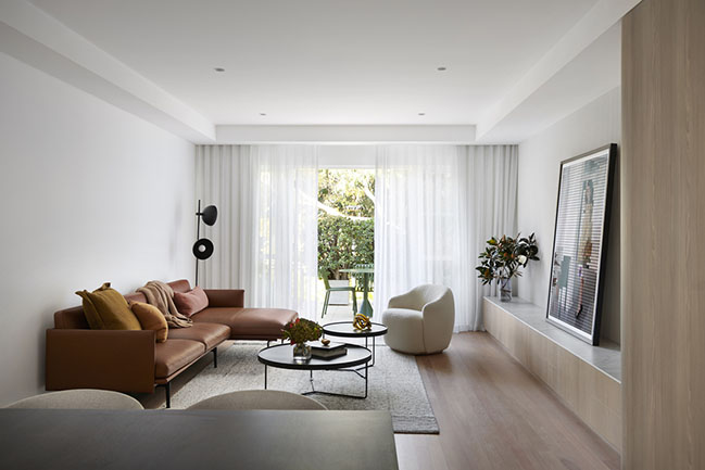
Renovated to improve connection and flow, this two-storey unit has been fitted with contrasting features that harness the theatrics of light and shade...
> Cityview Residence by Kieron Gait Architects
> Light House by Fabric Architecture Studio
From the architect: Ash oak timber and engineered white marble intersect with black detailing to create a timeless, minimal and modern design that fills the compact home with character.
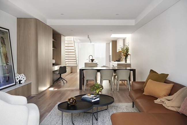
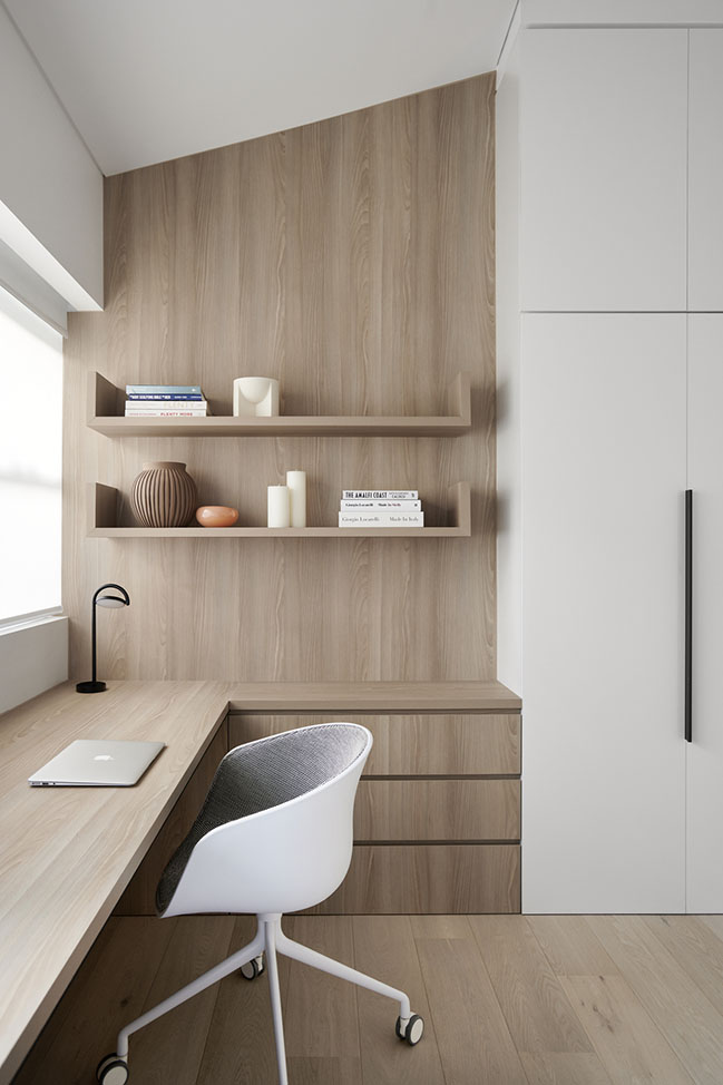
The homeowners are a professional couple who often find themselves working from home, but the spare bedroom they had been sharing was not equipped for such a purpose. Interior design firm, the Stylesmiths™ were enlisted to create intelligent storage solutions that offer a functional workspace both upstairs and down, without impeding on the long and narrow floor plan. An exciting challenge for Stylesmith Rose Sorkheh, knowing that a successful outcome would enhance our clients’ lives, modifying their home to suit their needs. This home renovation strived to keep a perfect balance of work, entertaining and relaxation at the fore.
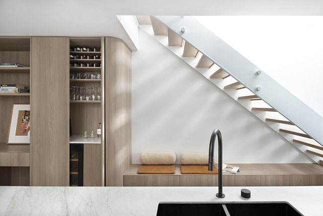
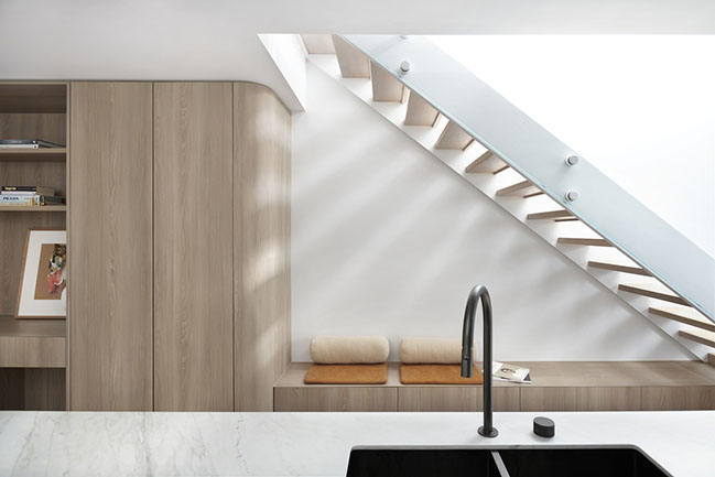
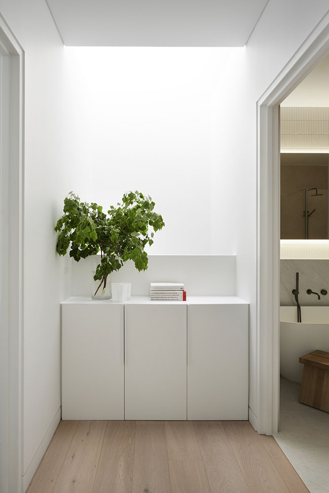
On the ground floor, dappled daylight lifts the elements adorned by golden and amber hues found within the warm timbers and materials. Existing skylights were widened to make the internal spaces at the heart of the home much brighter throughout the day, and an open tread staircase allows for daylight to filter to the depths of the home. The once dark and dated kitchen is now youthful and fresh, featuring porcelain marble stone look slabs and iron bronze fixtures to create a streamlined working zone. Here, surfaces were chosen for their stylish durability, hence the inclusion of minimalistic, exposed cooktop plates that blend elegantly with the surrounding design, while also being practical – heat, scratch and stain resistant.
Opposite the kitchen, bench seating with underneath storage offers the facility for entertaining, which the homeowners had previously thought impossible in such a tight space. A perfect spot to sit and chat with one another, enjoying a vino and preparing meals beneath beautiful sunlit shadows, this is a favourite for our client and lead designer, Rose, alike.
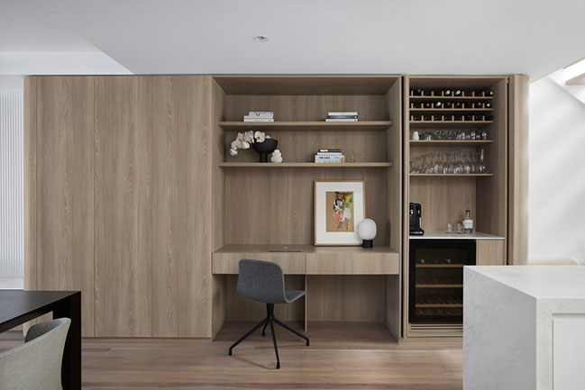
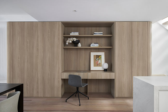
Tall and low cupboards run the full length of the wall, naturally creating an opportunity to introduce a study space, separate to the office upstairs. Built for a dual purpose, the custom joinery is designed to provide much needed storage, while also considering the needs of a study space. Thus, dedicated space has been allocated for printer, documents and other stationary items to be hidden neatly out of sight.
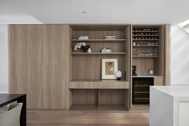
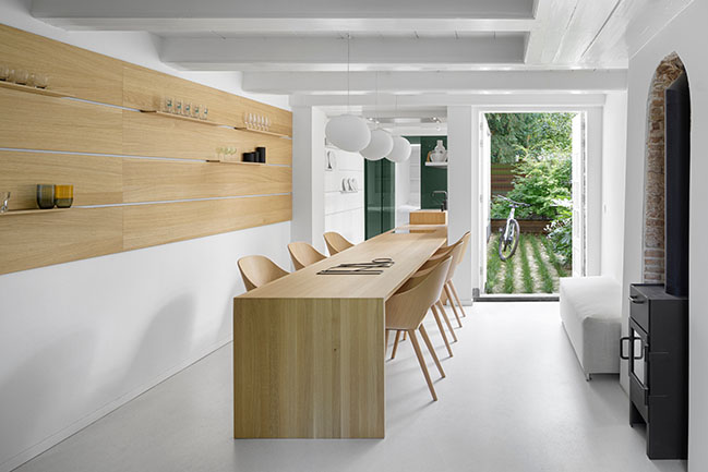
Between study nook and bench seating is an integrated bar area, complete with wine fridge, perfectly sized shelving for glasses and a preparation bench that doubles as a coffee station. Fitted with retractable doors that neatly tuck away, this thoughtful addition has added a new level of functionality which our clients thoroughly enjoy.
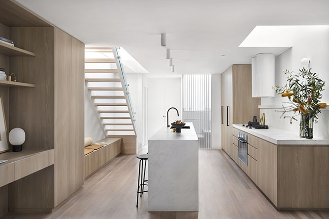
The timber joinery is luxe yet understated, its soft oak finish and ash undertones freshen the communal domain. Rounded at both ends, the feature is large but not intrusive. In fact, the lower level now feels more spacious with a spot to keep all the clutter that was previously exposed. Wooden floorboards underfoot continue to soothe the home, inspired by Danish design principles of simplicity, the natural pattern of the grains adds just the right amount of depth and texture without looking overwhelming.
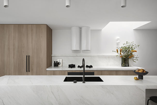
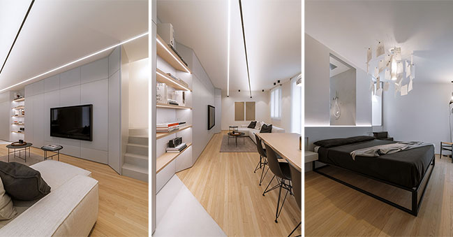
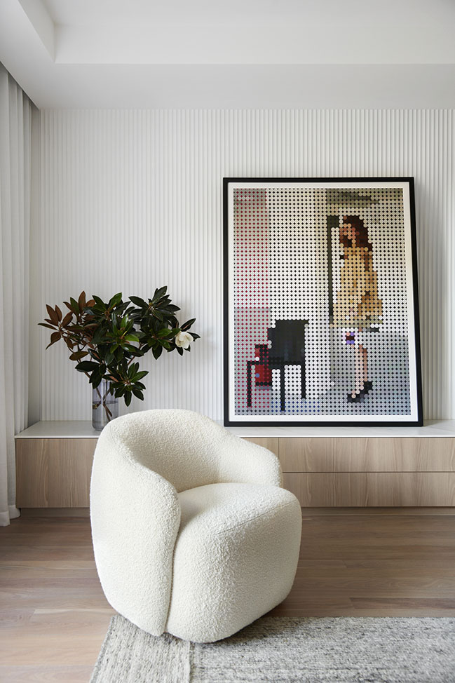
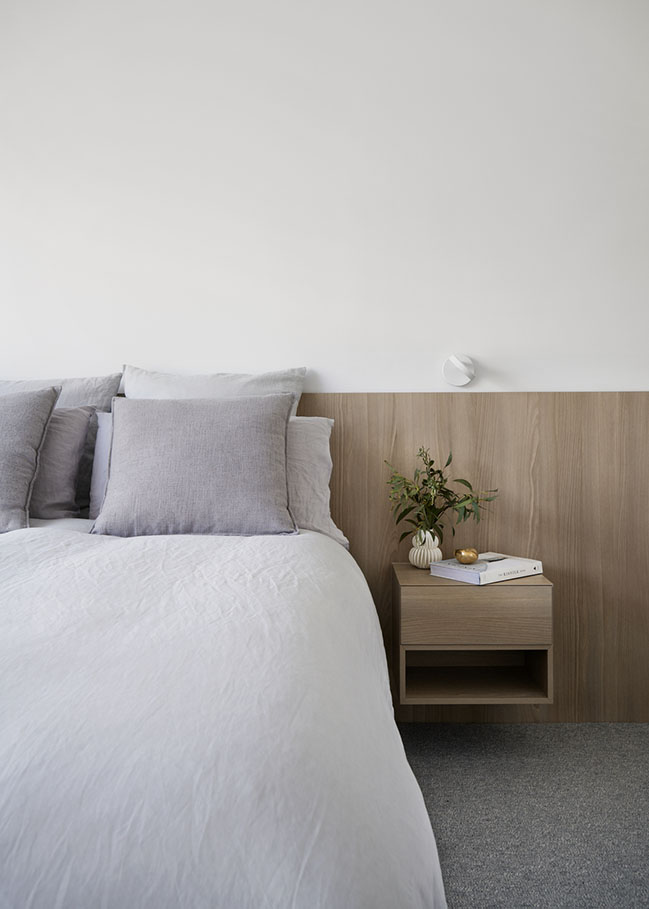
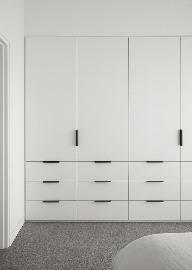
Scallop shaped wall panels add subtle character to the living area and stairway, with smoothness that’s replicated in buclè fabrics, cylindrical twin range hoods and rounded furnishings. Long drawers make for an easy entertainment unit that ties in with other joinery, offsetting the long tan sofa sitting opposite. This is a home project where nothing was added without a purpose; every design choice has been thoughtfully considered to benefit the clients while improving the visual appeal. The master bedroom is minimalistic with wardobe joinery to match, black handles adding all the drama needed to accent the wall of cupboards. Floating side tables blend into the custom wooden bedhead that’s attached to the wall, bouyed by soft grey carpet.
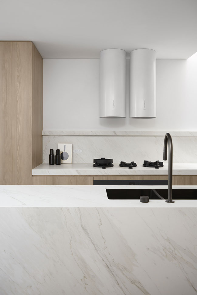
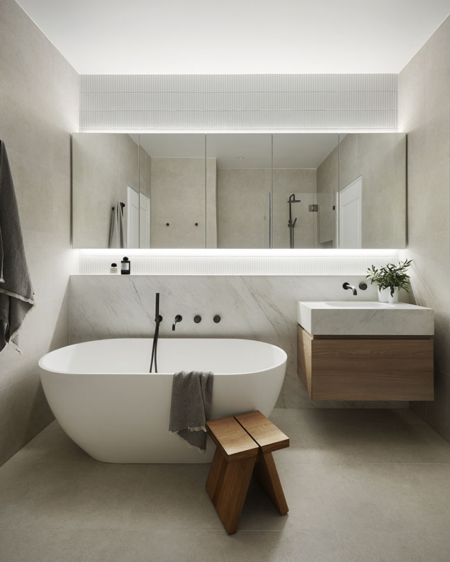
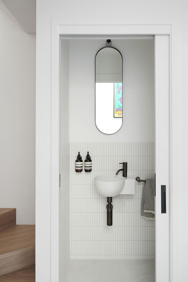
Kit kat tiles in the bathroom and powder room add to the tactility of the space, introducing a simplistic element that continues to make the most of a petite home. Backlit LED lighting brightens the washroom from behind a line of mirriors, encapsulating task and accent lighting in one. Including a soaking tub was important for the homeowners that value downtime. A tranquil space for intimate thoughts is offered via an uncomplicated bathroom design that sticks to the basics, using elegant stone that pairs well with warm timber and modest black tapware.
Interior Design: the Stylesmiths
Location: New South Wales, Australia
Year: 2022
Photography: Fiona Susanto
Tranquil Living by the Stylesmiths
08 / 15 / 2022 Renovated to improve connection and flow, this two-storey unit has been fitted with contrasting features that harness the theatrics of light and shade...
You might also like:
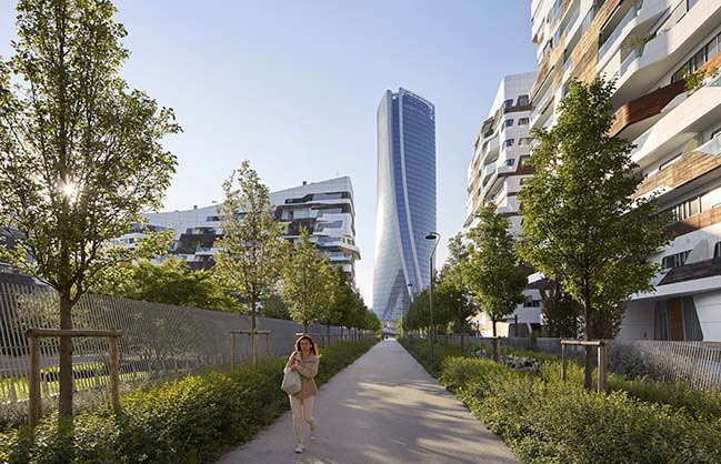
Recommended post: Generali Tower in Milan by Zaha Hadid Architects
