03 / 15
2018
The task of the project was to organize a comfortable space for the life of a creative family with two children. Work was to be done with two apartments, which occupy the second floor of a two-story house from the 30s of last century.
Architect: Ryntovt Design
Location: Kharkiv, Ukraine
Completion: 2017
Total area: 167sqm
Team: Yuriy and Oksana Ryntovt, Sergey Nykyforov, Ryntovt design team
Photography: Андрей Авдеенко
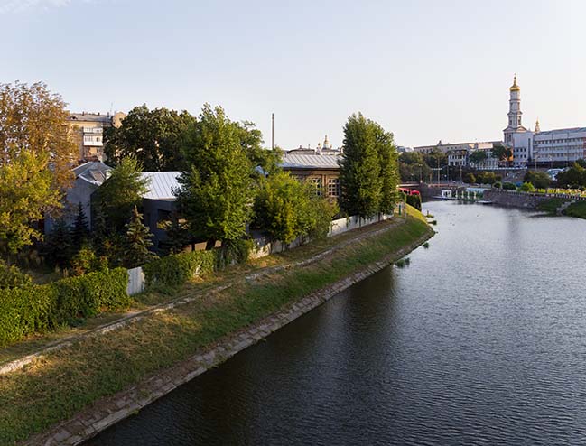
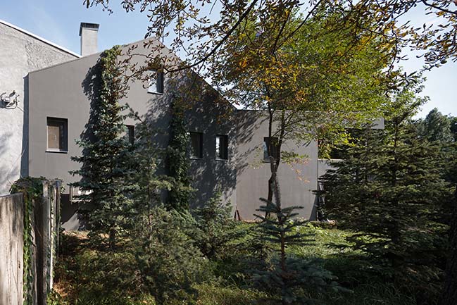
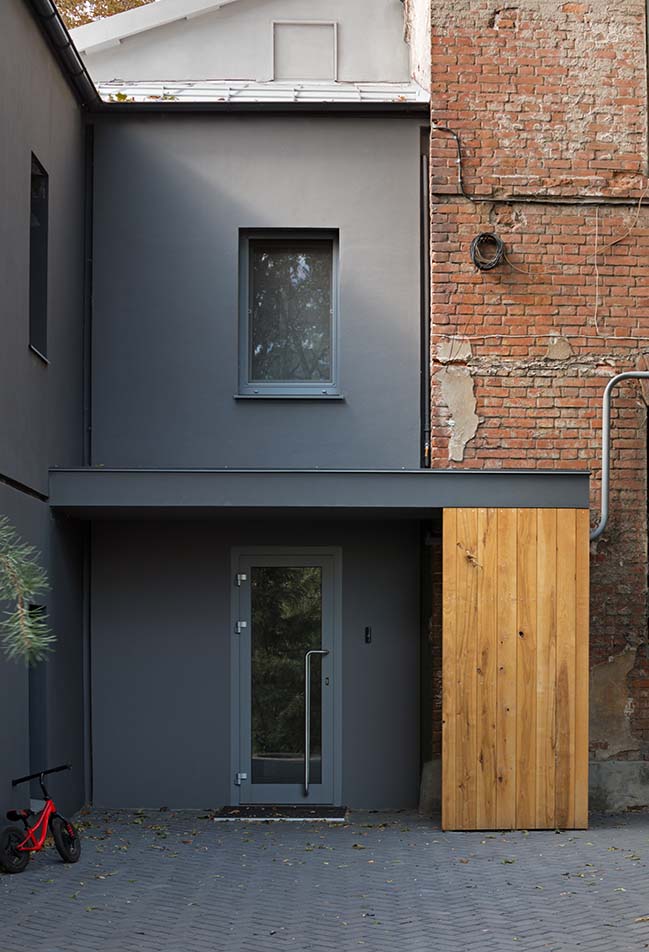
From the architect: The project required maximum inclusion, because it was not about minor adjustments, but about the reconstruction of internal and external volumes. It included work with the main building and the entrance group, which is connected with the neighboring building – a preserved architectural monument. It was important to connect a contemporary renovated house with the existing architectural context of the old city.
CONCEPT
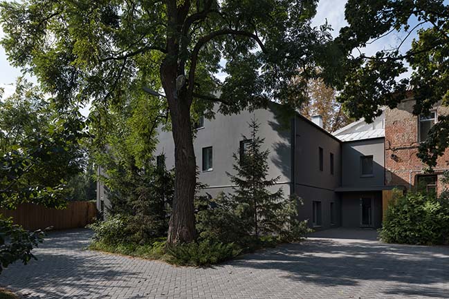
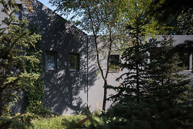
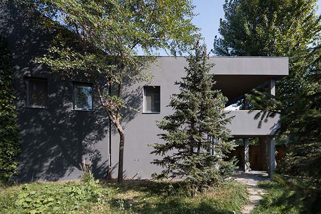
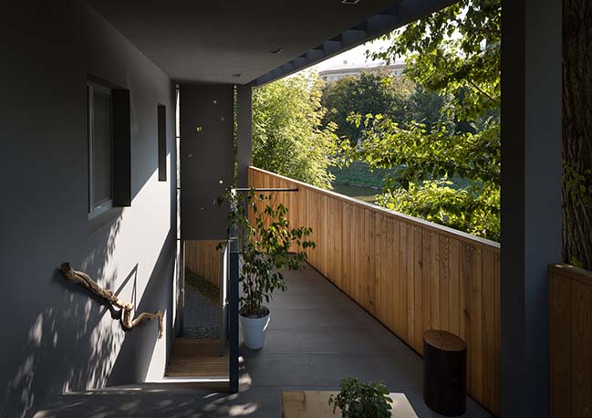
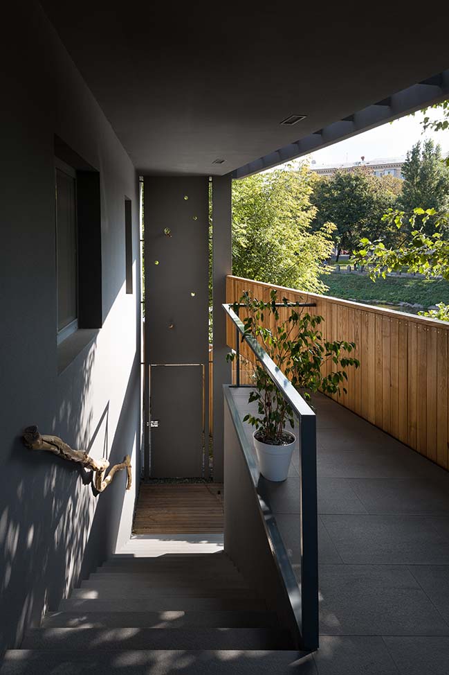
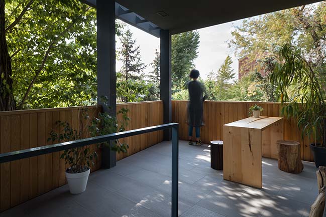
During the design process, site context took had to be take into the consideration and influenced building very much. The main concept was dictated by the location of the house in the historic part of the city, by the river located nearby, the view of the Assumption Cathedral and the connection of the building to the monument of architecture. The idea of the project was based on authors desire to preserve the authenticity of the building and to create close contact between house inhabitants and the site, which included surrounding nature on one side of the river, active urban life on the other and the river itself. The work with the view has to be mentioned separately: the terrace of the house is open to the embankment and city square with its life and activities. Due to the context necessity and the architectural brief, the project had to dissolve in the existing environment and the embankment lines. Architects aim to create the microclimate of the "forest" inside of closed courtyard space and organize a garden of spruce and juniper from the western facade.
PLANNING
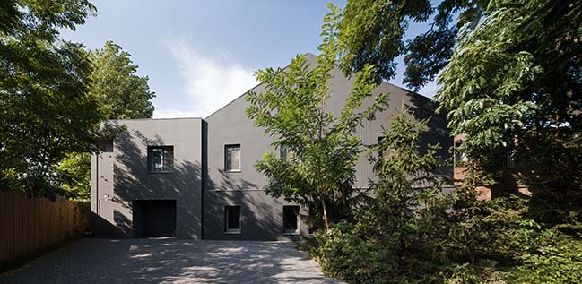
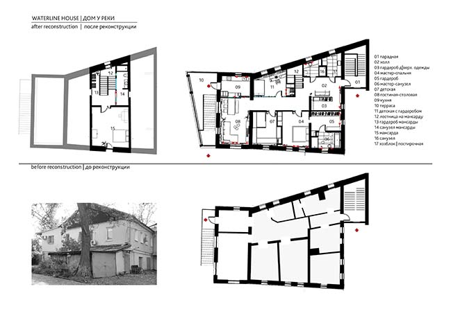
During the renovation the shape of the house, the total area and the configuration of the openings remained almost unchanged. Even the required replacing old windows with panoramic one with the view on the river did not outweigh the energy-saving factor and the desire to preserve the authenticity of the building. For the same reason, galvanized iron was chosen for the rooftop, as it is the most common roofing material in this part of the city. The dense grey color of the facade made it possible for the construction to "drown" into the shadow of the environment.
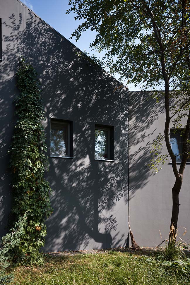
In the dismantling process, the project authors discovered the structural integrity problem, which was solved with the help of a new rigid frame inside the old building, which keeps the walls, floors and roof. The closed courtyard combines in itself atmosphere of intimacy, democracy and openness, which immediately gives you energy and lifting up you mood.
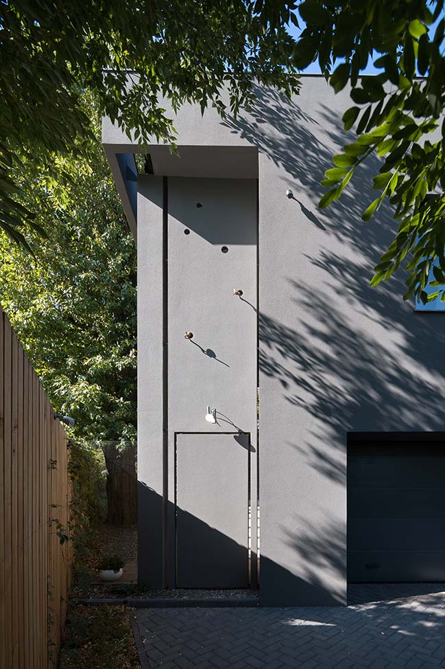
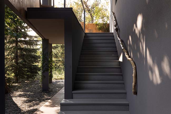
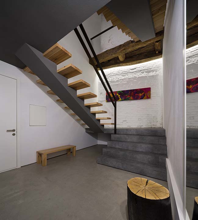
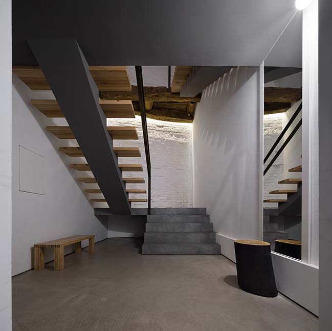
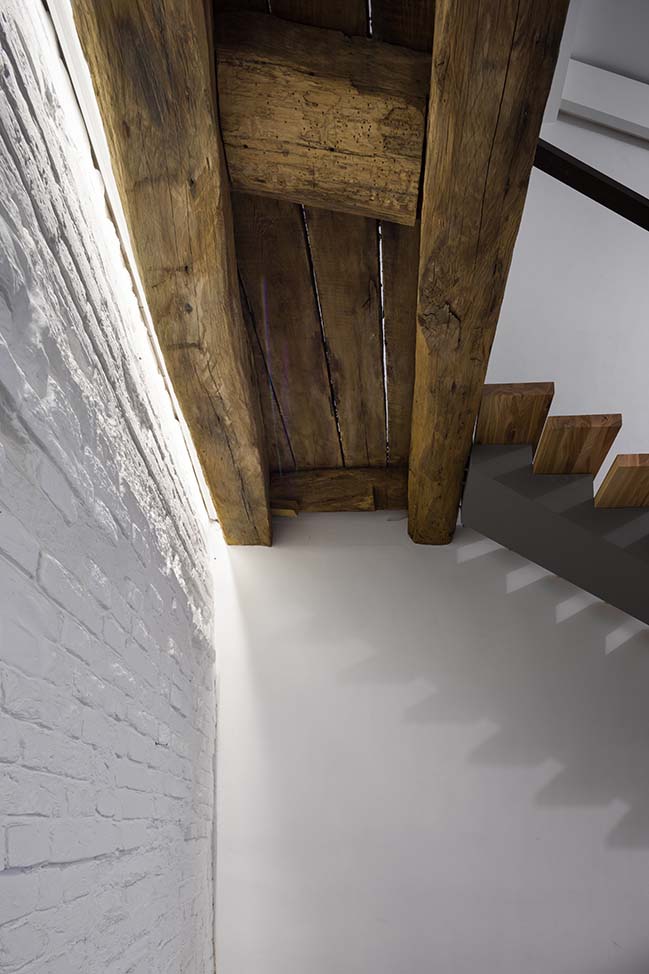
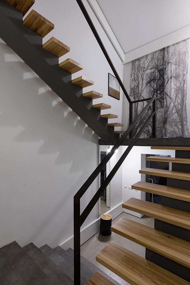
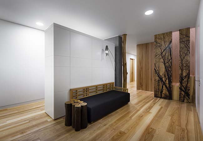
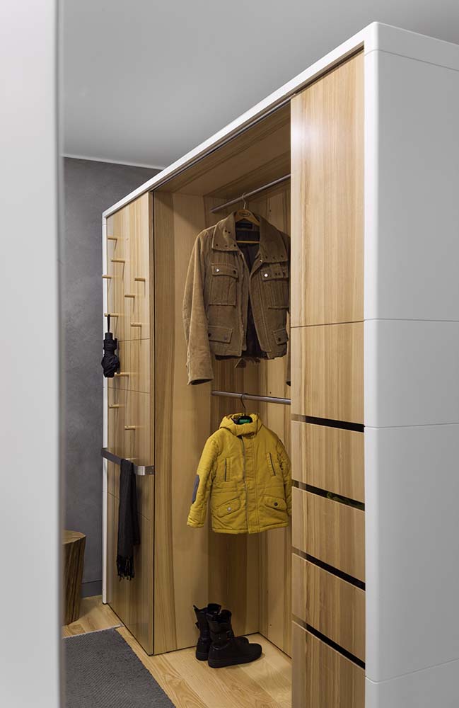
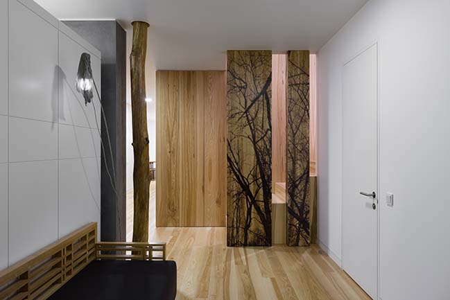
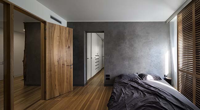
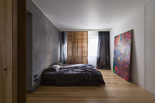
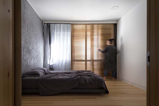
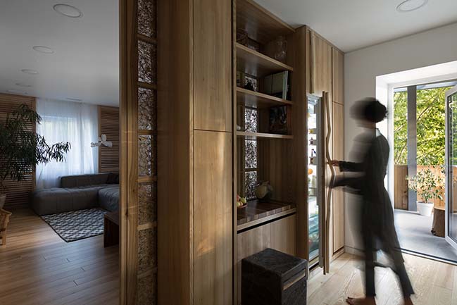
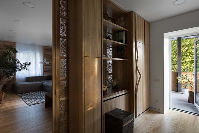
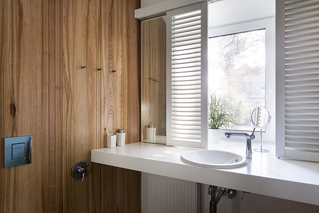
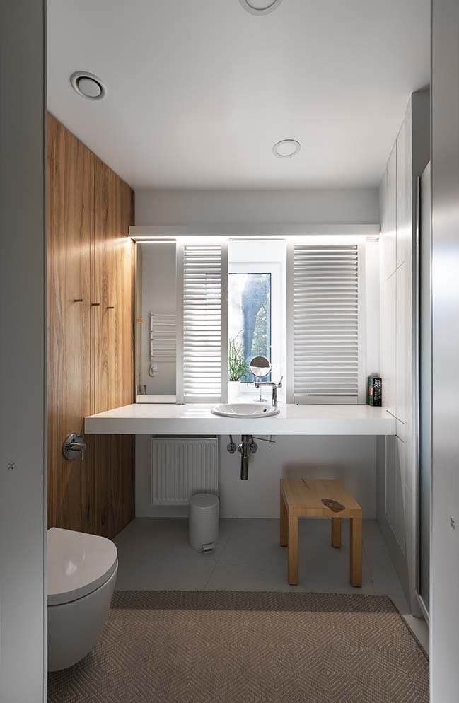
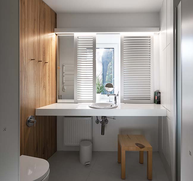
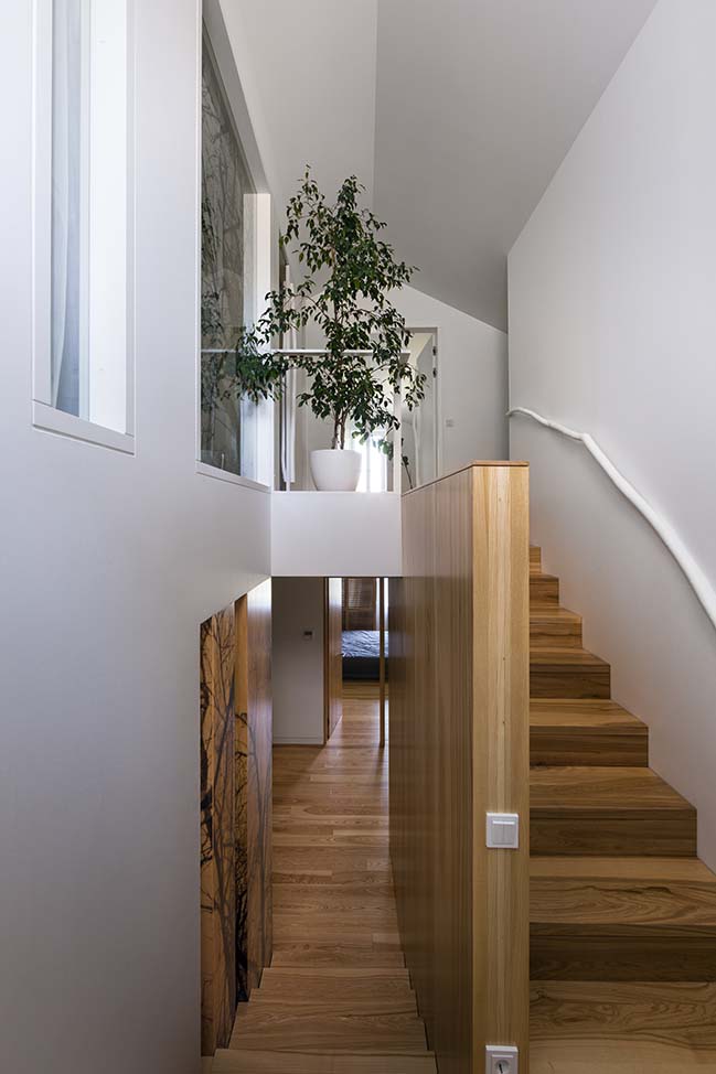
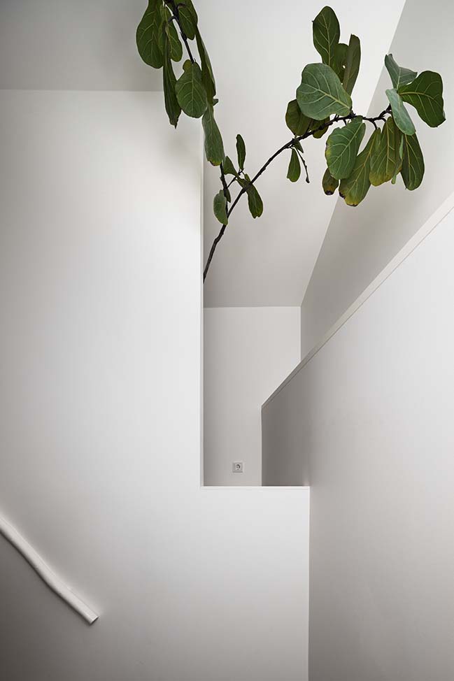
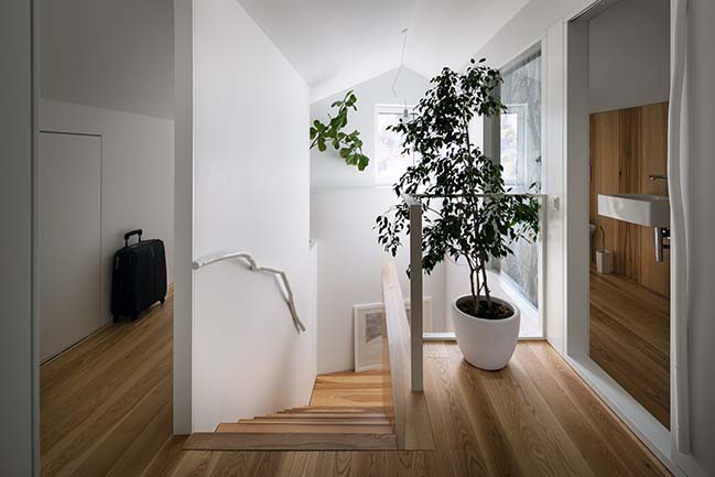
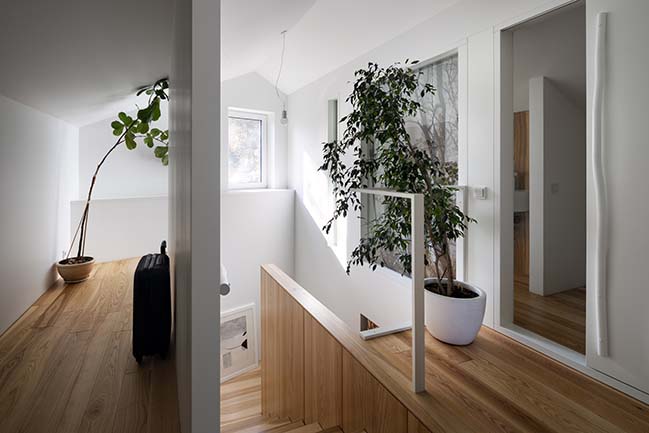
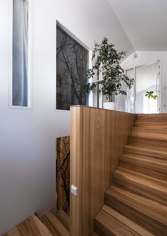
The entrance group and the connection between two houses emphasize the delicacy of the designing approach. The main entrance was given special attention, as it a public space and common space. Light, almost airy, the staircase connects to the old beam and uncovered brickwork of the early twentieth century. The interior navigation is built on horizontal and vertical links: connecting volumes and visual beacons already at the entrance reveal the main axis of space. The pylons made from an ash-tree array with a forest print on them and a load-bearing wall, which goes though the bedroom of the owners of the house, a bathroom, a wardrobe and a central hall, are setting up main accents in the house.
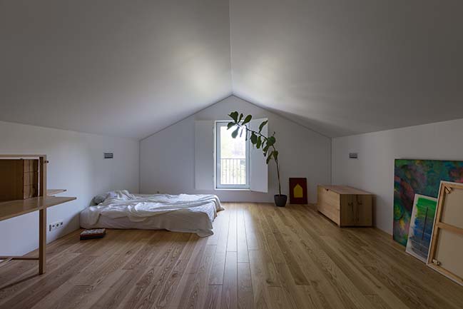
The long hall, which connects all the spaces, reveals the entrance to the attic floor, which is zoned with mention above pylons. The same print of the forest meets us on the curtains textile in the front. This and many other details give feeling of continuity throughout the whole space.
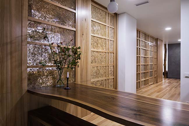
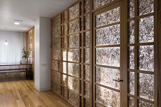
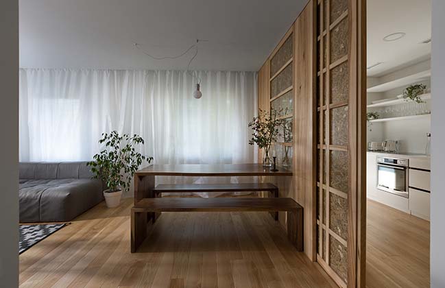
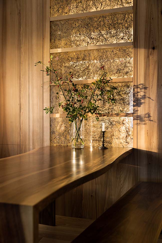
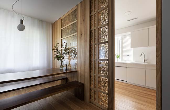
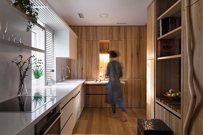
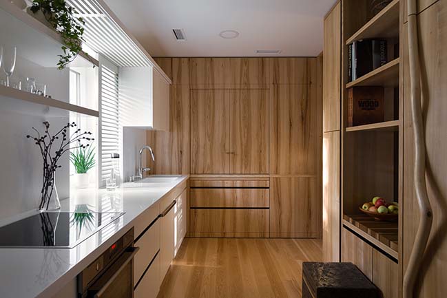
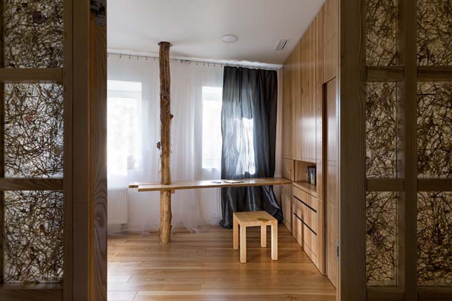
To avoid the tunnel feeling, one of the rooms was screened by a system of partitions made of solid wood, glass and dry grass with a swinging door block in it. The same partition system performs the function of zoning between the living-dining room and the kitchen, but with a sliding door. The zoning of the whole space contributes to the natural insolation of all spaces. This even includes a long hall, since there are no openings in it and no direct natural sunlight in the central space it doesn’t need extra heating in winter and cooling in summer. However, due to the mentioned above partitions and translucency of the space it gets enough of day light.
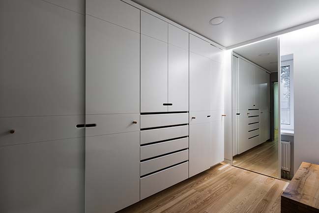
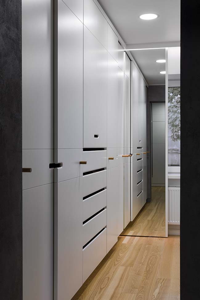
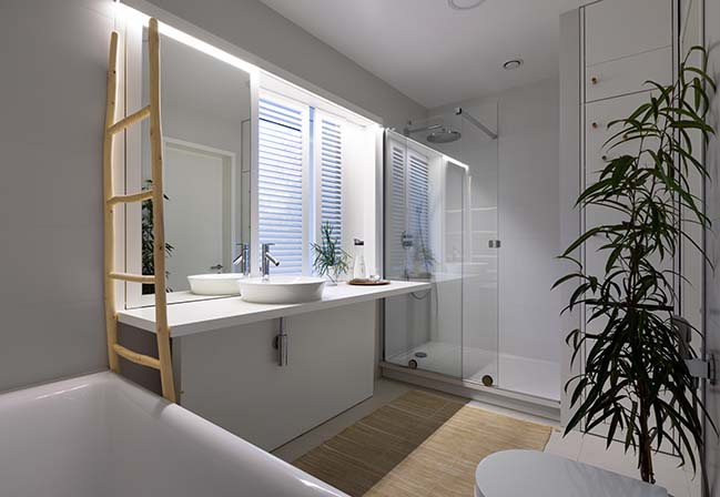
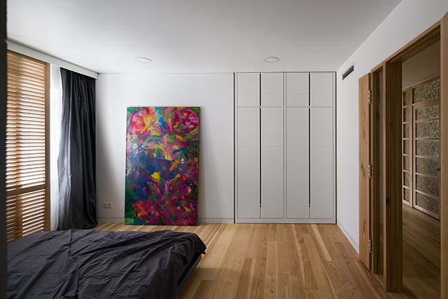
In total, the project contains 4 living rooms: a master bedroom with connected to it mater bathroom and wardrobe, two children's rooms, one of which has its own bathroom and a wardrobe as well, plus a guest room that also can work as an office.
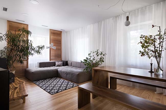
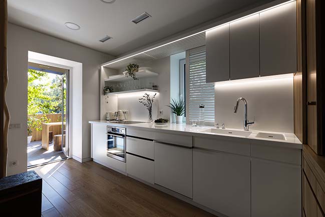
The successful orientation of the house allowed the private rooms of the apartment (bedroom, guest room and children's) face to the east and west side. On the south side is located living-dining room combined with the kitchen (which can be easily excluded from the total volume with a sliding partition) and exit on the large terrace. The northern part is occupied by a hall, a common wardrobe, an service rooms and a guest bathroom.
MATERIAL PALLETTE
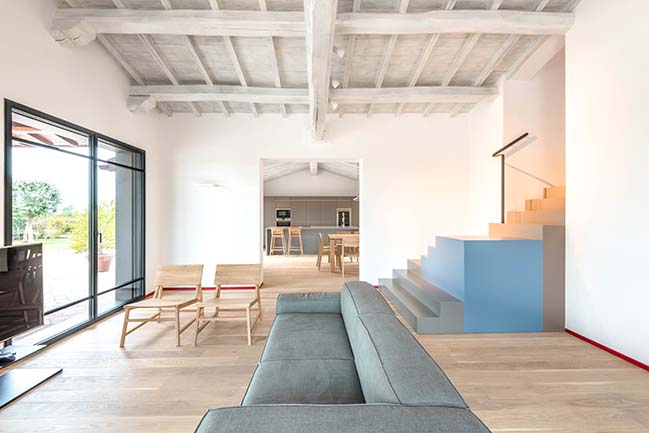
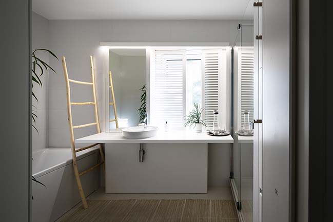
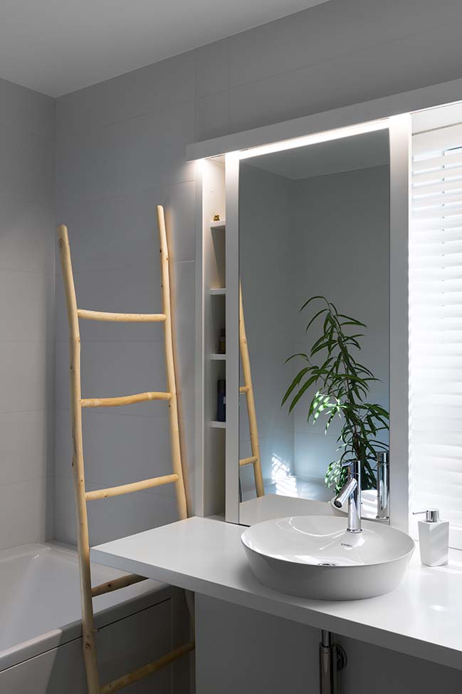
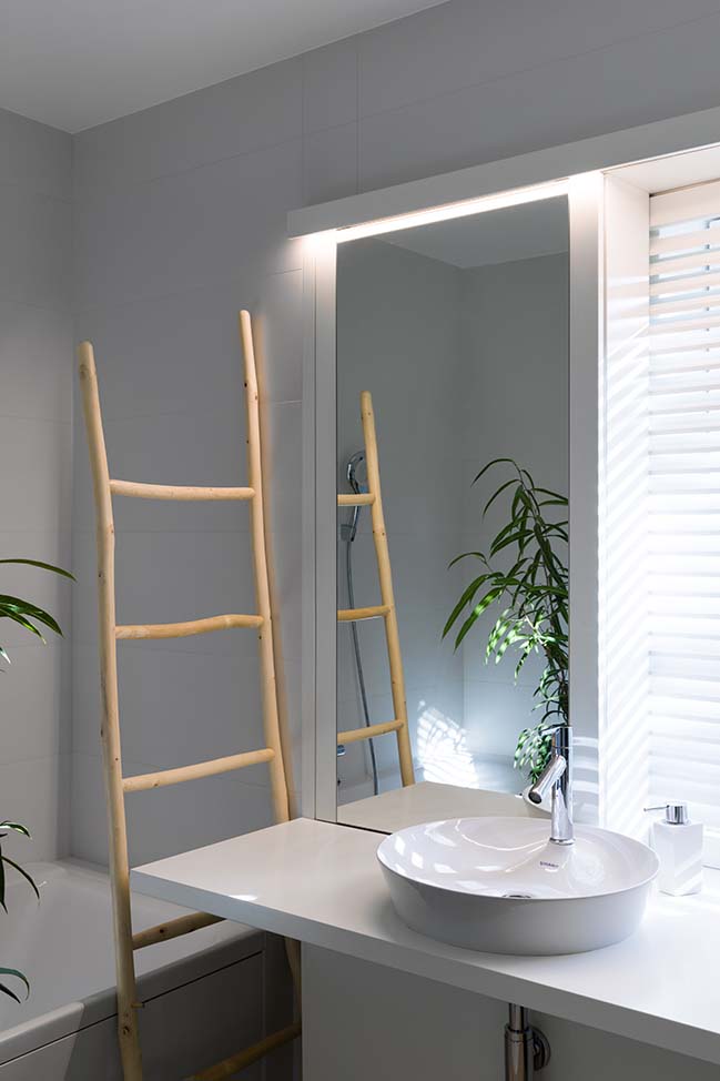
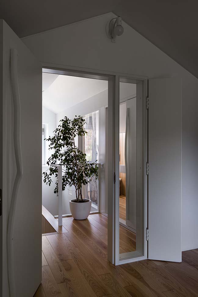
Monochromatic palette of the interior emphasizes the democracy of space and gives it a meditative character. Minimalism and functionality of the design solution are supported by a neutral white-and-gray colorist and enriched with rich walnut textures. Paperlike snow-white curtains in the living room, a combination of dry grass, glass and ash solid wood in the screening of the office and kitchen spaces create an atmosphere of asceticism of Scandinavian and Japanese interiors.
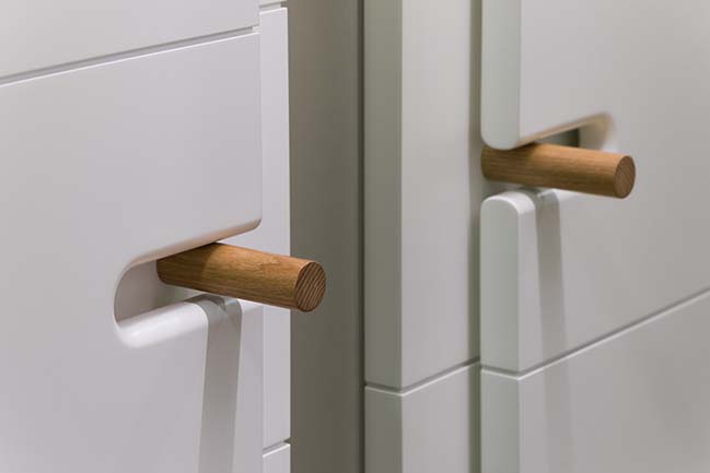
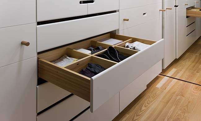
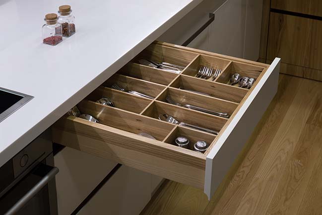
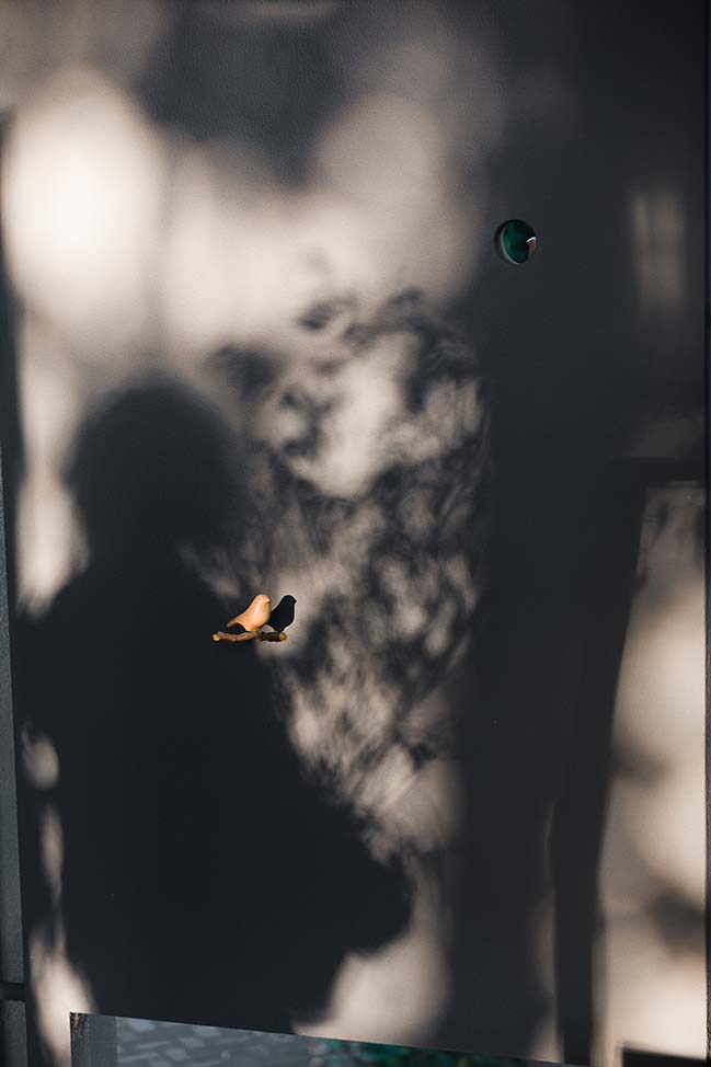
The internal white and gray surfaces are “painted” with shades created from screened partitions described above and light apertures in massive door blocks. These apertures have decorative doors on wooden hinges and they are also an important navigation part of the project and they give visual focus in the volume. The entire interior of the Waterline House is filled with local codes. For example, traditional local ornaments can be seen on carpets made of cotton and Carpathian wool. Carpets are made using old Scandinavian technique by Ukrainian craftsmen. There are almost no serial items in the project. All furniture is designed and produced by the workshop ryntovt design, which once again emphasizes the importance of a delicate individual approach to any project.


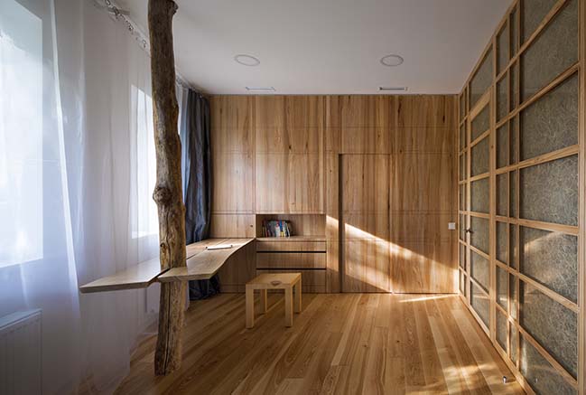
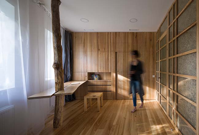
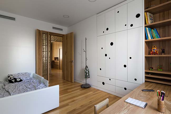

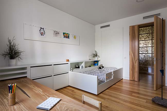
Waterline House in Kharkiv by Ryntovt Design
03 / 15 / 2018 The task of the project was to organize a comfortable space for the life of a creative family with two children. Work was to be done with two apartments,
You might also like:
Recommended post: Lava stone house by b.e architecture
