11 / 04
2021
By now, for creative agencies' office spaces as reported, cases boasting "future, technology and digital" by dizzying forms have been almost out of fashion. By contrast, in the "Cyber White Garden" newly created by AtelierTree, a single white-washed, sharp-cut and at-hand material exerts a novel "sense of technology"...
> Strangers: Room with a rejected view by Wutopia Lab
> Moments Photography Base by TRI-ORANGE DESIGN
Project's description: Innovation is not exactly only visual aesthetics, and right in this sense AtelierTree aptly takes full use of the spatial characteristics of the site and integrates the traditional garden experience therein, presenting a "Cyber White Garden" blending the ancient and the modern .
"Cyber" doesn't necessarily mean "punk"
Once transliterated into Chinese, "cyber" has become a hottest culture as embodying the information age and high-tech future bestowed by endless films and literary works. However, in AtelierTree's opinion, "cyber" doesn't necessarily mean "punk".
"In the development of the times, 'cyber' addresses a symbiosis that intertwines technology and humanity," introduces AtelierTree their interpretation of human concern by pure white as an anecdote to darkness and neon. The very inspiration of combining technology and humanistic tradition comes from an active dialogue with the site towards full realization of the owner's quest.
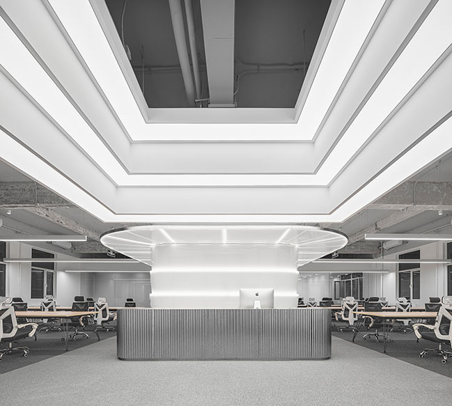
Engaged with advertising, film and art besides media, the client aspires for a simplistic, clean, practical and warm office space within a limited budget. "We hope to accommodate endless possibilities into the simplest and purest," said Casen Chiong, founder of AtelierTree: the pure white color presents all inspirations like a timeless canvas.
Creating A "Garden" Experience
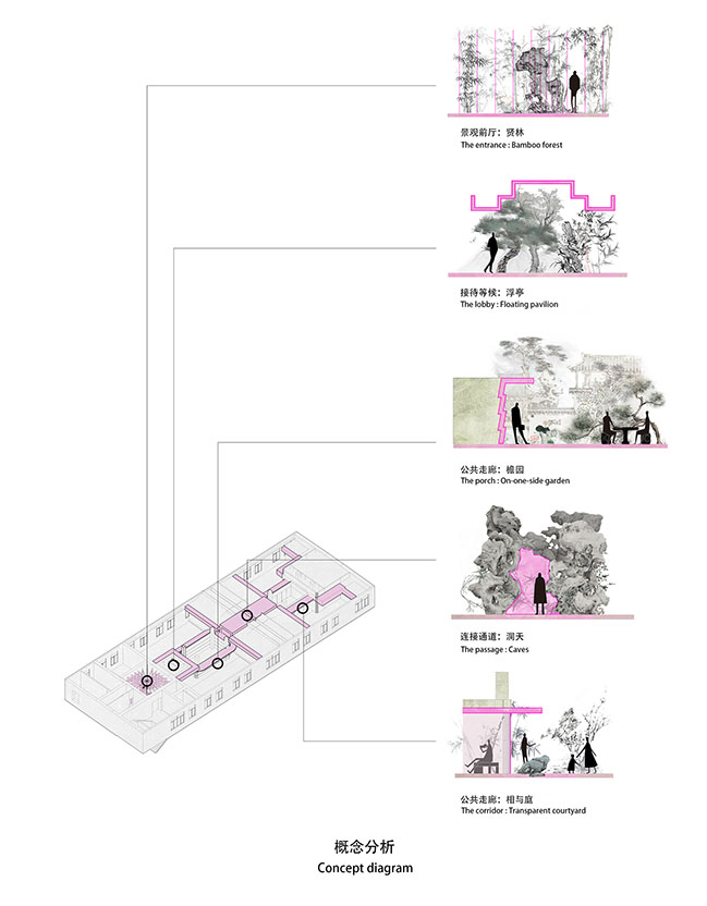
While the site was so regular as restricted to a symmetrical central axis, AtelierTree cleverly transported the traditional garden experience into the spatial sequence. "We hope, by key-sculpting and overall-organizing the public space nodes, the user of everyday may subtly find her or himself being 'visiting a garden'," said Casen Chiong.
So far as the regular site goes, the designer identified and organized the spaces by distributing each office function along the central axis, while interspersing several spatial nodes in a meandering progression that evokes the imagery of the garden space.

Literati's Habitat - As the Landscape Vestibule
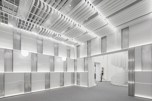
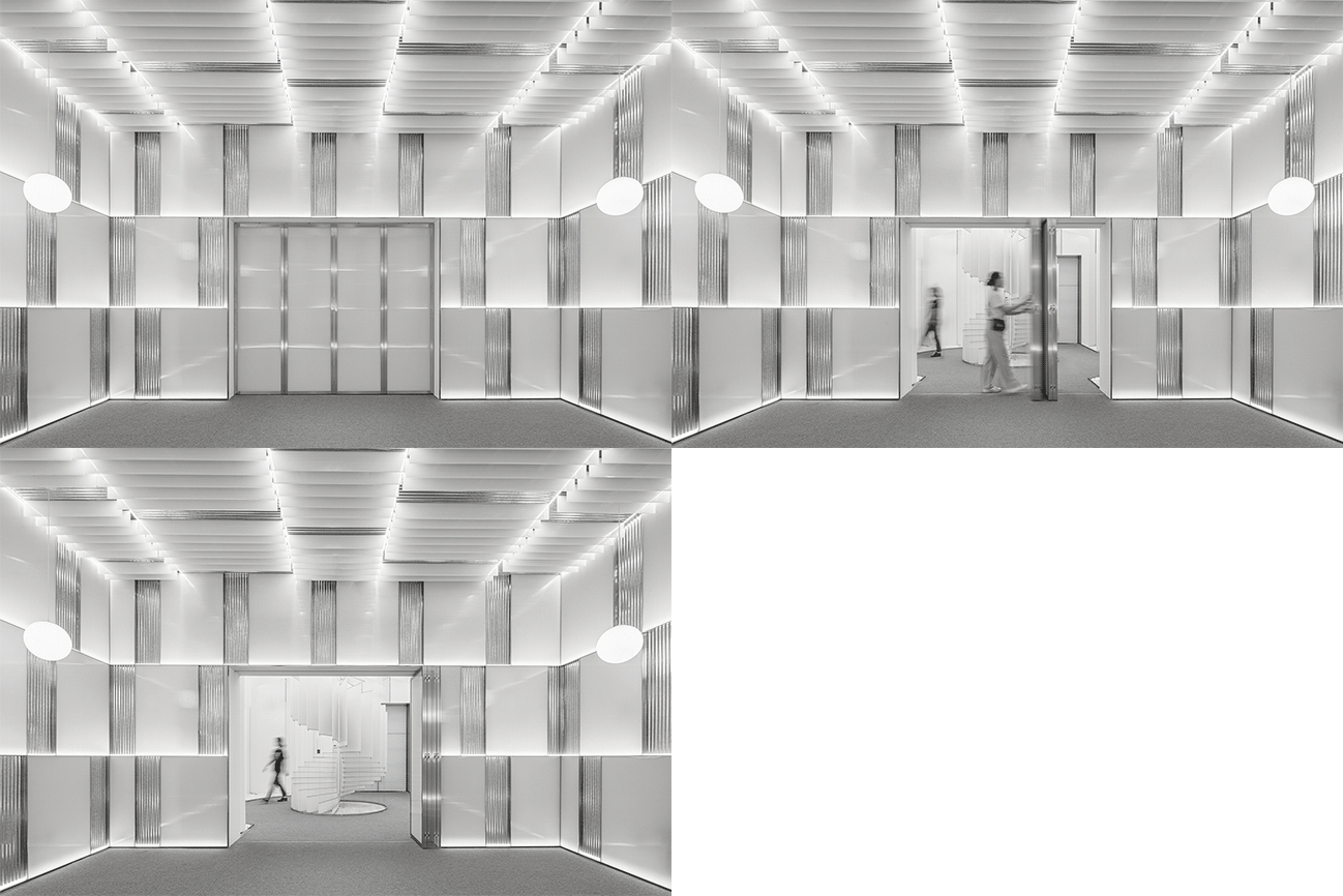
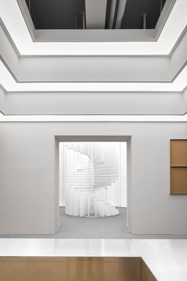
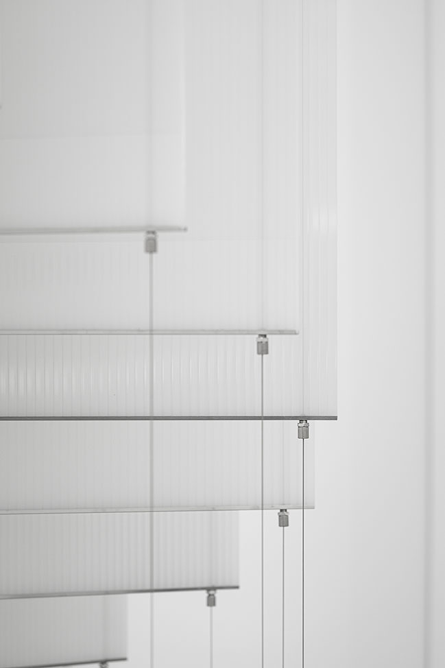
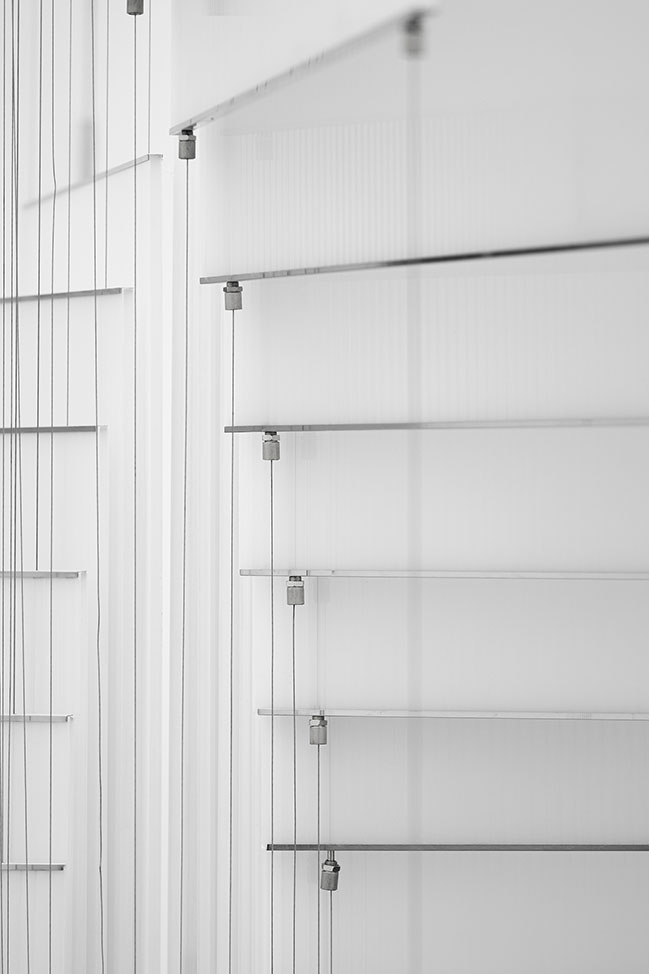
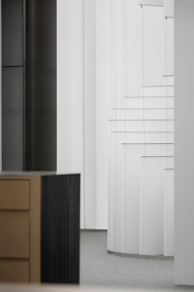
To guide people deeper in, a pure-white spiral-ascending installation is placed there that evokes an abstract bamboo groove by vertical lines intersected with different materials, and ushers further by the directional ceiling. It's a crafty response to the four immovable doorways at all its sides, especially one unfavorably opening the bathroom directly to the main office.
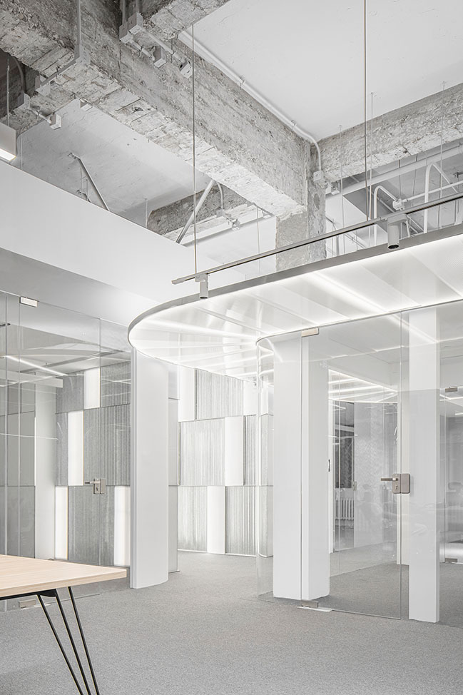
So the installation, being placed in the center, prevents the embarrassing confrontation while forming a spatial node as if a rockery in the garden, sets up a memorable reference point while converging the space. The light material feels breathable and the dynamic spiral diverges the otherwise confronting and interlocking flows of people.
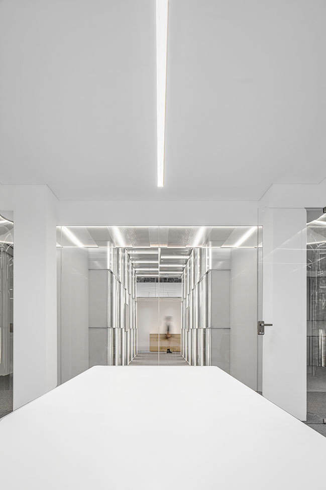
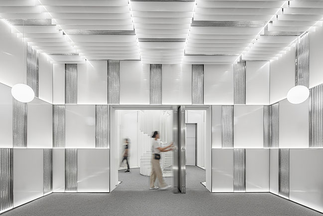
Right adjacent to the landscape vestibule is the multi-functional reception room featured with staggering corrugated metal and cream poly-carbonate panels. Folding doors allow the space to be opened and closed, flexibly accommodating both daily receptions and timely salon gatherings.
Floating Pavilion - As the Waiting & Reception Area
Once entering from the main entrance, one will find the main office via doorway on the right of the landscape vestibule. Beyond the opening left by the load-bearing wall, the spatial sequence makes its prelude with a pavilion as if to shelter the visitor into a garden.
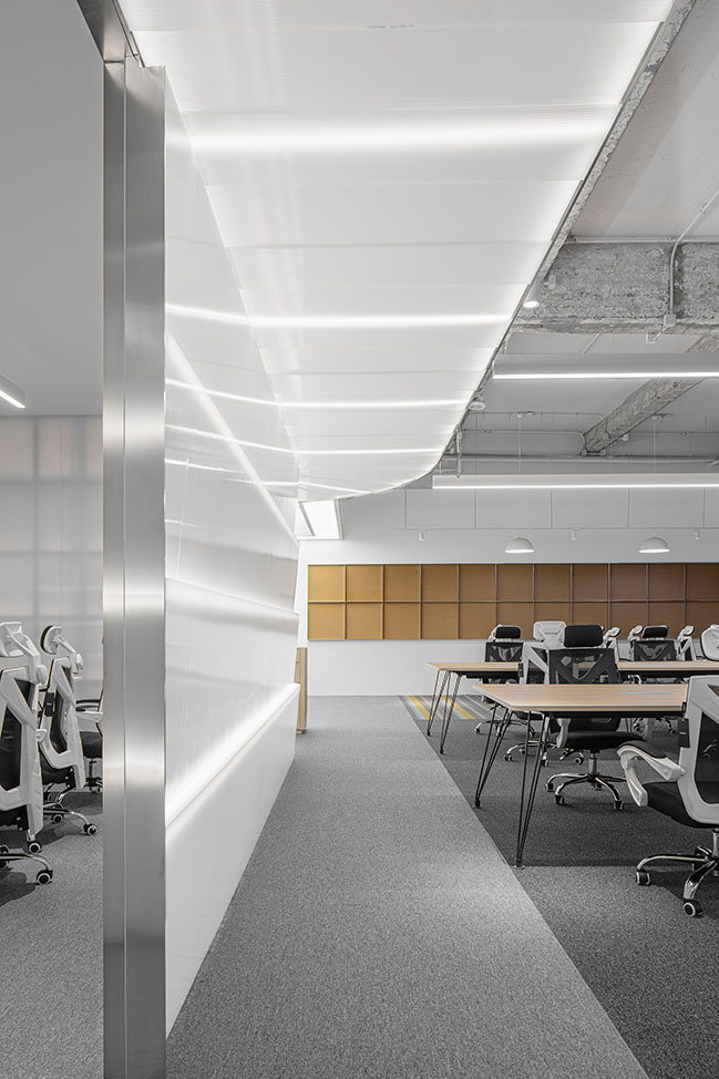
The disappearing "pavilion posts" blends the space into its surroundings, leaving the luminous roof float over, extend upward and subtly define the place. Once into it and looking back, one will find the landscape vestibule "framing a view" again, of the installation within the doorway, realizing the varying scenery with continuing motion in a garden.
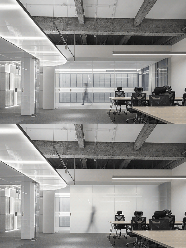
Eaves Garden - As A Public veranda
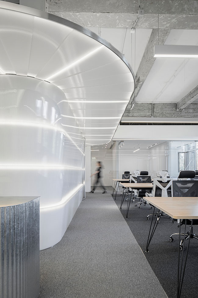
Behind the reception desk is a white translucent light box placed in the central axis, flanked with office areas on both sides that share it as the meeting room.
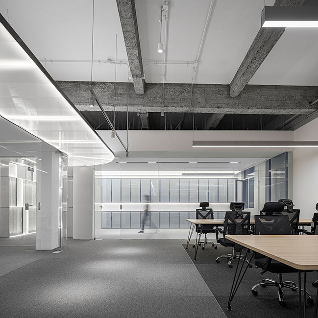
"If totally open, a regular-planned office will be devoid of organization and layering. A box placed in the central axis, being translucent instead of completely closed, will bathe us in the natural light," introduced AtelierTree.
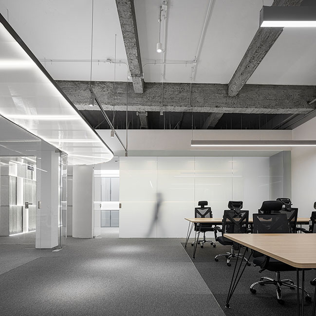
The inserted "light box" as a meeting room thus functionally divides there into two office areas with a convergence point in the middle. Close around the conference room, formed a circular circulation highlighted with the garden imagery right overhead, namely a continuing eaves that vibrates with the open office as if the veranda in a garden.
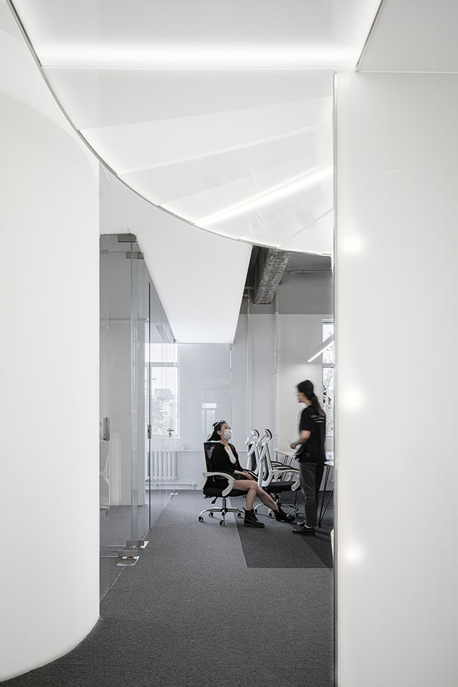
On one side is the office, on the other the light-transmitting wall that separates the meeting space, while the floating eaves defines the circulation area, together forming a hierarchy of dynamic and static spaces that relieves one another into scenery during the user's motion around.
Cave-cosmos - As the Connection
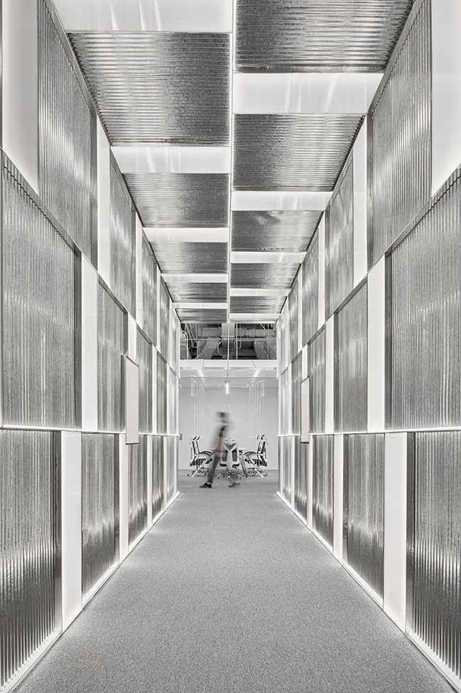
A doorway-style corridor connects the inner and outer office areas.
The original load-bearing wall, a masonry structure, restricts the space but also contributes to a new inspiration, for the client's needs have led to separated various functional spaces, now well connected into a "cave-cosmos" evocative of the garden. The elongated cave-like corridor connects the two office areas - "a new garden unfolds in the peach-blossom springs".
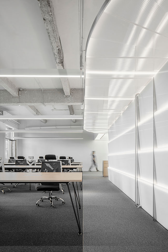
"This cave-like corridor feels as if walking through under the secluded cave of a rockery in a garden. Meanwhile the carefully arranged natural light shafts on both sides interwoven with different levels of artificial lights also make the space befit displaying photographic works and artistic creations," so introduces AtelierTree.

Communal Courtyard - As A Public Venue
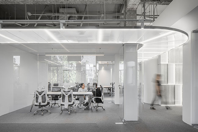
Passing through the "cavernous" corridor, one reaches a relatively small office area. Unlike the outer large office area being open and not without partition, the inner office area is divided into smaller units with an emphasis on connectivity.
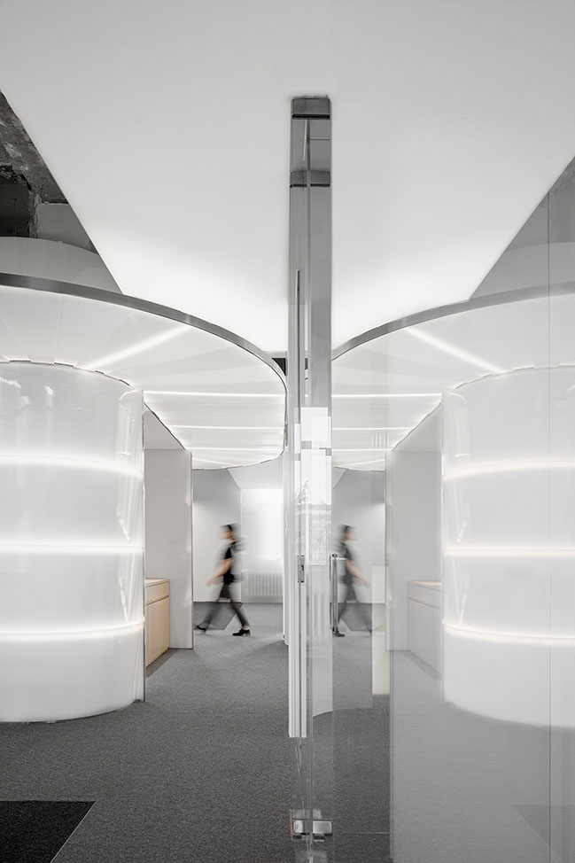
The meeting room in the center continues the central axis of the space while divides the space with transparent glass, so as to strengthen the overall visual connection by penetration of sight on both sides. The veranda around it with overhanging eaves, matched with transparent wall, is an aesthetic incarnation of the lattice-windows in a garden, simply as the poem goes, "how deep is the deep, deep courtyard", the seemingly blocked, actually continued multi-layered scenery of the traditional garden.
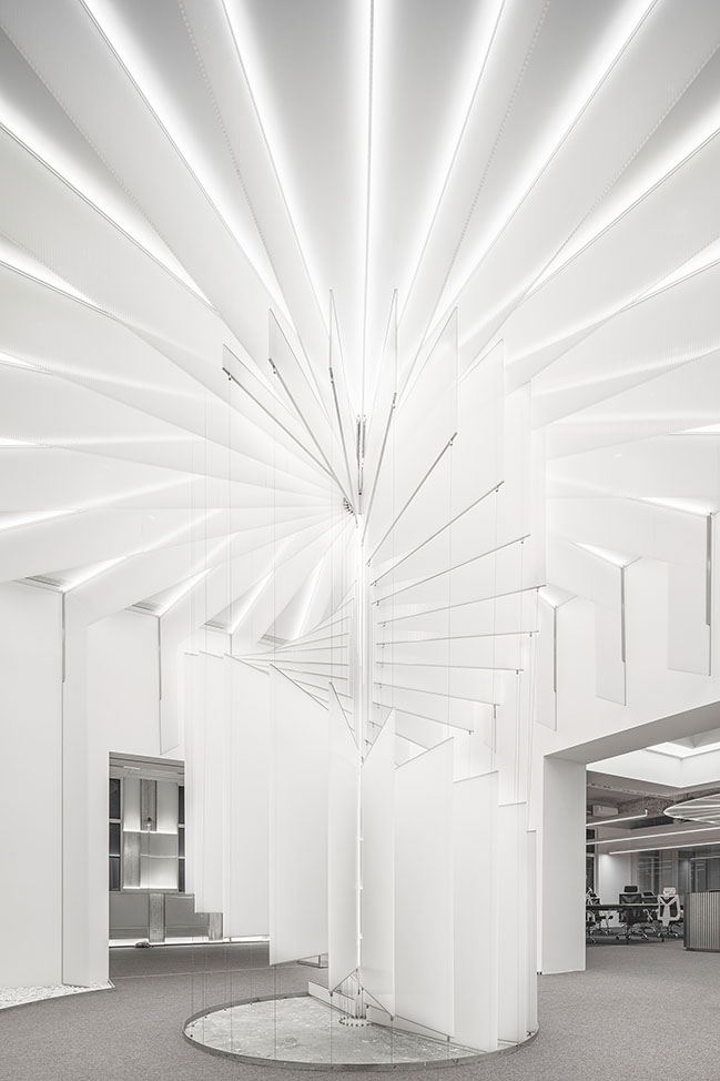
While delineating a cyber interface with uniquer form and materials, AtelierTree also infuses a "tour of the garden" with subtly-organized spaces, their latest practice by now that attempts on blending tradition with future. In the meantime of controlling the cost reasonably, an efficient collaborative office space comes into being with humanistic care, visualizing the possibility of brand new expression of office spaces in dialogue with the tradition, in the very present prevailing with futuristic and technological sense.
Design Firm: AtelierTree
Client: Beijing Big Door Interactive Technology Co.
Location: Chaoyang District, Beijing, China
Year: 2021
Area: 800 sqm
Lead Architect: Casen Chiong
Design Team: Huang Xiaokun, Zhai Shuoguo
Constructor: Beijing Giant Ant Architecture & Decoration Co.
Lighting Consultant: Wang Honglei
Photography: UK-Studio
YOU MAY ALSO LIKE: Hidden Garden in Shanghai by 100architects
Cyber White Garden by AtelierTree | Ancient garden transported into digital office
11 / 04 / 2021 By contrast, in the Cyber White Garden newly created by AtelierTree, a single white-washed, sharp-cut and at-hand material exerts a novel sense of technology...
You might also like:
Recommended post: agrAir installation by Piuarch at Milan Design Week 2018
