05 / 13
2019
ANGLE is a lifestyle concept store in Shenzhen, China that combines cafe, art gallery, and boutique. It is co-created with Charles Wang, co-founder of DONGLIANG. The project is located in South Area of No.1 Shenzhen Bay with a 300 sq. m space. The client hopes to see not just a boutique & cafe but one that is multi-functional, fun, and can differentiate itself from traditional boutiques.
Design Firm: Various Associates
Location: South Area, N0.1 Shenzhen Bay, Shenzhen, China
Year: 2018
Area: 300 sq.m.
Main Designer: Dongzi Yang, Zuoqian Wang
Project Leader: Qianyi Lin
Textile Designer: Litian He
Photography: Shao Feng
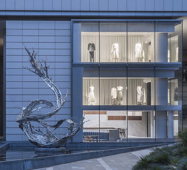
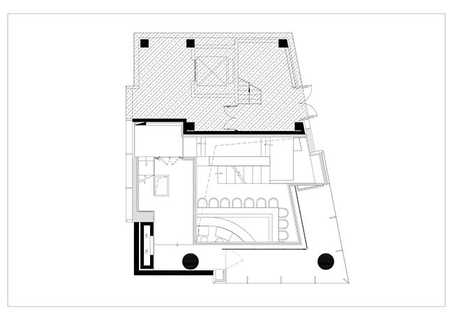
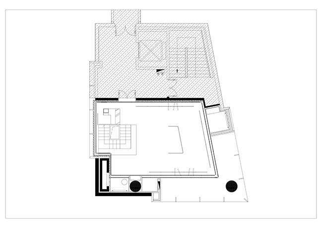
Project's description: The space was originally two separated floors. VA suggested using stairs to connect them. While improving business dynamics, the staircase can also serve as an exhibition stand. The ground floor is a cafe that can also be used as gallery space; the second floor is a high-end womenswear boutique. In addition to meeting the client’s needs, VA hopes to maximize the opportunity to showcase exhibits and give the space more uniqueness through the spatial language of stairs. In this way, customers can feel different sense of space and playfulness when traveling between the floors.
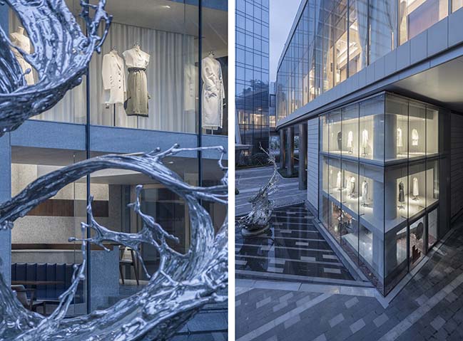
Meanwhile, as it is located at a street corner, which allows it to have two continuous glass shop windows, VA chose to incorporate the art of window display to the greatest extent, making it a design highlight of the interior space.
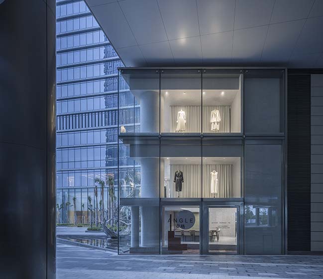
Considering the attribute of ANGLE as a boutique, VA maximized the usage of the glass facade by adding two layers of corner shop windows, so that it’s bright enough for people to clearly see the display from a distance.
With a 1.5 m depth outward window display, it not only solves the problem of outside light pollution and glass reflection, but also maximizes the shop display space. This ensures the independence of interior light source, while showcasing the clothes in a perfect manner.
At the street corner of this thriving commercial area, ANGLE’s personality shines through with its own design language.
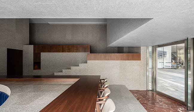
Ground floor overview: The layering of space provides people with a different routing experience from usual.
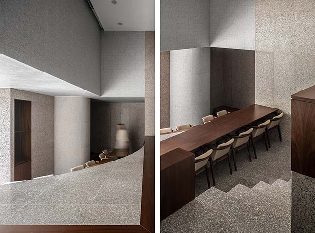
The food deliver window resembles a delicate display window, with the kitchen hidden beneath the stairs. This perfectly breaks the limitation of the original space and adds in more depth, thus highly improves the utilization of space.
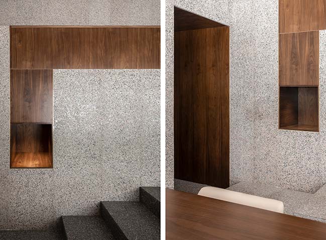
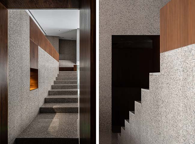
While the staircase serves as the way to second floor, it can also be used for exhibition. The stair step design maximizes showcase of all exhibits. This progressive movement guides customers and exposes them to more and more products as they walk up.
YOU MAY ALSO LIKE: UPAR Flagship Store Lighting Design by GD-Lighting Design
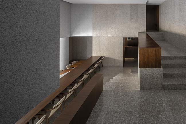
The layered structure allows people to be able to see various views and feel different senses of space depending on where they stand.
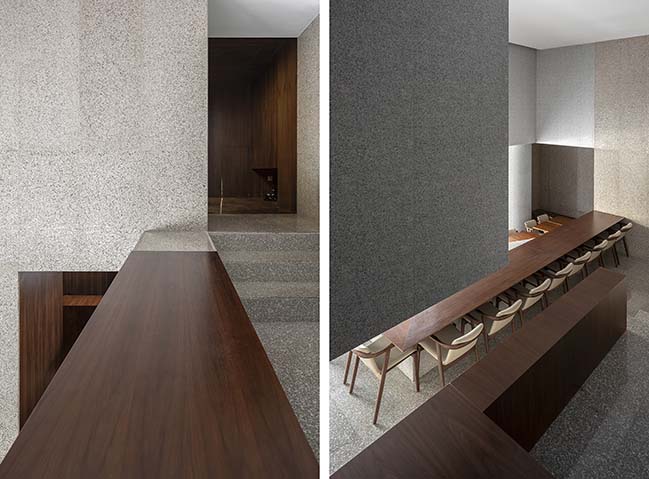
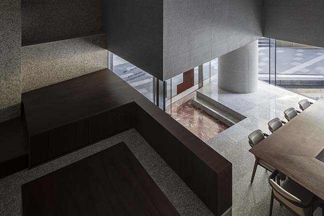
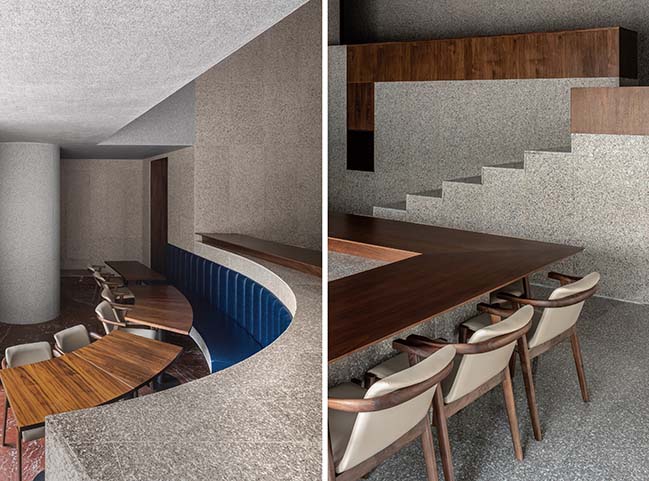
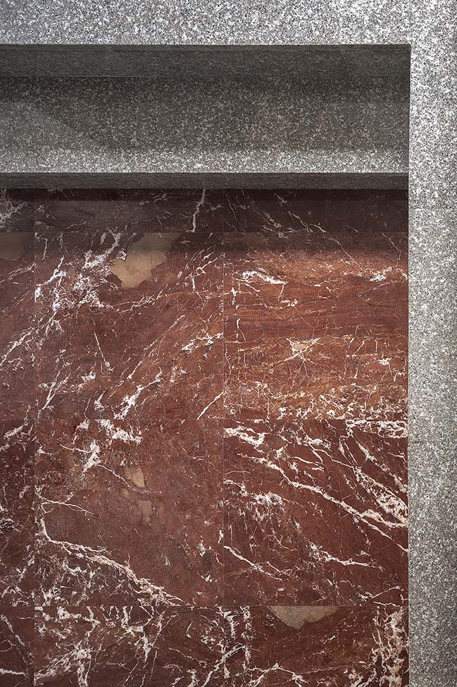
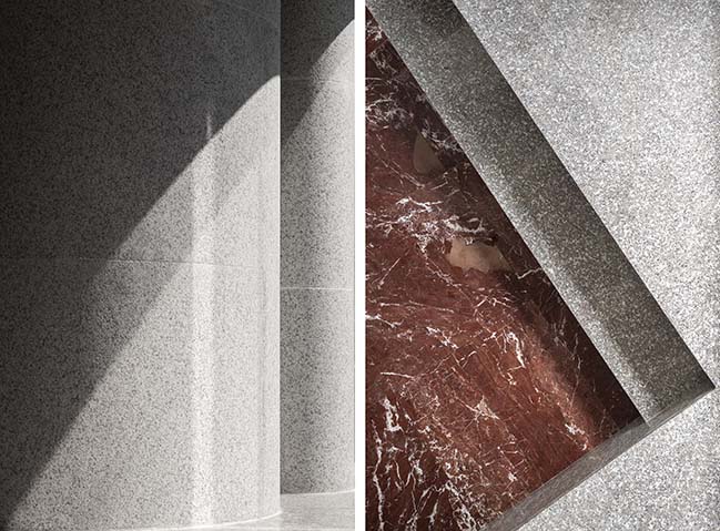
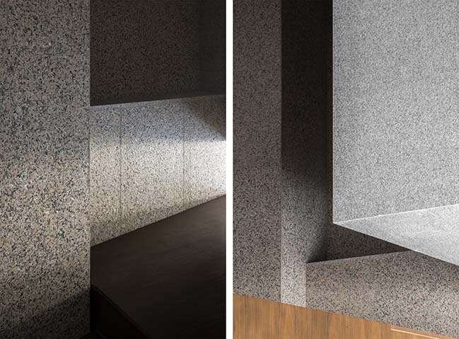
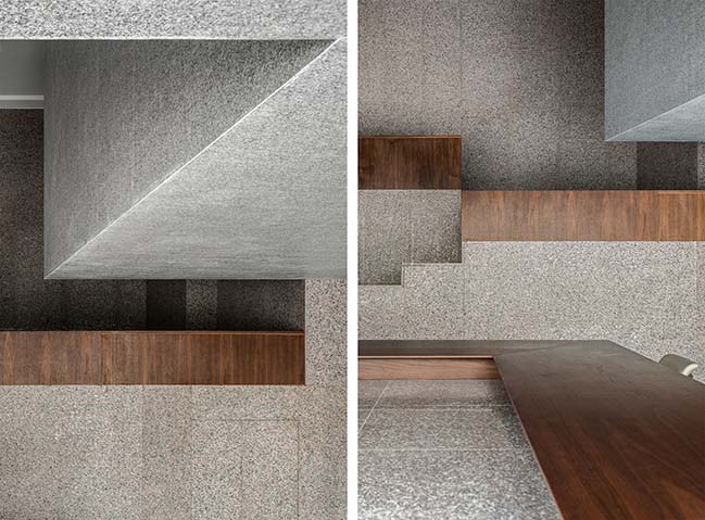
The mix-and-match of granite, walnut, red marble and indigo blue leather makes a timeless combination that is not easily affected by the current trend. The diverse spatial layers highlight the fusion of various materials and natural light.
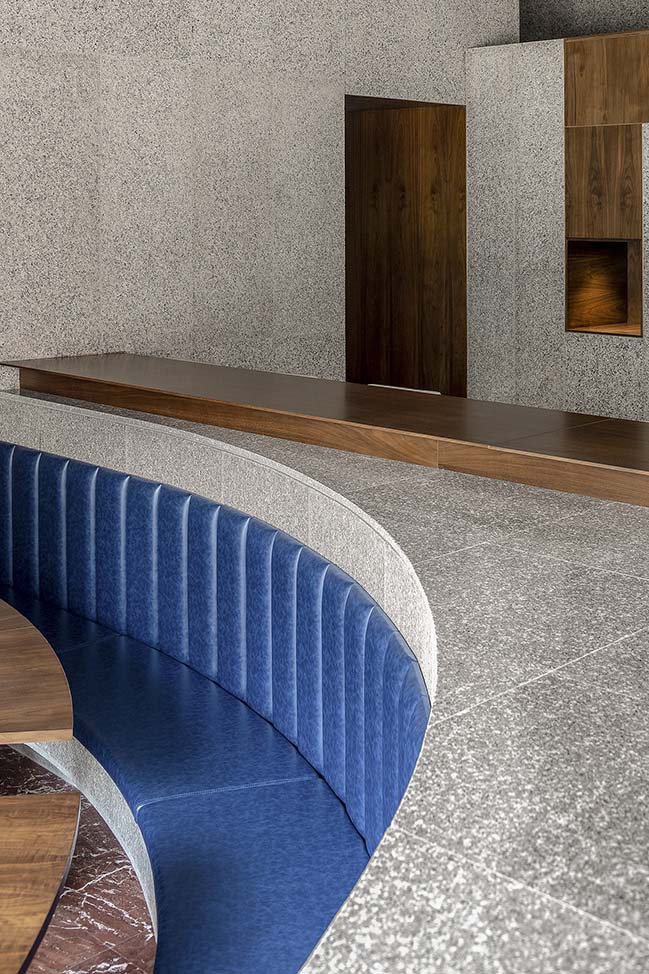
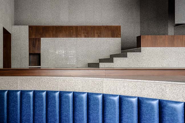
From the outside, the entire space extends from the bottom up, which is full of tension and layering while creating more walking paths for people and adding playfulness to the space. By this means, the utilization of height breaks limitation of space.
YOU MAY ALSO LIKE: United Cycling Lab & Store by Johannes Torpe Studios
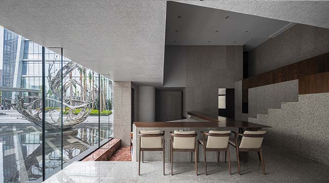
Looking from the entrance, the cafe area is divided into upper and lower levels. Seats on the lower level are relatively more private and have the best outside view. Sitting on the upper level seats allows you to have both outside and inside views. This feels subtler without the worry of being blocked by the front row.
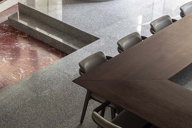
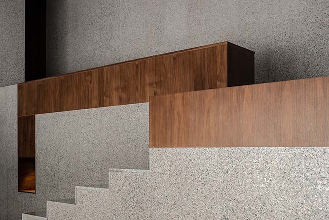
The details show the contrast in color, texture and form between two types of stone.
YOU MAY ALSO LIKE: ALEKSA studio designed flagship stores for eyewear brand For Art's Sake in London and Shanghai
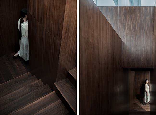
Wandering around the walnut staircase
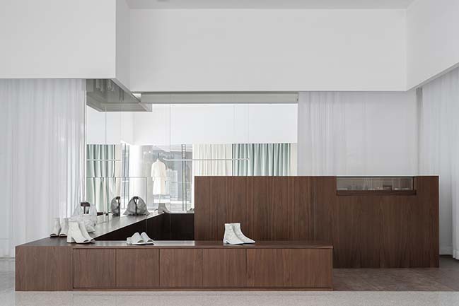
Overview of second floor boutique
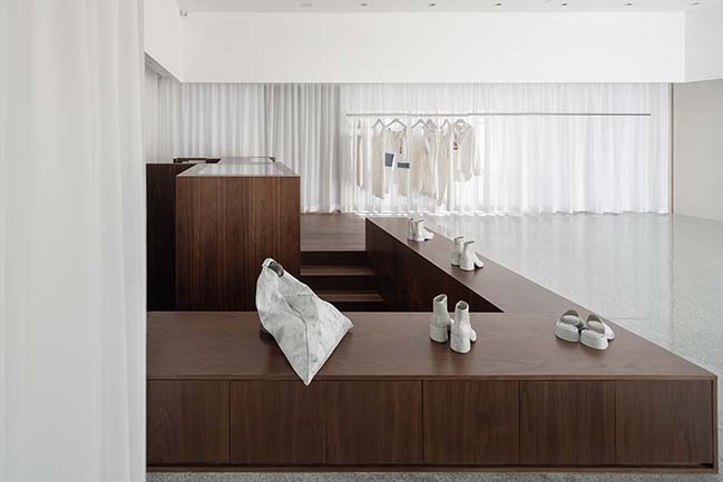
The clean, quiet and comfortable environment makes the shopping experience very relaxing. The height of the low platform can be used as display stand as well as seats when needed. The display racks are arranged in a wraparound manner to avoid dead corners, so it is more convenient for customers to shop around.

Cashier desk and accessories display stand.
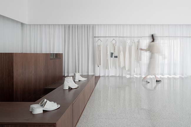
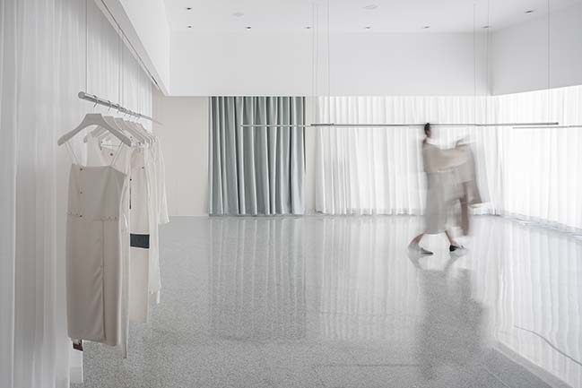
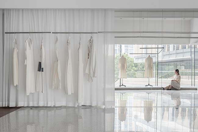
Outside the curtain is the independent window display area. When there is an event, it can also be combined with the interior space by opening the curtain.
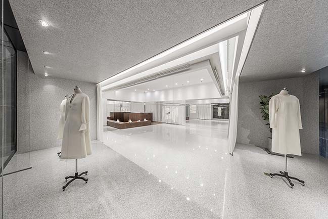
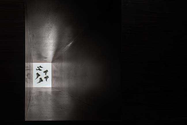
The display stand that connects ground floor counter and second floor makes the spaces more interesting to explore.
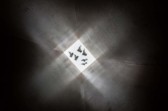
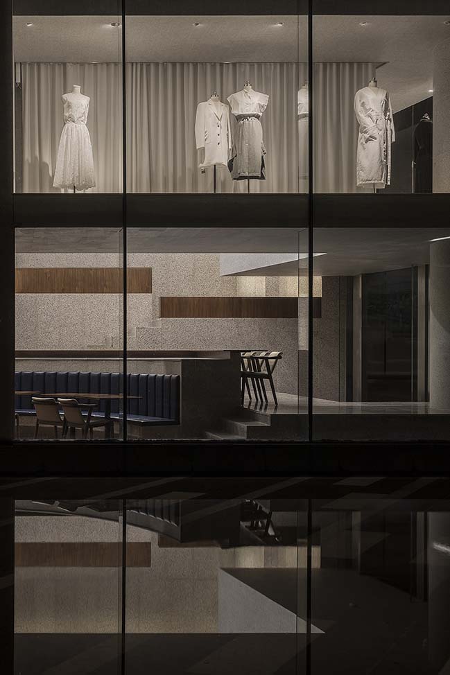
The spatial interlacing of window display and cafe area makes the interior more fun and unique.
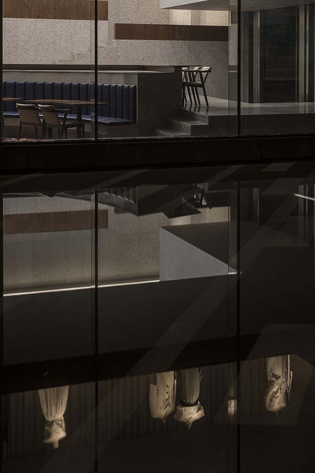
Looking from the outside at night, with the water in the pool reflecting the interior, it feels like being in the midst of another reality.
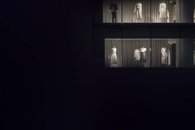
The window at night looks soft, clear and high-end.

ANGEL by Various Associates
05 / 13 / 2019 ANGLE is a lifestyle concept store in Shenzhen, China that combines cafe, art gallery, and boutique. It is co-created with Charles Wang, co-founder of DONGLIANG
You might also like:
Recommended post: The wooden house by Micaela Colella and Maurizio Barberio
