11 / 07
2018
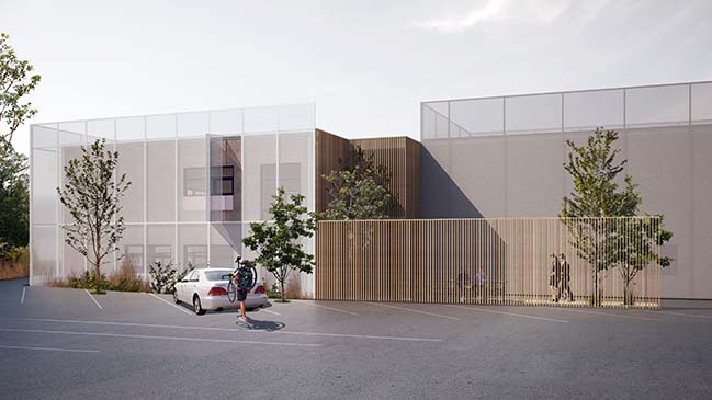
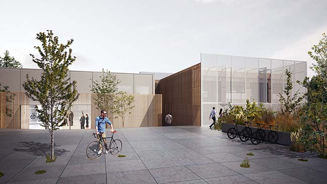
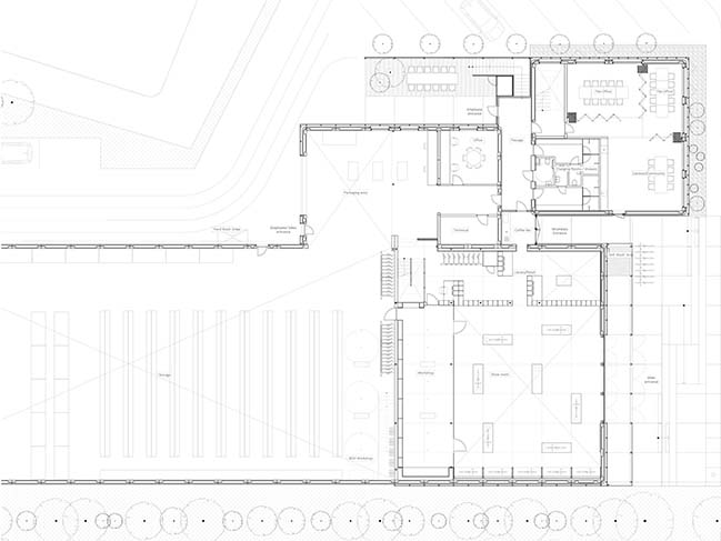
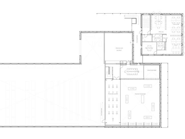
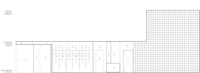
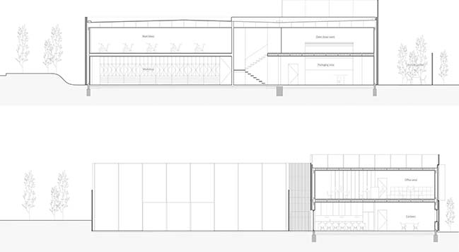
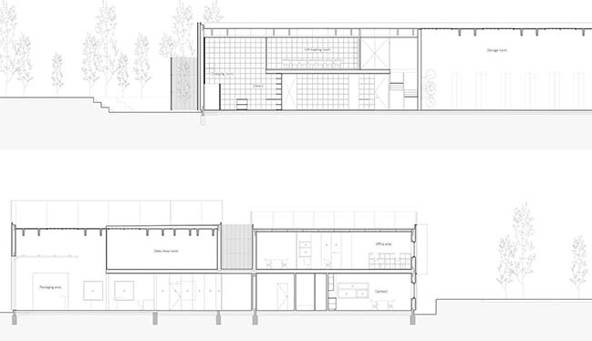
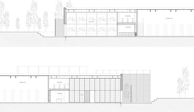
A dull industrial building from the 1990s has been transformed into a retail experience and Head Quarters for the Danish agency of Argon 18-bicycles. The store includes a product gallery with accessories and spare parts, a workshop, a bike-fitting area and offers training facilities on Watt bikes. The full project comprises of office facilities, meeting rooms, cantina, storage facility and an outdoor plaza by the main entrance, perfect for industry meet-ups and events.
Architect: Johannes Torpe Studios
Client: United Cycling
Location: Lynge, Denmark
Year: 2018
Area: 1,650 m2
Creative Director: Johannes Torpe
Project Leader: Kit Sand Ottsen
Design Team: Karolina Pajnowska, Rachel Jayne Mackay, Suguru Kobayashi, Allan Sejer, Allan Kruse
Photography: Alastair Philip Wiper
Video: Peter Larsen, LRSNStudio
DESIGN CONCEPT - The design concept draws its inspiration from the detailed engineering of a carbon fiber bicycle. It seeks to highlight the dreams and engineering that the bicycles represent. We have done this by juxtaposing the world of nature and science and the meeting between man and machine.
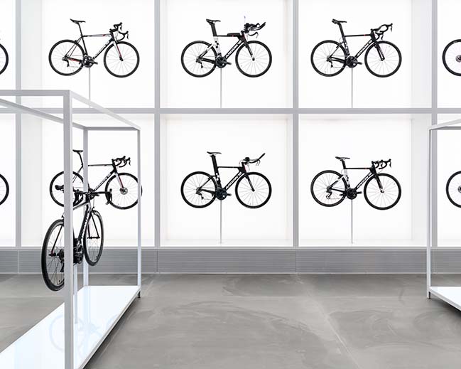
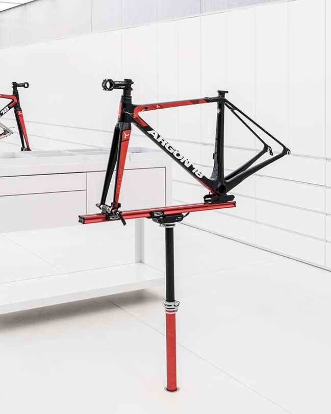
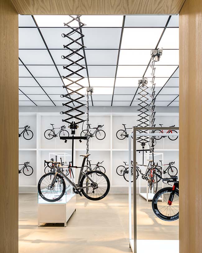
The architectural design follows a tight grid system that is introduced throughout the building and perhaps is most noticeable in the interior design. This choice pays tribute to the precision of the products and ensures a modular and scalable retail solution for a global rollout.
“In just over a year we have succeeded in turning 1650m2 of storage space into a modern, accessible and welcoming piece of architecture and an unparalleled retail experience.” - Johannes Torpe
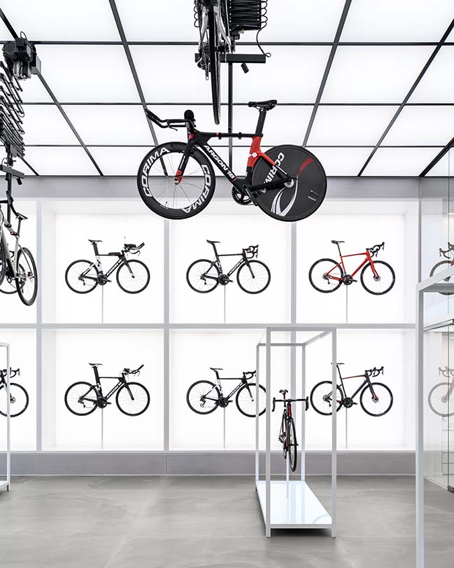
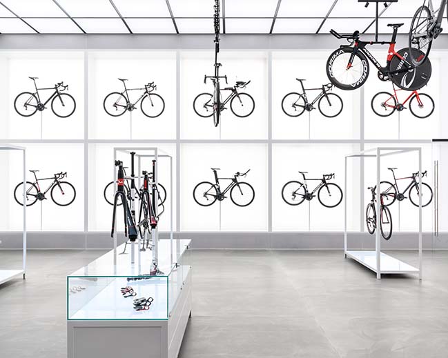
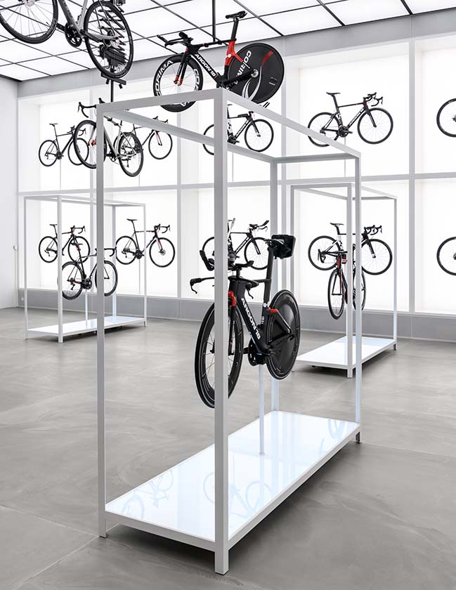
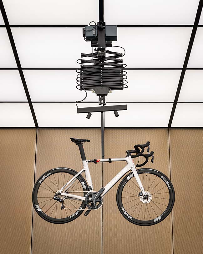
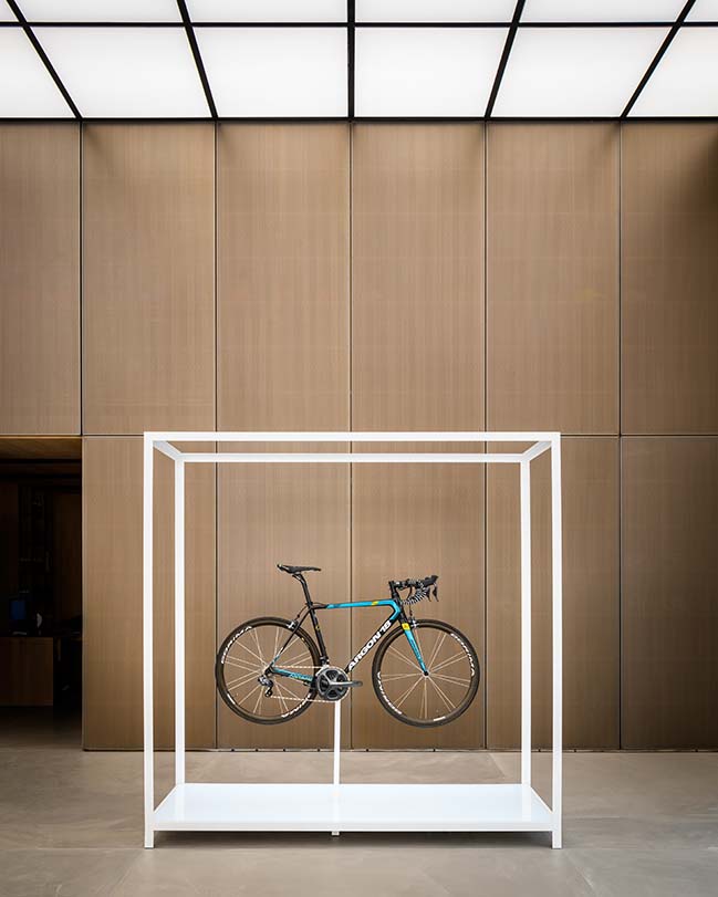
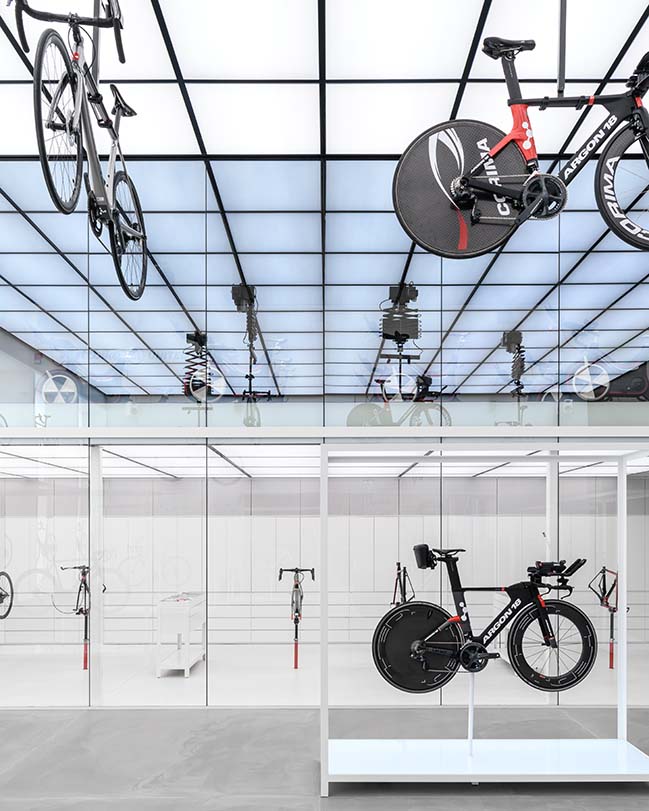
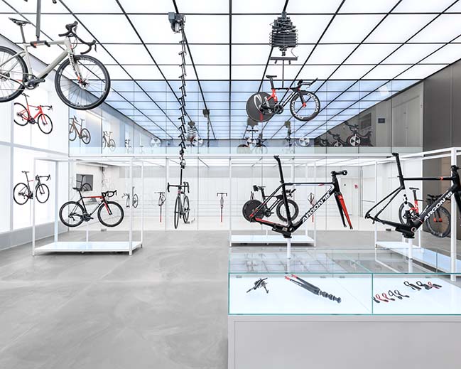
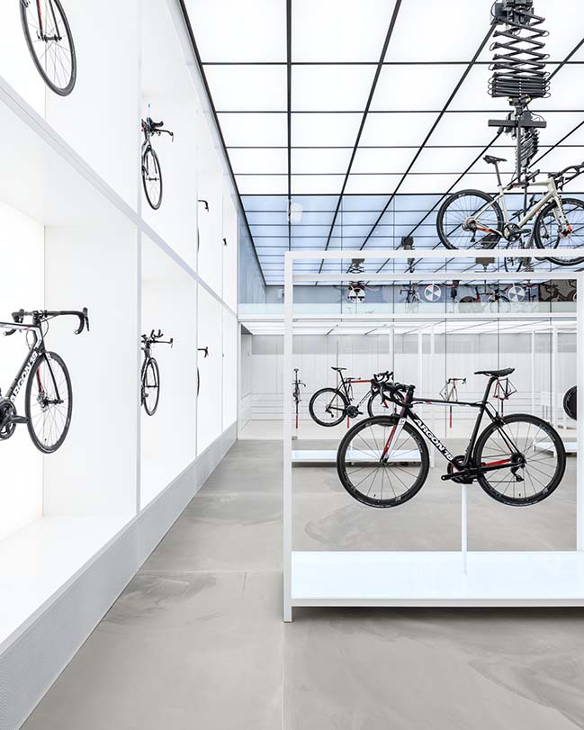
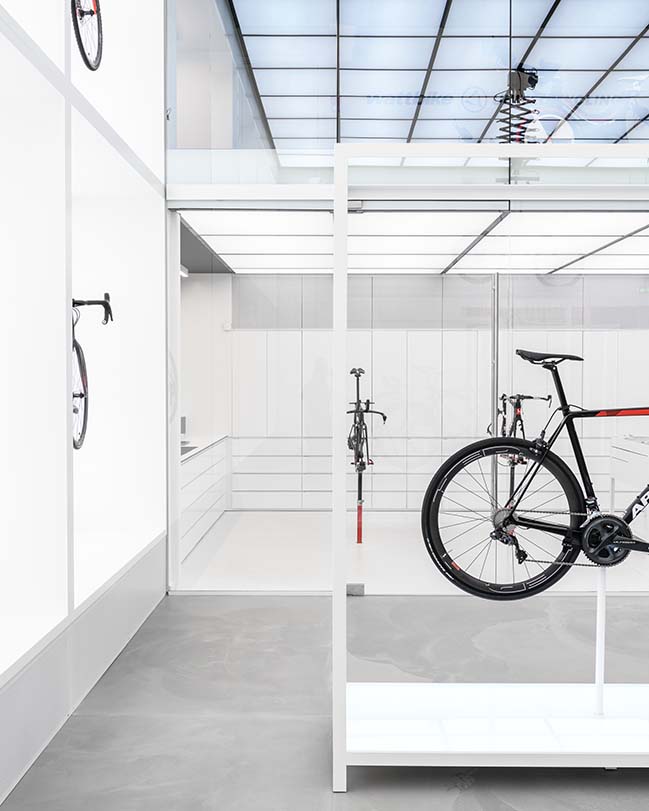
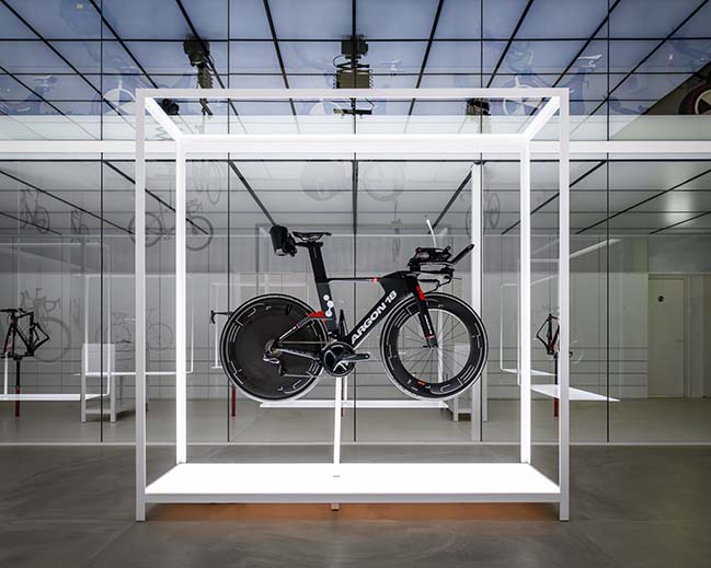
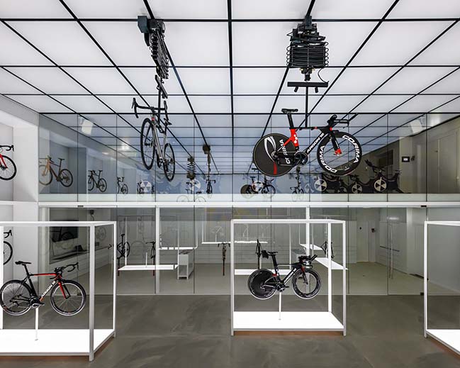
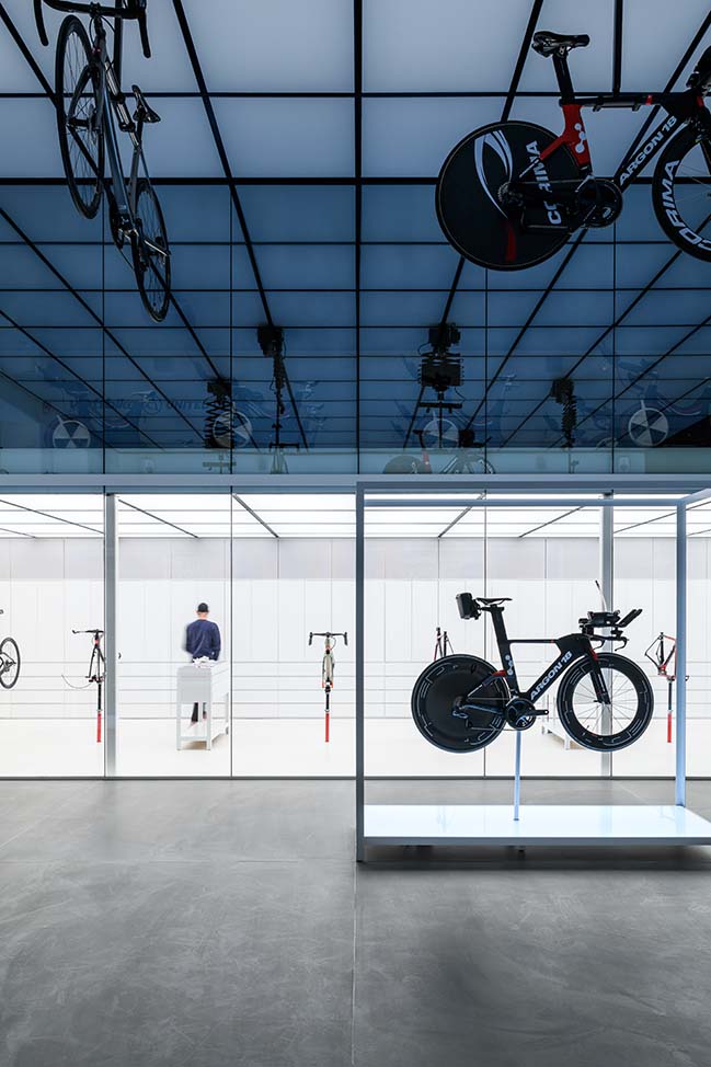
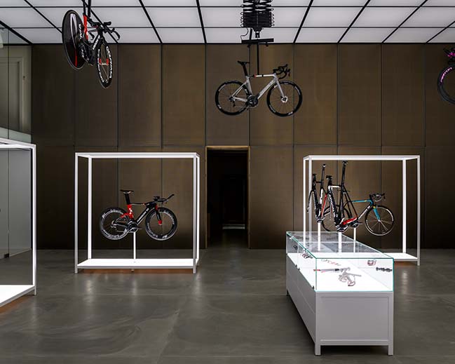
THE SHOWROOM IS THE CHAPEL - Concrete floors, bright white walls, custom built illuminated product display furniture and 6 meter ceiling heights with white luminous ceiling panels make the impressive framework of the showroom. One wall is a customised illuminated display for 8 bikes and suspended from the ceiling are five pantographs that elegantly display a selection of bicycle prototypes. With the click of a button, they can be lowered down for inspection by the customer. Mechanical, old fashioned and tactile all at once. Five display elements with lit surfaces and a cabinet box allow customers to take a closer look and feel of the individual bike parts.
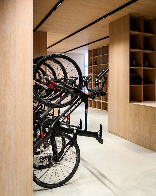
The south wall separates the showroom from the product gallery and is covered in perforated raw steel plates with a brass mesh attached on the backside. Through the perforations one can sense the inviting and cozy space of the product gallery. Here customers can find top-tier equipment and spare parts elegantly presented on costumised oak display units. Moving from the cozy wooden nest of the gallery into the grandiose, white and almost sterile showroom is a transition that displays the contrasts between nature and science, simultaneously combining the world of men with machines. It is a transition from low to high ceiling and from darkness into light.
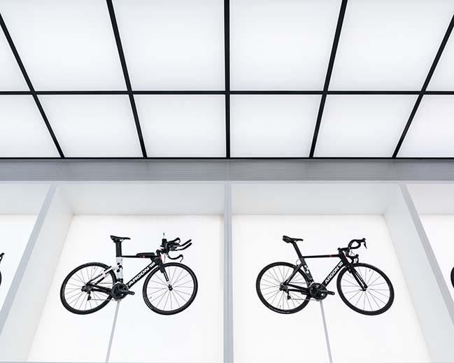
The showroom is designed to elevate the bicycles and display their sovereignty. It is a chapel for the bicycles. It offers an invitation to admire the products for their technical superiority, to inspect and touch them. All elements in the showroom and the product gallery follow the same gridlines. The combination of precision and the very technical products on display creates a clinical yet ethereal atmosphere – almost like entering a sci-fi laboratory.
MATERIALS & TRANSACTIONS - The carbon fiber bicycles from Argon 18 are some of the lightest in the world and inspired us to choose materials that exude lightness and have an airy yet industrial feeling to them. Bringing the larger theme of nature versus science into play, warm and natural materials such as oak are juxtaposed by the cold industrial feeling of concrete floors, black steel, reflective glass and illuminated ceilings.
The existing façade has been covered in white perforated aluminum plates; A material that references both the lightness and the precise engineering of the bicycle. By the entrance areas and passageways the facade material change to wooden lamella. All the functions inside the building are equally connected by different transparent materials such as perforated metal plates, wood lamellas and glass walls. Combined with the open space it allows for a full overview of the world of high-performance cycling – from the physical to the technical realms.
LANDSCAPING - The new main entrance has been established with a plaza designed for industry meet-ups and client events. Next to the main entrance a bike parking and cleaning station with air pump and running water is established. The square is set with rectangular concrete tiles referencing the modular façade on the building and the floor in the showroom.
United Cycling’s new HQ and showroom is truly a space allowing a full experience of the world of professional cycling.
“In short, we have designed a retail space that fosters knowledge, learning and innovation and perhaps even more important, inspires people to dream.” – Johannes Torpe
> YOU MAY ALSO LIKE: The Maersk Tower in Denmark by C.F. Møller Architects
> YOU MAY ALSO LIKE: The new Panda House in Copenhagen by BIG
United Cycling Lab & Store by Johannes Torpe Studios
11 / 07 / 2018 A dull industrial building from the 1990s has been transformed into a retail experience and Head Quarters for the Danish agency of Argon 18-bicycles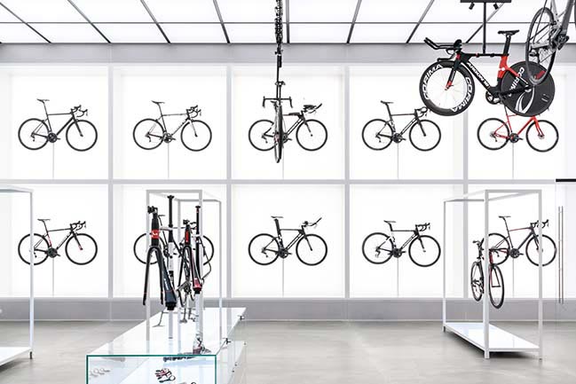
You might also like:
Recommended post: Amazing cardboard tubes architecture of Abu Dhabi Art Pavilion
