05 / 11
2020
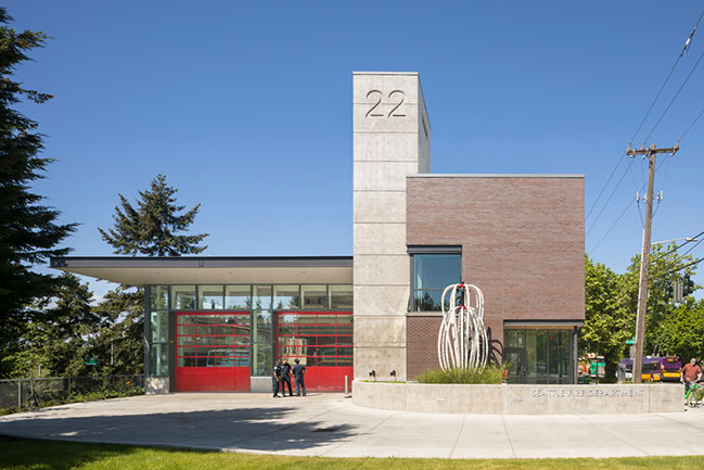
Fire Station 22 was conceived in response to two fundamental constraints: a very small and narrow site, and an operational imperative for a drive-through apparatus bay...
Architect: Weinstein A+U
Client: City of Seattle Department of Finance & Administrative Services
Location: Seattle, WA, USA
Area: 1,030 sqm
Weinstein A+U Team: Ed Weinstein, Kirsten Wild, Lauren Rock
Photography: Lara Swimmer
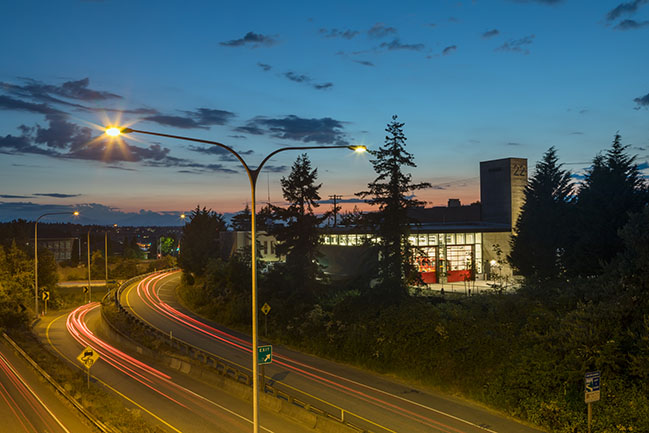
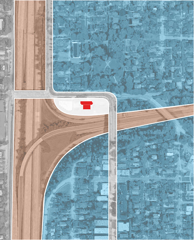
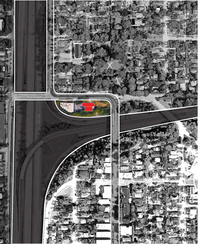
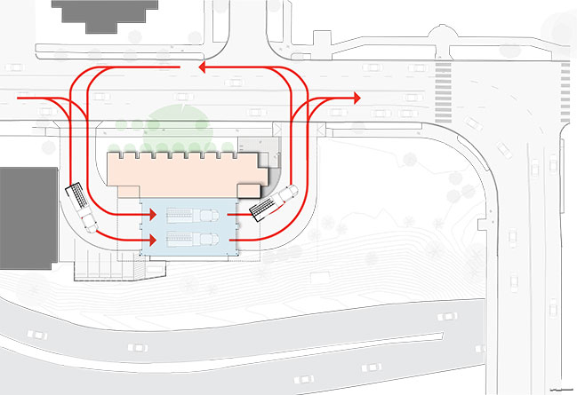
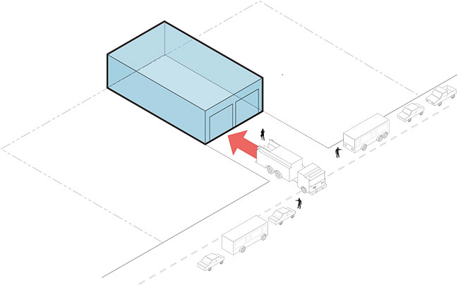
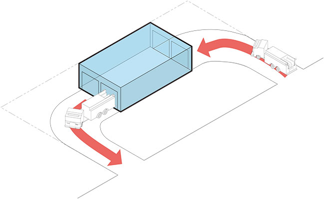
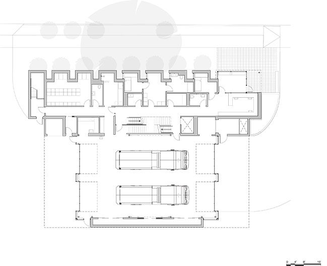
From the architect: The site is located on a heavily trafficked arterial street that leads to a freeway intersection, with frequent back-ups challenging access and egress to the station. The congested street precluded the potential for a conventional back-in apparatus bay design.
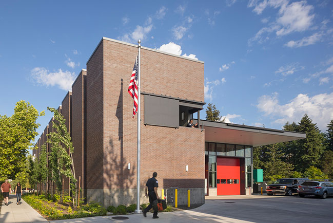
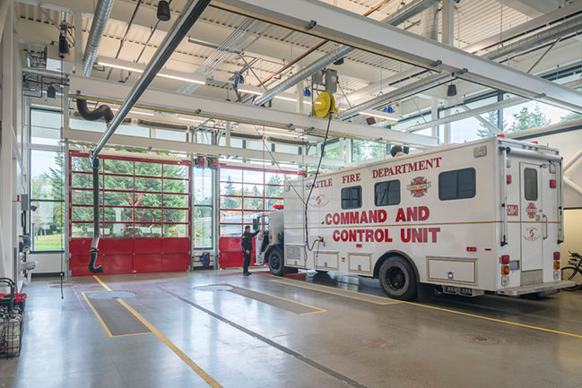
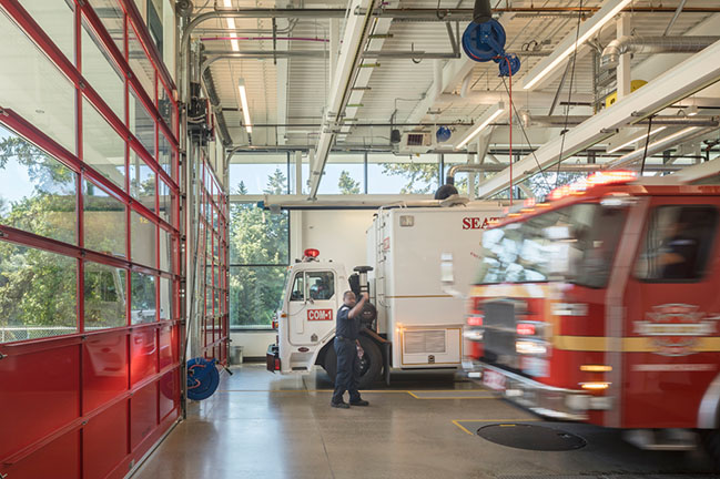
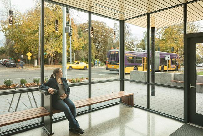
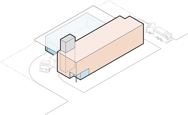
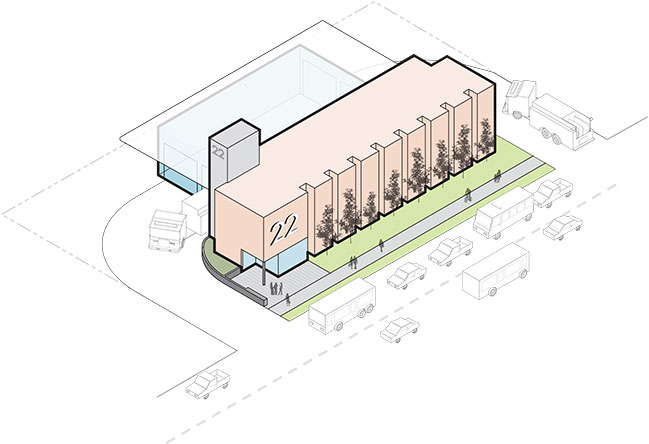
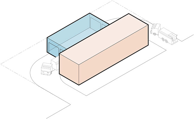
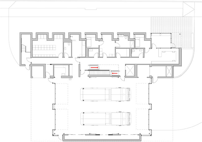
In response to these site constraints, the Fire Department mandated the use of a drive-through apparatus bay. Turning radius analyses determined that it was necessary to place the apparatus bay at the back of the site and then locate all of the normal back-of-house support spaces facing the residential neighborhood to the north. Contrary to the conventions of fire station design, in which the “sexy” apparatus bay is normally perceived as the iconic architectural element, the functional imperative for the drive-through circulation relegated the apparatus bay to a location that was screened from public view and placed the pragmatic support spaces at the public face of the building.
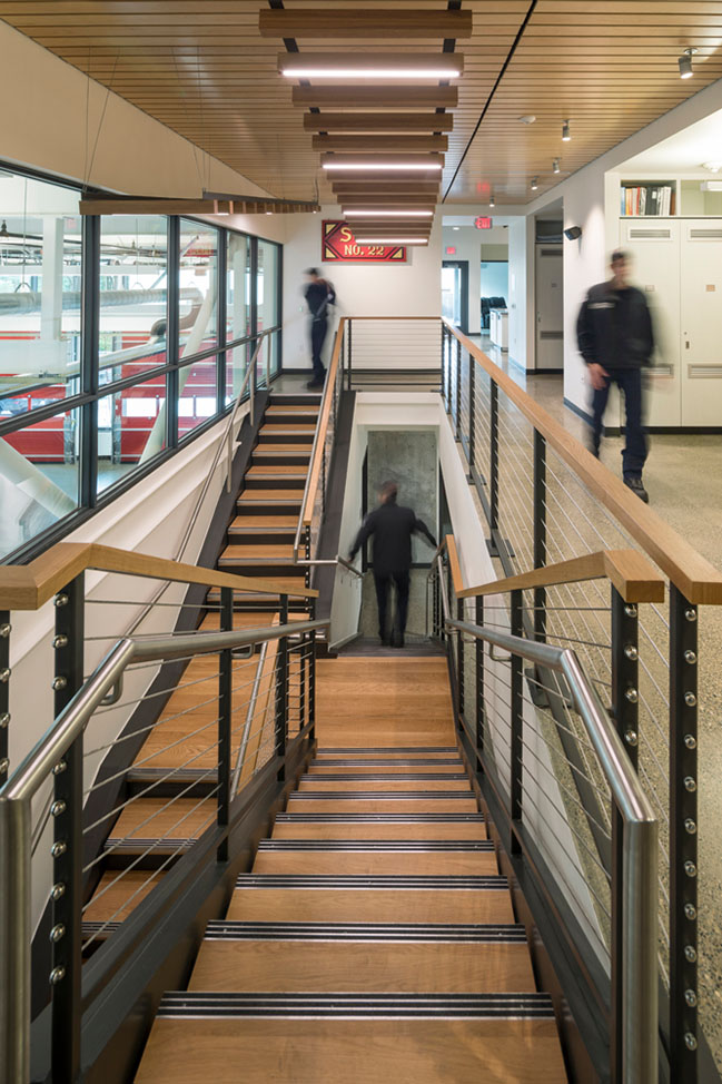
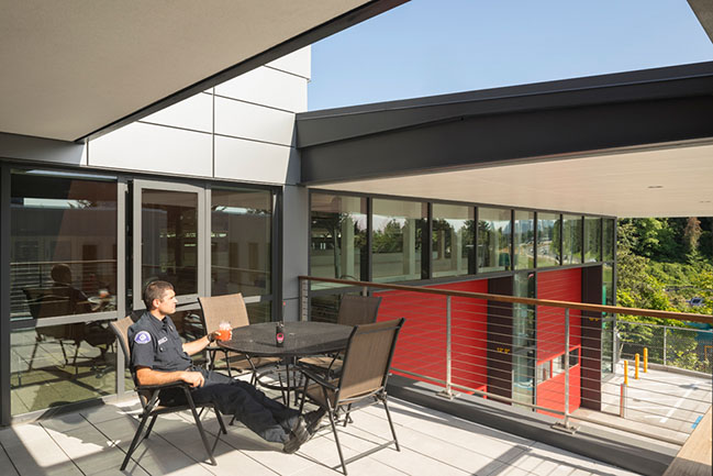
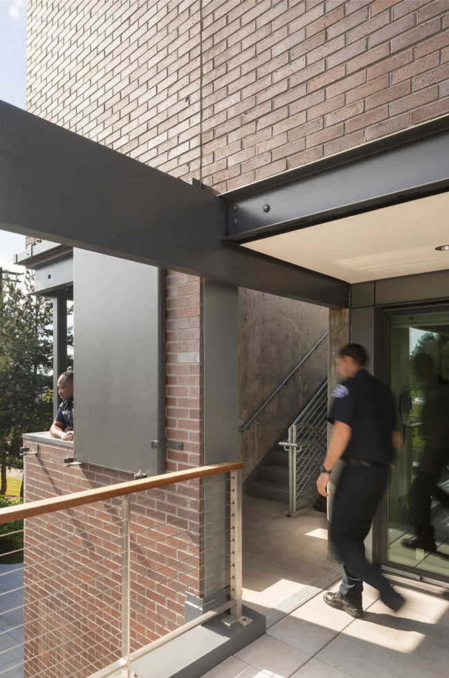
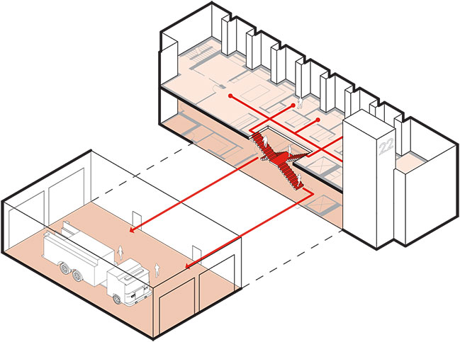
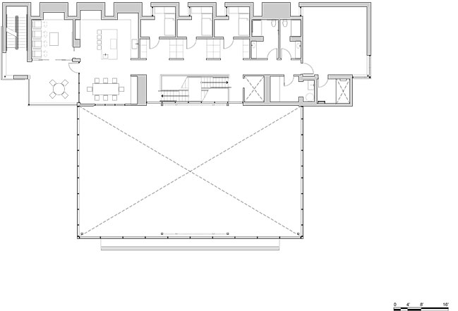
A two-story bar facing East Roanoke Street contains administrative functions and support spaces on the main floor with crew quarters above. In order to facilitate quick response times, a centrally located scissor stair with a shared landing reconciles horizontal and vertical circulation.
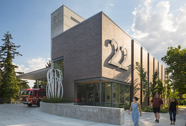
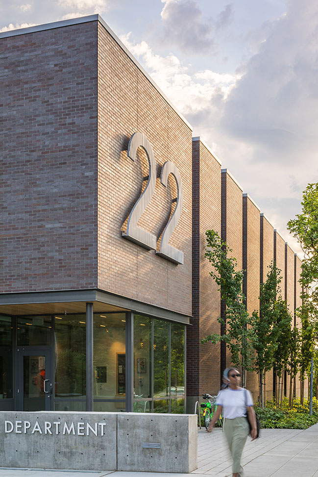
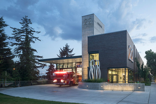
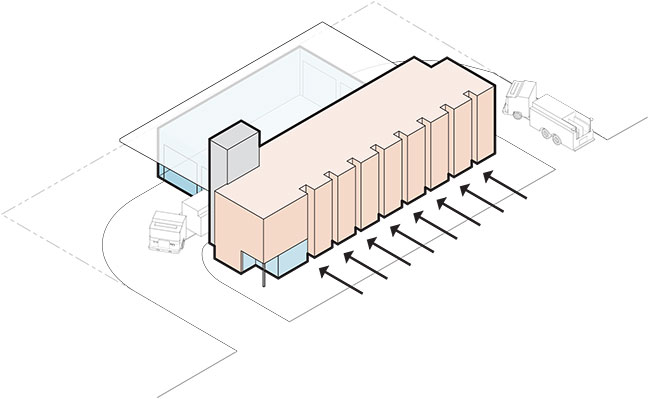
The placement of support and crew spaces on the public face of the building presented a unique challenge to express a “civic” presence for the small structure. The functional imperatives for these spaces require limited windows, eliminating the potential to express the station’s program and activities for public view. In response to this challenge, the north façade was fragmented into a series of crenellations to break down the scale of the monolithic façade and create an essential rhythm that could be perceived by passing vehicles. Bunk room windows were inset within these recesses to provide light and ventilation without diminishing privacy.
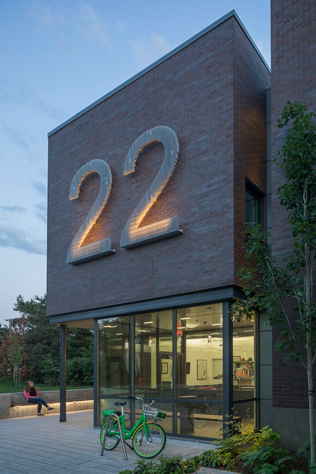
The civic presence of the facility was enhanced with a concrete hose-drying tower that anchors the building, providing high visibility from surrounding freeways and the adjacent neighborhood while reinforcing the strategic location of the station office on its small civic plaza. A super-scaled and illuminated “22” numeral supplements the civic presence of this “small building that lives large”.
Fire Station 22 achieved LEED Platinum Certification with highly efficient mechanical and plumbing systems, PV panels, and the use of harvested rainwater for 100% of the station’s non-potable water uses.
YOU MAY ALSO LIKE: Myeonmok Fire Station in Seoul by Yong Ju Lee Architecture

YOU MAY ALSO LIKE: Misiats Moon station by Dmytro Aranchii Architects
YOU MAY ALSO LIKE: Ultra-Fast Charging Stations for vehicles designed by COBE
Seattle Fire Station 22 by Weinstein A+U
05 / 11 / 2020 Fire Station 22 was conceived in response to two fundamental constraints: a very small and narrow site, and an operational imperative for a drive-through apparatus bay
You might also like:
Recommended post: Brick walls villa in The Netherlands
