03 / 12
2019
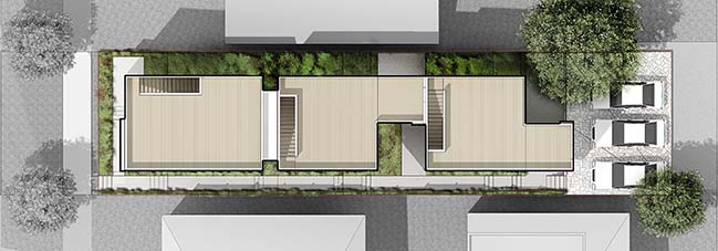
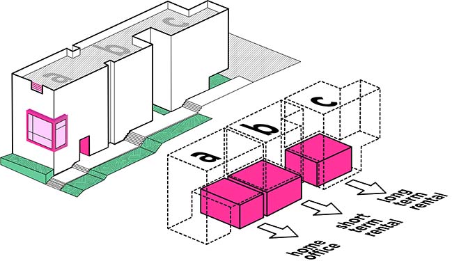
Kailin Gregga of Best Practice Architecture paired with Rob Humble of Hybrid Architecture and Steven Lazen (acting as a sole practitioner) to transform what was a single-family residential lot in Seattle’s Central District into three townhomes (one unit at 1,850 square feet and two additional units at 1,420 square feet each).

Architect: Best Practice Architecture - Hybrid Architecture
Client: Unit A: Aleksey Federov & Nikolay Saprykin, Unit B: Winnie Lam & Sean Gibbons, Unit C: Kailin Gregga & Steven Lazen
Location: Seattle, USA
Year: 2018
Lot Size: 5,760 sq.ft
Total Area: 4,650 sq.ft
Unit A: 1420 sq.ft
Unit B: 1420 sq.ft
Unit C: 1850 sq.ft
Collborators: Steven Lazen - Acting as a Sole Practitioner
Interior Design: Unit A+B: Rob Humble, Unit C: Kailin Gregga and Steven Lazen
Photography: Ed Sozinho
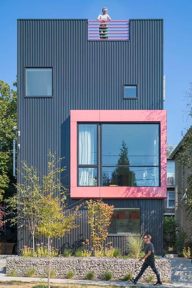
From the architect: Seattle has been home one of the hottest housing markets in the United States for years. And with all that growth comes questions around urban density, affordability and the best ways to address the city’s growing housing needs.
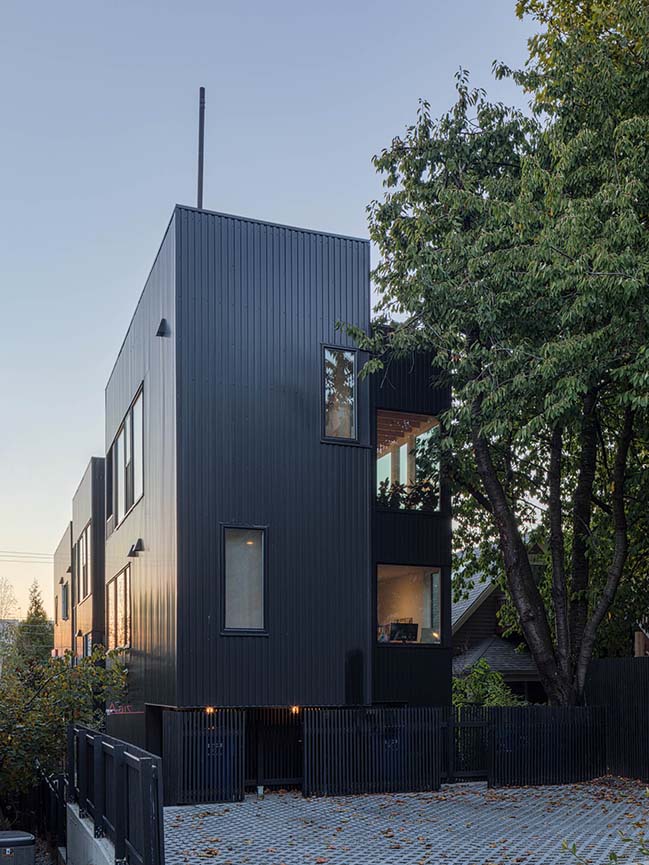
Big Mouth House is an answer to those questions. Developed by three Seattle architects, this small multi-family project is a modern take on what a versatile, forward-thinking, multi-family living can look like. Each unit within the project is a flexible urban home with a studio space on the lower level, a main living area upstairs and a rooftop deck to take advantage of Seattle’s unbeatable city views.
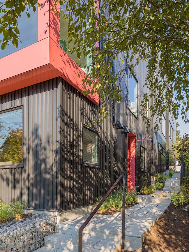
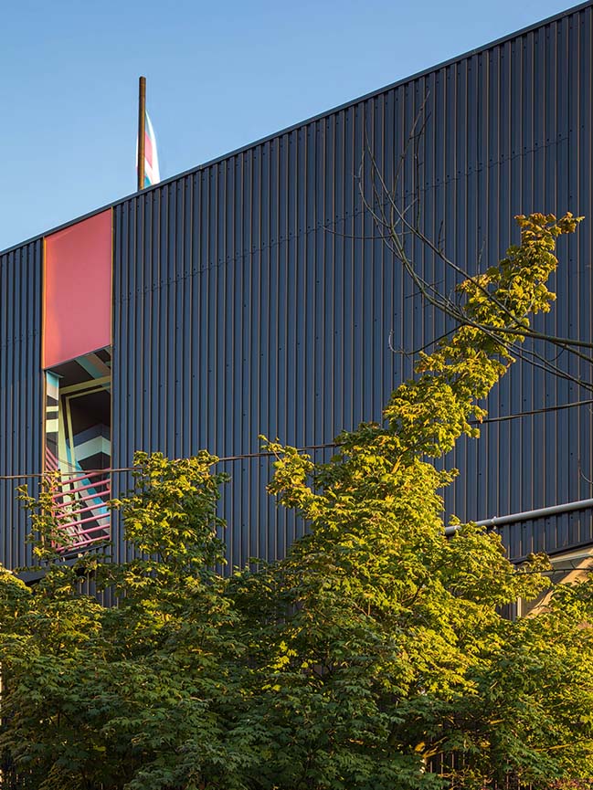
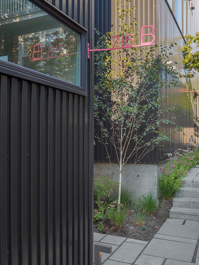
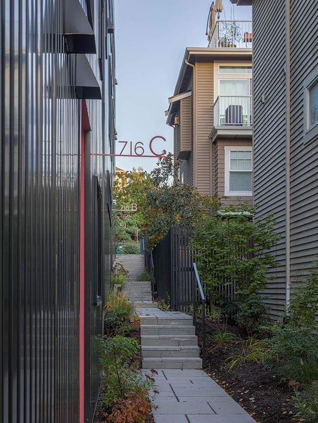
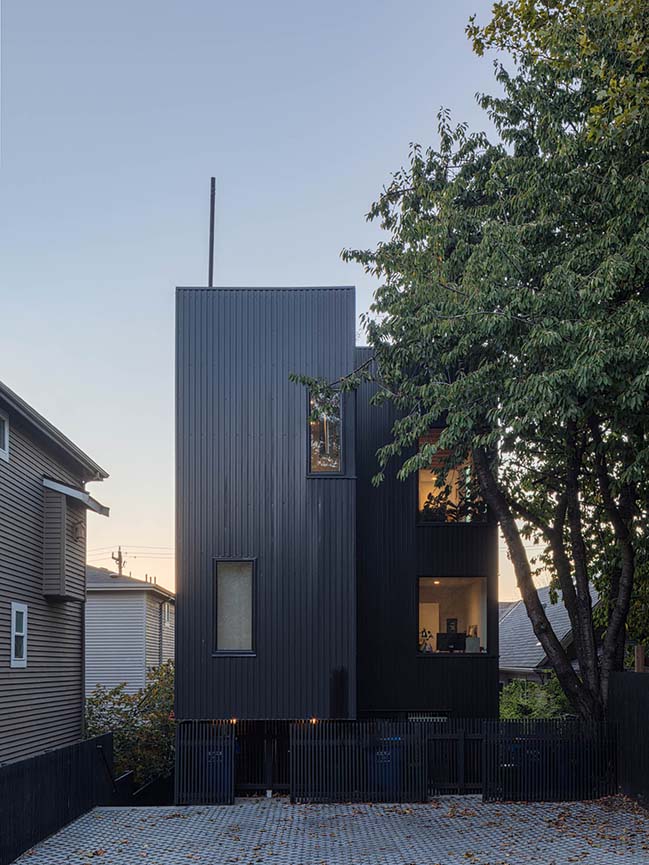
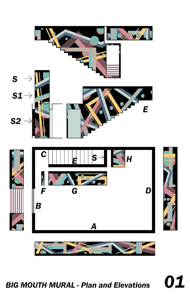
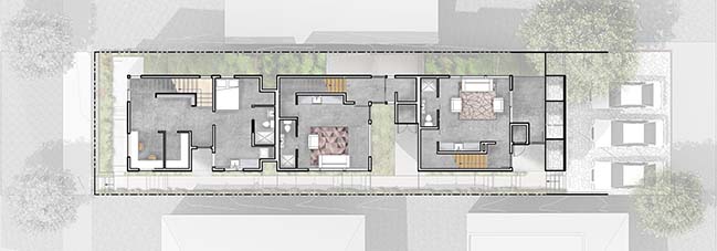
All three units share a lush walkway along the south side of the 5,760 square foot lot. The pathway stretches from the front sidewalk to the communal parking area in the rear alley. Black vertical metal cladding envelops the exterior–bringing a cohesiveness to the three attached homes–and continues as a 2x2 black painted fence that surrounds the site. Custom pink powder-coated panels and railing provide pops of color to enliven the dark facade. Entries to each unit are painted with bright colors and accented with pink signage. And for even more color, the rooftop areas are covered in a geometric mural by Seattle artist SAM WOOD WILSON.
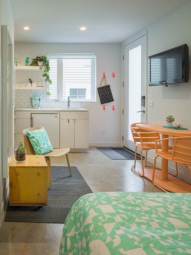
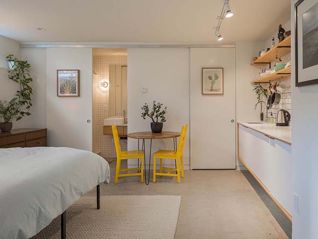
In contrast to the black exterior, the project’s interiors are large, airy, open spaces that take advantage of the property’s mostly western views. All three units were designed with a lower level income Accessory Dwelling Unit (ADU). These ADU’s are connected to the interior of the townhomes, but also come equipped with a separate entrance. This unique feature can be used as an extension of the family home (a guest suite, office, or family room) or as a rental apartment. With this flexible space, homeowners can accommodate an expanding family or use it to generate additional income with as a short or long term rental.
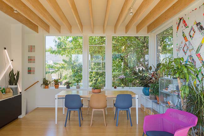
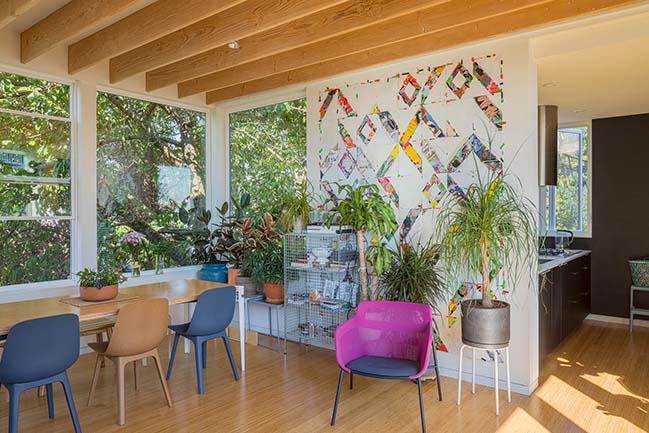
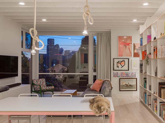
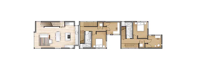
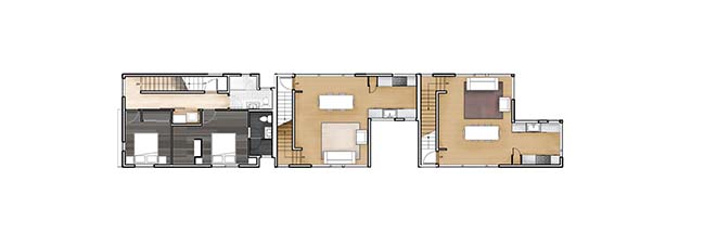
Units A and B feature interiors by Rob Humble. The ADU units are located on the lower level and can be accessed from either a lockable interior door or from a separate exterior entrance. This floor also includes a small storage space. The second level has two bedrooms and a bathroom. On the third floor, visitors will find a main living room, dining room and kitchen. These spaces have windows on both sides, with views to downtown and territorial views of the surrounding neighborhood. The location of the property was crucial to the design. By placing these main living areas higher up, the design team was able to take full advantage of the city views. Open rafters in the ceilings of the living and dining rooms help shape these large rooms and create height and volume.
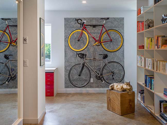
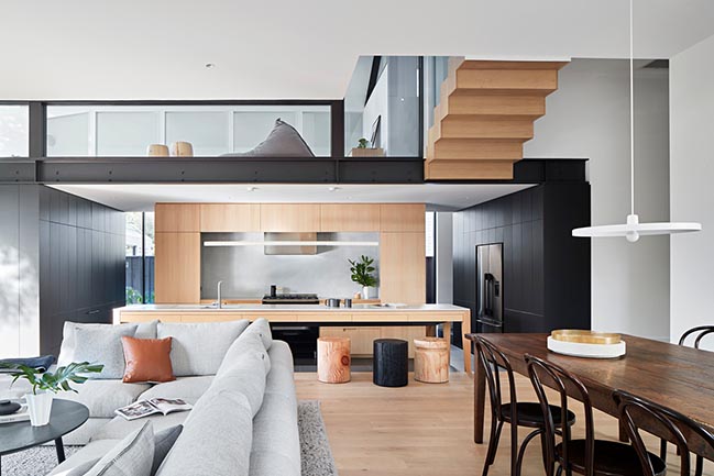
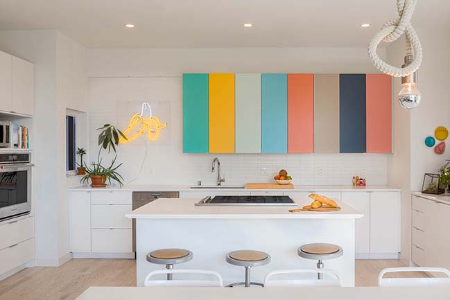
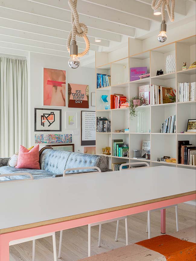
Unit C features interior design by Kailin Gregga and Steven Lazen. The design concept was a white box interior with pops of color in the kitchen cabinetry and furniture. The lower level contains the ADU unit, a storage space, an open office area and a zone for bikes. A two-story bookshelf stretches between first and second floor. The large shelf was designed to hold anything from keepsakes to books, allowing the rest of the house to be free from clutter. On the second floor, an open kitchen connects to the dining and living room, where a large floor to ceiling cantilevered window takes advantage of the western view to the downtown. Bedrooms and laundry are on the upper level, as well as the guest bathroom and stairway to the roof.
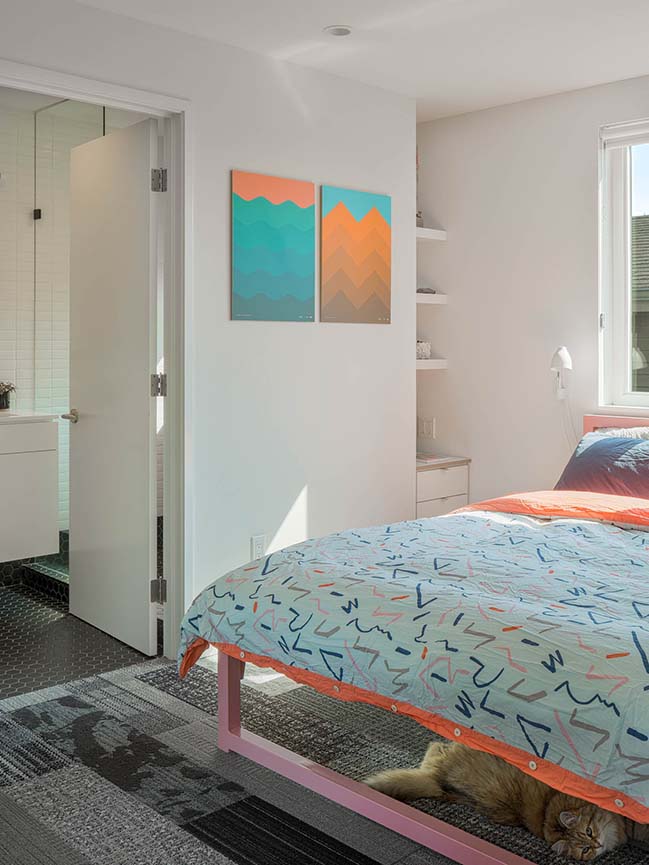
The thoughtful and intentional design of Big Mouth House offers urban homeowners much needed flexibility not offered to them with traditional home design. As city populations continue to grow, architects around the country can look to collaborations like this one for smart, innovative solutions to questions around urban living and multi-family design.
YOU MAY ALSO LIKE: Cycle House in Seattle by chadbourne + doss architects

YOU MAY ALSO LIKE: Tiny Tower in Philadelphia by ISA

Big Mouth House by Best Practice Architecture and Hybrid Architecture
03 / 12 / 2019 Kailin Gregga of Best Practice Architecture paired with Rob Humble of Hybrid Architecture and Steven Lazen (acting as a sole practitioner) to achieve flexible urban living
You might also like:
Recommended post: House Frances by THOSE Architects
