03 / 30
2018
As part of an investment property purchase by a professional couple, this charming bijou London apartment was refurbished for their young daughter in her twenties, in an upcoming prime spot of Marylebone. The new owners were attracted to the area because it was close to Regents Park and the location is very convenient for public transport connections. The client wanted to have two bedrooms and two bathrooms as this would help to maintain the value of the property and part of the brief was to keep in mind the potential to eventually let out the property or use it for the Air BnB market.
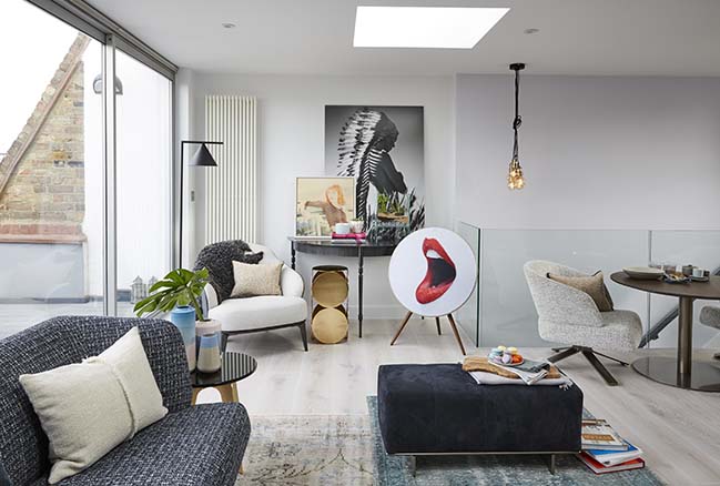
Design: Maurizio Pellizzoni
Location: Marylebone, London, UK
Year: 2017
Size: 72 m2
Photography: Jake Fitzjones
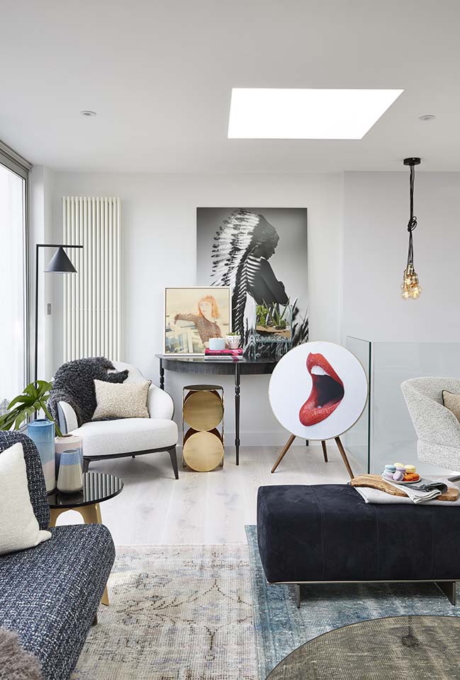
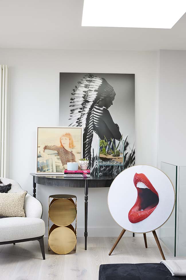
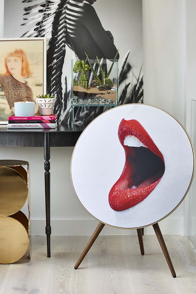
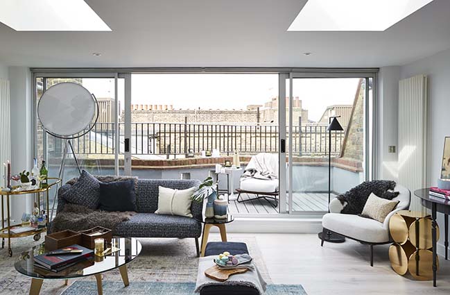
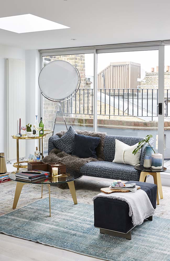
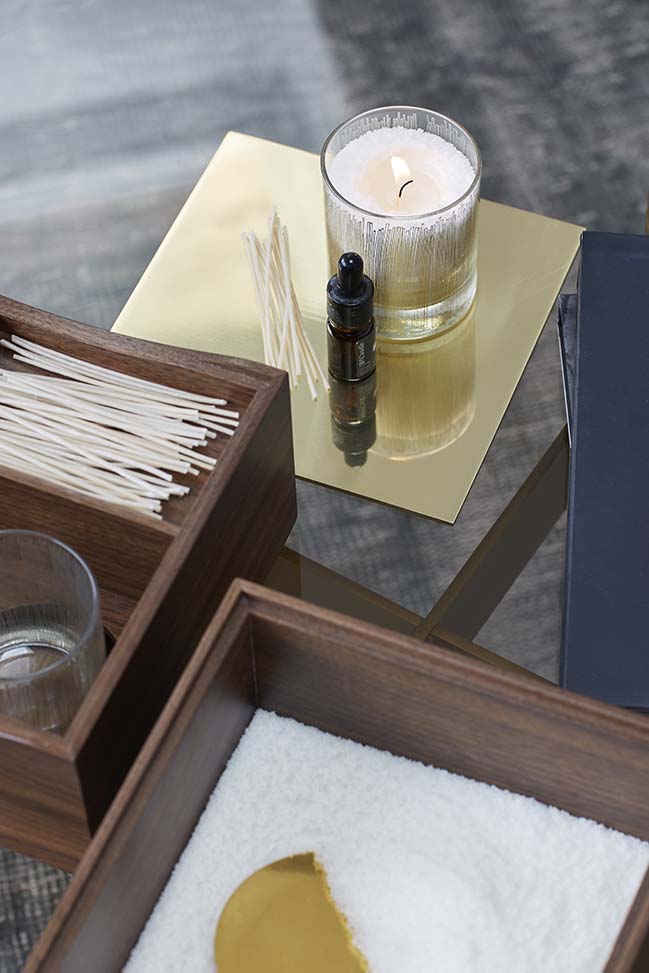
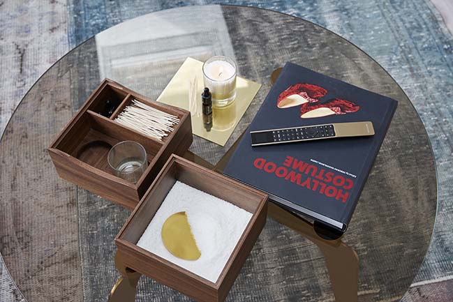
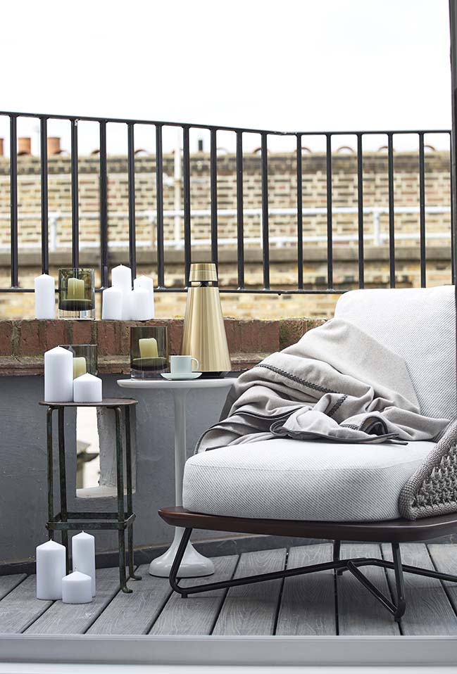
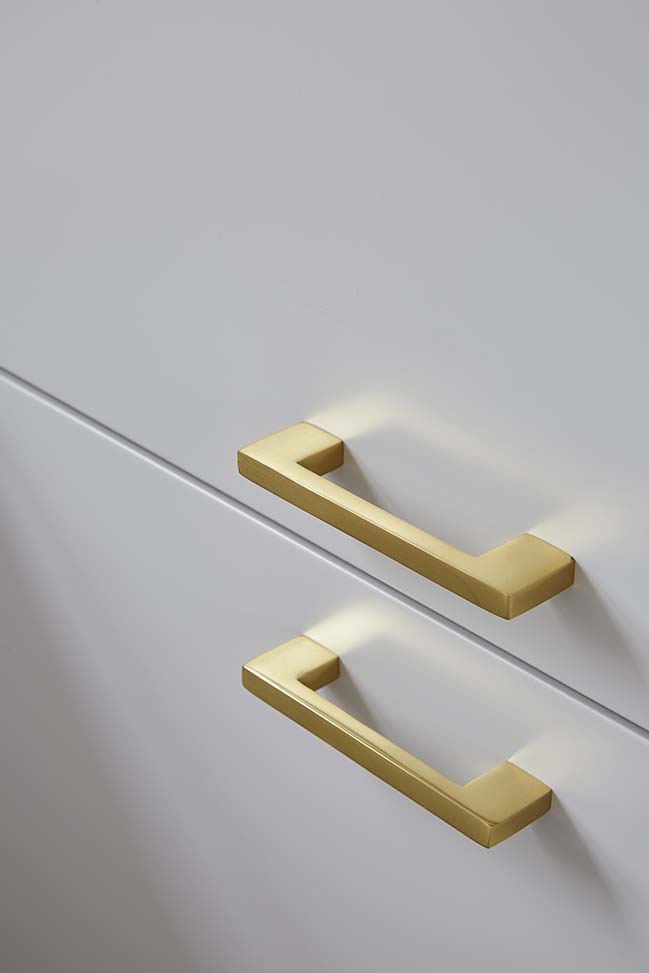
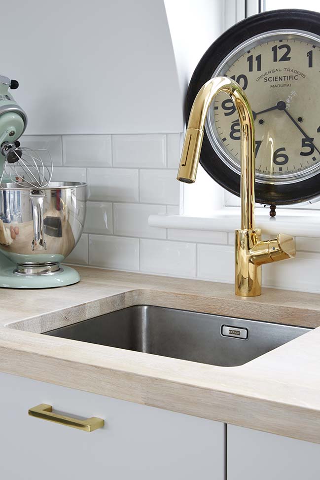
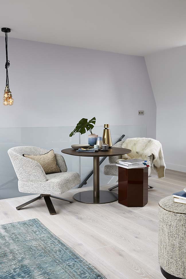
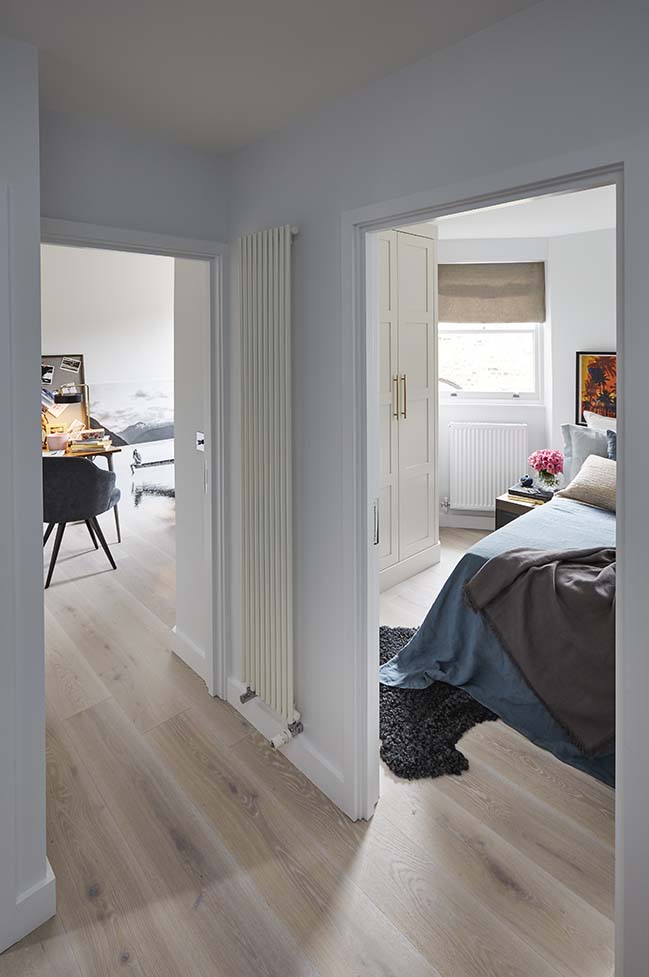
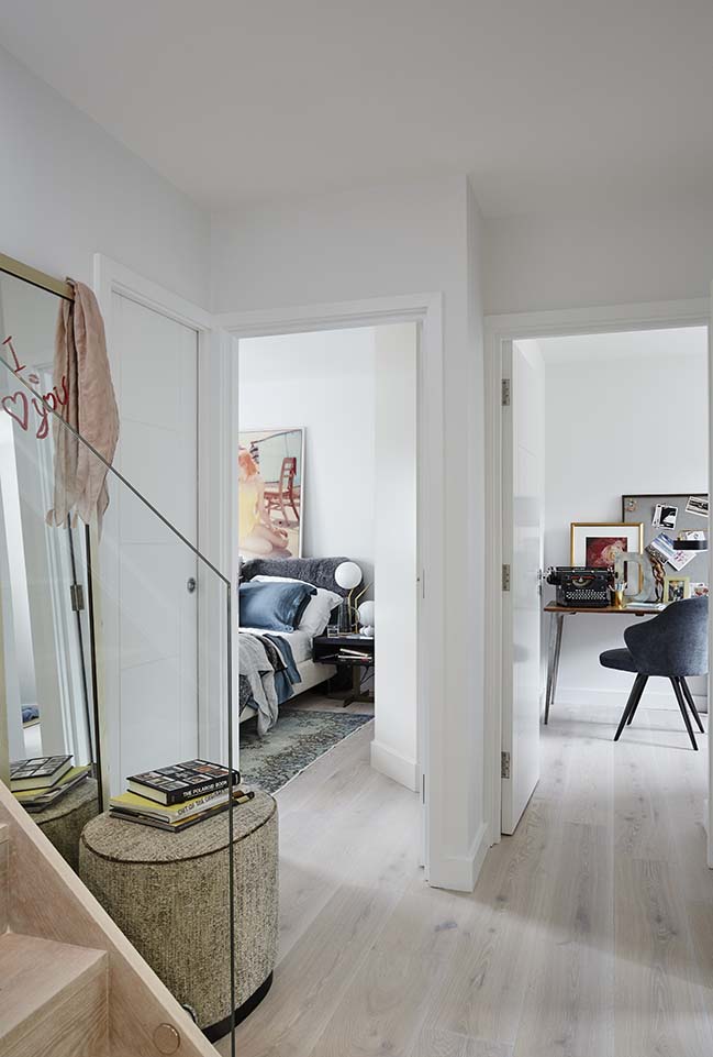
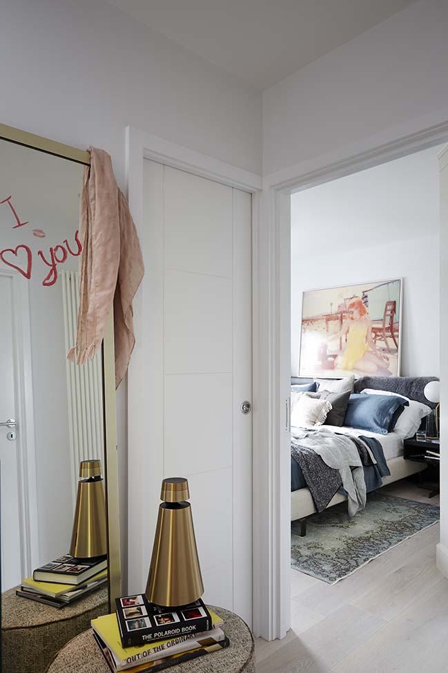
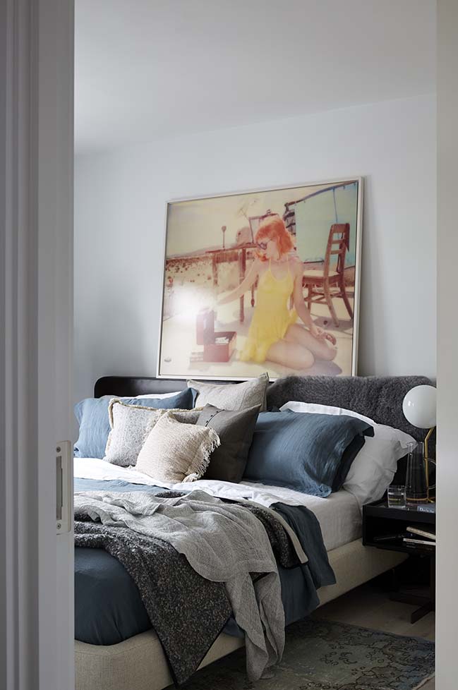
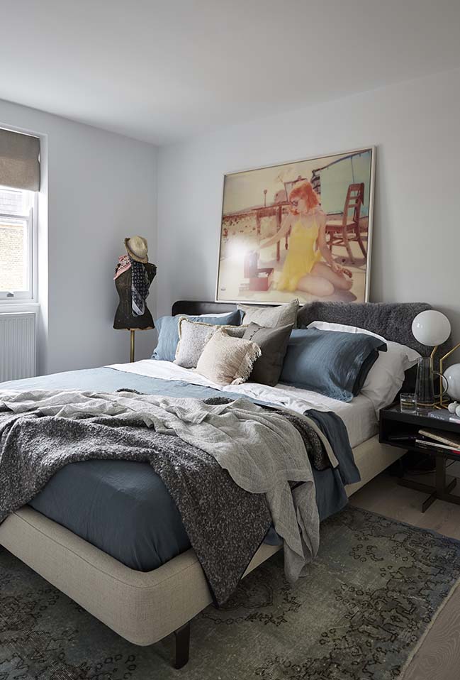
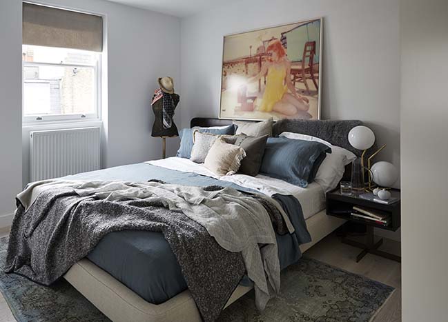
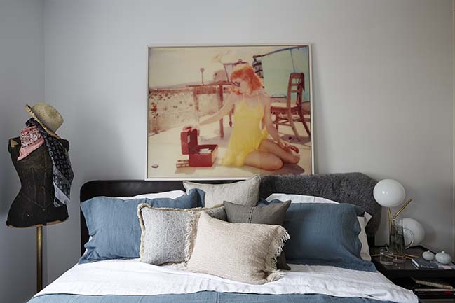
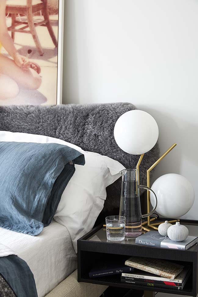
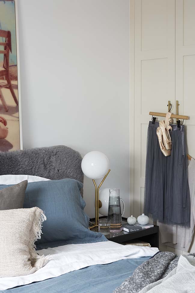
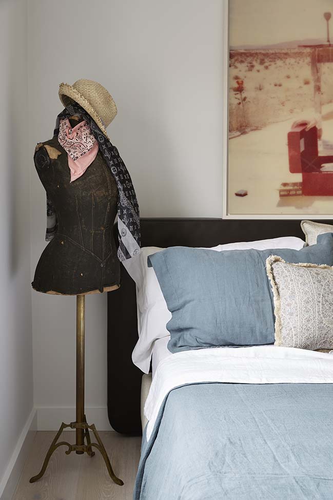
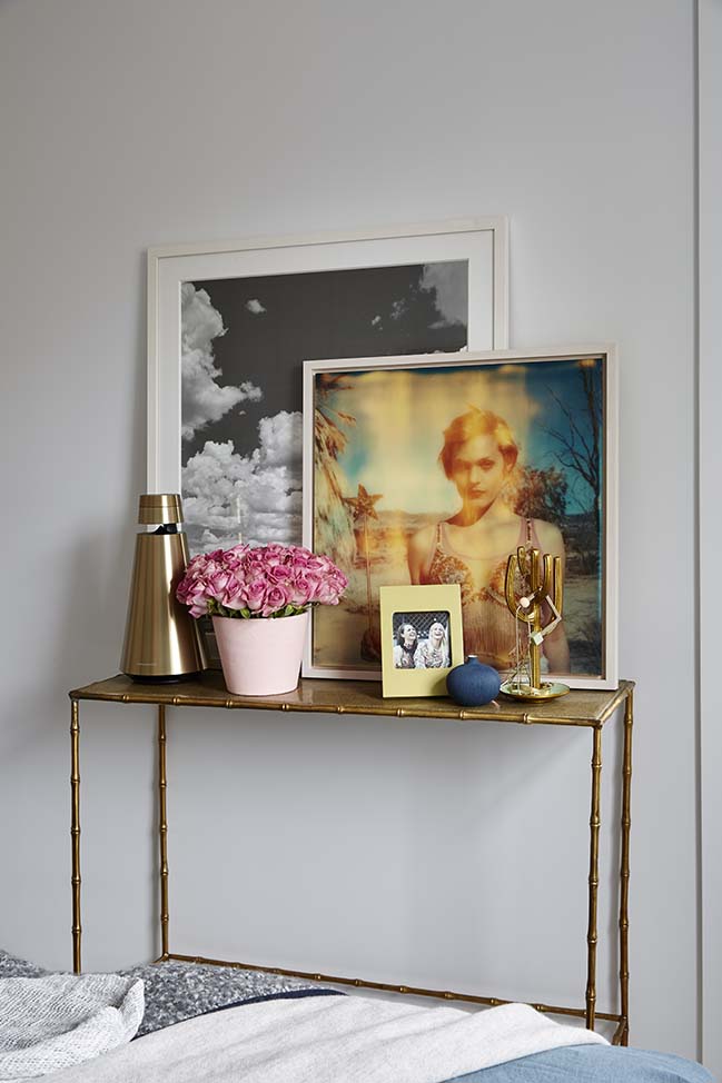
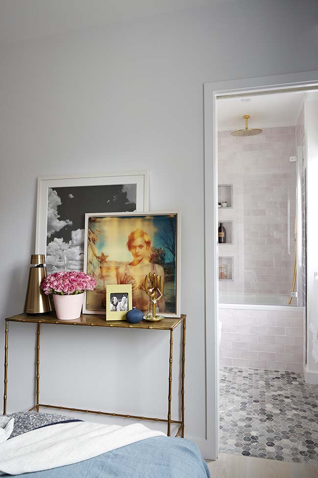
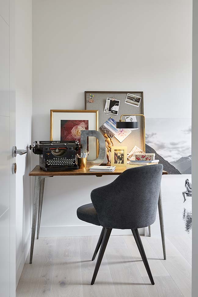
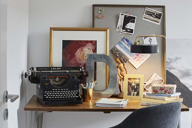
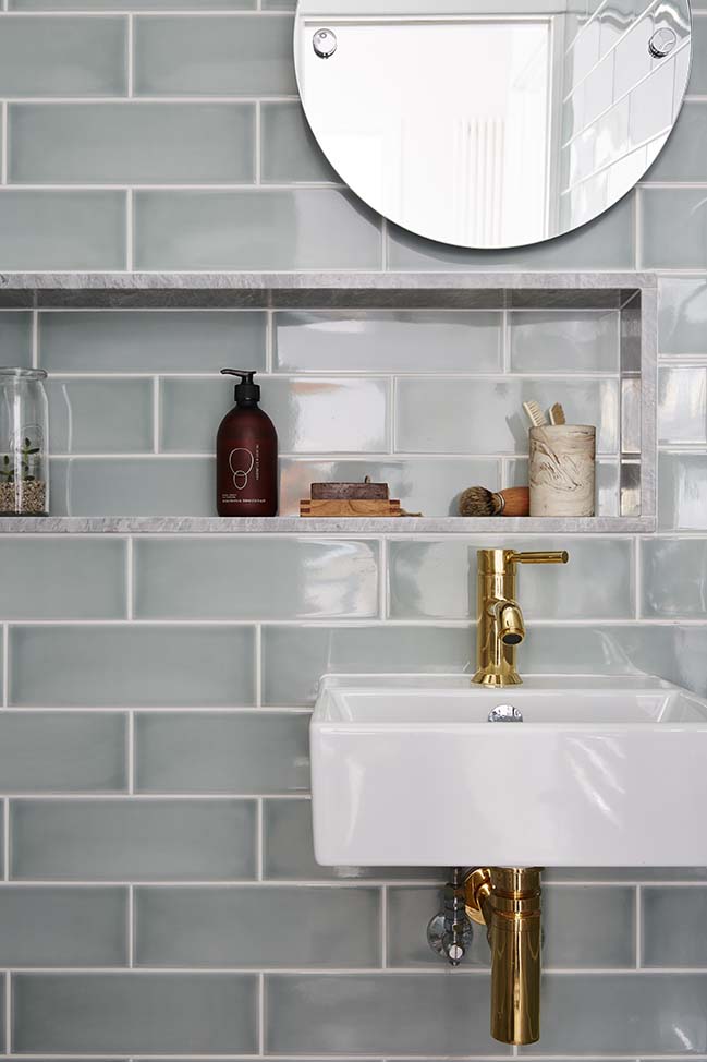
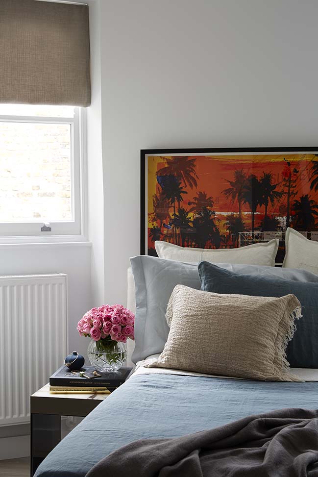
From the architect: The owners’ vision was to create the scheme of a Parisienne boutique hotel and Maurizio set out to achieve a vibrant, elegant, luxurious and modern apartment. The colour scheme evolved to what became a more feminine apartment using soft pastel colours and a mixture of polished brass and chrome finishes. Using a mixture of colours and textures inspired by Coachella, Maurizio used beautiful, high quality materials to create a jewel. The chosen artwork in particular reflects this style.
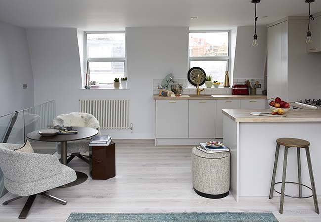
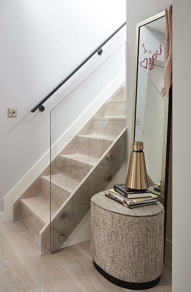
A small split level apartment, space planning was always one of the key points for the client as the original layout made every room seem very dark and impractical to use. The original entrance hall was very small with a dark corridor, as was the second bathroom, which was mainly constructed under the original staircase. This spiral staircase blocked both light from the hallway and made the upstairs living room a really awkward shape and small space. The biggest structural change made was to move the staircase in the flat, to turn it and lay it flat against the back wall, creating an incredible open feel to the whole flat that made the open plan top floor feel endlessly bigger. Before when you walked in, the whole place felt small, especially with the minuscule hallway. With only a few tweaks and smoke and mirrors, Maurizio made it look twice the square footage.
What makes the flat more special is the chosen flooring. These beautiful pale wooden floors turned it from feeling ordinary, into a home that has a real luxury feel and is much more spacious and bright. The furnishings are offset with accessories and lighting such as the beautiful lightbulb chandelier hanging over the staircase. It has an industrial feel which perfectly accents the elegance of the pale floors and creates such a beautiful glow in the evenings.
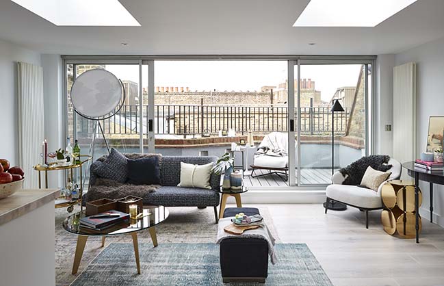
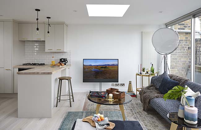
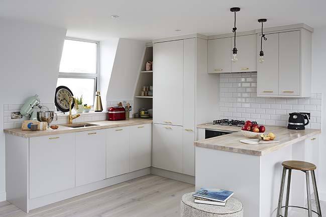
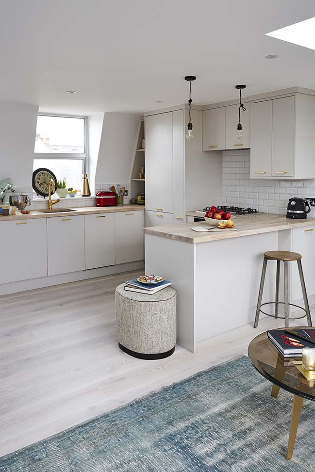
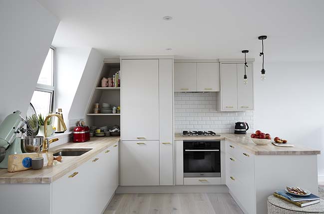
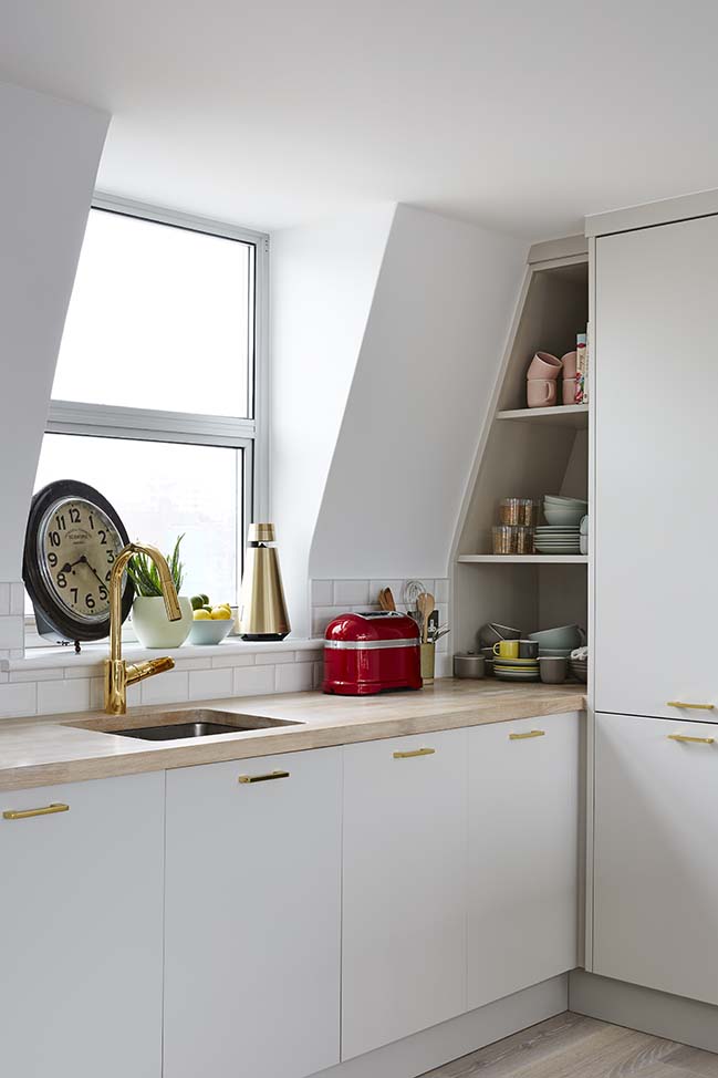
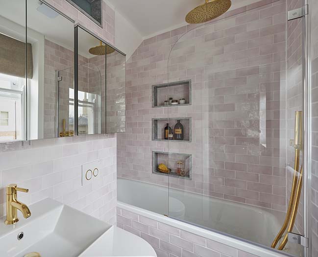
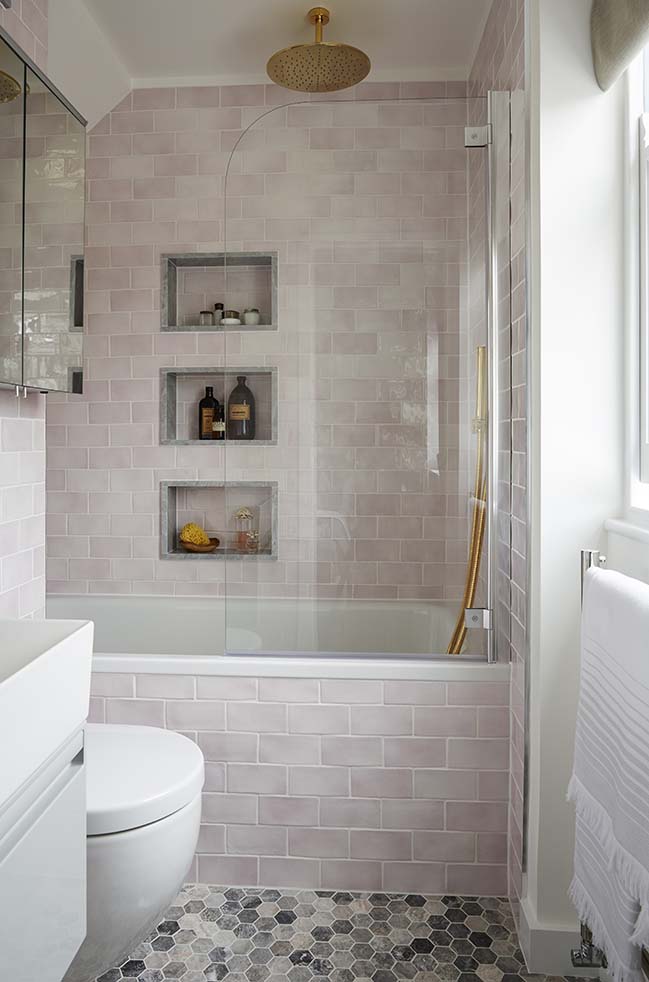
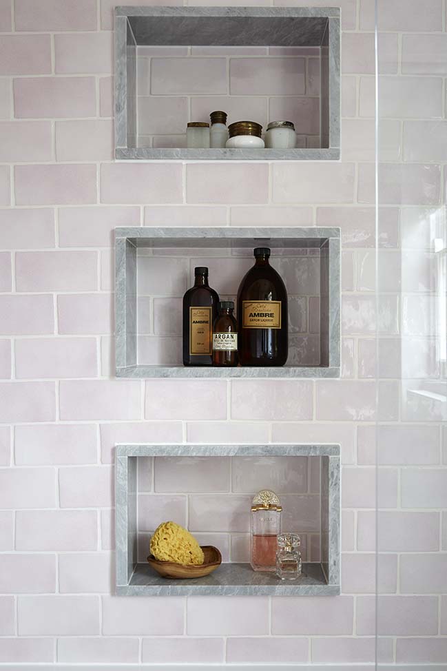
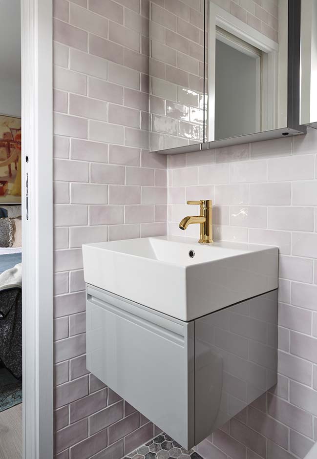
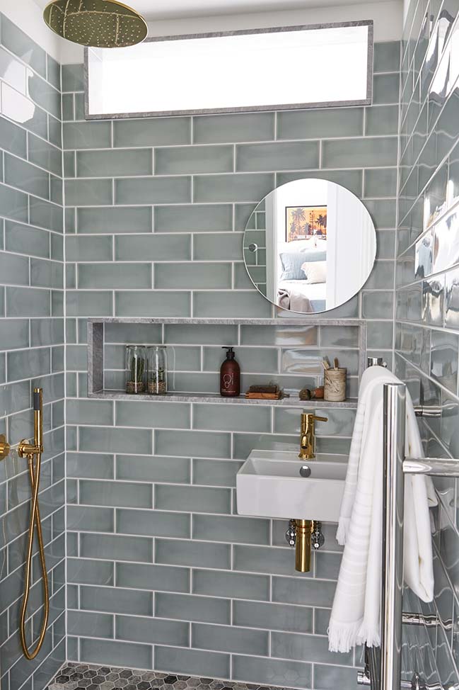
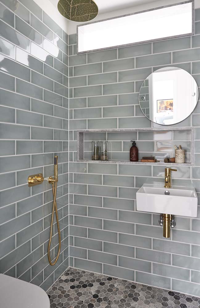
Every bit of space has been used which is most obvious in the kitchen where, despite its horseshoe shape, there is absolutely no dead space between cupboards. By installing built in wardrobes, the small bedrooms have a decent amount of storage space and the bathrooms, although small, have everything you could need. The flat makes you feel like you finally have space in the very cramped lifestyle that is London. In the winter it offers the ultimate cosiness and hygge ambiance, and in the summer it offers airiness and light to make the most of the good weather. Maurizio made every square-inch of the flat beautiful and useful.


> Butterfly House in East London by Biasol
> Stoke Newington Flat in London by House of Sylphina
Bijou Marylebone Apartment by Maurizio Pellizzoni
03 / 30 / 2018 As part of an investment property purchase by a professional couple, this charming bijou London apartment was refurbished for their young daughter in her twenties
You might also like:
Recommended post: Elliott Square House by DF_DC Architects


![Modern apartment design by PLASTE[R]LINA](http://88designbox.com/upload/_thumbs/Images/2015/11/19/modern-apartment-furniture-08.jpg)


