11 / 25
2019

Architect: Waterfrom Design
Location: Taipei, Taiwan
Year: 2019
Area: 114 sq.m.
Photography: Kuomin Lee
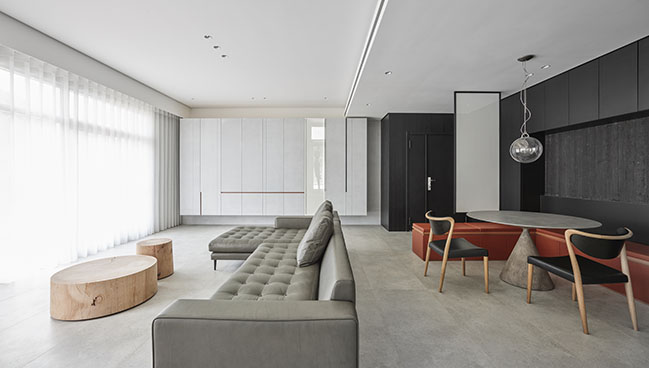
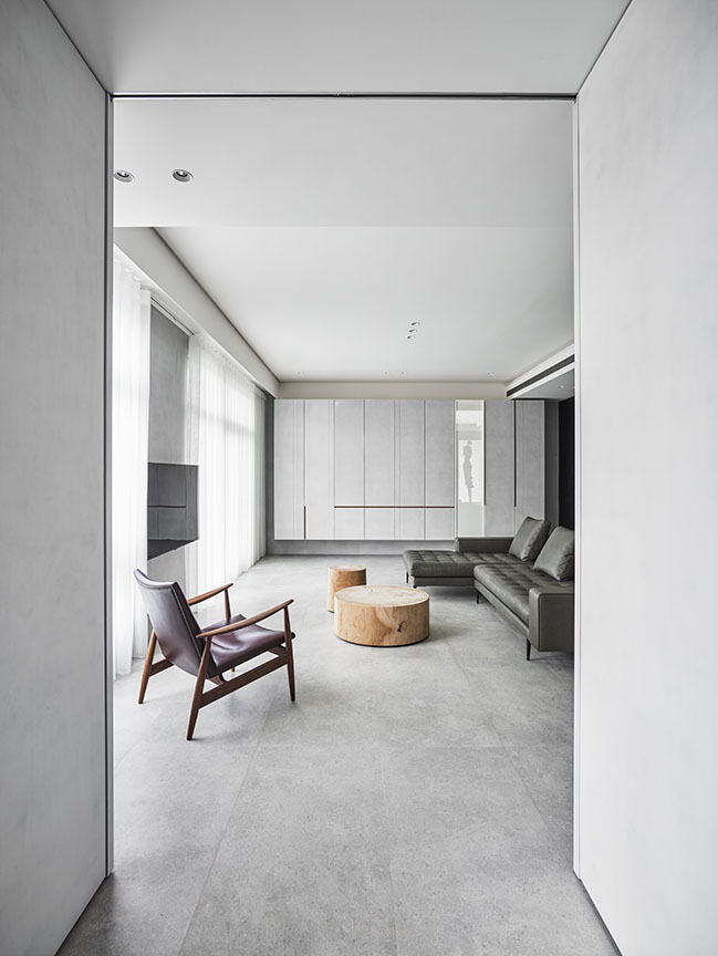
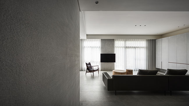
From the architect: To remove the excess decoration in design, we leave the depth of field of lacquer texture and color blocks in the residential space. Owners in the technology industry focus on the precision and practicality of spatial measurement, so we reduce artificial design and enhance the intuitive function.
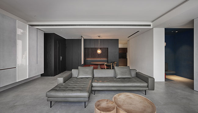
With the texture of paints on various materials to replace the decorative masonry, we arrange pieces of meticulous organic blocks for this elegant off-white space and increase the visual senses with the tone. You can image it as a vivid and interesting space with depth of field as the theme.
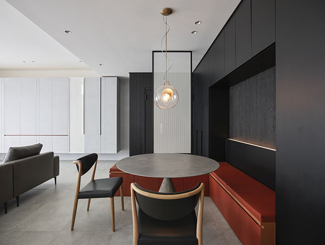
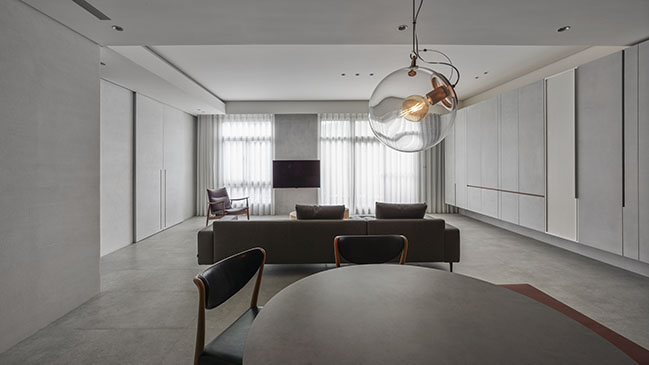
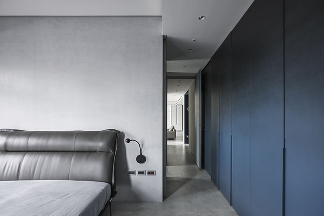
Each place seems to be a rectangular volume filled in the entire interior space to guide the flow indirectly and separate every function for allocation of this small-scale apartment. The substrate is lacquered with white oak hand painting which was scraped and piled up different layers of grey color blocks over and over again.

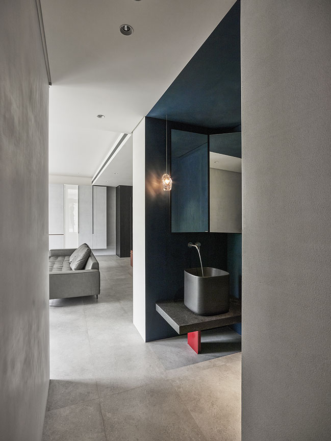
The space is arranged in each geometric block, and these blocks are connected each other in diagonal areas ingeniously. The combination of geometric shapes, lines and colors is like series of art work Corner Shallow Space from artist James Turrell.
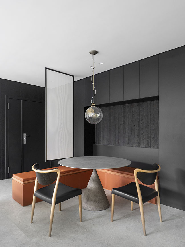
As the artist dug out geometric shapes like corners embedded in the wall, we use different angles, shades and colors to enhance different dimensions of each block, dissolve and extend the sensory grayscale background. When viewers walk into here, the space seems to be arranged in giant cubes, scattered in parallel and staggered, they can feel the calm and sense of volume in each corner of filed.
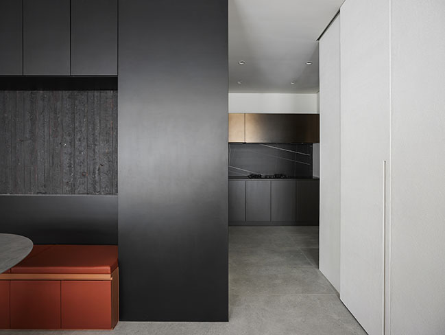
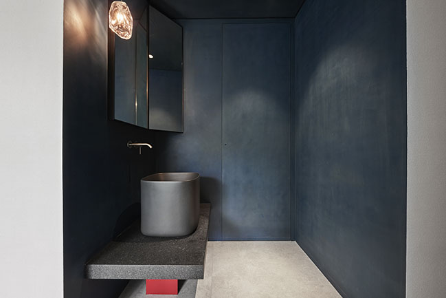
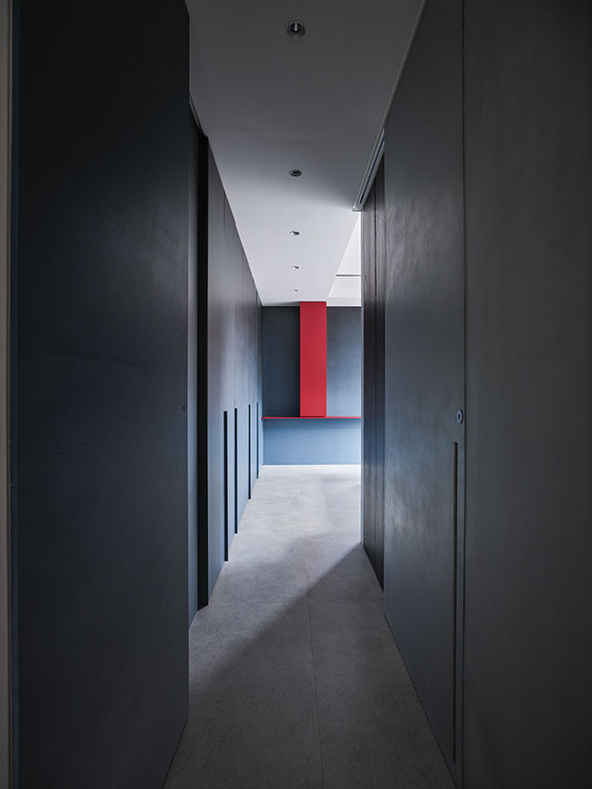
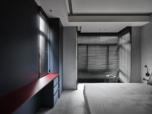
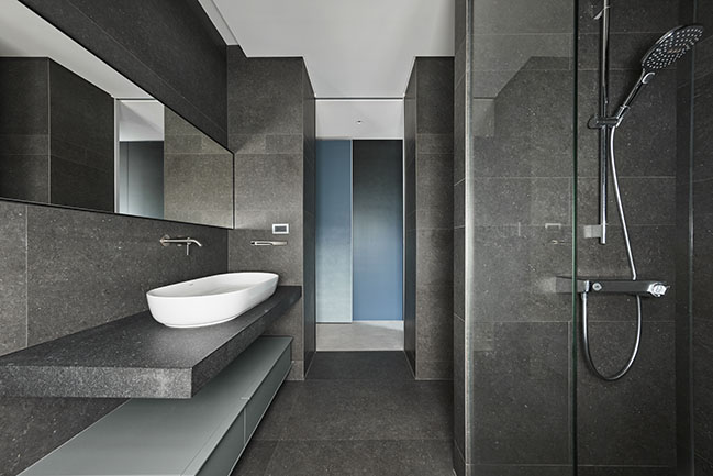
The progressive line of sight painted with different pigments and builds up the depth of field in each block. The entrance was bombinated with volume of veneer and leather, and collocated the advanced and retreated matrixes which made of yakisugi ban, this kind of multi-level extends to the bathroom area, creating a large setback square into a fascinating scenery. It breaks the linear layout of the corridor, and highlights the art of blues, extending to the whole corridor including door, cabinet and wall of bedroom area.
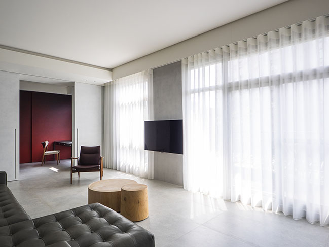
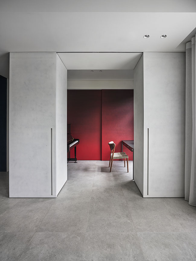
The line of sight of the corridor ends up with red pigment on the blue, and correlates the red wall of the study area to respond the depth of filed. This red wall, which shielded the sunlight before plan arranged, was become a semi-open study area, and was used the skill of Chinese ink painting to brush red pattern on its surface to highlight the unique and classic texture. In this space, people can enjoy the fascinating view in each frame from any angles with the fluctuating blocks that show depth of field as the theme.
YOU MAY ALSO LIKE: Vivid Color Apartment by Waterfrom Design

YOU MAY ALSO LIKE: Exhibition of Frozen Time by Waterfrom Design

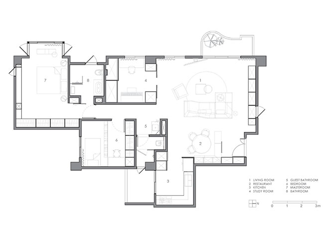
Geometric Color by Waterfrom Design
11 / 25 / 2019 To remove the excess decoration in design, we leave the depth of field of lacquer texture and color blocks in the residential space...
You might also like:
Recommended post: Mangrove Bay Citic Zhuhai by CCD/Cheng Chung Design (HK)


![Modern apartment design by PLASTE[R]LINA](http://88designbox.com/upload/_thumbs/Images/2015/11/19/modern-apartment-furniture-08.jpg)


