10 / 21
2020
New Affiliates has completed the redesign of a 500-square-foot pied-à-terre apartment near New York City’s Gramercy Park for a strategic advisor to emerging architects who lives bicoastally...
Architect: New Affiliates
Location: Gramercy Park, New York, NY, USA
Year: 2019
Total square footage: 450 sf
Project architect / designer: Ivi Diamantopoulou, Jaffer Kolb
Photography: Michael Vahrenwald / Esto
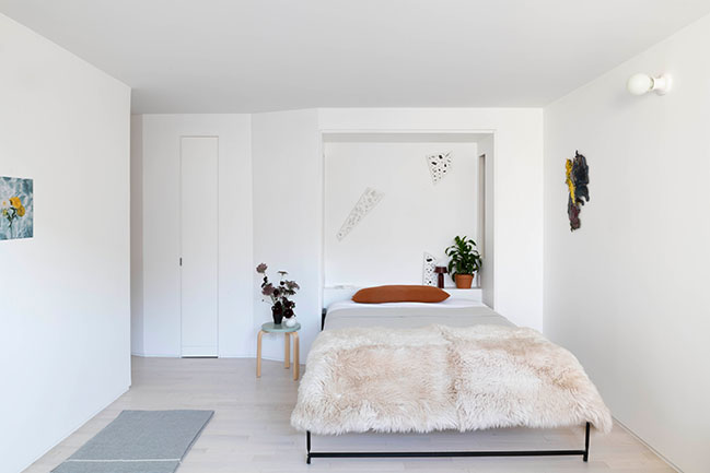
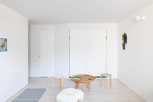
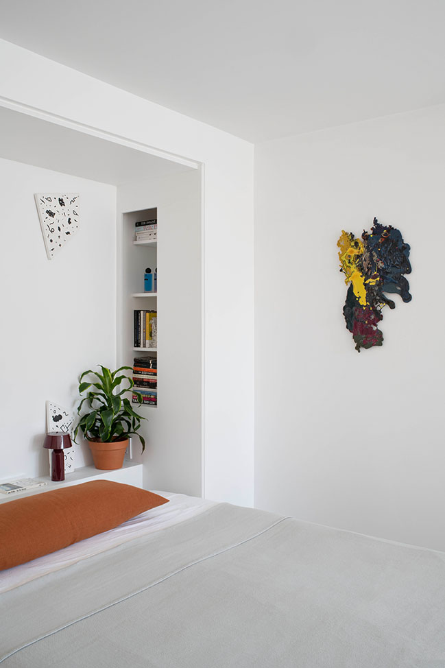
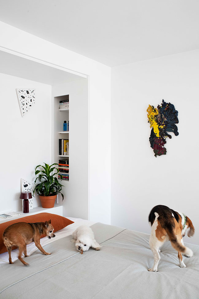
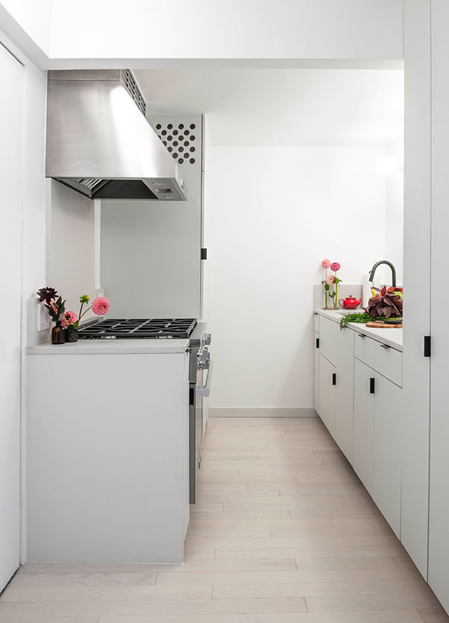
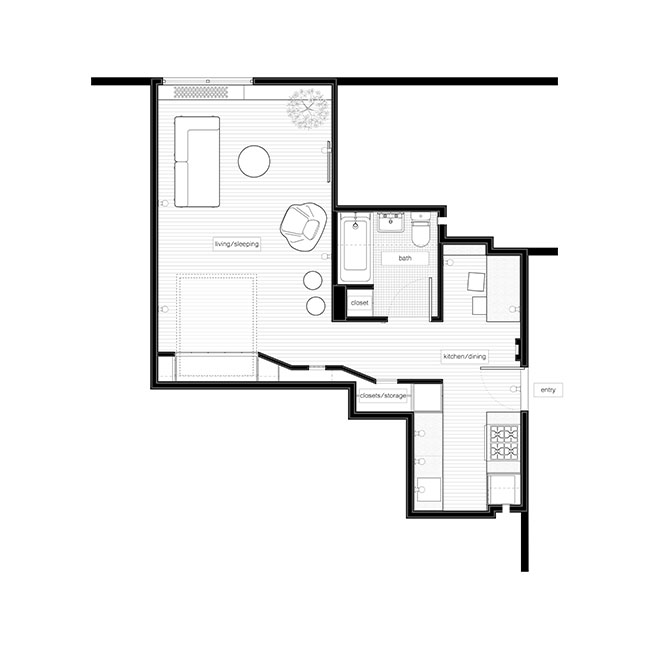
From the architect: The renovation focused on efficient space planning and flexible programming to provide ample live and work space within the confines of a small studio apartment. The apartment will serve as both a part-time residence and space for entertaining, and can convert quickly from home to salon, and from private interior to event space.
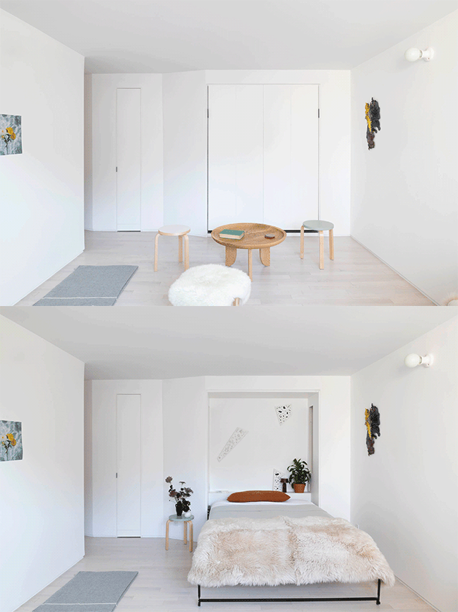
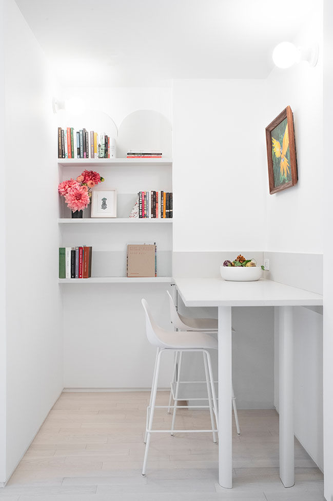
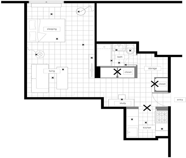
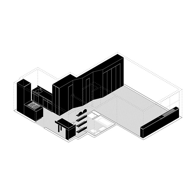
To optimize space for a range of daily uses, the designers compartmentalized the apartment into a sequence of dual-use areas: A small recess by the entry functions as an office as well as an extension of the adjacent kitchen; the bedroom also serves as a living and/or dining space. In plan, the apartment consists of two distinct zones with a bathroom in between, a footprint that imitates that of a larger-sized unit in program and feel.
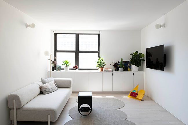
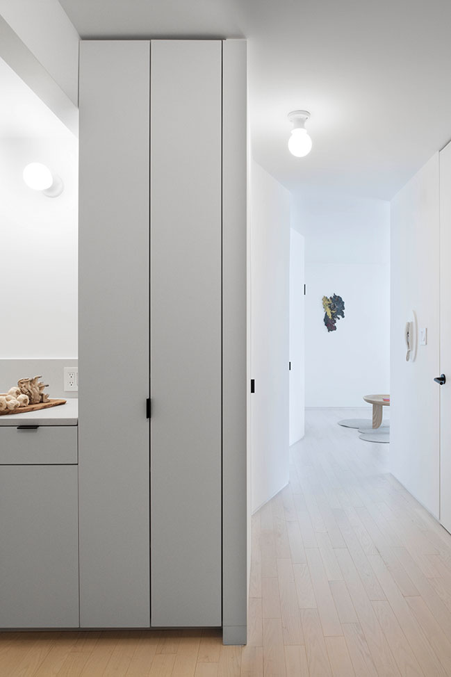
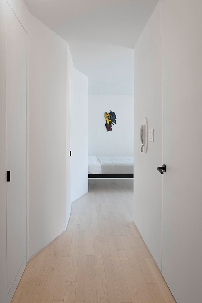
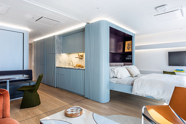
A pleated white wall connects the two main living areas: the hybrid kitchen/office with the back bedroom/living/dining space. This element serves multiple functions. It contains pantry storage, closet space, and a Murphy bed while bouncing natural light from the single window in the apartment throughout the interior. "We designed the pleated wall as a key visual element tying the apartment together, orienting it to maximize light and to draw visitors to the larger back room,” says co-principal Jaffer Kolb. “It houses everything--the bed, closets, kitchen pantry--into a single move, like a Swiss Army knife.” While the addition of this voluminous pleated wall takes up valuable square footage in the small space, it in fact produces the feeling of space from within through a subtle play of volume, light, and perspective. A custom millwork unit below the window acts similarly.
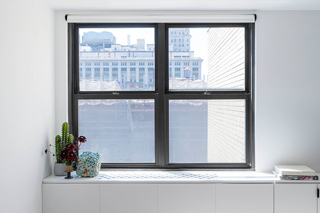
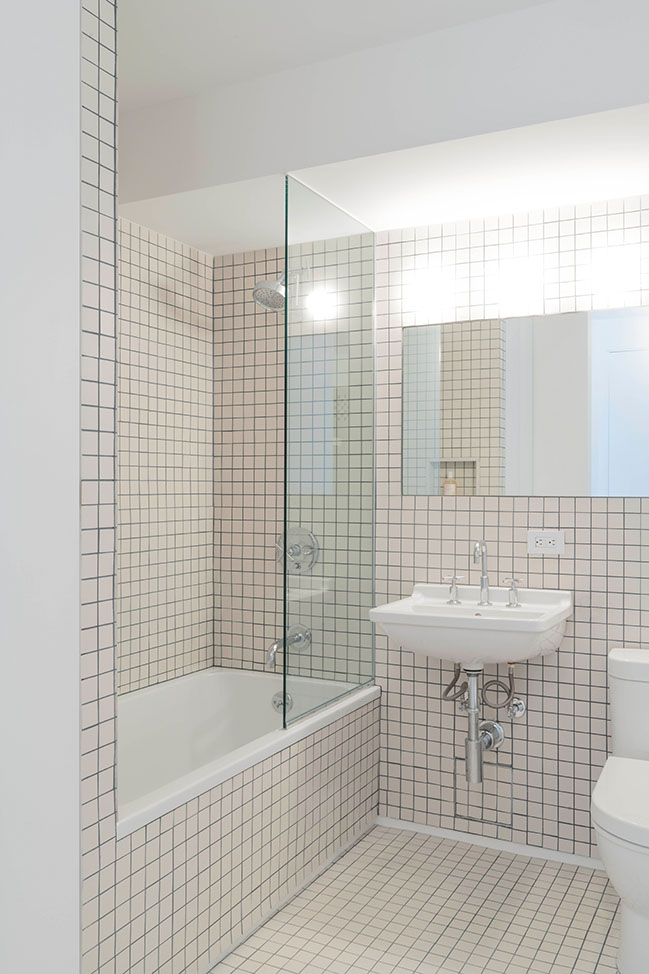
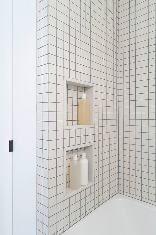
Across the unit, the designers balance compression and openness, using the material and finishes palette to make even the smallest spaces feel generous. For example, the bathroom is clad in a small grid-like 2-inch by 2-inch square tile, and the flooring throughout is white oak in thin, 3-inch planks. These small-scale materials manipulate the apparent proportion of the apartment. "We wanted to use materials that worked with the size of the unit—playing with textures, patterns, and reflectivity to transform the feeling of scale of the space," says co-principal Ivi Diamantopoulou.
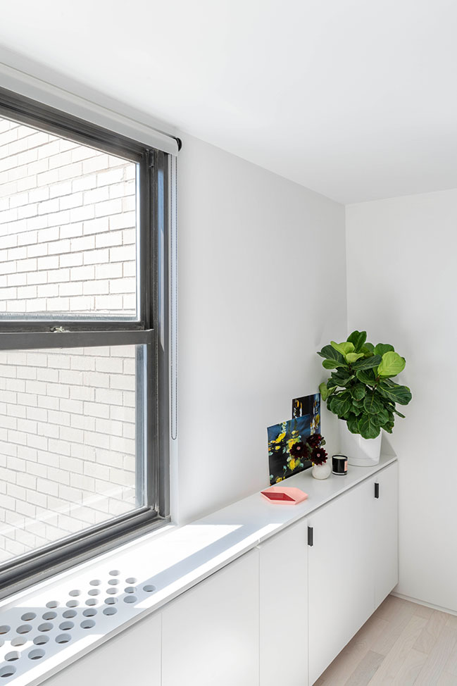
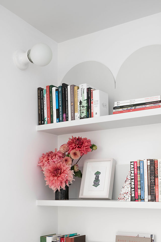
Additionally, the color palette made of soft neutral tones, including shades of off-white and pale green, create an open and airy atmosphere. Custom millwork with faceted and fun forms keep the project simple while also adding specific moments of character. A rabbit ear detail above the bookshelf in the office and small circles cut along the side of the kitchen cabinetry and top of the under-window cabinetry for venting create playful anchor points between the flexible living spaces.
YOU MAY ALSO LIKE: Bed-Stuy Loft in Brooklyn by New Affiliates
YOU MAY ALSO LIKE: Tunbridge Winter Cabin by New Affiliates
Gramercy Studio by New Affiliates
10 / 21 / 2020 New Affiliates designs flexible studio apartment in New York City for a strategic advisor to emerging architects who lives bicoastally...
You might also like:
Recommended post: The Expo 2020 Opportunity Signature Pavilion by BIG



![Modern apartment design by PLASTE[R]LINA](http://88designbox.com/upload/_thumbs/Images/2015/11/19/modern-apartment-furniture-08.jpg)


