01 / 28
2019
Designed by INDESIGN inc CONRATH architecte. The project brief was unusual, to say the least: Ensure me freedom in my advanced years.
Architect: INDESIGN inc CONRATH architecte
Project name: Ice Shore House
Location: Montréal, Canada
Floor space: 2200 sq. ft.
Architecture and site planning: Gary Michael Conrath
Drafting: Jonathan Conrath, Nahad Kamel, Veniamin Chukhovitch
Sustainability consultant, architect: Lyse M. Tremblay
Sustainability consultant, engineer: Frédéric Genest
Structural steel engineer: Serafino Valente
Wooden structure technician: Richard Leblanc
Builder: Alain Bédard Rénovations
Glasswork artist: Diane Ferland
Photography: Marc Cramer
From the architect: In 2013, an elderly citizen sought out the services of Gary Conrath. Both knew each other well since Indesign had conceived and constructed the co-property building where the woman had been living for a decade. The third storey dwelling was no longer suitable for her. She wanted to live at ground level, in an environment designed to meet her anticipated future needs.
Exterior Mobility - Following the advice of her architect, the client purchased a vacant lot in Verdun, a neighbourhood with history dating from the beginning of New France. Of prime importance, the site provided several alternatives to automobile driving. Bus travel, as preferred by seniors is immediately available in front, and the Métro, Montréal’s subway is but a short walk away.
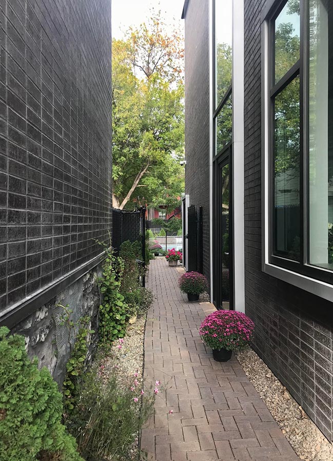
With an east-west orientation, the narrow 30-foot lot extends 120 feet in depth. Rather than occupying the full width, the architect opted for a footprint that allows for an open passageway adjacent to the southern façade. This approach preserves the privacy of the main entrance while also distinguishing the project from the densely built, shoulder to shoulder neighbouring homes.
In order to facilitate eventual wheelchair use, a smooth level surface connects the city sidewalk, the parking space and the main entrance.
Anticipating the future - In regards to his approach, Gary Conrath expresses the design paradox whereby existing urban forms must be challenged, but not so far as to disrupt the established architectural setting. In Verdun, the built environment is characterized by the recurring archetype of the duplex, adopted in the 1930s for financial considerations. If needed, owners and their families could curtail their spatial needs, live solely on the ground floor, and rent out the upper floor.
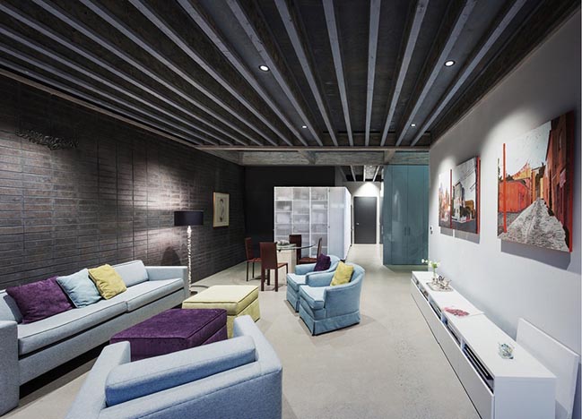
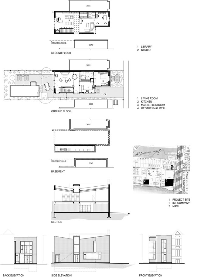
The idea of housing that can be adapted to accommodate significant life changes resonates throughout the project, with open, flat spaces found on two levels. The first floor includes essential living spaces including washroom and bedroom. The upstairs features a music room, study, artist’s studio and secondary washroom.
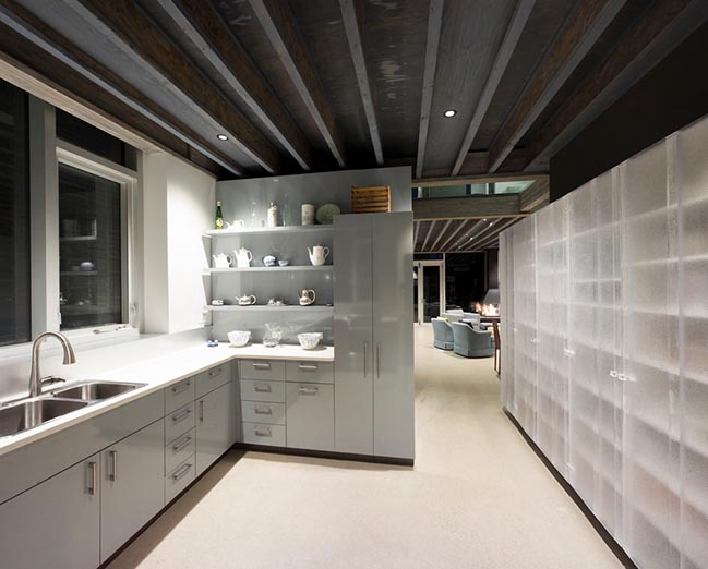
Furthermore, should the owner ever require home care services, the studio space would serve as living quarters for an attending careperson. With that possibility in mind, the building includes a private entrance on the south side with direct access to the stairs.
Referencing the Past - Several elements give the building’s architecture meaningful connections to the area’s history. First is the idea of a massive structure, common under the French regime, but expressed in a contemporary design language. Moreover, features typical to the traditional neighbourhood houses are integrated into the project, the inverted roof slopes serving as a case in point. This laneway design from the pre-rain gutter era serves to drain runoff from front and rear surfaces to a central point. More pragmatically, the structure’s form allows the inclusion of a discreet skylight not seen from the street. The resulting volumetrics combine to provide a complete solution in respect of municipal restrictions and the 29-foot height requirement.

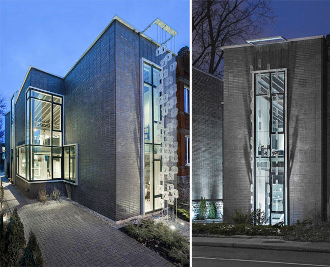
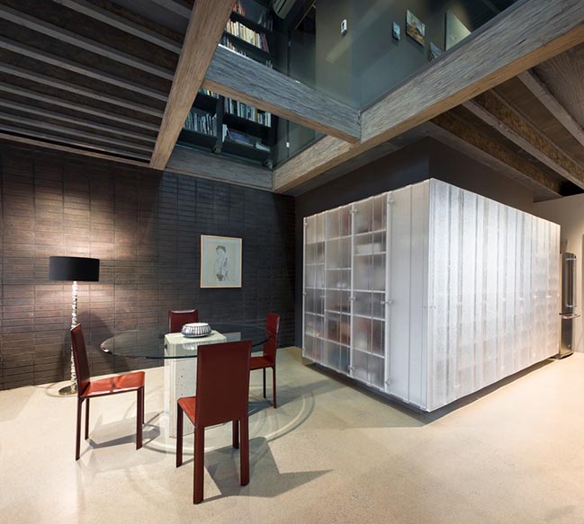
Demonstrating sensitivity to Verdun’s history are the suspended moulded-glass modules on the street façade. This frosted veil, positioned before the 25-foot front window, evokes memories of the Dominion Glass Co., founded in 1905, as well as of the ice-cutters who were so important to the neighbourhood’s economy in the 19th century.

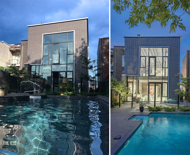
Inside and Outside and Vice Versa - The building itself is a design of cantilevered brick masses. Most striking is the strong connection made between the interior and exterior through dematerialized surfaces. Seen from the outside, the house’s interior planes replace that which is carved from the exterior walls. According to the designer, “a façade must entice the passer-by and extend a sense of welcome .” The invitation is all the more compelling thanks to the window frames that project outward, toward the street.
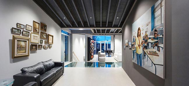
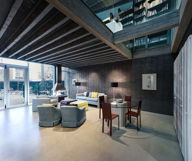
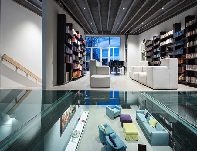
The inverse is also true: the landscape is brought inside, along with high-quality natural light. Diffused by the large east and west glazed surfaces, sunlight grazes along the walls and downward from top to bottom. To better capture sunshine from the south, a central vertical window projecting above the roofline (30 ft.) extends into a skylight feature. In addition, a transparent section of floor in the middle of the upper level floods the centre of the ground floor with a generous afternoon luminosity.
The Therapeutic Aspect - Visual fluidity is also a way to mitigate the trials and tribulations of the age at which people can find themselves confined to their home, the risk of depression never far away. The wide openings come into play here, allowing the owner to enjoy either nature or the city without having to go outside: a starry sky above the pool, the shadows of trees and raindrops on the glass catwalk; and on the street side, pedestrians passing by and the colourful morning sky.
Ice Shore House in Montréal by INDESIGN inc CONRATH architecte
01 / 28 / 2019 Designed by INDESIGN inc CONRATH architecte. The project brief was unusual, to say the least: Ensure me freedom in my advanced years
You might also like:
Recommended post: Antwerp Zoo by Studio Farris Architects
