02 / 19
2018
Everything has been designed in detail so that each architectural element finds its place, or each contrast highlights the existing ones. Today this house is installed in its present time and on the edge of the future.
Architect: Martins Afonso atelier de design
Location: Bordeaux, France
Completion: October 2017
Area: 400 sqm
Photo credits: Mickaël Martins Afonso
From the architect: In this mansion, the living space is revealed by the encounter between past and present. It is in the interpretation and the articulation of the existing architectural signs that has emerged the project, where each new architecture fragment fits and dances in its context.
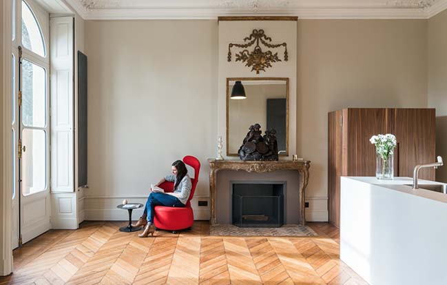
Anchored on the edge of the Jardin Public in the center of Bordeaux, the four-floor mansion from 1850 opens up to this beautiful garden, unveiling its majestic scenery over the seasons.
Thanks to a strong heritage context, the challenge of this rehabilitation was to create a new living environment adapted to current needs, without distorting what was already there, while at the same time bringing a new strength that wouldn’t fall into a simple mimicry.
The owners aimed at renovating this building to make it more suitable to their lifestyle, more comfortable and, above all, mirroring their tastes. The renovation involved a complete refurbishing of the interior, while including a partial thermal rehabilitation respecting the existing conditions of the building.
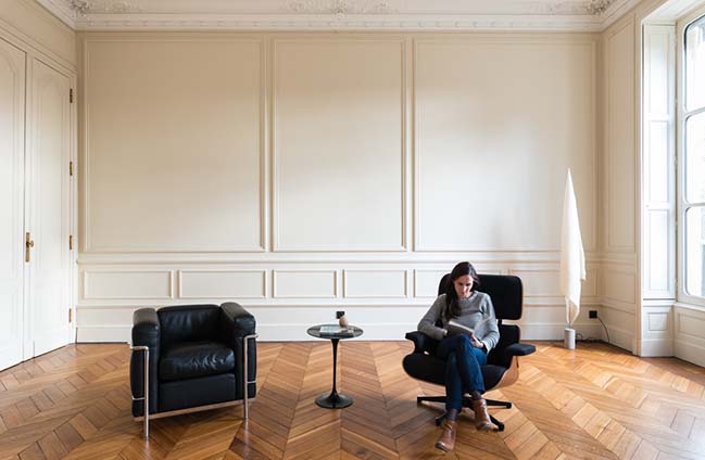
The latter, quite promising thanks to the well-preserved state of its interior features, such as woodwork, floors and plaster moldings, established the first orientation of the project, namely, the conservation of this heritage. It raised the question of the implementation and value of this singular aspect. But the aim was to sublimate the existing conditions through generating a contrast using new architectural elements.
The interiors have been designed to keep the charm of these old spaces, bringing a contemporary twist along. The old and the new were to flatter each other through this game of contrasts.
The allocation of the internal spaces of the building resulted in the following room-fitting:
On the ground floor, two living rooms and a kitchen; on the first floor, a more intimate living room, the office, and a fitness room with a bathroom; on the second floor, a master suite, with a large bedroom, a dressing room and a large bathroom; on the third floor, two children’s bedrooms with adjoining bathrooms; on the fourth floor, an en suite guest room.
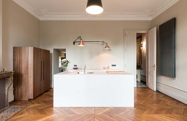
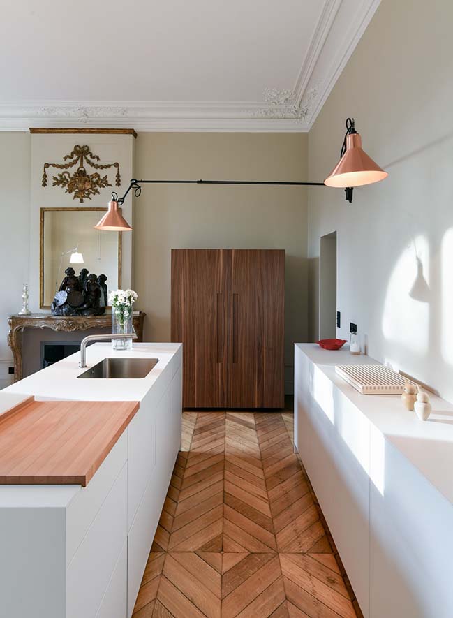
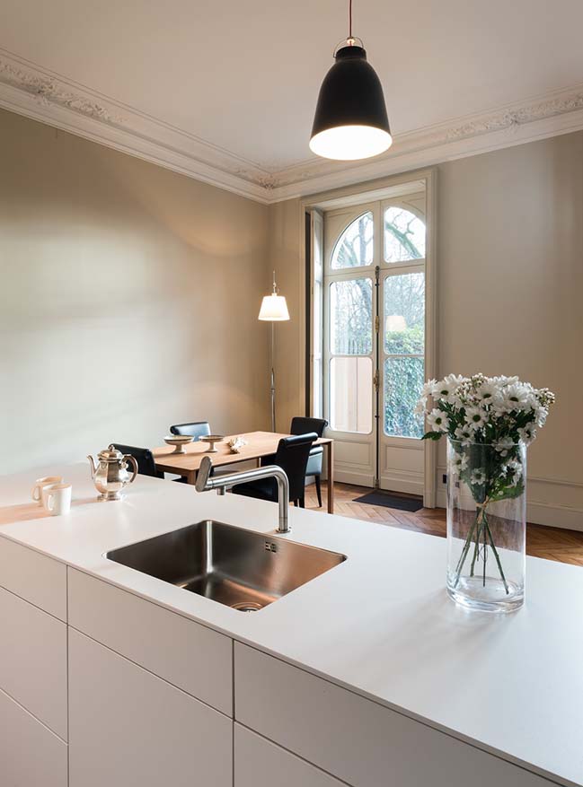
The ground floor hosts two magnificent living rooms separated by the kitchen. The latter extends into the largest living room, opening out on the garden. The kitchen unveiling the living room consists of three distinct elements: a one-piece central furniture, a furniture against the wall based on the proportions of the central furniture and a walnut cabinet. These three parts communicate with each other without overshadowing what was previously built, the central furniture is favored by such a block of ice in a warm environment.
The living room leads us to a private garden within the Jardin Public, by a porch dressed with Corten steel plates on its sides. It creates a warm atmosphere, an invitation to a restful and family moment.
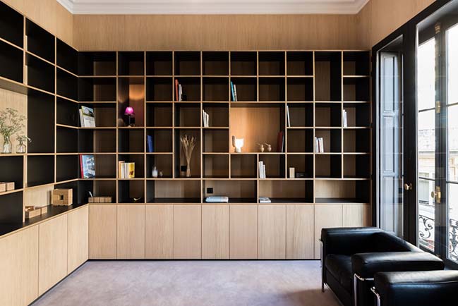
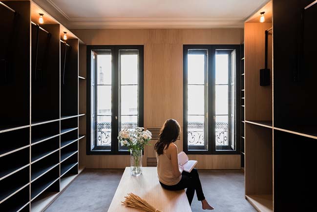
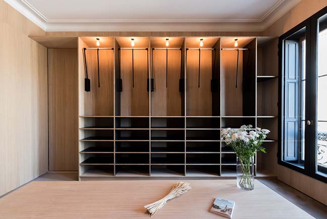
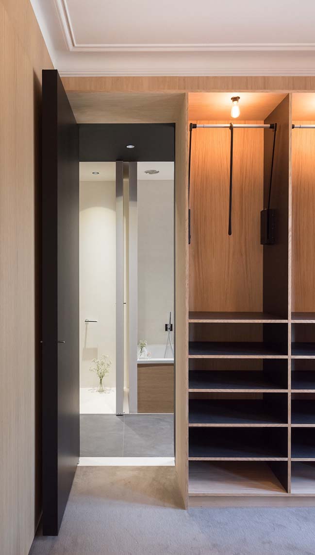
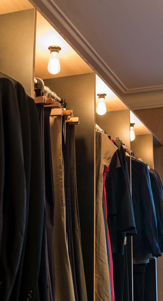
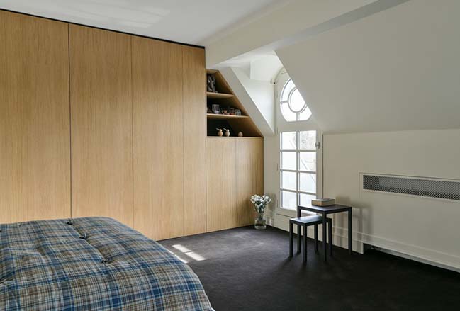
On the first floor, specific thoughts have been conducted to develop an office. Walls are clad with oak upon which a library rests. Here again, the contrast between the hue of the oak and the black elements brings a warm atmosphere to this space. The oak wall cladding also found in the large dressing room on the second floor, highlights the white plaster cornice.
All the carpentry arrangements, bathroom furniture, dressings, libraries, are designed following the same aesthetic, mixing these two materials. This brings a homogeneity of facilities as a common thread in such eclectic spaces.
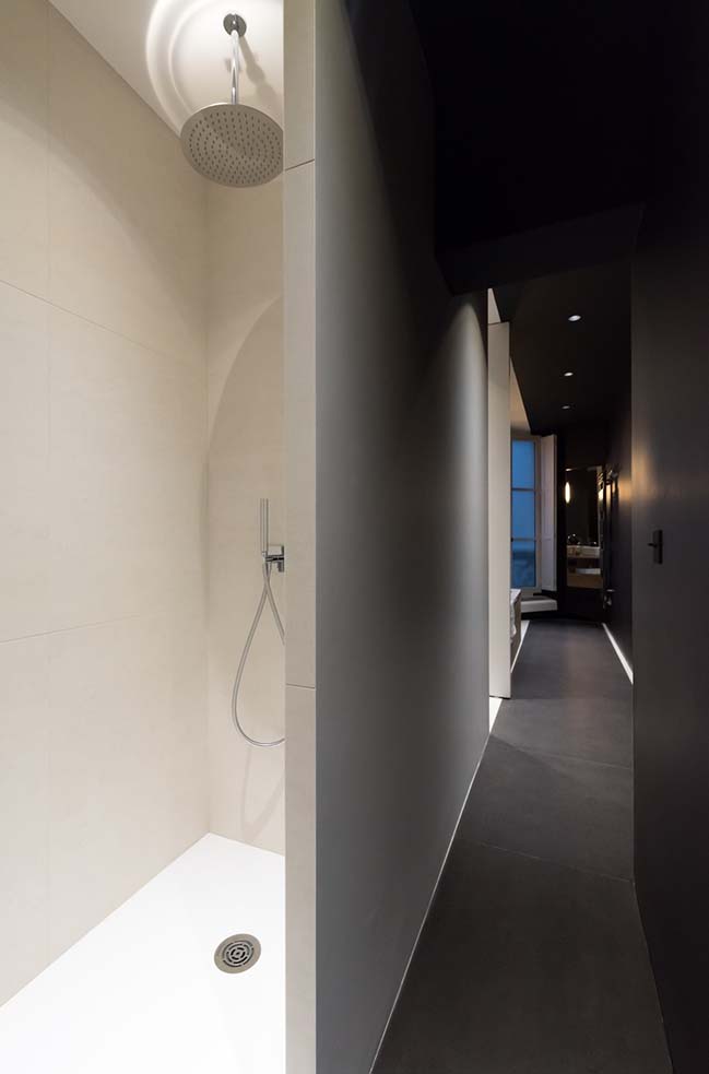
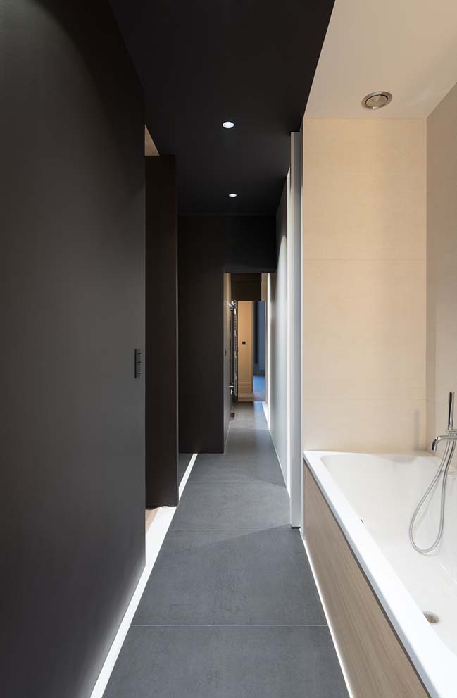
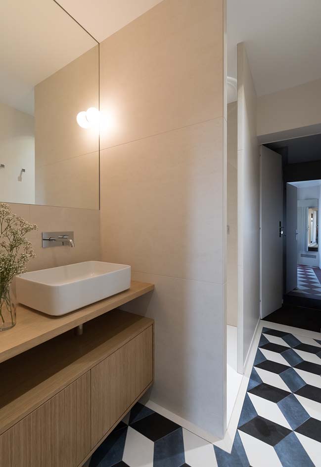
Each bathroom has been designed according to its particular context, the spacious parent’s bathroom, all in length, is materialized by two strips, one clear and one dark, blending the floor, wall and ceiling as a single element. The children’s bathroom has a more traditional tiling work, echoing ceilings with cornices, the floors reminiscent of a checkerboard, with diagonal tile floor compositions.
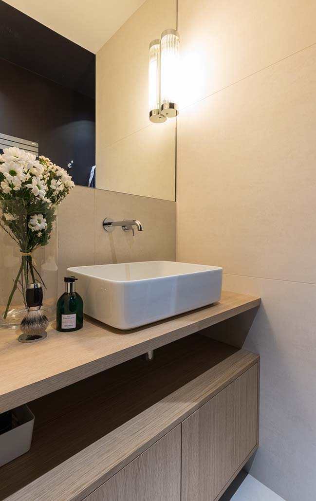
The colors’ choice also contributes to the overall staging. Both subtle in the living rooms or the bedrooms, it becomes more contrasted in the bathrooms or antechambers.
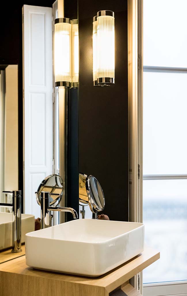
Numerous details punctuate these spaces, for instance the choice of materials as stretched carpets in wool, or the careful implementation of materials as the thinning edges of the porcelain stoneware generating “bird’s beaks”, or simply the care given to the custom-made product.
It was a project where periods of renovation and building works were major and decisive, because each discovery could have a consequence not only on architectural choices, but also on the preservation’s state of old features, which had to be protected during the entire construction period.
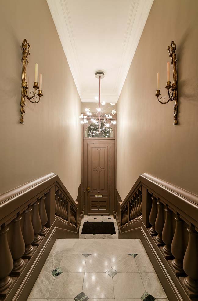
For these reasons, the choice of the right intervention teams was essential. They have made the realization of the project possible through mastering their skills. It was necessary to diminish a minimum of partitions and ceilings, and each reconstruction had to be realized along with the previous one. For instance, there were no partitions in plasterboard and no traditional joinery in composite wood.
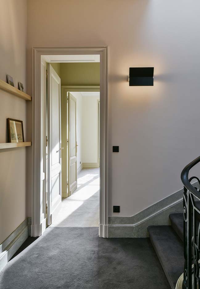
What makes this project amazing, especially in the areas where at first sight there doesn’t seem to have been any work done, is the fact that things stand out as obvious, as if it had always been this way. This feeling was very important in the overall composition of the project, as an invisible thread, which would be punctuated in some spaces by strong contemporary developments, highlighting once again the ancient space. To obtain this duality between new and unchanged spaces, it was important for on-site teams to work with old materials, as fine plaster, plaster cast, carpentry and traditional cabinetry. The result was to be as neat for the visible parts as for the hidden parts.
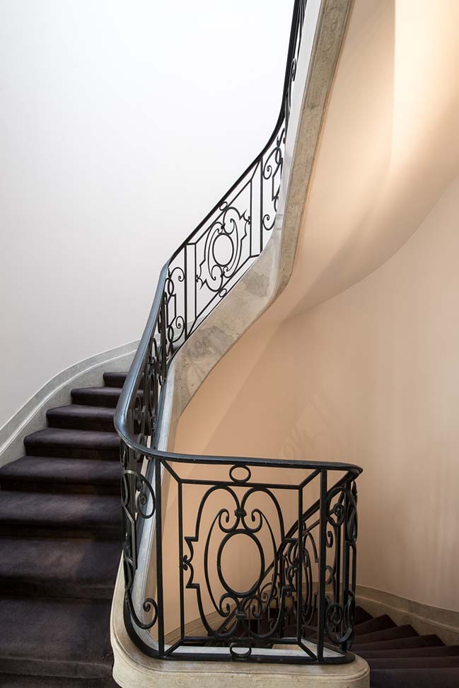
In the design of the spaces to remain unchanged, the execution of the electrical works and plumbing had to be made on the existing walls, tapping the paths for networks and then covering them as if they had always been there.
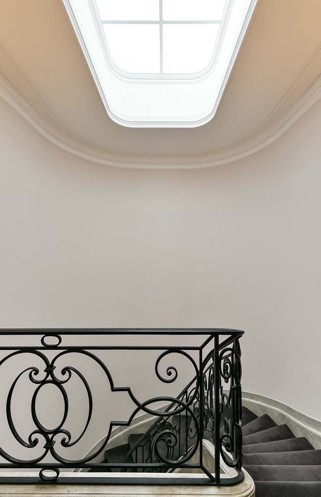
There is a real pleasure in walking through these spaces where nothing disturbs the eyes, but without really knowing why.
> Tiny House 11sqm in Paris by Batiik Studio
> Two private apartments in Paris by aavp architecture
Mansion L'hôtel de Bethmann by Martins Afonso atelier de design
02 / 19 / 2018 Everything has been designed in detail so that each architectural element finds its place, or each contrast highlights the existing ones
You might also like:
Recommended post: MAD Completes the Train Station in the Forest

